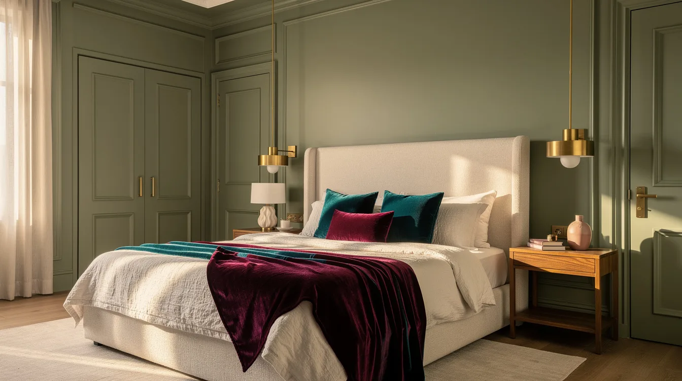
White trim can make a calm bedroom feel outlined by a marker, especially when the room is built around a bed about 160 centimeters wide. The hotel-style answer is color-drenching, painting the walls, ceiling, skirting boards, door frames and room-facing doors in one shade.
The technique does not hide uneven plaster or remove the joints between surfaces. It creates visual continuity, giving the eye fewer hard boundaries to process.
For a practical 2026 direction, start with muted sage, dusty blue or warm plaster pink, then use linen, wood and lighting for contrast. A low-sheen finish keeps the effect restrained and helps wardrobes join the same visual envelope.
Wrap Every Architectural Edge
Start with one color and carry it across the walls, ceiling, skirting boards, door frames and room-facing doors. Muted sage paint creates the softest hotel-suite mood, while dusty blue feels more tailored and warm plaster pink brings gentle depth.
White trim interrupts that envelope with a bright outline, especially around a doorway or ceiling line. White trim can still work in a deliberately contrasting scheme, but it weakens the seamless effect this technique is meant to create.
The ceiling is the detail many makeovers skip, and it is the one that most clearly changes the room’s geometry. A bright white ceiling leaves a strong horizontal boundary, while matching color makes the upper plane visually recede.
Color-drenching creates visual continuity rather than physically repairing joints or hiding uneven plaster. Uneven plaster will still be uneven, but the eye has fewer contrasting lines competing for attention.
Match Sheen Before Choosing Color
For maximum continuity, use the same color and an ultra-matt finish across compatible walls, ceilings and joinery. The result is quiet and enveloping, with architectural details appearing to fade into the room.
A subtler hotel-style version keeps the color consistent but varies the sheen: matt or eggshell on the walls and ceiling, then satin trim on doors, baseboards and other woodwork. Those surfaces catch a little light, so the room stays cohesive while the joinery remains visible.
When the wardrobe fronts are part of the composition, choose a compatible low-sheen acrylic paint instead of matching only the wall color. The lower reflection helps large storage surfaces sit inside the architecture rather than reading as separate furniture.
Always check that the finish is suitable for each surface before painting. Woodwork, metal hardware and previously coated doors may need different preparation even when the final color is identical.
Paint Doors Into the Backdrop
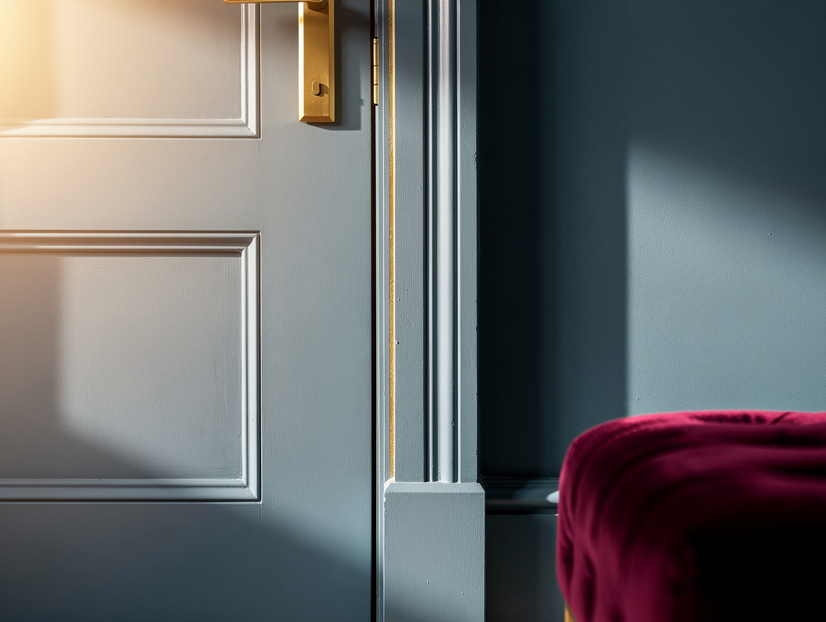
Dusty blue gives the technique a tailored boutique-bedroom character, particularly when the color runs from the ceiling down to the door. A documented bedroom makeover used dusty blue walls and extended the same tone across the room’s doors and millwork.
The room-facing door deserves special attention because it is often a large, uninterrupted rectangle. A blue door keeps that rectangle from breaking the wall into separate visual blocks, while the hallway side can remain a different color.
For a practical specification, use eggshell on the walls and ceiling with a slightly harder finish on the trim and door surfaces. Eggshell paint gives the broad planes a gentle glow without the high reflection that can make a small bedroom feel busy.
Leaving the exterior side of the doorway bright can make the transition feel intentional rather than accidental. The contrast of a white hallway against the blue bedroom also makes the color-drenched room feel more contained when the door is open.
Let Wardrobes Recede With Color
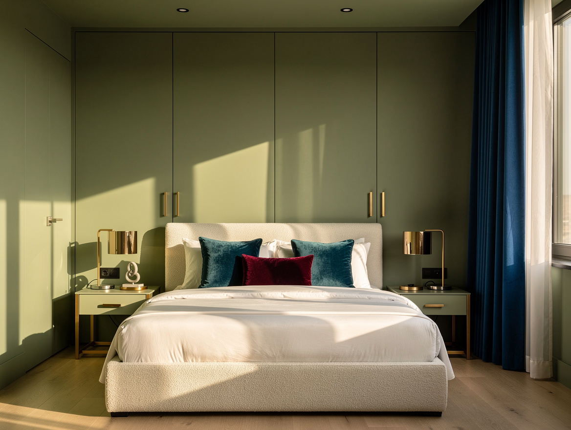
When storage occupies one entire wall, carry the color over the wardrobe fronts, ceiling and surrounding walls. Sage green paint is especially effective here because its muted quality softens the visual weight of a tall run of cabinetry.
Keep the hardware visually quiet so the doors read as part of the wall plane. Painted wardrobe fronts work best with simple handles or low-contrast pulls instead of a strong grid of dark metal.
Use a light bed to interrupt the green without cutting the room into separate zones. A light upholstered bed adds softness and keeps the storage wall from becoming the only dominant element.
For a bed around 160 centimeters wide, let the surrounding bedding and curtains stay close to the wall tone, then vary texture rather than adding another loud color. Natural linen bedding brings movement to the surface while preserving the calm, wrapped feeling.
Build Contrast Through Texture
Once the walls, ceiling and joinery share a color, contrast should come from materials that feel tactile in low light. Ivory linen bedding gives a dusty blue or sage room a clear focal point without introducing another sharp architectural outline.
Wood is the most reliable counterpoint because its grain adds warmth while remaining visually grounded. Oak bedside tables around 40 to 50 centimeters wide are useful design starting points, not measurements from any particular photographed room.
Lighting should support the color rather than flatten it with a cold overhead glare. A shaded lamp, warm bulb and softly illuminated warm wood surface can make low-sheen paint look layered instead of dull.
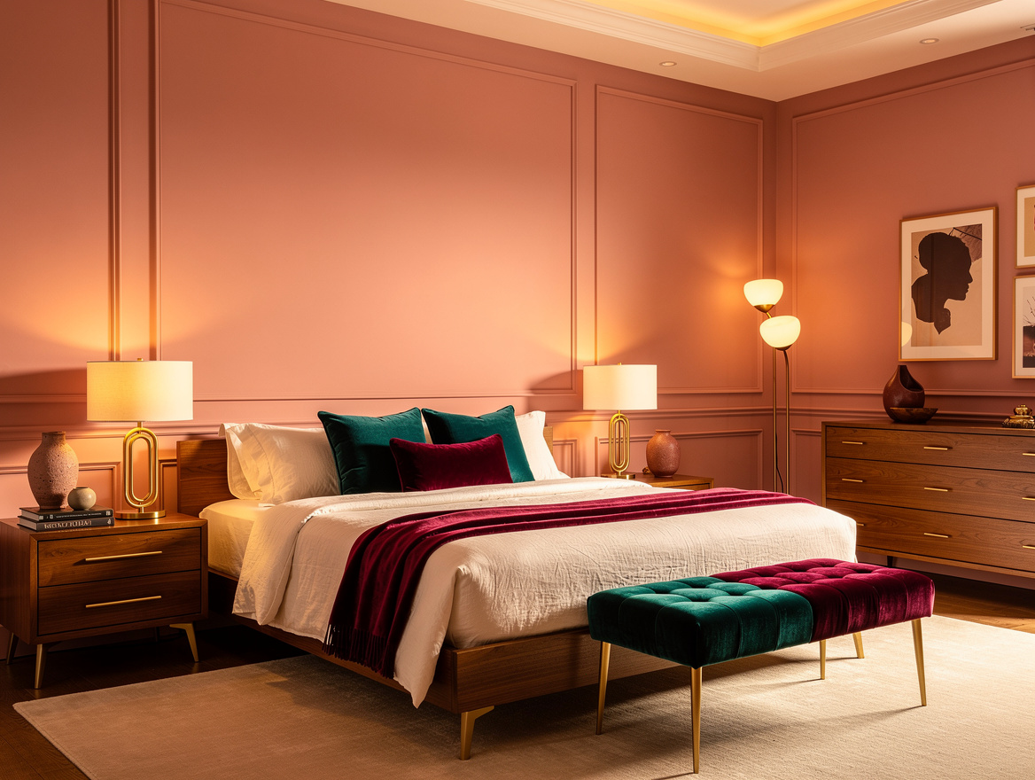
Warm plaster pink is another useful direction when the bedroom needs more warmth than sage or blue can provide. Pairing warm plaster pink with pale bedding and natural wood keeps the effect restful instead of sugary.
Test The Envelope In Changing Light
Paint a sample on the wall, near the ceiling and beside the door before committing to the full room. A paint sample can look muted in morning light, richer at night and unexpectedly reflective beside a window.
Check the color with the exact sheen planned for each surface, because the same pigment can read differently in matt, eggshell and satin. This matters most when a wardrobe or door sits directly beside the wall.
Color-drenching can make a room feel more continuous and cocooning, but it does not guarantee that a dark bedroom will feel larger or brighter. Use pale textiles and warm layered lighting when brightness matters, rather than expecting paint alone to solve it.
Make the ceiling the first test area, then decide whether the walls, trim, doors and wardrobes should follow. The most convincing rooms commit to the envelope early and reserve contrast for fabric, wood and lighting.
Begin with the ceiling and the room-facing door, then carry the color onto trim and wardrobe fronts if the surfaces are compatible. That order reveals the effect quickly and prevents bright outlines from undoing the hotel-suite calm.
Mia Carter writes about small-space living and budget home makeovers. She has restyled three rentals and tests most ideas in her own 45 sqm flat.