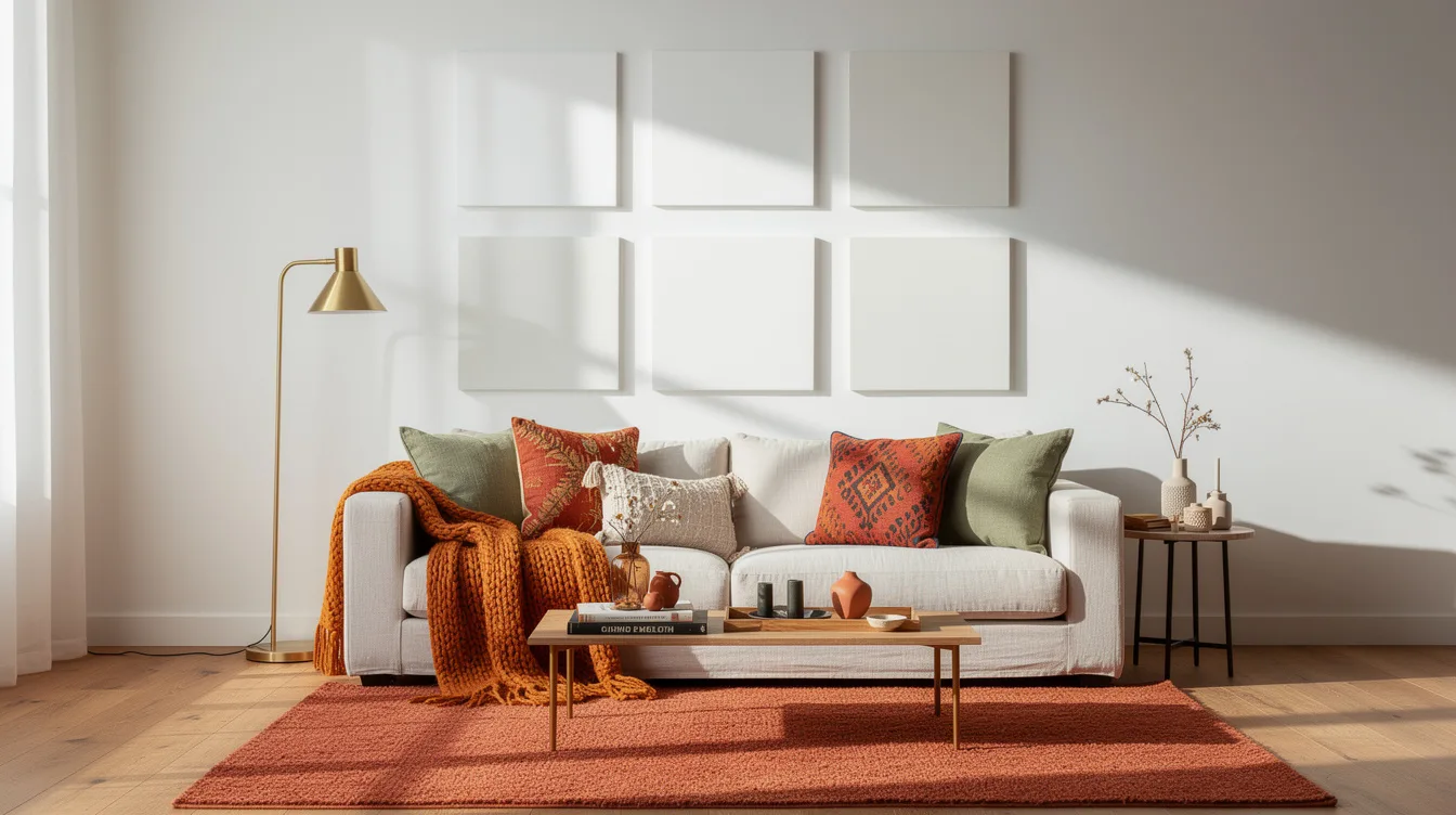
I once painted a 10-by-12-foot bedroom with a white that looked perfectly calm on its sample card, then watched it turn icy against the room’s east-facing windows. By dinner, the walls made my warm wood dresser look almost gray.
That project taught me the useful truth about white paint: the best choice is rarely the brightest one. It is the shade that agrees with your light, your finishes, and the mood you actually want to live with.
Read the Light Before You Browse
My first mistake was treating white as a neutral blank. On a north-facing wall, a crisp sample looked chilly by noon, while a warmer white held onto the soft glow from my oak floor.
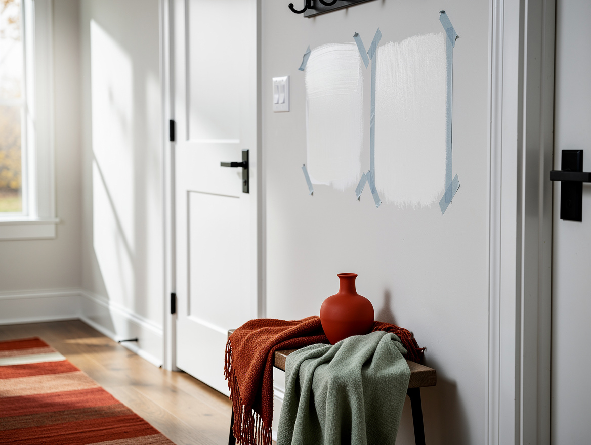
Stand in the room at breakfast, midafternoon, and after lamps come on. I paint each test patch at least 12 by 12 inches, because a tiny chip cannot show how a color reacts beside linen curtains or a dark sofa.
Start With a Softer Whole-Home White
For connected rooms, I favor a warm, slightly muted white over a stark gallery white. The current pull toward organic interiors makes sense here: creamy whites sit comfortably beside rattan, aged brass, and natural wood.
At Home Depot, compare warm samples against your fixed finishes before committing. A white that feels faintly beige on the card can look clean and relaxed across a large living-room wall.
Reserve Crisp White for Clean Contrast
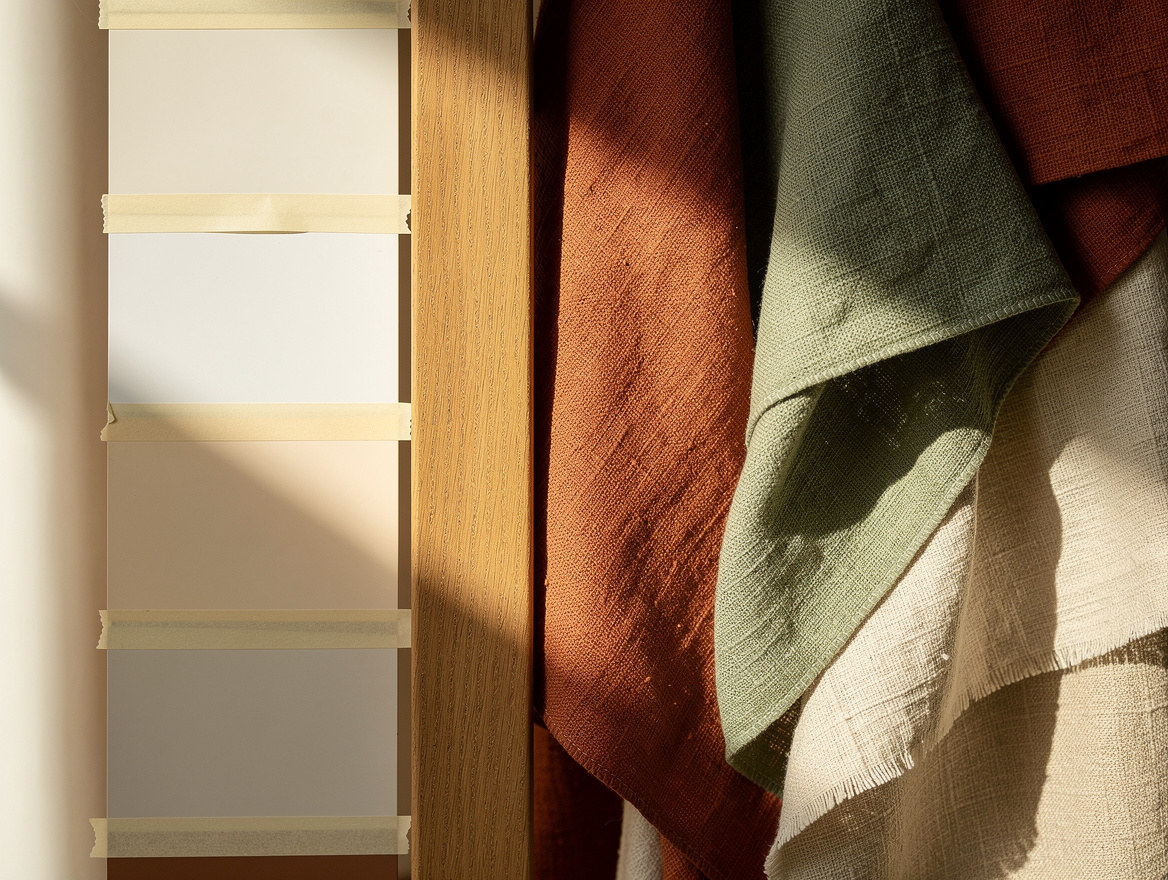
I use a sharper white when the room already has strong outlines, such as black window frames or charcoal tile. It gives modern spaces the clear contrast they need, especially around matte-black hardware.
Buy a sample first at Lowe’s, then place it beside every permanent surface. Crisp white can turn blue-gray in cool light, and I would never use it across an entire dim room just because it looked bright under store lighting.
Match the Finish to the Surface
Finish changes the result as much as undertone does. Matte paint is my default for walls because it softens minor dents and keeps a calm, high-end look without reflecting every lamp.
Choose eggshell where fingerprints and everyday traffic demand easier cleaning, then use satin or semi-gloss on painted trim, doors, and cabinets. Gloss has its place, but its shine makes sloppy prep impossible to ignore.
Test Samples Beside the Things You Keep
Paint directly on the wall, or on large movable boards if you are renting. A sample needs to meet the actual countertop stone, upholstery, and flooring, rather than floating alone on a white poster board.
I also move the sample near doorways, where one white often meets another room’s light. A typical 2.5-liter or 5-liter can suits many single-room projects, but samples are far cheaper than repainting after a full purchase from Ace Hardware.
Set Trim Apart From the Walls
Walls and trim do not have to match exactly. I like a soft wall white with a cleaner, brighter white on baseboards, because that small contrast makes molding look intentional rather than dingy.
Keep the shift restrained, especially in a low-light hallway. A satin or semi-gloss trim finish from Walmart catches enough light to define edges, while a high-gloss finish can feel too formal in an ordinary family home.
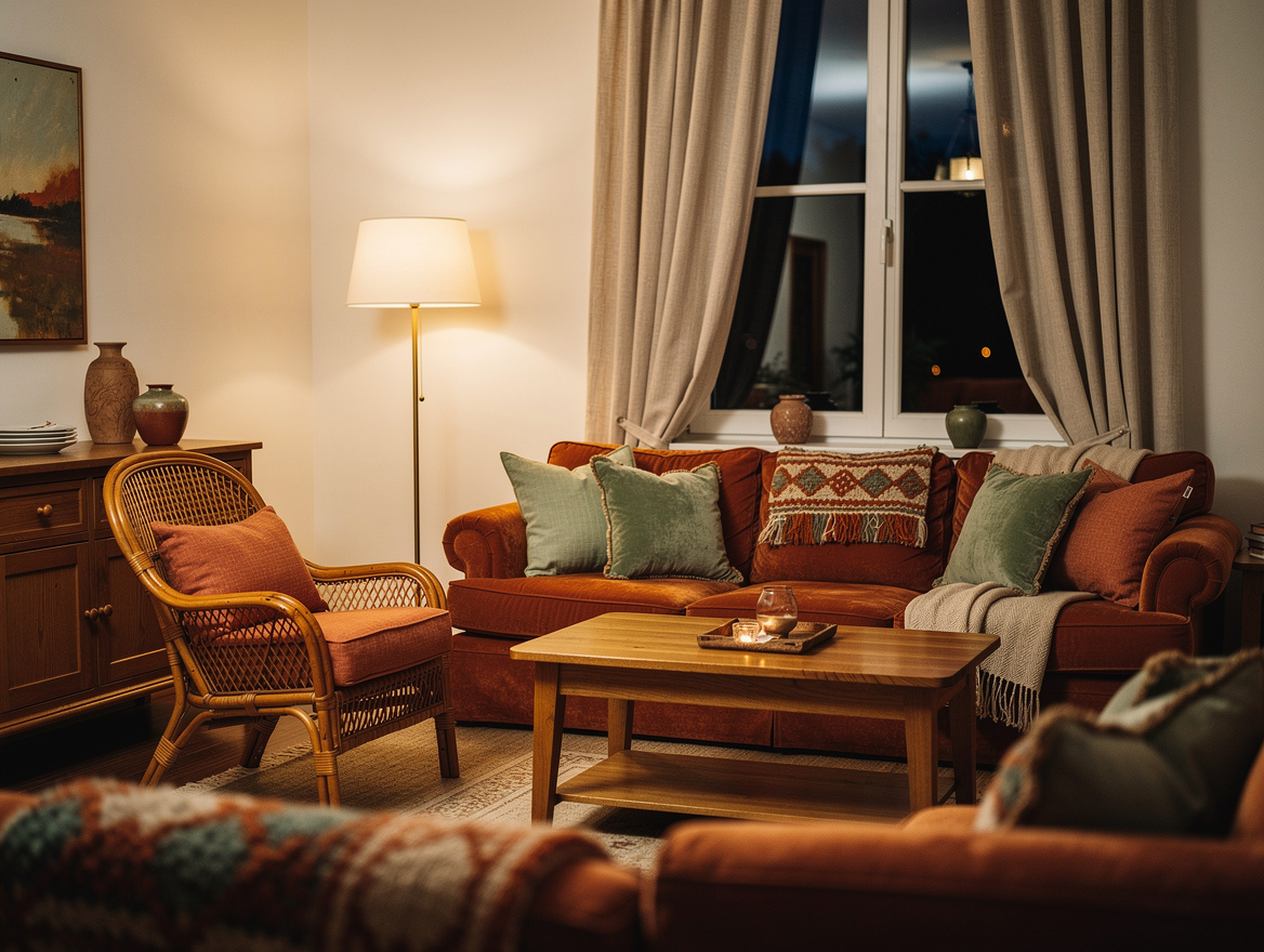
Begin with two large samples on the wall nearest your main window, then live with them for a full day. The white that still works after sunset is the one worth buying by the can.
Mia Carter writes about small-space living and budget home makeovers. She has restyled three rentals and tests most ideas in her own 45 sqm flat.