
A library room for book lovers can work without renovation, and the short answer is yes: paint, rugs, millwork cues, and one convincing bookcase wall do most of the heavy lifting. I learned that after trying to force a full built-in plan into a normal living room budget. Too much! Once I treated the passage like styling first and carpentry second, the whole idea got easier, and the room finally felt like somewhere you’d want to disappear into on a Sunday.
- This isn’t a list about buying more books.
- It’s about hiding a room behind your books.
- The whole effect comes from one convincing idea and a few quiet, moody, inviting cues around it.
- If you only do five of these, do 5, 8, 11, 17, and the closing move.
- Start with a continuous wall of disguised bookcases
- Anchor the hidden entry beside the fireplace
- Build a pivot shelf into existing trim
- Camouflage the latch behind stacked art books
- Paint the library reveal in oxblood lacquer
- Layer antique rugs toward the hidden threshold
- Hang portrait lights over the moving shelves
- Wrap the doorway in walnut picture molding
- Install pocket doors behind velvet library curtains
- Hide speaker panels inside cane cabinet fronts
- Why frame the passage in a soft arch?
- Add rolling ladder rails across the seam
- What goes beyond the panel?
- Conceal hinge lines with vertical book stacks
- Mount a gilded mirror on the swing panel
- Style lower cabinets as a quiet plinth
- How should you light the room beyond the panel?
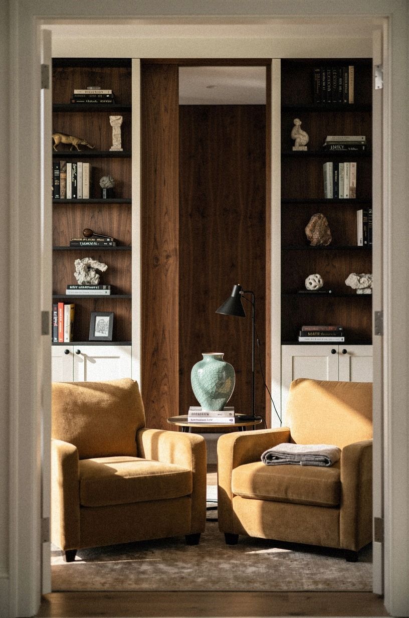
- Finish with club chairs facing the reveal
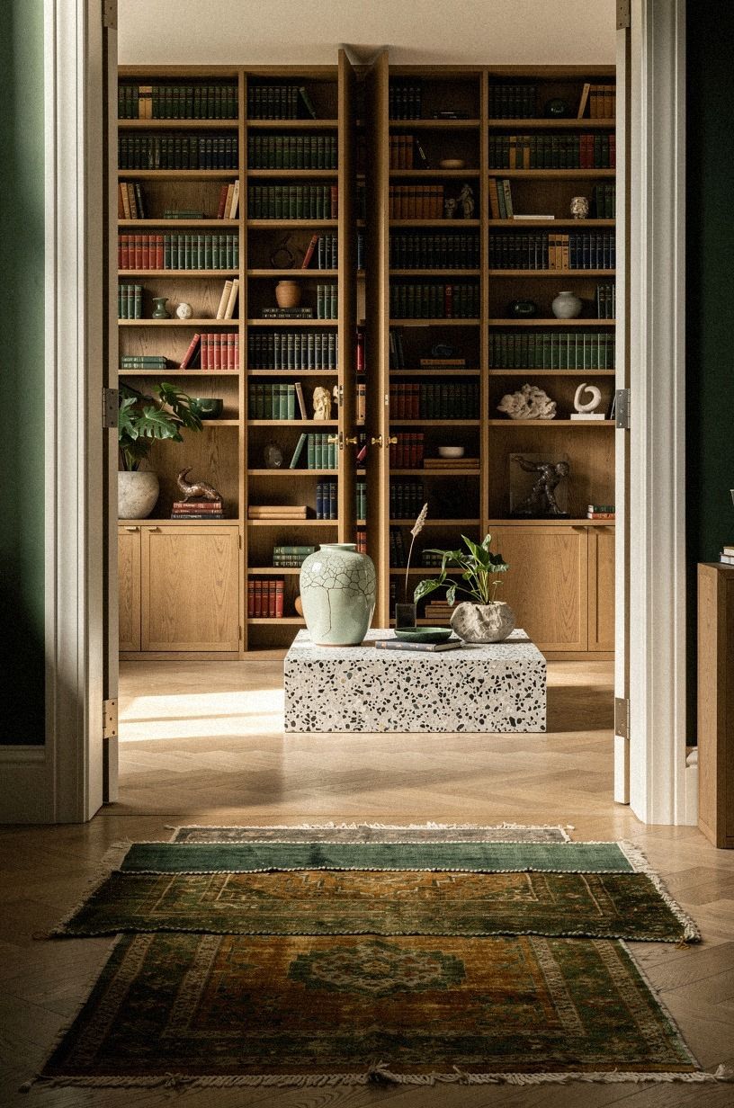
1Start with a continuous wall of disguised bookcases
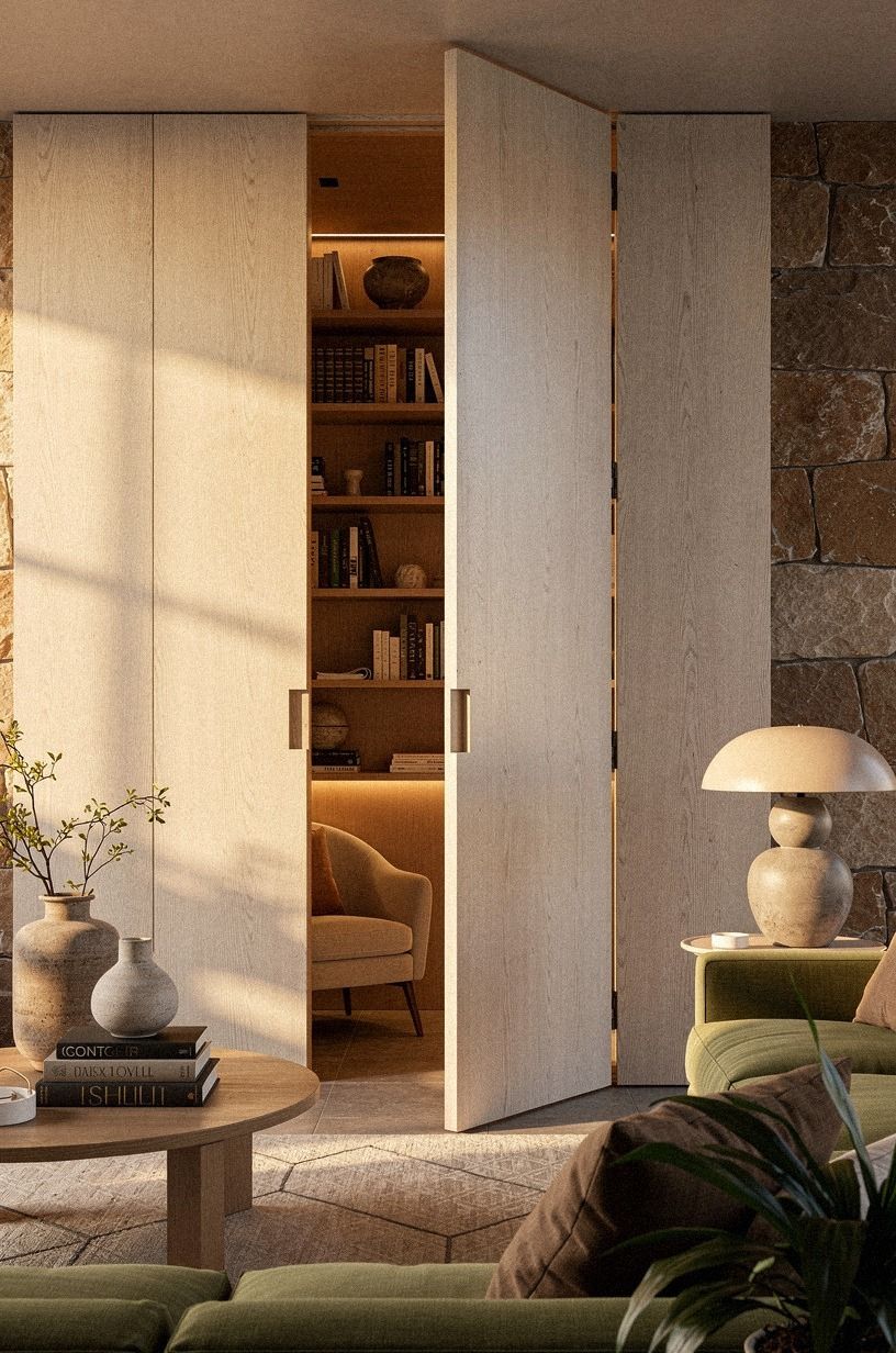
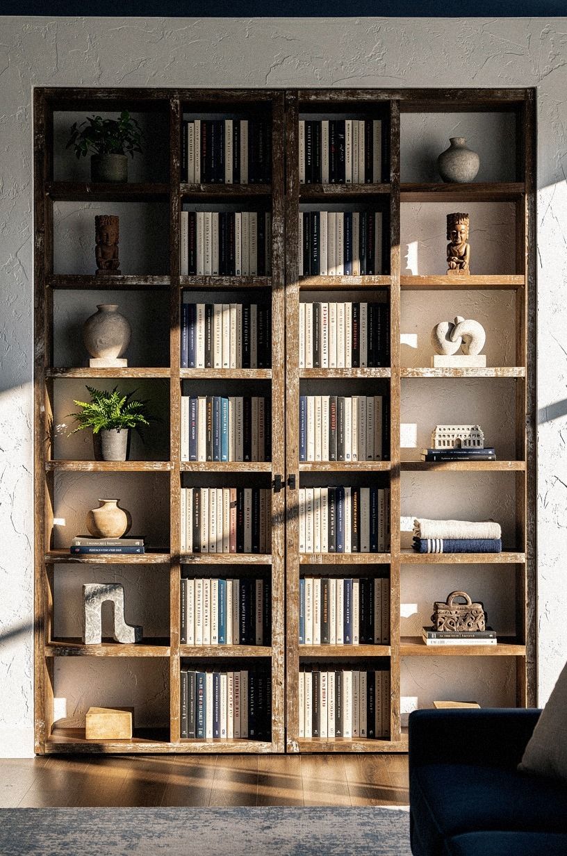
Start with the full wall, not the door. If you build one moving shelf without giving it neighbors, you can spot it from the sofa in five seconds. You want a continuous field of books, lower cabinets, and repeat spacing so your eye reads architecture before it reads hardware.
I like using IKEA BILLY units as the base because you can line up several widths and fake a custom run with trim. Keep your spines mixed, your shelf heights slightly irregular, and your center break subtle. For proportions that read as real, this bookshelf-door guide helps you study the proportions of convincing passages.
And don’t over-style the face. A parted shelf with books just visible beyond it works because the room stays calm, hushed, and believable, with one seam and one promise.
2Anchor the hidden entry beside the fireplace
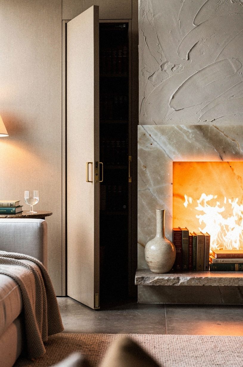
Put the moving panel beside the fireplace if you can. You already have a focal point there, so the extra visual weight feels earned rather than random. In a living room, the fire, the books, and the doorway want to talk to each other.
Use the hearth edge as your alignment line. If your mantel is painted Benjamin Moore Revere Pewter HC-172, let the side bookcase pick up the same softness while the inner library goes darker and moodier.
I would not center the opening on the wall unless the room is very formal. Off-center feels more believable, intimate, and dramatic, especially when bright flames are already pulling your eye sideways.
For layout balance, borrow a little from this living-room feng shui read. You want movement toward the fire, then a small sidestep into the library.
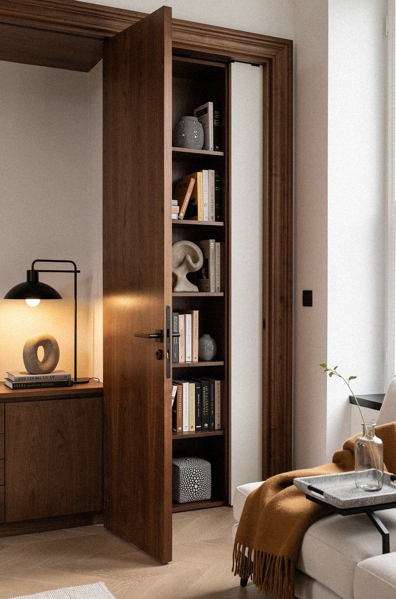
3Build a pivot shelf into existing trim
A pivot shelf works best when it looks like it has always belonged to the trim package. That is the whole point. If your baseboards, casing, and shelf face don’t share a language, the moving panel reads like stage scenery.
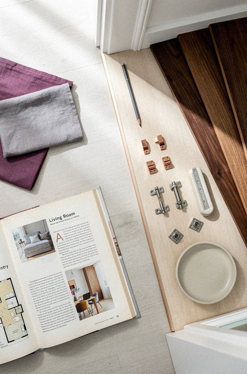
Match the rail width to what you already have and use 3/4-inch solid walnut veneer plywood only where the hand will notice it. I made the mistake of over-thickening the outer stile once, and the whole unit looked like a disguised appliance door. Keep the reveal tight, especially at the floor line.
Before you commit, sketch the swing on paper with your furniture footprints. A simple floor plan and this hidden-entry roundup will save you from building a door that bangs into a coffee table every time.
4Camouflage the latch behind stacked art books
The latch should disappear into something you were going to style anyway. A stack of oversized art books does the job because the spines sit flush, the pages add a little weight to the panel, and the books themselves feel collected, elegant, and lived-in rather than staged on a Calacatta Gold tray.
I keep a small brass hinge sample pinned to a felt square right behind the top volume so the release is reachable but invisible from the sofa. If you’re renting, mount the whole assembly with museum putty instead of screws, and the books lift off cleanly when you move.
For more cabinet-face illusions, this bookshelf-door guide shows how a parted shelf can do the same hiding work with even less hardware. And yes, that one felt pad under the bottom volume is doing real work. Without it, the stack drifts two inches over a season and the seam starts whispering.
5Paint the library reveal in oxblood lacquer
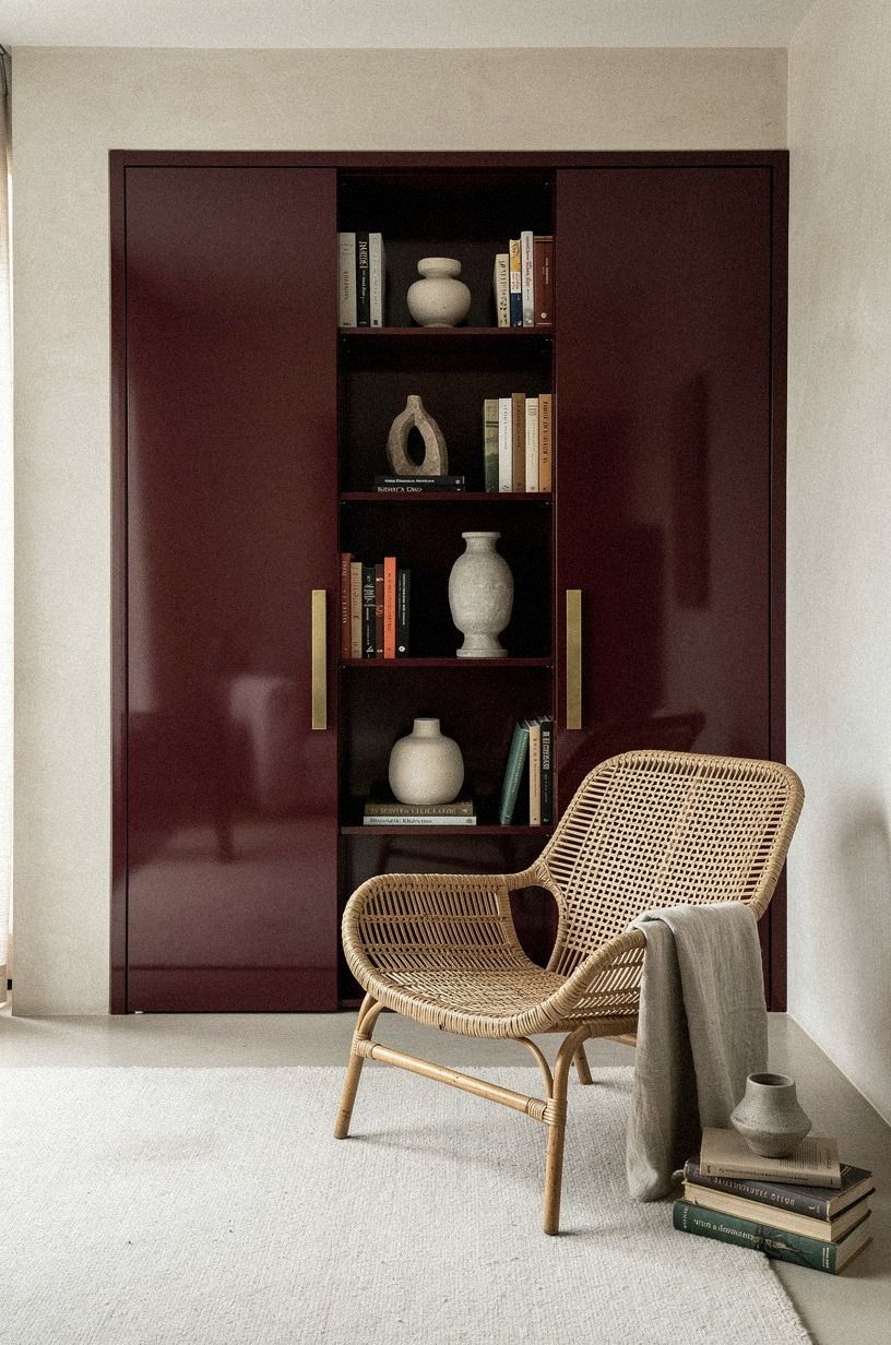
Paint the inside reveal darker than the living room. That is how you make the opening feel deeper than it is. Oxblood works because it reads brown in daylight, red at night, and almost black when the lamps are low, which gives the threshold a richer, smokier, more atmospheric pull.
I would choose Farrow & Ball Hague Blue No.30 for the outer room before I’d use black, then push the reveal into an oxblood lacquer finish so the threshold has contrast without shouting. If you paint both spaces the same value, you lose the little gasp that makes the passage feel worth opening.
If you want more color-direction examples, this bookshelf entrance guide is worth a look. The best versions keep the outer room calm so the darker opening lands harder.
And lacquer likes restraint. One chair, one side table, one glow on the surface. That’s enough to make the reveal feel polished instead of busy.
6Layer antique rugs toward the hidden threshold
Rugs can do the directional work your walls can’t. Layer them so the largest one grounds the seating area, then let a runner or smaller antique piece pull your eye toward the book wall and the partly open panel beyond.
Start with an 8×10 wool rug if your living room is small or a 9×12 wool rug if you need the front legs of every chair on fabric. The overlap should feel like a drift, not a stack. I like a faded rust medallion over a quieter, warmer, more romantic base because it gives you movement without asking for more furniture.
If your room still feels static, the answer usually isn’t another table. It’s one better path across the floor, and this bookshelf-door inspiration piece makes that obvious once you look for it.
7Hang portrait lights over the moving shelves
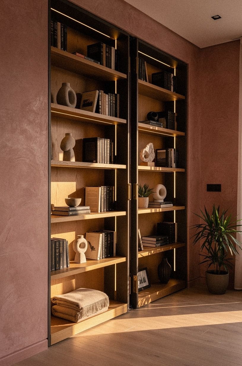
Upper lighting sells the built-in look. Without it, the wall reads flat, and a flat wall makes the seam more obvious. Portrait lights create a rhythm line above the shelves, which is useful when the panel below needs to disappear.
Choose aged Visual Comfort picture lights or a similar hardwired style with a warm bulb, then space them so the beam washes book spines instead of the ceiling. I wouldn’t use bright puck lights here. They make books look like retail stock, and that’s the opposite of the mellow, cocooning mood you want.
For more shelf-lighting rhythm, this hidden-entry roundup helps you see how the top line of light can make a whole wall feel built rather than bought.
But dimmers matter more than brand. If the light throws a soft amber band across the top third of the shelves, the join line underneath gets a lot harder to spot.
8Wrap the doorway in walnut picture molding
Molding is what turns a bookcase door into architecture. Even in a casual room, a walnut frame around the opening gives the panel a reason to exist. It also helps the edge read as design instead of carpentry.
Use cerused walnut molding with a finish close to your shelf face, then let the rectangles continue across fixed and moving sections. I love this move because you can fake custom millwork for less than a full rebuild, especially if your living room already leans old-house, tailored, and gracious in spirit.
For proportion ideas, I still look at this Norman village story because the rooms feel collected rather than showroom-clean. You want that same hush on your wall.
And don’t run the rectangles all the way to the corner. End them at the panel break, then resume on the other side at the same interval. That little matching step is the part that makes the seam feel designed.
9Install pocket doors behind velvet library curtains
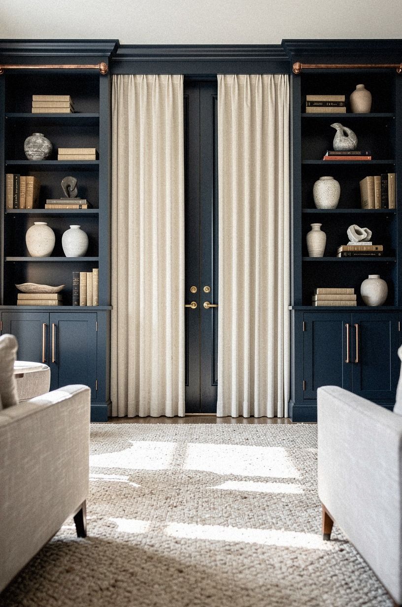
If a swing panel feels too ambitious, hide the opening with pocket doors and curtains. This is one of the few times more layers make a room easier, because the curtain softens the wall while the door handles the privacy.
Go with 18 oz cotton velvet in a midnight blue close to Sherwin-Williams Evergreen Fog SW 9130 on nearby trim, then let the fabric puddle just enough to kiss the floor. I would skip skinny rods and grommet tops. They feel temporary, and the whole point is to make the opening feel built in, sumptuous, and quietly theatrical.
This movie-room mood piece is useful here because it shows how fabric can soften a formal wall without making it feel precious. That’s a hard balance!
And yes, you can keep the curtain symmetrical even if the actual passage isn’t. That’s the part that makes the wall feel grand from across the rug.

10Hide speaker panels inside cane cabinet fronts
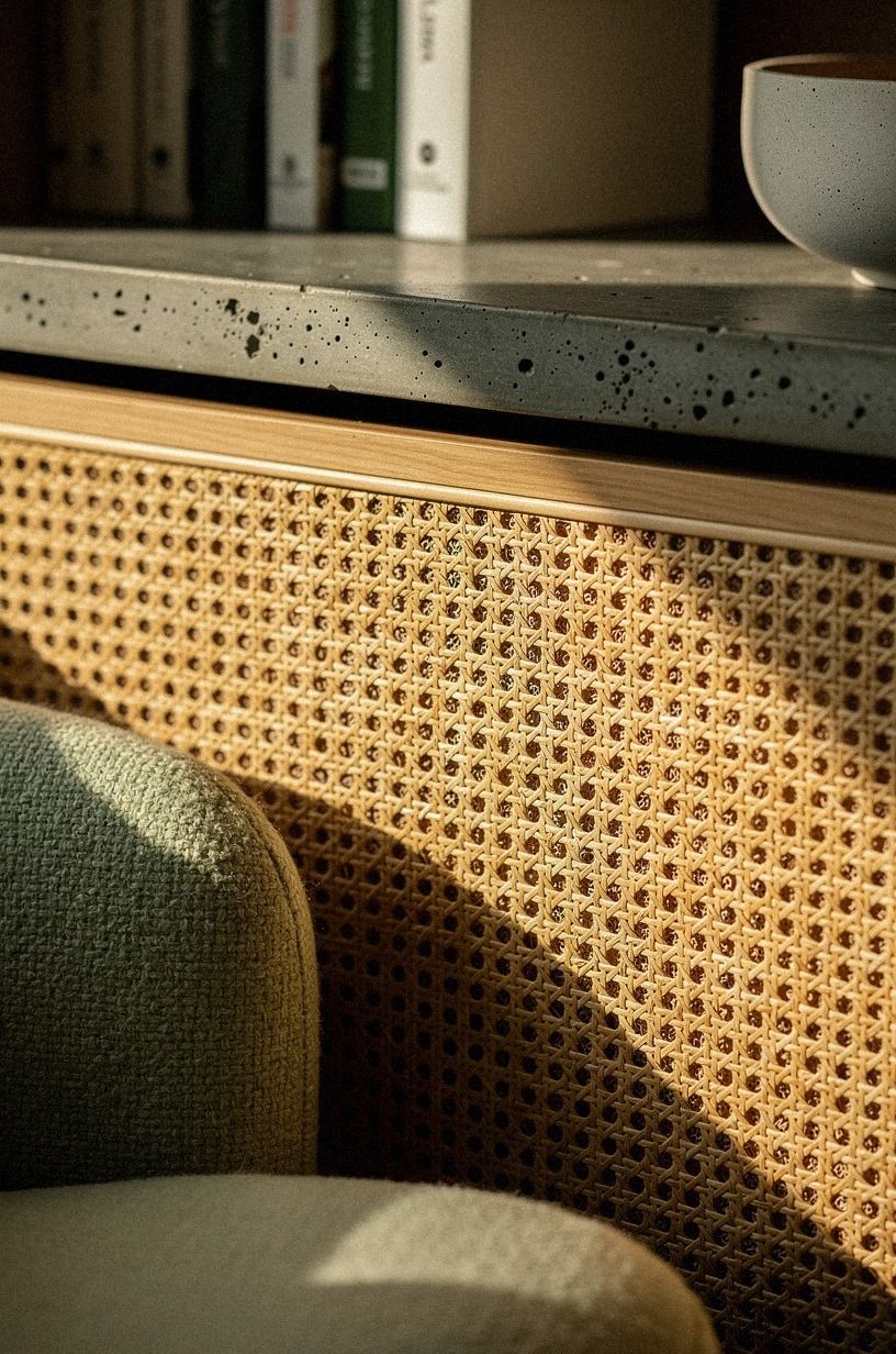
Lower cabinets are useful real estate, so don’t waste them. If you need speakers near the book wall, cane fronts let sound through while keeping the face lighter than a bank of painted doors.
A woven cane webbing insert, especially under a shelf stack, adds texture without competing with the books. Pair it with a bouclé chair and a matte finish cabinet paint so the detail reads intentional in a close look. I learned this after hiding a speaker behind solid wood once.
It looked fine. It sounded awful.
If you’re mixing tech with character, this hidden-room overview is a good reminder that concealment works best when the room still functions first.
11Why frame the passage in a soft arch?
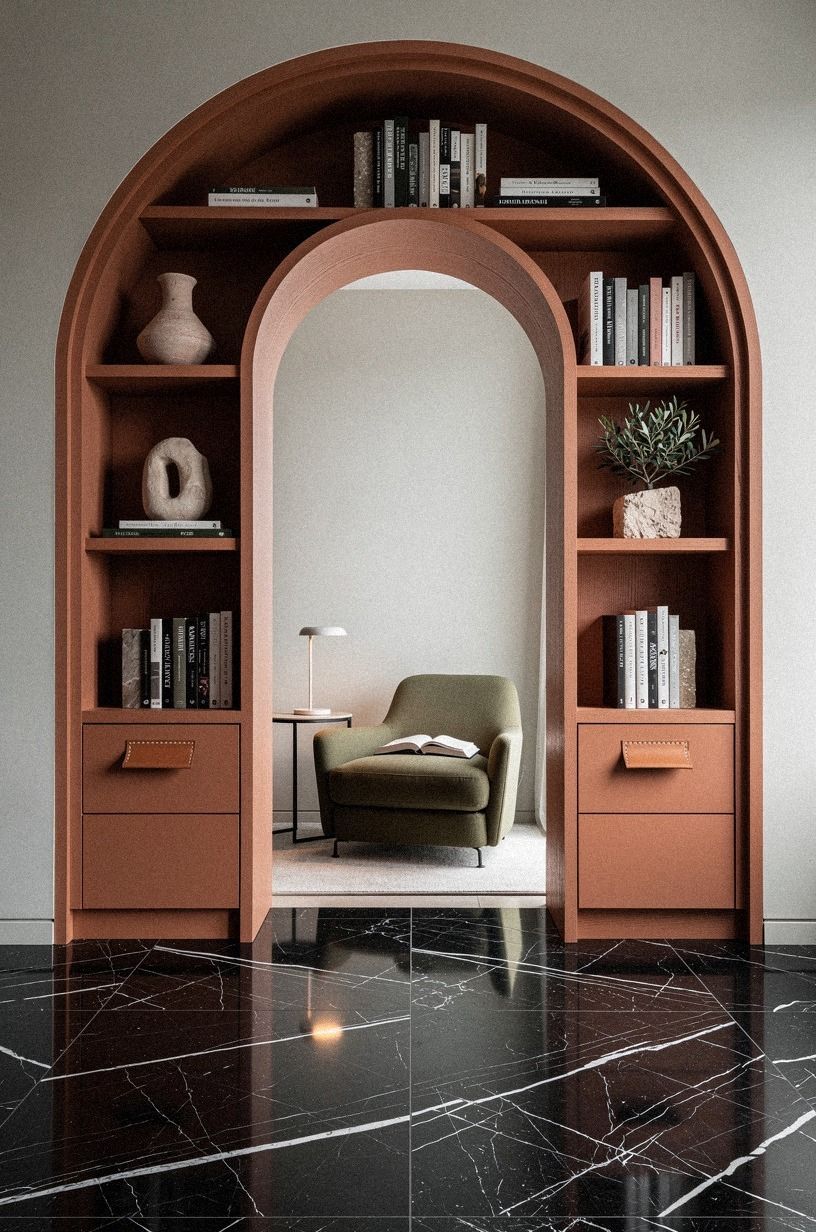
An arch can make a modest opening feel more important, especially if the rest of the room is fairly square. The move is to keep the curve soft and the shoulders low, so the arch whispers rather than shouts and the whole frame feels gentle, graceful, and expensive.
Build the arch from 1/4-inch MDF bending plywood, then wrap it in the same cerused walnut you used on the picture molding with a Tung oil sealer so the eye reads one continuous piece of millwork. A short reading chair on the inside reads better than a tall one, because the curve should sit a foot or two above the chair back.
I went too tall the first time and the arch ended up swallowing the whole passage. The curve loses every time it tries to dominate.
If you want to see how a soft curve plays against square millwork elsewhere, this bookshelf-door inspiration piece shows arches next to flat frames, and the difference is striking.
12Add rolling ladder rails across the seam
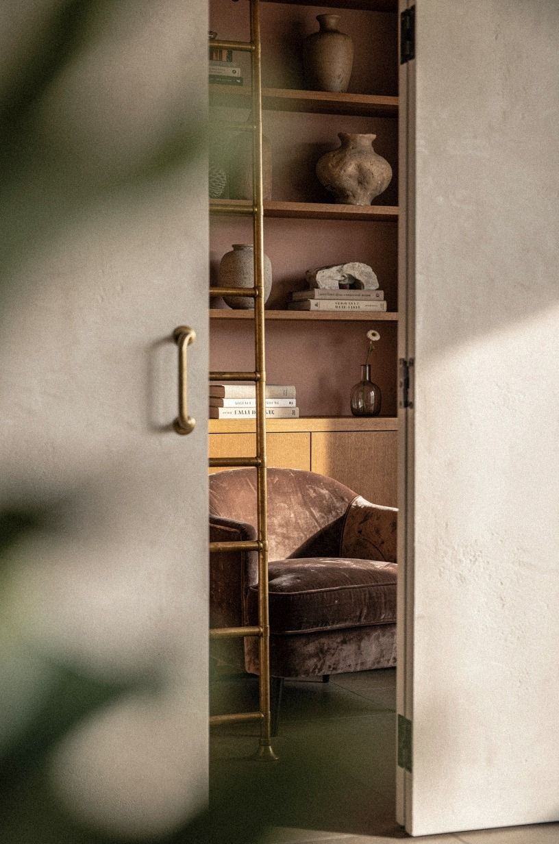
A ladder rail crossing the seam does two jobs at once: it hides the break and makes the wall look like a serious library. That extra layer of purpose helps you sell the fiction to anyone standing six feet away.
Mount antique brass ladder hardware across both fixed and moving sections, then keep the shelf depths consistent so the rail feels structural. I prefer brass here over matte black because the warmer finish catches light and softens the mechanics in a richer, more storied way.
For the lived-in vibe, steal a page from this movie-room idea collection. A little foliage in the foreground makes the rail feel discovered rather than staged.
13What goes beyond the panel?
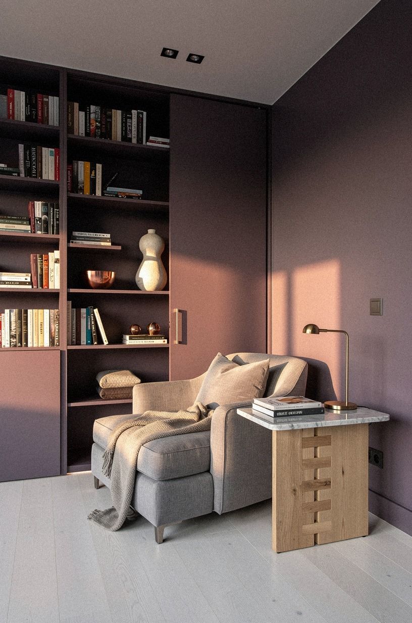
Give the room beyond the panel one unmistakable purpose. A reading chaise is the move because the silhouette reads instantly, and the promise of the passage is finally answered.
Choose a deep-seat bouclé chaise in bone with the seat at roughly 17 inches off the floor, then angle it about 30 degrees toward the panel so the chair pulls you through the opening. A floor lamp with a warm 2700K bulb in unlacquered brass on a Carrara marble base finishes the scene without competing with the books. If you want more nook inspiration, this bookshelf-door guide shows how the chair choice can either make or break the moment.
And resist the urge to add a side table with a stack of coasters. The chair, the lamp, and one soft throw across the arm is the silhouette. Anything more and the nook starts to read like a waiting room.
14Conceal hinge lines with vertical book stacks
Vertical stacks are better than horizontal clutter when you’re hiding hinge lines. They create a visual stripe, and stripes are forgiving. Your eye follows the books up instead of tracing the join line side to side.
Use taller hardcovers near the outer edges and let a few navy, cream, and walnut spines repeat across both sides of the break. I would not jam every shelf full. Empty inches matter here because they keep the wall from looking nervous, cramped, or fussy.
For more examples of convincing shelf rhythm, this bookshelf entrance article is useful. You can see how the cleanest walls leave space for the eye to rest.
15Mount a gilded mirror on the swing panel

A mirror on the panel makes the door earn its footprint. It also distracts from hardware because people read the reflection first, then the frame. That’s a nice little advantage in a room where disguise matters.
Pick a narrow gilded Louis-style mirror or a simple antique gold frame with enough height to feel architectural. I would not go extra wide. Too much width makes the panel heavy, and then you’re fighting swing clearance and sight lines at the same time.
For scale cues, this door-concealment guide helps you compare mirror shapes against shelf widths before you put holes in anything. Worth it!
Place a book, brass hinge sample, and marble tray nearby while you’re planning. If those finishes look good together on the floor, they’ll usually look good on the wall too.
16Style lower cabinets as a quiet plinth
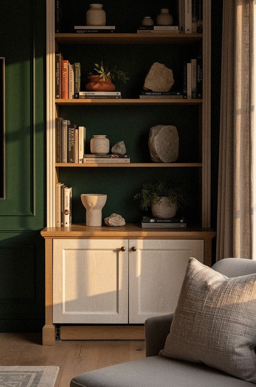
The lower cabinet run should read like a quiet plinth holding up the books, not like kitchen storage. Flush doors, a concealed toe kick, and one paint color across the whole base are what make the wall feel anchored, orderly, and reassuring.
This is also where your budget reality becomes clear. A styling-first version can look rich for far less than custom millwork if you spend on the pieces people notice first. A typical living room range looks like this:
I’d put the money into Benjamin Moore Revere Pewter HC-172 paint, one wool rug, and cabinet hardware before I’d pay for ornate feet or carved panels. People read the broad shapes first.
17How should you light the room beyond the panel?
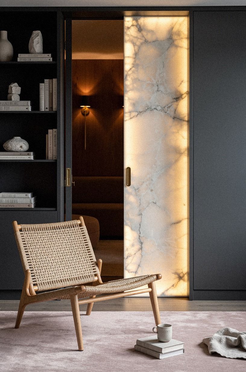
The room beyond the wall should feel dimmer, warmer, and a little quieter than the living room. Sconces at reading height do that better than any overhead fixture, because they push light sideways onto the page instead of bouncing it off the ceiling and flattening the intimate, cocooned mood.
I’d mount antique brass sconces about 60 inches off the floor on either side of the chaise, then run them on a separate dimmer from the living room circuit so the back room can stay at half the brightness. Pair that with one 2700K warm bulb per side and you’ve got the kind of glow that reads candlelit without anyone lighting a wick.
Skip the pull-chain. The dimmer is doing the work.
The other move that earns the space: hide one small floor outlet behind the chair so the lamp cord disappears. Visible cords are the fastest way to break the spell. For more candlelit-after-dark references, this movie-room mood piece shows rooms that pull off the same hush without overhead light.
18Finish with club chairs facing the reveal
Turn the seating toward the reveal once the wall is done. That’s the easiest way to make the library feel connected to the living room instead of trapped behind it. Two club chairs facing the opening make the passage part of the conversation.
Use chairs with a generous seat and keep the coffee table about 16-18 inches tall, roughly two-thirds the sofa length, so the arrangement feels easy to move through. I like warm brown leather or brushed olive fabric here because both play nicely with walnut.
And don’t crowd the doorway view. A clear sight line from chair to opening is what keeps the whole idea from feeling like a set piece.
Why the Borrowed-Architecture Rule Works Now
Here’s my honest take: the appeal of this look isn’t novelty. It’s relief.
Most living rooms got flatter over the last decade, not warmer. We took out trim, painted everything one pale tone, mounted bigger screens, and then wondered why the room felt emotionally blank, sterile, and forgettable by dinner.
A disguised library passage fixes that without demanding a contractor-grade overhaul. You borrow the signals people respond to instinctively: depth, shadow, framed openings, repeated wood tone, and the feeling that a room might continue past what you first saw.
That’s why this idea keeps coming back in 2026. People are tired of rooms that explain themselves in one glance.
I’ve also learned that the expensive version isn’t always the better one. A custom millwork wall can look incredible, sure, but if the furniture in front of it is underscaled or the lighting is cold, the whole thing falls apart.
Meanwhile, a normal living room with good paint, one rug that fits, a believable seam, and a reading chair beyond the panel can feel richer, softer, and far more enveloping because the proportions are calmer. That sounds unfair. It is.
If you’re deciding where to spend, I’d protect the broad reads first: wall color, rug size, chair scale, and warm lighting. Then I’d make the opening convincing.
Not flashy. Convincing.
That’s the part readers remember, and it’s the part guests keep walking toward without being told. When people lean in a little, you’ve nailed it.
A Few Things Worth Answering
What’s the cheapest way to fake a hidden library in a living room?
Start with the free moves: regroup your existing bookcase into a continuous run, paint the inner reveal one shade darker than the living room, and angle a chair you already own toward the new seam. That’s your test for under $50. If the idea sticks, then spend on picture molding and a proper chaise.
What’s the one move that makes the passage feel real?
The reveal. Paint the inside of the opening visibly darker than the living room, with an oxblood lacquer, Farrow & Ball Hague Blue No.30, or even a deep matte black, and the seam finally reads as depth instead of trim. Without that contrast, every other move is wasted.
Do I need a real hidden door to pull this off?
No. A rug layered toward one corner, a darker paint rectangle behind a freestanding bookcase, and a single chair angled into a small alcove will sell the same idea in a rental. Save the swing hardware for the house you own.
How much does a styling-first version usually cost?
About $300 to $1,200 for paint, lighting, a rug, and a secondhand chaise. A furniture-heavy redo with custom millwork climbs to $2,500 to $8,000. Free moves still carry most of the effect: rug direction, chair angle, shelf regrouping.
Is a hidden library worth it in a small living room?
Yes, because small rooms reward depth cues. Keep the opening off-center, let your rug guide the walk, and pick one chair with a low back so the silhouette stays quiet. More details in our compact reading nook ideas.
Where I’d Start First
If I had to pick one, I’d start with the wall of disguised bookcases. That’s where the lie becomes believable. Get the broad rhythm right first, and every rug, light, and chair you add after that finally has something solid to support.
Save this for the weekend, then move at your own pace from there.