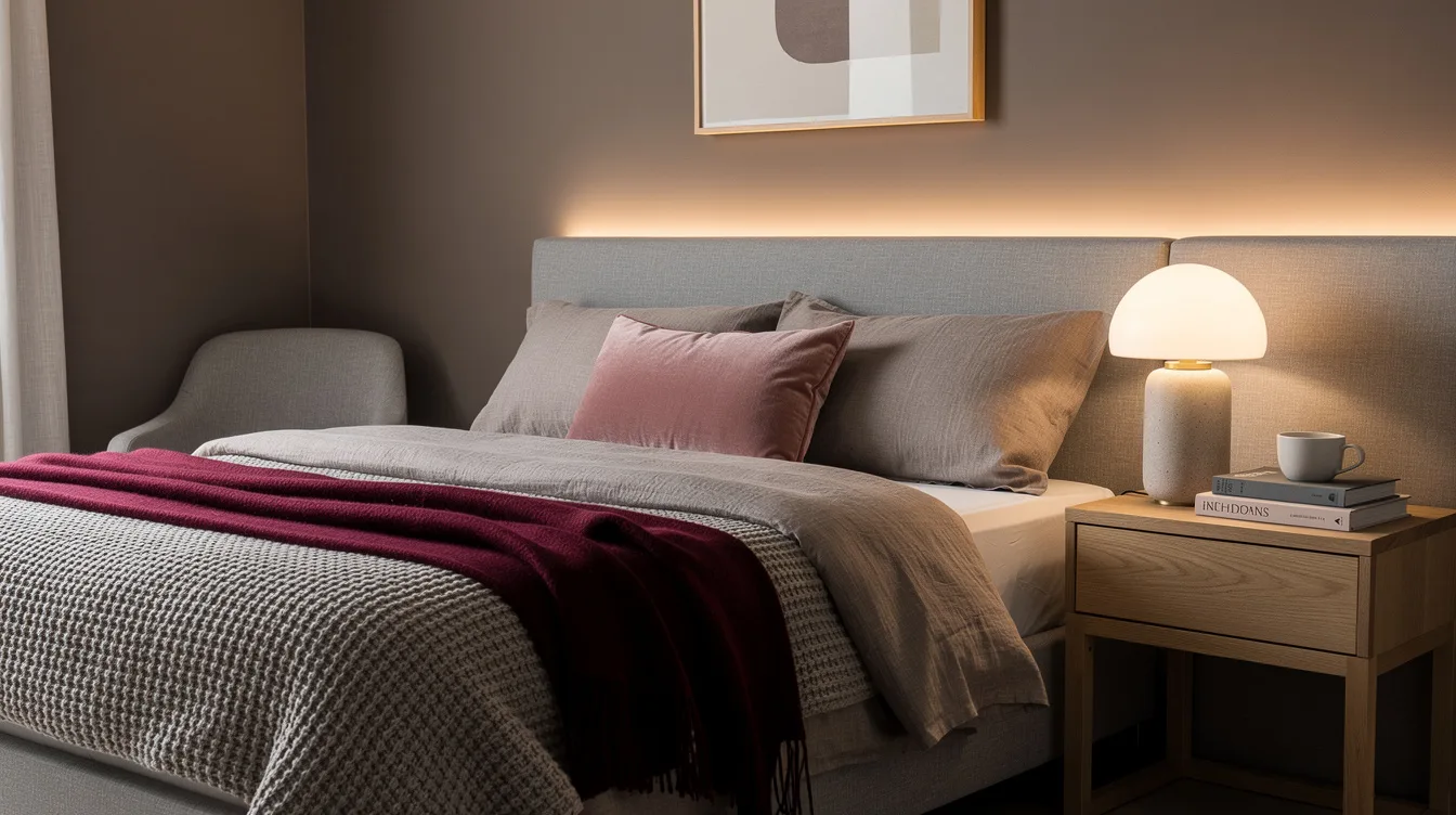
A monochromatic bedroom can look refined on a paint card and strangely flat once every surface receives the same treatment. In a typical room of about 120 square feet, a queen bed measuring about 60 by 80 inches already occupies a large visual area.
The solution is variation, not more color. Designers build depth with finish, fabric, wood, lighting, and carefully placed contrast so the room feels layered without becoming color drenched.
Choose One Color Family First
A monochromatic room needs a clear anchor, so start with the undertone rather than a favorite paint chip. A warm taupe palette feels grounded, while blue-gray reads cooler and more restful.
For a typical bedroom of about 120 square feet, test a warm mushroom paint color beside the window before buying enough for the walls. Daylight can pull beige toward yellow and gray toward blue.
Keep the main wall shade at medium depth. Very pale color can disappear against white trim, while a very saturated shade makes every matching accessory feel louder.
Vary the Surface Finish
Color repetition becomes interesting when the surfaces reflect light differently. Pair matte wall paint with a lightly washed wood nightstand, brushed metal hardware, and a fabric headboard.
Flat paint absorbs light, satin trim catches it, and glazed ceramic adds a small point of shine. Those shifts give the eye somewhere to move without introducing a second color family.
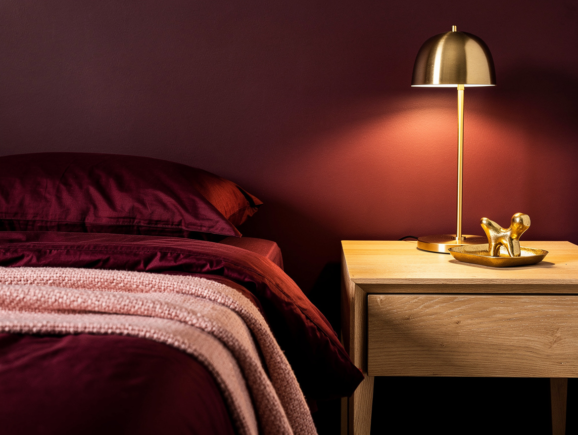
A basic IKEA wood nightstand often costs around $80, making it an affordable way to bring grain into a room filled with painted surfaces. The wood should support the palette, not match it exactly.
Layer Fabrics by Weight
Use bedding to create depth through texture and scale. A linen duvet, cotton sheets, and a chunky woven blanket can all sit inside the same sand, cream, or blue-gray range.
Choose a washed-linen duvet cover with visible slubs, then add smoother pillowcases behind it. The contrast keeps the bed from reading like one oversized block of color.
Texture matters more than collecting every possible shade. One quilted coverlet, one nubby throw, and a pair of plain pillows usually create enough variation for a queen bed.
Break Up the Matching Furniture
Matching furniture can make a monochromatic bedroom feel staged. Combine one painted piece with natural wood, woven fiber, or dark metal so the palette has structure.
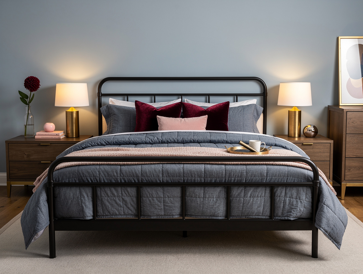
A black metal bed frame gives a pale mushroom room a strong outline without competing with the walls. Its narrow profile also leaves more visible floor around the bed.
Keep the larger furniture quiet and let one smaller piece carry contrast. A dark stool, a carved mirror, or a walnut lamp base is usually more effective than a whole set of black furnishings.
Use Lighting to Shift the Mood
Lighting can make one color family appear warmer at night and cooler in the morning. Use layered sources instead of relying on one overhead fixture.
Place a pleated ivory table lamp on each nightstand, then add a shaded ceiling fixture with a warm bulb. The fabric softens the light and gives the room another tactile surface.
For a calm bedroom, choose bulbs labeled warm white and keep their color temperature consistent across the room. A mismatched blue-white bulb can make beige walls look dull and gray bedding look icy.
Reserve Contrast for Small Details
A monochromatic bedroom still needs visual punctuation. Use contrast sparingly on the pieces that deserve attention, such as the mirror frame, curtain rod, or bedside hardware.
A deep olive ceramic vase can bridge a taupe palette toward green without turning the room into a second color scheme. Repeat that darker note once in artwork or a small cushion.
Window treatments should sit close to the wall color when the room is small. A textured curtain in a nearby shade keeps the vertical lines quiet and allows the bed to remain the focal point.
Edit the Palette Before It Spreads
Monochromatic design works best when every addition has a job. Before bringing home another pillow or basket, compare it with the wall, bedding, and largest wood finish together.
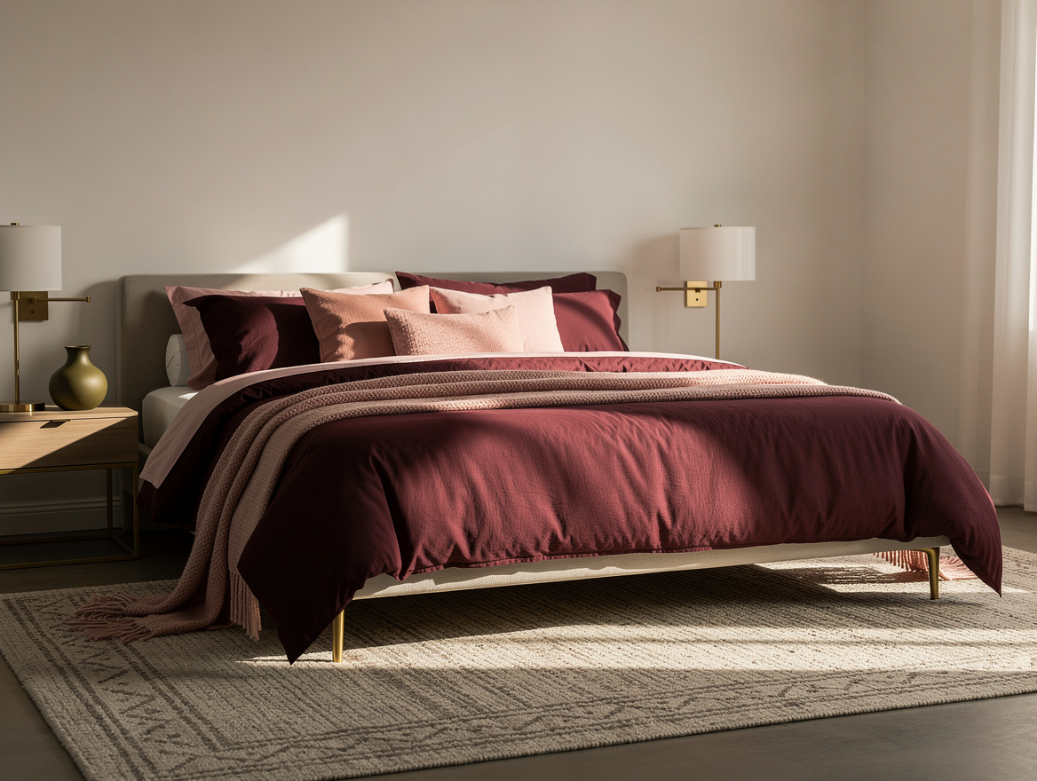
Keep a soft-gray wool area rug large enough to reach under the front legs of the bed. Its quiet pattern can add movement while its fibers separate the bed from the floor.
Remove anything that introduces a competing undertone, especially pink beige beside green beige. A smaller, more disciplined palette will feel richer than a room crowded with nearly matching objects.
Start with the wall color, then choose one bedding texture and one natural material before buying accents. That order keeps the palette calm, gives every later choice a reference point, and prevents the bedroom from turning into a single saturated box.
Mia Carter writes about small-space living and budget home makeovers. She has restyled three rentals and tests most ideas in her own 45 sqm flat.