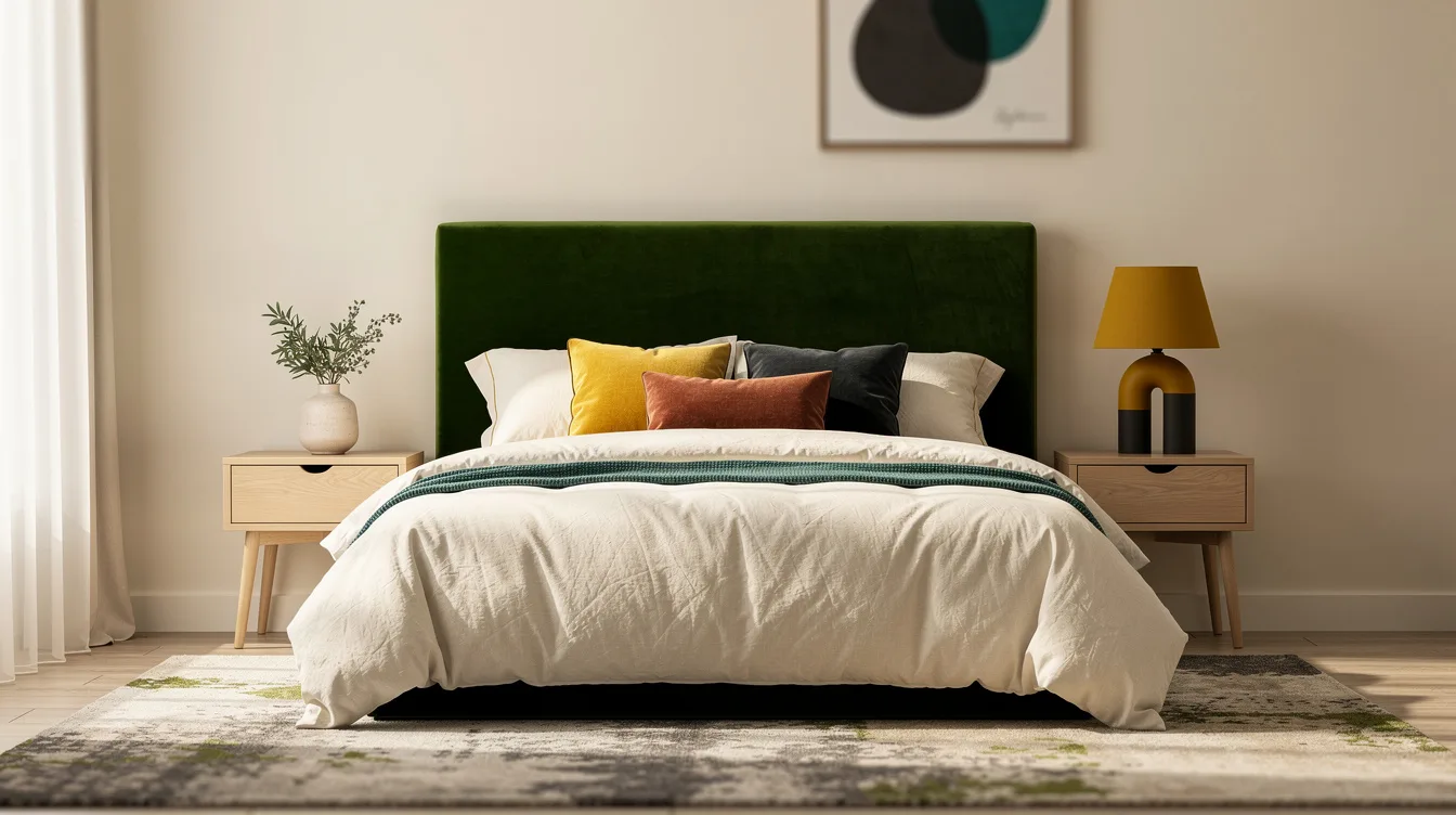
A 176 cm headboard over a 160 cm mattress can create a polished focal point, but only when the rest of the bedroom knows when to step back.
The reliable sequence is simple: choose the fabric or finish first, pull colors from it, quiet the wall, then add one small accent instead of decorating every surface.
Patterned upholstery benefits from direct color repetition, while a solid headboard needs contrast, texture, and enough empty space to hold its presence.
Choose the Headboard Before the Paint
Start with the headboard’s fabric or finish, then build every other color around it; this order keeps the room focused and stops the wall from competing with the bed.
A moss-green velvet headboard works beautifully with warm ivory walls, pale oak furniture, and bedding in soft cream, because the green becomes the room’s main color event.
A compact listed example measures 176 W × 110 H × 10 D cm for a 140/160 cm bed, so its 176 cm width extends only 8 cm beyond each side of a 160 cm mattress.
That proportion feels intentional without taking over the whole wall, which is why I prefer a defined headboard silhouette over an oversized beige rectangle with no textural contrast.
Extract Colors From a Pattern
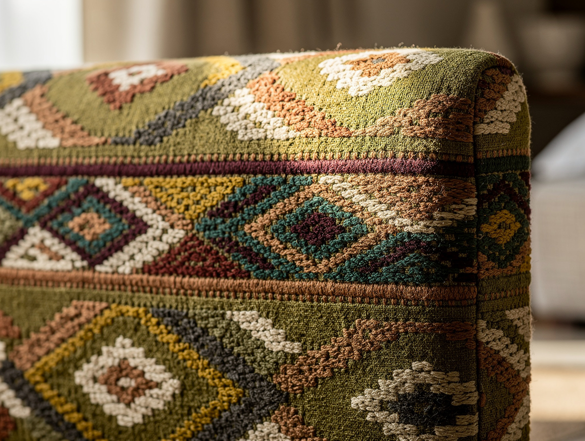
With a floral or striped headboard, pull the wall color, bedding tone, and small accent directly from the print instead of adding unrelated shades that make the composition feel scattered.
Choose one quiet background color from the pattern, such as warm ivory cotton, then select a larger supporting textile in a second shade that appears less often.
A floral design might carry olive into a throw and a muted burgundy into a cushion, while a stripe could repeat its clay tone through a rug or the trim on a window treatment.
The colors should return in rugs, accessories, and trim without matching exactly; a slightly lighter, darker, or dustier version gives the bedroom rhythm and keeps the headboard from looking isolated.
Quiet the Wall Behind the Fabric
A statement headboard needs breathing room, so use a wall color that supports its temperature rather than repeating its strongest shade at full intensity across the entire backdrop.
Pair clay velvet with pale putty walls, chalk-colored bedding, and dark wood bedside tables for a warm hotel mood that still feels relaxed at home.
For an earthy green headboard, warm ivory is more forgiving than a stark blue-white, while chocolate, burgundy, and soft brown can appear in small doses across the room.
I would skip a second strong terracotta feature wall, because the upholstered surface already carries enough warmth and deserves to remain the clearest focal point.
Scale Textiles to the Headboard
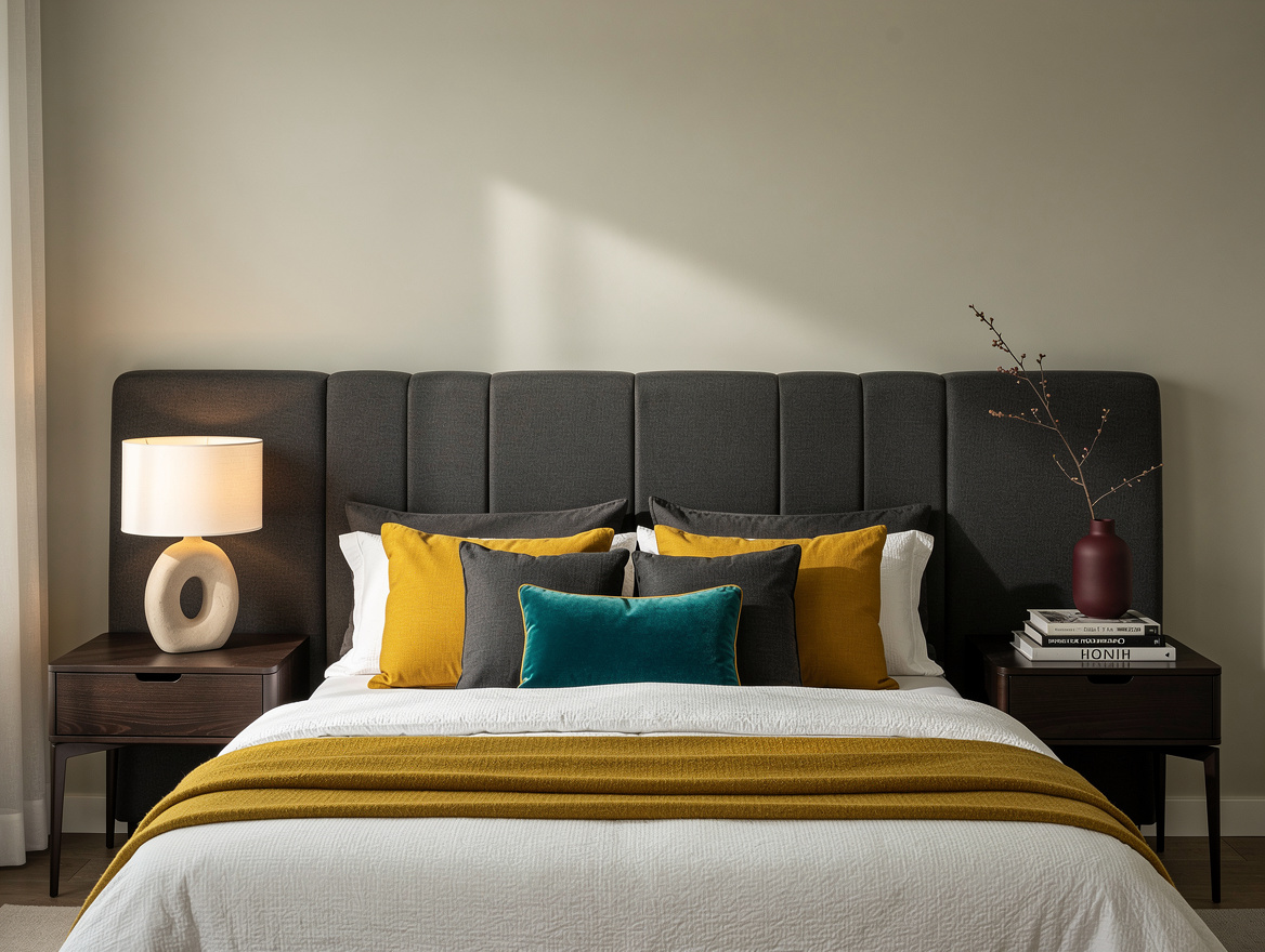
Extended hotel-style headboards change the palette because they act like a horizontal architectural band, so the rug, bedding, and bedside pieces must relate to their width rather than only to the mattress.
One listed queen configuration with two 24-inch side panels measures 114 W × 42 H × 3 D inches, while a version with two 34-inch panels measures 134 W × 42 H × 3 D inches.
Before choosing pale oak bedside tables, measure the outlets, lamps, curtains, and walking paths on the bed wall; the wider configuration needs a substantial uninterrupted area to look deliberate.
Let the large supporting textile carry a calmer color, such as cream, putty, or muted green, then use texture through linen, cotton, wool, or a low-pile rug instead of adding another loud print.
Limit the Final Accent
Finish the palette with one small accent that sharpens the headboard color, then stop before the room turns into a collection of competing accessories.
A rust cushion can warm a green-and-ivory scheme, while a terracotta ceramic lamp can do the same job; using both in large quantities weakens the hierarchy.
Keep the rest of the accessories quieter, perhaps with a dark wood frame, a woven basket, or a single burgundy detail that repeats the headboard’s undertone without copying its pattern.
The strongest bedrooms usually have one dominant color, one broad supporting color, and one restrained accent, with texture doing the extra work that more shades would only complicate.
Begin with a fabric swatch beside the wall paint and bedding, then choose the large supporting textile before buying lamps or accessories.
That single order of operations gives the headboard control of the palette and leaves the finished bedroom feeling considered rather than overworked.
Mia Carter writes about small-space living and budget home makeovers. She has restyled three rentals and tests most ideas in her own 45 sqm flat.