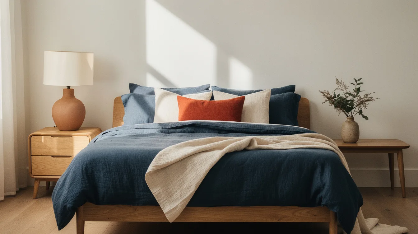
Complementary color sounds bold until a bedroom starts collecting too many opposites. In a queen room, approximately two 20 × 20-inch dusty-blue cushions and one 14 × 36-inch clay lumbar can create contrast without turning the bed into a color display.
The reliable formula is simple: use one muted hue on the largest colored surface, place its opposite in one or two small accents, and protect plenty of neutral space. Blue with orange, red with green, and yellow with purple all work better when their saturation is softened.
The goal is a room that feels considered at bedtime, not a color-wheel exercise.
Give the Larger Surface the Quieter Color
Complementary colors work best when their visual weight is unequal. Let dusty blue paint occupy the larger field, then bring in clay-orange through one small accent.
For a queen bedroom, warm white walls with plain ivory bedding create a quiet base for approximately two 20 × 20-inch blue cushions. The opposite hue should support the room, not compete with every surface.
This ratio keeps the color wheel working in your favor. Saturated blue walls paired with orange curtains, patterned bedding, and bright artwork would turn the same idea into visual noise.
Concentrate the Opposite Color at the Bed
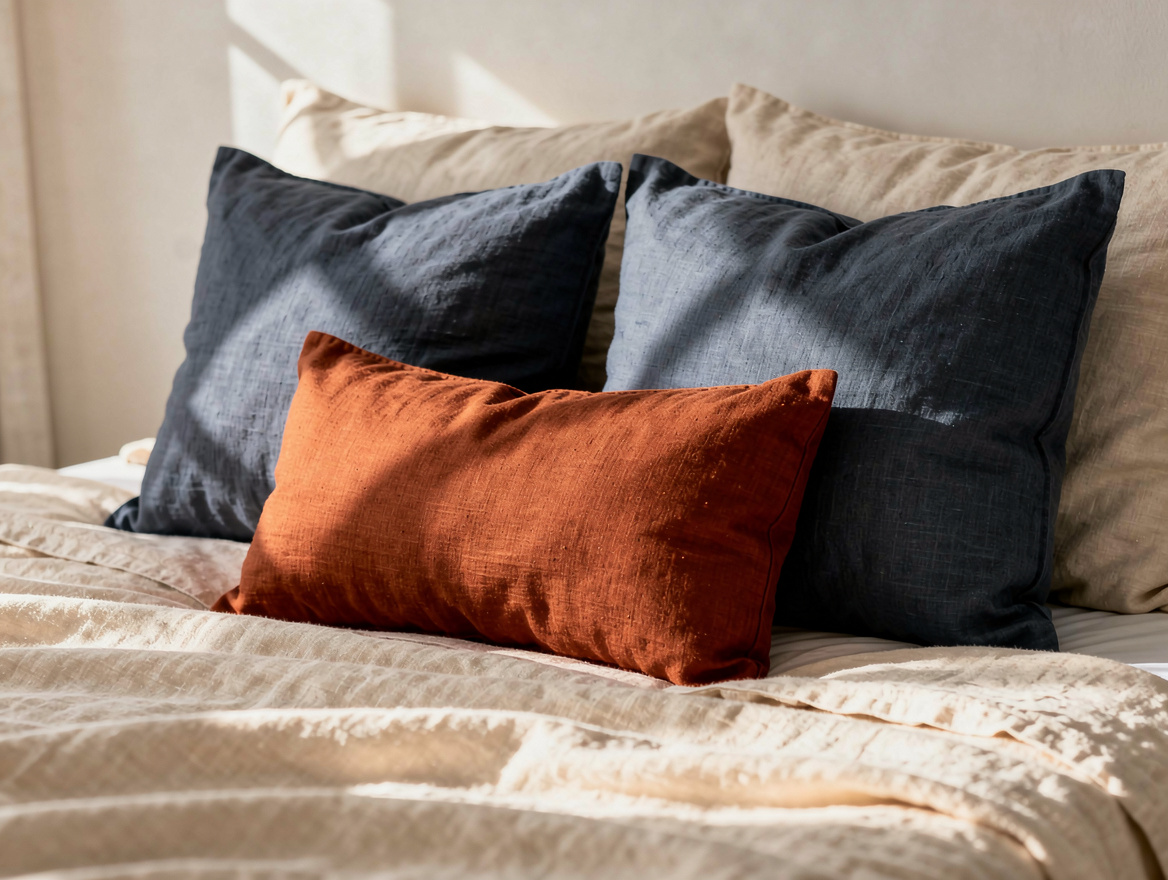
The bed is the natural focal point, so it gives complementary color a clear address. Place two gray-blue linen cushion covers behind one clay or rust lumbar cushion instead of distributing orange around the entire room.
IKEA’s DYTÅG cushion covers come in gray-blue and red-brown, with the 20 × 20-inch size listed at $19.99 per cover. Inserts cost extra, so two covers come to about $40 before that addition.
A terracotta throw measuring approximately 50 × 60 inches can replace the lumbar cushion when you want more softness. Use one option, not both, unless the rest of the room stays exceptionally restrained.
Use Warm White to Pause the Eye
Neutral space gives a complementary pairing room to breathe. Ivory cotton bedding and warm-white walls separate dusty blue from terracotta while keeping the bedroom comfortable rather than stark.
Keep the curtains neutral, too. IKEA’s white linen curtain pair measures approximately 57 × 98 inches per panel and is listed at $99.99, making it a useful benchmark for a large soft surface.
With two DYTÅG covers and the curtains, a restrained setup costs around $140 before inserts, tax, and delivery. If your bedding and window treatments already work, the color update can stay near the $40 cover cost.
Soften Saturated Pairs Before Shopping
Blue and orange are classic complements, but dusty blue and terracotta feel easier to live with than primary versions. The same principle applies to muted olive green with rose, burgundy, or softened red.
Yellow and purple need the most restraint in a bedroom. Try pale ochre with smoky plum, then keep the larger pieces cream, natural wood, or warm gray.
Paint is the place to control intensity first. A matte finish on one wall or the entire room gives a softened color more depth than a glossy surface, which can make a strong hue appear louder under lamps.
Repeat the Accent Once, Then Stop
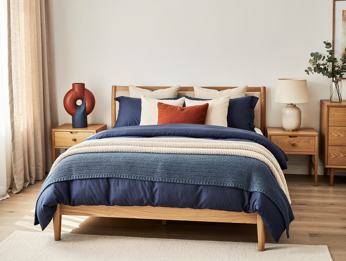
A small accent color gains authority through repetition, but repetition has a limit. After the terracotta velvet cushion, repeat the hue once in artwork, a ceramic vase, or a narrow bench cushion.
Choose artwork with a quiet ground, such as cream paper or a natural wood frame. A red detail inside one print can connect to a red cushion without forcing the same color into the rug, lamps, curtains, and bedding.
Two appearances usually feel intentional; five can make the room look decorated around a color formula. Leave at least one major surface untouched so the eye has somewhere to rest.
Let Wood and Texture Finish the Palette
Supporting materials should calm the color relationship instead of adding a third dominant hue. Natural oak furniture, woven baskets, and soft cotton give blue, orange, green, or red a grounded backdrop.
Texture also adds interest without introducing more color. A nubby throw, washed linen, or simple wool rug can make a restrained palette feel layered while staying visually quiet.
Keep the furniture finish consistent across the nightstands and dresser when possible. One warm wood tone is enough structure for a bedroom already carrying complementary contrast.
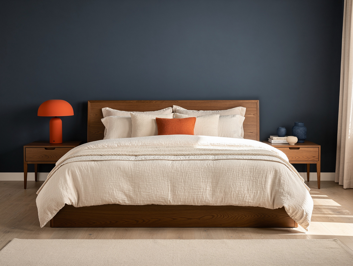
Begin with the largest surface, choose the quieter shade, and add the complementary color only at the bed. Once that relationship feels balanced, stop shopping and let the neutral space do its work.
Mia Carter writes about small-space living and budget home makeovers. She has restyled three rentals and tests most ideas in her own 45 sqm flat.