
Yes, Christmas tree themes that aren’t red and green can feel warmer and more personal. I tested fifteen looks in my small living room with one weekend, a hand-me-down tree, and too many ornaments. The result surprised me: the tree felt calmer, brighter, and far less tied to one holiday palette.
Here’s what it looked like before:
The tree stood beside a sofa with a 35-inch seat depth, a scratched oak table, and a television that sat too close to the window. Its old ornaments were a jumble of red glass, shiny green balls, and faded gold ribbon. Nothing was terrible.
Nothing belonged together, either.
I wasn’t replacing the room. I was working around what I had, including a narrow tree stand, one strand of warm-white lights, and a storage box with three broken ornament hooks.
You know that point when a room feels busy before you’ve added anything new? That was my starting line.
I made a note before touching it, then moved every ornament onto the dining table.
- Layer ivory ornaments with aged brass
- Could smoky blue replace traditional green?
- Build the Three-Texture Tree
- Swap sparkle for soft blush and champagne
- Anchor black and cream with the Quiet-Metal Ladder
- Float silver through a winter-white tree
- Paint the room warm, then style the tree
- Mix terracotta with natural wood
- Choose texture over color
- Frame the branches with the Three-Height Light Stack
- Hang paper stars over plastic shine
- Layer the Coastal Winter Palette
- Try the One-Color Drift with dusty mauve
- Build a natural tree with two woods
- Frame the tree with a calm neutral living room
1Layer ivory ornaments with aged brass
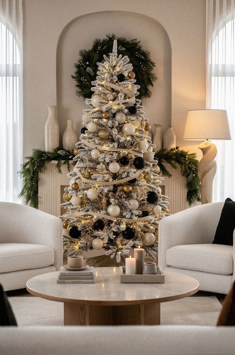
I started with ivory ornaments because they gave the tree the quiet base I wanted without making the room feel pale. I used matte balls, ribbed ceramic shapes, and a few paper stars.
The camel accents kept the branches warm, while small black details gave the ivory base definition. Nearby organic bouclé softened the contrast.
The first layer was the lights, pushed toward the trunk. The second was large ivory ornaments, spaced low and high. Then came the small brass shapes.
You don’t need a matching set, and you shouldn’t buy one if your storage box already holds useful pieces. I found that uneven shapes made the tree feel collected, elegant, and genuinely personal.
I left the bottom third lighter than the top. That small gap let the branches breathe beside the sofa, and it kept the tree from looking like a solid cone of decorations.
This Christmas tree theme guide for a designer look helped me edit the palette, though I removed half the ideas I didn’t need. I returned to the guide later when the tree needed one final, polished detail.
That was the first surprise!
2Could smoky blue replace traditional green?
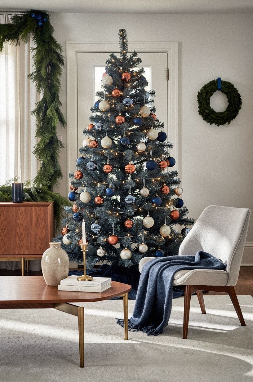
It can, especially if your living room already has cream upholstery or dark wood.
3Build the Three-Texture Tree
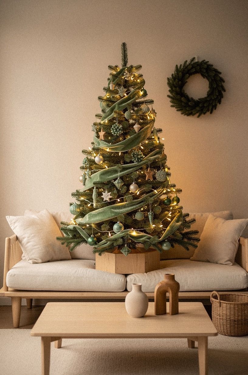
This was the first look that made me stop moving ornaments around. I chose a deep-pile mohair velvet ribbon, warm cream ornaments, and natural wood.
Each texture did a different job. Velvet softened the lights, while wood kept the whole thing grounded.
I placed the ribbon first, but I didn’t spiral it in a perfect line. You can tuck short lengths behind branches and let a few ends fall naturally.
The longest pieces sat near the center, where the eye lands from the sofa. I used small wooden beads near the top and larger carved shapes near the bottom, which created a natural weight shift.
I kept the palette to sage green, warm cream, and natural wood. Too many earthy shades would have made the tree dull beside the sofa.
The natural wood tones helped, but I resisted adding brown ornaments because the wood already carried that note. Sometimes your strongest color is the one you don’t repeat.
The result was tactile, relaxed, and collected. It didn’t look staged, which made it unexpectedly charming. I also linked this designer Christmas tree ideas guide from my notes when comparing ribbon shapes.
4Swap sparkle for soft blush and champagne
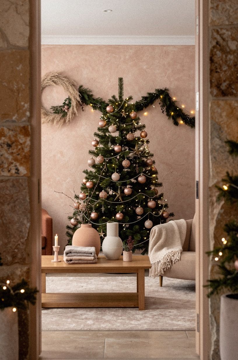
I had a terracotta box left from a birthday table setting, so I tested it on the tree before buying anything. The stone and olive tones kept the color grounded, while a touch of hand-applied Venetian plaster nearby added quiet texture.
5Anchor black and cream with the Quiet-Metal Ladder
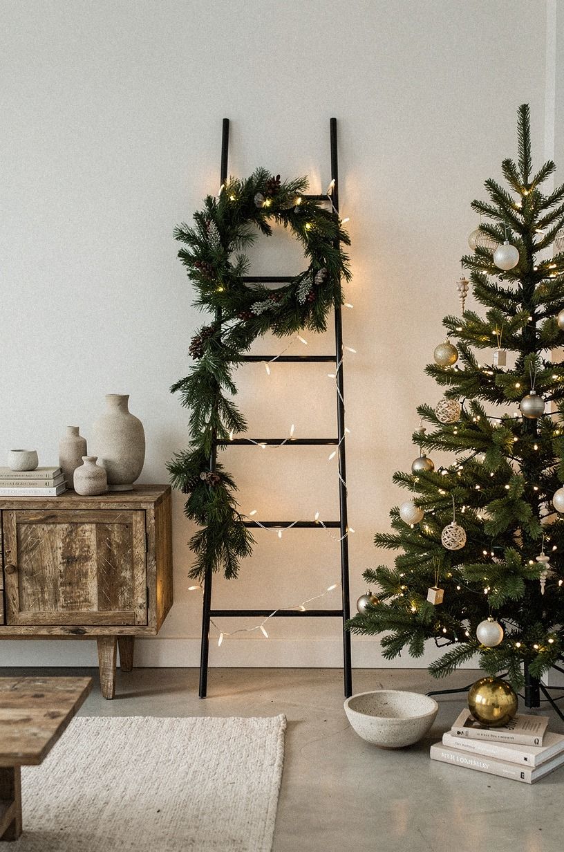
Dark accents can feel severe, so I used them as punctuation rather than the main color. The quiet-metal ladder was my rule: clay at the base, linen in the middle, and aged brass near the top. That movement led the eye upward without requiring a large topper.
I chose aged brass stars, clay-colored paper ornaments, and linen ribbon. A piece of reclaimed weathered teak grounded the base.
You don’t need more than eight or ten dark accents on an average tree. Place them in pairs that aren’t quite symmetrical, then step back from the doorway.
If they read in a solid stripe, move two pieces deeper into the branches.
The surprising part was how warm the tree looked beside a beige sofa. The dark notes gave the light something to push against, and clay kept it from feeling moody. I wouldn’t pair this look with bright silver tinsel.
That shine would flatten the quiet contrast and make your carefully chosen pieces compete.
The arrangement looked graphic, confident, and striking. For another edit, I revisited this Christmas tree theme guide and borrowed its advice about using one repeated finish instead of several competing metals.
6Float silver through a winter-white tree
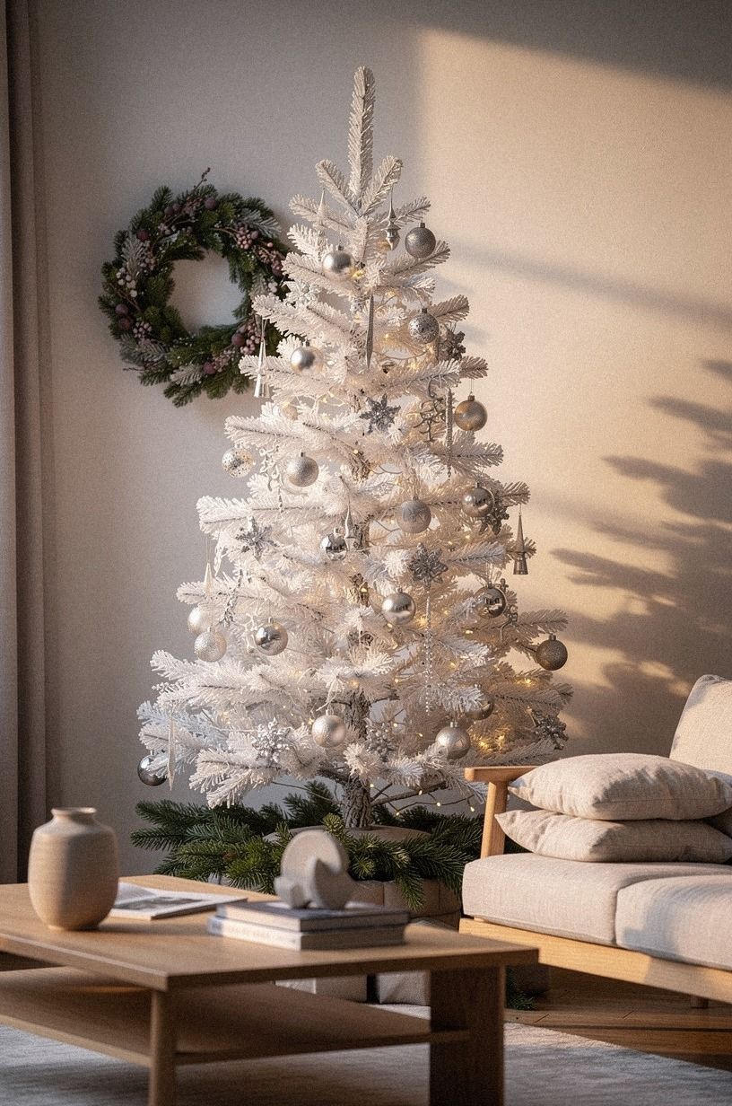
Silver usually makes me think of formal dining rooms, but the right finishes can feel relaxed. I used plum, soft grey, and rose gold instead of a bright metallic mix. The washed Belgian linen nearby gave the room enough softness to keep the tree from feeling cold.
I started with soft grey ornaments because they disappear gently during the day and settle into the branches at night. Then I added plum shapes and small rose-gold details.
You can use a single metallic garland, but don’t wrap it tightly from top to bottom. Short sections create movement without forming a hard stripe.
The tree needed one earthy note, so I added a length of washed Belgian linen ribbon with loose edges. That was the moment it became personal.
If you want more winter color without red or green, a small amount of midnight blue works better than bright navy. This tiny room with red-brown walls also reminded me that a controlled dark accent can make a pale room feel richer.
I used the same principle again when styling the mantel. One deeper note gave the softer palette definition without making it gloomy.
7Paint the room warm, then style the tree
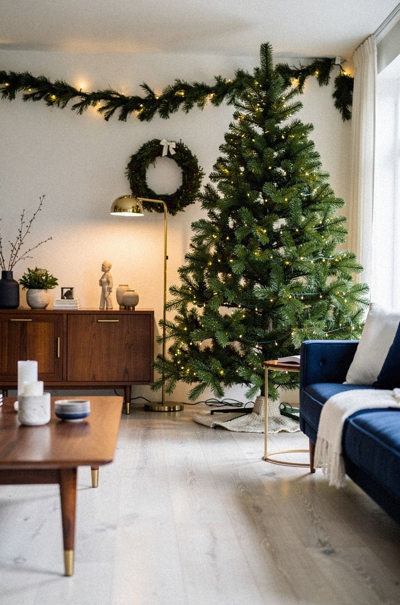
I changed the backdrop before changing the ornaments. A deep navy wall softened the room behind the tree, and that made the white decorations look intentional instead of washed out.
I didn’t repaint the whole room. One wall and a careful light adjustment were enough.
The tree itself used navy ribbon, white ornaments, and walnut accents. You can test paint with a large paper sample behind the branches before committing, especially if your room faces north. I made the mistake of judging the color at noon, then found it looked much darker after sunset.
Now I check it under daylight and lamplight.
I skipped a large tree skirt. A folded white textile covered the stand, while a cerused white oak accent nearby kept the base grounded.
That made the tree feel less bulky in the small living room. If you’re renting, removable art and a textile backdrop can give you the same warm effect without paint or wall damage.
The finished corner felt cozy, luminous, and refined without actually being costly. I also linked the red-brown room guide again while comparing wall colors, because its small-space advice helped me keep the backdrop restrained: see the warm wall-color reference.
8Mix terracotta with natural wood
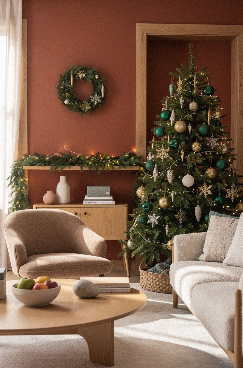
Emerald was my most successful surprise. I expected it to feel dramatic, but beside ivory and warm gold it became rich, earthy, and fresh. I used emerald ribbon, matte cream ornaments, gold accents, and small shagreen details.
Emerald has enough depth to replace red without shouting.
I placed the largest ornaments closest to the trunk so the outer branches stayed light. You can use air-dry clay shapes if you already have the supplies, but I wouldn’t make every piece by hand. One afternoon of shaping and drying is enough work for a tree that you’ll pack away in January.
The living room needed a quiet counterpoint, so I kept the surrounding surfaces cream. Too many dark pieces would have made the palette heavy.
If your room is already neutral, add gold carefully before adding more emerald. The goal is richness with air around it, not a tree that looks like a display shelf.
This palette had a jewel-toned, welcoming quality that made the room feel memorable. For entertaining ideas that kept the colors relaxed, I used this easy friendmas-at-home guide as another reference.
9Choose texture over color
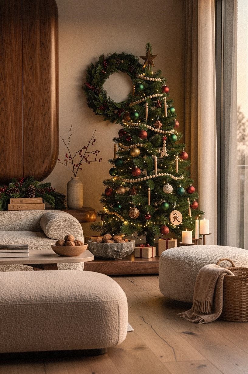
This was my answer to the question I kept asking: what if the tree doesn’t need a strong color scheme at all?
10Frame the branches with the Three-Height Light Stack
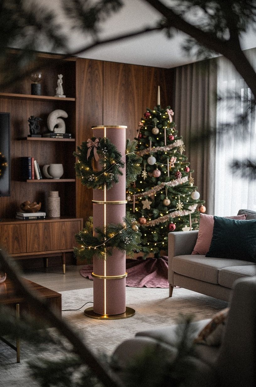
Lights were the makeover, even though I didn’t buy a new tree. I used the Three-Height Light Stack: lights deep inside the branches, lights at the branch tips, and one small lamp beside the base. Warm LED string lights filled the dark gaps without turning the tree into a bright wall.
You don’t have to add more strands if your current lights are evenly spaced. Instead, pull sections forward and push others back.
The depth matters more than the count. I kept the lamp about 16 inches from the stand, far enough to create a second glow but close enough to make the tree feel connected to the seating area.
I removed the overhead light before judging the result. That one choice changed the room in under a minute!
If your tree still feels flat, move the lamp rather than adding ornaments. Light can make a simple neutral tree feel inviting, while another layer of decoration may only make your living room feel crowded.
For a small room, I liked the lamp beside the tree more than a bright topper. It created a warm pool of light and made the corner feel intimate after dinner. I used the friendmas guide once more when checking whether the arrangement would still feel pleasant during conversation: the entertaining reference is here.
11Hang paper stars over plastic shine
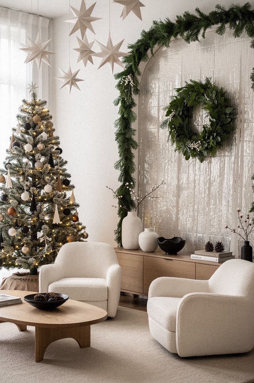
Paper gave the tree a handmade quality without requiring a full craft project.
12Layer the Coastal Winter Palette
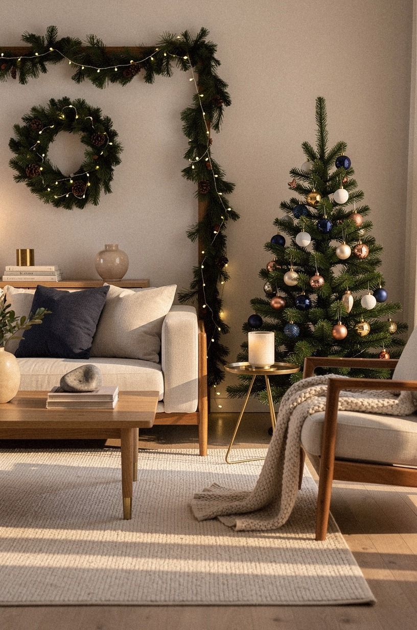
I wanted a coastal tree that didn’t look like a beach shop. The answer was restraint: ivory, midnight blue, copper, and one touch of unlacquered brass developing patina. The brass gave the palette an irregular edge, while the darker blue kept it from feeling too pale.
The color stayed close to the smoky-blue version, but the materials changed everything. You can use smooth glass for the blue pieces and warm ivory for the pale ones.
I skipped seashell garlands because they made the tree too literal. A single shell-shaped ornament says coastal; twenty say display window.
My favorite detail was a copper ribbon tucked behind the front branches. It gave the tree a little weight without adding too much shine.
If your room already has coastal art, keep the tree more neutral so it doesn’t compete. This friendmas decorating guide also helped me choose decorations that looked good during conversation, not only under direct light.
The finished palette was airy, crisp, and quietly charming. It suggested the coast without turning the living room into a themed display.
13Try the One-Color Drift with dusty mauve
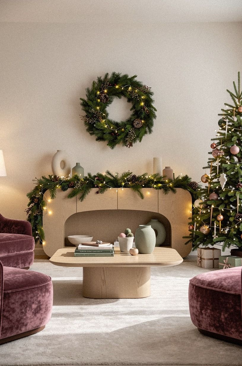
Sage green made the tree feel calm without turning it flat. I began with one green ornament color, then softened it with warm cream and natural wood. Deep-pile mohair velvet added softness and gave the branches a gentle, tactile finish.
You can create the drift with ornaments you already own. Sort them by value, not by exact shade, and place the deepest green pieces lower in the tree.
The lighter cream pieces belong near the top, where the room has more daylight. I wouldn’t add several competing colors, because the narrow story works best when it stays quiet.
The room needed a warm neutral to keep the tree from feeling heavy. Natural wood did that job better than more metallic pieces.
If your sofa is dark, add warm lights and a cream tree collar. Your eye will read the green as layered color rather than a single block.
The effect was soft, memorable, and a little unexpected. I checked the warm wall-color reference again before committing to the palette because the surrounding backdrop mattered as much as the ornaments: see the small-room color guide.
14Build a natural tree with two woods
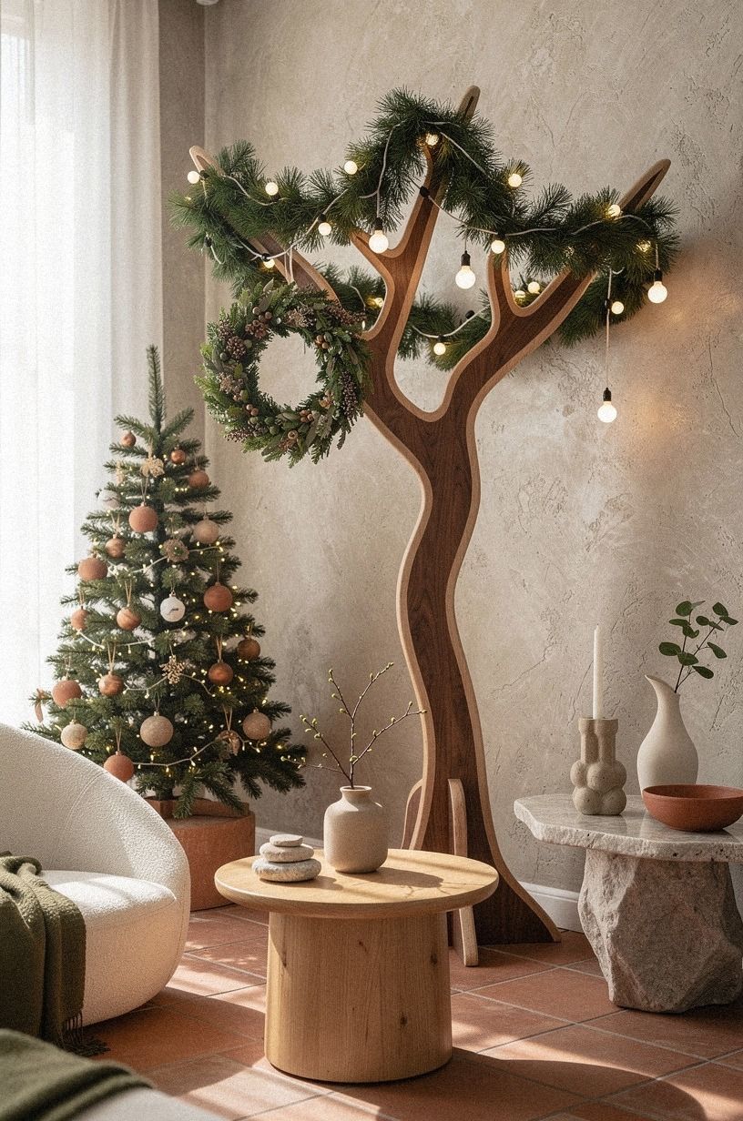
Natural wood can look plain if every piece has the same finish. Here, I paired natural wood with terracotta, stone, and olive so the palette felt warmer and more layered. The hand-applied Venetian plaster nearby added a soft, irregular surface that kept the wood from feeling too rustic.
15Frame the tree with a calm neutral living room
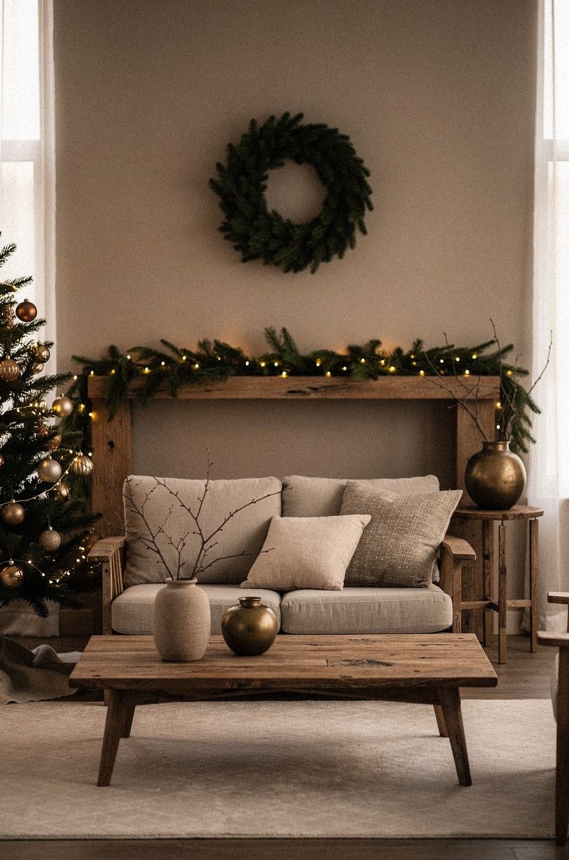
The last theme wasn’t an ornament palette. It was the full setting: clay, linen, aged brass, and warm light. I moved the tree 6 inches away from the window, angled the reclaimed weathered teak table toward it, and gave the branches more space on the sofa side.
Furniture spacing mattered more than I expected. The table sat 16 to 18 inches from the sofa, and the rug held the front legs of the seating.
You don’t need a larger tree to make the corner feel important. Give your eye a clear path from the sofa to the lights, then remove anything that interrupts it.
I kept the television from becoming the main focal point by turning one chair slightly toward the tree. That tiny shift changed how the room was used.
The designer Christmas tree ideas were helpful for styling, but the final improvement came from furniture placement. Your tree works harder when the room faces it.
The complete setting felt calm, generous, and finished without being formal. That was the strongest lesson of the whole experiment: sometimes the most beautiful tree is the one the room knows how to hold.
How Much It Cost: The Budget I Used
I treated this as a living room refresh rather than a renovation. The tree, stand, and most lights were already mine.
I spent the available budget on ribbon, paper ornaments, a few texture changes, and one small lamp. That kept the project inside the typical budget tier instead of drifting into a furniture purchase.
For comparison, these were the typical costs I kept in mind while deciding what not to buy:
The useful part was setting a stopping point. I didn’t replace the sofa, buy a new rug, or repaint the entire room.
You can spend $300 on a whole-room refresh, but a tree-only makeover can stay much lower when you reuse lights and make the palette work around what you own. IKEA KALLAX birch-effect storage held the ornament boxes, so cleanup took less than one evening.
My most memorable purchase was the lamp, not the ornaments. It changed the atmosphere immediately and made the tree feel more connected to the rest of the room. If you have limited money, spend first on light, ribbon, or one beautiful tactile material.
What I Learned From Letting the Tree Stay Imperfect
I thought the winning tree would be the most polished one. It wasn’t.
The ivory and brass version looked polished, but the natural wood tree made me want to sit down. That difference matters.
A seasonal room shouldn’t only look finished; it should invite you to live in it.
I made two mistakes. First, I bought ribbon before checking the light temperature, so the terracotta palette looked gray for one afternoon.
Second, I placed all the large ornaments at the front, which made the tree look shallow from the sofa. I moved half of them inward and saved the room.
You don’t need a new collection every December. You need one clear decision, then enough restraint to let it show. Farrow & Ball Hague Blue No.30 would be my choice for a dramatic backdrop, while Benjamin Moore Revere Pewter HC-172 is gentler if your room already has dark furniture.
And if you’re still unsure, start with texture. Texture gives a neutral tree feeling before color has to do any work.
I also learned that a few imperfect choices can make a room feel more alive. One crooked paper star, a slightly uneven ribbon tail, or a mismatched wood ornament can add warmth that a flawless set sometimes lacks. That was the most liberating discovery!
What People Always Want to Know
What is the best 15 Christmas Tree Themes That Aren’t Red and Green for a small living room?
The best choice is ivory, aged brass, and wood because it reflects light without making the tree look larger. IKEA KALLAX storage can hold the decorations nearby, and a narrow tree with open branches will leave more visual space around your seating. I’d also keep the lower branches lightly decorated.
Where can I buy 15 Christmas Tree Themes That Aren’t Red and Green pieces on a budget?
Look at IKEA, Wayfair, and Target first, then check Facebook Marketplace or a thrift shop for baskets, ribbon, and wood ornaments. Second-hand brass often has better color than new shiny pieces, and you can mix one vintage item into an inexpensive set. I’d shop the storage box before buying anything.
How much does a 15 Christmas Tree Themes That Aren’t Red and Green makeover cost?
A full living room refresh typically falls in the $300 to $1,200 budget range, while a tree-only update can cost less when you reuse lights and ornaments. Free styling changes include sorting by color, moving lights deeper, and removing half the decorations. I’d set a firm spending limit before shopping.
Can I create a 15 Christmas Tree Themes That Aren’t Red and Green on a budget?
Yes, and you can start with three free changes: regroup what you own, use paper ornaments, and shift the lights toward the trunk. A single ribbon in flax, cream, or dusty blue can carry the palette without requiring a new ornament collection. I’d add texture before adding more color.
Is a 15 Christmas Tree Themes That Aren’t Red and Green worth it in a small space?
Yes, because a restrained palette helps a small room feel less crowded. Keep the tree visually open, use warm lights, and place the front legs of your seating on an 8×10 rug if the room allows.
Open branches will give your eye somewhere to rest. I’d choose smoky blue, ivory, or natural wood first.
Is 15 Christmas Tree Themes That Aren’t Red and Green a good idea for a rental?
Yes. Use removable hooks, a tension rod for fabric, and a freestanding lamp instead of permanent changes.
Peel-and-stick accents can add color behind the tree, while paper ornaments and a textile tree collar create warmth without holes, paint, or built-in storage. I’d also use a large paper paint sample rather than committing to a wall color.
Where I’d Start First
If I had to pick one, I’d start with ivory ornaments and aged brass. They reflect lamplight, work with almost any sofa, and let you reuse what you own. Pin that palette for later, then remove three decorations before adding anything new.
My second choice would be natural wood with warm lights. It feels relaxed, tactile, and personal, especially when the room already has oak, linen, or cream upholstery. The best theme is the one that makes you want to stay in the room.