
The blue-green bathroom combo works because blue cools the eye while green keeps the room from feeling sterile. I’ve made the mistake of treating both colors like accents, then wondered why the room felt flat. You don’t need new tile. Paint, light, and one warm material can shift everything!
Don’t overthink: Layer a Green and Blue Bathroom Around One Old Mirror.
- Paint the Ceiling With the Two-Tone Blue Bathroom Rule
- Layer a Green and Blue Bathroom Around One Old Mirror
- Swap Beige Tile for the Sea-Glass Sandwich
- Anchor a Teal Bathroom Design With Warm Wood
- Hang the Three-Height Light Stack
- Build Blue Accent Bathroom Ideas Around a 60-Inch Tub
- Frame a Small Room With the Reflection First Rule
- Choose Green Over Gray for the Two-Color Rental Reset
- Mix the Two-Source Material Plan Before You Spend
- Ask: Can a Two-Tone Blue Bathroom Stay Calm?
- Float the Soft Hotel Finish for a Green and Blue Bathroom
1Paint the Ceiling With the Two-Tone Blue Bathroom Rule
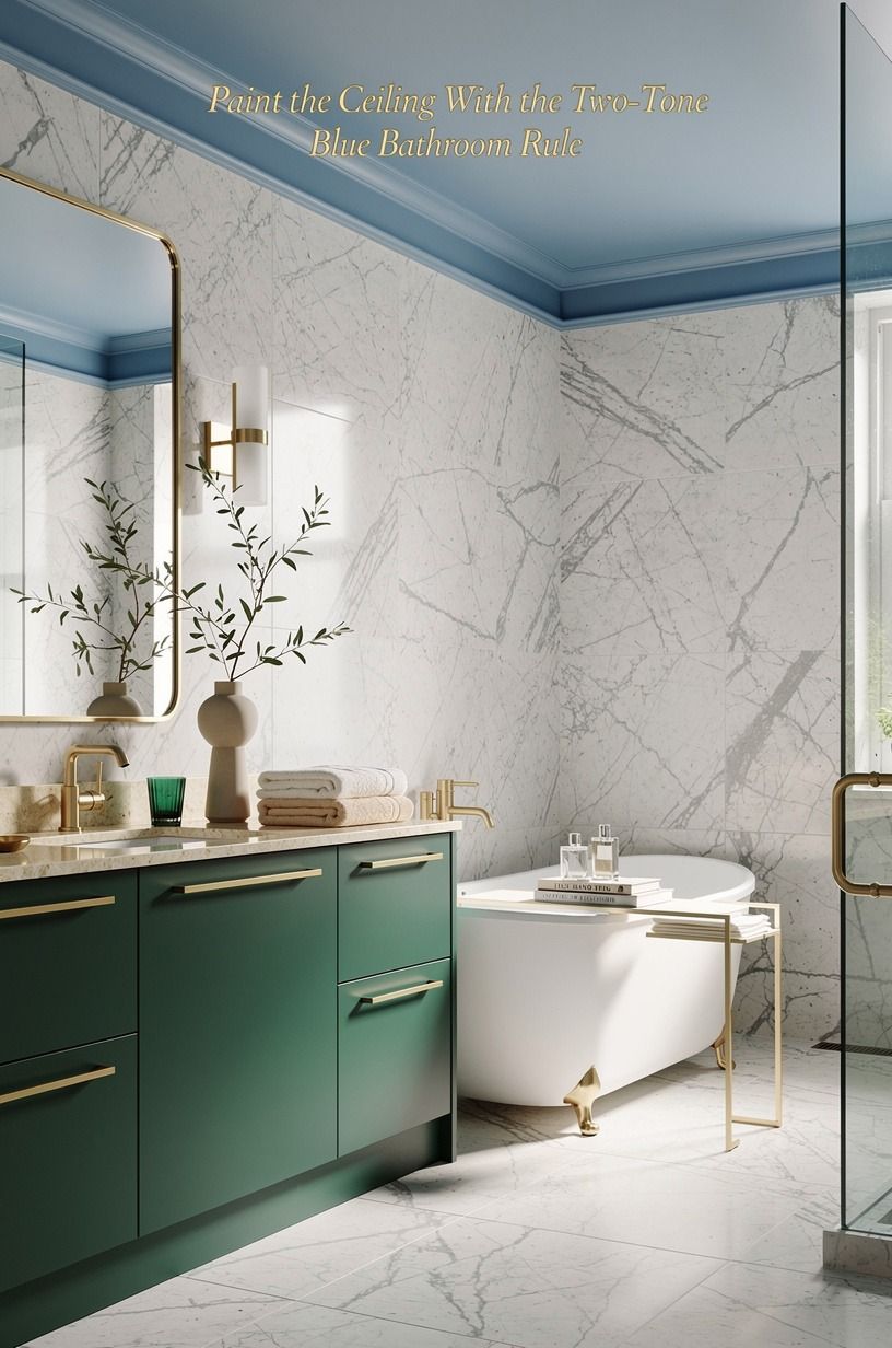
Paint the walls a softened emerald and carry a quieter cream onto the ceiling. Farrow & Ball Studio Green is dramatic below eye level, but it can feel heavy overhead, so I’d pair it with a pale cream ceiling or leave the ceiling warm white. You’ll get depth without making the bathroom feel like a painted box.
Your ceiling still matters if you’re working with a small room. A light surface catches the fixture’s glow and keeps the corners airy, while the emerald walls make white towels and gold hardware look crisp.
If you’re unsure about the pairing, test two large poster boards near your mirror for a full day. Morning light and evening bulbs won’t treat color the same way.
I’d skip painting every surface the same saturated shade. It’s bold, sure, but the reflection can turn your skin gray under cool bulbs.
Use a matte mineral paint on the ceiling and a washable eggshell on the walls. A slab of Carrara marble with subtle gray veining can add a quieter surface without competing with the color.
And if your bathroom has a window, watch the color at noon before you commit. You’ll notice whether the emerald reads leafy, gray, or almost blue. For another deep-color reference, see this moody deep green bathroom makeover, then choose the version that suits your light.
2Layer a Green and Blue Bathroom Around One Old Mirror
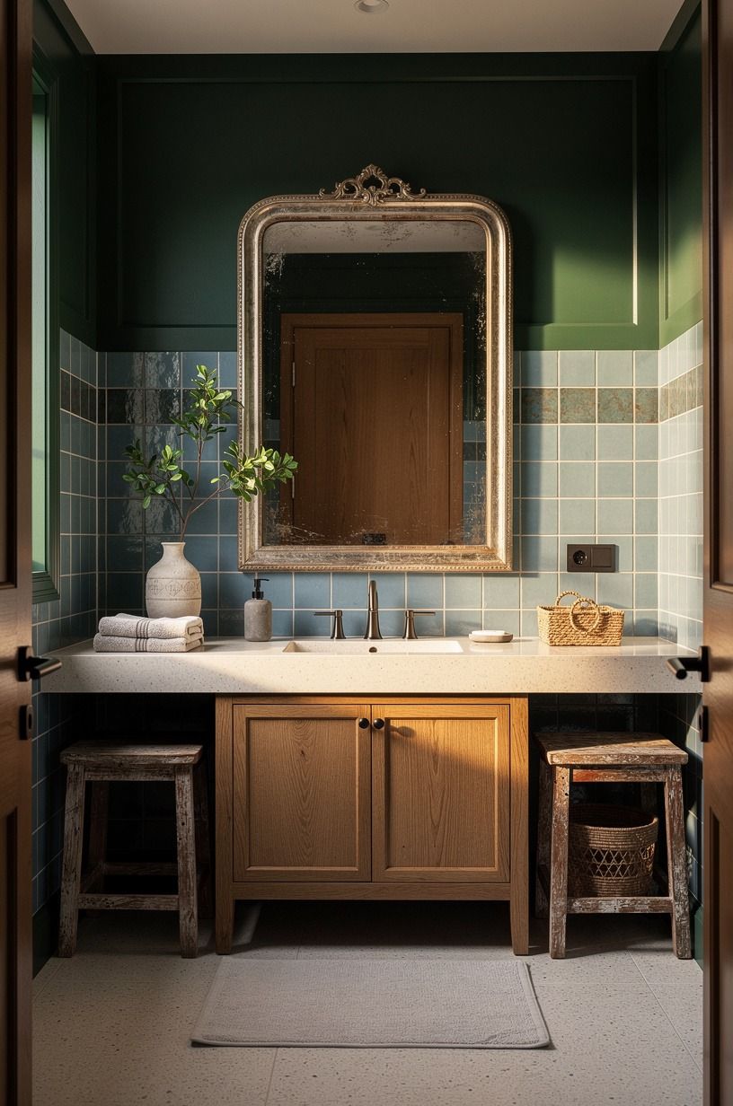
Keep the existing mirror and let the wall color do the expensive-looking work. A forest-green wall behind a simple mirror creates a clean backdrop, while rust towels, a plant, or a narrow runner bring the second color closer to the floor. Natural oak can soften the scheme if the green feels too cool.
You don’t need a matching towel set. In fact, matching everything can make the room look staged.
I’d combine sage cotton towels with one rust hand towel, then add a small stool in reclaimed weathered teak so the palette has somewhere warm to land. Your eye will move from wall to textile to floor instead of stopping at the vanity.
Try a rounded mirror if your vanity has hard lines. The curve breaks up all those rectangles, especially around a standard 32 to 36 inch vanity height.
I once used a mirror that was too narrow, and the sink looked stranded beneath it. You’ll want the mirror to feel generous, not like a postage stamp.
For a related color pairing, browse these dusty blue bathroom ideas. The lesson is useful: one color can carry the architecture while the other only needs to repeat twice. That restraint makes the room feel calm, not busy.
3Swap Beige Tile for the Sea-Glass Sandwich
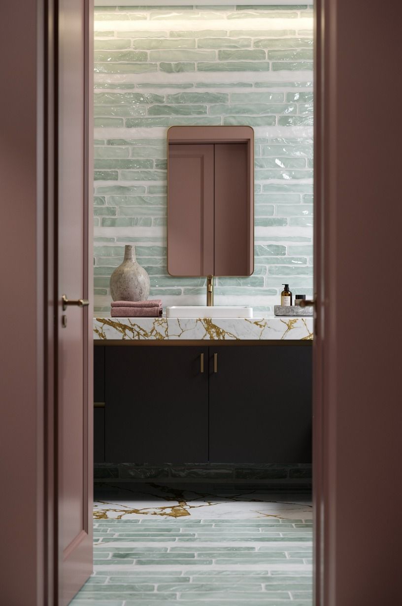
You can leave beige tile in place and still change its personality.
4Anchor a Teal Bathroom Design With Warm Wood
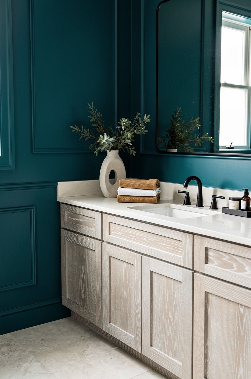
Warm white needs a grounded anchor or it can feel flat. Add a wood stool, a framed print, or a vanity basket in cerused white oak so the room has grain and shadow. I prefer wood over shiny brass here because the surface feels lived-in, especially beside camel textiles and black accents.
Your vanity doesn’t need replacing to gain that effect. An IKEA HEMNES cabinet can look more intentional with a wood tray, woven storage, and one black pull.
Keep the counter mostly clear. Two objects have more impact than seven small bottles competing with the faucet.
Use a warmer bulb if your warm-white walls look flat after sunset. You’ll want the light to reveal the camel and oak tones instead of making everything look clinical.
I’d choose a frosted globe fixture with a dimmer, not a row of exposed cool-white bulbs. The latter makes even expensive tile feel harsh.
I tried a warm-white wall with too much black metal once, and the contrast was harsher than I expected. A camel linen basket would have been the better call. If you’re drawn to darker color, this slate blue bathroom guide shows how texture can keep a moody palette welcoming.
5Hang the Three-Height Light Stack
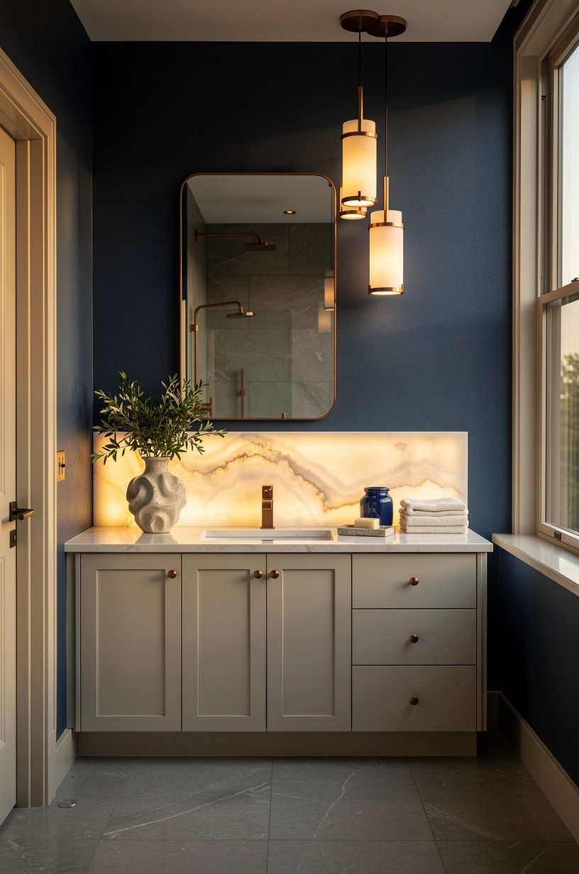
Use three visual heights to make the midnight-blue palette feel designed: a wall light near the mirror, an ivory towel or art piece at eye level, and a low basket or stool near the floor. Copper works well for the fixture because it warms the dark color without adding a hard yellow shine.
Your bathroom will feel taller when the eye travels up and down. Keep the middle layer simple, perhaps an ivory botanical print with a thin oak frame.
Put the low layer near the vanity or tub, where it can hold spare towels without becoming clutter. You don’t need a chandelier to create drama.
If your current fixture can’t move, change the bulb and add a small plug-in picture light somewhere safe and practical. I’d avoid blue-toned bulbs completely.
They flatten midnight blue and make ivory surfaces look icy. A warm pool of light around the mirror is much more flattering.
And yes, a small bathroom can handle a dark fixture. The room only feels cramped when every surface absorbs light. Pair the metal with backlit translucent onyx, pale towels, and one reflective glass container.
For more atmospheric inspiration, look at this alpine blue-green landscape palette.
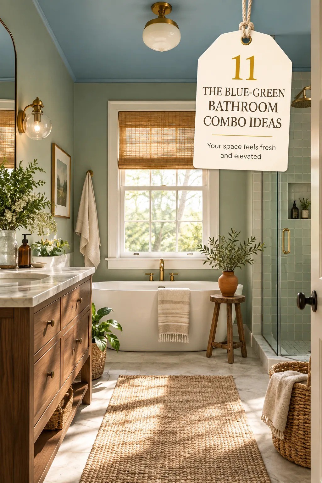
6Build Blue Accent Bathroom Ideas Around a 60-Inch Tub
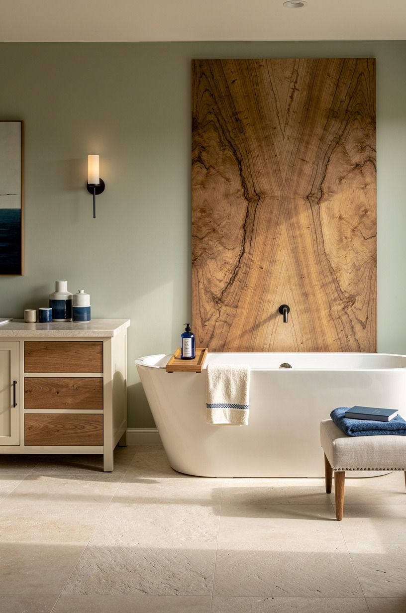
If you have a standard tub, let its proportions guide the design instead of fighting them.
7Frame a Small Room With the Reflection First Rule
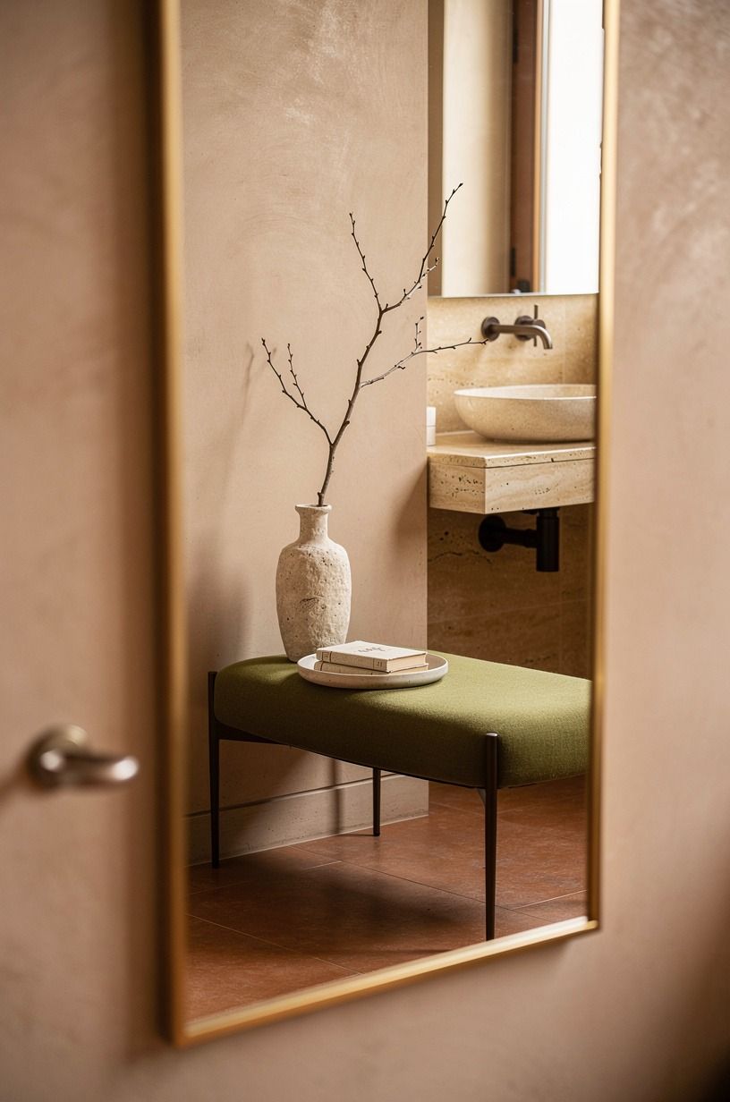
Start with the mirror, then decide where the strongest terracotta-and-olive moment belongs. A wide mirror over a small vanity reflects light across the room and gives your color more reach. Warm travertine adds a softly textured border around the reflection, which is especially helpful when the walls are earthy.
Your toilet needs at least 21 inches of clearance in front, so don’t let a decorative basket or stool steal the walking path. The best small-space styling looks generous because it protects circulation. You’ll feel the difference every morning, particularly when two people are moving around the vanity.
Try an olive wall behind the mirror and terracotta on the opposite wall if the room is long. The contrast creates a destination instead of making the corridor feel endless. I’d avoid a half-wall of contrasting paint unless your trim is strong enough to finish the break cleanly.
But if your room is truly narrow, paint the shorter end wall the deeper terracotta shade. Your eye will stop there, and the room can feel more balanced.
Keep the fixtures quiet and let the stone carry the texture. See these powdery blue-green small-room ideas for a similar use of one concentrated color.
8Choose Green Over Gray for the Two-Color Rental Reset
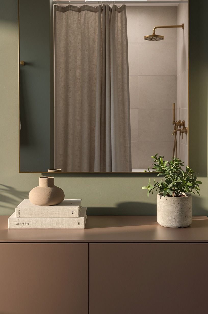
For a rental, clay is often a better wall color than gray because it brings warmth and works with linen, wood, and aged metal.
Keep the change reversible with a clay-toned textile, a linen shower curtain, or removable wall accents. Aged brass can repeat the warmth without looking too polished, especially when its patina is allowed to develop. You don’t need a permanent renovation to make the palette feel deliberate.
Try a linen bath mat with one small brass tray rather than adding several matching accessories. The room will feel softer and less decorated. If the existing fixtures are chrome, let them stay.
Aged brass can appear in only two places and still have an effect.
I’d avoid pairing clay with too many bright colors. Warm white, natural linen, and one aged-brass detail are enough to keep the bathroom grounded. For a rental-friendly reset, this green bathroom color story shows why a restrained palette works.
9Mix the Two-Source Material Plan Before You Spend
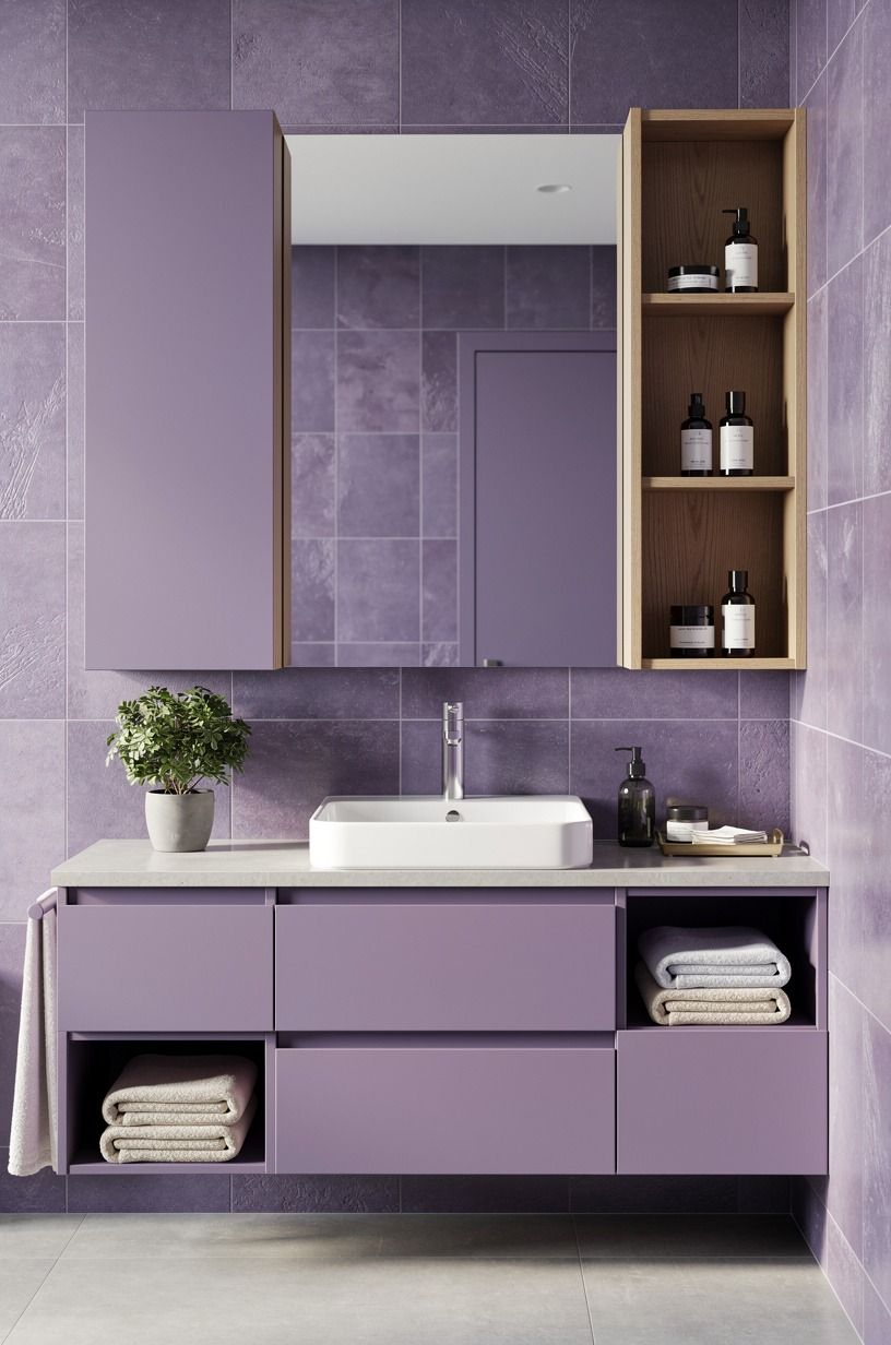
Choose two strong materials and let everything else support them. My favorite combination is oversized-chip terrazzo with a plum or gray wall and a rose-gold detail.
The terrazzo brings several quiet tones together, so the room feels layered instead of chilly. You can repeat its warmth in a wood frame or woven basket.
Your budget can stay modest if you keep the expensive surface area small. Use terrazzo on one niche or backsplash, not every wall. Subway tile costs less and can still look refined when the grout line is considered.
I’d spend on the faucet only if the existing one is visibly worn, not because a new finish feels exciting.
Here are typical US cost ranges to keep the scale honest:
Material choices have their own range:
You don’t have to choose the highest tier to get a rich result. A quiet blue-gray bathroom scheme shows why surface texture can matter more than quantity. Spend where your hand touches the room, then let paint do the visual work.
10Ask: Can a Two-Tone Blue Bathroom Stay Calm?
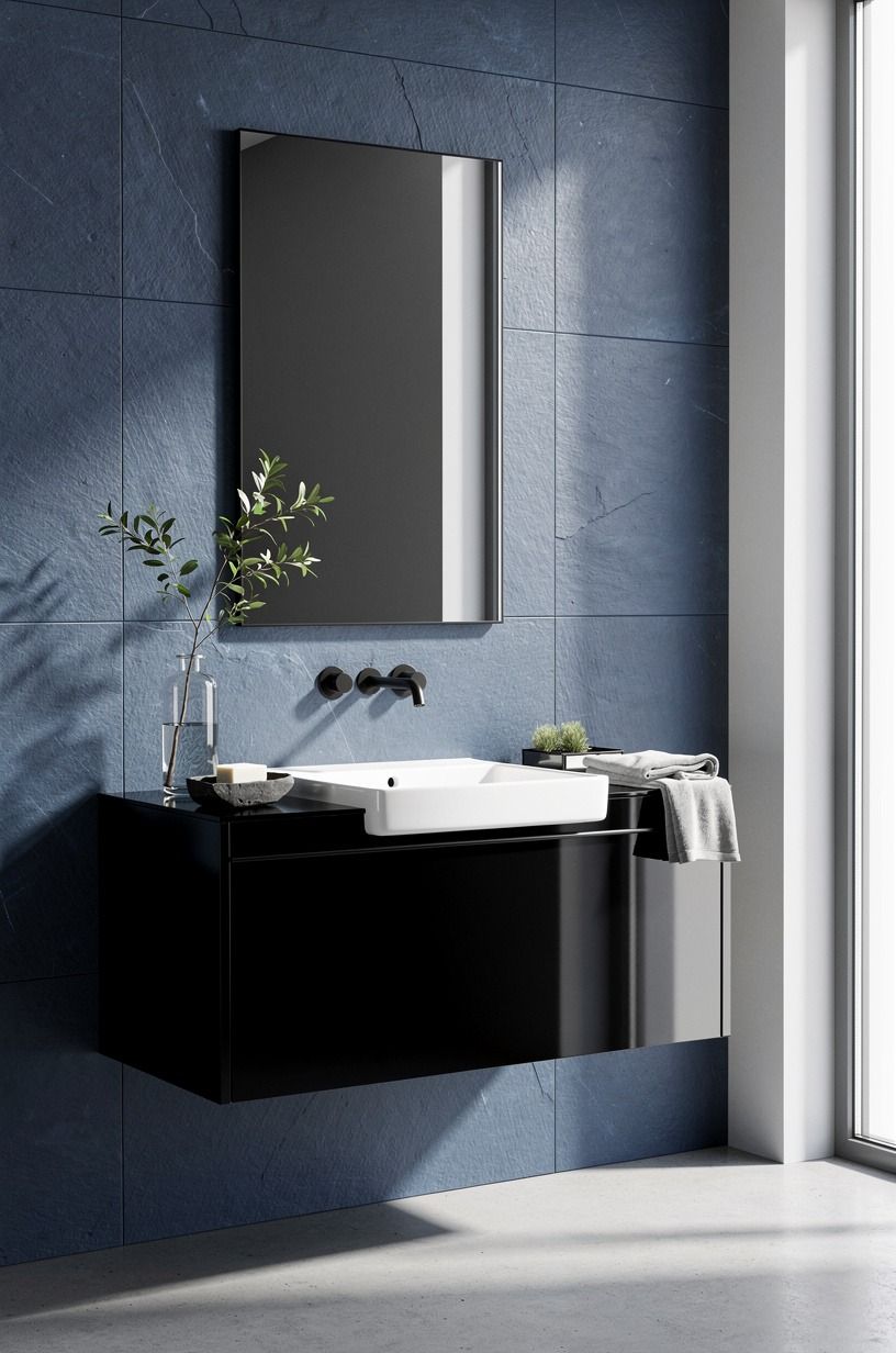
Yes, if navy occupies more space and white acts as punctuation. Use navy on the walls, white on the vanity and trim, and walnut in the cabinet, towels, or art. Benjamin Moore White Dove OC-17 can bridge the two shades on trim and ceiling.
Your eye needs somewhere to rest. Keep the floor quiet, especially if you’re using patterned tile or a strong shower curtain.
A pale stone-look floor, white porcelain, or walnut-toned vinyl can hold the scheme together. I’d avoid adding pink, yellow, and black as extra accents.
The room doesn’t need a full rainbow.
Try the 60-30-10 balance without treating it like a law. Sixty percent can be your light neutral, 30 percent navy, and 10 percent walnut plus metal. You’ll know it’s working when you can name the palette in one breath.
If you need to explain every object, there are too many.
I went back and forth on blue cabinetry because it can dominate a small vanity. Hand-applied Venetian plaster was the calmer choice for the walls, especially beside white counters and walnut. For another example of a strong pairing with restraint, see this black and green bathroom color story.
11Float the Soft Hotel Finish for a Green and Blue Bathroom
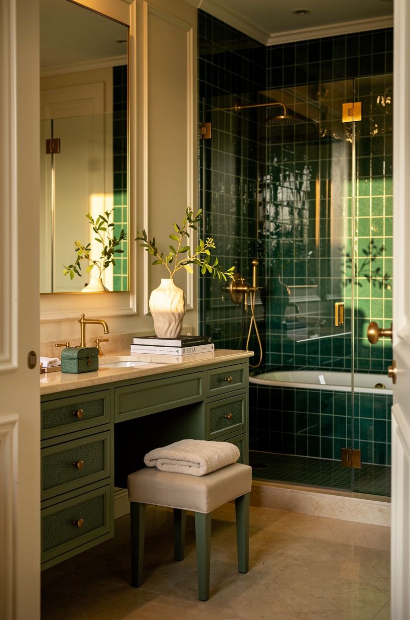
Create the hotel feeling through repetition, not expensive fixtures. Use one emerald wall, one cream textile, crisp white towels, and a tray with a restrained gold detail. Shagreen accents add a relaxed texture, and their subtle grain makes the room feel lived-in instead of staged.
Your vanity area will look calmer when the counter has a clear center. Keep the soap, hand towel, and one small vessel within reach, then move everything else into a drawer or basket. I’d choose a cream stool only if you have enough clearance; otherwise, a simple wood stool will do the job better.
Make the shower curtain reach close to the floor, but keep it clear of standing water. A long vertical line gives you height, while a narrow emerald stripe can connect the curtain to the walls. You’ll want the bottom edge to hang cleanly, not puddle beside the tub.
And don’t forget scent. A eucalyptus bundle, unscented candle, or clean soap can finish the sensory part without adding more color. This is where the room becomes inviting: the towel feels soft, the light is warm, and the palette isn’t shouting.
For an organic color reference, browse these blue-green coastal details.
Why This Pairing Is Having a Moment
Blue and green are returning because people are tired of rooms that look finished but feel empty. I’ve noticed the shift in bathrooms first. A cool blue still feels clean, while green brings the quiet, earthy note that white rooms often lack.
Together, they can feel serene without turning precious.
The combination also works with what you already own. White porcelain, chrome, oak, rattan, and linen can all sit beside it.
You don’t have to replace every fixture to make the palette believable. If your room is dark, choose a lighter green and reserve the blue for one wall, the vanity, or the textiles.
That choice gives you control over the mood.
The trend isn’t a reason to buy more. It’s a reason to edit better.
I’d rather see one excellent paint color, one textured towel, and an old wood stool than a bathroom crowded with coordinated accessories. Your room should still look like you use it.
The Mistake I’d Avoid in Your Bathroom
I once layered too many blue-green objects into a bathroom because each piece looked good alone. The result was muddy. The towels, art, vase, and mat all had different undertones, and the room lost the clean contrast that made the palette appealing in the first place.
Now I choose the wall color first, then test the second shade beside the largest fixed surface. That might be tile, a vanity, or the floor.
You’ll see the undertone immediately. A blue that looks gentle on a sample card can become sharp beside gray grout, while a green can turn yellow beside warm beige tile.
My rule is simple: one dominant color, one supporting color, and one quiet neutral. Farrow & Ball Bone can soften a darker scheme, while a clean white can keep pale blue-green combinations fresh.
You don’t need both. Pick the neutral that already appears in your bathroom, and your update will look more natural.
But if you’ve already bought the wrong shade, don’t panic. Move it to a textile or small frame before repainting the whole room. Your mistake may become the accent that makes the better color feel intentional.
What People Always Want to Know
What is the best blue-green bathroom combo for a small bathroom?
A pale blue wall with muted green textiles is the safest small-room choice because it reflects more light while still adding warmth. Try IKEA KALLAX birch-effect storage for a nearby towel zone, and keep the floor quiet. You’ll get color without visually shrinking the room.
Where can I buy blue-green bathroom pieces on a budget?
Look at IKEA, Wayfair, and Target for towels, mirrors, curtains, and storage, then check Facebook Marketplace or a local thrift shop for wood stools. Cotton waffle towels are especially useful because texture gives you depth without requiring a matching set.
How much does a blue-green bathroom makeover cost?
A small refresh usually runs about $100 to $300 for paint, textiles, and a mirror, while the supplied US budget range for paint, a mirror, a faucet, and textiles is $200-$1,200. Free changes include editing the counter, rearranging storage, and reusing frames.
Can I create this bathroom look on a budget?
Yes, and you can start with paint, a secondhand mirror, and towels you already own. Removable blue hooks can add color in a rental, while a thrifted wood stool brings warmth. You don’t need new tile to make the palette feel considered.
Is a blue-green bathroom combo worth it in a small space?
Yes, because the two colors give a small room dimension without requiring major construction. Keep the lighter shade on the larger surface and place the darker tone near the vanity or shower. This blue bathroom inspiration guide shows how restraint helps.
Is this color combination a good idea for a rental?
It is, especially when you use a tension rod, removable hooks, peel-and-stick accents, and freestanding storage. Removable wallpaper can create one blue-green focal wall if your lease allows it. Keep the strongest color on pieces you can take with you.
Where I’d Start First
If I had to pick one, I’d start with the blue wall behind the mirror. It gives every white fixture a cleaner outline, and you can test the whole palette without touching tile or plumbing. Pin this blue-green bathroom color guide for later and start with one paint sample.