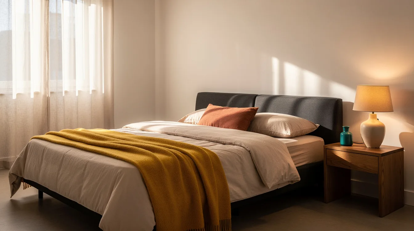
I painted my last rental’s 11-by-12-foot bedroom a red I picked off a paint chip, and by the second week it felt like I was sleeping inside a fire station.
That color went back to Behr a month later, on my own dime.
Designers see this exact regret on repeat: a shade chosen for drama ends up costing sleep, and sometimes resale value too.
Here are the bedroom colors that tend to backfire, and what typically works instead.
Painting Walls a Stark, Clinical White
A blindingly bright white like Behr’s Ultra Pure White reads crisp on a paint chip and clinical once it covers four walls.
It bounces nearly all the light in the room, which works against a space that’s supposed to help you wind down.
Real-estate agents will tell you buyers often read a stark white bedroom as unfinished rather than calm, especially with builder-grade trim already white.
Stark white also shows every scuff and shadow, which means more touch-ups than a warmer tone would ever need.
A warmer off-white, something closer to Valspar’s Swiss Coffee, keeps the brightness without the sterile edge.
It also plays nicer with wood furniture and warm-toned bedding, which most of us already own.
Choosing Fire-Engine Red as a Bold Statement
Fire-engine red measurably raises heart rate and alertness, which is the opposite of what a rest-focused room needs.
It also visually shrinks a space, a real issue in a typical 130 to 160 square foot bedroom.
I’ve watched it clash with everything from oak nightstands to white cotton bedding, forcing constant workarounds just to keep the room from feeling like a dare.
Even a single accent wall in true red can dominate a room that size.
If you want that warmth, a muted terracotta gets you there without the jolt, and it ages far better in daylight.
Reaching for Neon or Lime Green
Lime and neon green photograph well for about a season, then keep a room feeling switched on long after the lamp goes off.
The saturation reflects light in a way that reads more break room than bedroom.
It’s also one of the harder colors to soften with layering, since most neutral bedding and rugs fight it rather than calm it down.
Even a small dose, like a single nightstand or headboard, tends to be plenty of that energy in a bedroom.
A softer eucalyptus or mossy green delivers the same botanical mood at a fraction of the intensity, and it still reads current.
Picking Icy Pastels Like Baby Blue or Bubble-Gum Pink
Baby blue and bubble-gum pink can read more nursery than primary suite once real furniture goes in.
They date fast, too, since both track closely with whichever pastel trend was loudest a season or two back.
Pastels also limit furniture pairings, since most wood tones and metal finishes end up looking slightly off against them.
I’ve seen buyers walk a room painted this way and immediately start mentally repainting it, which is not the reaction you want during a showing.
A dusty, mineral-toned blue holds the same softness with far more staying power over the next several years.
Going All-In on One Loud Trend Color
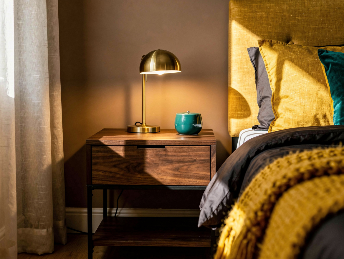
Committing every wall to one loud trend shade, think deep burgundy or an oversaturated sage, is the fastest way to lock yourself into a look that ages out within a year or two.
Repainting a standard bedroom later typically runs somewhere around $300 to $400 in paint and labor if you’re hiring it out.
That’s real money to spend twice on the same four walls.
Save the boldest shade for one accent wall instead of the whole box, and let the other three carry a calmer neutral.
Defaulting to Flat, Cool Gray Because It Feels Safe
Flat, cool gray felt like the safe default for most of the last decade, and that’s exactly the problem now.
Designers increasingly flag icy grays and flat greige as sterile rather than soothing, especially under LED bulbs that already skew cool.
It can leave a bedroom feeling more like a rental unit than a place you chose on purpose.
A warmer greige with real beige undertone, or a soft taupe, reads current without chasing whatever comes next.
Testing Warmer Alternatives That Actually Work
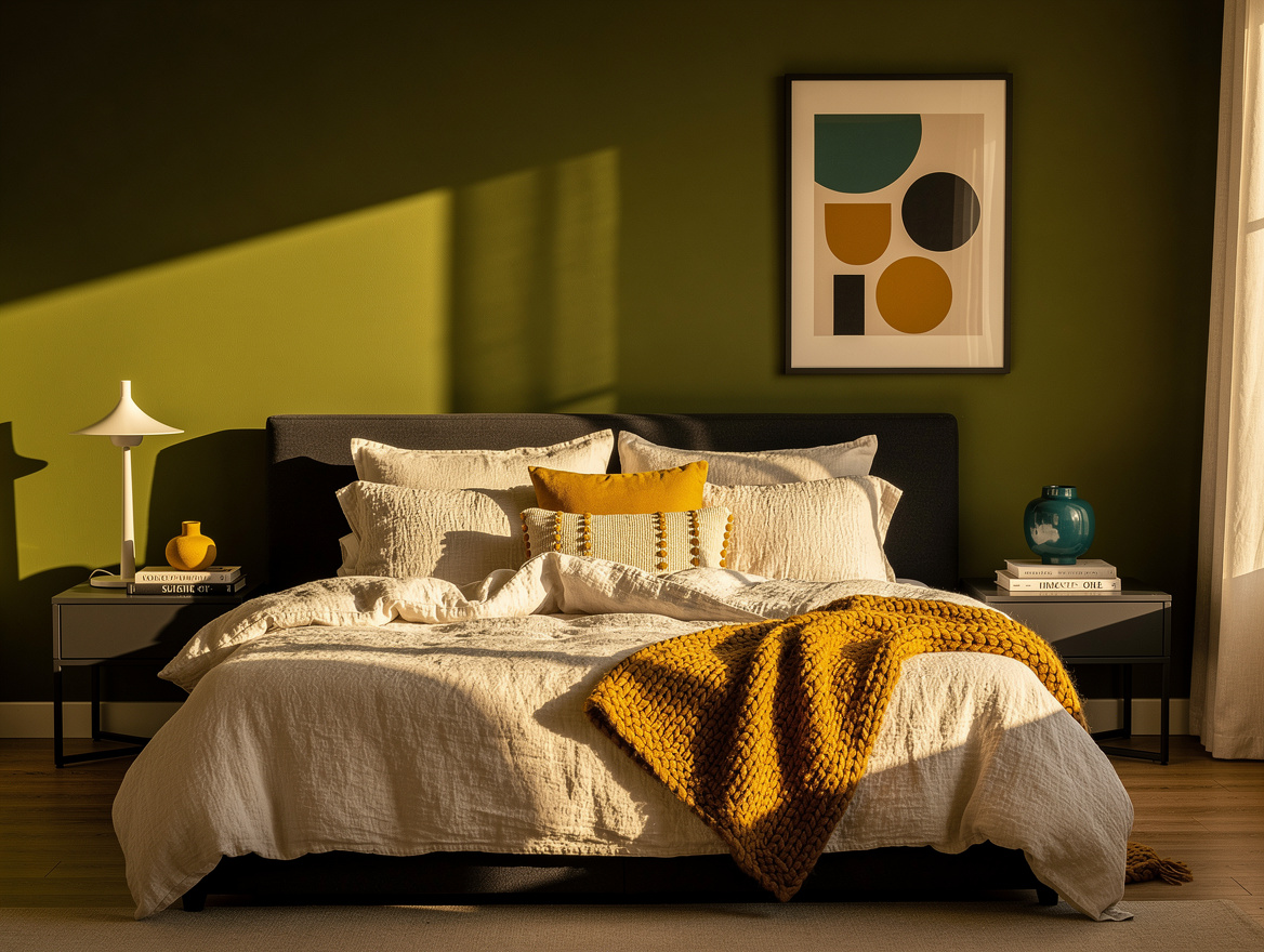
The colors holding up best for bedrooms lately lean warm and a little muted: mineral blue, olive, warm taupe, dusty mauve.
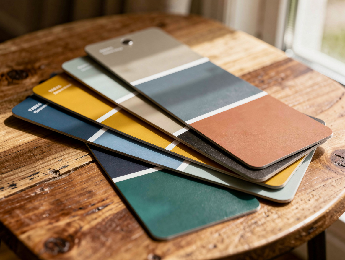
A sample pot from Home Depot or Lowe’s typically runs about $5 to $8, which is cheap insurance against a $300 repaint later.
Paint a two-foot square on two different walls and live with it for a few days under both daylight and lamp light before committing.
One gallon typically covers roughly 350 to 400 square feet, which is usually enough for a standard bedroom with a little left over for touch-ups.
Trim and doors can stay a slightly warmer white than the walls, which keeps the whole room from reading flat.
Start with the sample pot, not the full gallon, and give the color a few nights under your actual lamp before it goes on every wall.
The room you wake up in every day deserves better than a shade you picked in five minutes at the paint counter.
Mia Carter writes about small-space living and budget home makeovers. She has restyled three rentals and tests most ideas in her own 45 sqm flat.