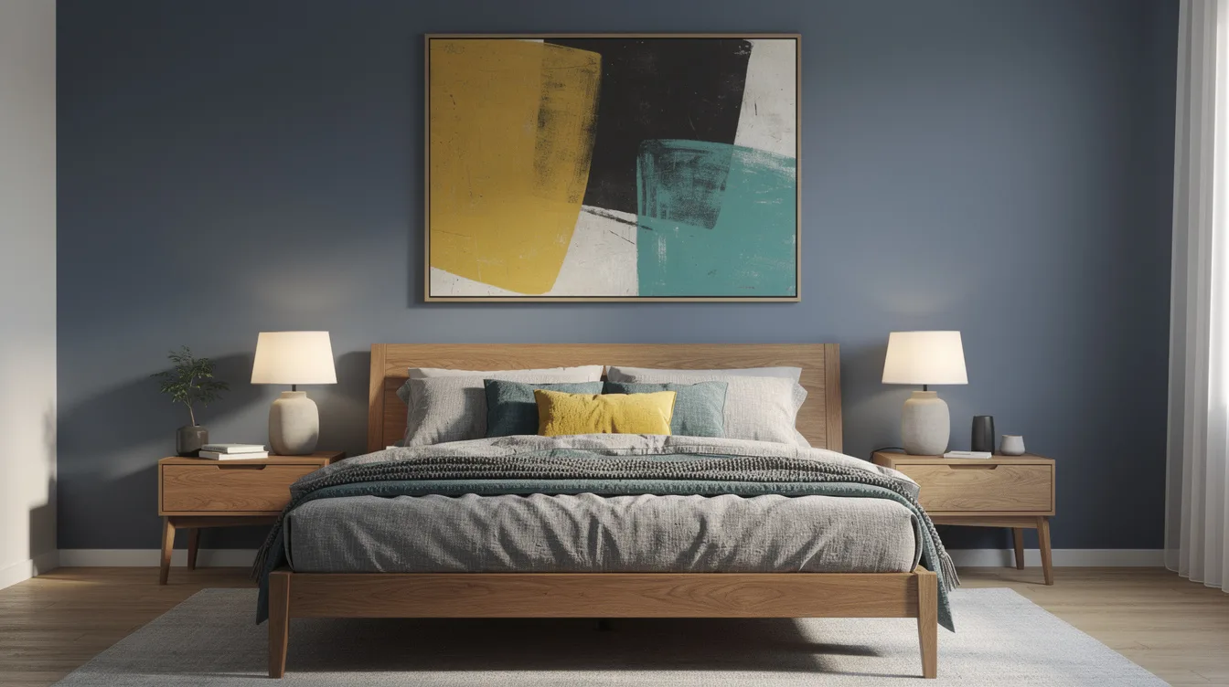
A typical 24-by-36-inch framed print can control the mood of a bedroom before the paint color even enters the conversation. The common mistake is choosing a wall shade from a store card, then hoping it will cooperate with the art. Start with the image, test the room’s light, and let the quieter colors do the work.
Read the Artwork’s Visual Hierarchy
Start with the color that commands attention in the artwork, then study what supports it. A large red shape, dark horizon, or bright patch of blue should guide the room’s energy, while smaller details can remain accents.
Look at the piece from across the room and squint slightly. The shades that remain visible are usually the strongest candidates for walls, bedding, or a nearby chair.
If the piece includes oil paint, its surface may make colors appear richer than they do on a flat wall. Choose a quieter version of the same family so the room stays restful.
Keep the frame in the conversation, too. A dark wood frame can support warmer walls, while a thin black frame gives a cooler palette more definition.
Pull Out a Quiet Supporting Color
The safest wall color usually comes from a supporting shade rather than the artwork’s loudest note. A dusty green, muted clay, or softened blue can connect the room without competing with the focal piece.
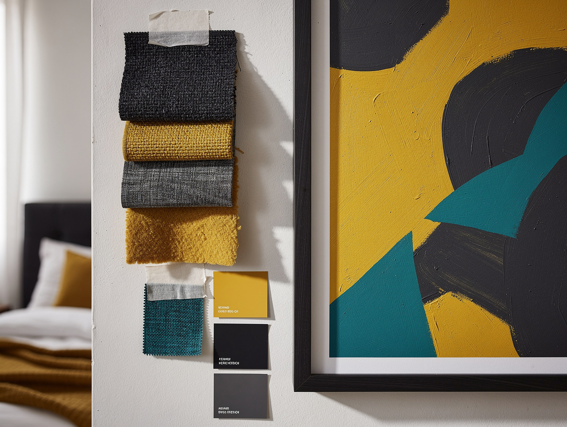
Place several Home Depot paint swatches beside the artwork instead of holding them against a blank wall. The comparison reveals whether the color belongs to the piece or only looks appealing by itself.
For a room with a vivid print, try a low-saturation version of one background color. The effect feels intentional because the wall echoes the art without copying its most dramatic detail.
Texture can reinforce that choice. A linen duvet cover in a related tone adds softness and keeps a painted surface from feeling too formal.
Match Temperature and Light
Color temperature matters as much as the color name. A cool gray-blue painting can look awkward beside yellow-toned walls, while warm artwork often benefits from cream, sand, or gentle brown.
Study the room during morning, afternoon, and evening light before choosing paint. North-facing bedrooms often make colors appear cooler, while direct afternoon sun can intensify warm pigments.
Use the floor as a bridge when possible. Natural oak flooring can connect warm artwork to a cooler wall color, especially when the room includes woven or tan furnishings.
Window treatments deserve the same test. A Target cotton curtain placed near the art can show whether the room’s whites lean pink, yellow, gray, or blue.
Test Paint Beside the Frame
Paint samples belong beside the artwork, not across the room from it. The frame, glass, mat, and image colors all change how the wall reads.
Brush a large sample onto foam board so you can move it around without marking the wall. Leave it near the bed, dresser, and artwork for at least one full day.
A Home Depot sample pot is useful for testing undertones, but the small card at the store is too limited for a final decision. View the color in both shadow and direct light.
Pay attention to contrast. A pale mat may disappear against a pale wall, while a medium wall color can make the artwork feel sharper without making the bedroom dramatic.
Balance Saturation With Soft Furnishings
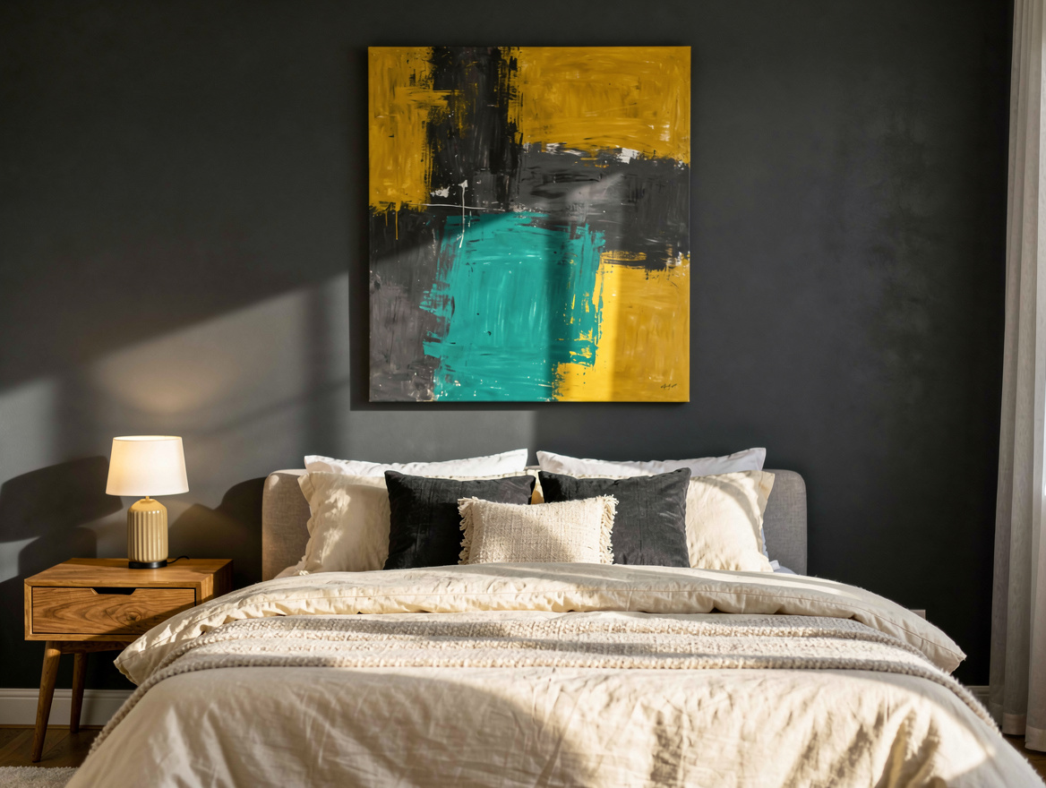
When artwork is highly saturated, keep large bedroom pieces calmer. The goal is to give the eye one clear destination instead of making every surface demand attention.
A textured velvet headboard can hold a rich color beautifully, but it should usually sit one step quieter than the artwork. Deep blue art may pair better with smoky blue upholstery than with bright navy.
Repeat one small color from the piece in bedding or a cushion, then stop. Repeating every shade turns coordination into a theme, and bedrooms rarely need that much visual instruction.
Affordable basics make this experiment easier. A Walmart quilt in cream, faded blue, or warm gray can test the palette before you commit to custom textiles.
Repeat the Color in Small Doses
After selecting the wall color, carry one artwork shade into two or four smaller objects around the room. The repetition should feel discovered, not arranged with a ruler.
A ceramic vase, book cover, or lampshade can provide enough color near the bed. Use different materials so the shade feels part of the room rather than a repeated graphic.
An IKEA table lamp with a warm bulb can soften a cool painting and make its quieter colors more noticeable at night. Lighting changes the palette, so include it in the decision.
For a final layer, try an Amazon throw blanket that borrows a secondary color from the artwork. Fold it loosely at the foot of the bed and let the painting remain the room’s strongest statement.
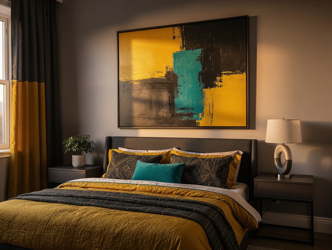
Begin with one large sample board placed directly beside the artwork, then live with it through a full day and evening. That small pause will reveal more than a dozen paint chips ever could.
Mia Carter writes about small-space living and budget home makeovers. She has restyled three rentals and tests most ideas in her own 45 sqm flat.