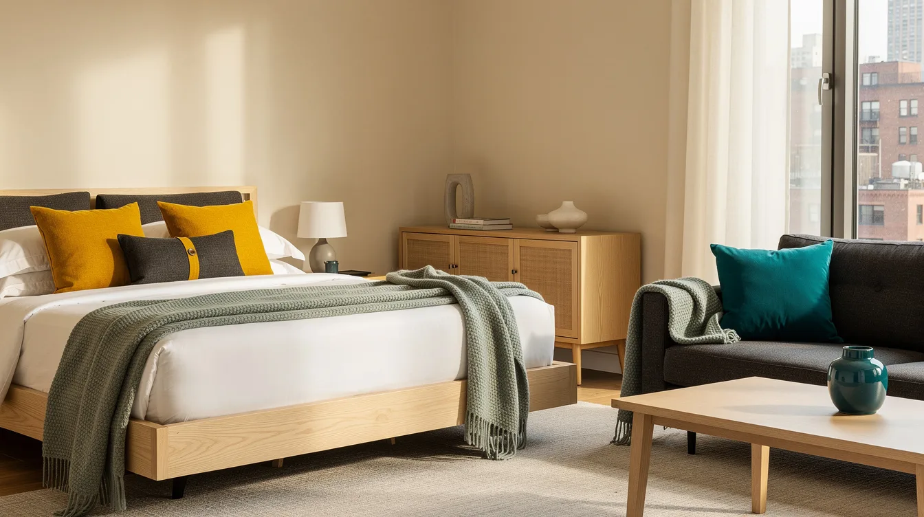
A bedroom and adjacent sitting area can share color without looking like one oversized set. The practical test is a small one: tape an approximately 180 × 220 cm sitting-area footprint before choosing the final accent pieces.
Keep the bedroom restrained, then give the sitting area a stronger version of one color. The same trim, curtain fabric, wood tone, or cushion shade can carry the connection across the doorway.
The goal is movement, not matching walls. A quiet base makes the transition feel intentional while leaving both rooms with a distinct purpose.
Repeat One Color at Two Volumes
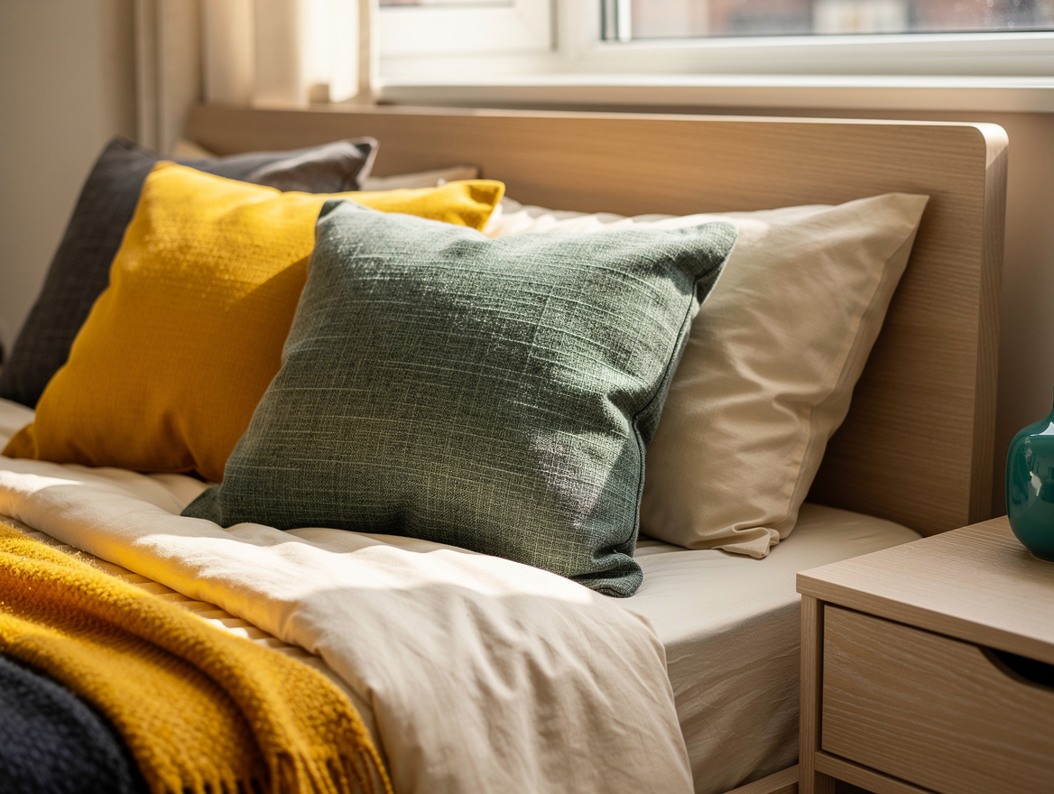
Begin with warm cream as the bedroom background, then let gray-green carry the eye toward the sitting area. The bedroom should hold more cream, while the adjoining space can use the green on curtains, cushions, or one upholstered chair.
Natural linen keeps the transition relaxed and gives both rooms a shared texture. This scheme works because the colors repeat without forcing every surface to match.
For a practical starting point, use two roughly 50 × 50 cm IKEA DYTÅG cushion covers on the bed and one on the reading chair. At about €12.99 each in the supplied listing, they add a clear color link without making the bedroom feel busy.
Keep the strongest green below eye level in the bedroom, then allow it to rise through the sitting area with curtains or upholstery. That shift gives each room its own mood while keeping the doorway visually calm.
Keep Shared Walls Quiet
When the bedroom and sitting area open directly into each other, paint the shared walls the same soft cream. A continuous backdrop usually creates better flow than two competing wall colors placed a few feet apart.
Use a deeper shade only where the sitting area has a true doorway or architectural break. In that case, repeat the same trim color around both openings so the change feels planned rather than abrupt.
IKEA DYTÅG curtains offer a useful bridge because the supplied listing includes gray-green, beige, white, and blue-gray options, with two panels measuring about 145 × 250 cm and priced around €85 per pair.
Choose curtains that echo the bedroom wall or bedding, then keep the sitting-area chair quieter. The strongest opinion here is simple: the wall should connect the rooms, while the textiles create the contrast.
Deepen the Color Family Next Door
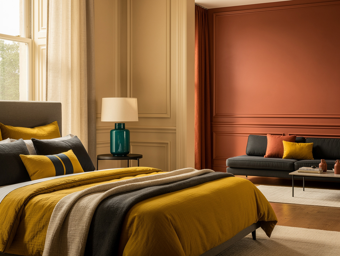
A warmer transition begins with plaster pink in the bedroom and moves toward terracotta in the sitting area. Use the pale shade on the bedroom walls, then bring the deeper tone through a chair, cushion, or curtain next door.
Repeat one small rust accent on the bed, perhaps in a cushion or folded throw, and place one pale pink detail on the sitting-area chair. The colors should belong to the same family, but their proportions should change from room to room.
Rust linen is especially effective because its texture softens the stronger pigment. Pair it with pale oak and a warm neutral rug rather than adding another saturated color.
If the sitting room is separated by a doorway, a deeper terracotta wall can work; in a continuous layout, keep the walls pale and let the furniture carry the shift. This is a warmer, more layered choice than gray-green, but it still follows the same color-flow logic.
Change the Proportion, Not the Palette
Color flow depends more on proportion than on identical products. Let the bedroom use cream bedding with small green accents, then give the sitting area a stronger green presence through the chair, curtains, or rug.
A gray-green throw measuring about 130 × 170 cm can sit on the bed or the chair, but placing it on both pieces may make the rooms feel staged. Repeat the hue once, then let the surrounding neutrals do the linking.
Balance that color with neutral upholstery, pale wood, or a cream lampshade. The bedroom should feel quieter because it has fewer colored surfaces, not because it uses a completely different palette.
Use the same test from the doorway: squint slightly and look for one color moving through the rooms in changing amounts. If the accent appears everywhere at equal strength, remove one piece.
Bridge Rooms With Material Repeats
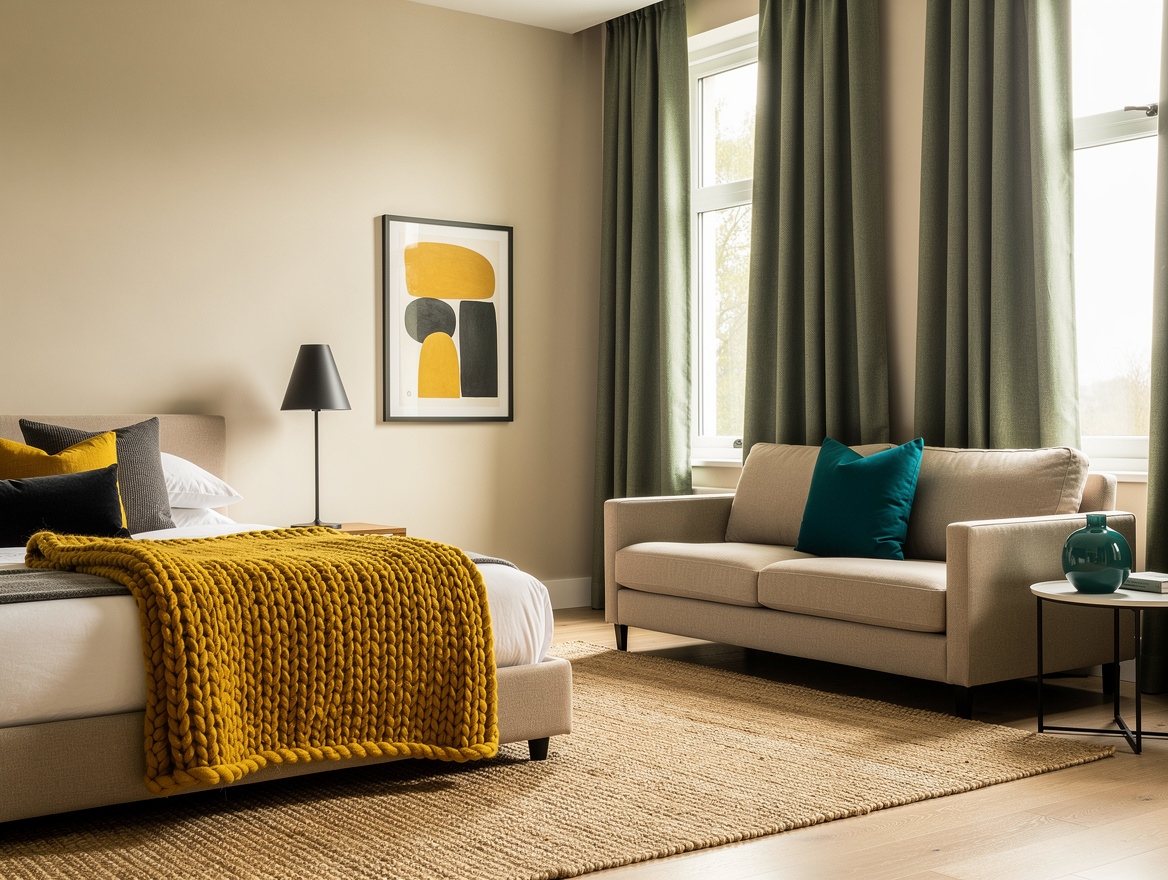
Materials can connect spaces when the colors are not exact matches. Repeat pale oak on a bedroom nightstand and sitting-area side table, then use the same finish on a frame or shelf.
Add warm metal in small doses, such as a lamp base in one room and a side-table detail in the other. Two repeated finishes are enough; bringing in a new black, silver, or brass finish at every turn weakens the flow.
IKEA LOHALS natural flatwoven rug is listed at about €99.95 for roughly 160 × 230 cm, making it a useful neutral bridge beneath a stronger green seating arrangement. Its natural tone can soften both cream and terracotta schemes.
Keep the rug’s texture visible rather than covering it with too many layers. A calm material repeated across the threshold often does more work than another decorative color.
Tape the Layout Before You Shop
Color decisions become easier when the furniture footprint is clear. Reserve about 180 × 220 cm for one chair, a small table, and a sitting-area rug, then tape that outline on the floor before ordering anything.
Painter’s tape can show whether the chair blocks the bedroom view or leaves enough walking space. If the arrangement feels cramped in tape, stronger color will make it feel even more crowded.
For a typical small package, one curtain pair, three cushion covers, one throw, and one rug total about €254 based on the supplied product listings, before inserts, rods, or delivery. That figure gives you a useful ceiling for the first pass.
Spend first on the item that carries the color farthest, usually the curtains or rug. Add cushions last, because they are the easiest pieces to adjust when the flow feels too faint or too loud.
Start by taping the sitting-area footprint, then choose one anchor color and assign it a lighter role in the bedroom and a fuller role next door. That decision will guide every curtain, cushion, rug, and trim choice that follows.
Mia Carter writes about small-space living and budget home makeovers. She has restyled three rentals and tests most ideas in her own 45 sqm flat.