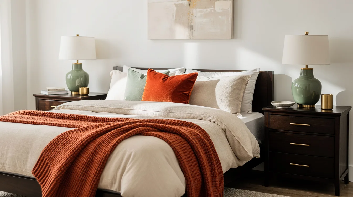
A dark nightstand can look oddly weak when it sits against a wall in the same middle range, even when both colors are attractive. The IKEA IDANÄS measures 18½ inches wide, and its dark finish needs a clearly lighter or darker setting to read as furniture instead of background.
That distinction comes from color value, meaning how light or dark a surface appears, rather than whether it is brown, green, blue, or cream. The fix is simple: create separation behind the piece, then keep nearby accessories from flattening the effect.
These bedroom schemes show how to use that contrast with real finishes, practical dimensions, and prices that make the strategy easier to picture.
Read value before choosing a hue
Start by judging how light or dark each surface appears, then think about whether the colors belong to the same family. Value contrast creates the silhouette that makes a bed, dresser, or nightstand read clearly from across the room.
A medium-brown dresser against a medium-green wall may look pleasant, yet the furniture can visually melt into the background. A pale wall behind dark walnut usually creates a cleaner edge because the two surfaces sit farther apart in lightness.
For paint, the light reflectance value scale gives the idea a useful reference. White Dove OC-17 is listed at an LRV of 83.16, while Hale Navy HC-154 is listed at 8.36, so they produce dramatically different backdrops.
Set dark wood against warm white
Use a warm-white wall when the bedroom furniture has a deep brown finish, especially around a bed with a tall headboard or broad dresser. Warm-white paint gives dark pieces enough breathing room without forcing the room into a harsh black-and-white scheme.
The IKEA IDANÄS nightstand is a practical example: its dark-brown-stained beech veneer over engineered panels measures 18½ by 15¾ by 26¾ inches and is listed at $199.99 each. IKEA IDANÄS nightstand construction also includes solid-wood legs, a soft-closing drawer, and an open shelf.
Allow about 37 inches of combined width for a pair, before adding the bed and side gaps. Dark-brown-stained beech veneer will stand out best when the wall behind it stays mostly open.
Place a pale lamp or ceramic object on top instead of adding another dark accessory. Ivory bedding can repeat the light value near the center of the room and keep the nightstands from feeling visually stranded.
Put pale pine on a navy wall
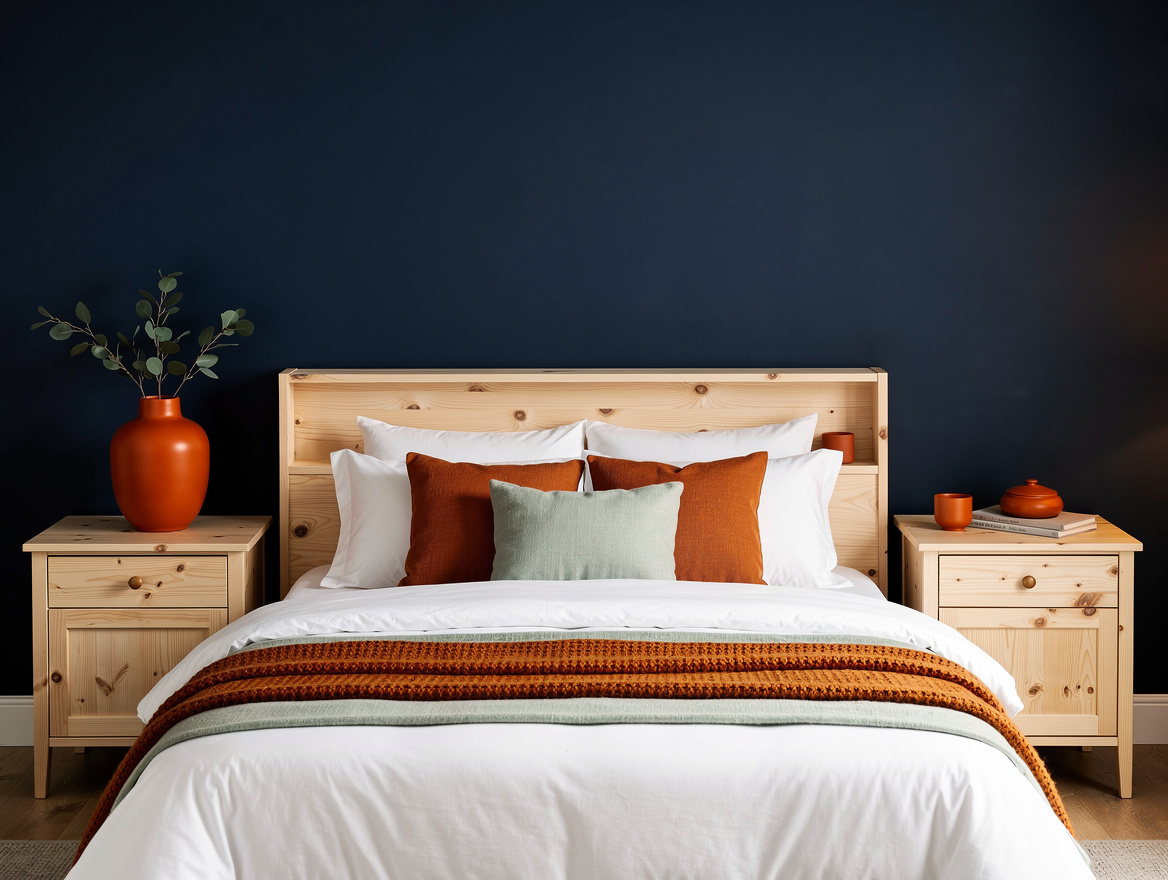
Reverse the formula when the furniture has a light natural finish. A navy wall gives pale wood a strong visual outline, making a compact nightstand feel intentional rather than unfinished.
The IKEA TARVA nightstand uses untreated solid pine for its main components, with a fiberboard back and drawer bottom, and measures 18⅞ by 15⅜ by 24⅜ inches. IKEA TARVA nightstand is listed at $79.99 each, or $159.98 for a pair.
Use the darker paint on one bed wall if covering the entire room feels heavy. Untreated solid pine has enough natural variation to keep the contrast from looking flat, especially when the room receives soft daylight.
Keep the surrounding pieces calm so the pale wood remains the focal point. White cotton bedding bridges the navy wall and the furniture without introducing another competing value.
Separate medium wood from middle tones
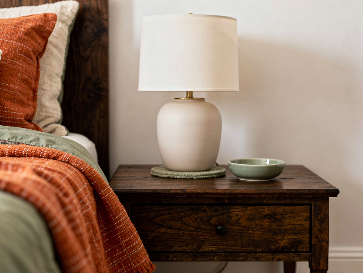
Medium-toned furniture needs a background that makes a decisive move lighter or darker. Medium-brown wood often disappears against beige, muted green, or another mid-value finish because the edges lack enough separation.
Try a pale plaster-colored wall behind a walnut dresser, or place an oak bed against a deeper blue-gray surface. Pale plaster works when the room needs airiness, while a deeper backdrop gives the same furniture more visual weight.
Pay attention to the rug and curtains as well, since both can soften the contrast between the wall and the furniture. Deep blue-gray paint can support medium wood without demanding the sharper drama of near-black.
Test a large paint sample beside the actual furniture at morning and evening. A color that seems contrasting in a store may land much closer in value once it shares a wall with the wood.
Concentrate contrast on one focal piece
Let one item carry the strongest value difference instead of making every surface compete. A statement dresser against a clearly lighter or darker wall can anchor the bedroom while smaller pieces fade into a quieter supporting role.
Repeat only a small accent from that focal area, such as a brass-colored pull or a pale vase. Brass-colored details add warmth, but they should not be asked to create the main contrast.
Use texture to add interest after the value relationship is working. A light ceramic lamp on dark furniture can provide a small highlight, while linen, wood grain, and woven fabric keep the room from feeling overly graphic.
Before buying new accessories, step back from the doorway and check the furniture silhouette. The strongest piece should be easy to identify within a glance.
Begin with the largest visual plane, usually the wall behind the bed or dresser, and compare it directly with the furniture finish. Once that value gap is clear, choose bedding and accessories that support the silhouette instead of competing with it.
Mia Carter writes about small-space living and budget home makeovers. She has restyled three rentals and tests most ideas in her own 45 sqm flat.