
Cheap sweet 16 party ideas that still look expensive usually stay within the $200-$800 budget tier because the biggest changes come from paint, textiles, art, and organization. I learned this after overbuying decorations nobody noticed. Your guests remember atmosphere, food, and one strong visual moment. Start there, and your party can feel warm, polished, and personal!
- Layer a Paper Backdrop With the Three-Color Rule
- A Softer Color Story for One Wall
- Build the Three-Height Dessert Display
- When Ceiling Glare Takes Over, Stack Three Light Sources
- Frame the Entry With a Balloon Garland
- Let the Glassware Tell the Story
- Hang Oversized Art at the Right Height
- Where Should the Snack Table Float?
- Style a Photo Corner With Drapery
- The Two-Wood Rule for Tables and Trays
- What Deserves the Budget First?
- Pair Linen Drapes With a Quiet Rug
- A Sculptural Branch Around the Cake
- Create a Self-Serve Drink Station
- Handmade Signs, One Custom Detail
- Arrange Seating Around Conversation
1Layer a Paper Backdrop With the Three-Color Rule
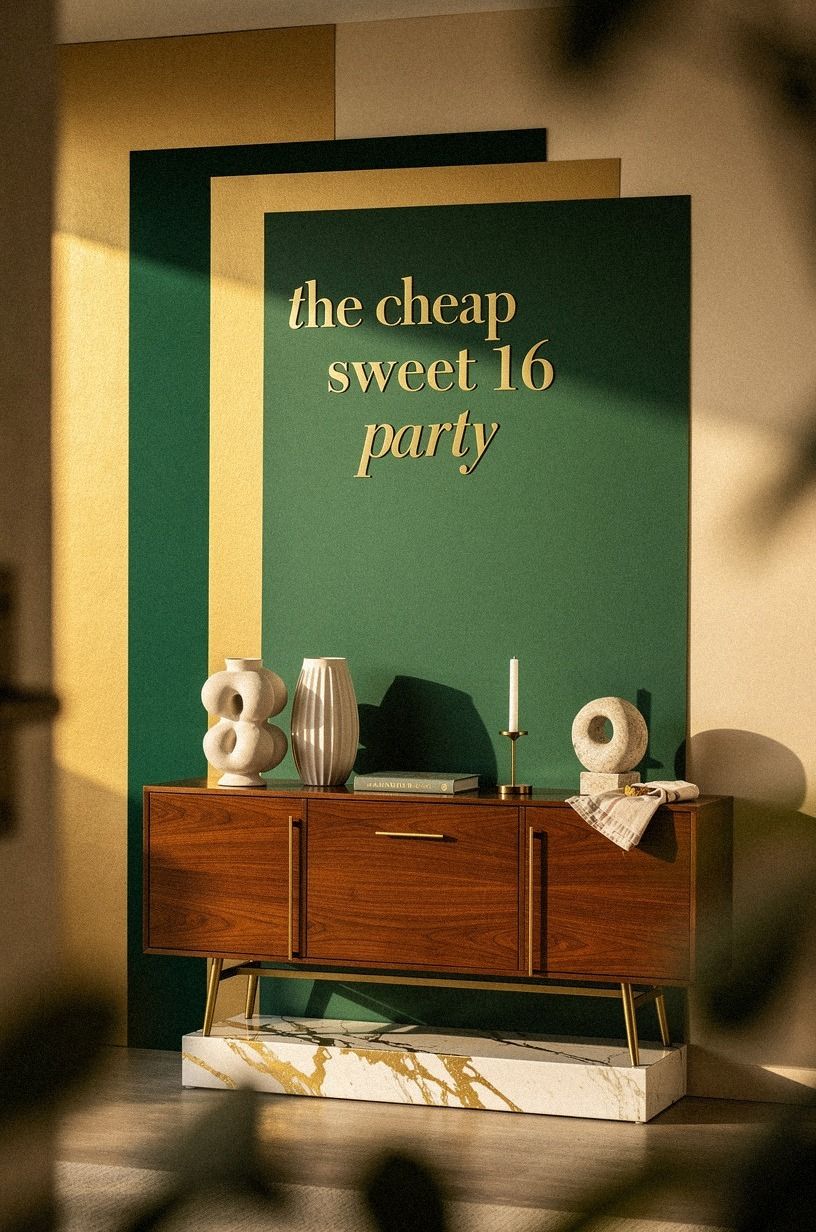
A layered paper backdrop gives your sweet 16 party one bold focal point without filling every wall. Choose three colors, such as emerald, gold, and cream, then repeat them in paper fans, tissue pom-poms, and a Calacatta marble cake stand with gold veining. If you’re styling a dessert table, you’ll want the backdrop wide enough to frame the display without swallowing it.
I prefer one generous arrangement over several tiny clusters because your eye needs somewhere to land.
Use matte paper for the base and one glossy accent for a little light. Metallic gold can work, but too much makes the room feel like a party store exploded. A soft Farrow & Ball Pigeon No.25 wall behind the display will keep the palette calm.
You don’t need a rented wall system, and you won’t miss one when the layers create real depth.
Hang the backdrop behind cake, gifts, or a photo spot. If you’re renting, use removable hooks and painter’s tape to protect your walls.
I once placed a backdrop too low, and every photograph cut off the best details. Test the arrangement from the entrance before guests arrive so the main details stay visible. For more low-cost polish, borrow ideas from the finish that makes cheap paint look expensive.
2A Softer Color Story for One Wall
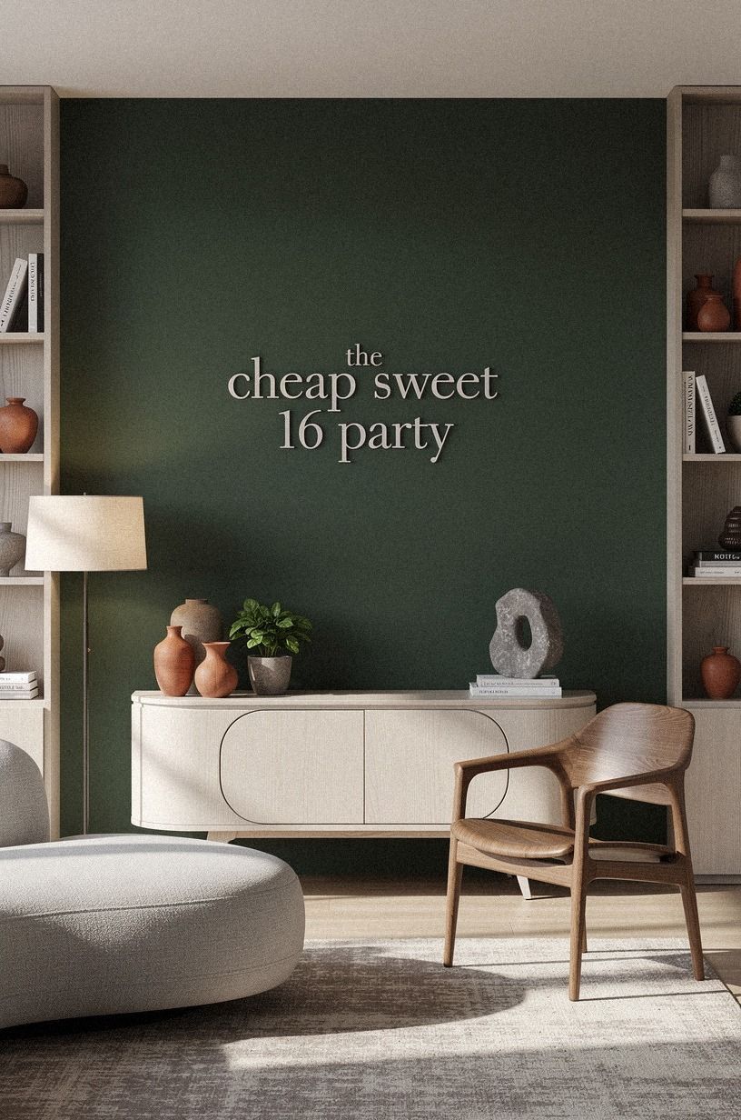
Painting one wall is one of the affordable sweet 16 party ideas that changes the room before you buy a single decoration. A forest green accent wall adds depth, while rust textiles and natural oak keep the palette warm. You can use leftover paint if you have it, and your party will still feel intentional rather than temporary.
The expensive-looking part comes from restraint. Pick one background color, one textile shade, and one metallic note.
If you’re using rust napkins, don’t add five unrelated colors because your table will lose its calm rhythm. A warm, inviting backdrop gives your dessert, flowers, and clothing room to stand out.
But I wouldn’t paint every wall a deep shade for one night, especially if your room doesn’t get much daylight.
Use cerused white oak for a gentle material contrast that won’t create harsh reflections. Your guests won’t study the wall, but they’ll feel the difference when every detail has a clean background.
If you need more color direction, why dark green powder rooms always look more expensive has useful contrast inspiration. Your best party palette should look good beside ordinary furniture, too.
3Build the Three-Height Dessert Display
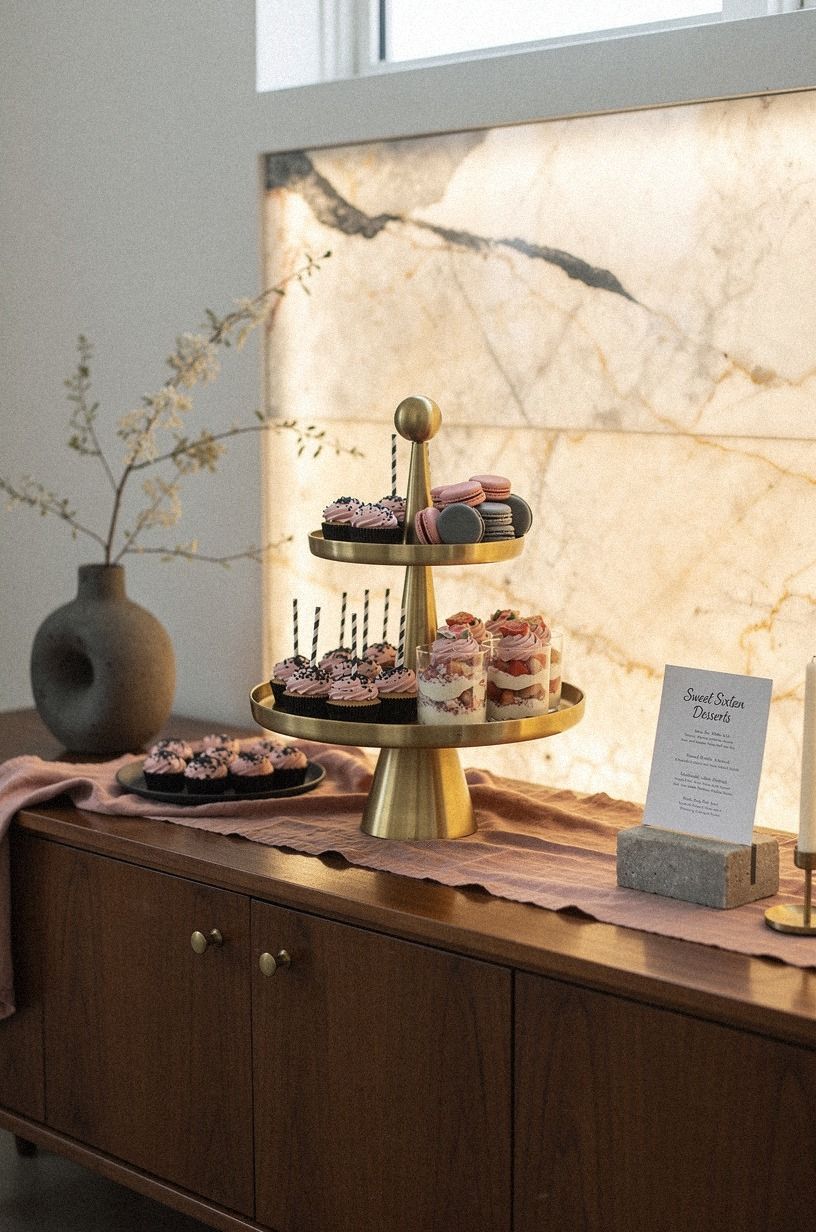
A dessert table looks refined when your eye can move up, across, and down. Build three heights with a cake stand, a stack of backlit translucent onyx boards, and a low ceramic platter.
This three-height arrangement keeps cupcakes, cookies, and fruit from becoming one flat row. If you’re working with a narrow table, you’ll gain more visual impact from height than from extra food.
Choose one hero dessert and let the rest support it. I like a simple white cake with a dusty rose ribbon nearby, balanced by charcoal and brass accents. Put the tallest item slightly off center, not directly in the middle, because symmetry can feel stiff.
Your display should feel gathered, not measured with a ruler.
Add small handwritten cards in thick charcoal card stock, then stop. Too many signs make the table look like a buffet at a conference.
And if you’re trying to stretch your budget, borrow cake stands from family before buying new ones. Your guests will notice the layered composition, while nobody will ask whether every platter came from the same set. A few polished accessories can do more than a crowded dessert menu.
That little asymmetry works!
For another restrained styling reference, browse the seven pieces that still look expensive in every apartment. The useful lesson is simple: choose a few pieces with presence, then give them room.
4When Ceiling Glare Takes Over, Stack Three Light Sources
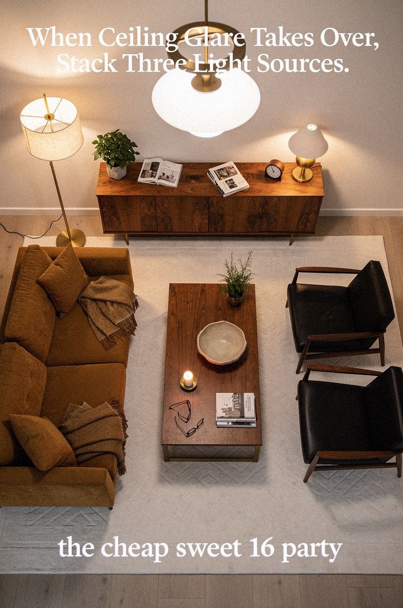
Harsh overhead lighting makes even lovely decorations look flat. Use three sources instead: overhead light, task light, and ambient light.
A pair of table lamps, one floor lamp, and a string of warm bulbs can create the soft, calming glow your photos need. If you’re styling a rental, plug-in fixtures and battery candles give you flexibility without electrical work.
I prefer lamps with book-matched walnut details because the grain adds warmth without looking too shiny. Add warm white LED bulbs, then keep one brighter source near the food so guests can see what they’re choosing.
You don’t want a dreamy room where everyone squints at the snack table. Your party needs beauty and function together.
But skip blue-toned bulbs. They make skin look tired and turn cream linens gray.
If you’re unsure where to place the lamps, take a phone picture from the entrance and look for dark corners. Your eyes will adjust in person, but your camera won’t.
For another practical styling reference, read the seven pieces that still look expensive in every apartment. A small plug-in sconce can also brighten a dark corner without requiring a rewiring project.
5Frame the Entry With a Balloon Garland
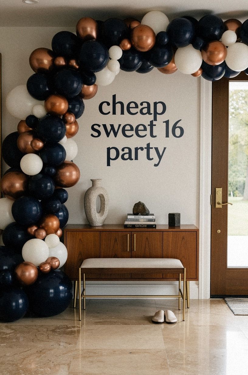
A balloon garland can look elegant when you limit the color range and vary the size. Mix midnight blue, copper, and ivory, then attach the garland to a doorway or dessert wall.
You don’t need to cover the entire ceiling. One strong frame tells your guests where the celebration begins, and your entry photographs will feel more complete.
Use matte-finish balloons beside only a few copper accents. Glossy balloons everywhere can make your room feel loud instead of sophisticated.
If you’re building the garland yourself, leave small gaps so the wall can breathe. I like an irregular shape because it feels playful and modern, while a perfectly even arch can look rented.
And don’t put the fullest section at eye level if people will walk beneath it. Leave enough clearance for taller guests, then secure the ends carefully. Your garland should survive hugs, coats, and people moving through the space.
For a softer alternative, use warm travertine plinths or paper lanterns in the same palette. This is one of the easy sweet 16 party ideas where editing matters more than quantity.
If you want a restrained material direction, the accessories that make an outfit look expensive makes a similar case for one finishing detail. Let it breathe!
6Let the Glassware Tell the Story
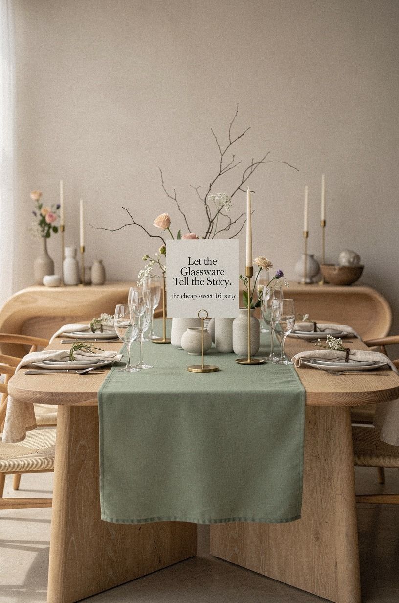
Mismatched glassware can feel collected instead of cheap when you repeat one detail. Look for clear glasses with different silhouettes, then add one modern item, such as a natural wood tray with an unlacquered brass edge. Your table will gain texture without looking like every item came from a different event.
Keep the plates simple and let the glasses provide the charm. Cut crystal, sage green ribbed glass, and plain tumblers can sit together when your napkins share one warm cream color.
If you’re serving sparkling drinks, use a consistent garnish so the group still looks tied together. I wouldn’t rent a full matching set unless your guest count demands it because uniformity can erase the warm, gathered feeling.
Check thrift stores and family cupboards first. You might find enough pieces without spending anything, and your guests won’t know which glass cost nothing.
If you’re setting a drink station, place the tallest glasses at the back and short tumblers near the front. Your setup will look fuller, and people can serve themselves without reaching across the whole table.
More layering ideas appear in the accessories that make an outfit look expensive.
7Hang Oversized Art at the Right Height
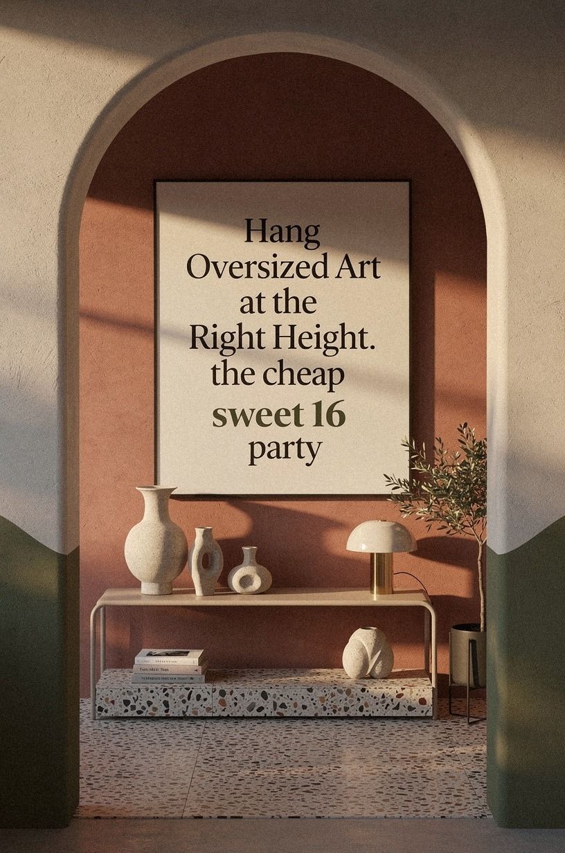
One oversized print can make a party area feel intentional, especially when the rest of your decorations stay quiet. Print a favorite photograph, a simple abstract, or a custom initial, then mount it in a terracotta, stone, and olive palette with an oversized-chip terrazzo frame. Hang the center about 57-60 inches from the floor so the artwork feels comfortable at eye level.
You can create a gallery wall, but I wouldn’t start there for a short event. A large piece gives your room a clear visual anchor, while several small pieces can look unfinished if the frames don’t relate. If you’re using family photographs, choose one color treatment, such as black and white, so your display feels calm.
Use removable picture strips when you’re renting, and test the weight before the party. Your guests may gather beneath the art for pictures, so you don’t want a frame slipping during the evening.
I once hung a print too high above a buffet, and the empty space underneath made the whole arrangement feel disconnected. Your wall should support the table, not float above it.
For a wider approach to using fewer, stronger pieces, revisit the finish that makes cheap paint look expensive. A quiet frame often does more than a wall full of small decorations.
8Where Should the Snack Table Float?
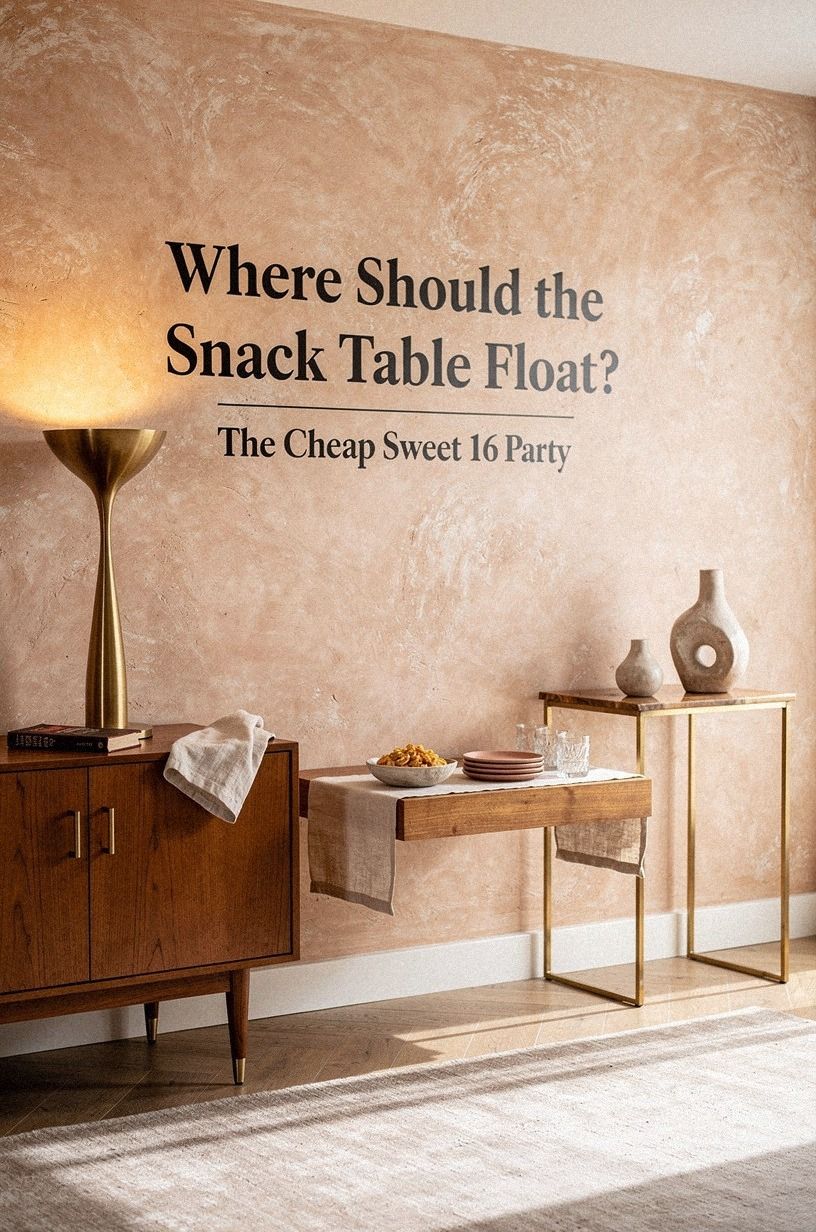
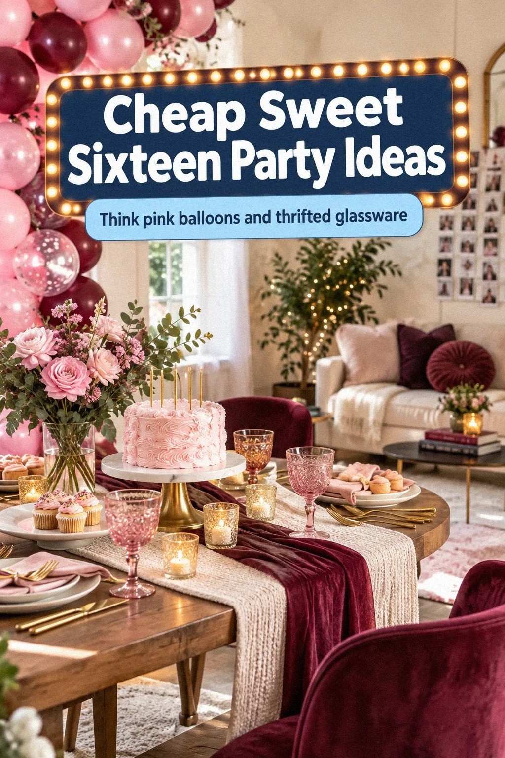
A snack table doesn’t need to hug a wall.
9Style a Photo Corner With Drapery
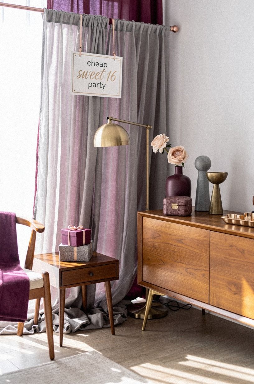
A curtain can turn an ordinary corner into a quiet photo area. Hang plum and gray drapes from a rod placed 4-6 inches above the frame, and let the fabric fall to the floor. Add one rose gold accent and a few shagreen details so the background feels richer without becoming busy.
Your guests will naturally gather there, especially if you add a small stool or bench.
Don’t pull the curtains too tightly. A little pooling at the bottom makes the corner feel relaxed, while crisp tension can look like a store display.
If you’re using a tension rod, test it before adding flowers, clips, or photos. I prefer one curtain panel on each side with the wall visible in the center because it gives the pictures breathing room.
Add a small sign with the birthday girl’s name, but keep the lettering large and plain. Your background needs a readable detail, not a wall of tiny decorations. If you’re searching for a warm fabric direction, the seven pieces that still look expensive in every apartment can help you coordinate the plum textile and furniture.
Your photo corner should feel soft, not staged.
10The Two-Wood Rule for Tables and Trays
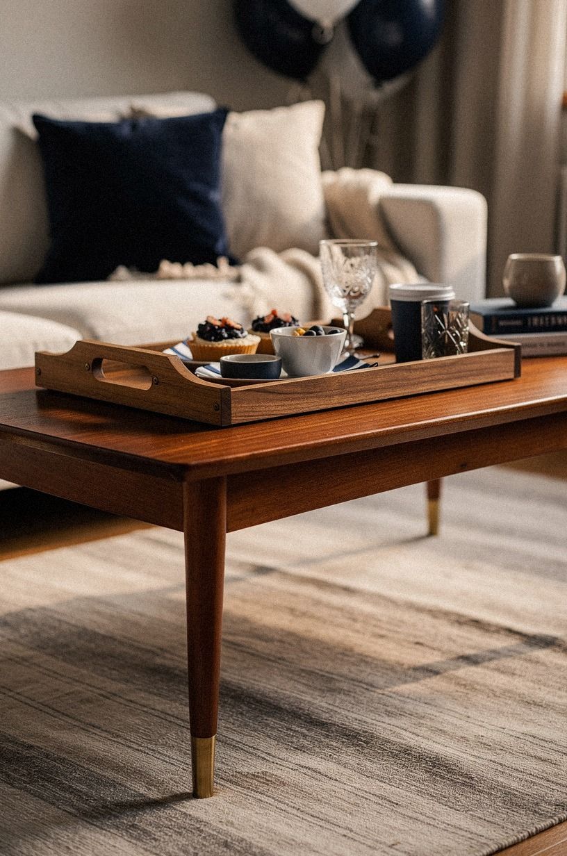
The Two-Wood Rule keeps a mixed party setup looking deliberate: use no more than two wood tones. Pair navy and white table linens with a walnut tray, or combine a vintage walnut table with a light washed Belgian linen runner. Your decorations can vary, but the wood relationship gives the room a quiet structure.
I wouldn’t mix orange oak, red mahogany, and gray driftwood in one small space. That combination competes with your food and flowers.
If you’re borrowing furniture, cover the least attractive piece with a soft washed Belgian linen cloth instead of trying to disguise every grain. A simple cover can make mismatched tables feel like part of one plan.
Place trays where guests need them, not where they look best in an empty room. Your cake knife, napkins, and cups should be easy to reach. And if you’re using wood near drinks, add small coasters or washable mats.
Your party can feel polished while still being practical. This rule costs nothing if you shop your own home first, which is why it’s one of my favorite cheap sweet 16 party ideas.
For more guidance on choosing a few versatile accents, read the accessories that make an outfit look expensive. Repetition creates the sense of intention.
11What Deserves the Budget First?
Before buying decorations, decide what deserves your money.
12Pair Linen Drapes With a Quiet Rug
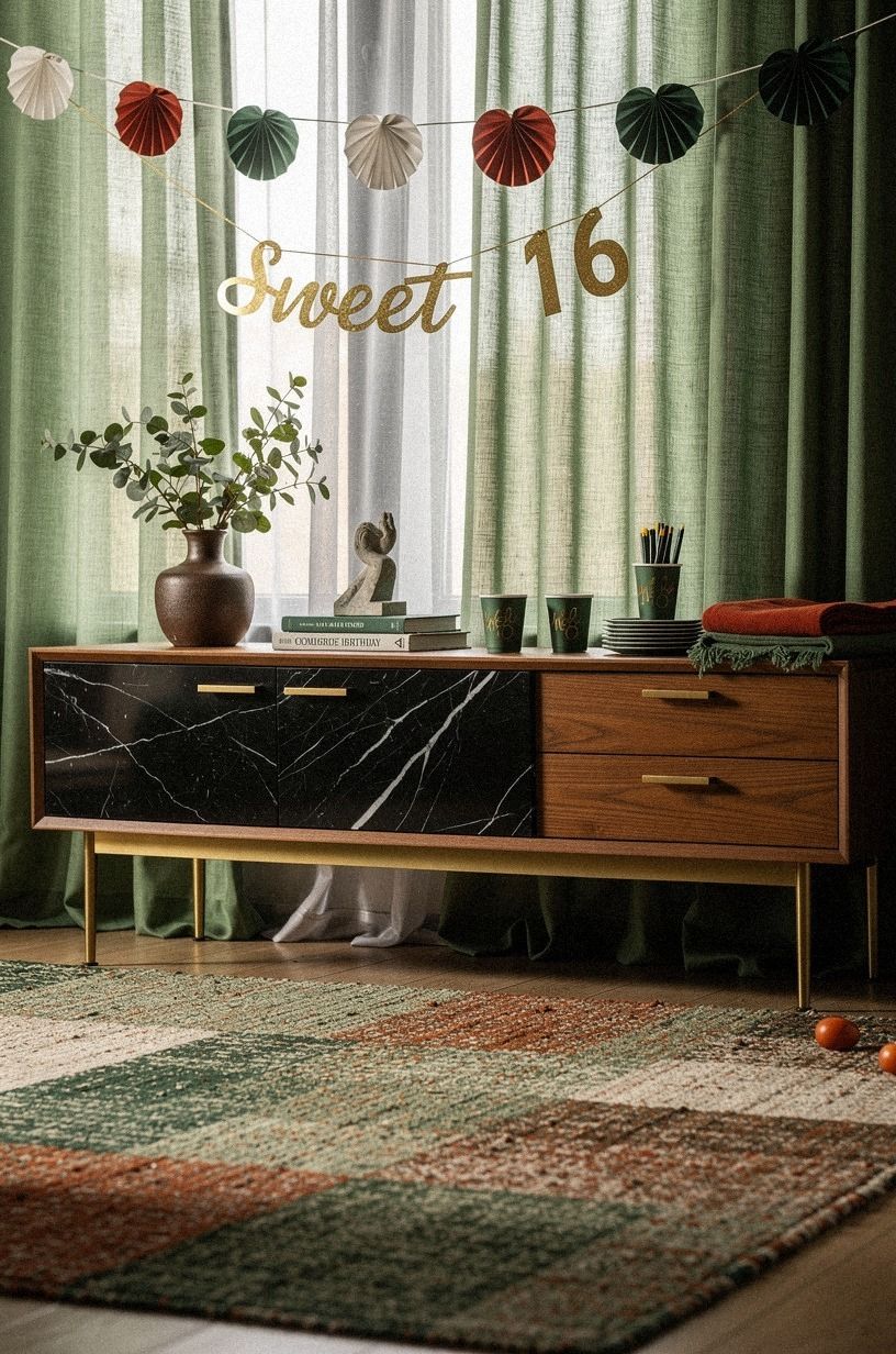
Soft textiles make a party room feel more inviting, especially when the walls and furniture are basic. Use forest green drapes, rust napkins, and natural oak accents, then add a rug large enough for the furniture to overlap it. You don’t need every fabric to match, but your textures should share a similar warmth.
If you’re borrowing chairs, let the rug and tablecloth soften their appearance. I prefer a Nero Marquina black marble accent with white veining because it gives the softer palette some structure. Your guests should feel the room is comfortable without noticing one loud decoration.
Place the rug where chair legs can overlap it safely, and tape down curling corners. You won’t want anyone catching a heel during the first dance or moving toward the food. If your budget is tight, use a clean cotton throw over a table instead of buying new drapery.
This one accessory that makes a look feel more expensive makes the same case for restraint and texture.
13A Sculptural Branch Around the Cake
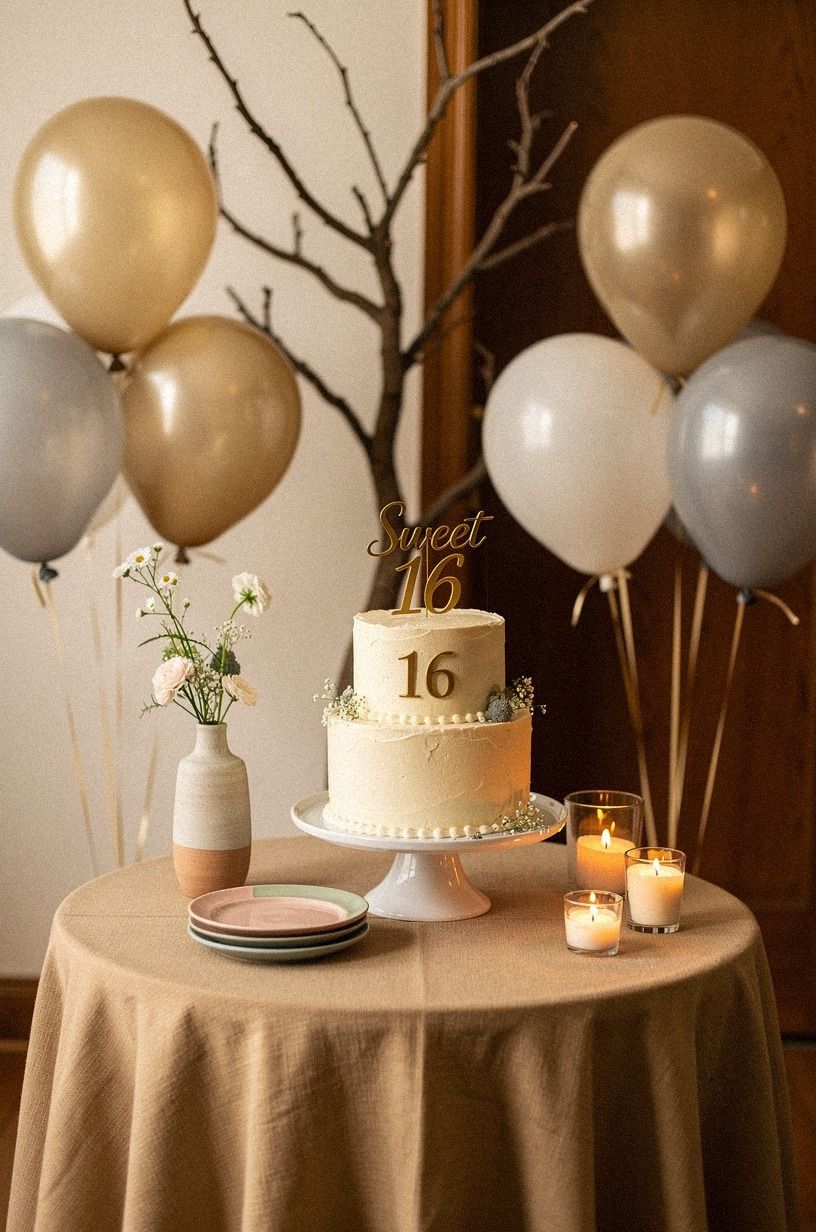
A few branches can create a dramatic cake backdrop for almost no cost.
14Create a Self-Serve Drink Station
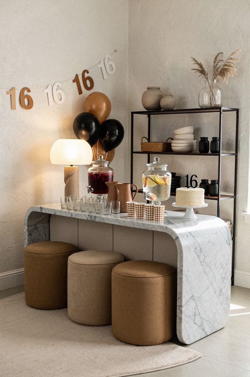
A self-serve drink station gives guests freedom and keeps you from refilling every glass. Use a narrow console, a Carrara marble tray with subtle gray veining, and two labeled pitchers for water and a signature nonalcoholic drink. Keep the surrounding details warm white, camel, and black so the station feels considered rather than busy.
Place cups, napkins, and straws in that order so the line moves smoothly. If you’re offering ice, keep it in a lidded container near the end of the station.
I would skip a complicated drink menu because guests want to talk, dance, and find their friends, not decode six options. One special drink can feel more generous than many ordinary ones.
Add citrus slices or herbs only when they support the color palette. A few mint leaves in a clear pitcher can look fresh and calming, while too much garnish makes the station messy. Your drink area should be easy to reset during the party.
For a small visual detail with strong impact, look at the accessory that makes a simple look feel more expensive.
15Handmade Signs, One Custom Detail
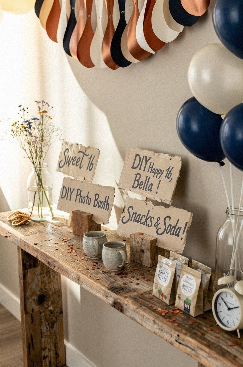
Handmade signs feel elevated when the typography and paper look consistent. Use ivory cardstock, copper ink, and one custom detail such as the birthday girl’s initials. Set the signs on a small piece of reclaimed weathered teak so the handmade details feel warm rather than overly polished.
I wouldn’t print every phrase in a decorative script. It can be difficult to read, especially near a dim snack table.
Use a simple serif typeface for the main words and save handwriting for names or short notes. If you’re styling a midnight blue palette, a small copper clip will hold the sign without adding another bright metallic.
And leave some surfaces unmarked. Your guests don’t need instructions for every bowl, chair, and doorway. One welcoming sign at the entrance, one food label set, and one message card are enough.
If you’re unsure how much detail your room can carry, photograph it from the doorway and remove the first object your eye notices. Your party will look calmer immediately.
For more ideas about using one finishing accent, read this one accessory that makes a look feel more expensive. Consistency matters more than complicated lettering.
16Arrange Seating Around Conversation
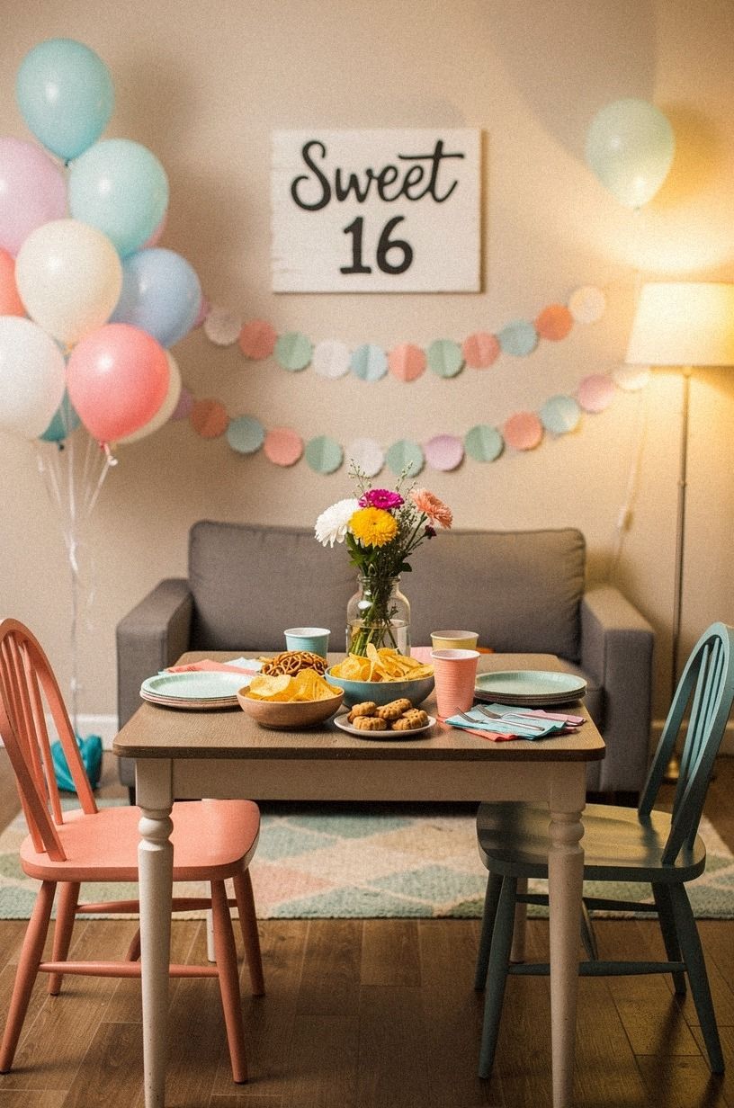
The most expensive-looking party is still uncomfortable if guests have nowhere to sit. Arrange chairs in small conversational groups, then keep the center open for movement. Mix natural wood chairs with simple folding chairs, but repeat sage green and warm cream cushions so the arrangement feels connected.
A small Calacatta marble side table with gold veining can add one polished note.
A low bench can hold several guests without taking visual space, while floor cushions add a relaxed note for younger friends. If you’re using a small room, don’t push every seat against the wall. Your guests will talk more easily when chairs face each other instead of facing the television or an empty corner.
I once placed every chair around the edge because I wanted the room to look spacious. It did look spacious, but nobody settled in.
Your layout should support the kind of evening you want, whether that’s dancing, talking, or opening gifts. Before guests arrive, sit in each group yourself.
If you can’t see the person across from you, move the chair.
For a final reminder about choosing pieces that work hard, revisit the seven pieces that still look expensive in every apartment. Comfortable furniture is part of the decoration.
The Party Details I’d Spend Time On
I’ve hosted and styled enough small celebrations to know that expensive-looking doesn’t mean expensive. It means your decisions agree with each other. The paper backdrop, the drink station, and the napkins can all be inexpensive, but if they share a quiet color story, your guests read the room as intentional.
That impression happens quickly, often before anyone notices the individual decorations.
My biggest mistake was buying too many small pieces. I had bowls, signs, ribbons, candles, and little objects scattered across every surface, and the room felt nervous.
Once I removed half of them, the cake looked better, the photos looked cleaner, and people could move without brushing against something. If you’re unsure, take one thing away and look again. Your first instinct will often be to add, but editing is where the polish appears.
I’d spend time on three things: flattering light, one memorable backdrop, and comfortable food service. Those choices affect how your guests feel, how your pictures turn out, and how easily the party runs. Paint can help, especially Benjamin Moore White Dove, but it won’t rescue a crowded layout.
A thrifted tray can feel refined when it holds the right items. A costly fixture can feel awkward when it throws glare over everyone’s face.
Your budget works harder when every purchase has a job.
The best part is that your celebration doesn’t need to imitate a styled showroom. A handwritten note, a favorite family dessert, or a photograph from childhood can make the room feel more personal than a matching rental package.
And if something goes slightly wrong, people will remember the laughter, not the uneven ribbon. Give your party a clear visual anchor, then leave enough space for real life to happen around it.
If you want one more example of restraint doing the heavy lifting, read the one accent rule that makes a beige bedroom look expensive. The same idea works for a sweet 16: choose the detail people will remember.
A Few Things Worth Answering
What is the best cheap sweet 16 party idea for a small party?
A layered backdrop and a three-source lighting plan give you the most visible impact in a small room. Use paper, borrowed lamps, and warm lighting to create a focal point without taking floor space. Your guests will notice the atmosphere before they notice the cost.
Where can I buy sweet 16 party pieces on a budget?
Look at IKEA, Wayfair, Target, Facebook Marketplace, and local thrift stores. Choose simple shapes, then repeat one material such as linen or unlacquered brass.
You don’t need a large shopping plan, and borrowed trays or glasses can look just as polished. For guidance on selecting versatile pieces, see the seven pieces that still look expensive in every apartment.
How much does a sweet 16 party makeover cost?
A focused makeover can cost about $100 to $300 when you use paint, borrowed furniture, thrifted glassware, and handmade signs. Your free upgrades include rearranging seating, editing decorations, and using existing lamps. Spend first on the backdrop, light, and food presentation.
Can I create a sweet 16 party on a budget?
Yes, and you can start with three free moves: shop your home, rearrange the furniture, and reuse jars or frames. Add inexpensive paper decorations, cotton napkins, and one color story. Your room will feel warmer before you buy anything new.
A restrained palette also benefits from the finish described in why dark green powder rooms always look more expensive.
Is a sweet 16 party setup worth it in a small space?
Yes, because a small room can feel intimate and welcoming when you control the layout. Keep one clear walking path, use a vertical backdrop, and choose furniture that serves two purposes. You won’t need many decorations when each one has a visible role.
Is a sweet 16 party a good idea for a rental?
Yes. Use removable hooks, tension rods, peel-and-stick accents, and freestanding lamps instead of permanent changes.
A removable wallpaper panel can create a background, while a curtain hides an ordinary wall. Your landlord won’t have to know the party ever happened.
The paint guidance in the finish that makes cheap paint look expensive can also help you choose a temporary backdrop color.
Where I’d Start First
If I had to pick one, I’d start with the lighting. Bad overhead glare makes every other detail look cheaper, while three warm sources soften the room and improve every photograph.
Pin the lighting plan for later and build the rest of your sweet 16 party around that glow. Start with light, and the room will follow!