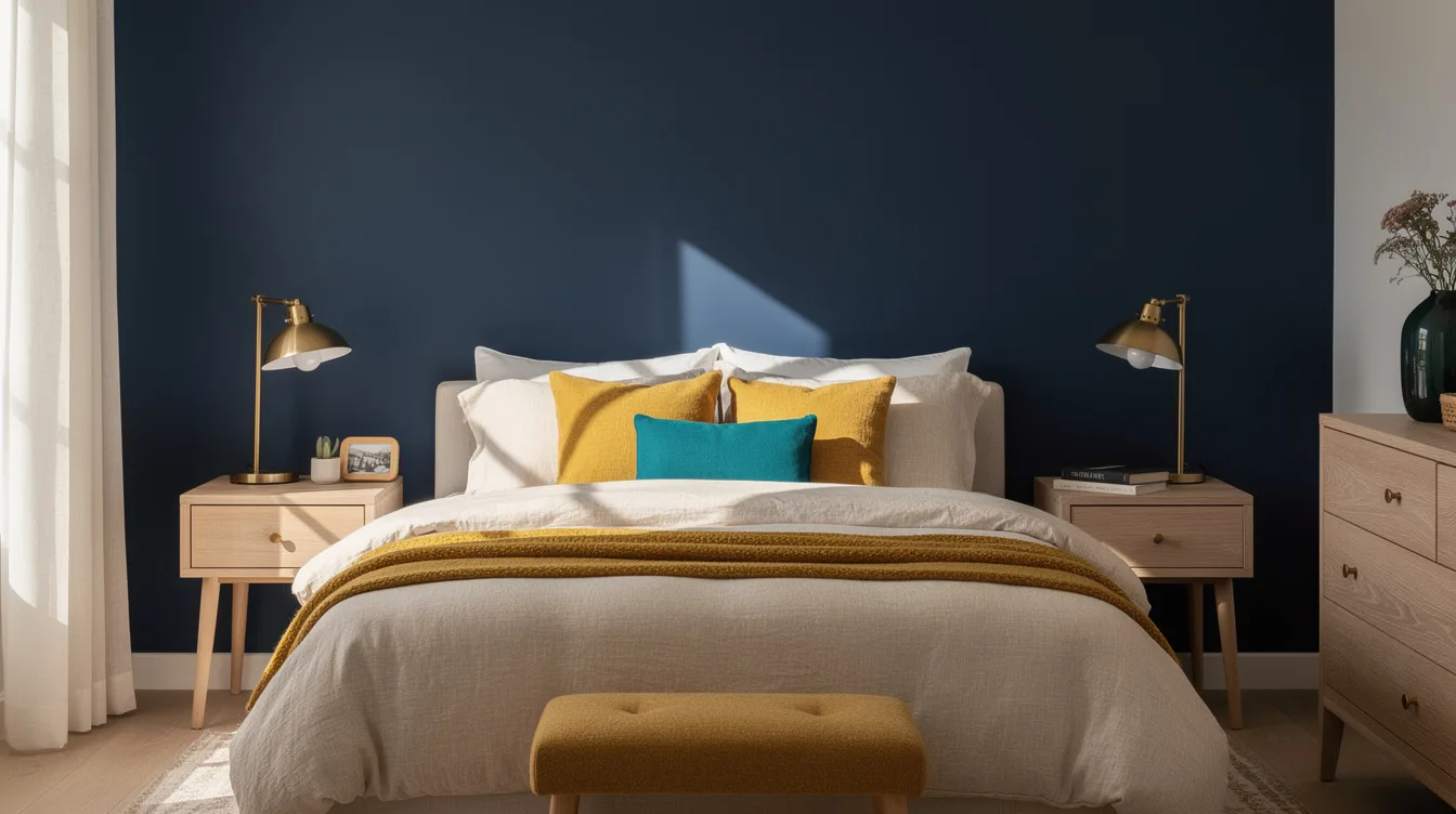
A bedroom of about 86 to 129 square feet can handle deep green, navy, oxblood, cobalt, or terracotta. The catch is visual hierarchy: one saturated field needs quiet zones, light soft surfaces, and texture around it.
When every wall, textile, and accessory competes, the room feels smaller for the wrong reason. Designers make deep color feel cocoon-like by controlling contrast instead of avoiding bold paint altogether.
Paint One Saturated Field
Choose one visual anchor, usually the wall behind the bed, and let it carry the strongest color in the room. Benjamin Moore Hale Navy creates depth while warm white on the remaining walls keeps the bedroom from feeling boxed in.
For a green scheme, Benjamin Moore Caldwell Green has enough weight to feel intimate without demanding a colorful bed frame or busy artwork. Repeat the wall color only twice, perhaps in a small cushion and a lampshade trim.
In a narrow bedroom, keep the saturated color on the short wall behind the bed. The compact block adds depth and prevents the long walls from creating a tunnel effect.
Build a Quiet Envelope
Surround strong color with soft, low-contrast surfaces in ivory, mushroom, putty, or warm white. Warm ivory paint works especially well beside navy, oxblood, cobalt, and terracotta because it softens the transition without washing out the anchor.
A useful starting ratio is roughly 80% muted surfaces, 15% medium-strength color, and 5% clear saturated accent. The uneven distribution gives the eye somewhere to rest.
Keep the ceiling calm, particularly when the room has a low ceiling or limited daylight. A warm off-white overhead usually feels more generous than a second dramatic color.
Keep Soft Surfaces Light
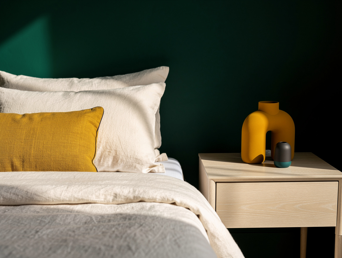
The bed is usually the largest object in a small bedroom, so its textiles have an outsized effect. Linen bedding in cream, oatmeal, or soft white keeps the composition airy while adding enough texture to prevent the room from looking flat.
Pair the bedding with a beige upholstered headboard or a natural timber bed. Pale oak brings warmth to deep blue and green without introducing another strong color.
Add one tonal throw rather than a full set of contrasting pillows. A cotton duvet with a slightly rumpled finish looks relaxed and gives saturated walls a softer landing place.
Repeat Color With Discipline
Strong color feels intentional when it appears in a few controlled locations. Farrow & Ball Hague Blue can guide the wall, a small cushion, and one art detail, but spreading it across curtains, bedding, lamps, and storage quickly creates visual noise.
Use only one contrasting note for the rest of the room. A terracotta cushion, muted ochre shade, dusty-pink vase, or restrained brass detail is enough to wake up navy without competing with it.
Skip the familiar pileup of saturated walls, patterned curtains, graphic rugs, bright artwork, and mixed metals. In a compact room, each additional high-contrast item makes the anchor feel less special.

Soften Contrast With Texture
Texture lets a deep color feel layered instead of glossy or harsh. Matte paint absorbs light gently, while linen, wool, cotton bouclé, rattan, and plaster-like finishes add interest without adding another hue.
Place a rug at least about 160 by 230 centimeters beneath the bed when the layout allows. A wool rug in oatmeal, stone, or faded beige connects the bed to the floor and gives the eye another quiet zone.
Natural materials also keep a color-drenched room from feeling overly decorated. A walnut nightstand can make deep green or oxblood feel grounded, particularly when paired with simple bedding.
Control Light and Hardware
Color changes dramatically throughout the day, so test a sample beside the bed before painting the full wall. Sherwin-Williams Bracing Blue can read vivid in daylight and much moodier at night, which makes bulb temperature and shade material important.
Set bedside lamps roughly 45 to 60 centimeters from tabletop to shade top so the light reaches the wall and bedding rather than falling only downward. A cream fabric shade spreads the glow and keeps dark paint from feeling heavy after sunset.
For full color-drenching, carry one closely related hue across the walls, baseboards, doors, and possibly the ceiling. Farrow & Ball Studio Green works best with warm ivory and timber, while black hardware should stay limited and purposeful.
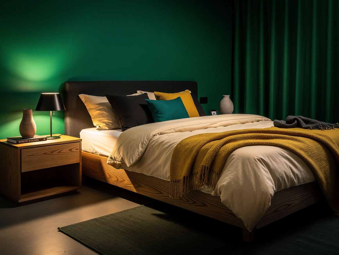
Start with the wall behind the bed, then add warm ivory bedding and one natural timber piece before choosing any accent accessories. That order gives the color authority while leaving the small room room to breathe.
Mia Carter writes about small-space living and budget home makeovers. She has restyled three rentals and tests most ideas in her own 45 sqm flat.