
Your party food display can look polished with the pieces you already own, plus a clear order for placing them. I learned this after one crowded table turned into a traffic jam of plates, tongs, and half-hidden desserts. The fix wasn’t more food. It was height, space, and a warmer visual rhythm. Let’s build it step by step.
- Start With Guest Flow
- Build the Three-Height Food Stack
- One Hero Platter Sets the Tone
- Start With Guest Flow
- Build the Three-Height Food Stack
- One Hero Platter Sets the Tone
- Why Warm Linens Matter
- Benjamin Moore White Dove Frames the Buffet
- Mix Serving Shapes With the Two-Wood Rule
- Arrange Food by Color Before Texture
- Small Bowls Keep the Spread Legible
- Where Bread and Crackers Belong
- Add the Three-Source Light Stack
- One Material Story Beats Matching Plates
- Place Labels Where They Help
- A Separate Dessert Moment
- Add Greenery With the Herb Cluster Rule
- When a Painted Serving Zone Helps
- Repeat One Metal Accent
- Photograph the Display Before Guests Arrive
- Reset the Table in Small Waves
1Start With Guest Flow
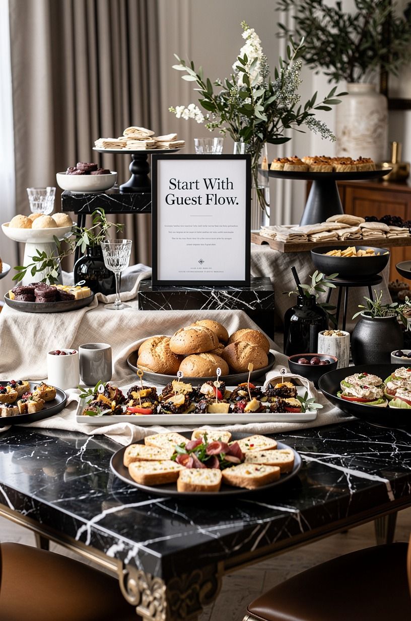
Before you place a platter, walk the path your guests will take. Your buffet should move from plates to savory food, then sides, napkins, and sweets, with enough breathing room for two people to reach without bumping elbows. This simple order makes a party food buffet feel calm instead of frantic.
I like to sketch the table on scrap paper first. Mark the serving side, the wall, and the place where drinks will sit.
Don’t put beverages at the beginning of the line, because guests will stop there while everyone behind them waits. And if your room is tight, use a separate Nero Marquina marble-topped console for drinks so your food display can stay airy and inviting. Once the path works, move on to the three-height food stack.
2Build the Three-Height Food Stack
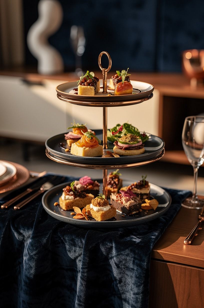
A flat table makes every dish compete for attention. Build three visible levels with a low board, a medium cake stand, and a taller riser at the back.
You don’t need matching pieces. A midnight-blue board beside a stone pedestal looks more collected than a boxed set, and a strip of deep-pile mohair velvet beneath the arrangement adds an unexpectedly soft note.
Keep your tallest display behind the food guests will reach for least often, such as wrapped bread or a bowl of fruit. Your main dish should sit around the middle so people can serve themselves without stretching.
I made the mistake of putting a tall stand in front once, and nobody could see the dip behind it. Give your eye a clear path, and the whole table will feel more refined!
A copper-toned riser or painted wood stool can create the same lift without buying a matching set. For the visual centerpiece, use the hero platter.
3One Hero Platter Sets the Tone
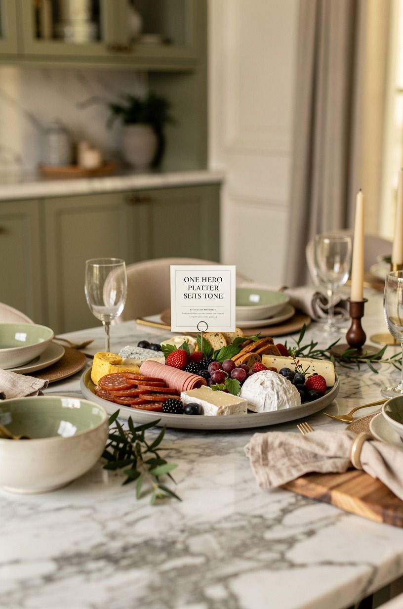
Choose one dish to carry the visual weight of your event food display. It might be a roast, a layered sandwich board, or a mound of pastries.
Place it in the center, then let every other dish support it instead of fighting for the spotlight. A Carrara marble serving board with subtle gray veining brings softness and feels elegant without needing decoration.
Your hero platter shouldn’t be the widest item on the table if guests can’t reach around it. Leave open space at both sides, and keep the edge clean enough for a serving utensil.
Would you rather have six competing plates or one memorable center? I’d choose one. If you’re styling a smaller spread, let a roast chicken or tiered pastry stand carry the attention, then add a warm linen layer underneath.
4Why Warm Linens Matter
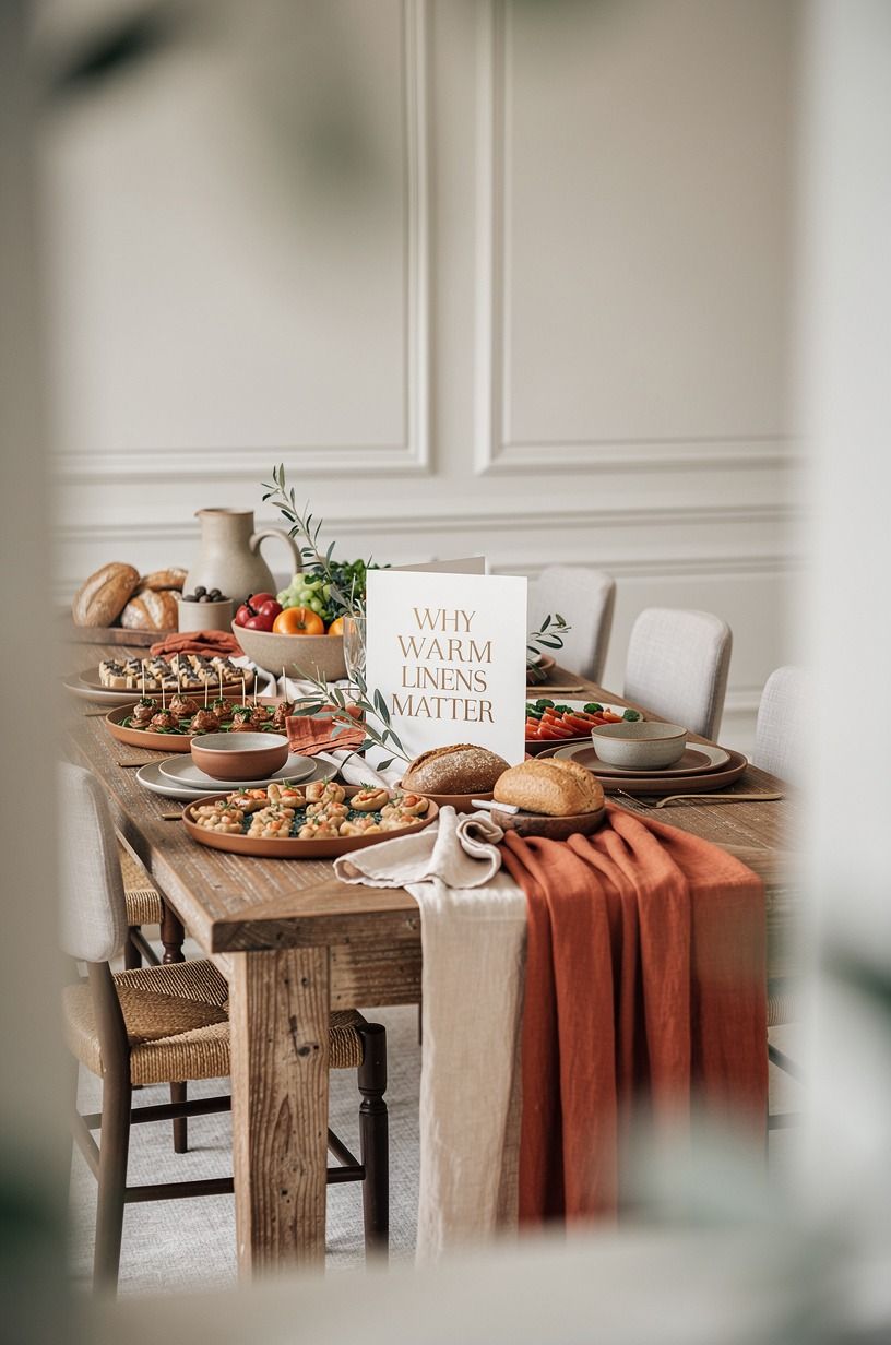
A textile underneath your display softens the hard edges of plates and boards.
5Benjamin Moore White Dove Frames the Buffet
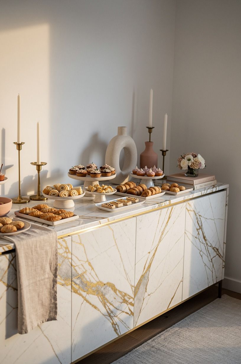
The wall behind your food matters more than most hosts expect. Paint the backdrop in a muted shade so the dishes stand out without looking harsh. Benjamin Moore White Dove OC-17 gives you a soft foundation, while Farrow & Ball Pigeon No.25 adds gentle depth behind pale ceramics and golden pastries.
Don’t hang random art directly above the tallest platter. Instead, use one framed piece or a low arrangement that stays visually quiet. If you hang art nearby, keep its center around 57 to 60 inches from the floor so it reads comfortably while guests stand.
I’ve tried leaning several small frames together, and it looked fussy behind food. One larger piece with an aged brass frame will give your display a more sophisticated line.
Continue that material story through the serving shapes.
6Mix Serving Shapes With the Two-Wood Rule
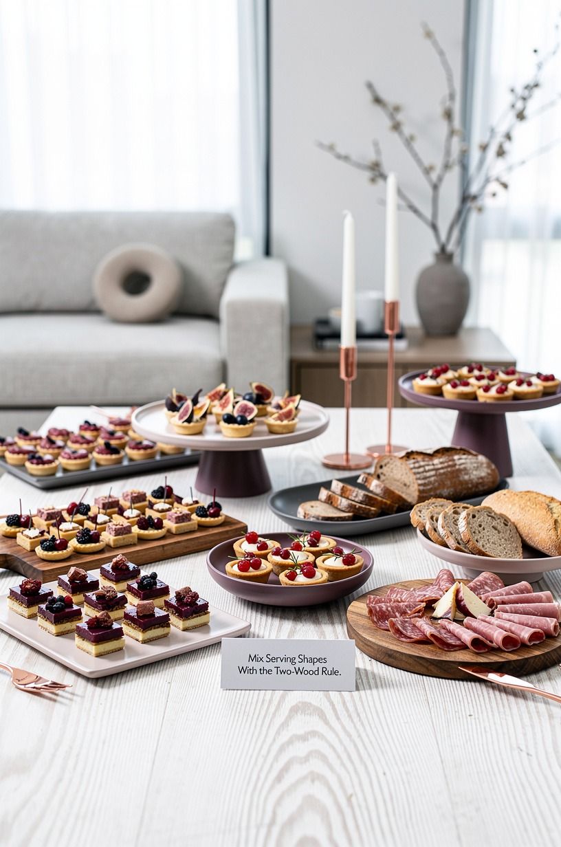
Use two wood tones at most. That’s my Two-Wood Rule, and it keeps a generous buffet from looking like a furniture showroom. Pair a cerused white oak shelf with a darker serving board, then repeat one of those tones in a small bowl or tray.
Your serving pieces can vary in shape, but they shouldn’t all have the same outline. Add one round bowl, one long rectangle, and one irregular ceramic dish.
Skip a whole collection of identical white platters. They’re practical, but they flatten the display and leave you with no visual pause.
But if your food is colorful, matte ceramic shapes will let it stay in charge. A cerused white oak board beside a pale shelf feels organic and charming without requiring extra decorations.
Next, arrange the food by color and texture.
7Arrange Food by Color Before Texture
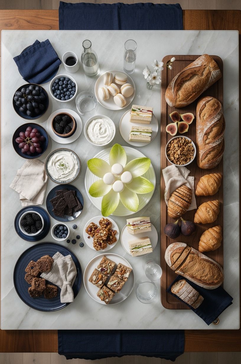
Start with the colors on your table, then work in texture. Put green vegetables near pale bread, golden pastries beside dark berries, and creamy dips next to crisp crackers. This gives your cold buffet a bright rhythm before you add flowers or candles.
A backlit translucent onyx serving slab can hold small dishes and bring in a luminous, quiet note.
You don’t need every shade represented. Two strong colors and one quiet neutral are usually enough for your eye.
I’d skip a rainbow arrangement unless the party calls for it, because it can make the table look childish instead of elegant. Place soft foods in bowls and crisp foods on boards so each surface has a purpose.
Your guests will notice the food first, which is exactly what you want! Pair golden pastries with dark berries when the spread needs a little more contrast, then use small bowls to contain the details.
8Small Bowls Keep the Spread Legible
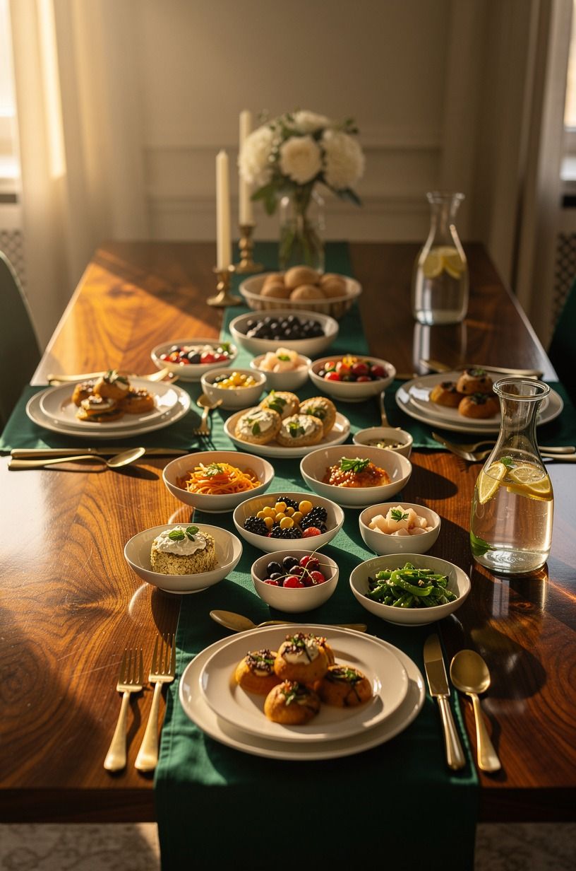
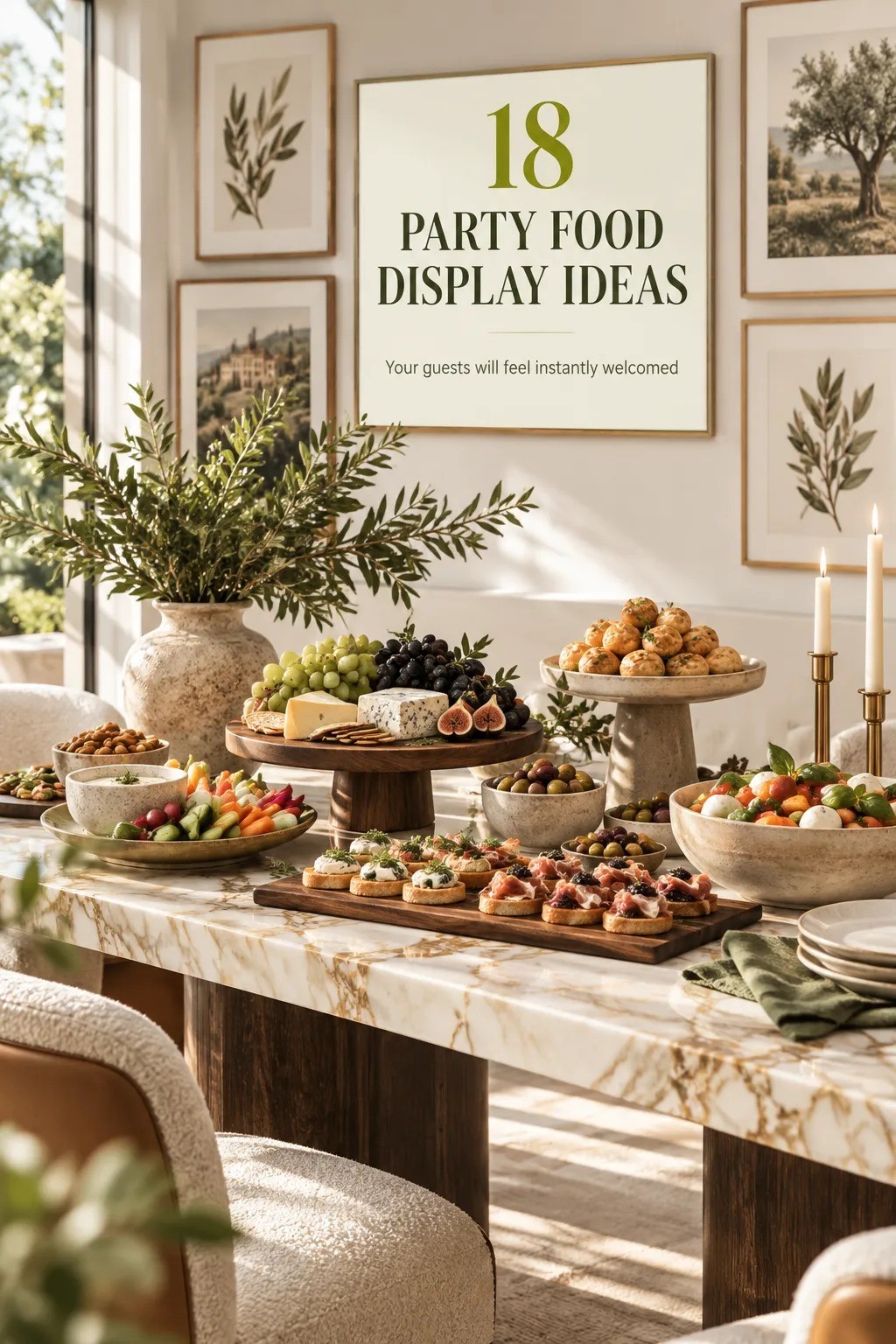
Small bowls make a large buffet easier to read. Put sauces, nuts, olives, pickles, and toppings into individual vessels so guests don’t drag one messy container across the table.
A book-matched walnut side table nearby can add tactile warmth to the room, but your bowls should stay smooth and easy to wipe. A book-matched walnut tray can add interest without stealing attention from the food.
Group the small bowls in threes, with one slightly raised on a low stand. You’ll create order without making the display rigid.
Don’t fill every bowl to the rim, because food needs a little visual breathing room. And if you’re serving something with a strong color, keep it in a pale bowl so the contrast feels deliberate. This is also a good place to use a piece from your own kitchen instead of buying another serving set.
Keep the tallest bowls near the upper tier.
9Where Bread and Crackers Belong
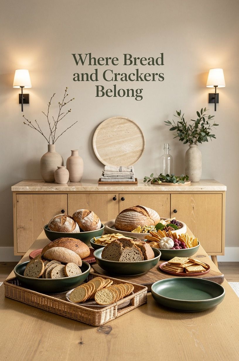
Bread and crackers are ideal for height because they’re easy to reach and don’t need to stay perfectly level.
10Add the Three-Source Light Stack
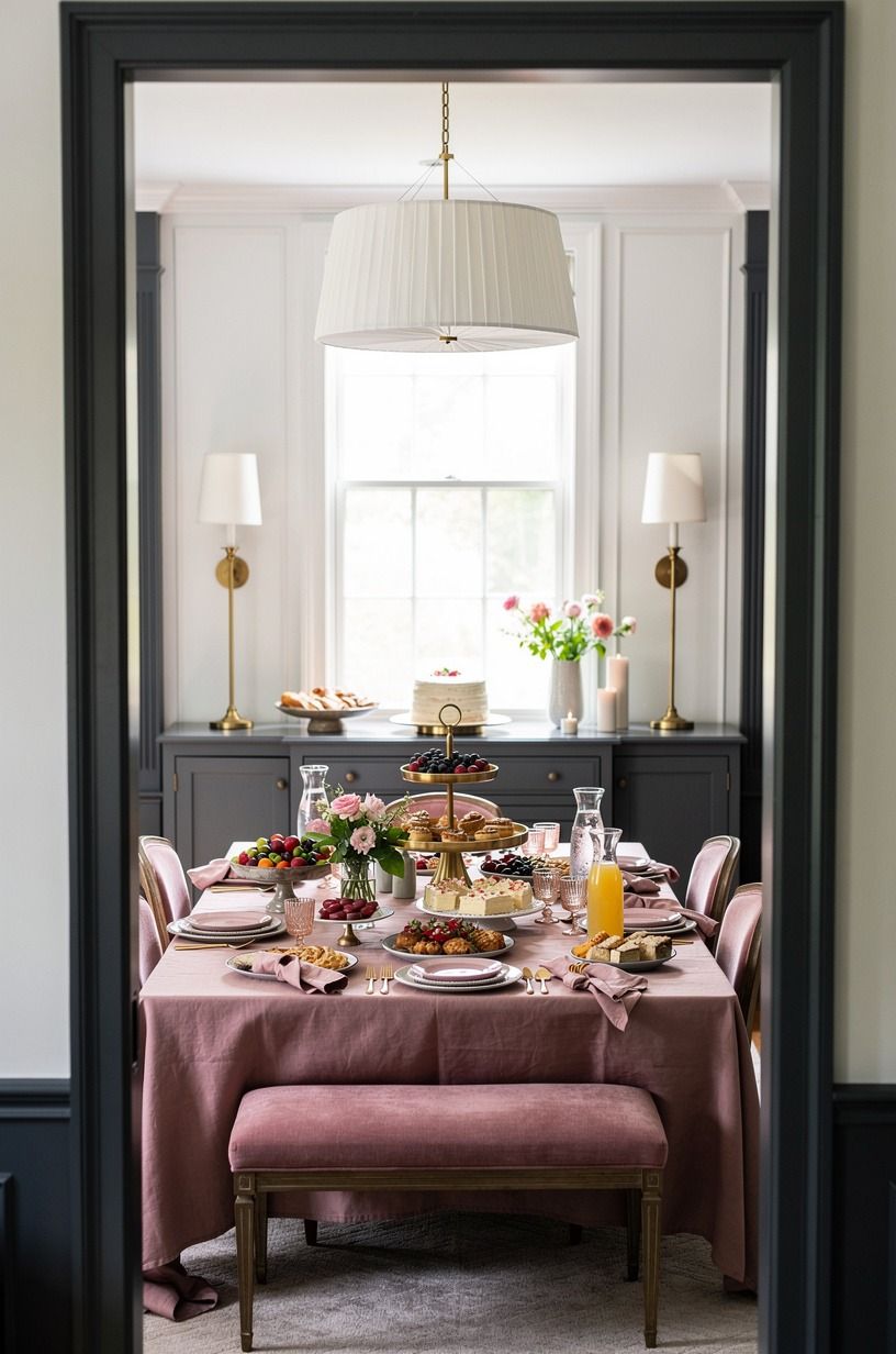
A buffet needs more than overhead light. Build the Three-Source Light Stack with ambient light in the room, a nearby lamp, and a small candle or low glow at the table edge. The light should skim across the food, not shine straight down and bleach every color.
An unlacquered brass table lamp with a warm fabric shade can soften the whole corner.
You’ll want the brightest source behind or beside the display, never directly in front of it. Keep cords out of the serving path, and don’t place an open flame beside loose linen.
I once used one overhead fixture for an entire dinner, and the food looked flat by the time guests arrived. Three light sources make the table feel intimate, peaceful, and ready.
A warm-white LED and beeswax taper will keep the atmosphere flattering without turning the display yellow. Next, refine the material story.
11One Material Story Beats Matching Plates
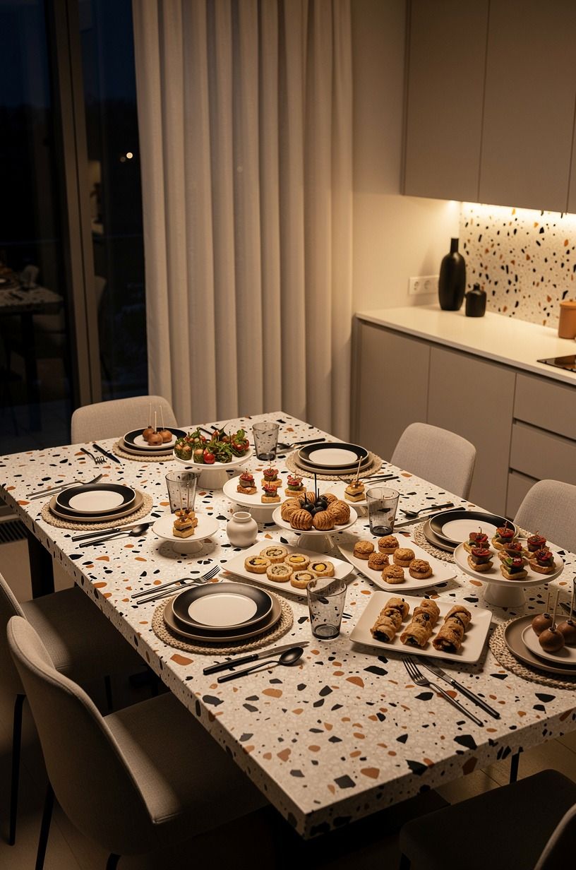
A fancy buffet doesn’t need every plate to match. It needs a material story.
Choose cream stoneware, clear glass, or matte ceramic, then repeat that choice across your serving pieces. Oversized-chip terrazzo gives a rustic table more character than a glossy, identical set.
If you’re borrowing dishes, let the variety show in small doses. Keep the largest plates in one family, then bring in contrast through bowls or glasses.
Don’t mix five finishes just because you own them. The table will feel noisy, and your food will lose its edge.
But one imperfect handmade bowl can make the arrangement feel personal. Try cream stoneware with smoked glass if you want contrast that still feels connected.
Your guests don’t need showroom symmetry. They need a display that looks generous and lived-in. Add labels only where they genuinely help.
12Place Labels Where They Help
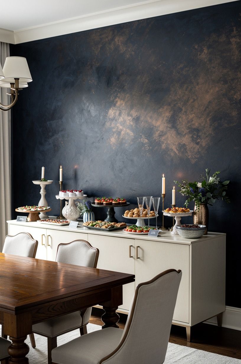
Labels are useful when a dish contains nuts, strong spices, or an ingredient guests may ask about repeatedly. Keep them small and place them in front of the dish, not inside it.
A simple card beside an ivory ceramic bowl against hand-applied Venetian plaster can look polished when the lettering is clear and restrained. Recycled card stock feels warmer than glossy paper.
You don’t need labels for every item at a casual gathering. Use them for the dishes that need context, then let the food speak for itself. I’d skip ornate calligraphy if guests have to squint to read it.
Your goal is smooth serving, not a stationery display. If the table is in a darker corner, use cream cards rather than bright white, because the softer contrast feels more welcoming and still reads clearly.
When the savory side is settled, give dessert its own visual moment.
13A Separate Dessert Moment
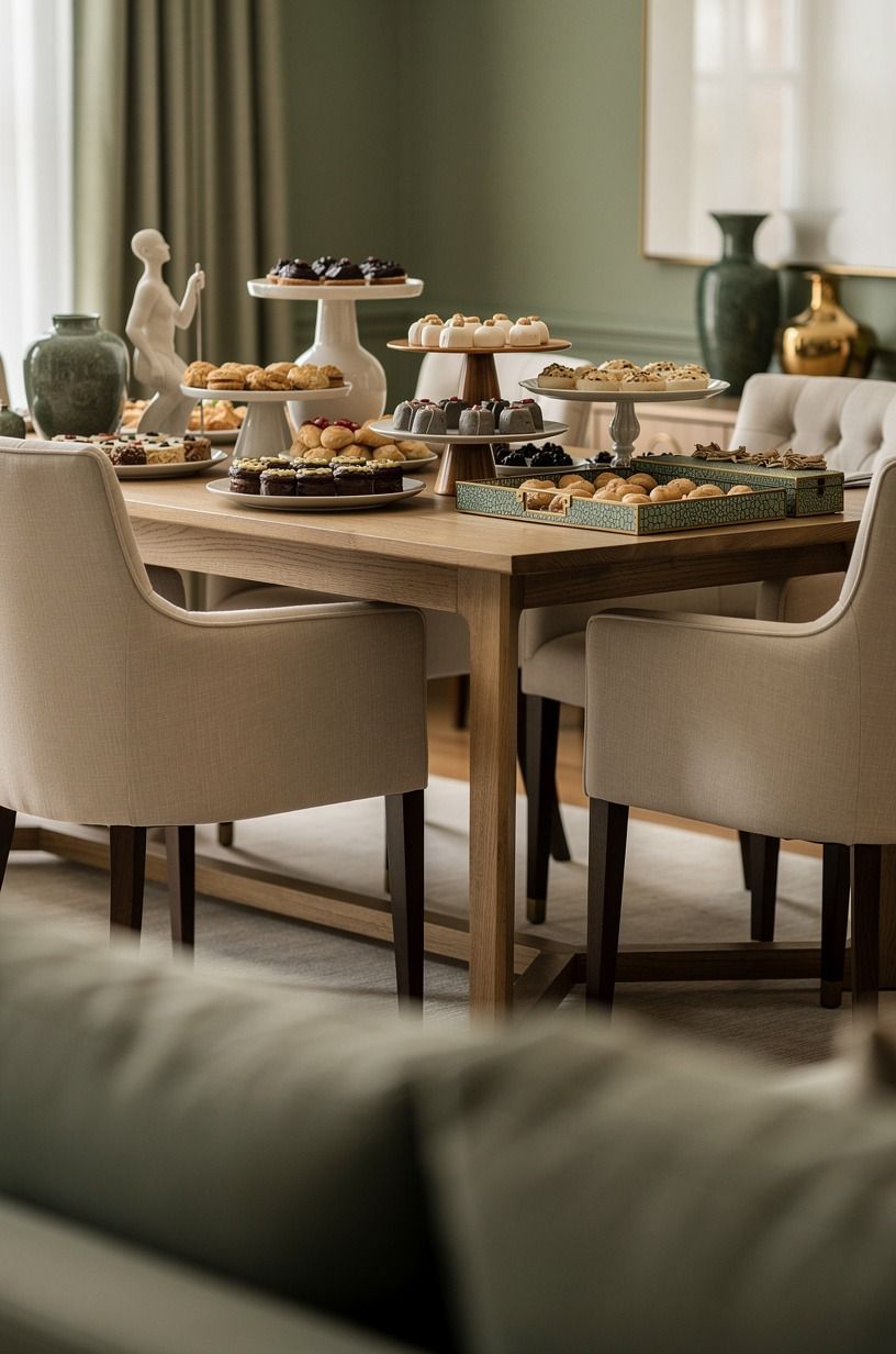
Dessert deserves its own visual beat, even if it sits on the same table.
14Add Greenery With the Herb Cluster Rule
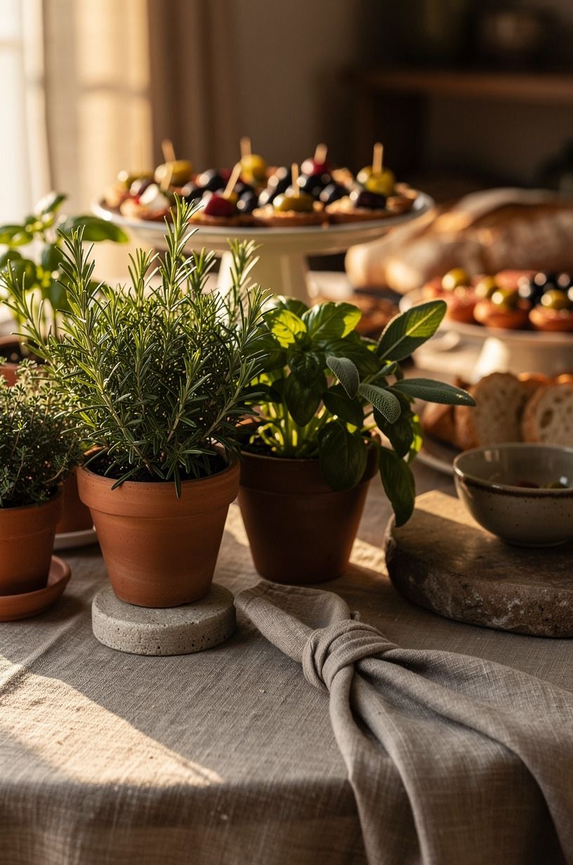
Fresh herbs can do more work than a large floral arrangement. Group rosemary, mint, or leafy stems in two or three small vessels, then keep them near the back edge where they won’t interfere with serving. The Herb Cluster Rule works because the greenery feels connected to the food instead of placed beside it as an afterthought.
Rosemary stems and mint leaves also add scent without overwhelming the room.
Choose low containers so your guests can still see across the table. A washed Belgian linen runner can sit beneath the herb vessels and catch stray water drops.
You don’t want petals falling into a dip, so skip loose flowers directly beside uncovered food. I’d also avoid tall branches in a narrow room.
They’re dramatic, but they steal sightlines and make your guests lean around the centerpiece. If the wall needs more definition, consider a painted serving zone.
15When a Painted Serving Zone Helps
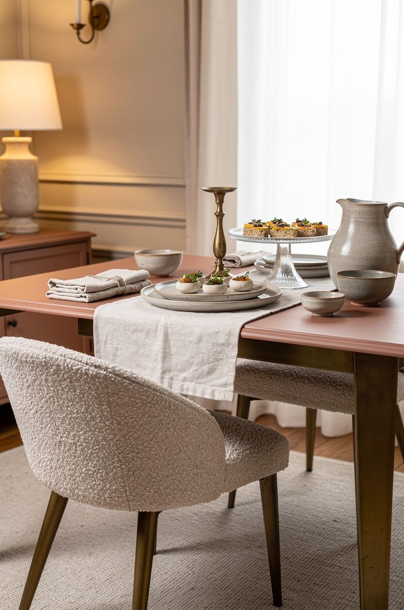
If your buffet lives against a tired wall, paint only the serving zone instead of changing the entire room. A clay-toned neutral gives you a calming foundation that works with linen, wood, white dishes, and aged metal. It’s subtle enough for everyday use but still makes the food display feel intentional.
Your paint should support the arrangement, not become the arrangement. Test the color beside your actual plates because daylight can shift the mood quickly.
I’d skip a very dark wall if your dishes are already deep brown or black. The display may look dramatic at first, but the food will disappear by evening.
Use a soft contrast so your buffet stays bright and inviting from the first guest to the last. A little aged brass nearby can keep the palette from feeling too flat. Then repeat one metal accent.
16Repeat One Metal Accent
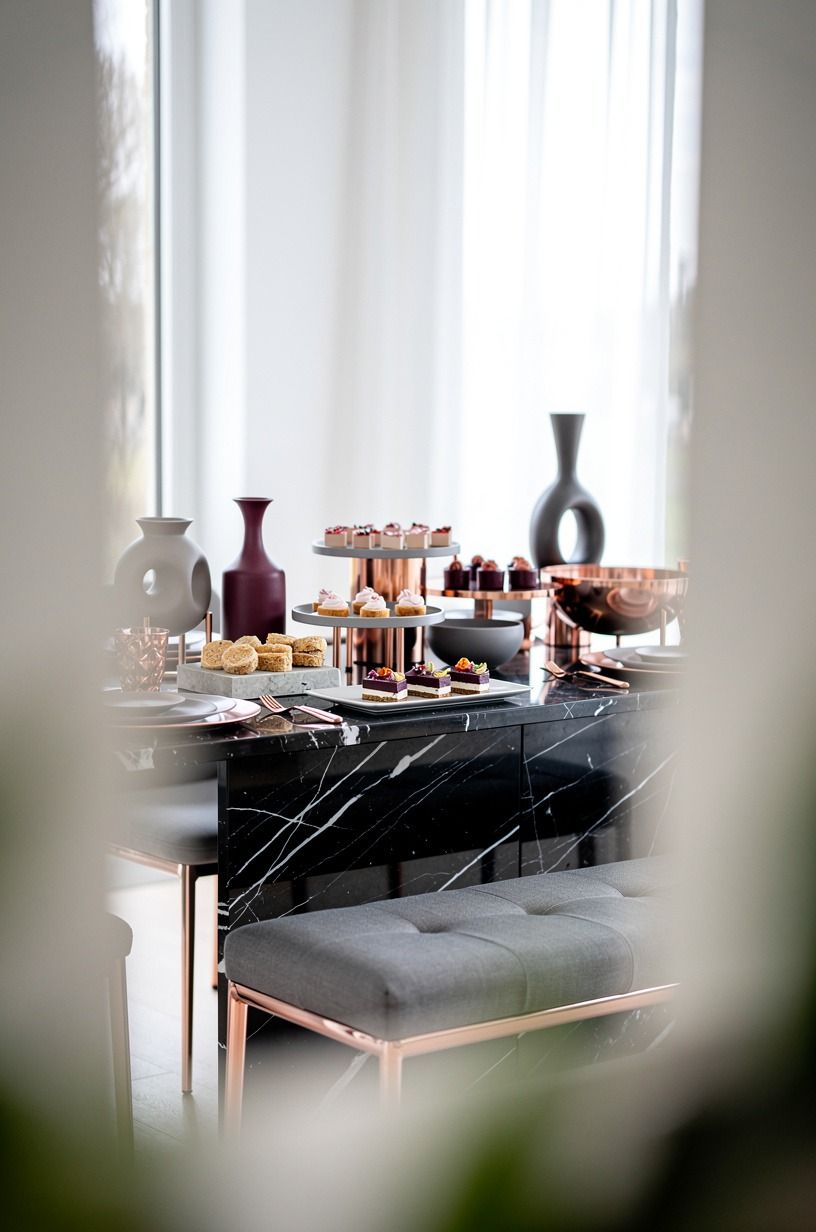
Choose one metal and repeat it three times. It might appear on serving tongs, a candleholder, and a small frame.
Rose gold adds a gentle glow, while a small piece of Nero Marquina black marble keeps the arrangement grounded. Don’t mix polished silver, brass, and black metal across every object.
Your repeated metal can be tiny. In fact, it should be.
A pair of rose gold candleholders beside a ceramic bowl is enough to connect the display. I’d avoid shiny gold trays because they reflect overhead light and can make the table feel busy.
But if your room is mostly pale wood and linen, one warm metal note will make the buffet feel refined and quietly luxurious. A touch of black can work too, provided it appears more than once.
Before guests arrive, take a quick photograph.
17Photograph the Display Before Guests Arrive
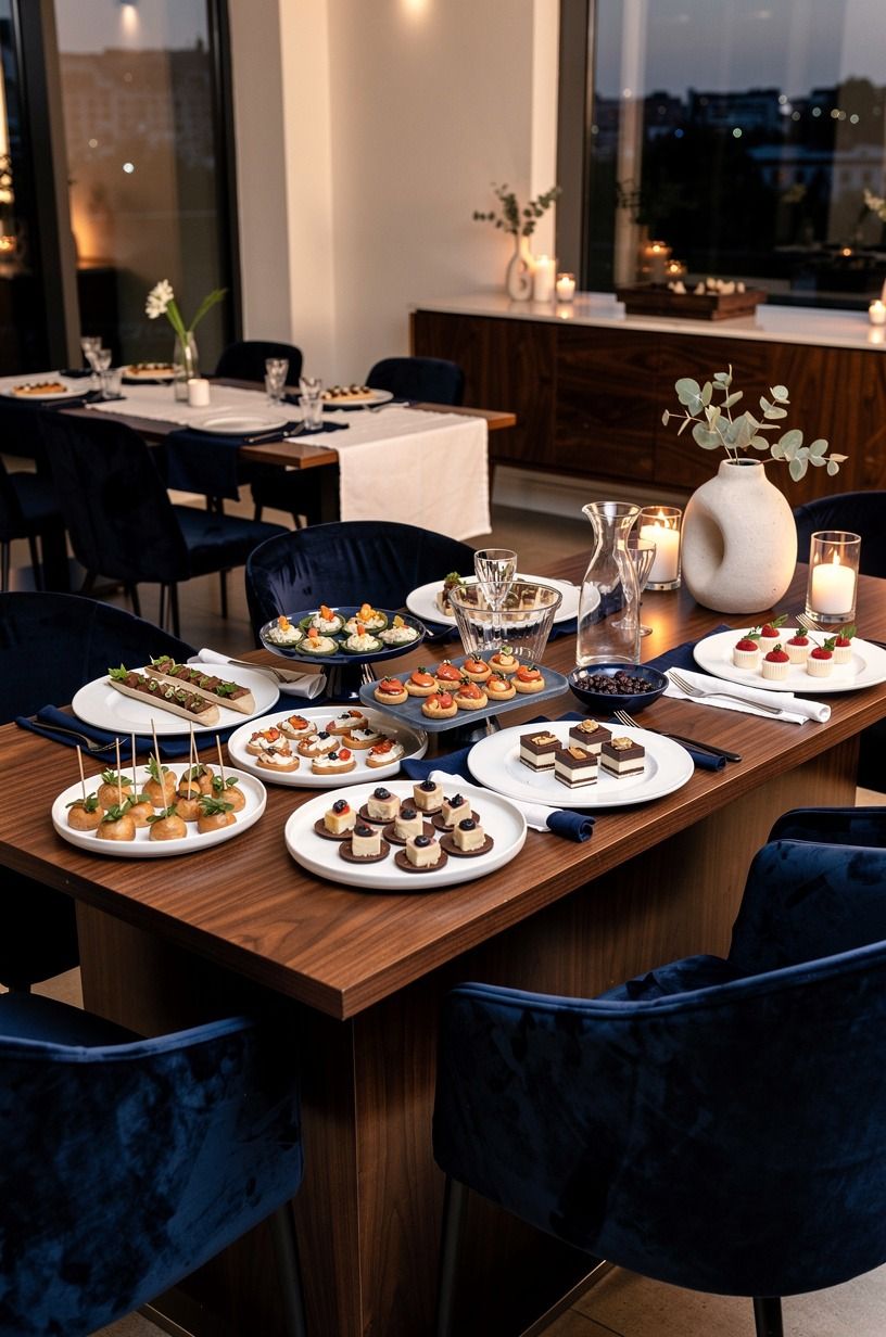
Take one photo from the guest’s eye level before anyone reaches for food. This reveals gaps, blocked labels, and dishes that are too close together.
You’ll see the event food display as a whole instead of noticing each item separately. I usually catch one awkward corner this way, often a serving spoon that’s pointing directly at the prettiest platter.
A walnut spoon rest can solve that small problem without adding visual noise.
Move only what interrupts the visual path. Don’t keep styling once the table feels balanced, because extra objects are usually where the clutter begins.
Check the photo for repeated colors, blocked serving pieces, and a crowded front edge. A deep-pile mohair velvet accent nearby or small walnut tray may be all you need to correct the composition. Then plan how you’ll reset the table once the party is underway.
18Reset the Table in Small Waves
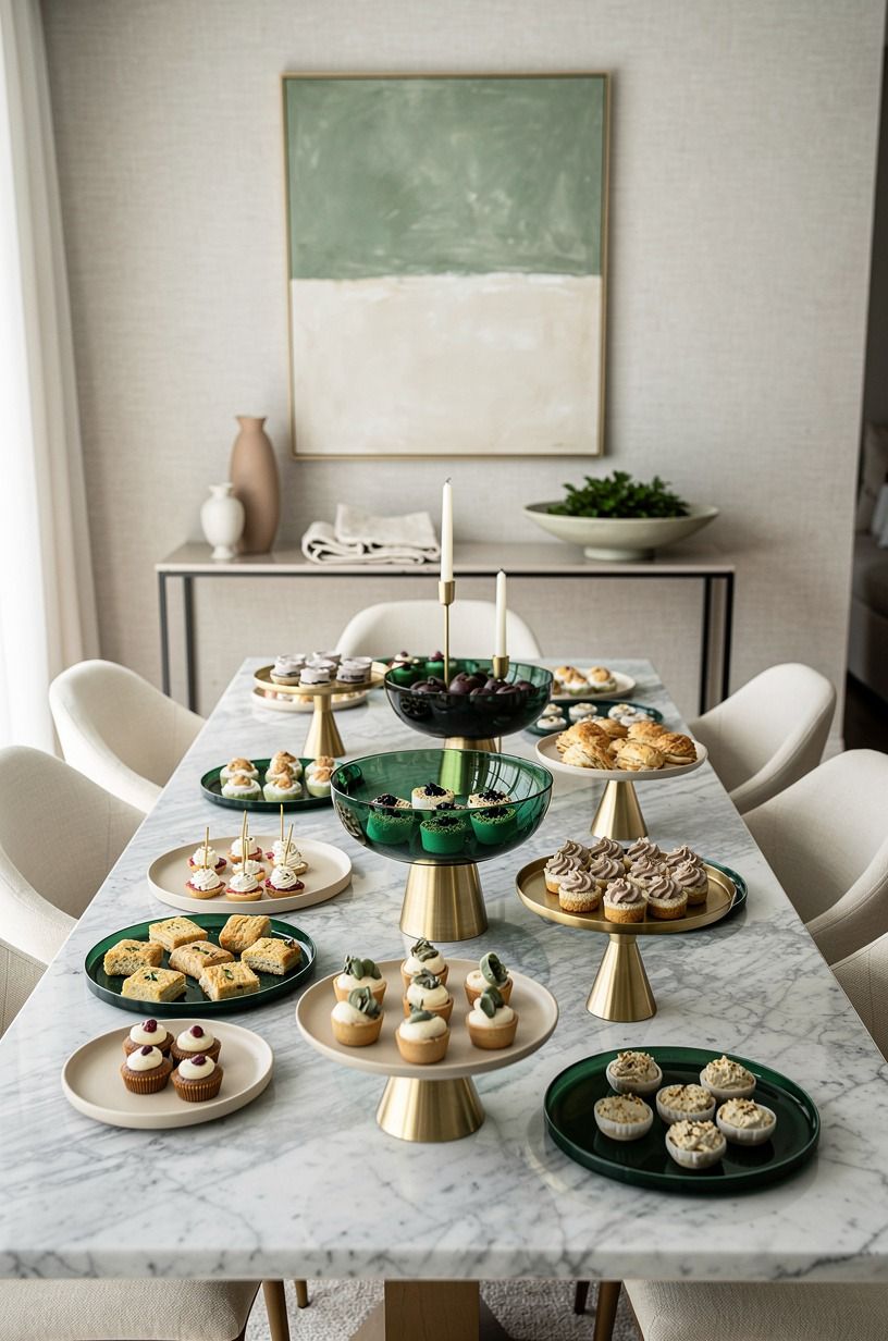
A display looks fancy when it stays cared for throughout the gathering.
What I’d Change After Styling Party Buffets
I used to think an impressive buffet depended on having enough matching serving pieces. It doesn’t. The moment that changed my mind came after I hosted a gathering with borrowed plates, one chipped wooden board, and a table that was smaller than I wanted.
I spent too long worrying about what I lacked, then noticed guests were drawn to the raised bread basket and the bowl of herbs. They didn’t care that the dishes came from three different kitchens.
They cared that they could see, reach, and understand the food.
Now I start with movement. Where will your hand go first?
Can you pass behind the table without brushing a chair? If the answer is no, another platter won’t solve the problem. I’d rather remove two dishes than squeeze them into a crowded line.
Space is part of the display, and it costs nothing.
I’ve also learned that height should be practical, not theatrical. A cake stand can make a bowl visible, but a tower of risers turns serving into a balancing act.
My preference is a low, medium, and tall rhythm with the tallest item holding something guests won’t need every minute. That keeps the table useful while it still looks composed.
The best party food display is a little imperfect. Let the wood show a mark.
Let one herb stem lean. Use Benjamin Moore White Dove OC-17 if you want a calm backdrop, or Farrow & Ball Pigeon No.25 if you want more mood.
Your job isn’t to create a frozen photograph. It’s to give people an easy path to good food, with enough warmth that they linger after their plates are full.
That’s where the fancy feeling comes from.
The Questions I Get Asked Most
What is the best party food display idea for a small party?
A raised center platter and separate drink station work best because they protect your serving space. Try a cerused white oak shelf for height, then keep the main table limited to food. You’ll gain a clearer path, better sightlines, and a more calming arrangement without adding a large piece.
Where can I buy party food display pieces on a budget?
Look at IKEA, Wayfair, and Target first, then check Facebook Marketplace or a thrift store for boards and cake stands. Secondhand wood trays often add more character than new matching sets. You don’t need everything from one collection, and your display will feel more personal when the materials vary thoughtfully.
How much does a party food display makeover cost?
A small refresh can use what you own, while a larger room update may follow the typical $200-$800 budget tier for paint, textiles, art, and organization. A mid-range setup with accent furniture, lighting, and a rug is typically $1,500-$5,000. Your food display itself doesn’t need to reach those totals.
Can I create a party food display on a budget?
Yes, and you can start with three free moves: rearrange the table, group food by color, and raise one dish on an upside-down bowl or sturdy box. A folded linen napkin can become a runner, while a thrifted board adds texture without changing your room.
Is a party food display worth it in a small space?
Yes, because a small space rewards clear organization. Keep the tallest piece at the back, move drinks elsewhere, and let the furniture overlap a rug if one is nearby. Your table will feel more open when every item has a job instead of filling every available inch.
Is a party food display a good idea for a rental?
Yes. Use removable hooks for a small frame, a tension rod for a linen backdrop, and peel-and-stick surfaces only where your lease allows them. Removable table styling gives you color and structure without permanent changes, and you can take every useful piece with you when you move.
How high should art hang near a buffet?
Hang the center of the art around 57 to 60 inches from the floor, then check it from the standing guest’s view. You don’t want the frame hidden behind the food. A low arrangement may work better when your tallest platter already creates plenty of height.
Where I’d Start First
If I had to pick one step, I’d start with the three-height food stack. A flat buffet hides its best pieces, but one raised board makes the whole spread easier to read and serve. Pin the idea for later, then build around the platter you’re most excited to share!