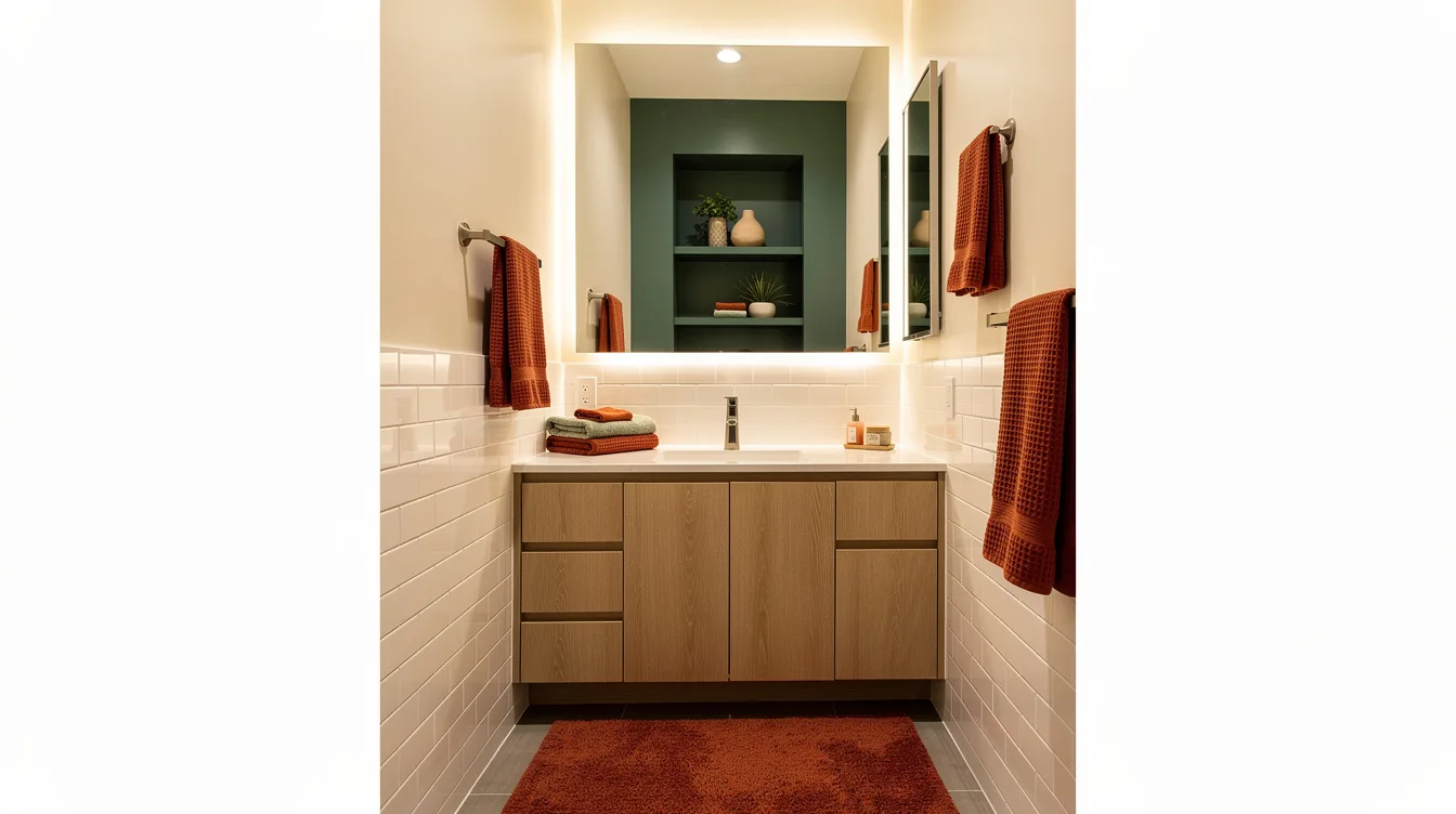
A windowless bathroom asks a rude question the second you turn on the light: will this color wake up the room or make every corner recede? In a typical 5 x 8-foot bathroom, the paint choice covers far more visual territory than the vanity hardware.
I’d skip the instinct to use blinding white everywhere. A light color with a soft undertone gives artificial light something gentler to bounce around, especially when the tile, ceiling, and trim already lean bright.
Soften Stark Tile With Warm Off-White
Choose a creamy off-white when bright white tile feels chilly under LEDs. Behr Swiss Coffee is a useful starting point because its warmth keeps a small bath from reading like a clinic while still reflecting available light.
Carry the same pale family onto the ceiling in a tiny powder room, roughly 3 x 5 feet, to erase the visual break at the top of the wall. Add light oak, brushed nickel, and a white shower curtain, then let the room stay quiet.
Ground Cool Lighting With Pale Greige
Use pale greige when your bathroom has white porcelain, a gray countertop, and lighting that feels a little too blue. Benjamin Moore Pale Oak gives those hard surfaces a warmer backdrop without turning beige or yellow.
This color direction looks particularly polished with travertine-look porcelain and unlacquered brass. Keep the ceiling white in a standard full bath, then repeat the wall tone in a linen-colored bath mat instead of adding a busy pattern.
Test Blue-Green Before Committing
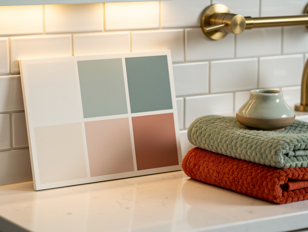
Misty blue-green can make a windowless bath feel calmer, but the undertone changes dramatically after sunset. Paint a large sample board in pale sage acrylic paint and move it beside the vanity, shower tile, and mirror before buying a gallon.
Artificial light can pull a green shade minty or gray, so check it with the exact bulbs you use each day. A soft seafoam wall works best beside white tile and light wood, with matte black saved for one small detail such as a towel hook.
Warm Up a Guest Bath With Muted Blush
A muted blush has more backbone than people expect in a powder room. Choose a dusty, almost-neutral peach rather than a sugary pink, then pair it with an ivory cotton towel and a clean white vanity.
Brass is the right finishing note here because it makes the color feel intentional. A brushed brass mirror, simple globe sconce, and pale floor tile are enough; extra floral wallpaper or pink accessories will tip the room into theme territory.
Use Soft Gray Only With the Right Bulbs
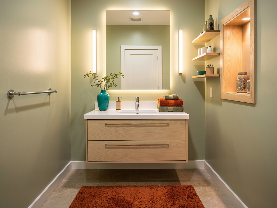
Cool gray is still viable, but it needs neutral or cool-neutral lighting and enough lightness to avoid a basement effect. Sherwin-Williams Light French Gray is a sensible direction for homeowners who want a blue-gray cast without a heavy charcoal wall.
Pair it with chrome or brushed nickel and keep the shower tile white. Around 3000K to 3500K LED lighting usually gives pale gray more life than an overly warm bulb, though a sample board should make the final call.
Cocoon a Larger Powder Room Deliberately
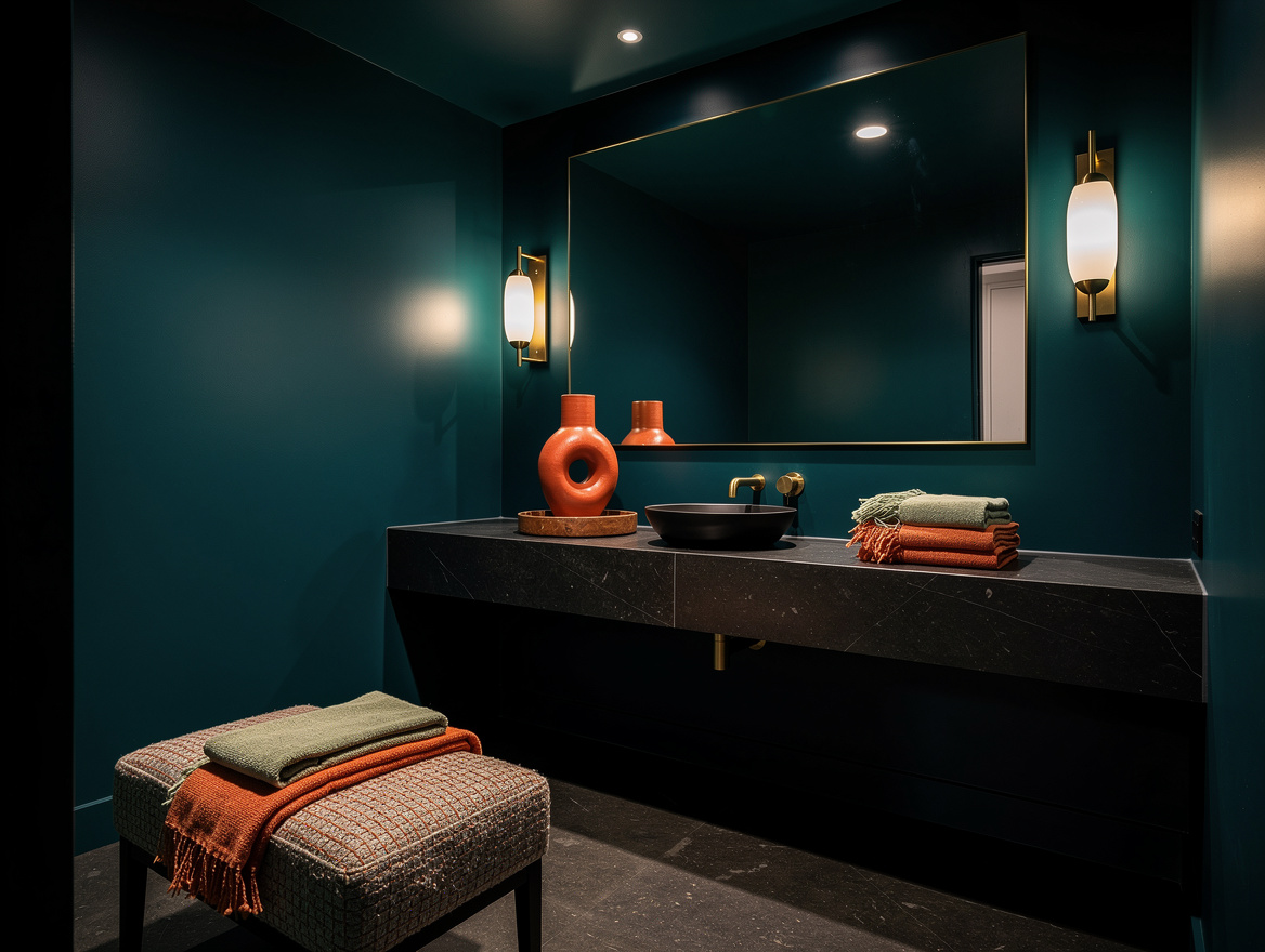
Deep blue-green or charcoal can work, but reserve it for a larger windowless room with excellent lighting and a mirror that earns its size. In a bath around 8 x 10 feet or larger, an all-over dark color can look tailored instead of cramped.
Commit fully: paint the walls and ceiling in the same deep family, use a large reflective mirror, and add strong layered light. A deep blue-green wall beside a tiny mirror and weak vanity bulb looks gloomy, full stop.
Start with one sample board in the place that gets the least flattering light, usually beside the mirror. Once that wall color holds up at night, choose a washable 100% acrylic bathroom paint and make sure the exhaust fan vents outdoors before the room sees regular steam.
Mia Carter writes about small-space living and budget home makeovers. She has restyled three rentals and tests most ideas in her own 45 sqm flat.