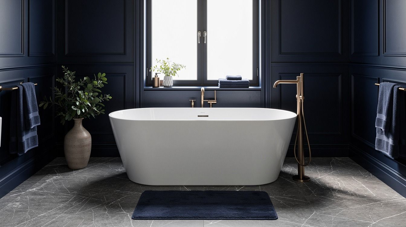
Dark blue bathroom ideas that feel rich, not heavy or flat start with one simple truth: deep color works when you balance it with warmth, shine, and breathing room. I learned that the hard way after painting a tiny bath navy and leaving everything else cold. It looked expensive for one hour, then gloomy by dinner. The difference wasn’t less blue. It was better texture, better light, and a few sharper choices.
- Color-drench the walls, ceiling, and trim
- Tile the shower in glossy navy zellige
- Frame a navy vanity with brass sconces
- Wrap the tub wall in sapphire paneling
- Paint beadboard deep blue below marble
- Anchor patterned floors with midnight cabinetry
- Gloss the ceiling for a lacquered glow
- Pair navy tiles with warm walnut shelves
- Run blue mosaic tile behind the sink
- Install a dark blue fluted vanity
- Layer indigo wallpaper above white wainscoting
- Use cobalt grout lines for graphic contrast
- Surround the mirror with navy built-ins
- Choose a blue stone-look shower niche
- Contrast deep blue walls with unlacquered brass
- Panel the bath apron in rich navy
- Add a velvet blue vanity stool
- Repeat navy through towels, art, and trim
- Backlight sapphire tiles for a jewel-box shower
1Color-drench the walls, ceiling, and trim
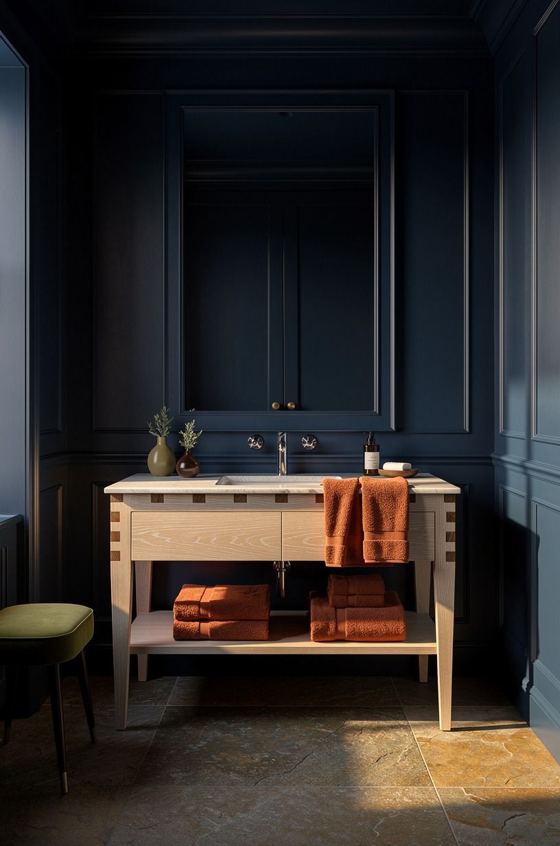
Go all in if you want a color drench blue bathroom to feel intentional, not timid. When the walls, ceiling, and trim share one inky tone, your eye stops chopping the room into little parts and starts reading it as one calm envelope. That’s why a small bath can feel bigger with dark paint, not tighter.
I made the mistake once of painting only the walls and leaving the ceiling bright white. It looked unfinished, like the room quit halfway through.
Use a blue with a little softness in it, not a flat black-blue that dies by 4 p.m. Farrow & Ball Hague Blue (No.30) is a smart place to start because it keeps its depth without turning muddy.
In a bathroom with terracotta notes and warm stone, that richer blue feels grounded. If you’re worried about the room reading heavy, keep your mirror large, your metal finishes warm, and your sightlines clear. You can see the same dark-color confidence in these dark bedrooms that feel bigger, not smaller.
And yes, paint the trim too. That’s the part people skip, and it’s why their dark blue bathrooms never quite land.
2Tile the shower in glossy navy zellige
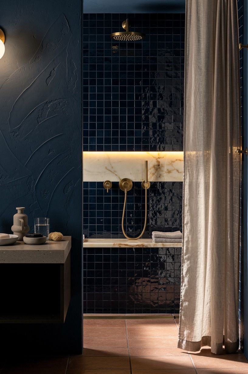
Choose shine before pattern if you want navy blue bathroom tiles to carry the room.
3Frame a navy vanity with brass sconces
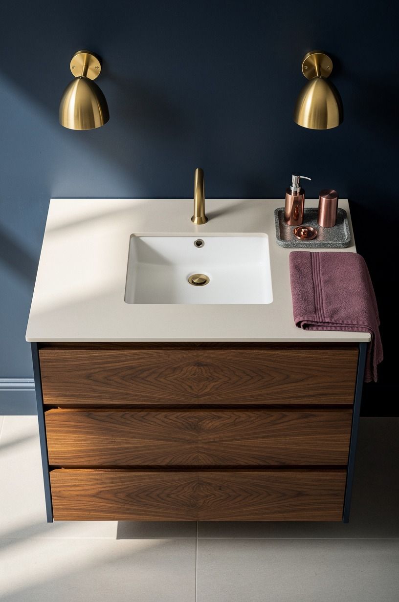
If your vanity is navy, flank it with light instead of relying on one overhead fixture. The brass sconces in this setup do two jobs at once: they warm up the blue and they make the mirror zone feel architectural. That’s a huge upgrade in dark blue bathrooms because the sink wall is where cold lighting shows up fastest.
Nobody looks rich under a harsh can light.
I like the Three-Height Light Stack here: sconces at eye level, a mirror with some visual weight, and a lower line from the drawer or countertop detail. It keeps the composition from feeling top-heavy.
Use unlacquered brass if you can because the finish softens with time and doesn’t feel as sharp as polished gold. And don’t undersize the vanity.
A height between 32-36 in usually looks right and feels right for daily use. Book-matched walnut drawers underneath help a navy cabinet read tailored rather than generic.
If you’re chasing that same collected darkness in another room, these French blue bedrooms that feel collected, not decorated are worth a look.
4Wrap the tub wall in sapphire paneling
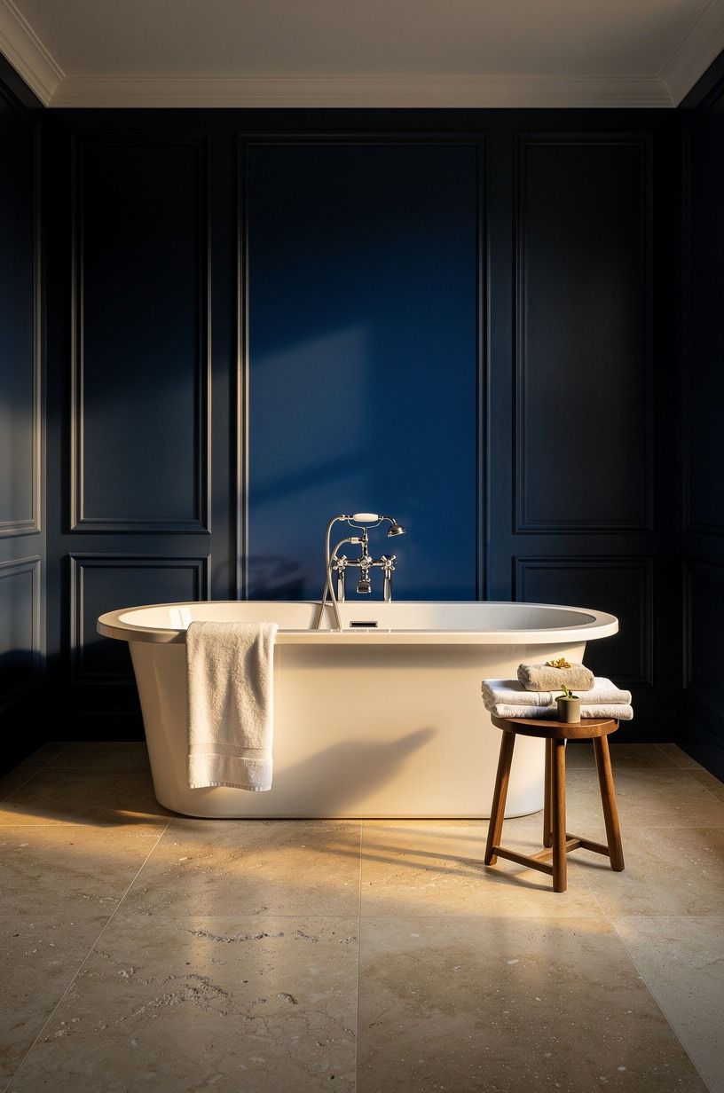
Paneling behind a tub gives you depth without the visual noise of more tile joints. That’s why this idea works so well in jewel tone bathrooms.
The sapphire wall reads tailored and old-house in the best way, especially when it’s framing a sculptural white tub from a clean 45-degree view. You get contrast, but you also get structure.
And in a room with warm travertine underfoot, that blue starts to feel serene instead of stern.
Use panel spacing that feels deliberate, not fussy. Wider stiles usually look calmer in a bathroom than skinny cottage lines. I wouldn’t crowd this wall with too much art, either. Let the panel rhythm do the decorative work.
The tub itself is already a strong shape, especially if it’s close to the standard 60×30 in footprint. Add one warm metal accent and one soft textile, then stop. Real talk: this is one of those places where restraint looks more expensive than more stuff! If you love dark tones that still feel soft around the edges, the balance in these dark moody bedrooms that feel lived in, not staged follows the same rule.
That’s the sweet spot!
5Paint beadboard deep blue below marble
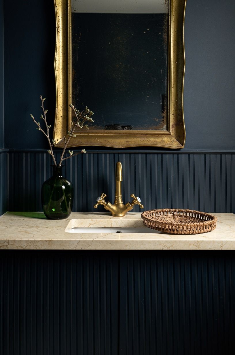
This is one of the easiest ways to make a small vanity wall look custom. Deep blue beadboard under a marble ledge gives you contrast, texture, and a built-in stopping point for the color.
In a bathroom, that matters because full-height darkness isn’t always what the space needs. Sometimes you want the weight low, then a lighter upper wall so your eye can rest.
The detail that keeps this from feeling theme-y is the stone. Use Calacatta marble or another cream-leaning top with visible warmth, not a cold gray slab that fights the blue.
Then let a green or bronze accent carry the room quietly. I also think beadboard looks better when it’s painted in a richer finish, eggshell or satin, not chalky flat.
You can wipe it down, and the little bit of sheen helps the grooves show up. If your bathroom is short on natural light, copy the warm-contrast approach used in these dark walnut walls that still feel warmer and larger.
Same principle. Dark below, warmth above, no panic.
6Anchor patterned floors with midnight cabinetry
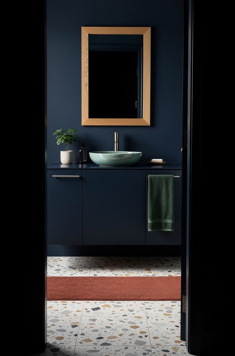
Patterned floors need a visual anchor or they start to float around the room. That’s why midnight cabinetry works here.
It gives the eye a solid, grounded block to land on while the oversized-chip terrazzo floor does its busier thing underneath. In a doorway view, that heavier cabinet tone makes the whole bathroom feel settled, not scattered.
I wouldn’t pair a loud patterned floor with pale builder-grade vanity boxes. Too weak. If you’re going bold underfoot, the cabinetry has to answer back. Midnight blue is better than black for that because you keep depth without flattening every edge.
And if you have a tight layout, pay attention to clearance. A bathroom starts feeling cramped fast when the cabinet swing and toilet area don’t leave at least 21 in clear in front. That’s the stuff nobody talks about in inspiration photos.
You need the room to function before it can impress you. For another lesson in dark tones with attitude, these grunge bedroom ideas that stay dark without feeling heavy show how weight and texture can coexist.
7Gloss the ceiling for a lacquered glow
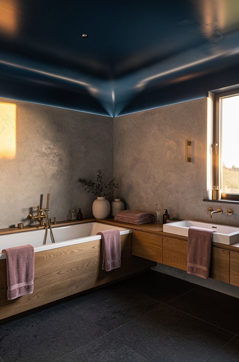
A glossy ceiling is how you make dark blue bathrooms feel lit from within.
8Pair navy tiles with warm walnut shelves
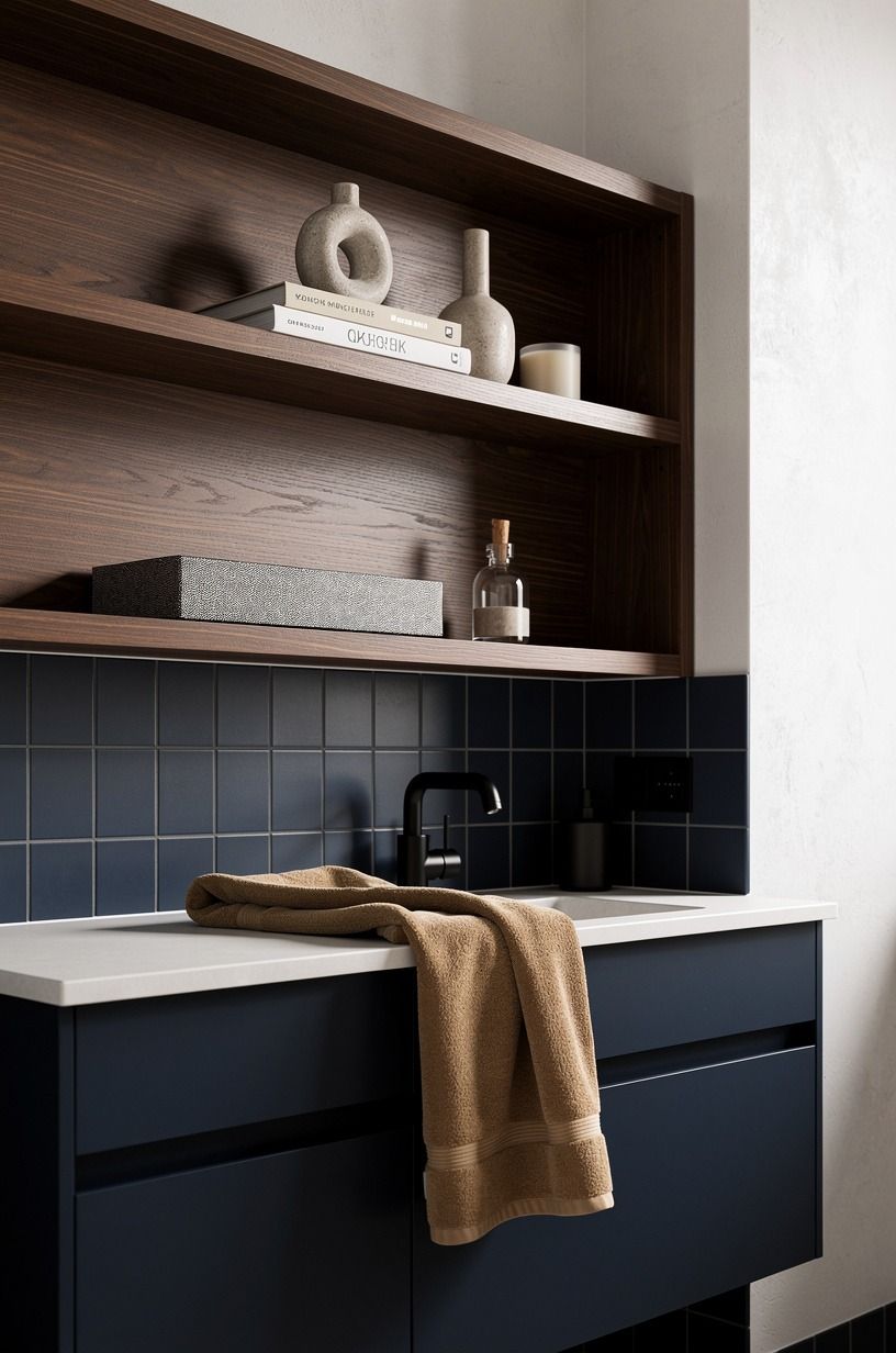
This is the easiest warm-up move in the article, and it’s one I’d recommend to almost anyone. Navy tile has a cool, crisp edge.
Walnut shelves bring back the human part. You need both.
When you put warm wood against blue, the bathroom stops feeling like a tile box and starts feeling furnished.
Use real wood if you can, not fake oak laminate with a gray cast. Walnut is especially good here because the brown has enough red in it to soften navy without going orange.
Keep the shelf thickness substantial so it looks intentional. Thin floating boards can feel flimsy fast.
I also like camel towels and warm white plaster nearby because they help the blue read richer. One more thing: don’t overload open shelves.
Folded towels. A stone dish. Maybe a low black vessel. Done.
The same warm-wood relief is what makes these dark western bedrooms feel moody without feeling heavy work so well. You need the rougher natural note.
9Run blue mosaic tile behind the sink
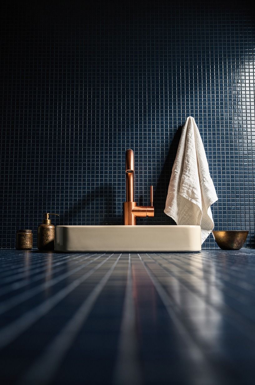
A sink wall is a smart place to spend on detail because it’s where your eye goes first. Blue mosaic tile behind the vanity gives you pattern and shimmer without asking you to tile the whole room. And from a low angle, with the vanity wall centered, you really see how those smaller pieces catch light differently than a larger-format tile would.
I’d skip a super-busy mosaic if the countertop already has strong movement. Let one surface be the star. But if your top is simple, mosaic can carry more visual energy.
A midnight blue mix looks especially good with a pale stone and a darker grout line that doesn’t disappear completely. If you need a more affordable version, subway tile usually comes in around $2-$10/sq ft, though it won’t give you the same jewel-like flicker.
That little shimmer is the point. You can borrow the dark-meets-light palette idea from these moody blue bedrooms if you’re building a whole color story through the house.
10Install a dark blue fluted vanity
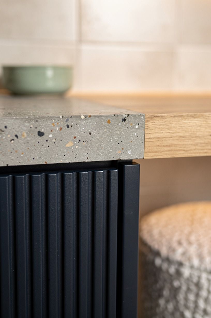
Texture matters even more than color when you’re working this dark.
11Layer indigo wallpaper above white wainscoting
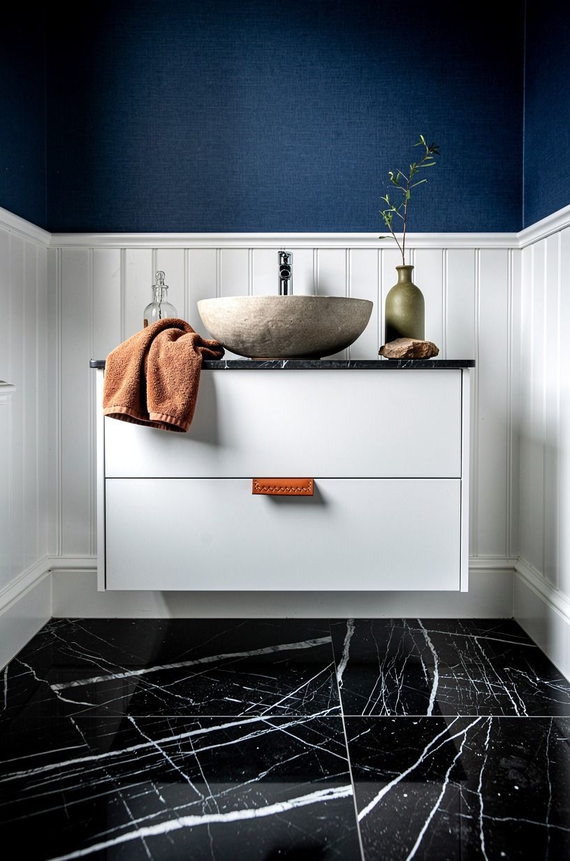
If full blue walls feel like too much commitment, split the room in half. White wainscoting below and indigo wallpaper above gives you darkness with relief built in.
It also makes the upper walls feel dressed, not just painted. In the right bathroom, especially with a dramatic Nero Marquina marble floor underfoot, that mix reads classic and a little daring at the same time.
The pattern matters. Go for something with motion or botanical rhythm, not tiny busy repeats that blur the minute steam hits the room.
I like wallpaper best when the wainscoting is crisp and simple, because the clean lower half keeps the room from becoming one long decorative sentence. And if you’re renting or just commitment-shy, removable paper has come a long way. It isn’t perfect, but it’s better than staring at a blank wall you don’t love.
For another room that uses blue in a more layered, dressed-up way, these French blue bedrooms show how pattern and trim can keep color from feeling flat.
12Use cobalt grout lines for graphic contrast
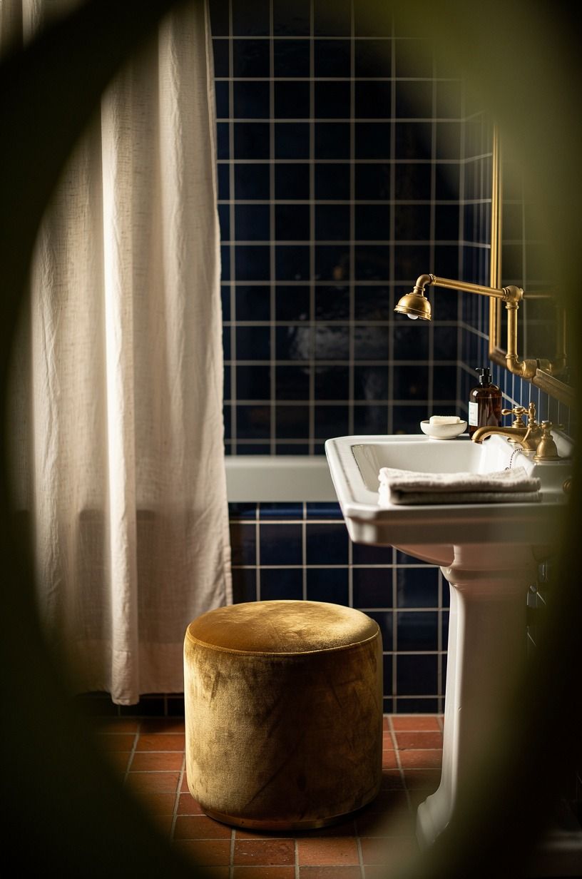
Most people think about tile color and stop there. But grout can do real design work, especially in dark blue bathrooms where you want a little graphic snap. Cobalt grout lines give the wall definition, almost like outlining the geometry without turning it harsh.
Through a leafy foreground, with clay tile underfoot and linen nearby, that extra contrast keeps the room from dissolving into one dark blur.
This works best when the tile itself is simple enough to let the grout show. I’d never force cobalt grout into a room that’s already shouting.
But in a restrained shower or sink wall, it’s sharp in the best way. Keep the plant moments organic, keep the floor warm, and let the grid become part of the style story.
You also don’t need to run it everywhere. One zone is enough. If you’re building a home where each room gets its own version of mood, the tonal confidence in these dark boho bedrooms is a good reminder that contrast doesn’t have to be loud to be memorable.
13Surround the mirror with navy built-ins
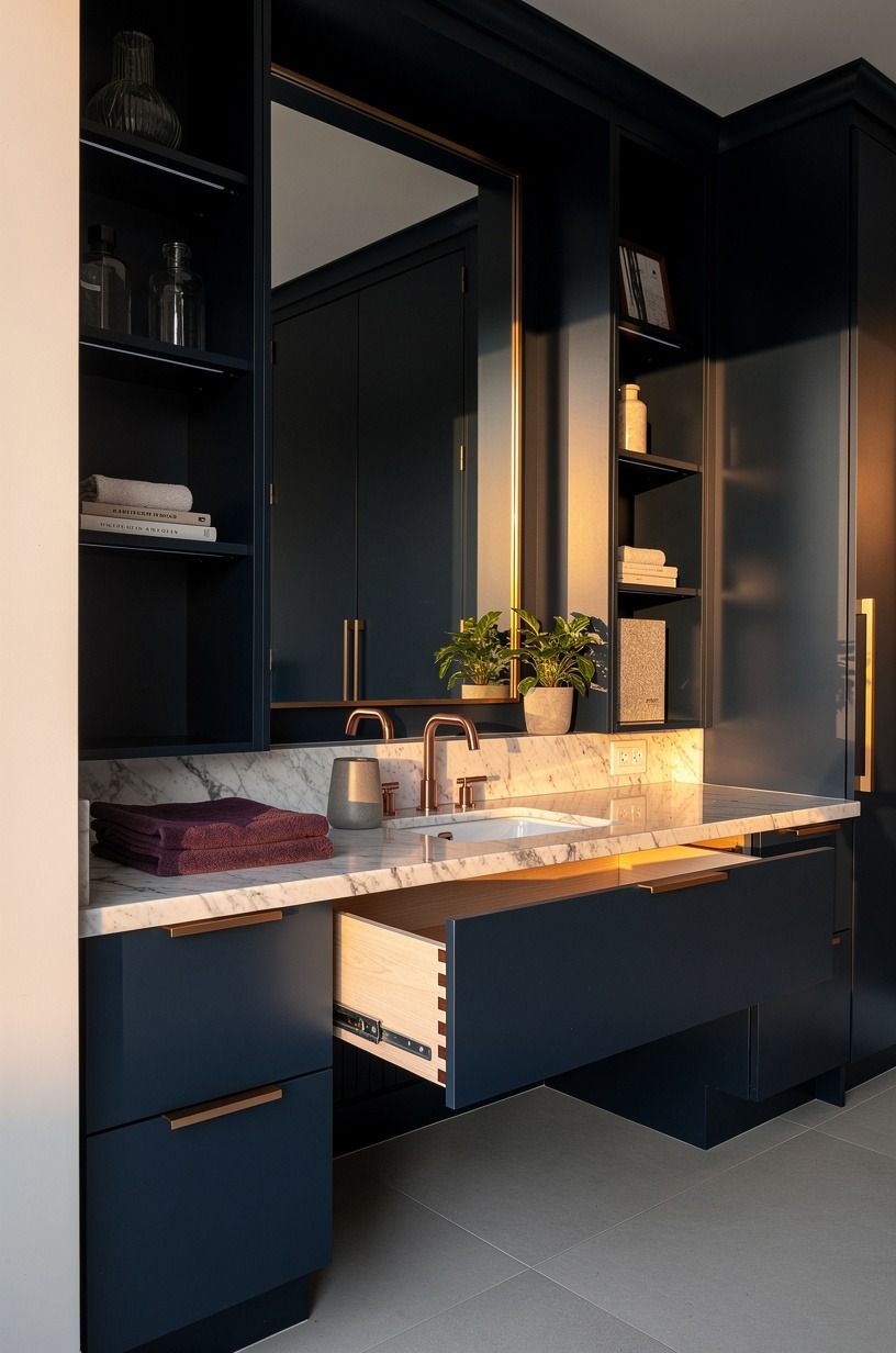
Built-ins make a bathroom feel planned, and planning is half of what reads luxurious. When you wrap a mirror in navy cabinetry or open shelf framing, the vanity wall starts acting like furniture instead of a loose collection of parts.
That’s a huge shift. In a wide-angle view, you can see how the mirror, shelves, counter, and floor all start speaking the same language.
I like this move most in bathrooms that need storage but can’t spare floor space. Vertical built-ins let you stash the boring stuff and display just enough pretty stuff to soften the room. Rolled towels. A small tray.
Maybe a ceramic vase. That’s it. And keep your shelf depth reasonable so the mirror still feels generous.
Around 8-10 in can be plenty for side storage without crowding the sink zone. If you’ve ever admired why hotel baths feel calmer than yours, this is one reason. They build the frame around the experience. For that same wrapped, immersive feeling in another dark interior, see these dark bedrooms that feel bigger, not smaller.
14Choose a blue stone-look shower niche
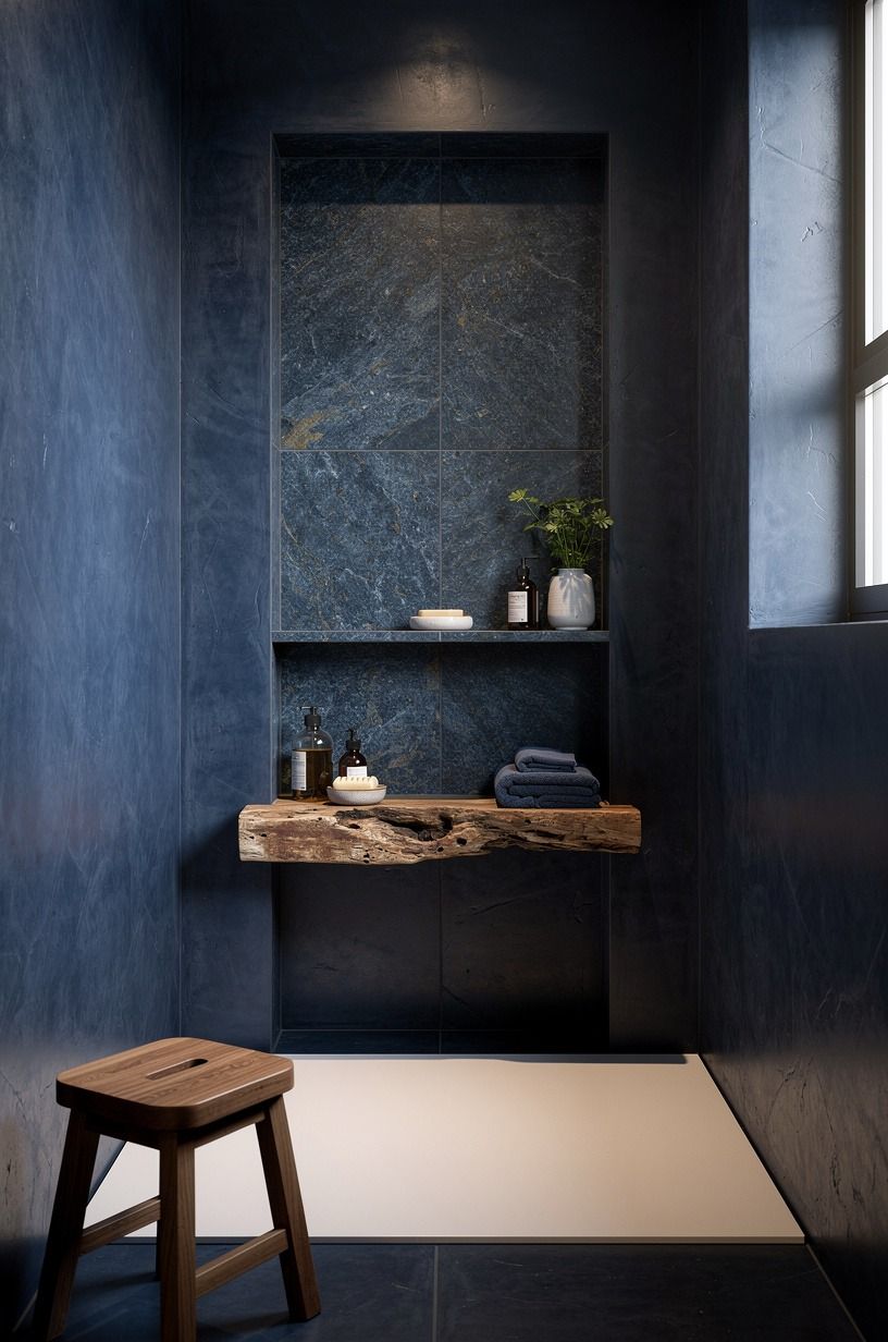
A niche is small, but it shouldn’t look like an afterthought. If you’re tiling the shower in dark blue, make the niche feel integrated by using a blue stone-look surround that reads cut from the same design idea. When you step toward the shower and see that niche centered cleanly, the whole bathroom feels better resolved.
This is where the shower starts looking custom rather than contractor-basic. You can line the niche in a slightly different tone so it stands out softly, but I wouldn’t make it a random accent color.
Too much contrast and it starts screaming for attention. Keep the shelf thickness clean, and make sure the niche lands where your bottles actually fit.
Function first. For a comfortable shower footprint, 36×36 in is usually the minimum where details like this still breathe.
And if you can repeat the stone-look finish somewhere else in the room, even in a tray or ledge, do it. Repetition is what makes a niche feel intentional instead of decorative filler.
15Contrast deep blue walls with unlacquered brass
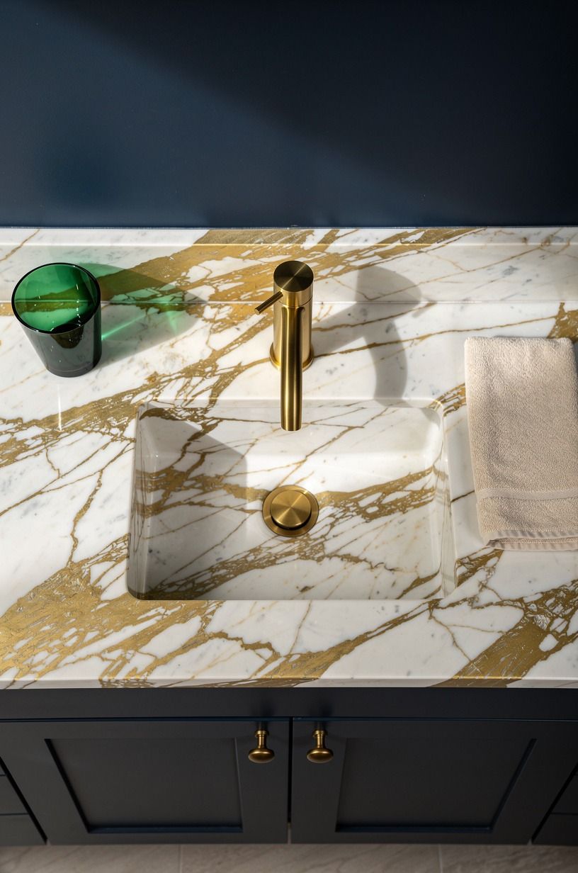
This pairing works because both materials improve when light hits them.
16Panel the bath apron in rich navy
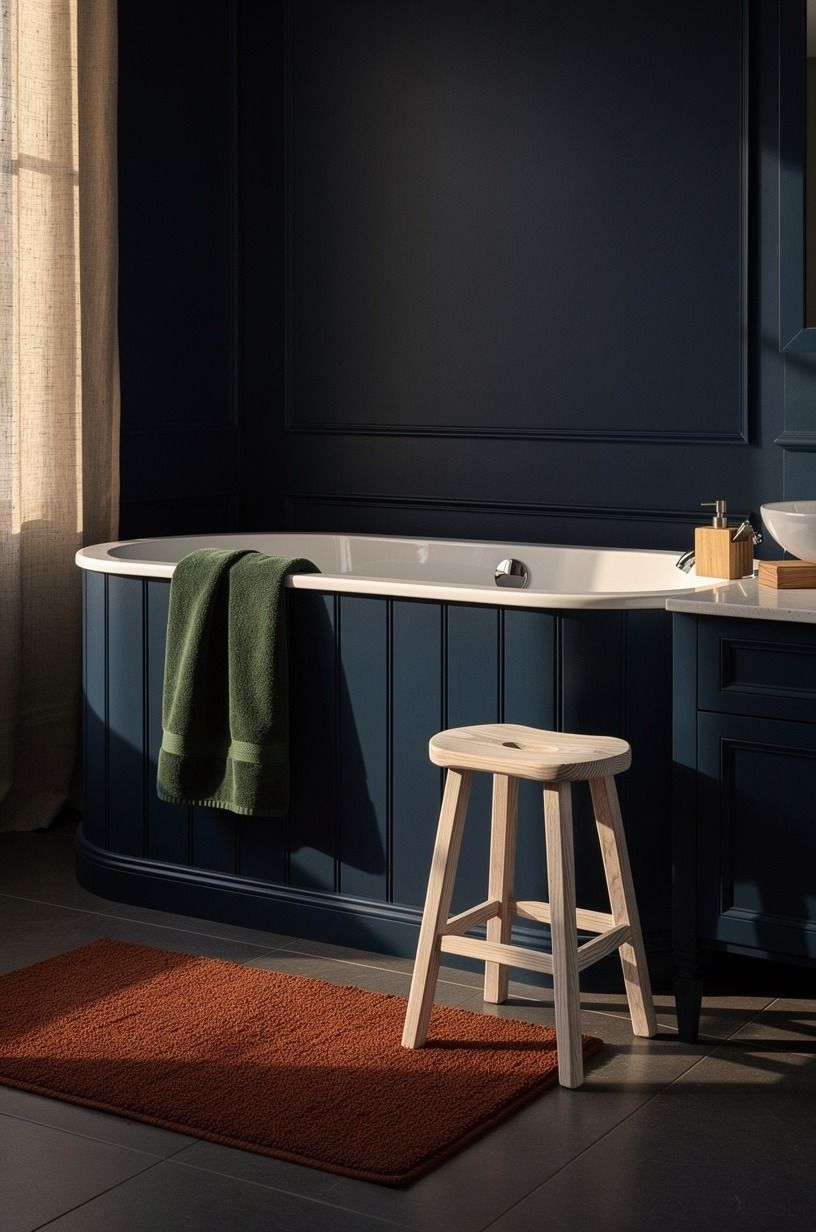
A bath apron is wasted space in too many bathrooms. Panel it in a rich navy and suddenly the tub feels built in, not dropped in.
That’s especially strong when the floor has a little movement and the vanity nearby carries the same deep tone. In a 45-degree room view, the apron becomes part of the architecture instead of the blank side of a fixture.
Use the same blue family as the walls or vanity, but not always the exact same finish. A tiny shift can help the layers show up.
I also think this looks best when the trim profile is simple. Too much detailing and it starts drifting into furniture cosplay.
With cerused white oak or another warm wood nearby, that paneled navy feels balanced and expensive. Want the room to look custom without relocating plumbing?
Do this. It gives you the look of a more designed bath without the chaos of a full rebuild, and that’s often the smartest kind of upgrade.
17Add a velvet blue vanity stool
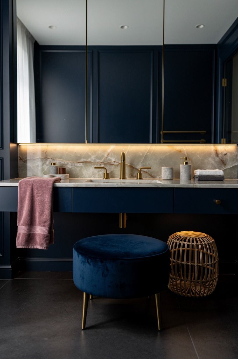
A stool is one of those bathroom pieces people think is optional until they see one styled well. Then suddenly the room looks finished.
A velvet blue vanity stool adds softness right where a dark vanity can start feeling too hard-edged. And in a frontal, symmetrical shot with dusty rose towels nearby, that plush seat breaks up all the stone, paint, and mirror with something you can almost feel through the photo.
Choose a stool with a real fabric hand, not stiff synthetic velvet that shines weirdly. Mohair velvet or a good performance velvet holds color beautifully and gives you that low, brushed glow. Keep the scale small enough that you can still move easily around the vanity.
Bathrooms don’t forgive clutter. If your layout is tight, use the stool as a pull-out piece rather than something permanently parked in the walkway.
I also love how this move gives you a second blue note without more hard finishes. A room full of tile needs one thing that feels soft. Always.
18Repeat navy through towels, art, and trim
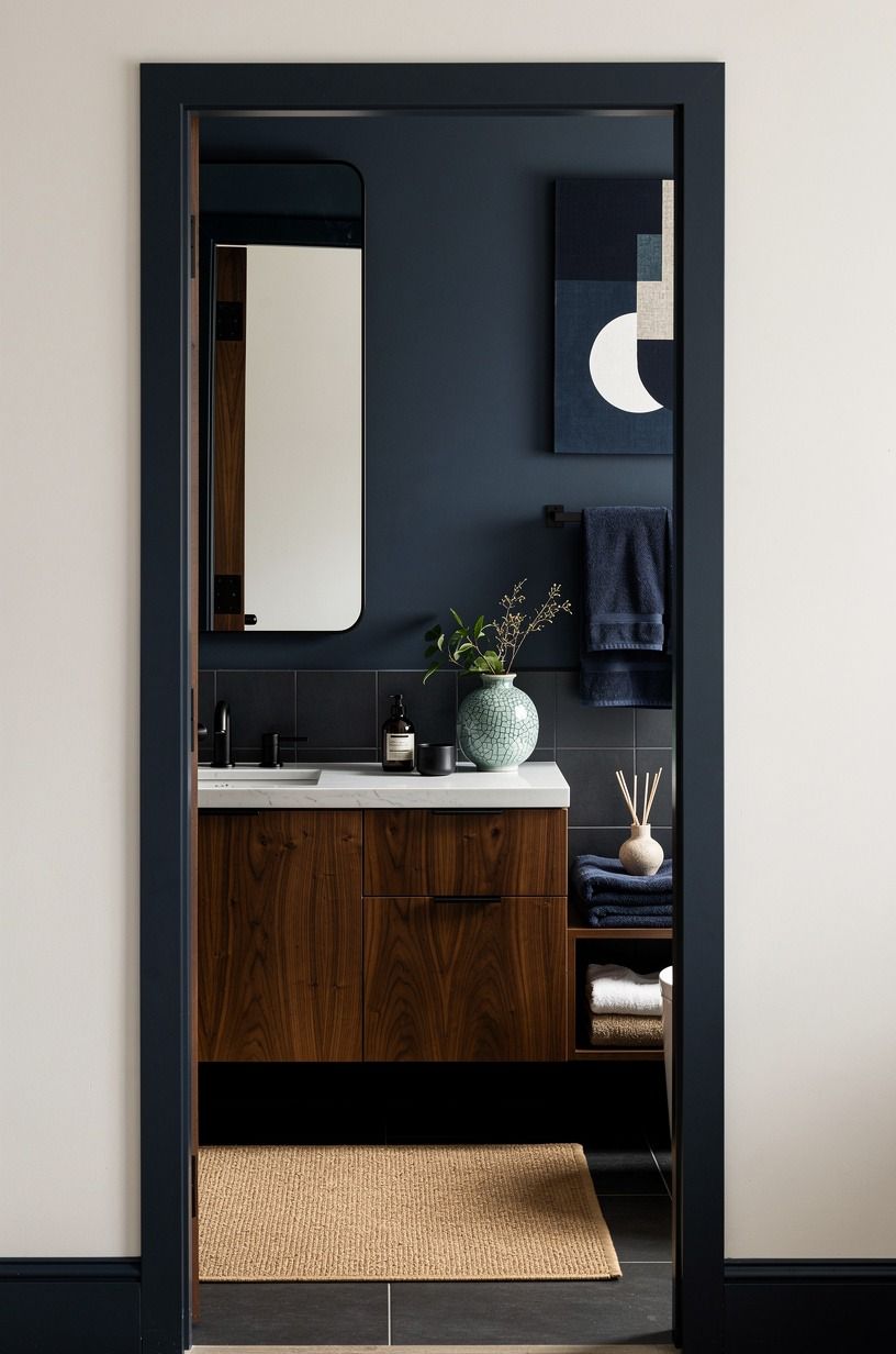
If you don’t want to renovate, repeat the color instead of rebuilding the room.
19Backlight sapphire tiles for a jewel-box shower
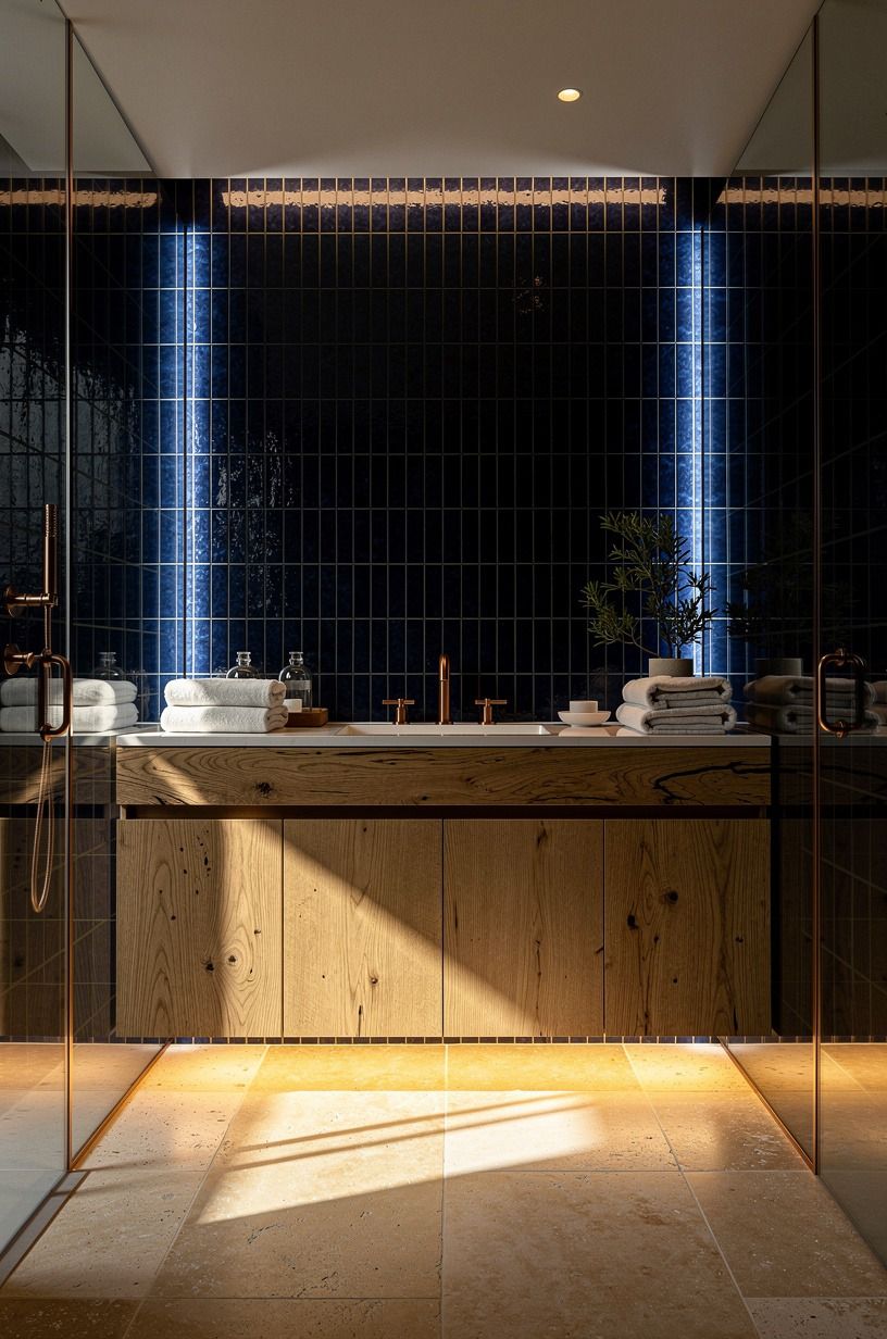
If you want one truly dramatic move, this is it. Backlit sapphire tile turns a shower into the moment of the room, especially when the rest of the bathroom stays controlled. The light coming through or around that deep tile gives you glow, depth, and a little theater.
That’s what makes it feel expensive. Not bigger. Smarter.
You don’t need the entire bathroom screaming for attention when the shower can do the heavy lifting. Keep the floor quieter. Keep the vanity crisp.
Let the tile be the jewel. And make sure the lighting temperature stays warm, because cool LEDs will kill the whole mood in seconds. I’ve seen dark tile look flat under the wrong bulb and almost liquid under the right one.
That’s the difference. If you want to splurge anywhere in a blue bathroom, I’d argue for the shower zone before almost anything else.
It’s where light, water, and material get to perform together.
What Dark Blue Gets Right That Pale Bathrooms Usually Miss
What you’re really chasing with dark blue isn’t drama for its own sake. It’s control.
Pale bathrooms often look clean on day one, but they can also feel generic because every surface is doing the same thin, bright thing. Dark blue gives you hierarchy. The walls can recede.
The brass can glow. The stone can look creamier. The towels can feel thicker. Everything has somewhere to land.
I’ve also noticed that dark blue makes you edit better. You stop buying random filler because random filler looks worse against a serious backdrop. That’s a good thing. A color-drenched room, a walnut shelf, one proper sconce pair, a vanity with real texture, that already says enough.
And if you’re spending money, the blue helps the expensive materials earn it. Marble looks warmer against it.
Brass looks less flashy. Even a basic tub looks more sculptural when the wall behind it has depth. That’s why these rooms feel rich when they’re done well. The color isn’t the whole move.
The editing is.
What It Usually Costs to Get the Look
If you’re wondering whether this style is worth the spend, the short answer is yes, but only if you put the budget in the surfaces you touch and see most. Paint, tile, lighting, and the vanity wall do more for a dark blue bathroom than chasing fancy extras ever will. Here’s the real cost picture.
And if you’re comparing materials, these ranges help you decide where the visual payoff is strongest for your money.
The Decision Framework I’d Use Before Buying Anything
If I were starting from scratch, I’d choose in this order: wall treatment, vanity zone, then metal finish. That’s because dark blue only feels rich when the room has one clear anchor and one clear warm counterpoint.
Paint can do that. Tile can do that. But if you mix three competing blue moments before picking your anchor, the bathroom starts looking busy instead of expensive.
My own mistake was thinking more darkness automatically meant more mood. It doesn’t. What matters is where the dark color sits and what you pair it with. I’d rather see you use Sherwin-Williams Sea Salt (SW 6204) on the adjacent wall outside the bath and spend your real money on the navy shower or brass sconce pair than blow the budget on a dozen average upgrades.
The honest version? A room feels luxurious when the materials keep talking to each other. Blue plus walnut. Blue plus marble.
Blue plus brass. Once that triangle is working, the rest gets much easier.
The Questions Worth Answering First
What is the best dark blue bathroom idea for a small bathroom?
Color drenching is the best pick for a small bathroom because it removes visual stops and makes the room feel more unified. One continuous envelope reads bigger than chopped-up contrast. Pair it with a floating mirror and a compact vanity, even something as simple as an IKEA cabinet tip.
Where can I buy dark blue bathroom pieces on a budget?
Start with IKEA, Target, and Wayfair for mirrors, stools, lights, and storage pieces that don’t look flimsy. Budget flexibility is best when you mix retail with secondhand.
Facebook Marketplace. Thrifted brass frames. One good towel set instead of ten average accessories.
How much does a dark blue bathroom makeover cost?
A cosmetic makeover usually lands around $200 to $1,200, while a more serious refresh with vanity, tile, and lighting can run $3,000 to $9,000. Paint does the most cheap work. Re-tiling the shower and moving plumbing is where the number climbs fast.
Can I create a dark blue bathroom on a budget?
Yes, and you don’t need a full renovation to do it. Paint plus textiles gets you surprisingly far.
Navy paint. Better towels.
A warmer bulb. A brass mirror from the secondhand market.
That’s a real mood shift for much less than a new vanity.
Is a dark blue bathroom worth it in a small space?
Yes, a small space can make dark blue look even better because the color feels immersive instead of scattered. The tight footprint helps the drama. Keep the mirror large, the storage edited, and the walkway clear so the room still breathes.
Is a dark blue bathroom a good idea for a rental?
Yes, as long as you use reversible layers. Low-commitment upgrades can still look polished.
Peel-and-stick wallpaper above wainscoting. Removable art.
A tension-rod curtain in navy linen. Better towels. Swap the lightbulbs before you touch anything else.
Where I’d Start First
If I had to pick one, I’d start with glossy navy zellige in the shower. It doesn’t just darken the room, it throws light back, so the blue feels alive instead of dense. Pin that shower idea for later and use it as the finish benchmark for everything else.