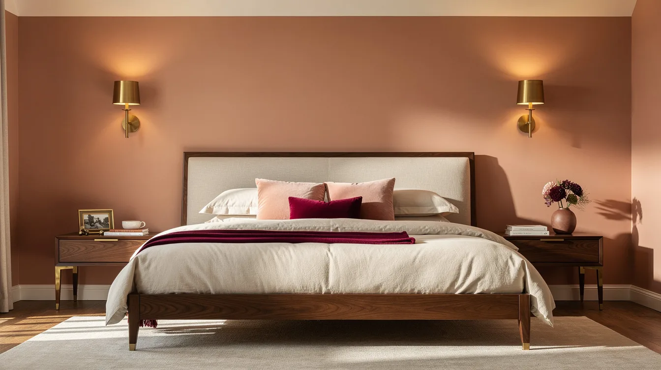
Peach walls can feel daring until the first walnut dresser arrives and suddenly the room looks either quietly expensive or oddly sweet. Around a 63-inch bed, the difference often comes down to whether the peach has a clay undertone and whether the wood has enough presence to anchor it.
The dependable version is warm, grounded, and a little tailored. It asks for restraint, not a matching set of peach accessories.
Choose a Clay-Based Peach
A peach bedroom turns sugary fast when the paint leans bubblegum. Choose a muted shade with beige or terracotta beneath it, then use a flat or low-sheen Home Depot paint sample to test it beside your furniture.
A light peach with an LRV around 68 should keep a modest bedroom bright, while a deeper clay peach needs daylight or strong bedside lighting. Glossy paint is the wrong finish here, since it throws distracting reflections across a wall meant to feel restful.
Give Walnut Enough Visual Weight
Walnut should cover roughly 20 to 30 percent of the visual field, not appear as one lonely picture frame. A low walnut-veneer bed, matching nightstands, and one dresser give peach walls the grounded weight that makes them feel grown-up.
Thin, scattered wood accents leave the palette looking accidental. For a small or medium room, keep the ceiling warm white and let the furniture carry the richer brown note instead.
Size the Feature Wall to the Bed
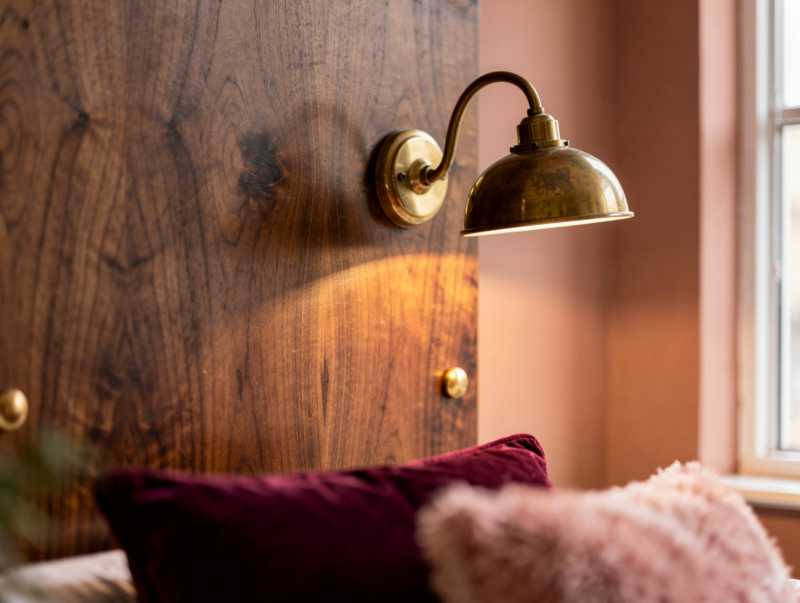
A walnut slat wall that barely extends beyond the mattress looks undersized. For a roughly 63-inch bed, plan a peach-backed feature zone about 87 to 98 inches wide, allowing around 12 to 18 inches beyond each side.
Paint first, then mount walnut slat panels across the bed zone so the peach remains visible at both edges. The framing matters, especially when the wall is wider than the bed and the room needs a clear center.
Buy Veneer With Your Eyes Open
“Walnut effect” usually means a printed finish over MDF or particleboard, and that can look flat under morning light. A real-wood walnut veneer gives you more believable grain without the cost and heft of solid walnut.
At IKEA, inspect samples and online finish descriptions before committing to a full bedroom set. Mixing one printed walnut piece with several strongly grained veneer pieces often creates a mismatch that peach walls make even easier to notice.
Warm Up the Bedding Before Adding Color
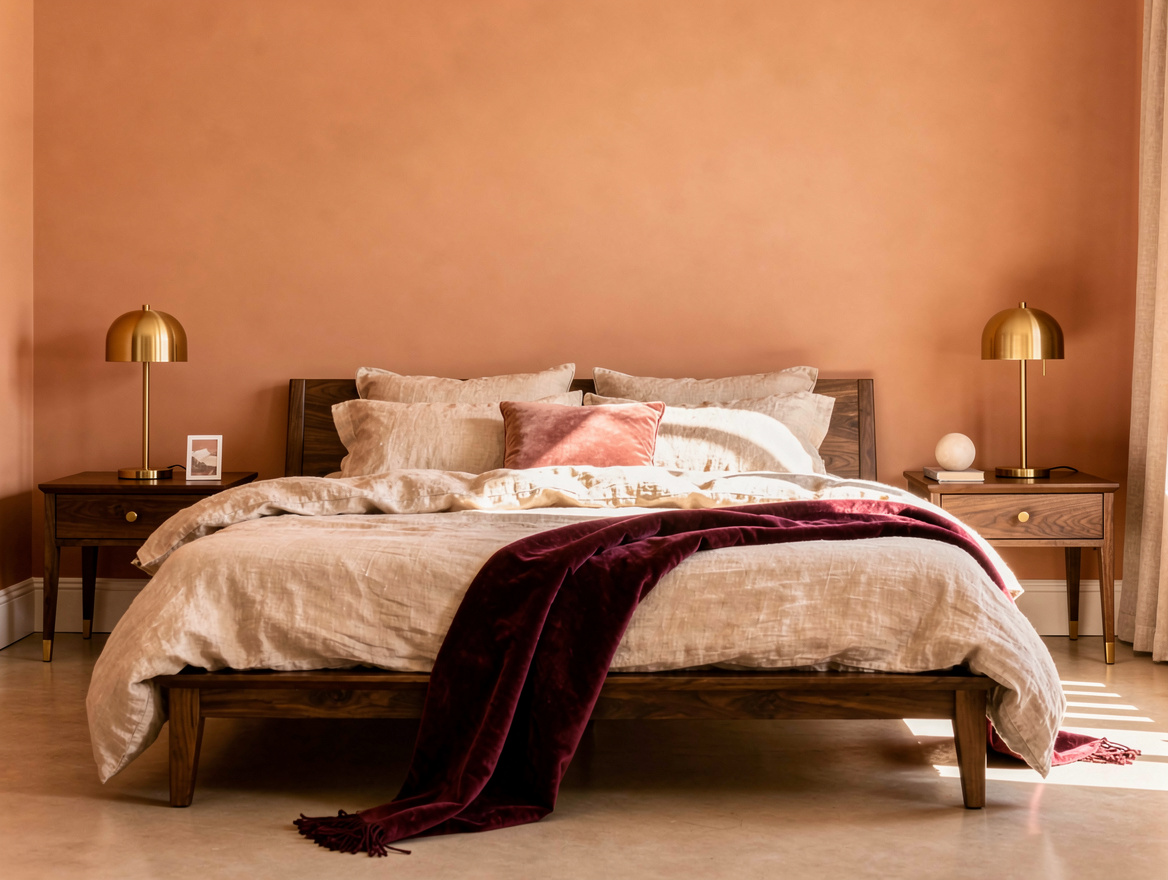
Bright white bedding can make peach look sharper than intended. Start with ecru linen bedding or oatmeal cotton, then add one small accent in muted olive, rust, or burgundy.
The refined 1970s direction works particularly well in bedrooms with good daylight: deeper rosy peach, creamy sheets, smoked glass, and restrained walnut. Skip piles of decorative pillows, because this palette already has plenty of personality in the walls and wood grain.
Match the Lights to the Wood Tone
Cool chrome lamps can make walnut look redder and peach look pinker. Choose black or aged-brass bedside sconces from Wayfair or Target for a modern focal wall with cleaner contrast.
Keep light shades warm white, especially near a headboard wall. A pair of properly placed reading lights is more convincing than a crowded gallery wall, and it lets the peach-and-walnut pairing remain the main event.
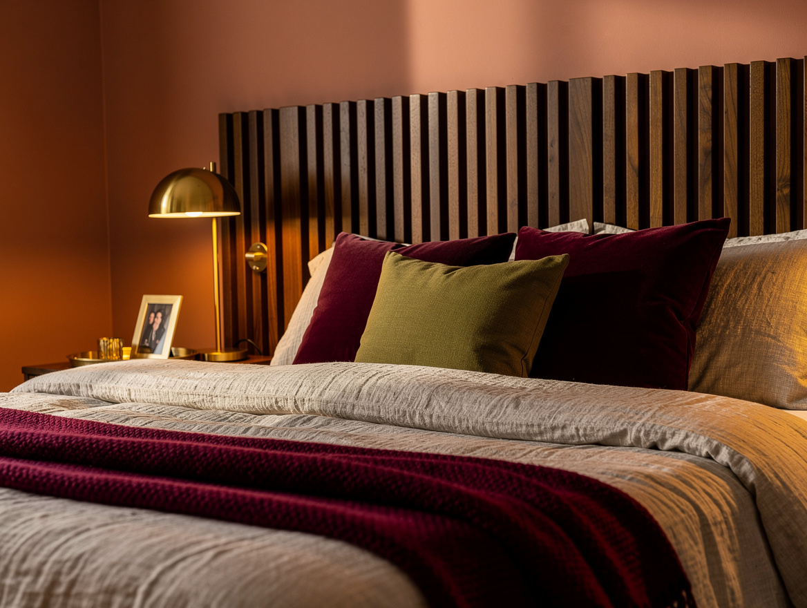
Begin with one paint sample beside your largest walnut piece, then check it in daylight and at night. That small test will settle the entire bedroom direction before you buy another pillow or panel.
Mia Carter writes about small-space living and budget home makeovers. She has restyled three rentals and tests most ideas in her own 45 sqm flat.