A roughly 12-by-16-foot living room can feel oddly unsettled when its paint ignores the sofa, floor, and daylight. I’ve watched a warm camel sectional turn pink against the wrong beige, even before a single pillow entered the room.
For 2026, the strongest palettes lean earthy and softened: warm whites, mushroom browns, muted greens, gray-blues, terracotta, and selective hits of peach or mustard. The common mistake is choosing a color chip in isolation, then asking the room to make it work.
Ground Warm Neutrals With Texture
Warm off-white, greige, and soft mushroom brown give an organic-minimal living room more depth than stark white ever could. Pair a Behr Swiss Coffee wall with pale oak, linen upholstery, and one matte-black frame for a room that feels settled.
Skip cool gray when the floor, sofa, and daylight already read warm. A flat or eggshell finish helps a plaster-textured wall look soft while hiding the small scuffs that a busy living room collects.
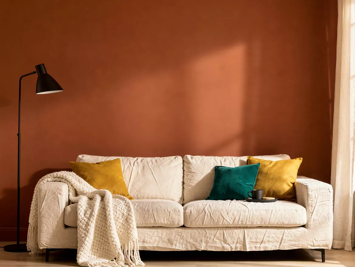
Limit Terracotta to One Anchoring Wall
Terracotta works best when it has a job: grounding the wall behind the sofa or defining a television zone. Use terracotta paint on that single plane, then keep surrounding walls sandy cream so the color has room to breathe.
Designers are moving away from coating every surface in rust. A nubby ivory rug, medium-toned wood, and a matte-black floor lamp keep this palette warm without pushing it into a themed look.
Test Muted Green Through the Day
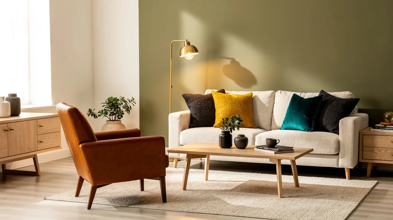
Olive, deep sage, and dusty green can make a living room feel connected to the outdoors, but they change dramatically with exposure. Paint a large sample of Benjamin Moore Saybrook Sage before deciding, then check it in morning shade and evening lamplight.
Give the color weight with cognac leather, dark wood, or aged brass. A leather accent chair prevents a muted green wall from feeling overly precious or flat.
Use Gray-Blue to Soften Bright Rooms
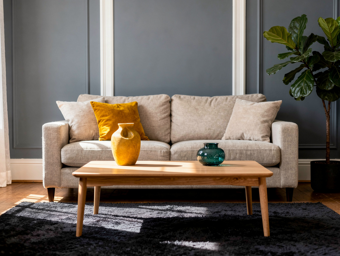
A softened blue-gray is a smart replacement for plain white in a sun-filled living room. Choose a dusty blue wall color with gray in its undertone, then add warm white trim and light oak so the room stays inviting.
Don’t reach for a crisp nautical blue unless the room already has a coastal point of view. A faded teal accent wall and an oatmeal linen sofa create calm with far more staying power.
Reserve Dark Paint for Architectural Drama
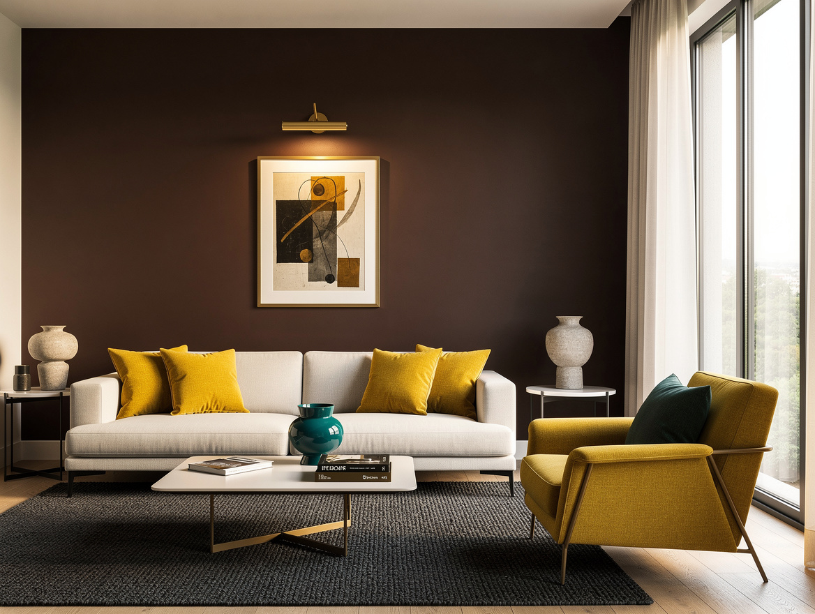
Charcoal, espresso brown, and near-black paint can make a large room look more intentional, especially behind a sofa or built-in shelving. A deep espresso accent wall needs contrast nearby: warm off-white walls, substantial windows, or a ceiling that feels comfortably high.
Small dim rooms rarely benefit from four dark walls. Bring in a brass picture light or pale upholstered seating first, because a dark shade should frame the room’s best features rather than erase them.
Keep Bold Accents Below the Ceiling Line
Mustard, plaster pink, peach, and muted teal are having a lively moment, but designers generally treat them as accents. Follow the familiar 60-30-10 balance loosely: let the bold mustard paint cover one niche, one wall, or a compact fireplace surround.
A whole room in a high-energy shade gets tiring faster than most people expect. Repeat the color in a Target velvet pillow or small artwork, then let warm neutrals carry the larger surfaces.
Begin with the wall your eye lands on from the doorway, and sample only two or three shades there. Let the room’s existing wood tone and natural light make the first decision for you.
Mia Carter writes about small-space living and budget home makeovers. She has restyled three rentals and tests most ideas in her own 45 sqm flat.