
A dressing area can disappear inside a bedroom even when the furniture is perfectly useful. A 70-centimeter-wide table needs a visual address, and color can provide one without taking away floor space.
Paint the wardrobe wall, wrap a recess in a deeper shade, or build a full-height panel behind the mirror. The convincing schemes follow the room’s furniture and architecture, while arbitrary stripes usually make the layout feel accidental.
Frame the Dressing Table From Floor to Ceiling
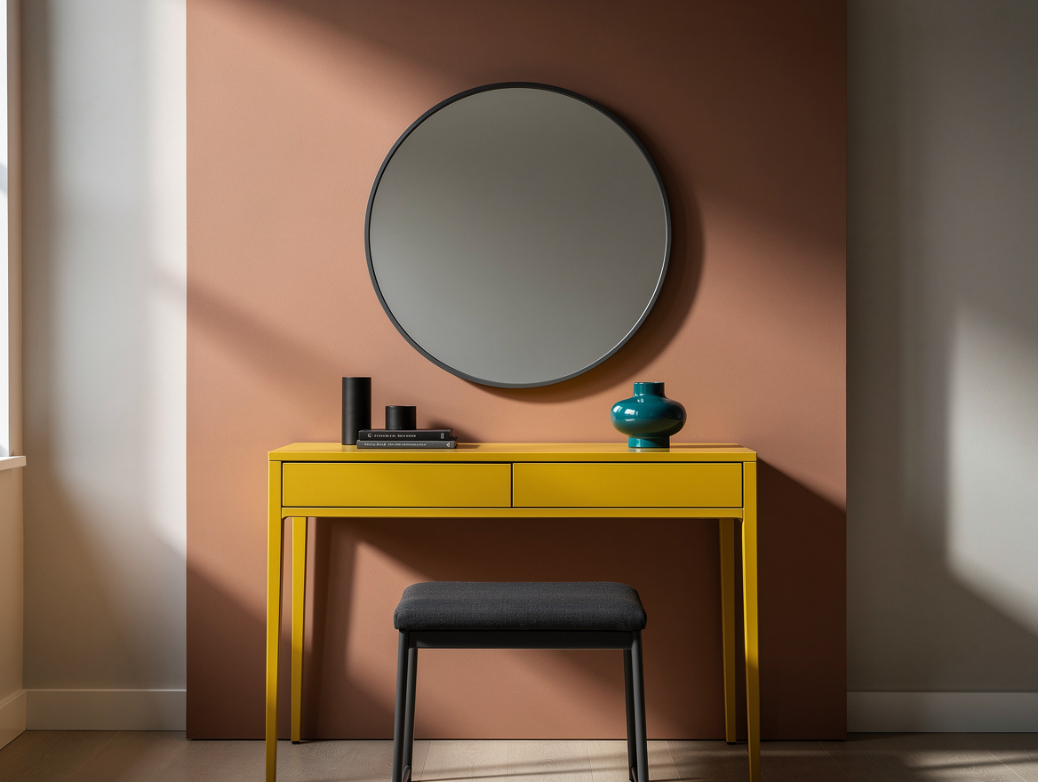
Keep the sleeping area in warm white paint, then create a floor-to-ceiling rectangle behind the dressing table in muted blue, clay, or olive. The color should surround the mirror and table closely enough to read as a dedicated station, rather than a random painted stripe.
An IKEA BRIMNES dressing table is about 70 centimeters wide, 42 centimeters deep, and 77 centimeters high, with a listed price of €89.99 in the supplied retail example. Those proportions leave a useful painted margin on either side of a suggested 100- to 120-centimeter panel.
Allow roughly 90 centimeters in front for the stool and movement, then test the arrangement with the stool pulled out. A washable wall finish is the practical choice here because makeup, dust, and chair marks collect quickly around a daily-use station.
Wrap a Darker Shade Around an Alcove
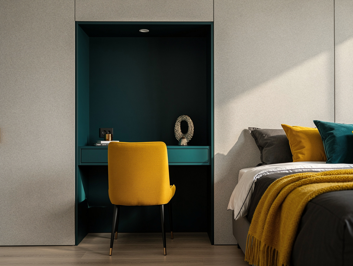
Use the architecture as your guide when the bedroom already has a recess. Paint the back wall and both side returns in a deeper blue or green, leaving the main bedroom lighter so the dressing zone gains a clear visual edge without a new partition.
A documented bedroom example pairs a dark-painted dressing alcove with a wallpapered bed wall, allowing each function to feel separate while the room remains open. Continue the darker shade onto the alcove ceiling if you want the recess to read like a small room within the room.
For a suggested alcove about 180 centimeters wide and 150 centimeters deep, place a 40- to 45-centimeter-deep dressing table against the back wall and keep the center floor open. This is the strongest approach when the room needs definition but cannot spare the space or cost of construction.
Stop the Color at the Architectural Opening
Paint should end where the architecture changes, not where a tape line happens to look convenient. Stopping the olive or clay wall color exactly at the alcove opening makes the boundary feel intentional and keeps the rest of the bedroom visually calm.
In a flat wall without a recess, align the color with the wardrobe, a column, or the edge of a full-height panel. A wardrobe wall is especially useful because it already belongs to the dressing function and gives the color a logical place to finish.
Avoid a horizontal stripe across the middle of the bedroom unless a strong architectural feature supports it. The better rule is simple: let furniture and structure decide the shape, while color supplies the separation.
Keep the Bed Wall on Its Own Color Logic
Give the sleeping zone a different treatment so the two functions do not compete. A soft wallpapered bed wall can sit opposite a darker painted dressing area, creating contrast through material as well as color.
Choose one quiet connection between the zones, such as a shared warm undertone or matching metal on the mirror and bedside lighting. A brushed brass mirror frame can repeat across both areas without making them look identical.
The dressing wall should carry the stronger color when the goal is definition, while the bed wall should support rest. I would rather see one deep, controlled alcove beside restrained wallpaper than several unrelated accent walls fighting for attention.
Measure the Clearance Before Choosing the Table
Color only works when the furniture fits comfortably inside its boundary. In the suggested 150-centimeter-deep alcove, the 42-centimeter depth of the IKEA BRIMNES table leaves approximately 108 centimeters between its front edge and the opening before the stool is considered.
Pull the dressing stool out during the layout test and check that the bedroom path remains clear. A painted zone that forces people to turn sideways or brush past the mirror will feel cramped, no matter how polished the shade looks.
Keep the central floor open in a suggested 180-by-150-centimeter recess rather than filling both side walls. That restraint gives the darker color room to define the area without making the bedroom feel packed with furniture.
Repeat One Finish to Make the Boundary Hold
Repeat one physical detail inside the dressing zone so the painted shape feels connected to the objects it contains. A black metal mirror paired with a black light fixture creates a quiet frame, while a white table can remain visually light against a deeper wall.
Use the same logic with a natural wood stool and a small wood tray, but stop before the area becomes a separate decorating theme. The color boundary should do most of the work.
For planning, allow roughly €150 to €250 for the painted panel, the IKEA table, and basic painting supplies, excluding a separate stool or added lighting. The total is a DIY allowance rather than an installation quote, so put the first dollars toward clean edges, adequate lighting, and the shade you will live with daily.
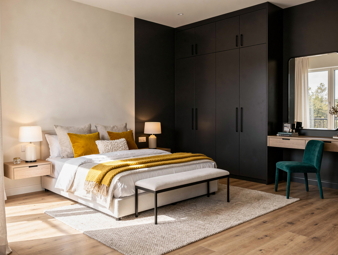
Start by marking the table, mirror, and stool on the floor before opening a paint can. Once the clearance works, let the strongest color stop at that footprint and keep every extra finish quiet.
Mia Carter writes about small-space living and budget home makeovers. She has restyled three rentals and tests most ideas in her own 45 sqm flat.