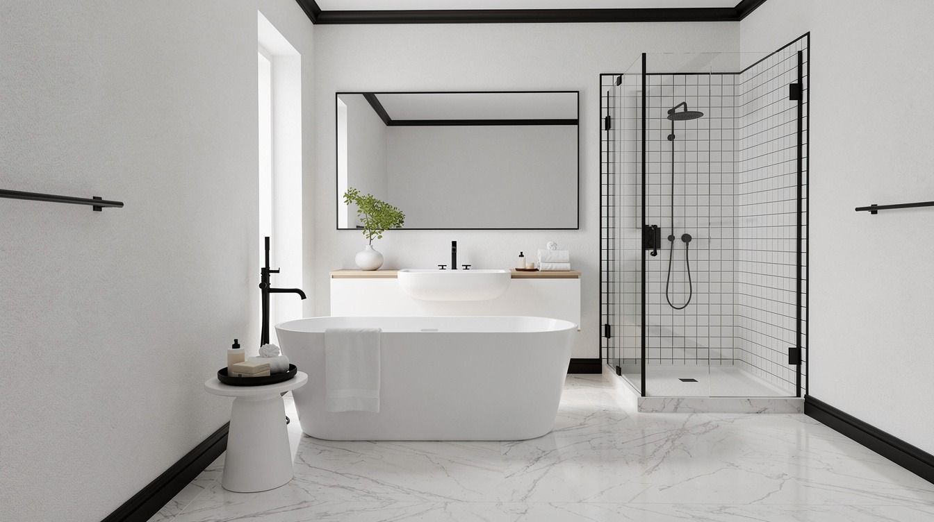
How to design a black and white bathroom that never fails starts with contrast you can control, and a typical refresh can begin around $200. I learned that after trying to warm up a flat white bath with baskets and candles while the bones were still wrong. The room stayed cold until the lines got sharper, the finishes got quieter, and the palette stopped arguing with itself. That is the fix.
Don’t overthink: Anchor the vanity with matte black hardware.
Before You Start: The Three-Surface Rule
Before you buy a faucet or roll out a mat, decide where your black will live on just three surfaces: trim, metal, and one grounding plane. If you spread black across seven little things, your eye keeps hopping and your bathroom feels fussier, not cleaner. I like to sketch it first because you can see fast whether your contrast is landing on the walls, the floor, or the vanity zone.
The budget reality most people need up front is simple. A cosmetic pass gets you farther than you’d think, especially if your vanity is solid and your layout already works. If you are weighing a bigger redo, the cost jump usually comes from tile labor and plumbing access, not from the paint itself.
- Start with crisp white walls and black trim
- Anchor the vanity with matte black hardware
- Lay a checkerboard floor under white fixtures
- Frame the mirror in slim black metal
- Paint the ceiling black for quiet drama
- Choose white tile with dark grout lines
- Run black wainscoting around the lower walls
- Hang globe sconces against a black backdrop
- Build contrast with a white freestanding tub
- Add a black faucet to a white sink
- Style open shelves with black and white towels
- Soften the palette with warm wood accents
- Repeat black lines through shower door framing
- Ground the room with a striped bath mat
- Finish with white art in black frames
1Start with crisp white walls and black trim
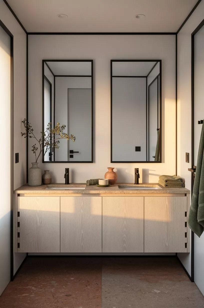
Paint first, because white walls do the heavy lifting in a black white restroom. The cleanest version is a soft white with a little body, not a blue hospital white, and I keep coming back to Benjamin Moore White Dove OC-17 for that reason. Against slim black trim, it reads bright but still calm, especially when a cerused white oak vanity is sitting in the room and you want the wood grain to stay visible.
You also need the black line to feel deliberate. Keep it on the casing, window trim, and door edge, then stop.
If you’re tempted to paint every shelf bracket and random accessory black too, I’d skip that, because scattered contrast looks busy long before it looks tailored. The part that worked for me was treating trim like eyeliner for the room: sharp, narrow, and done on purpose.
If you like a darker color story nearby, this look sits well beside why navy is the bathroom color that never goes out of style.
2Anchor the vanity with matte black hardware
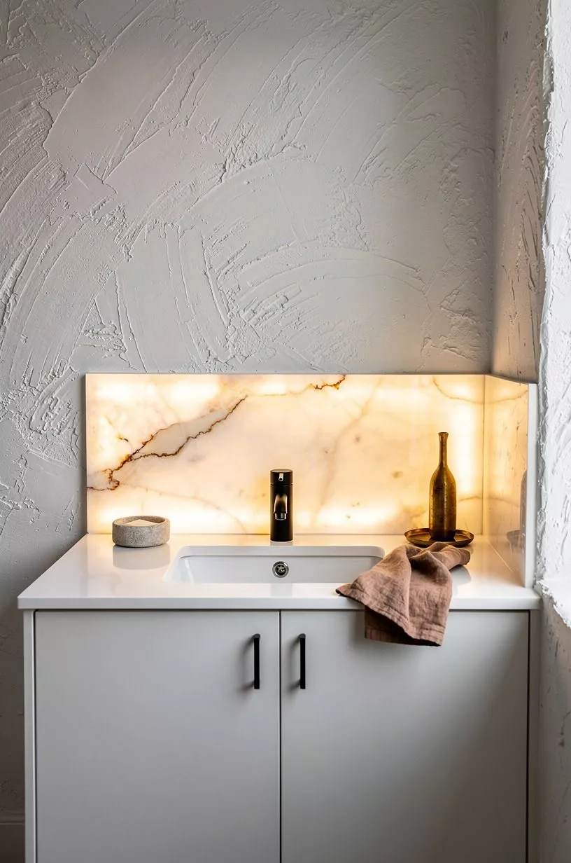
Your vanity should feel planted, and matte black pulls are the quickest way to do it. In a bathroom with black color bathroom details, a white cabinet can drift into the background unless the hardware gives it a little weight. I prefer straight bar pulls or a simple tab pull over ornate knobs because the room already has plenty of visual action from the contrast.
Watch the scale here. On a 32 to 36 inch vanity height, oversized pulls can make the cabinet feel toy-like, while tiny ones disappear once towels and bottles move in.
I made that mistake once, and the vanity looked undecided from every angle. A quiet black handle centered on each drawer front is enough.
You want the cabinet to read as one clean block, not a collection of parts. For more examples of contrast done right, I still like these black and white bathroom designs that feel timeless and expensive.
3Lay a checkerboard floor under white fixtures
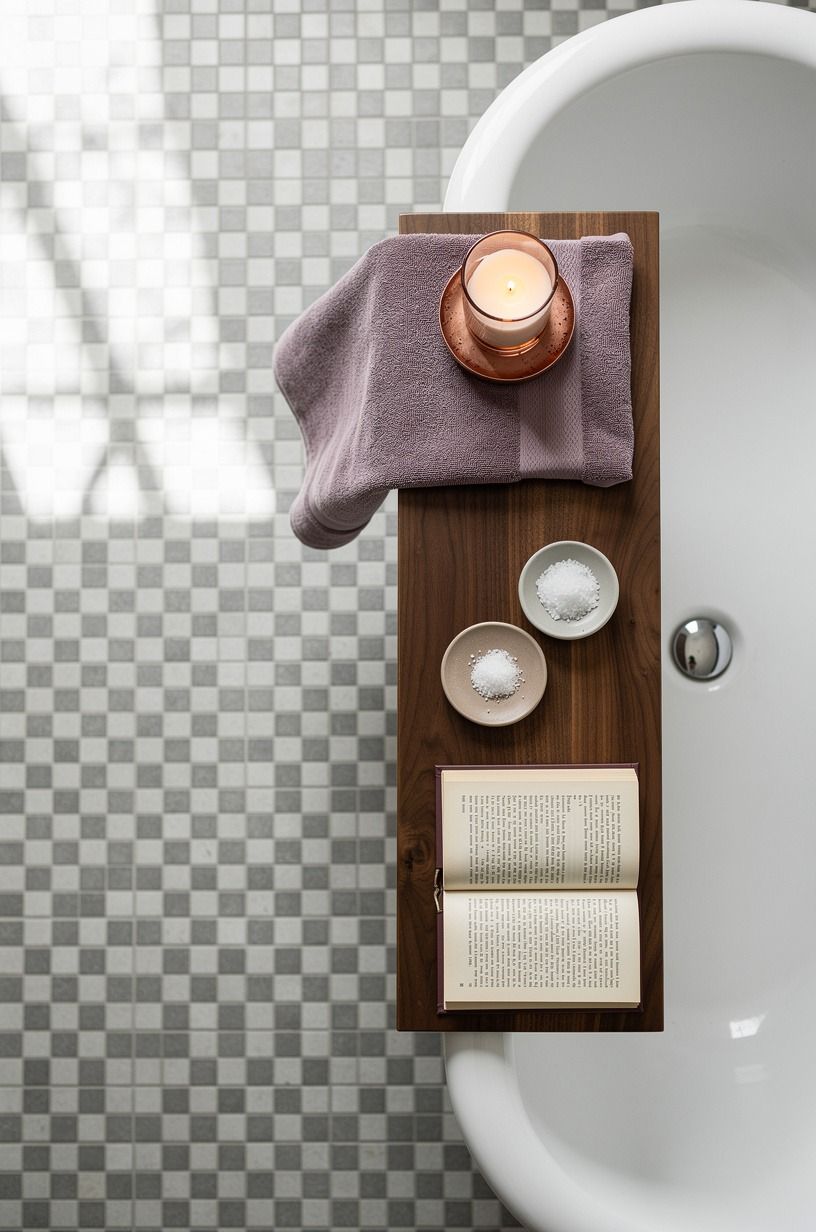
A checkerboard floor does more than add pattern. It gives your tub, pedestal sink, and toilet something crisp to sit on, which matters in small full bathroom ideas black and white rooms where every object is visible at once. I like a classic square layout under bright white fixtures because the floor becomes the rhythm while the porcelain stays quiet.
Keep the scale honest. In a tight bath, huge tiles can feel theatrical in the wrong way, while tiny checks get noisy fast. Medium checks usually hold the room together, and they look best when the white squares relate back to the wall color instead of fighting it.
But don’t mix a warm cream floor with a stark paper white sink unless you want the mismatch to shout at you all day. If your plan includes softer lighting above that floor, this soft white lighting guide is worth a quick look.
4Frame the mirror in slim black metal
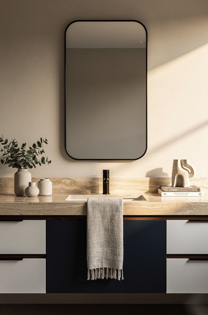
A mirror needs an outline. In a bathroom with black details, black metal framing gives the vanity wall a center point without adding bulk, and that’s why a slim frame beats a chunky farmhouse one here.
You want definition, not weight. The reflection already doubles the room, so the frame should act like a fine line around it.
I also think this is where people overspend for no reason. A clean metal frame looks expensive because of proportion, not because it came from a luxury showroom.
If your vanity has a strong wood note underneath, a narrow frame keeps the balance between warm and crisp. Too-thick black metal starts bossing the room around, and then your faucet, sconces, and trim have to compete.
That is not the game. It should feel composed the second you walk in, and these black and white bathroom examples show the same restraint.
5Paint the ceiling black for quiet drama
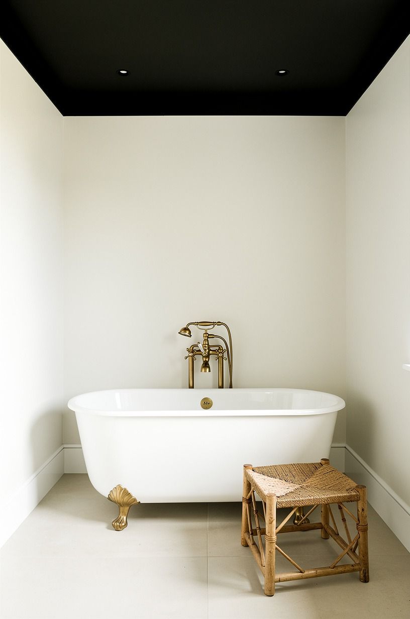
This is the move people hesitate over, but a black ceiling can calm a bathroom down if the walls stay white and the fixtures stay simple. In a room with a centered tub, the dark ceiling reads like a lid that pulls the composition together. I would not do it in every bath, though.
If your ceiling is chopped up with vents, random soffits, and a bad patch job, dark paint will expose every one of them.
When the ceiling plane is clean, the result is good. Think Farrow & Ball Hague Blue No.30 depth, but taken all the way to black so the white walls feel brighter by comparison.
And yes, you need good bulbs or the room dies. Soft globes, not icy LEDs.
I learned that the hard way in a powder room that looked moody at noon and grim by dinner. If you’re nervous, study how contrast is handled in these black and white bathroom layouts before you open the paint can.
6Choose white tile with dark grout lines
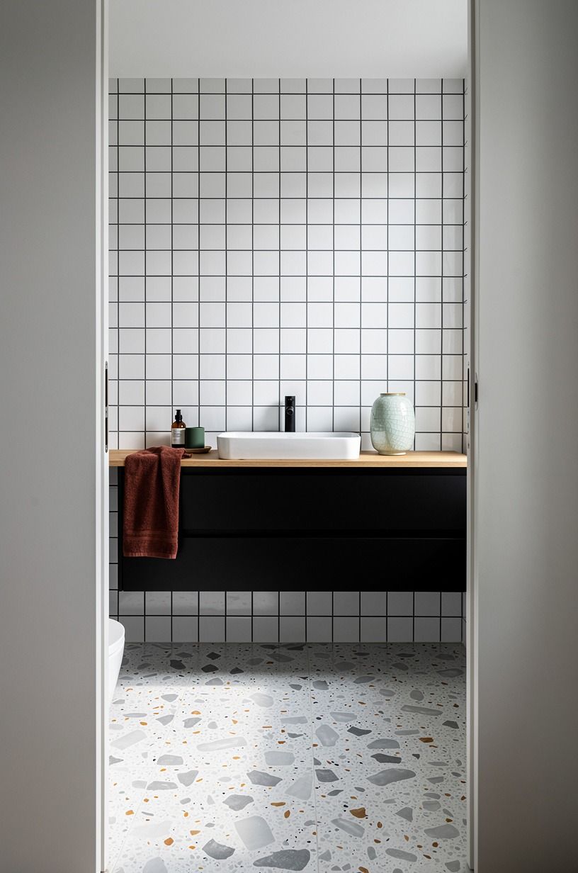
Dark grout is the part nobody respects enough. On white tile, it draws the pattern for you, and that means a plain field of subway or square tile suddenly has structure.
Through a doorway, you notice the grid first, then the light bouncing off the surface. That’s why it works so well in a black white restroom that needs shape but doesn’t need another material.
You do need restraint. I’d skip dramatic marble-look tile with loud veining if you’re already planning dark grout, because the pattern starts competing with the joints.
A simple subway tile at about $2 to $10 per square foot gives you more mileage than a fussy option here, while zellige tile at $15 to $35 per square foot buys texture if you want a softer reflection. Pair either one with an oversized-chip terrazzo floor only if the terrazzo stays pale and the chips stay spare.
Otherwise the room starts talking too much, which is why I keep these black and white bathroom references close.

7Run black wainscoting around the lower walls
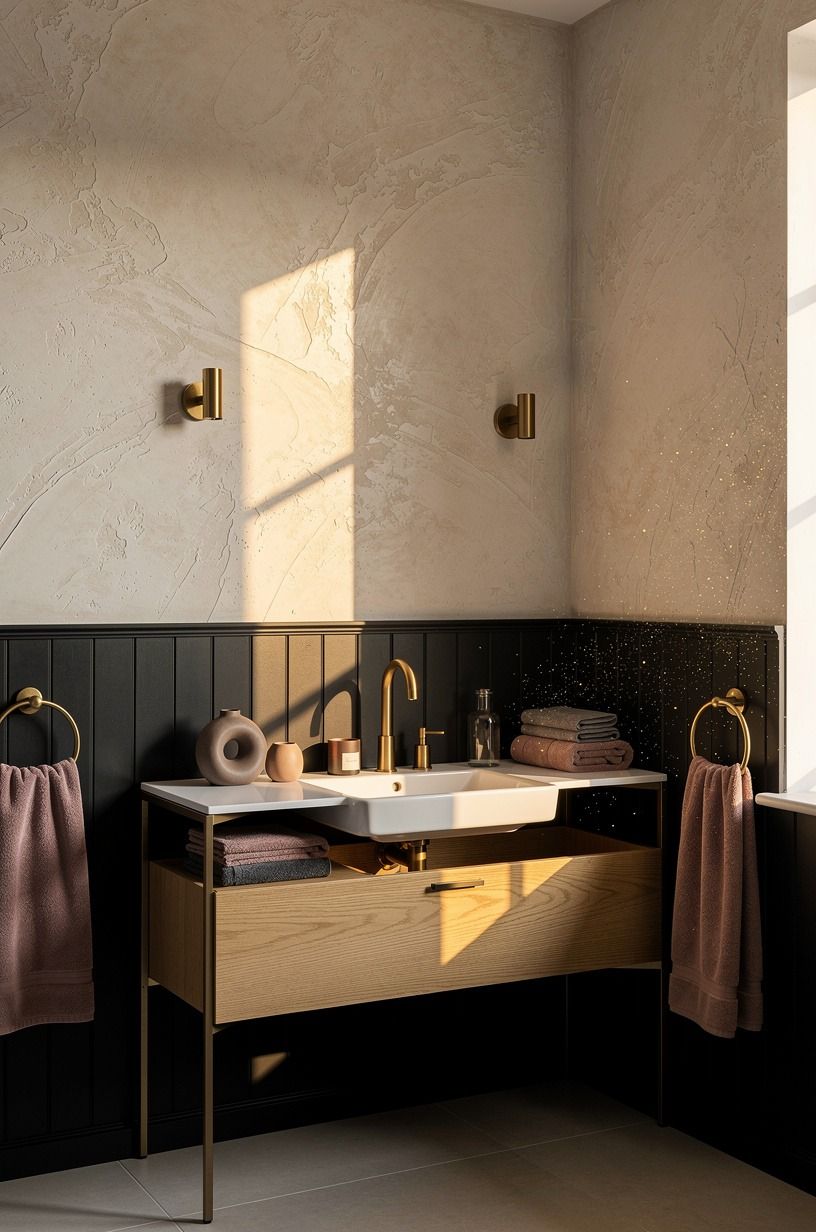
Black wainscoting is one of those moves that fixes the lower half of the room fast. You get protection where splashes happen, a strong horizontal line, and a grounded base under all that white. In small full bathroom ideas black and white layouts, that lower band can make basic walls look finished even when the architecture is boring.
The key is height. Keep the cap line low enough that your white upper wall still carries the light, especially if you don’t have a window doing much work.
I like a simple board-and-batten look in Sherwin-Williams Sea Salt SW 6204 elsewhere in the house, but here I’d stay committed and take the lower paneling black. But don’t add busy wallpaper above it just because you can.
The contrast already has a voice. Let it speak in one sentence, not six.
If you want another color route for a neighboring bath, navy can do a similar grounding job.
8Hang globe sconces against a black backdrop
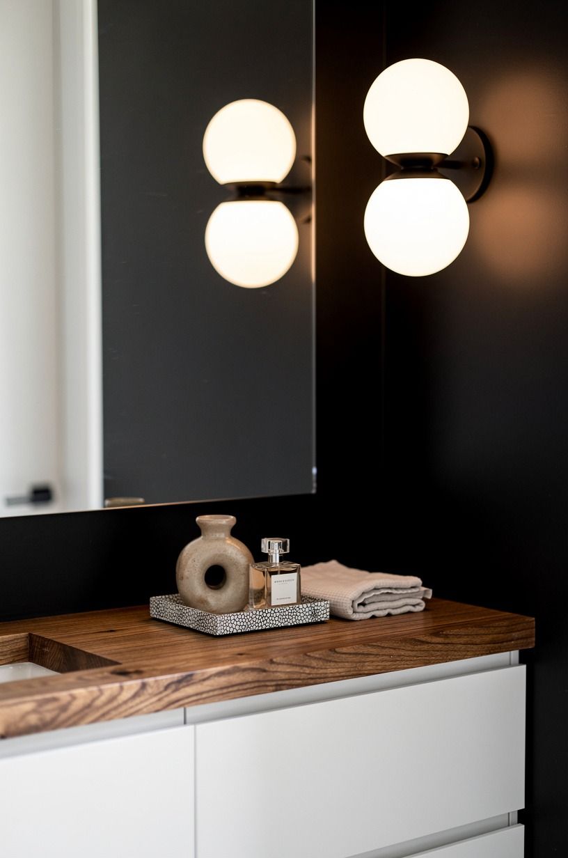
Warm globe sconces against a dark wall are a cheat code for softness, and yes, you notice them before anything else. The glow spreads in a little amber halo, then stops right at the vanity edge, which keeps the room intimate instead of flat. I prefer frosted globes with simple black backplates because clear glass can get sharp fast in a hard contrast palette.
This is also where lighting temperature matters more than fixture price. You can hang an expensive sconce and still ruin the mood with a bad bulb. I would not go blue-white in a black and white bath, ever.
The room turns clinical in seconds. Use the lights to blur the edges a little, especially if the backdrop is fully dark and the vanity is bright white.
For bulb direction and placement, this soft white lighting piece lines up with exactly what you want here. Huge difference!
9Build contrast with a white freestanding tub
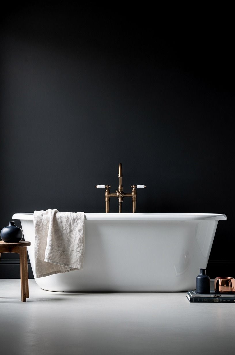
A freestanding tub should look like it was dropped into the room on purpose, and white is the right call when the walls have gone dark. Against black, the silhouette gets sculptural without needing a clawfoot flourish or a fancy finish. Standard size still works brilliantly here too: 60 by 30 inches is enough to read generous in most bathrooms if the surrounding floor stays open.
You do not need a feature tub with chrome feet and drama baked in. I’d skip that.
A plain oval holds more tension against a dark wall because the shape is simple and the contrast does the talking. And if your floor-level view catches the tub, baseboard, and wall line all at once, the room suddenly feels taller than it is.
That is the kind of visual payoff you cannot fake with accessories. For more on this sort of contrast, these black and white bathroom layouts are useful.
10Add a black faucet to a white sink
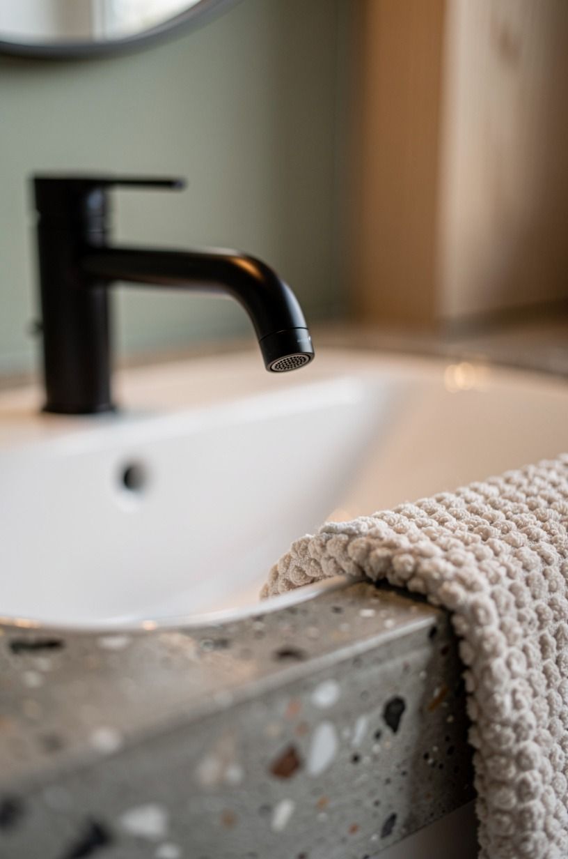
This is the hero detail in close view, and that’s why finish quality matters. A matte black faucet over a white basin gives the sink a focal point the second you step in, especially if the counter is a poured concrete slab or a pale top with almost no movement. You want that silhouette to look crisp from three feet away, not dusty or chalky.
I also think faucet shape matters more than brand prestige. A bent neck with too many curves looks fussy in a black color bathroom.
A simple arc or straight spout feels cleaner. If you’re shopping ranges, this is the money picture: a brushed brass faucet usually lands around $120 to $450, so black often feels like the smarter spend when you want impact without adding warmth in the wrong place. But buy the best finish you can touch, because cheap black plating is the first thing to look tired.
If you want a full room view around that detail, these black and white bathroom designs help.
11Style open shelves with black and white towels
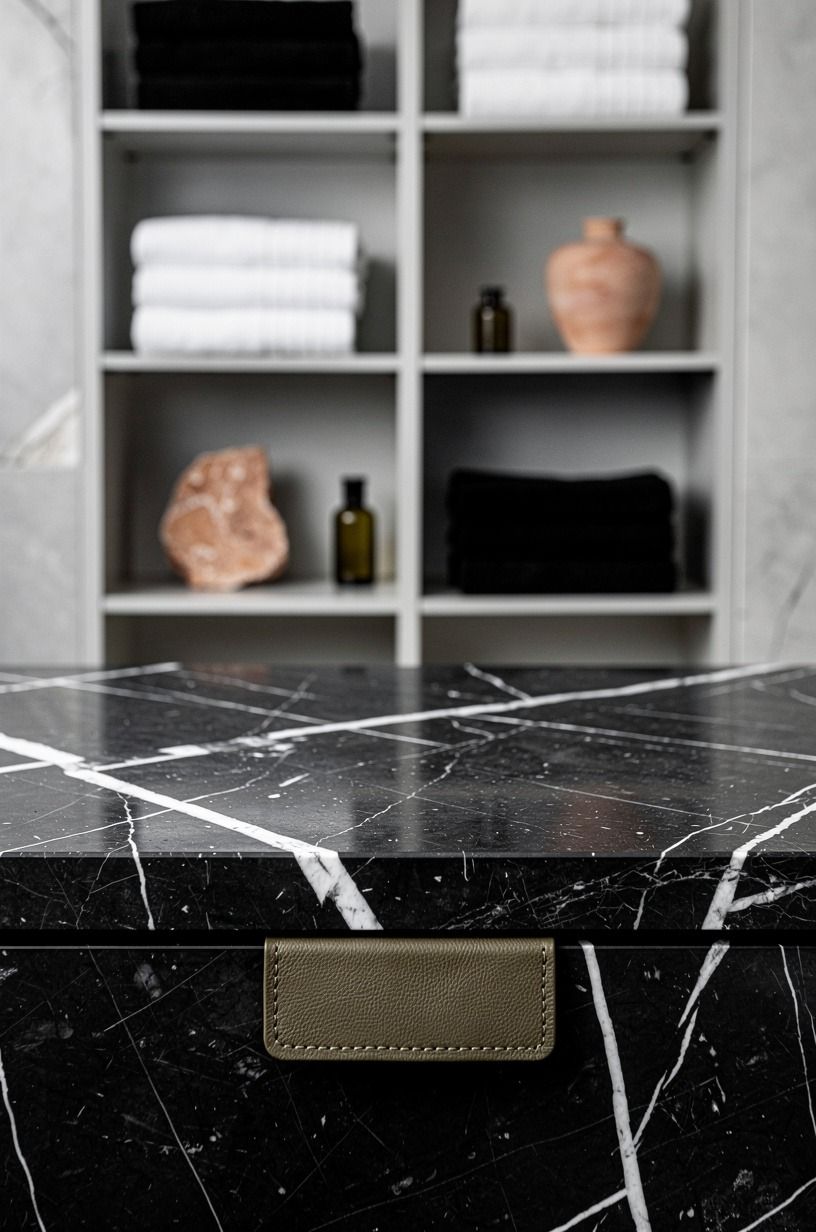
Open shelves need editing or they turn into retail storage. In a black and white bathroom, stacks of 600gsm Turkish cotton towels give you softness without changing the palette, and the contrast looks even better when the shelf sits above a Nero Marquina marble surface with white veining. The room gets texture, not clutter.
Fold fewer pieces than you think you need. Two white stacks, one black stack, maybe a small lidded jar.
Done. I used to overfill open shelves because empty space made me nervous, but empty space is what makes the towels look intentional.
And if you add one dark hand towel beside two white bath towels, your eye reads balance right away. Want a faster way to judge whether the mix is working?
Compare it with the restraint in these black and white bathroom examples.
12Soften the palette with warm wood accents
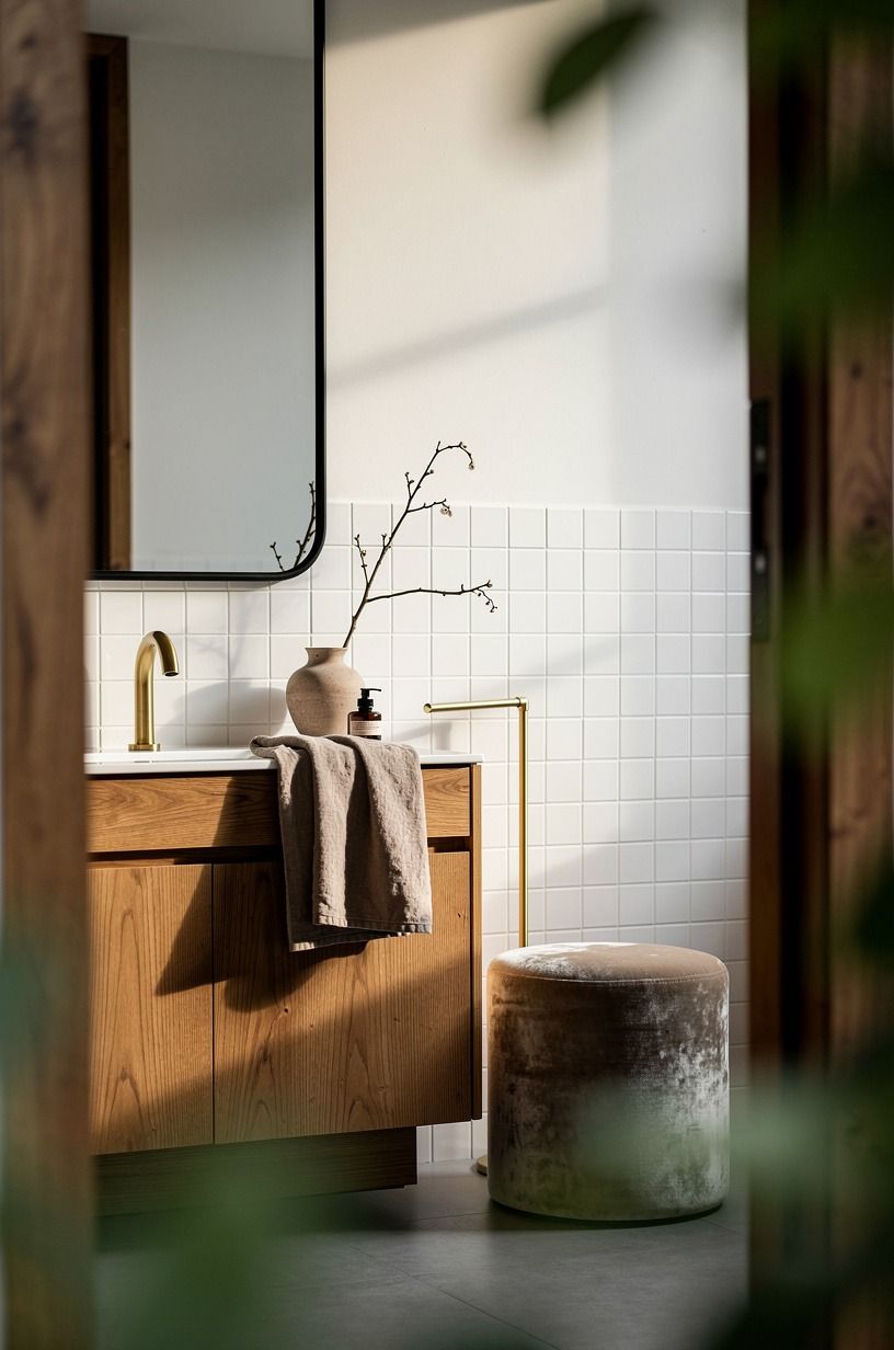
This is where the room starts feeling lived in.
13Repeat black lines through shower door framing
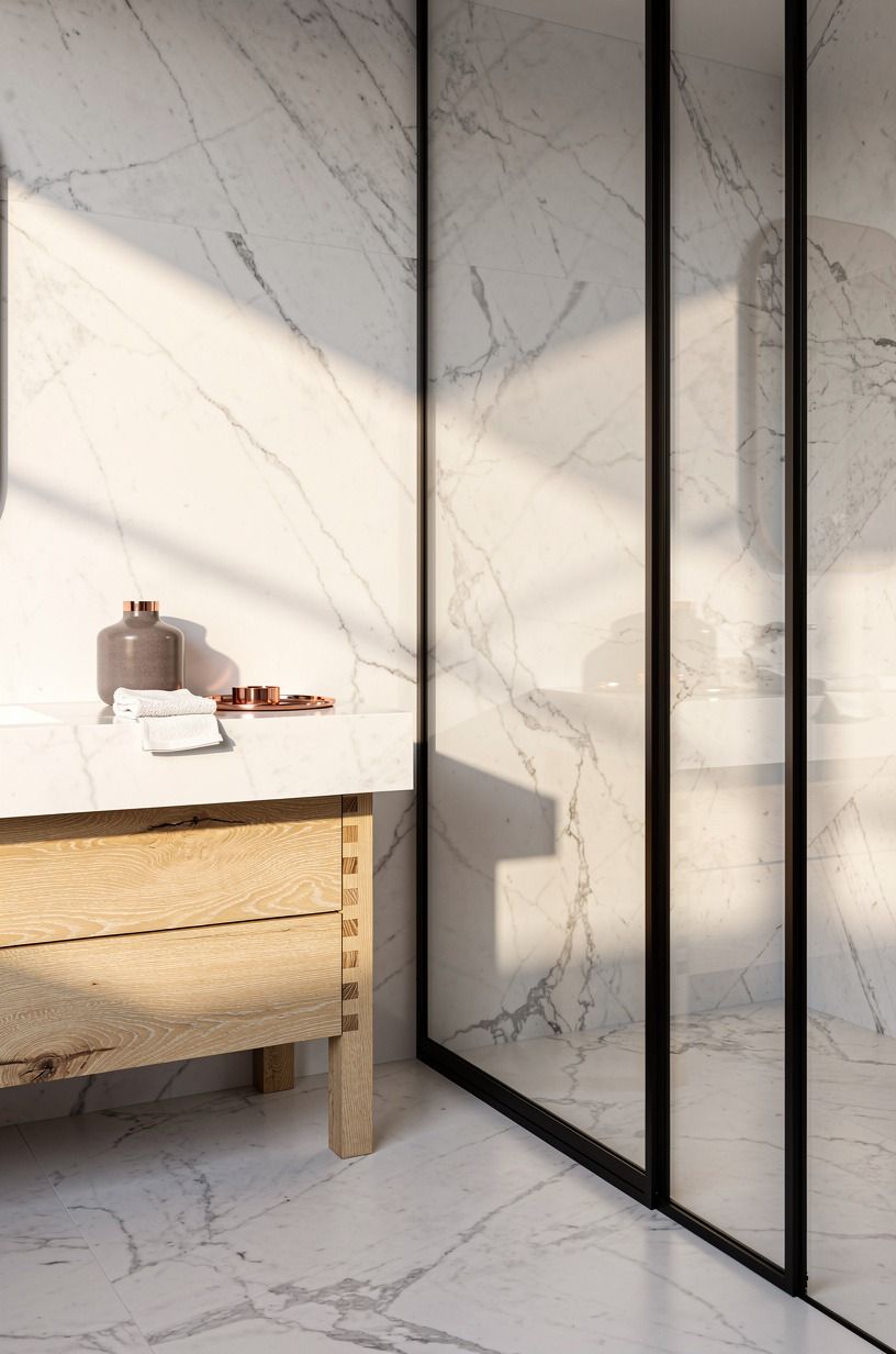
Shower framing should echo the rest of the room, not show up like a separate project. Black metal around the glass repeats the trim, mirror, and faucet notes, so your eye keeps finding the same language from one side of the bathroom to the other. In a wide-angle view, that repetition is what makes the room feel designed rather than assembled.
You also need the proportions to make sense. A comfortable shower starts around 36 by 36 inches, and dark framing can make that footprint feel tighter if the mullions get too busy.
So keep the door lines slim. I’d rather see one confident perimeter frame than a faux factory grid that cuts the glass into tiny boxes.
Why make a clean room feel crowded? If you like contrast but want a softer neighboring scheme, navy solves the same problem with less edge.
14Ground the room with a striped bath mat
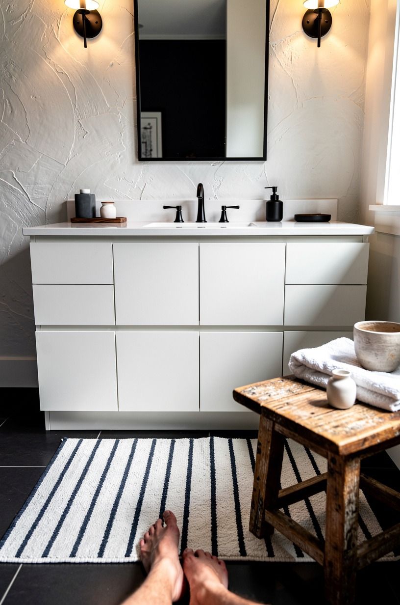
A bath mat sounds minor until you step into the room and realize it’s the one thing your feet and your eyes meet at the same time.
15Finish with white art in black frames
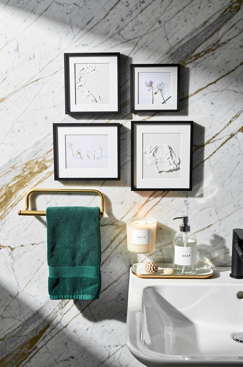
Art should be the last move because it tells you what the room still needs. In a bathroom with black trim and white surfaces, simple white artwork in black gallery frames gives you one last repeat of the contrast without stealing attention from the vanity or tub. Over a pale stone or Calacatta Gold marble top, the black frame edges look especially crisp.
Keep the subject matter quiet. Abstract line work, architectural sketches, even a tonal print.
I wouldn’t hang busy color photography here unless the rest of the room is almost severe. You want the frames to echo the mirror and shower lines, not introduce a new story.
And yes, spacing matters. Lay the pieces out on the counter first, move them around, then hang.
That extra ten minutes saves a lot of crooked regret. And these black and white bathroom ideas show how quiet art keeps the room sharp.
My Black-and-White Decision Ladder
What makes this palette last while so many bathroom looks date out in two years? It’s not because black and white is neutral.
Plenty of neutral rooms still die on contact. It’s because the contrast gives you a built-in hierarchy: light bounces off the white, shape gets drawn by the black, and then every warm note you add has a job instead of showing up as filler.
I have messed this up before by chasing mood too early. I once bought the towels, the tray, and the mirror before I settled the wall color and trim, and the room felt like three bathroom ideas fighting in a trench coat. That is why I push order so hard now.
Paint first. Lines second.
Glow third. Texture last.
If the bones aren’t right, every accessory becomes a negotiation.
The honest money question matters too. I’d spend first on the surfaces you can’t stop seeing: the wall color, the mirror outline, the floor pattern if the floor is exposed, the faucet if it’s right at eye level. I wouldn’t burn the budget on a fancy vessel sink unless the rest of the room is brutally simple, because statement sinks often want attention the palette has already claimed.
And you don’t need expensive black everything. You need black in the right places.
The rooms that feel best to me have one more thing in common: warmth enters as relief, not as decoration. A teak stool.
A stack of thick towels. A pale oak vanity under hard trim lines.
That is why black and white does not fail when other trends do. It leaves room for you. Your habits, your light, your clutter level, your morning face, all of it.
The palette is disciplined, but it isn’t stiff. That’s a rare combo, and these black and white bathroom ideas make that easy to see.
What People Always Want to Know
What is the best Why Black and White Is the Bathroom Combo That Never Fails for a small bathroom?
A white wall, black trim, and one grounded floor pattern is the best place to start. The payoff is clarity because the room feels organized fast. I like a slim vanity and a simple mirror, and these black and white bathroom ideas show why restraint wins.
Where can I buy Why Black and White Is the Bathroom Combo That Never Fails pieces on a budget?
Budget shopping works well here because clean lines matter more than label flex. I check IKEA, Target Threshold, and Wayfair for mirrors, pulls, and mats, then I look at Facebook Marketplace for stools or framed art. You can save real money if the silhouette is good and the finish is simple.
How much does a Why Black and White Is the Bathroom Combo That Never Fails makeover cost?
About $200 to $1,200 covers paint, mirror, faucet, and textiles in a typical cosmetic refresh. That’s enough to change the room if your layout and plumbing stay put. Once you add new vanity work, tile labor, or shower changes, you’re usually moving into the $3,000 to $9,000 range.
Can I create a Why Black and White Is the Bathroom Combo That Never Fails on a budget?
Yes, and you do not need a full demo. Start with the cheap wins: paint the trim black, swap the mirror frame, add a striped mat.
White towels. One wood stool.
Better bulbs. Those moves cost less, and they still change what you notice first when you walk in.
Big payoff!
Is a Why Black and White Is the Bathroom Combo That Never Fails worth it in a small space?
Yes, especially in a small bathroom. The contrast helps the room read cleaner because every surface has a clear role. Keep at least 21 inches of clearance in front of the toilet if you can, then let the black details stay skinny so the footprint doesn’t feel pinched.
Is Why Black and White Is the Bathroom Combo That Never Fails a good idea for a rental?
Yes, if you keep the changes reversible. Renters can still get the look with peel-and-stick floor squares, removable art, tension-rod textiles, and swapped hardware you store for move-out day. And if the bath feels harsh, borrow the bulb advice from this soft white lighting guide.
Where I’d Start First: The 60-30 Contrast Rule
If I had to pick one step, I’d start with crisp white walls and black trim. That line tells every other choice where to sit, and your mirror, faucet, floor, and towels stop improvising. Pin this direction for later and build the room from the shell inward.