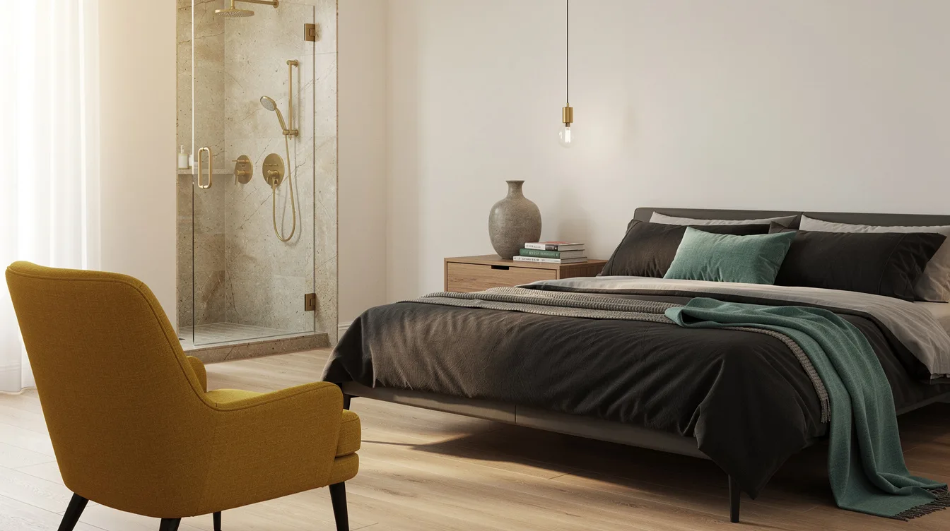
The bedroom may feel calm until you open the door to an attached bathroom lined with cool gray tile and bright white fixtures. That hard shift can make a 54-inch upholstered bed look as though it belongs to a different home.
The fix is coordination, not duplication. Treat the two spaces as rooms from the same collection, sharing one anchor while allowing the bathroom to use a cleaner, more water-resistant version of the bedroom palette.
For a look that can carry through 2026, start with warm off-whites, mushroom, oak, limestone or travertine-look porcelain, then add one restrained accent such as sage, inky blue, clay, or oxblood.
Start With the Bathroom’s Hardest Surfaces
Begin with the attached bathroom’s floor tile, shower surround, vanity, and plumbing fixtures because those elements are expensive and disruptive to replace. A **Home Depot limestone-look porcelain floor** can quietly dictate whether the bedroom should lean creamy, sandy, gray, or pink.
Designers pull paint from the undertone already present in the stone or tile, rather than choosing a bedroom color in isolation. If the bathroom has cool gray flooring, a golden beige bedroom wall will create a visible clash across the doorway.
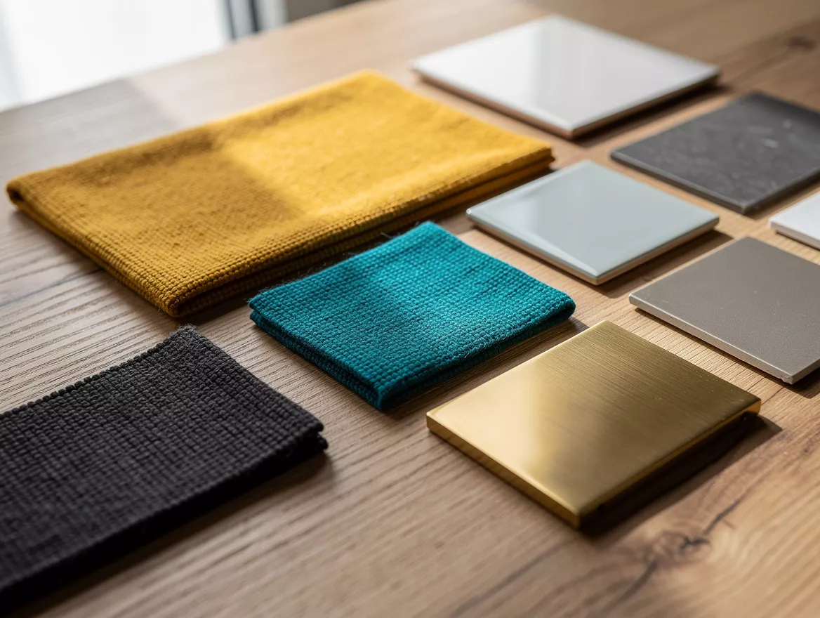
Make a small sample board with the tile, vanity finish, countertop, and a piece of bedroom flooring before buying paint. This simple move prevents a fashionable color from becoming the wrong color for the entire suite.
Choose One Anchor Across the Threshold
The strongest bedroom-bathroom connection usually comes from one shared anchor, such as oak, warm white, aged brass, blackened metal, or veined stone. An **IKEA oak vanity** can link a pale bedroom floor and a bathroom without forcing both rooms into the same exact palette.
Let the rooms feel related, not duplicated. A bedroom with oatmeal walls and ivory bedding can lead into a bathroom with warm-white walls and beige stone-look tile while the repeated wood tone keeps the transition intentional.
One anchor is enough; repeating every finish makes the suite feel like a showroom package. My preference is oak when the bedroom needs warmth, and brushed metal when the existing cabinetry already carries the visual weight.
Make the Bathroom Palette One Step Cleaner
The bedroom can handle a richer, softer, or moodier version of the shared color because it has fewer moisture concerns and more textile layers. In the bathroom, use a cleaner and slightly lighter expression, such as a cream wall beside a sage bedroom accent.
A **Target sage bath towel** can echo the bedroom’s green without turning the shower area into a fully green box. Keep the strongest version of the color near the bed, where upholstery, curtains, and bedding can absorb it.
This approach works especially well with sage, dusty blue, clay, and oxblood. Use the accent in a headboard, lumbar pillow, or painted niche, then let the bathroom repeat it in a smaller dose through towels, a vanity, or one decorative detail.
Build the Palette Around 60-30-10
The 60-30-10 proportion gives both rooms a practical color map: about 60% dominant neutral, 30% secondary material or color, and 10% restrained accent. Warm off-white walls and shower tile can occupy the largest share, while pale oak and stone create the middle layer.
Use **Wayfair linen curtains** to support the dominant neutral without adding another competing color. Then reserve the smallest percentage for aged brass, forest-green towels, charcoal lamps, or a clay-toned accessory.
This ratio is a guide, not a demand for mathematical perfection. The real test is whether the eye moves naturally from the bedroom to the bathroom instead of stopping at a hard change in color temperature.
Repeat Wood and Metal With Restraint
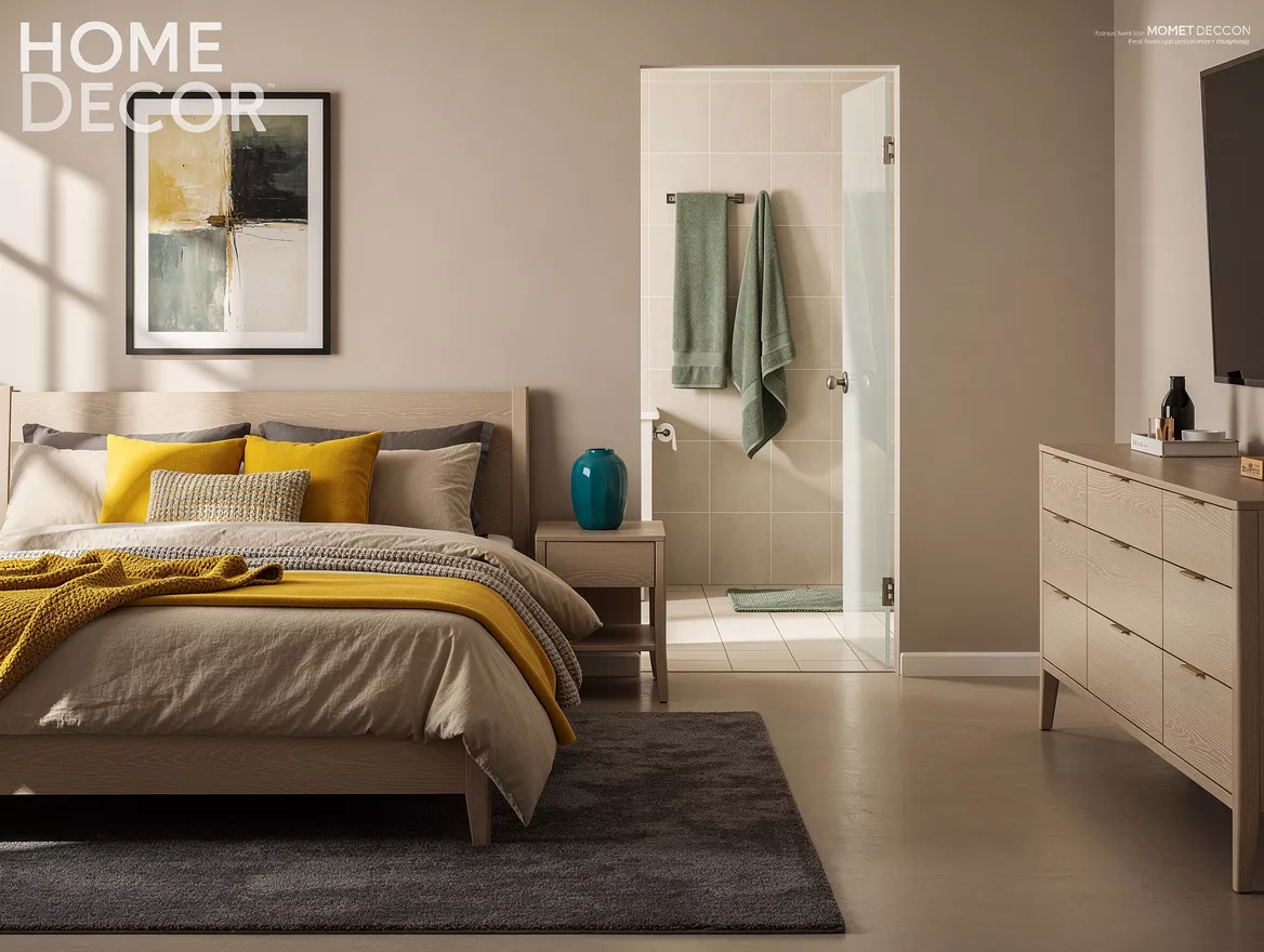
Material repetition often coordinates a suite more gracefully than matching paint. A pale oak bedside table, a wood vanity, and a warm metal light fixture can create continuity even when the bedroom and bathroom use different wall colors.
A **Lowe’s brushed brass faucet** works beautifully with warm whites, mushroom, taupe, and natural wood, but it should meet at least one other brass detail nearby. Repeat the finish in a mirror frame, cabinet pull, or small tray, then stop.
For a blue-and-oak scheme, polished nickel keeps the effect crisp without adding yellow warmth. A **Wayfair polished nickel mirror** can bridge dusty blue walls, pale oak furniture, and near-white bathroom tile with a quiet, tailored feel.
Test Every Undertone in Real Light
Paint that looks soft at the store can turn pink, green, or icy once it meets tile and daylight. Place large samples beside the bathroom floor, bedroom headboard, and trim, then check them in morning, afternoon, and artificial light.
A **Lowe’s paint sample** is more useful on a movable board than on a single wall because you can carry it through the doorway. Hold it beside the shower tile, then beside the bedding, and reject any color that only works in one room.
Warm mineral whites, cream, mushroom, and muted wood tones are forgiving foundations for a 2026 suite. If the bathroom already has a strong cool gray, respect it with blue-gray paint and nickel rather than trying to warm it up with unrelated yellow beige.
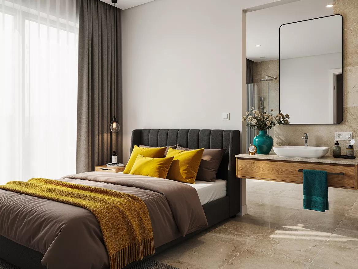
Before ordering paint or bedding, place the bathroom’s tile, vanity sample, and metal finish beside the bedroom’s largest fabric. Let that fixed material choose the palette, then carry one shared anchor across the threshold and leave the rest of the match behind.
Mia Carter writes about small-space living and budget home makeovers. She has restyled three rentals and tests most ideas in her own 45 sqm flat.