The blush ceramic vase you bought at Target for $24 catches afternoon light on May 14th and suddenly your living room looks like a church basement decorated for Easter. The color itself isn’t wrong. Dusty pink works in Parisian apartments and Vermont farmhouses photographed for Domino. But that glossy finish reflects light like plastic eggs under fluorescent bulbs, and your brain registers “seasonal clearance aisle” before you can rationalize why.
The difference between pastels that feel grown-up and pastels that read juvenile sits in surface finish, not shade selection. Matte ceramic, raw linen, and unglazed terra-cotta turn soft spring colors into something you’d keep past June. It’s not about avoiding color. It’s about choosing materials that absorb light instead of bouncing it back at you.
Why glossy pastels trigger the Easter aisle reflex
Glossy finishes on pastel objects create specular highlights that mimic synthetic materials. Plastic eggs, polyester ribbon, acrylic craft paint all share that same sheen, and your eye associates high gloss with mass-produced holiday decor because that’s the dominant finish in seasonal sections. The result is a space that feels temporary, not curated.
Matte surfaces diffuse light to create depth. A $32 matte-glazed vase from West Elm in the exact same blush tone as that Target find reads completely different because the surface texture scatters light instead of reflecting it in sharp points. Design experts featured in Architectural Digest note that warm metals like unlacquered brass are replacing chrome for the same reason. Sheen broadcasts cheap.
And it’s not just ceramics. A glossy acrylic tray holding pastel throw blankets looks like party supplies. A whitewashed rattan basket from IKEA at $28 holding the same blankets looks like you meant it.
The three material swaps that make pastels feel deliberate
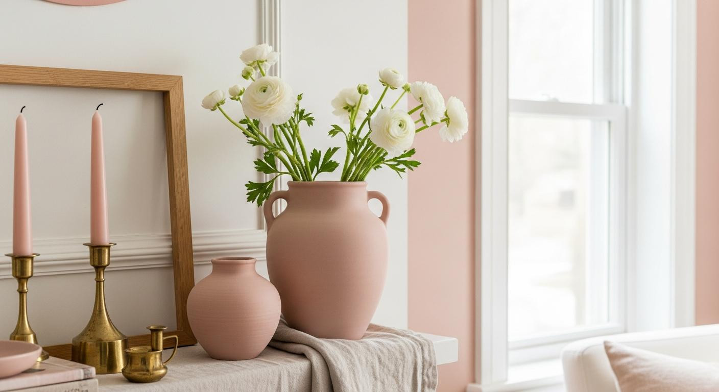
Bisque-fired pottery is unglazed ceramic fired once, and it reads as artisan instead of mass-produced. The porous surface has texture you can feel, and it makes mint green or sky blue look collected rather than themed. CB2 matte stoneware vases run $34 to $48, while glossy HomeGoods equivalents cost $18 to $24. That extra $16 changes how the whole room feels.
But the biggest transformation comes from textiles. Linen’s slub texture and matte hand make sage green feel coastal instead of juvenile, especially when paired with warm wood. Shiny piping and synthetic blends catch light like satin ribbon. Target linen-blend pillow covers start at $22. West Elm pure linen runs $44. The weight alone tells your hand it’s not from a party store.
Wood and rattan beat plastic every time for baskets and trays. Professional organizers with residential portfolios confirm that natural materials anchor soft colors without adding visual noise. Linen curtains in pale periwinkle next to an oak side table create a balance that keeps the space from feeling too sweet.
Warm metals and black accents stop soft colors from floating
A blush throw pillow alone on a white sofa looks like you forgot to put away Easter shopping. The same pillow next to a $89 brass floor lamp from Article looks intentional. ASID-certified interior designers recommend unlacquered brass and brushed nickel to give pastel rooms gravity, and the science backs it up. Warm metal tones create visual weight that prevents soft colors from feeling untethered.
Brass candleholders from CB2 at $24 anchor a mantel styled with pale blue ceramics. Schoolhouse Electric drawer pulls at $18 each turn mint-green cabinet interiors from quirky to considered. And the patina that develops on unlacquered brass over time adds the kind of depth that makes a space feel lived-in, not staged.
Black frames work the same way. A pastel abstract print in a gold filigree frame reads craft fair. The same print in a simple black wooden frame from IKEA at $12 reads gallery-ready. The restraint in the frame finish elevates the softness of the art, which helps balance all the white. Texture layering matters more than color when you’re trying to avoid that juvenile look.
Where glossy finishes still work in spring rooms
Not all shine is bad. Glass vases work because transparency reads differently than opacity, and light passes through instead of bouncing off. Mercury glass has patina that offsets sheen. A $47 vintage ceramic lamp with crazing and age spots can have gloss without reading cheap because the wear adds character.
The key is patina, scale, or transparency. If a glossy pastel object is under 6 inches tall and costs under $30, swap it. If it’s vintage, over 12 inches, or handmade, the sheen becomes part of the story. Lighting designers with residential portfolios note that reflective surfaces work when they’re earned, not applied.
Your questions about grown-up pastel spring decor answered
Can I use pastel colors in a rental without looking temporary?
Yes, if you anchor them with permanent-feeling materials. A blush linen pillow on a neutral sofa reads like a style choice. A glossy pink throw blanket reads like you’re waiting for summer to put it away. Choose matte textiles and ceramics in pastel tones, then add them to rooms with wood furniture, brass lighting, or black accents. Material upgrades matter more than ownership status.
What’s the maximum number of pastel items before a room feels juvenile?
It’s not about quantity but finish density. You could have seven pastel objects in one room if they’re all matte linen, raw wood, or bisque ceramic. But three glossy pastel items will tip a space into Easter territory. Design experts featured in Domino emphasize that neutral backdrops with pastel touches work when those touches have texture, not shine.
Are there pastels that work better for sophisticated spring styling?
Blush, pistachio, mint, sky blue, and periwinkle are the 2026 spring pastels showing up in trade coverage. But sophistication comes from execution, not hue. Dusty rose in matte linen looks expensive. The same dusty rose in glossy polyester looks like party decor. Choose desaturated versions and prioritize matte or textured finishes. Sage over lime, dusty blue over baby blue.
Your mantel at 6pm when warm light hits the unglazed ceramic vase holding three stems of white ranunculus. The matte surface absorbs brightness instead of bouncing it back. The blush tone reads calm, not cute. One textile upgrade can shift the whole feeling, and this is that shift in porcelain form.