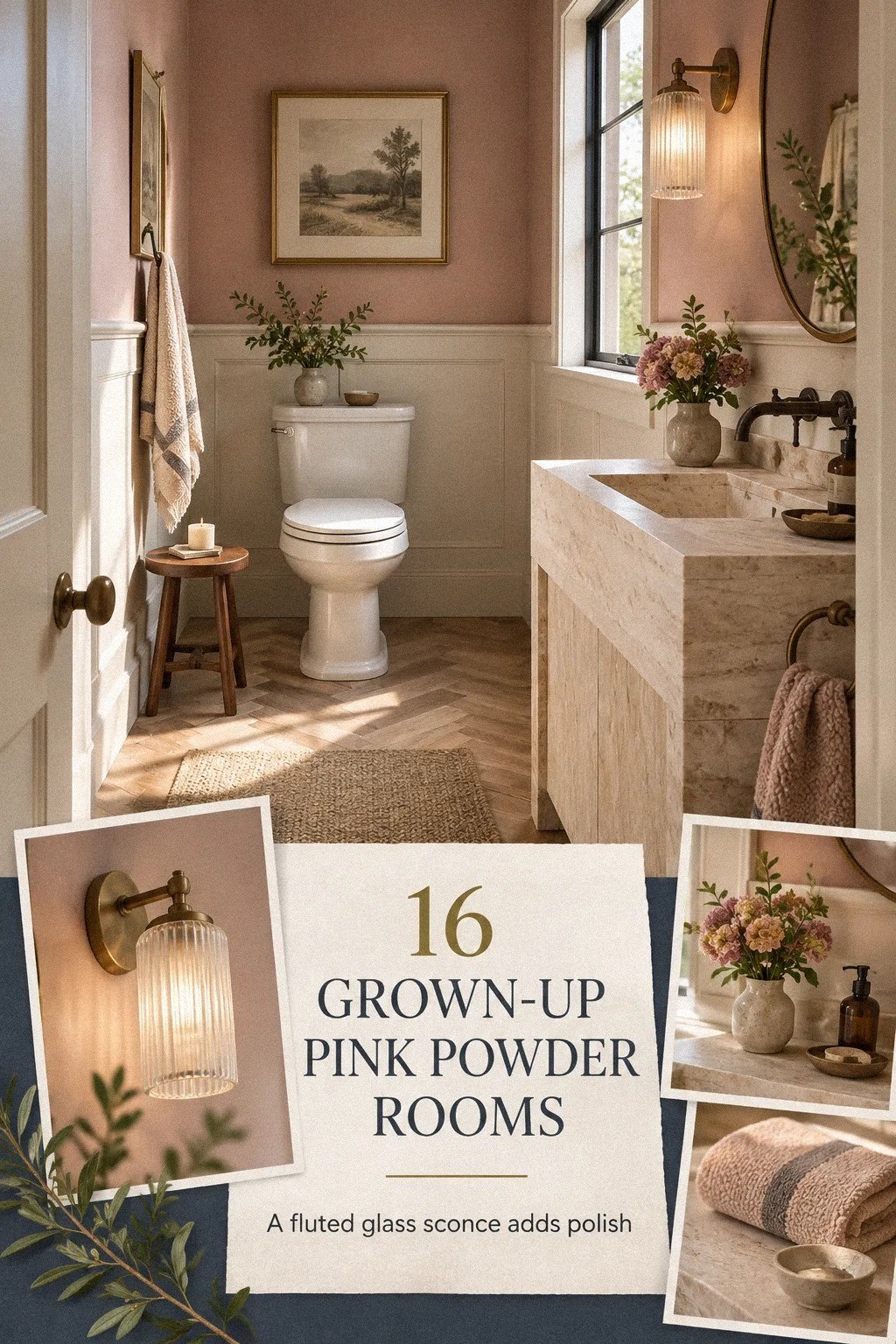
Yes, grown-up pink powder rooms can look sophisticated without turning sugary, and the fix is contrast, not more pink. I once painted every surface pale petal and wondered why the room felt like a nursery. Now I use darker paint, aged metal, and one serious material so your small bath feels warm, intentional, and yours.
- Paint the upper walls with The Two-Tone Lift
- Anchor powder bath inspiration with a dark vanity
- Pair pink with Hague Blue for a moody contrast
- Swap shiny chrome for aged metal
- Layer light with The Three-Height Light Stack
- Cover one wall with patterned wallpaper
- Repeat wood with The Two-Wood Rule
- Ask what the room needs before adding more pink
- Hang a mirror with a strong silhouette
- Choose a skirted vanity instead of a floating cabinet
- Frame art instead of filling the walls
- Paint the trim pink over plain white
- Mix towels with a restrained texture stack
- Build a rental-friendly powder room
- Spend the budget on one serious surface
- Choose warm pink over bright pink
1Paint the upper walls with The Two-Tone Lift
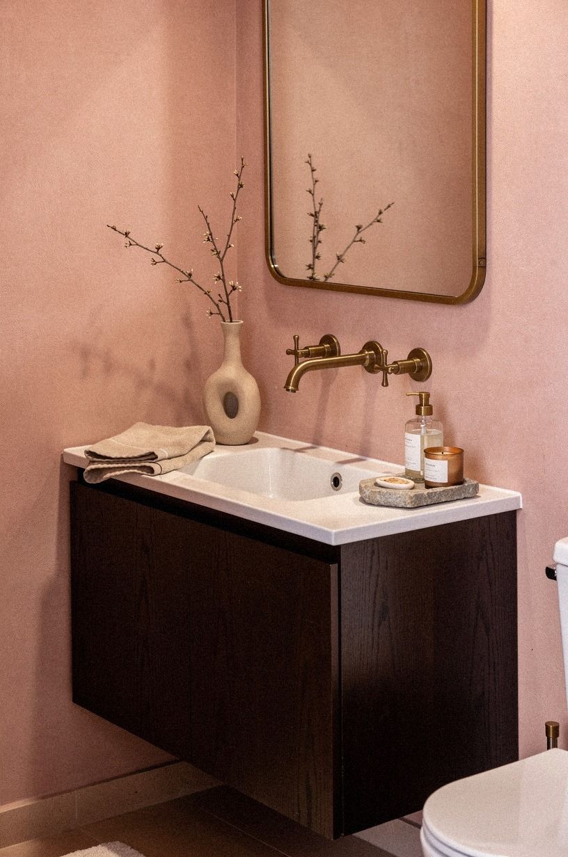
A two-tone powder room gets its maturity from where the color stops. Paint the upper wall a deep navy, then carry a warm white across the lower half or the vanity wall. Farrow & Ball Hague Blue No.30 works beautifully beside creamy white because its depth keeps the contrast from looking sugary.
I’d skip stark white below the chair rail. It makes the room feel divided and clinical, while a warm ivory gives your eye somewhere quieter to rest. If you’re working with existing trim, paint it the same color as the lower wall so the architecture feels calm.
Your finish matters, too. Carrara marble with subtle gray veining on the vanity brings a quiet richness, while walnut adds warmth without introducing another loud color.
You’ll get a soft, inviting room that doesn’t need a pile of accessories to prove its point. That small shift matters!
If you’re setting priorities for a small refresh, our guide to the 80/20 budget rule for calmer rooms can help you decide which finish deserves the money.
2Anchor powder bath inspiration with a dark vanity
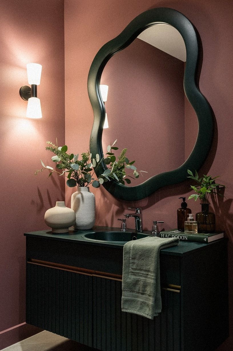
Pink walls need weight underneath them. A deep emerald vanity gives your powder bath inspiration a grounded center, especially when the room is narrow and the sink occupies most of one wall. Emerald looks especially composed beside gold hardware and warm cream, creating depth without making the room feel gloomy.
Choose a vanity with visible grain or a painted finish that isn’t too polished. Reclaimed weathered teak brings the right amount of texture, while I’d skip a high-gloss lacquer cabinet. It reflects every bulb and makes the room feel more commercial than collected.
If your vanity is 32 to 36 inches high, keep the mirror and sconces visually close so the wall doesn’t feel stretched. You don’t need a giant piece. You need one dark block that tells the pink where to stop.
For another example of using depth instead of decoration, see this dark green powder room approach.
3Pair pink with Hague Blue for a moody contrast
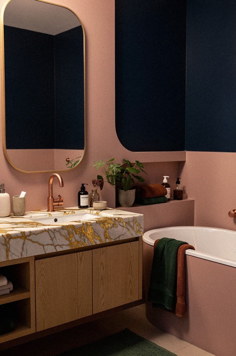
The fastest way to make pink feel grown-up is to give it a serious neighbor. Use pink on the walls and forest green on the door, vanity, or ceiling.
Add rust and natural oak to keep the small room from becoming gloomy. That push and pull feels refined, not precious.
I’ve tried pairing blush with pale gray, and it often looks washed out under bathroom bulbs. Your better move is a color with enough depth to hold its shape at night.
If you’re nervous about a dark ceiling, start with the door. It’s a smaller commitment, but you’ll still see the contrast every time you enter.
And don’t add five more colors to explain the scheme. Rust, natural oak, and one serious stone are enough. A Calacatta marble surface with gold veining can soften the green without turning the room rustic.
If wallpaper is the stronger direction for your room, compare pattern scale with these small powder room wallpaper ideas.
4Swap shiny chrome for aged metal
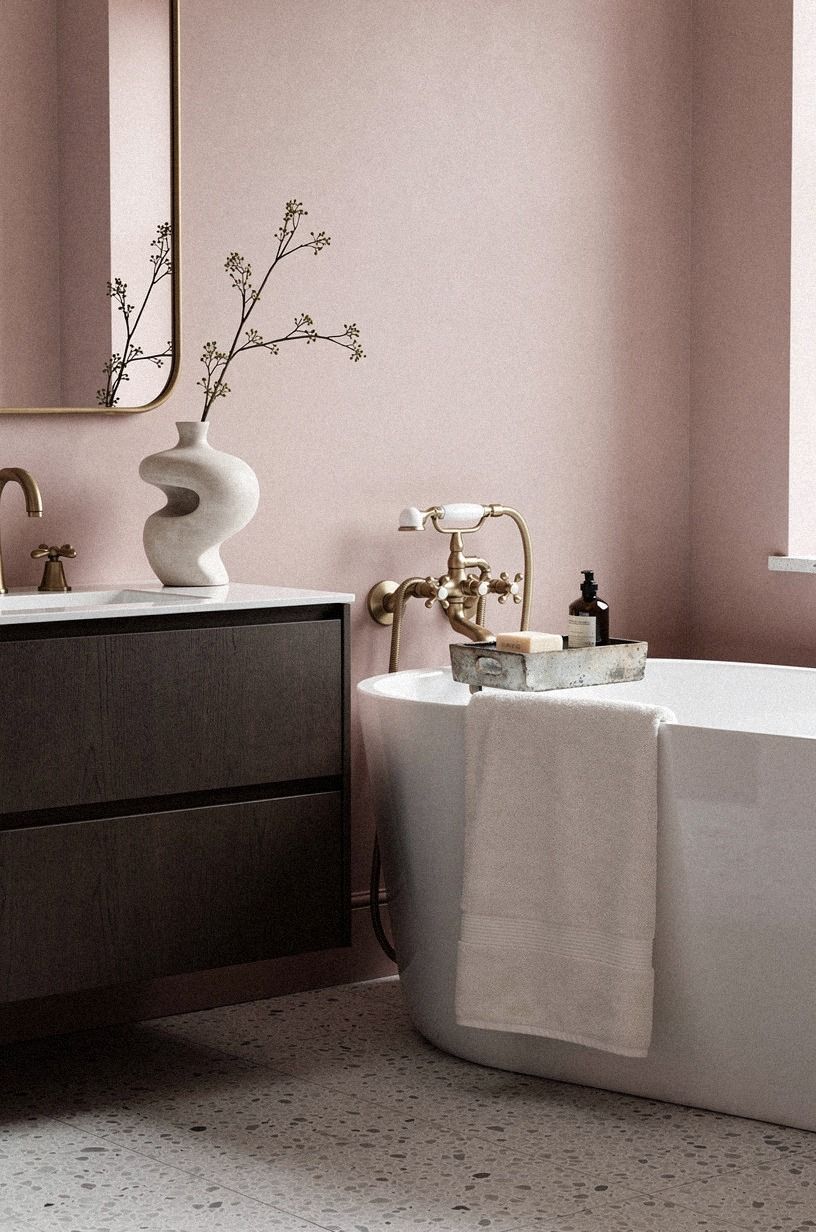
Pink powder room decor becomes more sophisticated when the metal looks like it has lived somewhere before. Choose aged brass for the faucet, mirror frame, or cabinet pulls. Its muted yellow undertone gives dusty rose warmth, while the gradual darkening keeps everything from looking showroom-new.
I’d skip rose gold here. It repeats the pink too literally, and your room can start to feel themed instead of designed. Chrome is practical, but it makes pale pink look colder than it is, especially beneath a cool LED bulb.
You don’t have to replace every fixture. Start with the piece closest to eye level, such as the mirror or faucet, then repeat the finish once.
If you’re mixing materials, keep charcoal to one strong detail. Cerused white oak can sharpen the composition while softening the gentle color.
The five-texture rule for rooms that feel flat is useful when your metal choices need a little warmth around them.
5Layer light with The Three-Height Light Stack
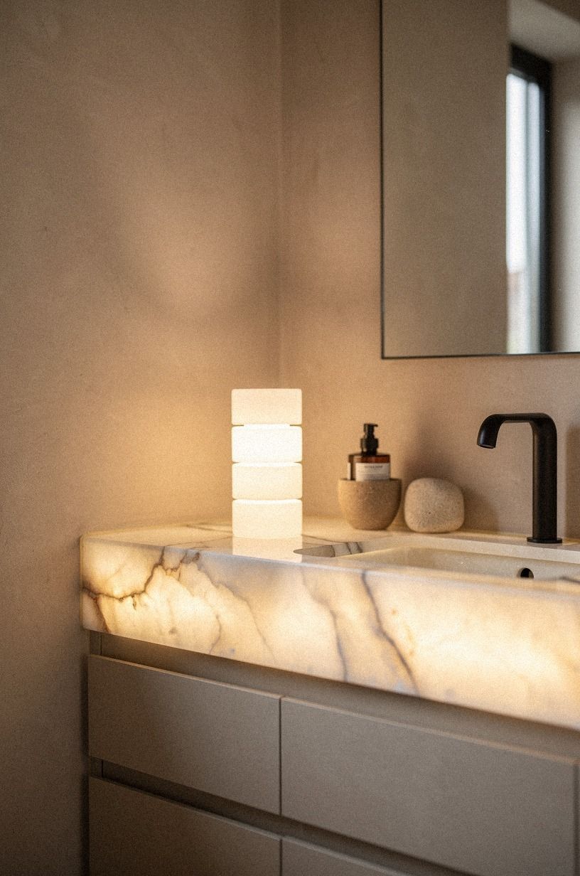
A small powder room needs more than one ceiling fixture.
6Cover one wall with patterned wallpaper
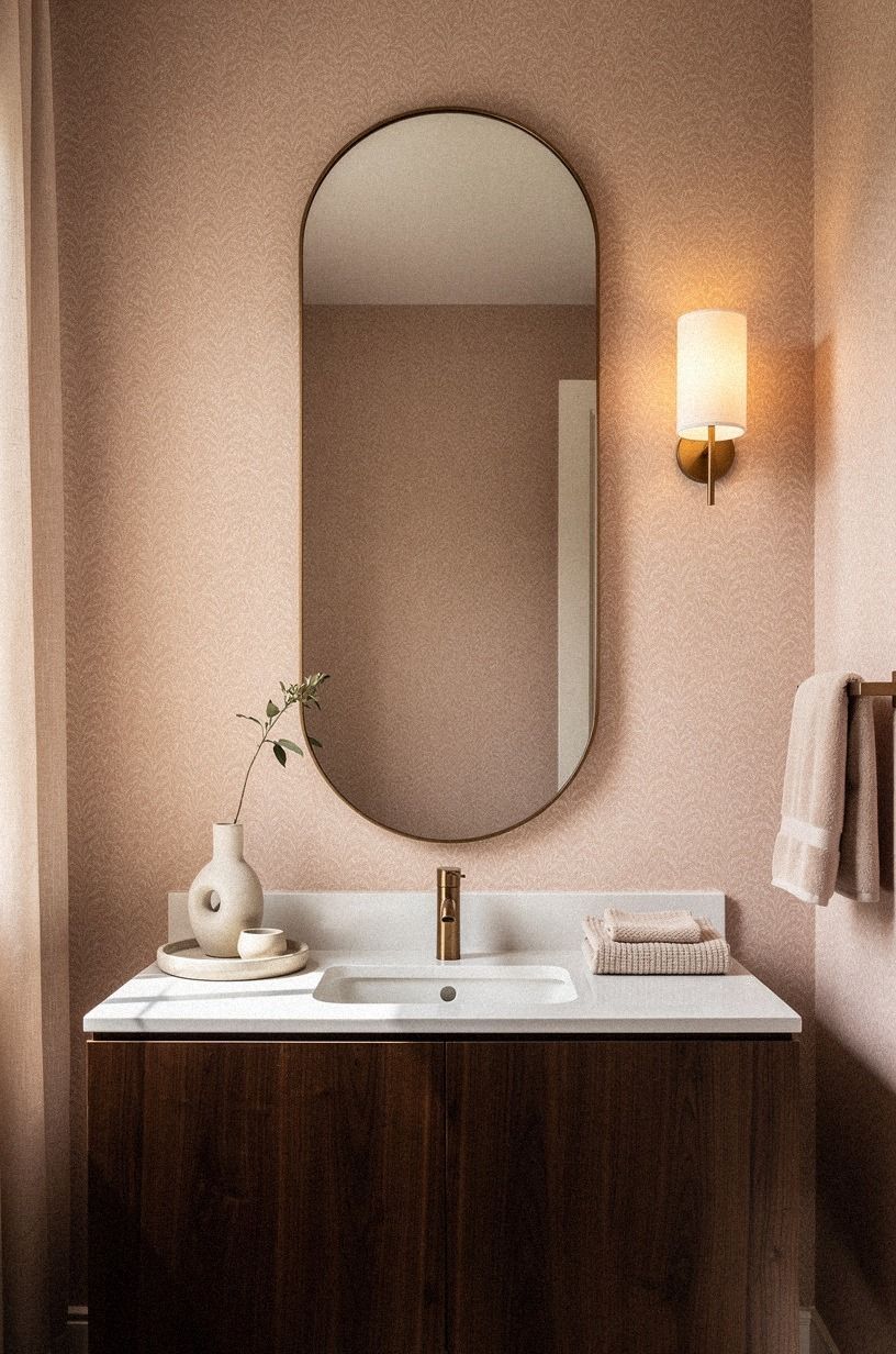
Pink wallpaper works best when it has an adult-scale pattern and a little visual tension. Choose a midnight blue wallpaper with copper and ivory details instead of a tiny all-pink floral. One wall is enough in a powder room, especially behind the mirror where the pattern gets contained.
Your goal isn’t to make every surface compete. Keep the other walls quiet, then repeat one color from the paper in the hand towel or art. If you’re choosing between a delicate blossom and a large leafy print, I’d take the larger print.
Small flowers can read nursery-like when the room has no darker material to balance them.
Before you commit, order a sample and hold it beside your actual flooring. Book-matched walnut brings warmth to the cooler palette, while bathroom lighting changes everything. Our guide to small powder room wallpaper ideas with pattern can help you judge scale before your walls become the experiment.
7Repeat wood with The Two-Wood Rule
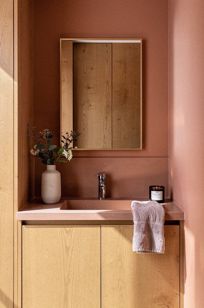
The Two-Wood Rule keeps pink rooms from feeling overly decorative. Use one main wood and one supporting wood, then stop. A vanity in natural wood can sit beside a lighter oak stool or frame, but three different finishes will make your small room look busy.
I’d rather see a modest vanity with real grain than a larger piece with fake gray wood. Your eye notices the edge of the cabinet, the drawer front, and the mirror frame at close range, so visible wood grain matters more than size. A little warmth under the sink can make pink feel grounded.
And if you’re styling a shelf, keep it spare: a small wood tray, a ceramic cup, and a folded towel. That’s enough. Warm travertine gives the wood a softly textured partner, while linen, ceramic, or metal can complete the mix.
If your budget is tight, the 80/20 budget rule can help you decide whether the mirror frame or the vanity deserves the larger share.
8Ask what the room needs before adding more pink
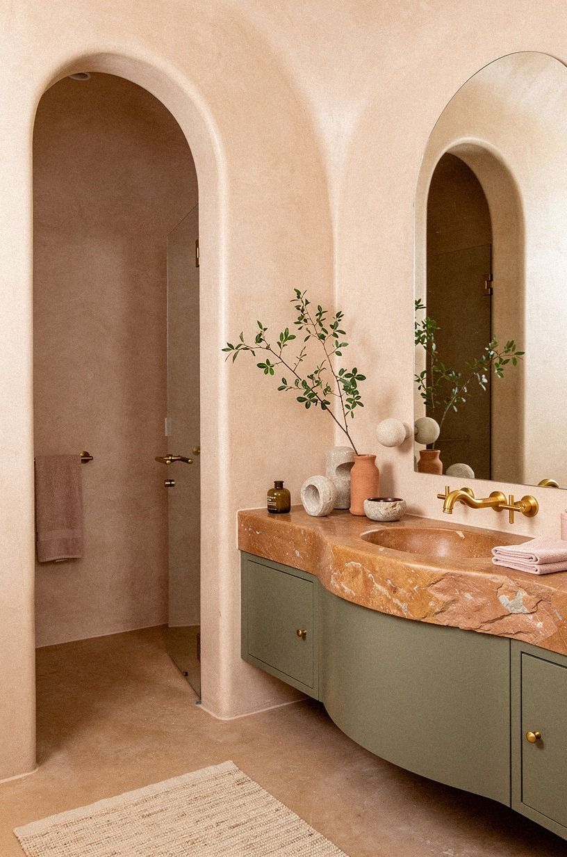
What does your powder room need most: color, texture, or contrast? That question saves you from buying another pink object when the real problem is a cold floor or a weak light source. In a small space, every item has to earn its place.
If your walls are already rosy, bring in terracotta, stone, and olive before adding another pink accessory. Unlacquered brass developing a soft patina gives your hand something tactile to notice and adds warmth without making the room feel decorated.
I’ve made the mistake of treating a color problem with more color. You’ll get a calmer result when you diagnose first. A dark green powder room that looks expensive explains the same principle from another angle: depth usually comes from contrast, not decoration.
You can also use the five-texture rule as a quick check before buying another accessory.
9Hang a mirror with a strong silhouette
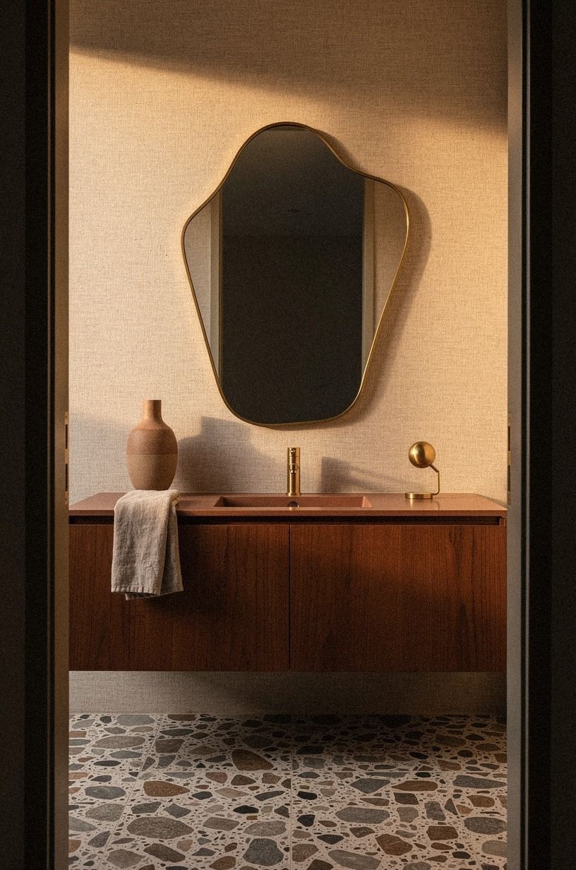
A pink powder room can handle a mirror with personality, but the shape should be clear.
10Choose a skirted vanity instead of a floating cabinet
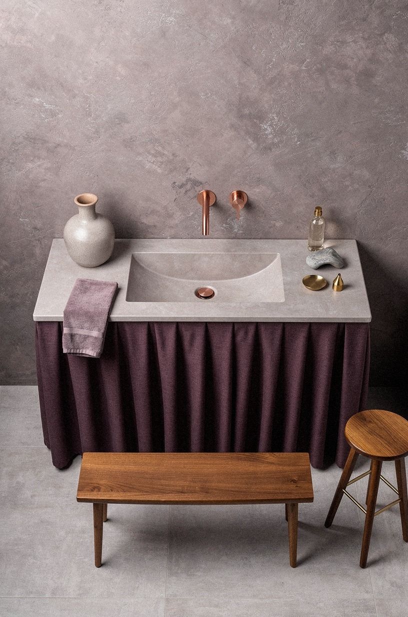
A skirted vanity brings softness to a pink room without relying on ruffles or novelty. Use a muted plum or gray fabric with a small rose-gold detail. The fabric hides plumbing, adds movement, and makes a basic sink feel more like furniture.
I’d skip a floating cabinet when your bathroom already has hard tile, a hard mirror, and a hard porcelain basin. The open gap can make the room feel visually sharp and expose every pipe. A tailored skirt gives your eye a warm break, especially in a rental where you can’t change the floor.
Keep the hem clean and close to the floor. Your fabric shouldn’t puddle where water can reach it.
If you want a little pattern, use a narrow stripe rather than another floral. Hand-applied Venetian plaster on the wall can add depth without turning the room theatrical.
For help balancing the fabric with harder finishes, use this texture guide before choosing the curtain material.
11Frame art instead of filling the walls
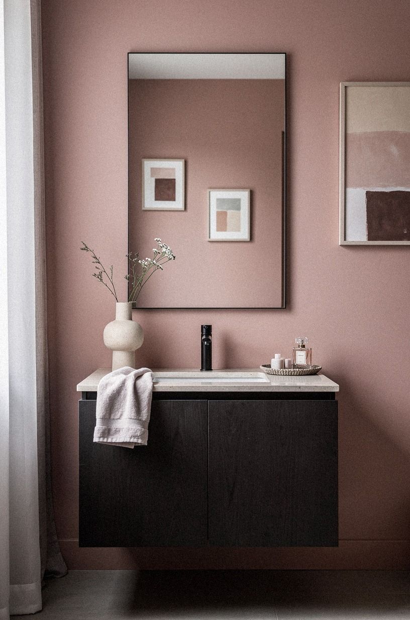
Art gives powder room decor a point of view, but you don’t need a gallery wall.
12Paint the trim pink over plain white
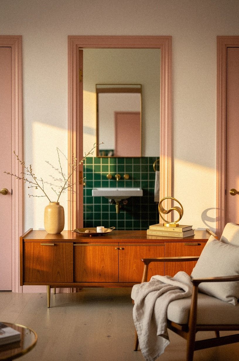
Pink trim is a quiet move with a big effect. Paint the baseboards, door casing, and ceiling edge in the same family as the wall, then let the vanity or mirror provide the contrast. A soft emerald satin paint makes the architecture feel enveloping instead of chopped into separate strips.
I’d choose painted trim over bright white trim when your powder room has limited natural light. White can make the pink look more saturated and abrupt, while matching trim lets the color blur gently around the room. If you’re worried about too much color, keep the ceiling lighter rather than defaulting to white everywhere.
And remember the door. It’s often the largest uninterrupted surface in a powder room, so leaving it white can break the spell.
Your door can be emerald, cream, or gold-toned. The right choice depends on whether you want the room to feel airy, moody, or intimate.
Washed Belgian linen can soften the palette through a hand towel or window treatment, giving the richer colors somewhere quieter to rest.
If you’re considering a deeper door color, this dark green powder room guide shows how a dark architectural element can anchor a pale palette.
13Mix towels with a restrained texture stack
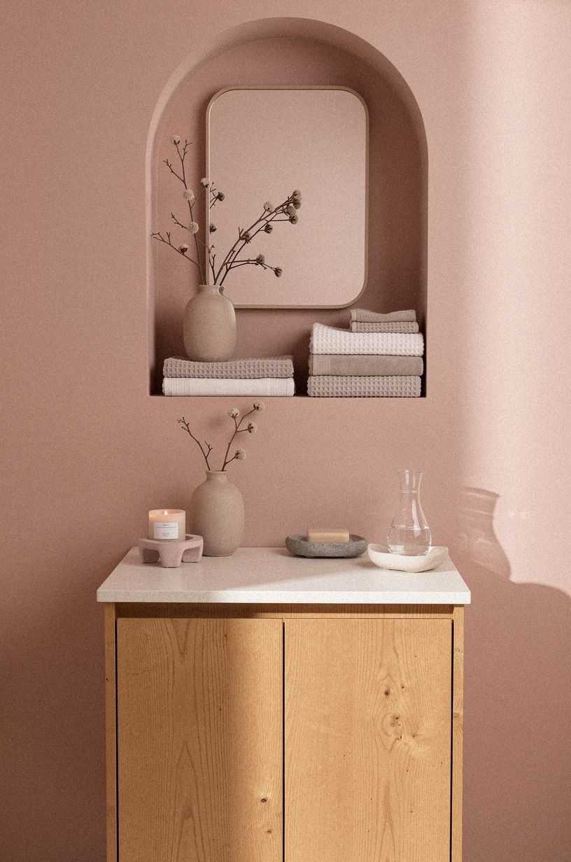
Towels are where a pink powder room can become childish fastest, especially when every textile carries a different frill. Build a restrained texture stack instead: an organic bouclé hand towel, rust-colored cotton, and a natural oak tray.
Your palette can include pink, but it shouldn’t be all pink. I’d use forest green with rust, warm cream, or natural wood.
The contrast makes the color feel deliberate, while the tactile surfaces keep the room inviting. A bouclé towel catches light differently than a smooth wall, and that quiet shift gives the room depth.
If you’re buying nothing new, fold what you own by color and remove the loudest pattern. You’ll be surprised how much calmer the room looks when the textiles have a shared temperature. Our five-texture rule is especially useful when your finishes are mostly paint and porcelain.
You can also compare your paper choices with these pattern ideas for small powder rooms before adding another textile print.
14Build a rental-friendly powder room
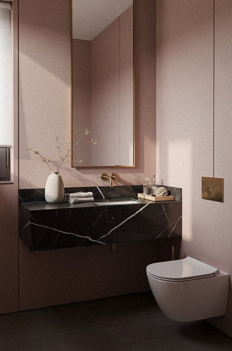
You can create grown-up pink powder rooms in a rental, but your strongest moves need to be removable. Try peel-and-stick wallpaper in dusty rose, a tension rod for a fabric skirt, and removable brass-look hooks near the door. These changes add color and texture without asking your landlord for a renovation.
I’d skip temporary wallpaper with an ultra-small pattern. It can look noisy in a room where you’re standing close to every wall.
Choose a larger design with charcoal and brass details, and test the adhesive on a hidden patch first. Your future self will appreciate knowing how cleanly it lifts.
A tension rod can also support a charcoal curtain under the sink. Add a small piece of Nero Marquina black marble with white veins as a tray if the vanity needs a harder note. You don’t need permanent changes to make your bath feel personal!
For a larger pattern, these small powder room wallpaper ideas can help you avoid a noisy rental-friendly finish.
15Spend the budget on one serious surface
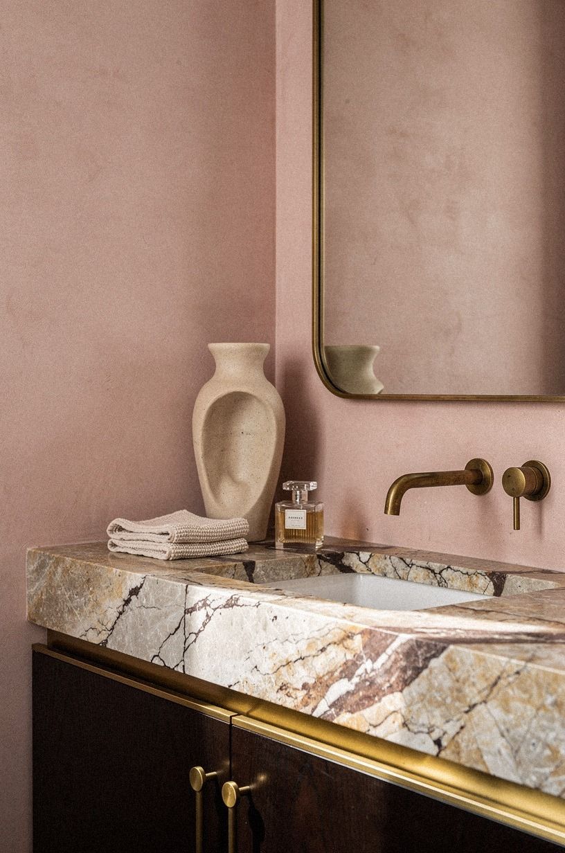
If you’re planning a larger update, spend first on the surface your hand and eye meet most often. A camel-toned deep-pile mohair velvet stool can make a basic pink cabinet feel considered, while a new vanity may matter less if the countertop still looks thin and generic.
The table below gives typical US ranges. Your project may land differently, but these tiers help you decide whether you’re refreshing finishes or changing the room’s infrastructure.
For a powder room, I’d usually stay in the budget or mid range unless plumbing is already failing. A simple 80/20 budget rule for calmer rooms can help you put most of your money toward the surface that changes the room every day.
If you’re comparing materials, this dark green powder room example is a useful reminder that a strong color can make a modest material feel more intentional.
16Choose warm pink over bright pink
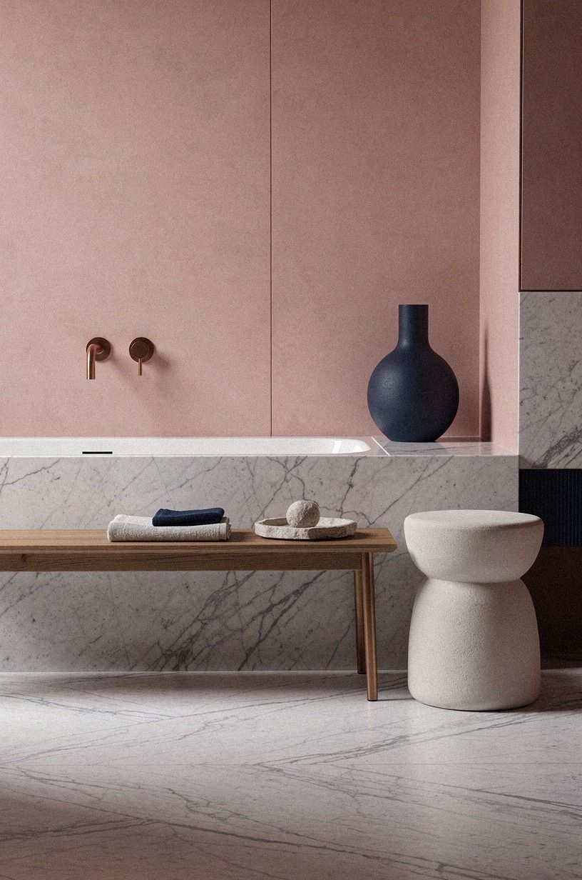
Why does one pink powder room feel sophisticated while another feels childish?
The Pink Rule I’d Keep
I used to think a sophisticated pink powder room needed expensive tile, a custom vanity, and a dramatic mirror. Then I painted one small bathroom with a muted rose, a midnight blue door, and a copper frame I already owned. The room changed because the colors had somewhere to push against each other, not because every finish was new.
That’s the rule I’d keep: pink needs an anchor. It can be dark paint, warm wood, stone, or even a serious black-and-white photograph, but it needs one element that refuses to be sweet. Without that anchor, your room keeps asking for more accessories, and each new piece makes the composition louder.
I’ve also learned to respect the light. A pink that looks gentle on a sample card can turn peach near a warm bulb, while an ivory can look nearly beige in shadow.
Your best test is a large painted board moved around the room for a full day. It’s less exciting than ordering everything at once, but it saves you from living with the wrong undertone.
If you’re choosing between a trendy fixture and a better surface, choose the surface. A faucet can be replaced later.
The wrong tile or countertop controls every decision around it. I’d rather have a simple vanity, good lighting, and Carrara marble with subtle gray veining than a room packed with fashionable details that don’t speak to one another.
For one last pattern comparison, see these small powder room wallpaper ideas and notice how contrast keeps pink from becoming too sweet.
A Few Things Worth Answering
What is the best pink approach for a small powder room?
A muted blush with one dark anchor is the safest choice. A gray-based rose can feel warm without shrinking the room. Pair your paint with a simple vanity, aged metal, and one mirror with a strong outline.
Where can I buy pink powder room pieces on a budget?
Look at IKEA, Target, and Wayfair for vanities, mirrors, and textiles, then check Facebook Marketplace or a local thrift shop for frames and small wood furniture. You don’t need every piece to match, and secondhand materials often give your room more character.
How much does a pink powder room makeover cost?
A surface refresh can fall within the $200-$1,200 budget tier when you’re painting, replacing the mirror, changing the faucet, and updating textiles. The free part is editing, so remove clutter and rearrange what you already own before buying anything.
Can I create this look on a budget?
Yes, and you can start with paint, a new hand towel, and better light. Use a removable wallpaper sample as art, switch one visible fixture, and frame a print you already have. You’ll get more impact from contrast than from buying a complete matching set.
Is a pink powder room worth it in a small space?
Yes, because a small room lets you take a clearer color risk with less paint and less furniture. Keep the vanity visually simple, use a mirror that reaches toward the light, and preserve at least 21 inches of clearance in front of the toilet.
Is pink a good idea for a rental?
Yes, if you keep the changes reversible. Peel-and-stick wallpaper, a tension-mounted fabric skirt, removable hooks, and plug-in lighting can give your room warmth without permanent work. Test every adhesive first, and keep the original hardware in a labeled bag.
Where I’d Start First
If I had to pick one, I’d start with the dark painted door. It costs less than changing the whole room, gives pale pink a clear edge, and makes every brass, wood, and linen detail look more intentional. Pin this idea for later and build the rest around that contrast.