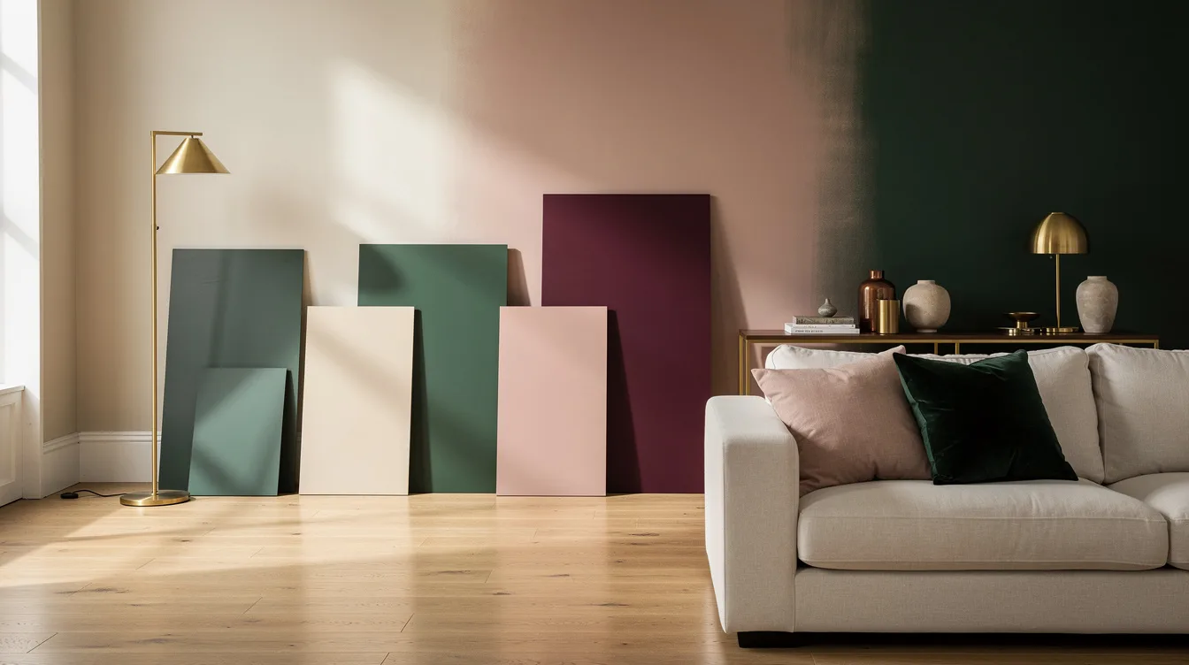
I’ve seen people spend $60 on sample pots and still end up with the wrong wall color because they skipped the room itself. In a 12-by-14-foot bedroom, the paint never works alone, it works with light, flooring, and whatever bulky furniture is already taking up half the view.
Designers usually make this easier than homeowners do: they study the light, check the fixed materials, then build from warm neutrals before adding deeper color with intention. That approach holds up far better than chasing whatever shade is everywhere for a minute.
Read the Light Before You Read the Paint Strip
Start with the windows, not the color deck. North-facing rooms usually make paint look cooler and flatter, while south-facing rooms can warm up even a soft beige fast.
Test big swatches on at least two walls and look at them in morning, afternoon, and lamplight. A warm white that feels calm at noon can turn yellow under a 2700K LED bulb, and that shift is exactly why designers sample first.
Don’t trust a two-inch chip under store lighting. Sample pots at Home Depot or Lowe’s are typically about $6 to $8, and that is cheap compared with repainting a whole room.
Match the Undertones to Your Fixed Materials
Paint should answer the room you already have. If your floor has honey or red notes, a cool gray wall will usually fight it and make the whole space feel accidental.
Look hard at the materials that are staying: oak flooring, stone counters, brick, tile, trim, even a big sofa. Designers do this first because fixed materials cost far more to change than paint, and the undertone clash is what makes a room feel off even when the color is technically nice.
If your kitchen has creamy counters and warm wood cabinets, choose a warm neutral with some body. Cool white in that setup is a common mistake, and it rarely looks crisp, it just looks disconnected.
Build From a Warm Neutral Base
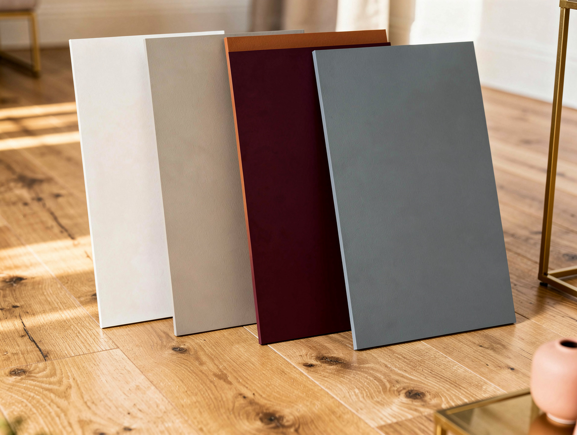
The safest designer move in 2026 is still a warm neutral base. Think warm white, soft greige, mushroom, putty, or a taupe that has enough depth to hold up after sunset.
These shades work because they are flexible with natural wood, plaster, linen, and older trim. A gallon of interior paint at Ace Hardware or Walmart often starts around the mid-$20s for basic lines and climbs much higher for premium finishes, so your base color should be the one you can live with for years.
I’m firmly on the side of warm whites over stark white in most American homes. Under common LED lighting, icy white can feel sterile fast, while a warmer neutral still reads clean without that hard blue cast.
Use Deep Color on Purpose, Not Out of FOMO
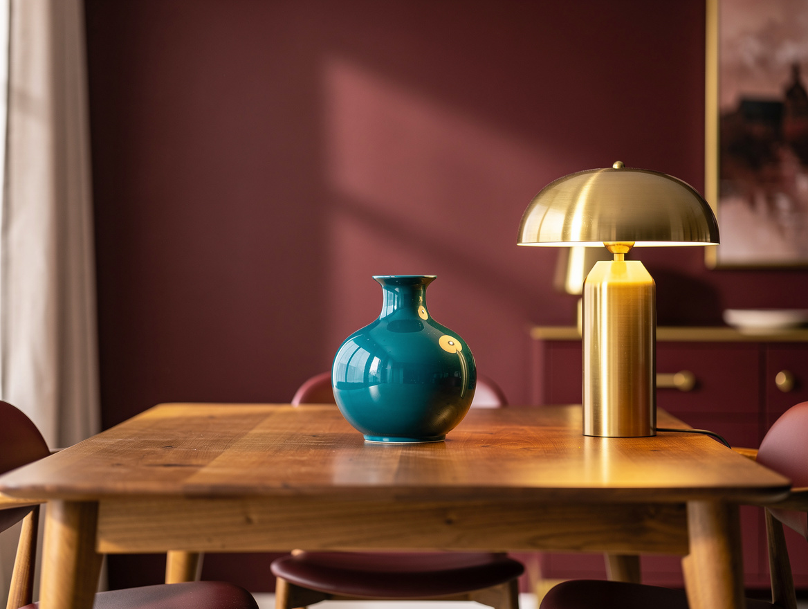
Designers are still using green, moody blue, terracotta, and muted red, but in targeted places. One saturated room, a painted vanity, or built-ins with depth usually land better than pushing a trendy shade through the whole house.
A deep tone looks richer when it has a reason. Try it on a dining room, an entry, library shelving, or lower cabinets, where mood matters more than maximum brightness.
This is where people go wrong with trend chasing. A color can be gorgeous on social media and still feel exhausting on four walls if the room is small, dark, or already packed with visual texture.
Choose Finish as Carefully as the Color
Finish changes the color more than people expect. Flat and matte absorb light and soften imperfections, while eggshell and satin bounce more light and can make color read sharper.
For most living rooms and bedrooms, designers usually lean matte or eggshell on drywall because it gives a softer read. In baths, kitchens, and kids’ spaces, a more washable finish earns its keep, especially when an average repaint can run well over $100 in materials before you even add tools.
Gloss is where restraint matters. I like it on trim, doors, and built-ins, but high shine on every wall can make even a good color feel cheap.
Commit After Testing Large Samples at Home
Once you narrow it down, go bigger than a tiny swatch. Paint sample boards or peel-and-stick sheets around 18 by 24 inches are worth it because you can move them next to curtains, tile, rugs, and wood furniture without guessing.
Set one board by the window trim, one near the floor, and one across from the main light source. The same beige can read pink by a terracotta rug, green beside gray tile, and perfectly balanced near walnut furniture, and that is the kind of real-life edit designers make every day.
If two colors are close, pick the one with slightly more depth. Pale paint often washes out on a full wall, and homeowners usually regret going too thin more than going a touch warmer or richer.
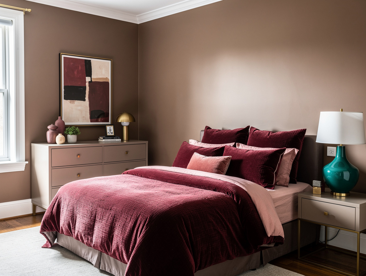
Start with the room that gets used the most, then sample two warm neutrals and one deeper option on large boards before you buy gallons. That small pause is usually what keeps a whole-house paint plan from turning expensive and weird.
Mia Carter writes about small-space living and budget home makeovers. She has restyled three rentals and tests most ideas in her own 45 sqm flat.