Dark green powder room ideas can make a small bathroom feel rich without a full renovation. I learned that after painting mine Farrow & Ball Hague Blue and keeping the old vanity. The room looked dramatic, warm, and surprisingly calm by nightfall. I didn’t replace everything. I changed what the eye noticed first.
Here’s what it looked like before
Before the makeover, the room had the full starter-home package: pale walls, a builder-grade mirror, chrome hardware, and a vanity that disappeared against the floor. Nothing was broken.
Nothing had character, either. You could wash your hands there, but you wouldn’t linger.
The overhead bulb made the room feel flat, and the small window offered very little daylight. I kept the toilet clearance at the standard 21 inches in front, so I couldn’t shift the layout.
That limitation helped. I had to make the walls, reflection, and lighting work harder.
I also had to accept that this wasn’t a full bathroom renovation. The floor was usable, the plumbing worked, and the vanity had good storage. That meant every change needed to earn its place visually.
If you’re weighing a dramatic color for your own space, this guide to painting a powder room dark is a useful place to start.
- Paint the walls deep green first
- Two Woods, One Clear Hierarchy
- Why I Swapped Chrome for Unlacquered Brass
- The Reflection Ladder Frames the Mirror
- Build the Three-Height Light Stack
- Matte Tile or Glossy White?
- Protect the Small-Space Shadow Rule
- Benjamin Moore Chestertown Buff Softens the Green
- Float One Shelf, Not a Collection
- Art Instead of Extra Storage
- Choose Texture Over Another Color
- Can Dark Green Work Without Daylight?
1Paint the walls deep green first
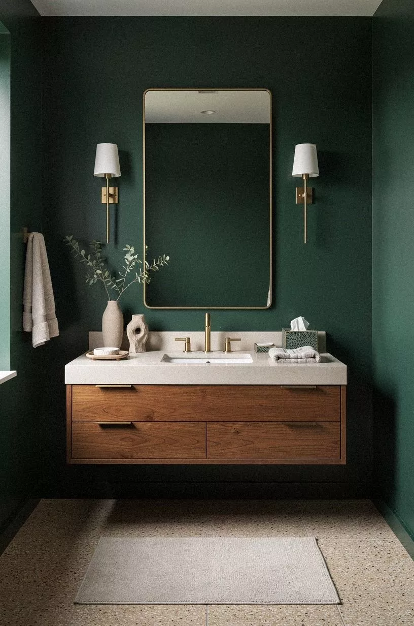
The first decision was the easiest one. I painted the walls in Farrow & Ball Hague Blue No. 30, even though it reads greener in the room than it does on a small sample card. In the morning, it feels earthy and calming.
After sunset, it turns moody and intimate without becoming gloomy.
I tested three swatches beside the mirror because dark paint can change dramatically across one wall. You should test your own walls for at least a full day before buying paint. I didn’t want a cold green, so I skipped blue-gray options and chose a shade with enough depth to sit beside aged brass and shagreen accents.
The sheen mattered, too. I used an eggshell finish because it can handle the occasional splash and still has enough softness to keep the walls from looking plastic. A very flat finish would have felt velvety, but it would’ve been harder to clean near the sink.
Dark green works especially well in a powder room because the room is small enough to commit. You don’t have to carry the color through an entire hallway or bedroom. If you’re comparing dark powder room ideas, this dark paint guide explains why the smallest room can handle the strongest color.
I also painted the narrow strip behind the toilet instead of stopping at the visible edges. That small decision made the room feel enveloped rather than partially decorated. The color needed to look intentional from every angle, not only from the doorway.
2Two Woods, One Clear Hierarchy
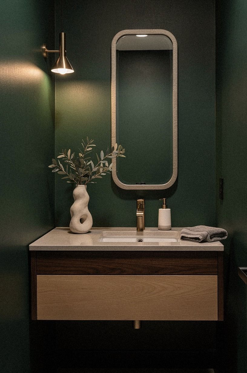
I used two quiet finishes and stopped there. The vanity had a muted plum finish, while the frame above it carried a layer of washed Belgian linen.
That contrast gave the room warmth without making every surface match. More pattern would have made the little room feel busy.
You don’t need a matching wood set. You need a clear hierarchy.
Let one finish carry visual weight, then use the second in a smaller dose. I tried a darker frame first, and it swallowed the mirror.
The softer linen treatment was the better call because it caught the afternoon light and kept the walls from closing in.
The texture helped as well. The vanity’s broad surface made the cabinet feel wider, while the linen around the frame gave the mirror a little height. Those differences are quiet, but they keep a compact room from looking like it came from one showroom display.
If your home already has several wood tones, choose the one with the strongest grain for the larger piece. The smaller finish can be paler, rougher, or slightly warmer.
It doesn’t have to match. It only has to look related.
I wouldn’t add a third wood just because the room feels plain. A grey accessory, a dark frame, and a plum cabinet would have created too many competing notes. The green paint already has presence.
The finishes need to support it, not argue with it.
3Why I Swapped Chrome for Unlacquered Brass
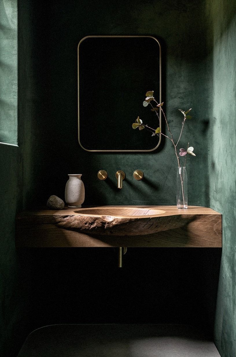
The chrome faucet was the first thing I removed.
The replacement brought in a warm brass note beside navy, white, walnut, and an organic bouclé texture. Those materials gave the sink area more depth without adding another strong color.
4The Reflection Ladder Frames the Mirror
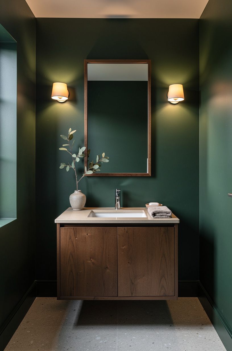
The original mirror stayed, but I gave it a thicker frame. I chose a simple Nero Marquina black marble surround with enough profile to cast a narrow shadow around the glass. That small edge made the mirror feel intentional instead of temporary.
The Reflection Ladder is my name for using three reflective heights: the mirror, the faucet, and one small metal object on the counter. You can see the room move upward instead of stopping at the sink. A large mirror isn’t always the answer in a small powder bath.
I prefer one that leaves a little wall around it because the emerald wall needs room to read.
I mounted the mirror so its center sat close to eye level rather than pushing it toward the ceiling. That left enough space for the cream linen-shade sconce above it and kept the proportions comfortable for shorter guests.
What would your eye notice first if the mirror weren’t the loudest object? In my room, the answer became the emerald wall and the warm gold faucet. That was better than entering to see one oversized rectangle of glass.
A framed mirror can also conceal a less-than-perfect wall edge. Mine covered a small patch where the previous mirror had been removed. I didn’t need to skim-coat the entire wall, and the marble frame made the repair look planned.
5Build the Three-Height Light Stack
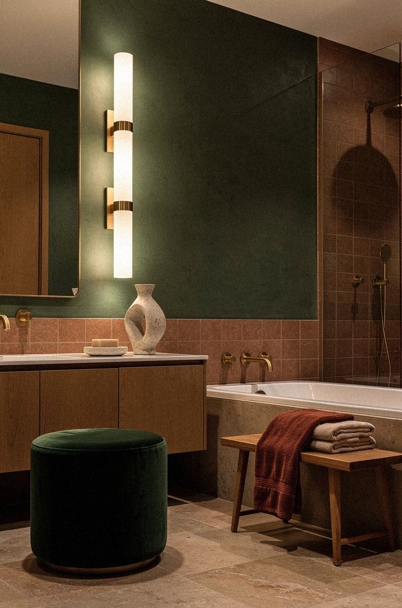
The old ceiling fixture had one job, and it did it badly. I added a wall light above the mirror, kept the ceiling fixture on a dimmer, and placed a low candle on the opposite side of the vanity. Those three points created what I call the Three-Height Light Stack.
You don’t need three expensive fixtures. You need light at different levels. The wall light handles faces, the ceiling fixture handles movement, and the candle brings a soft pool of amber near the counter.
I chose a deep-pile mohair velvet accent because bare glass looked sharp against the paint. Its softness tempered the reflection without making the room feel old-fashioned. The dimmer was just as important as the fixture.
Bright overhead light is useful when cleaning, but it’s not the mood I wanted at dinner.
The candle stays inside a stoneware holder so the flame doesn’t compete with the faucet. I also kept it away from the towel and sink splash. It isn’t meant to become a permanent hazard disguised as decor!
Honestly, this was the most inviting change I made. If you’re planning a larger lighting update, save this moody powder room wallpaper look for ideas about balancing pattern and glow.
6Matte Tile or Glossy White?
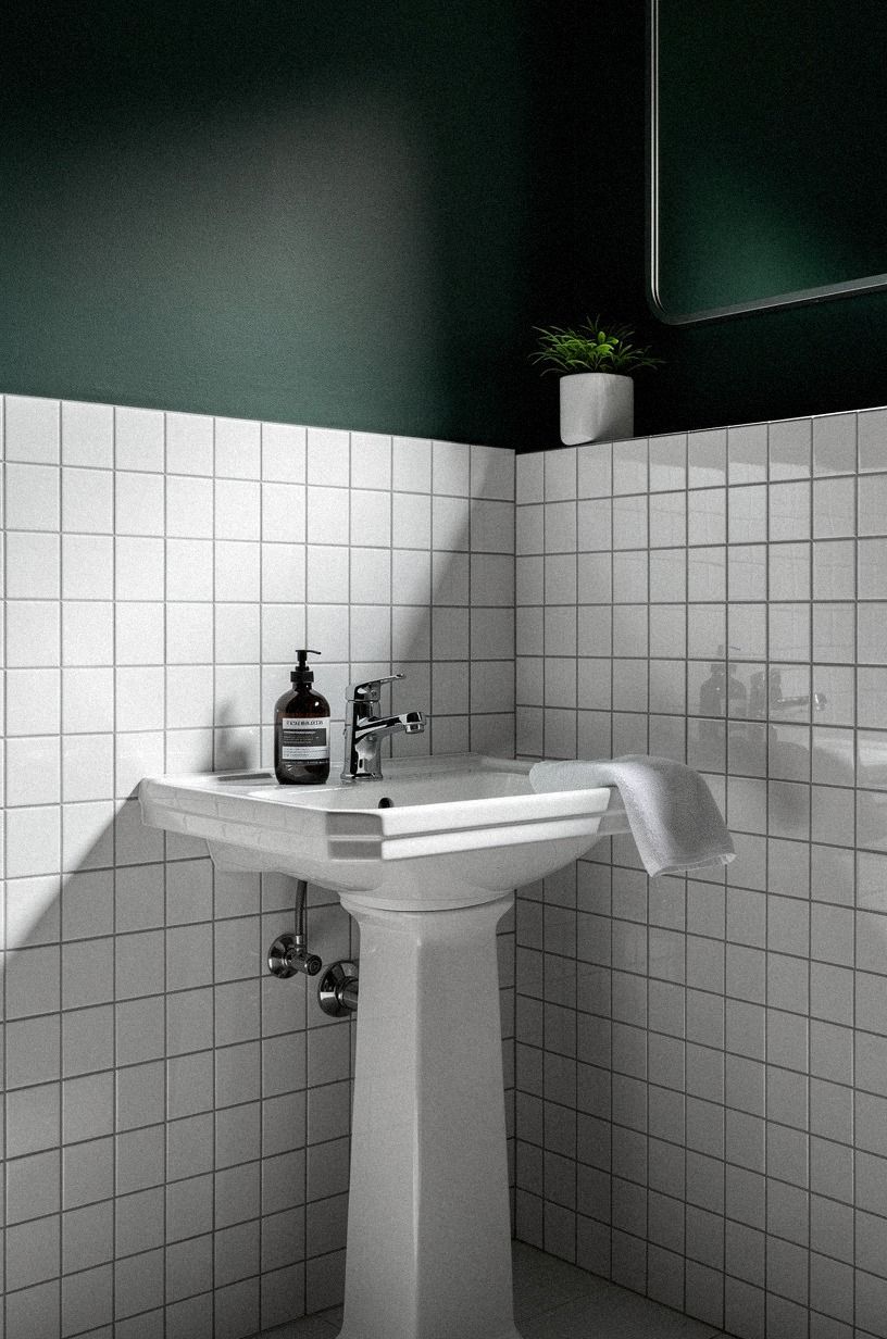
The floor was serviceable, so I didn’t touch the Carrara marble with its subtle grey veining.
That restraint kept the dusty rose, charcoal, and brass palette from becoming too busy. A new tile would have added cost without solving the room’s real problems, which were the flat light and cold hardware.
7Protect the Small-Space Shadow Rule
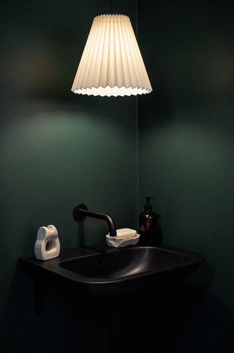
I wanted the room to feel dramatic, not crowded. The Small-Space Shadow Rule became simple: every large object needed one visible gap around it. The mirror sits away from the corner, the towel hangs below the light, and the vanity doesn’t touch the side wall.
You can make a powder room feel larger by protecting shadows, not by painting everything white. The narrow gap beside the vanity gives the eye somewhere to rest. I also kept the vanity height within the usual 32 to 36 inches, so the sink stayed comfortable without adding a bulky raised cabinet.
IKEA KALLAX wasn’t right for the vanity itself, but its pale finish inspired the reclaimed weathered teak shelf I used nearby. I wouldn’t force open shelving into every room. Here, one shelf was enough.
I measured the door swing before adding anything. The shelf doesn’t interfere with the handle, the towel doesn’t block the light switch, and the small wastebasket can be pulled out without hitting the toilet. These details aren’t glamorous, but they keep a pretty room from becoming annoying.
If your space feels visually cramped, remove one object before buying another. These moody powder room ideas that look more expensive show how spacing can do more than quantity.
8Benjamin Moore Chestertown Buff Softens the Green
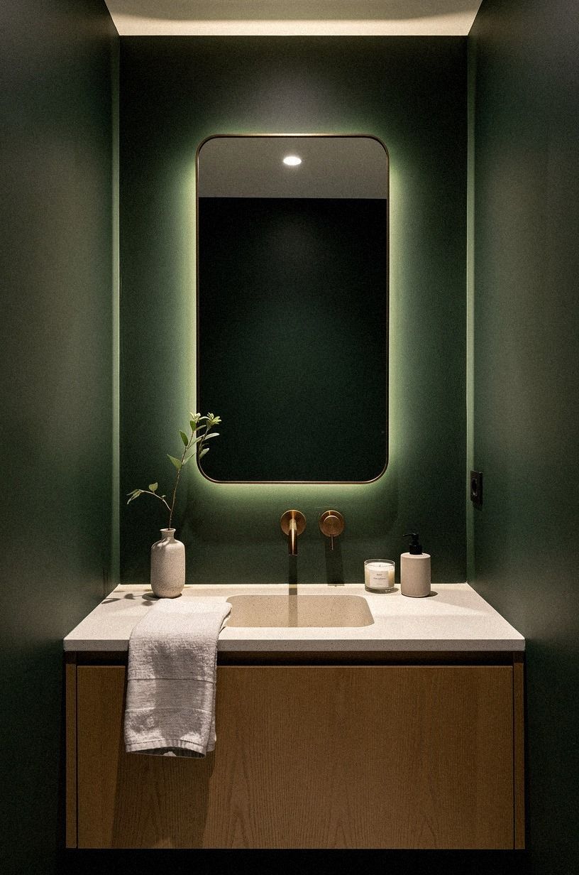
Dark green needed a partner, and I rejected stark white. I used a warm ivory tone on the inside of the medicine cabinet and on a small ceiling border. It has a gentle undertone that softened the contrast without washing out the walls.
You might prefer Sherwin-Williams Sea Salt SW 6204 if your room gets stronger daylight. It reads airy in some spaces and gray-green in others, so sample it before committing. I tried a bright cream first, but it made the green look harsher.
The warm neutral was the better choice because it connected the copper details, ivory surfaces, and Calacatta marble with its gold veining. But don’t spread the neutral across every surface. A small powder room needs contrast to keep its shape.
I used the ivory sparingly, almost like a lining. The ceiling border is only a few inches wide, and the medicine cabinet interior is visible only when the door opens. Those small areas still matter because they soften the transition wherever the dark wall stops.
The room’s palette became simple: deep green, warm ivory, copper, midnight blue, and a little Calacatta marble. That’s enough variation for a space this size. Adding pink, blue, or bright white would have made the room less settled.
9Float One Shelf, Not a Collection
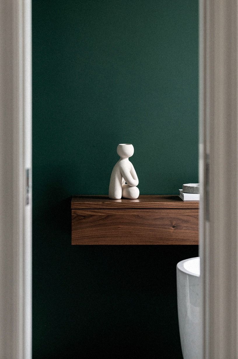
The wall above the toilet was empty, but I didn’t want a stack of little decorations. I installed one cerused white oak shelf, only deep enough for a small vase, a folded hand towel, and a framed photograph. The shelf sits high enough to avoid bumping shoulders while still reading as part of the room.
You can style a shelf with fewer pieces than you think. Mine holds a ribbed ceramic vessel, a sprig of sage foliage, and one candle in aged bronze. That’s it.
I tried adding a second shelf, and the wall started looking like storage instead of a considered corner.
The vase is slightly taller than the frame, while the candle is the lowest item. That uneven rhythm keeps the arrangement from looking stiff. I also left a clear section of shelf visible, because completely filling it made the wall feel heavy.
The folded towel is practical, not a prop. Guests can reach it without turning around, and the texture adds softness against the painted wall. If you’re drawn to fuller arrangements, these small powder room styling ideas show how spacing can do more than quantity.
A shelf should solve a problem or create a moment. Mine does both by giving the empty wall purpose without turning it into a display case.
10Art Instead of Extra Storage
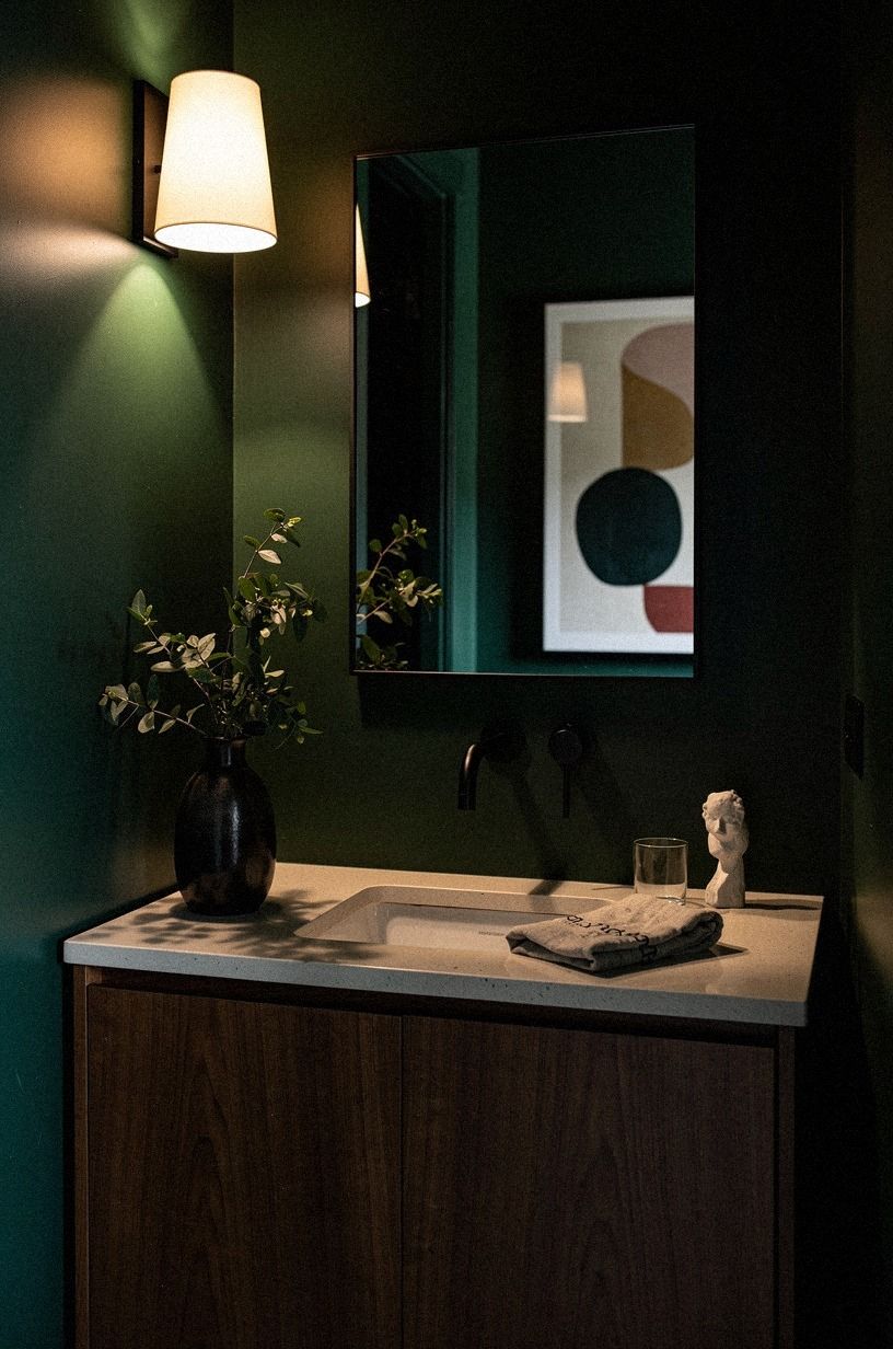
I skipped a tall cabinet because the room already had enough vertical edges. A small piece of backlit translucent onyx gave the blank wall interest without adding another storage box.
11Choose Texture Over Another Color
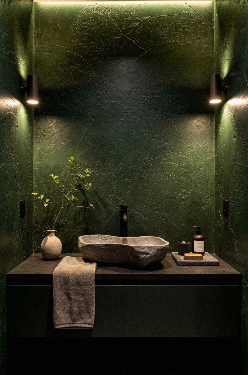
The room already had clay, linen, aged brass, and book-matched walnut. I didn’t add another accent color. I added texture instead: a 600gsm Turkish cotton hand towel, a nubby wool-blend bath mat, and a small ceramic soap dish with a chalky finish.
You can make a dark powder room feel cozy without adding five more colors. Texture catches the light differently, which gives the room movement when the palette stays quiet. I tested a patterned towel, but it made the sink area feel scattered.
The heavier cotton was the better investment because it feels substantial in your hands and holds its shape after washing. A thin decorative towel would have looked fine for a week, then started curling at the edges.
I also replaced the plastic soap bottle with a smoked glass dispenser. It isn’t a major change, but the darker material disappears against the vanity instead of introducing another bright object.
If your own room feels too flat, try changing the textiles before repainting the walls. A woven basket, ribbed vessel, or nubby mat may provide the movement you’re missing. You don’t have to solve every problem with color!
Texture is especially helpful when the room already has a strong palette. It gives guests something to notice up close while allowing the overall composition to remain calm from a distance.
12Can Dark Green Work Without Daylight?
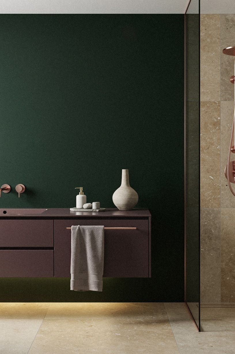
Can dark green powder room ideas work when the room has almost no daylight? Yes, but you need to control the undertones and the bulbs. I used warm bulbs, kept the ceiling pale, and added warm travertine near the vanity instead of green tile on every wall.
The result feels dramatic in the evening and still readable during the day.
You should also protect the practical clearances. A standard toilet needs at least 21 inches in front, while a vanity generally sits between 32 and 36 inches high. Those measurements matter more than squeezing in one extra decorative object.
I considered a floating vanity, but the visible plumbing would have made the room feel unfinished. Article Sven leather tones inspired the tan sample I tested, yet I chose walnut because it looked calmer beside the paint. For another small-room comparison, see these dark guest bathroom ideas.
If the room has no window, choose a green with enough warmth to survive artificial light. Blue-based greens can turn cold under certain bulbs. A sample board is more reliable than a tiny paint card, and you should move it around the room before deciding.
The ceiling doesn’t need to be bright white. A warm off-white can keep the room from looking chopped into dark walls and a glowing lid. I used the buff tone near the ceiling because it made the transition gentler.
How much it cost
I kept the makeover focused on paint, reflection, lighting, hardware, and textiles. That meant I didn’t move plumbing, replace the vanity, or retile the floor. Your own total will depend on what you already have, but the typical US ranges below show how quickly a bathroom project can grow once the work becomes structural.
The paint and styling route is where I would start. A new vanity or partial wall tile can create a bigger change, but it moves the project into a very different spending tier. If your powder room needs more than a cosmetic update, price the plumbing before you fall in love with tile.
Material choices shift the total as well. Zellige tile typically runs $15-$35 per square foot, while subway tile is often $2-$10 per square foot. A marble top can reach $50-$100 per square foot, and a brushed brass faucet commonly falls between $120 and $450.
I wouldn’t spend high-tier money on a room that only needs better light and a stronger wall color. Start with the surface people see first. For additional ways to stretch a smaller budget, revisit these moody powder room ideas and compare what changed the mood versus what simply filled space.
What I learned from choosing dark green
I went back and forth for weeks because dark green sounds like a brave choice until you’re standing beside a tiny sink with a paint brush. My first sample looked almost black after sunset. I nearly chose a lighter sage, then remembered why I wanted the room to change in the first place.
The pale option was calm, but it didn’t have enough presence.
The lesson wasn’t that dark paint works everywhere. It was that a small room gives you permission to make one clear decision. You don’t need every finish to be dramatic.
You need the wall color, light, and mirror to support one another.
The warm brass keeps the green from feeling severe. The wood keeps it earthy.
The simple art keeps it peaceful. Those three relationships mattered more than the exact brand of faucet or frame.
And you should expect the room to look different at different hours. At noon, the green feels grounded and fresh.
At night, it becomes intimate and almost theatrical. That’s why I wouldn’t judge a paint sample under one bulb.
Live with it. Move a lamp. Look at it when you come home tired, because that’s when the room has to feel inviting.
The most expensive mistake would have been replacing everything before understanding what bothered me. The vanity wasn’t the real problem.
The harsh light was. The chrome was. The blank wall was.
Once I fixed those, the old pieces stopped looking like obstacles and started looking useful.
If you’re still unsure, read this dark powder room guide before buying gallons of paint. Then look at your own room with the lights on and off. A thoughtful first change can tell you what the second one should be.
A Few Things Worth Answering
What is the best dark green powder room idea for a small bathroom?
Paint the walls in a deep green, then pair it with one warm wood element and a West Elm or simple framed mirror. The combination gives you rich contrast without crowding the room. A small vanity, soft towel, and one light source at face height are enough.
Where can I buy dark green powder room pieces on a budget?
Start with IKEA, Wayfair, and Target, then check Facebook Marketplace or a local thrift store for mirrors and frames. Secondhand wood often has more texture than new budget furniture, and you won’t need many pieces to make your room feel warm.
How much does a dark green powder room makeover cost?
A cosmetic makeover typically falls within the $200-$1,200 budget range in the United States. Paint, a mirror, faucet, and textiles can be enough. You can keep costs lower by using your existing vanity and changing only the light, wall color, and hardware.
Can I create a dark green powder room on a budget?
Yes, and you can begin with paint, a secondhand mirror, and new towels. Keep the existing faucet if it works, then spend your money on the light fixture or a sample pot of Farrow & Ball Hague Blue. Those changes give you the strongest visual return.
These budget-friendly powder room examples can help you prioritize.
Is a dark green powder room worth it in a small space?
Yes, because the smaller footprint keeps the color from becoming expensive or overwhelming. Use the walls as the main statement and keep the floor quiet. You should also protect at least 21 inches of clearance in front of the toilet.
Is dark green a good idea for a rental?
Yes, if you use removable changes. Peel-and-stick wallpaper, a tension-mounted towel bar, a framed mirror, and removable hooks can create the mood without permanent work.
Removable wallpaper is the safest place to test a color before committing to a future home. For more inspiration, see this moody wallpaper look.
Where I’d Start First
If I had to pick one, I’d start with the wall color. You can’t layer warmth over a cold green or harsh bulb, and every mirror, towel, and brass detail will fight the room. Paint first, watch it at night, and let the rest follow.
Then change the light. After that, choose one metal, one wood contrast, and one useful textile. You won’t need to replace every surface to make the room feel considered.
Pin this makeover for later. The change was worth it!