
What separates a timelessly elegant powder room from a trendy one is simple: start with useful proportions, then layer materials that age well. I learned this after repainting a tiny room twice in one year. Your powder room shouldn’t chase every new finish. It should feel warm, refined, and quietly personal.
Before You Start: Build the Timeless Powder Room Kit
Measure the room before you shop. Your vanity should sit between 32 and 36 inches high, and you’ll want at least 21 inches of clearance in front of the toilet.
Those numbers sound ordinary, but they’re what keep a small room comfortable instead of cramped. I’d rather see a plain vanity with breathing room than an expensive cabinet that blocks your knees.
Make a short material list before you choose a color. Honed travertine, unlacquered brass, Belgian flax linen, a framed mirror, and one warm light source will take you much farther than a cart full of matching accessories. You don’t need every finish to coordinate perfectly.
You need each one to have a reason for being there.
If you’re styling for fall, save the broader fall home decor checklist before you buy anything. It’s easier to make one room feel connected to your house when you’ve already decided which textures belong throughout your home.
- Start With the Bones for Timeless Powder Room Ideas
- What Should the Room Feel Like?
- Paint Over Wallpaper When the Walls Need Quiet
- The Three-Height Light Stack Anchors the Vanity
- Paint the Ceiling for a More Enveloping Powder Room
- Frame the Mirror Instead of Chasing the Latest Shape
- Choose Patina Over Shine for Hardware That Ages Well
- Layer Texture With the Soft Materials Rule
- Where Should Art Hang at the Guest’s Eye Level?
- Build Contrast With Stone Over Shine
- Classic Modern Master Bath: What Belongs Here?
- Edit the Shelf With the Three-Object Limit
- Finish With a Doorway Test for Quiet Detail Over Visual Noise
1Start With the Bones for Timeless Powder Room Ideas
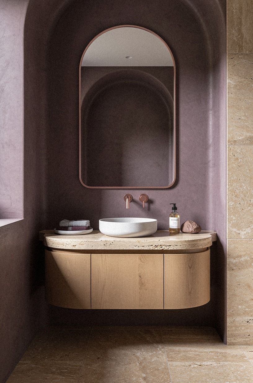
Look at the fixed elements first: flooring, vanity position, toilet clearance, and plumbing. Your room can handle a dramatic color if its proportions work.
It can’t handle a beautiful faucet when the door hits the vanity every time you open it. I’d fix the awkward circulation before spending money on decorative pieces.
A compact powder room doesn’t need a full renovation. You can keep the existing toilet and vanity, then improve the visual weight with a framed mirror and better lighting.
Warm travertine gives the room softness and character without making it rustic. If you’re working around a builder-grade cabinet, paint it instead of replacing it, especially when the box is still solid.
I made the mistake of choosing hardware before checking the cabinet holes. Don’t repeat that expensive little detour. Your first step should be a measuring tape, a pencil, and a sketch of every wall.
If you’re also updating nearby rooms, use the fall decorating checklist to decide which materials deserve to repeat. A single shared wood tone or metal finish can make the house feel considered.
2What Should the Room Feel Like?
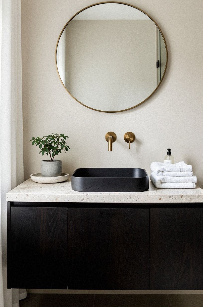
Before you choose paint, answer one question: should your powder room feel calming, moody, inviting, or bright? Your answer will narrow the materials quickly.
I’d choose a serene room with dark walls over a pale room packed with trendy objects because guests remember atmosphere, not the number of accessories. That choice will save you from buying a roomful of the wrong things!
For a moody powder room, Farrow & Ball Hague Blue No. 30 gives the walls depth without turning them flat. In a room with little daylight, sample it beside your mirror and light fixture.
You’ll notice the color shift from blue to ink as evening arrives. That change is part of its charm.
And don’t assume a small room must be bright white. A darker wall can make the edges recede, which gives your eye fewer competing lines. If you’re still deciding between warm and cool color, browse this quiet-room perspective and think about how your space should behave, not just how it should feel.
A calm room usually needs fewer objects. A dramatic room can handle one strong material, such as unlacquered brass, but it still needs somewhere for the eye to rest.
3Paint Over Wallpaper When the Walls Need Quiet
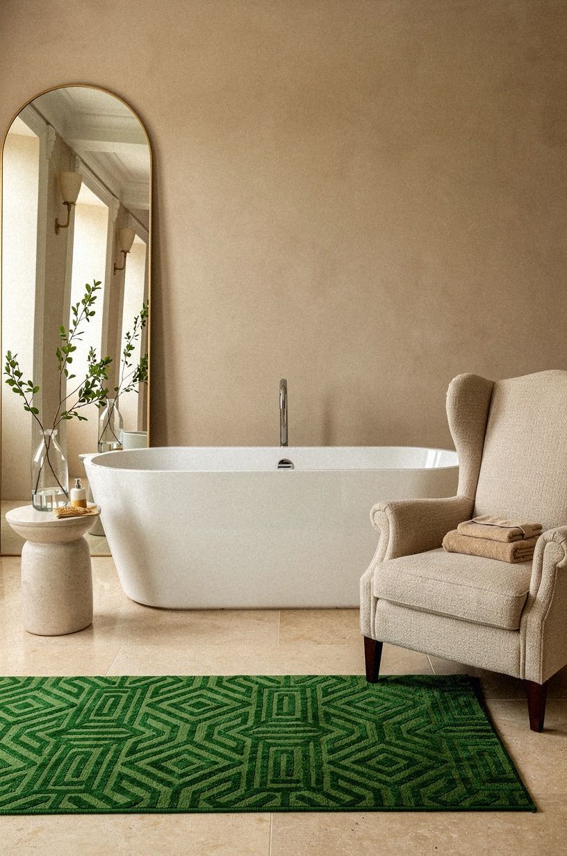
Paint is the better choice when your walls have awkward patches, uneven corners, or a finish you may want to change later. Your powder room will feel more expensive when the backdrop is calm enough to let the mirror and faucet carry some weight.
I’d skip tiny novelty wallpaper here. It often dates faster than the plumbing.
Benjamin Moore Chestertown Buff HC-9 brings a soft, earthy warmth to rooms with cream tile or wood tones. Use it behind a brass mirror and an oversized-chip terrazzo soap dish, and you’ll get contrast without visual noise.
If your room has no window, test the color at morning, afternoon, and night. You won’t see the same paint three times.
But wallpaper can work when the pattern has scale and restraint. Choose a broad botanical or a small geometric with two quiet colors. Your room should still look composed after the trend cycle moves on, and a controlled pattern gives you that chance.
If you do choose wallpaper, order a sample before committing to a full roll. Check it beside the trim color, the floor, and the light fixture. A pattern that seems soft online can become surprisingly busy under a warm bulb.
4The Three-Height Light Stack Anchors the Vanity
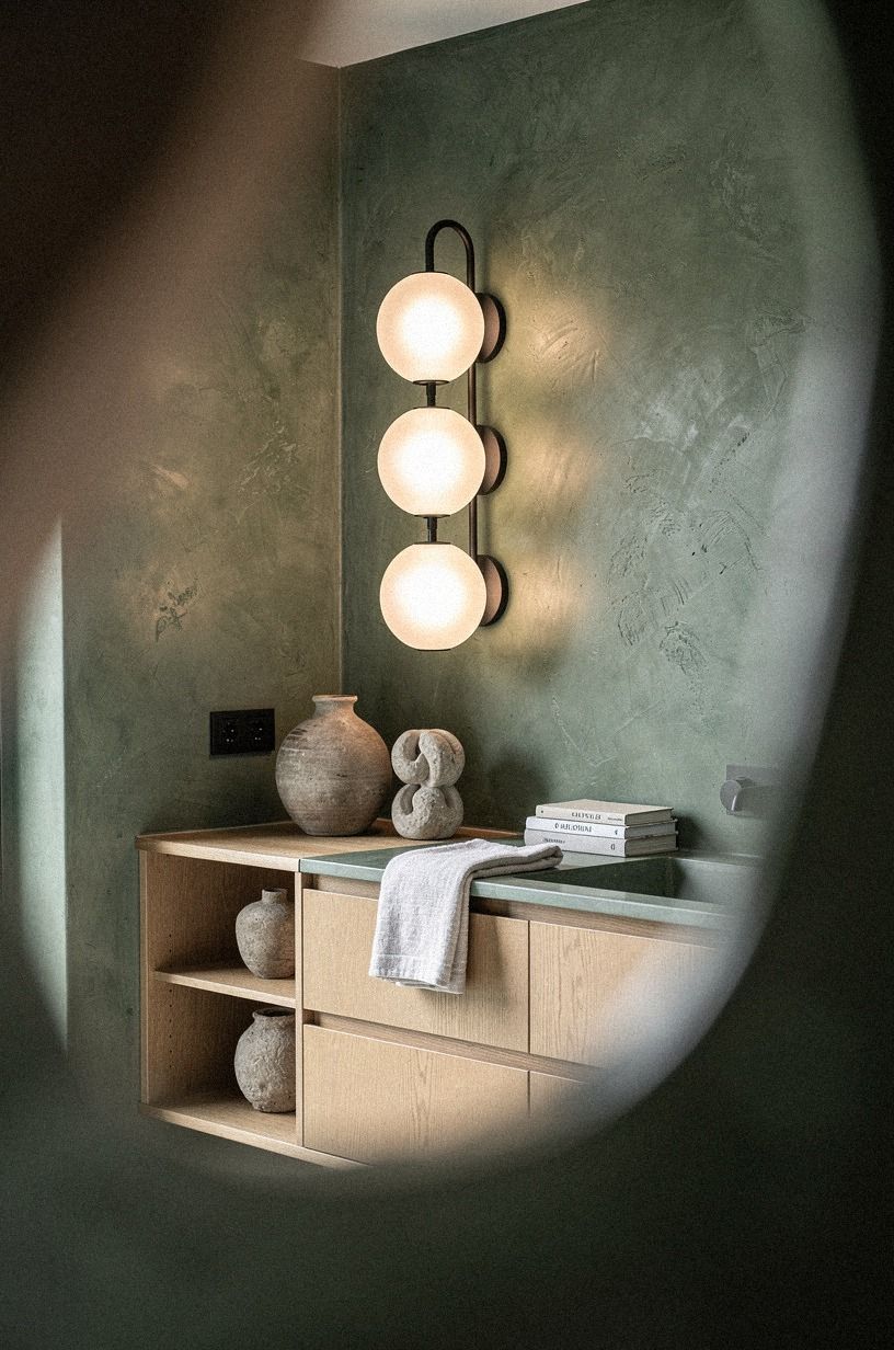
The Three-Height Light Stack is my favorite way to keep a powder room from feeling like a showroom. Your eye needs something low, something at face level, and something above. The vanity provides the low anchor, the mirror occupies the middle, and the ceiling or wall light finishes the vertical line.
Start with a mirror that’s narrower than the vanity by a few inches. Hang the light so it doesn’t cut across your reflection, then add one low object such as a stone tray. Hand-applied Venetian plaster works especially well when the room already has warm paint because its irregular surface absorbs light instead of flashing it back.
You don’t need a large chandelier. In fact, I’d avoid one in a narrow room because it can make the ceiling feel lower. A pair of compact sconces gives your face better light and creates a gentle pool of brightness on the wall.
Good light changes everything! If you’re planning the rest of your seasonal rooms, this home decorating checklist can help you keep the same layered lighting logic elsewhere.
Use 2700K bulbs when you want warm skin tones and softer reflections. If your room already has yellow tile, move slightly cooler, but don’t install a stark daylight bulb just because it seems brighter in the store.
5Paint the Ceiling for a More Enveloping Powder Room
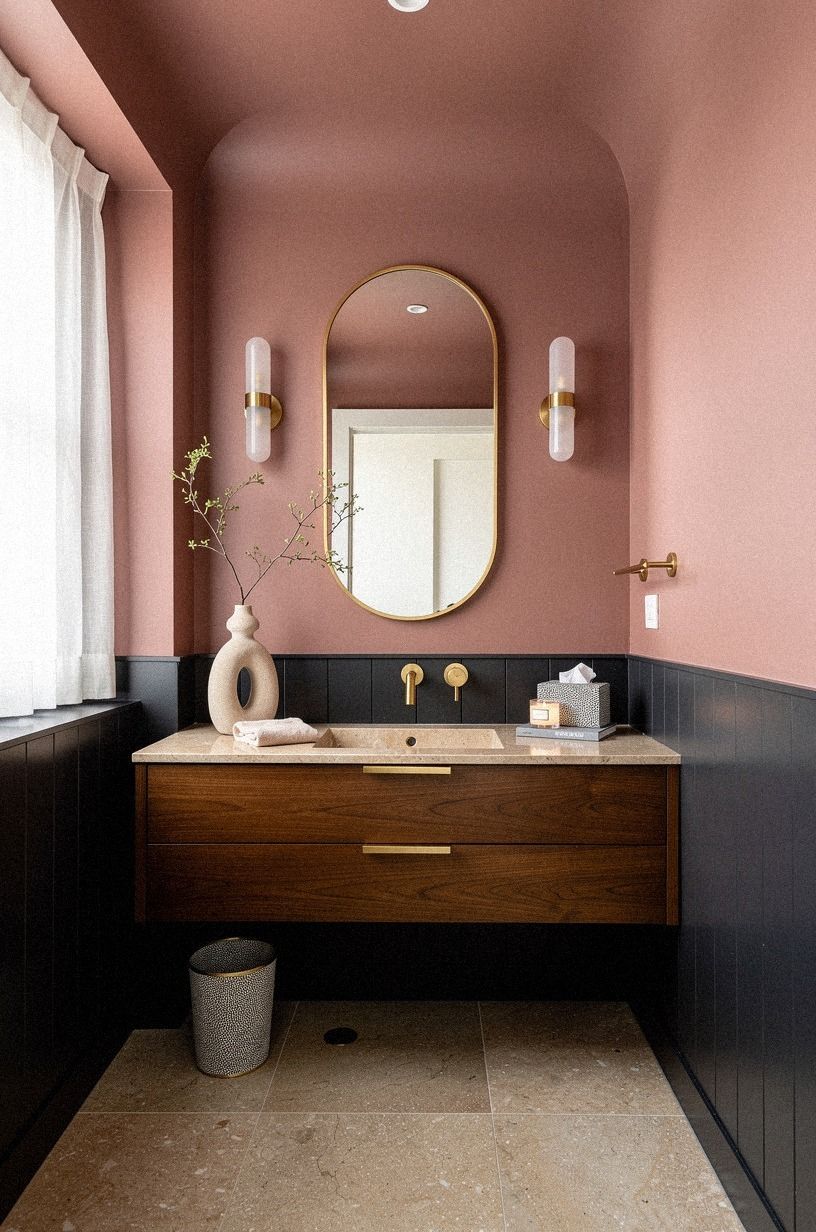
Painting the ceiling can make your room feel intentional instead of chopped into separate surfaces. Your ceiling doesn’t have to match the walls exactly. A lighter version of the wall color will soften the transition, while a deeper version can create a dramatic, intimate effect.
I like Farrow & Ball Setting Plaster No. 231 when a powder room needs a gentle dusty-rose cast. Pair it with a charcoal accent and warm bulbs, and the room feels enveloping without becoming heavy. The finish matters too.
A low-sheen ceiling hides small imperfections better than a high-gloss surface.
But don’t paint a dark ceiling just because the room is small. If you already have dark walls, a bright ceiling may give your eye a place to rest. You’ll know the balance is right when the room feels wrapped rather than compressed.
And test the ceiling color before committing. The light bouncing down from it changes the way your mirror reflects skin, tile, and metal, so your sample should sit above eye level for a full day.
For a room with a strong seasonal palette, revisit the fall home color guide before choosing a second wall color. The ceiling should support the room’s mood, not introduce another unrelated shade.
6Frame the Mirror Instead of Chasing the Latest Shape
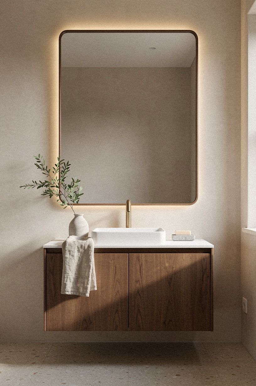
A framed mirror is one of the strongest timeless upgrades because it gives the wall a finished edge. Your mirror doesn’t need an unusual outline to make a statement. It needs the right width, a material with character, and enough space around it to breathe.
Choose a camel-toned frame when you want warmth without adding another shiny finish. Its soft color makes the room feel lived-in, while polished chrome can look too sharp beside warm paint. I’d skip a frameless builder mirror unless your goal is a deliberately minimal room.
For a narrow vanity, a tall rectangular mirror usually works better than a wide oval. It draws the eye upward and leaves room for sconces. If your ceiling is low, keep the frame slim so the wall doesn’t feel crowded.
Your mirror also needs practical placement. Hang it where you can see your face without leaning forward, and check that the door won’t reflect a messy hallway. That small sightline matters more than a fashionable silhouette.
The frame should relate to something else in the room, but it doesn’t have to match the faucet exactly. A black frame can sharpen pale walls, while a camel frame can connect to warm textiles. For more ideas about visual restraint, revisit this quiet-room perspective.
7Choose Patina Over Shine for Hardware That Ages Well
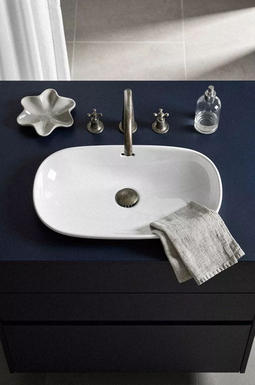
Hardware is where a powder room can become dated quickly. Your faucet, cabinet pull, towel ring, and light finish don’t need to match exactly, but they should share a visual temperature. I’d choose two related metals over one matching set that makes the room feel packaged.
A copper faucet with a rounded spout works beautifully beside dark paint and cream stone. Copper also gains character as it changes tone, which is useful in a room guests actually touch. If your budget is tight, replace the faucet first and keep the existing cabinet hardware until you can upgrade it properly.
Don’t mix five finishes because a showroom did. Two is enough for most small rooms.
Copper and ivory can live together when one catches the light and the other quiets it. Your eye will read the difference as layering, not confusion.
For a no-drama update, save the polished chrome and replace only the cabinet pulls. You’ll see the change immediately, and you won’t have to disturb the plumbing.
Pay attention to the shape as well as the finish. A rounded spout, a simple knurled pull, or a narrow ring feels more settled than an elaborate handle that announces its decade.
8Layer Texture With the Soft Materials Rule
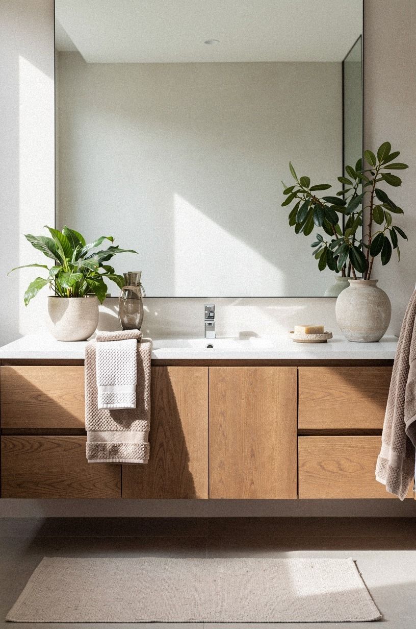
The Soft Materials Rule says your powder room needs at least one textile or tactile surface to keep hard finishes from taking over. Your hand towel, window treatment, and small rug can provide that softness without turning the space fussy.
Choose 600gsm Turkish cotton for a hand towel if you want a dense, absorbent texture. Fold it rather than rolling it, then place it where guests can reach it without crossing the room. A small Nero Marquina marble ledge can add a dark, tactile note near the window, while a woven basket hides extra paper products.
I’d skip a shag bath mat in a powder room. It traps dust, crowds the floor, and looks too casual beside a refined vanity. A flat-weave rug with a quiet stripe will give you warmth without competing with the tile.
This is where your room can pick up a little personality. A hand-thrown ceramic cup, a folded towel, and one branch in a narrow vessel are enough. You don’t need a shelf full of objects to make the room welcoming.
Texture should appear at different heights. Put the towel near the sink, the rug underfoot, and the basket low against the wall. That distribution keeps the room from feeling visually top-heavy.
A related layered decorating guide can help you carry the same idea into larger rooms.
9Where Should Art Hang at the Guest’s Eye Level?
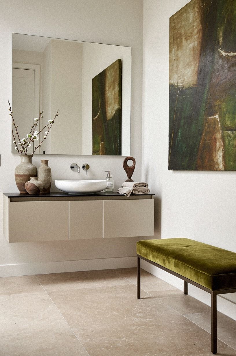
Art gives your powder room a point of view, but the placement should feel natural.
10Build Contrast With Stone Over Shine
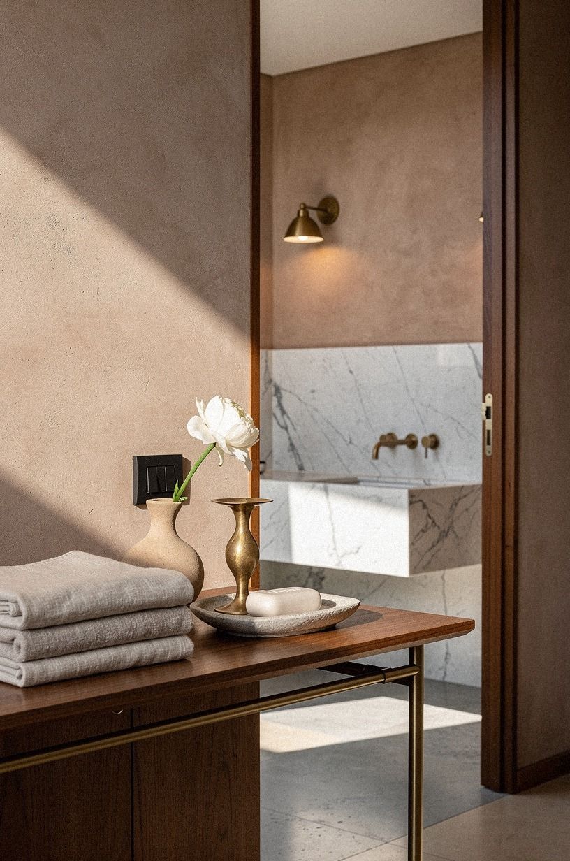
Stone Over Shine is a simple contrast rule: choose one matte, irregular surface to balance your smoother finishes. Your powder room will feel more sophisticated when every surface doesn’t reflect the same amount of light.
Try Carrara marble with subtle gray veining on a tray or vanity top if a full slab isn’t practical. It gives you visual movement without the mirror-like glare of polished stone. Aged brass can work too, especially when its softened finish sits beside linen-colored walls and quieter stone.
I’d avoid pairing glossy tile, glossy paint, polished metal, and a lacquered vanity in one tiny room. It sounds luxurious, but the reflections compete and every water mark becomes visible. You’ll spend more time wiping surfaces than enjoying the result.
The better approach is one reflective moment surrounded by quieter textures. Let the mirror shine. Let the wall, tile, and towel absorb the rest.
A soapstone tray, a limewashed wall, or a honed limestone ledge can introduce the same balance without starting a full renovation. Save the seasonal texture checklist if you’re collecting materials gradually.
11Classic Modern Master Bath: What Belongs Here?
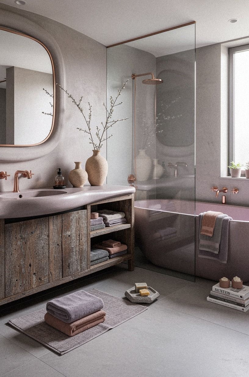
A powder room can borrow ideas from a classic modern master bath without pretending to be one.
12Edit the Shelf With the Three-Object Limit
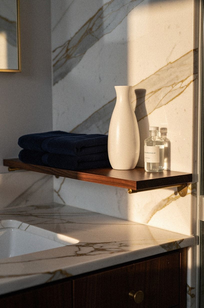
A shelf becomes elegant when your eye can understand it in one glance. Use the Three-Object Limit as a starting point: one useful item, one natural shape, and one piece with a personal connection. Your powder room doesn’t need a styled shelf that looks untouched.
Try a ceramic soap vessel, a small branch, and a framed matchbook or miniature print. Calacatta marble with gold veining in a shallow tray can bring color and movement without requiring a new wall treatment. If you’re styling a narrow ledge, keep every object below the mirror’s lower edge.
I’d remove anything that only fills space. A decorative box nobody opens, a fake plant covered in dust, or a sign with a bathroom joke will pull the room toward novelty. Your guests may not name the problem, but they’ll feel the difference.
And leave some empty space. The gap is what lets the objects look chosen instead of accumulated. For a quieter approach to styling, compare your shelf with this room-atmosphere guide.
Your useful object might be a lidded stone container for matches or a small hand lotion bottle. The natural shape could be a branch, shell, or smooth piece of wood. The personal object should have a story, even if nobody else knows it.
13Finish With a Doorway Test for Quiet Detail Over Visual Noise
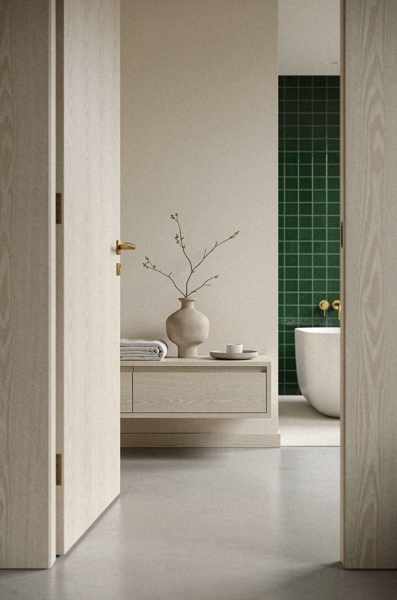
The doorway test is the final step. Turn on the lights, stand outside the room, and notice what your eye catches first. Your powder room should present one clear focal point, usually the mirror, wall color, or vanity, instead of thirteen competing details.
Take away one object, then look again. I almost always prefer the edited version. Warm white paint on trim can help the architecture read clearly, especially when the walls are deeper.
Check the baseboards, switch plates, towel position, and cabinet alignment because small crooked details become obvious in a compact room.
Your last check should happen at night. Many rooms look balanced in daylight and harsh after dark.
If the mirror throws a cold glare, change the bulb temperature or add a side light. If the floor disappears, bring in a small woven texture. The night check catches details daylight hides!
But don’t keep adjusting forever. A room can be refined and still look lived-in. This story about noticing small details makes the same larger point: gradual change often creates the most convincing result.
Before you close the door, test the towel reach, the cabinet swing, and the reflection from the hallway. Those small practical checks will tell you more than another hour of scrolling.
Why Timeless Rooms Age Better
I don’t think timeless design means avoiding every trend. That would leave you with a room so cautious it has no pulse.
To me, timeless means the permanent pieces carry the room, while the temporary pieces can change without making the whole design feel foolish. Your faucet, paint, mirror, and floor should still make sense when a popular color disappears from every feed.
I’ve made the opposite mistake. I once chose a finish because it looked good under intense light, then watched it look icy and flat at home.
The room needed texture, not another polished surface. Since then, I’ve paid more attention to what a material does at night, after a towel has been used, and when the room is quiet.
The best powder rooms also have a little tension. A dark wall with pale stone.
A traditional mirror above a simple vanity. Brass that’s beginning to soften beside a crisp white sink.
You don’t need every element to belong to the same decade. You need the contrast to feel deliberate.
That’s why I’d spend your money on the parts you touch and see every day. Improve the light, choose a faucet with a comfortable handle, and make sure the vanity height works for you.
Decorative objects can come later. A room with good bones can wait, and waiting keeps you from buying pieces you’ll resent.
I want the finished space to feel like someone lives nearby, not like a showroom has been sealed behind the door. If you can walk in at midnight and still understand why each material is there, you’ve made something lasting.
And if one small trend sneaks in, that’s fine. Your room should have a point of view, not a museum label.
A Few Things Worth Answering
What is the best timeless powder room style for a small bathroom?
A framed mirror, warm wall color, compact vanity, and one aged metal finish create a calm focal point without crowding the room. I’d pair Benjamin Moore Chestertown Buff with oak or stone, then keep your accessories low and useful. You’ll get warmth without losing clear floor space.
Where can I buy timeless powder room pieces on a budget?
Look at IKEA, Wayfair, Target, Facebook Marketplace, and local thrift shops for affordable structure. Your best second-hand finds may be mirrors, ceramic vessels, and small framed art. Skip used plumbing unless you can inspect it carefully, because a cheap faucet can become an expensive repair.
This fall shopping checklist can also help you prioritize materials.
How much does a timeless powder room makeover cost?
A small refresh can fall within the $200 to $1,200 budget tier when you keep the vanity and plumbing. Paint, a mirror, faucet, and textiles fit that range. Larger work rises quickly when you add tile, lighting, or a new vanity.
Can I create a timeless powder room on a budget?
Yes, and you can start with free improvements. Remove clutter, edit the shelf, wash the walls, and reposition the towel.
Then spend on one visible upgrade, such as paint or a framed mirror. You don’t need to replace everything for the room to feel more intentional.
Is a timeless powder room worth it in a small space?
Yes, because a small room lets you see the result quickly. A clear focal point and correct spacing can make the room feel more comfortable without adding square footage.
Keep at least 21 inches in front of the toilet, then use vertical storage and a tall mirror. This small-space decorating guide can help you think through the surrounding layout.
Is timeless powder room design a good idea for a rental?
Yes. Choose reversible changes such as removable wallpaper, a tension rod, peel-and-stick lighting, and freestanding storage.
Keep the original hardware labeled in a box. Your rental can still feel personal, but every change should be easy to remove when you move.
How long does a powder room refresh take?
A paint-and-accessory refresh can take a weekend if your walls are ready and you’re keeping the existing plumbing. Planning time matters most because wrong measurements create delays.
Give your samples a full day, and don’t order a mirror until you’ve checked the door swing. The same idea applies to creating a quieter home atmosphere, as explained in this room perspective.
Where I’d Start First
If I had to pick one step, I’d start with the paint color. A cold wall can make every warm material look dull, while the right shade gives your mirror, towel, and metal something to work against.
Test Benjamin Moore Chestertown Buff first. Pin this guide for later, then choose slowly.
For the final styling pass, use this small-detail decorating story as a reminder to trust gradual changes.