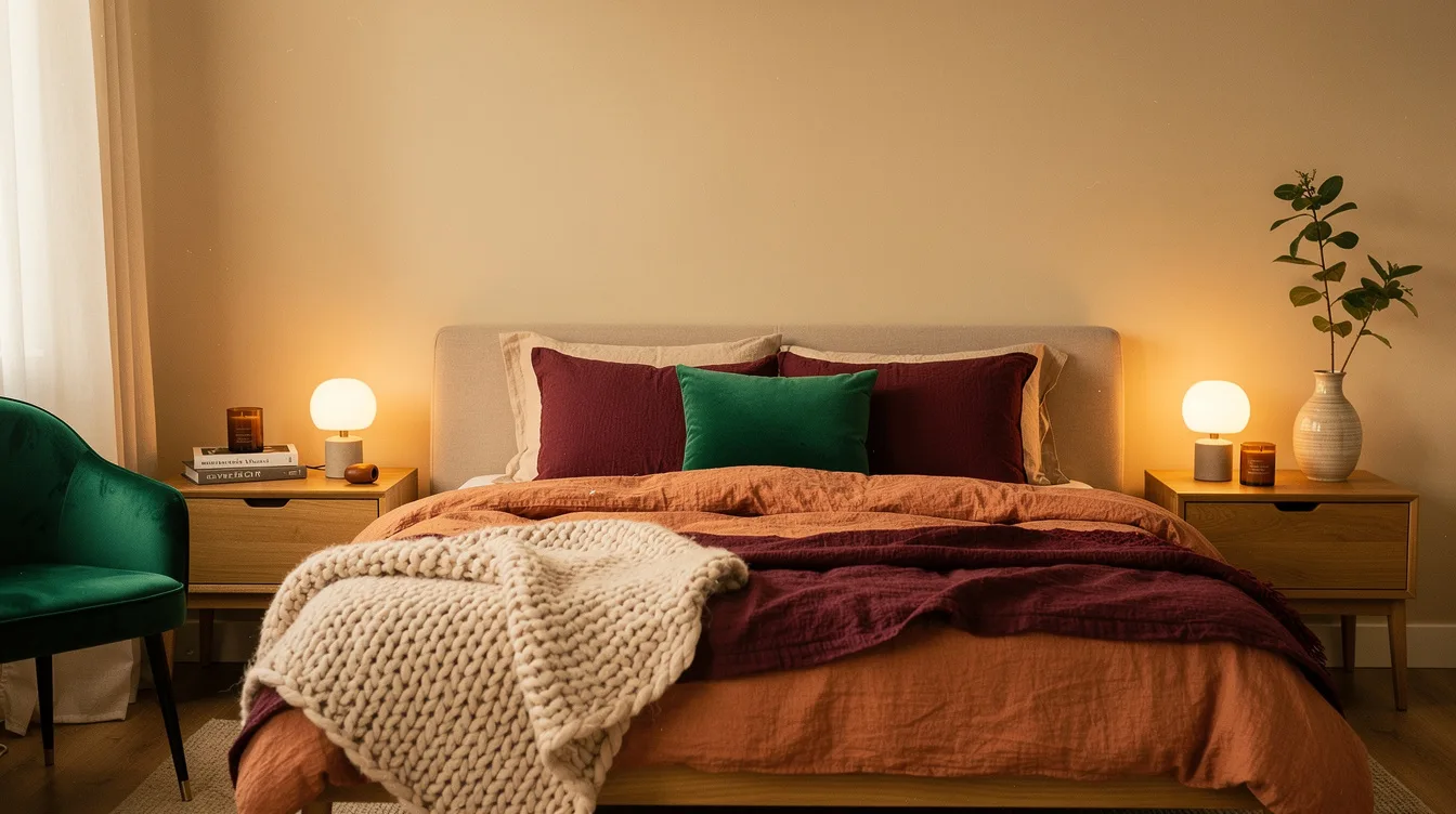
I used to think a sunset bedroom needed a dramatic orange wall. Then I saw how quickly that color turned sharp under a bedside lamp, especially around a typical 160-by-200-centimeter bed.
The stronger approach borrows the sky’s progression instead: a warm neutral foundation, blush and peach near the middle, then terracotta, rust, burgundy, or plum in smaller textile layers.
In 2026, the convincing version is tactile and cocooning. Washed linen, cotton, wool, soft woven fabrics, statement headboards, and warmer light create the glow without making the room feel themed.
Start With a Warm Neutral Base
The sunset effect begins with restraint. Use warm beige, sand, pale putty, or creamy off-white across the walls and larger furniture so the room feels like golden hour rather than an orange box.
A typical 160-by-200-centimeter bed already creates a strong visual block, so the surrounding color needs to stay quiet. Natural oak and soft brass keep the base warm without competing with the bedding.
Muted walls also make seasonal changes easier. A pale clay quilt can bring in more warmth during colder months, while ivory layers keep the same room calm in brighter weather.
Build the Bed in Five Texture Layers
Keep the bed to about five layers, each with a clear job. Begin with cotton percale sheets and pillowcases in warm ivory, almond, or light sand.
Add a duvet cover in washed linen colored oatmeal, flax, pale peach, or muted rose. Its natural wrinkles give the bed movement and stop the palette from looking overly polished.
Place a coverlet in cotton gauze, waffle cotton, or textured linen over the duvet, choosing terracotta, cinnamon, or faded rust. Around 200 to 400 grams per square meter works as a useful weight range for a coverlet that feels substantial without becoming stiff.
Finish with one visibly different throw, such as chunky wool, brushed cotton, or a soft knitted weave, then add two sleeping pillows and a typical 30-by-50-centimeter lumbar cushion. More pillows usually make the bed look staged instead of inviting.
Keep the Strongest Orange Below Eye Level
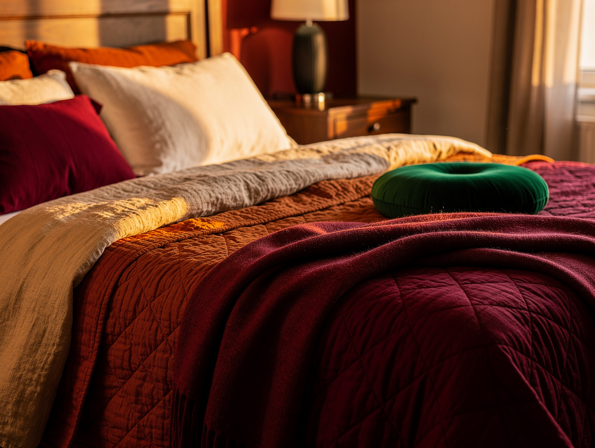
Sunset colors work best when the strongest shade sits low. Put muted terracotta on a bedspread, folded coverlet, or rug rather than covering every wall.
A rust throw across the lower third of the bed creates the visual warmth people want without making nighttime lighting feel harsh. The same approach works with paprika, cinnamon, or tobacco.
Let the upper half of the room stay softer with ivory bedding, warm curtains, and a pale headboard. This keeps the eye moving toward the bed while preserving a restful ceiling line.
Warm the Room With Layered Light
Paint alone cannot create the glow of late afternoon. Use a warmer source around 2200K to 2700K for bedside lamps or dimmable ceiling fixtures, then soften the light with fabric shades.
Full-height linen drapery filters daylight and gives the peach and clay tones a gentler cast. Hang it close to the ceiling when possible so the fabric reads as part of the room’s architecture.
A small lamp on a nightstand, a low glow near the dresser, and one reading light beside the bed provide more depth than a single bright overhead fixture. The room should still look grounded after sunset, not artificially orange.
Anchor Blush With Deeper Tones
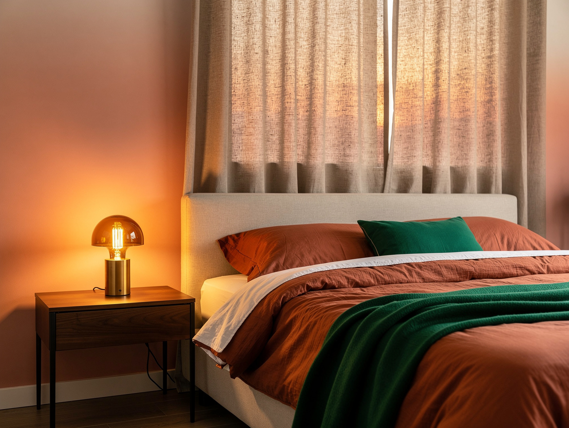
Blush and peach need a darker note to keep the room from feeling sugary. Burgundy works especially well on a bed-end throw, narrow cushion, or upholstered headboard accent.
For a moodier bedroom, bring in charcoal wool through a rug or small cushion. Its cool depth gives the warmer colors a sharper edge without breaking the sunset story.
Dark wood, aged brass, or a walnut nightstand can carry the same weight. Keep these anchors limited to a few pieces so the room remains soft instead of turning into a heavy winter scheme.
Size the Textiles for Real Draping
Good color placement loses impact when the bedding is undersized. For a typical 160-by-200-centimeter bed, a 240-by-220-centimeter duvet cover or a roughly 260-by-240-centimeter option gives the top layer enough fall for a relaxed, hotel-style finish.
A typical 150-by-200-centimeter throw folded lengthwise across the lower third looks intentional on that bed size. On a 140-by-190/200-centimeter bed, a smaller throw keeps the foot from becoming crowded.
Larger beds need stronger scale. A typical 180-by-230-centimeter throw suits a 180-by-200-centimeter bed, while a roughly 200-by-300-centimeter rug gives a queen-size arrangement enough landing space around the sides.
Use IKEA or another approved retailer for simple cotton basics, then spend attention on the tactile top layer. Texture carries the sunset mood farther than adding another bright color.
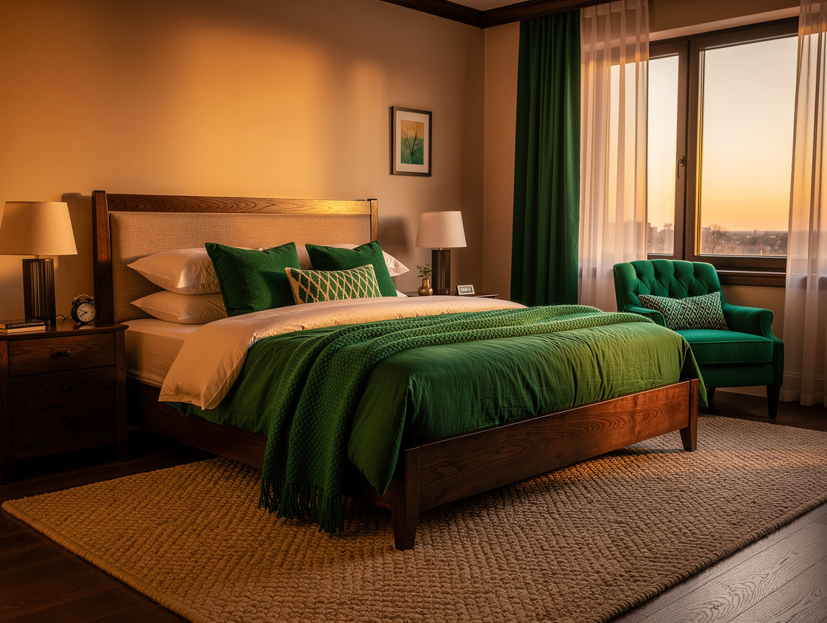
Begin with the wall color and sheet set, then add one textured layer at a time. Stop when the bed feels warm from across the room and calm when the lights go down.
Mia Carter writes about small-space living and budget home makeovers. She has restyled three rentals and tests most ideas in her own 45 sqm flat.