
A graduation photo display guests will love starts with a clear story, not a pile of prints. I learned that after taping photos everywhere and watching people miss half of them. This guide gives you a warm, organized path from blank wall to welcoming memory station. And it works!
- Start with the Guest-Sized Story Grid
- Gather Materials Before You Print
- Decide What Guests Should See First
- Anchor the Display with the Three-Height Rule
- Layer Graduation Photos from Past to Present
- Mix Candid Prints with Formal Portraits
- Build a Caption System Guests Can Follow
- Hang the Main Line with the 60-Inch Check
- Add One Table for the Three-Source Light Stack
- Swap Matching Frames for One Common Material
- Layer a Memory Basket Beside the Photos
- Frame the Wall with a Soft Color Block
- Make the Ceremony Portrait the Quiet Center
- Finish with a Guest Path and a Photograph
1Start with the Guest-Sized Story Grid
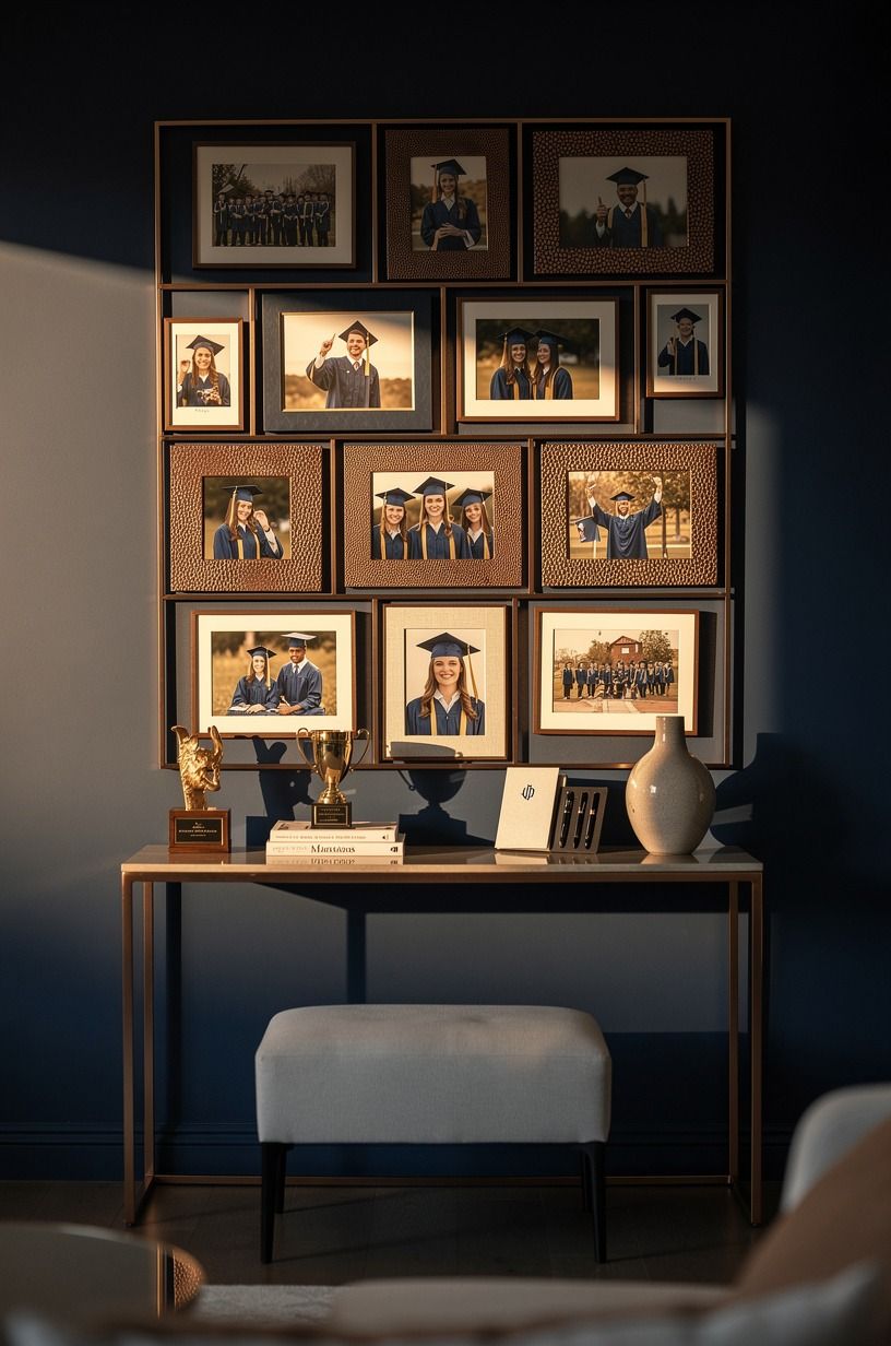
Choose one story before you print a single photo. Your graduation photo display ideas will feel more intentional if guests can follow a simple path: childhood, school years, friendships, then the ceremony. I like four broad chapters because nobody has to stand there reading tiny labels for ten minutes.
Use a shagreen-accented midnight-blue picture ledge or a wide sheet of ivory cardstock for the base. Add copper clips to warm the palette.
Keep each chapter to eight or ten photos, depending on your space. If you’re styling a narrow hallway, this small-space visual reference may help you think about rhythm and repetition.
Your first photo should be recognizable from six feet away. A toddler face, a first-day-of-school picture, or a proud cap-and-gown portrait works better than a crowded group shot. You’ll want guests to understand the beginning instantly.
And don’t make every image the same size. Mix four-by-six prints with two five-by-seven portraits so your display feels gathered rather than manufactured. The story grid is your anchor, and it keeps your graduation photo boards from becoming visual noise.
2Gather Materials Before You Print
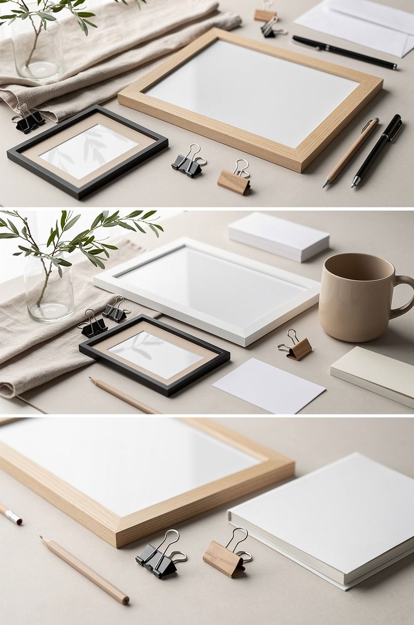
Collect everything in one place before you start cutting, taping, or framing. You’ll need photo prints, removable hooks, scissors, painter’s tape, labels, a ruler, and either a board, ledge, wire, or wall section. Your preparation will save you from running to the store with glue on your hands.
A washed Belgian linen-covered foam board gives you a soft, polished background without the weight of framed art. Pair it with natural wood clips or a sage-green backing for a gentle, grounded palette.
For a rental, removable adhesive hooks and lightweight clips are safer than nails. If you’re short on storage, read these small-space organization ideas for the same principle: every item needs a job.
Here’s the cost reality. Your display can be free if you already own clips and frames, or it can become part of a larger room refresh. These are typical US ranges from the project budget:
You don’t need the mid or high tier for photos alone. I’d spend first on clear printing and a stable display surface, not decorative extras. Your memories should look crisp, and the setup shouldn’t wobble when someone reaches for a caption.
3Decide What Guests Should See First
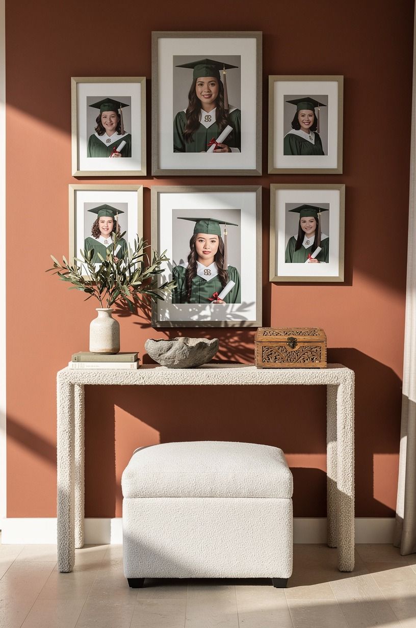
What should guests see first? Put the graduate’s strongest portrait at eye level, then let the supporting photos spread outward from it. Your display needs one visual doorway, and a centered five-by-seven print usually does the job without shouting.
Choose a stone-colored frame with an organic-bouclé mat if the room already has bright walls, or use natural wood against Benjamin Moore Terra Cotta Tile 118 for a warmer backdrop. Bring in one olive accent nearby. I’d skip a full wall of identical black frames because it can feel formal and cold at a casual party.
Keep the center of your main image about 57 to 60 inches from the floor. That standard art height works for most adults and prevents guests from bending or craning their necks. If your display sits above a buffet, you can raise it slightly so serving dishes don’t compete with the photos.
And leave breathing room around the hero image. Your guests don’t need to inspect every inch at once. A little empty space makes the central portrait feel calm, confident, and easy to remember.
4Anchor the Display with the Three-Height Rule
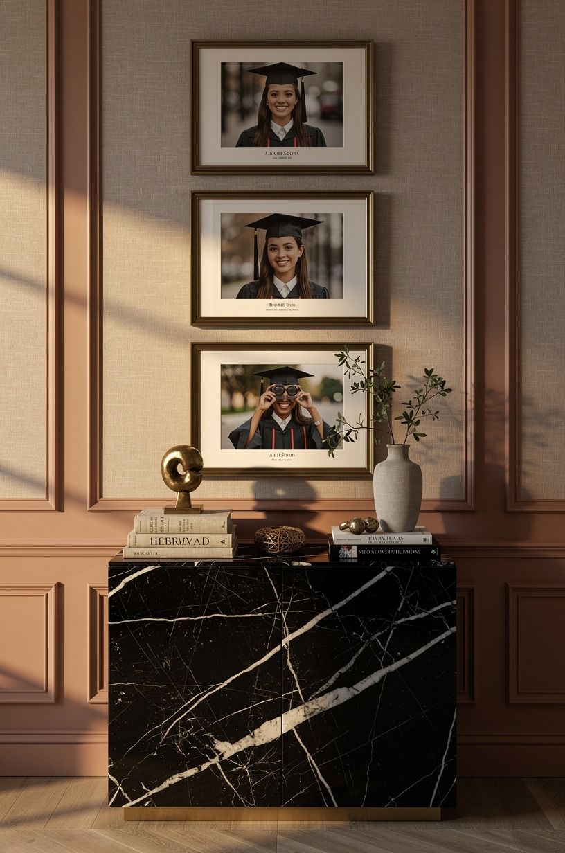
Build three clear heights: low, middle, and high. Your low layer might be a table frame, the middle layer could be clipped photos, and the high layer can hold a graduation year card or a strand of lights. This Three-Height Rule keeps your graduation display ideas from sitting in one flat line.
Use a Nero Marquina black marble slab with white veining for the lower surface if your table is already busy. It gives the arrangement weight without adding another object. For the middle layer, aged-brass clips on a linen cord feel warmer than shiny wire, especially beside clay-colored table linens.
Your high point should stay simple. A small banner with the graduate’s name or year is enough, and you’ll want the lettering large enough to read from across the room. Don’t add five signs because the display will start to resemble a store window.
If you’re decorating a rental, pair the display with a soft bathroom styling reference for ideas about mixing height, texture, and open space. The display should feel inviting, not crowded.
5Layer Graduation Photos from Past to Present
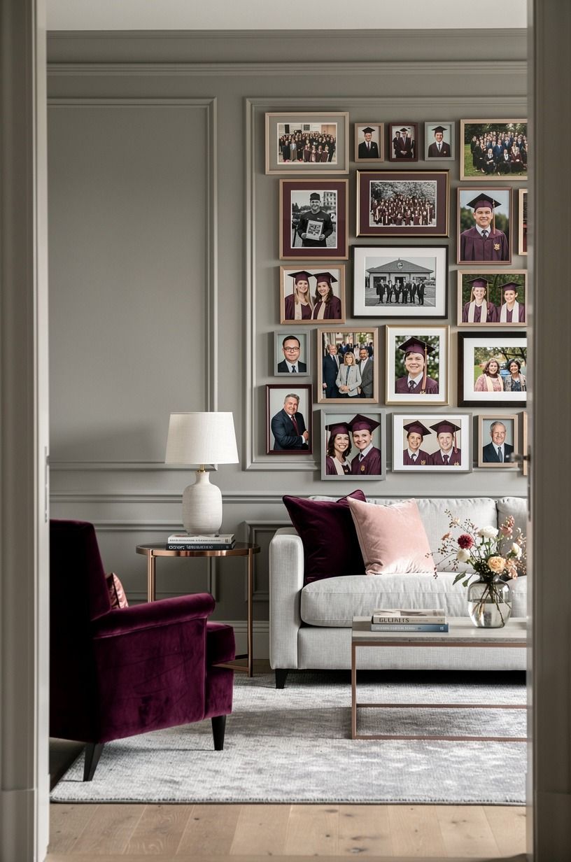
Arrange your photos chronologically from left to right or top to bottom. Guests naturally read a sequence this way, and you won’t have to explain why the first image shows a preschool backpack while the next shows a college ceremony.
A plum mat board will unify photos from different years, especially when some prints have blue shadows and others have yellow indoor light. Add a strip of deep-pile mohair velvet beneath the arrangement for softness. I’d avoid heavy filters because they flatten the little details you’ll want later, such as crooked bangs, missing teeth, and old team shirts.
And add one sentence beneath every major chapter. “First day of kindergarten” or “The year she found theater” gives guests a reason to pause.
Your labels don’t need to sound polished. They need to sound like your family.
For a more colorful arrangement, borrow a muted palette from these cherry blossom color ideas. Pale pink, soft green, and warm cream can sit beside school colors without overpowering the photographs.
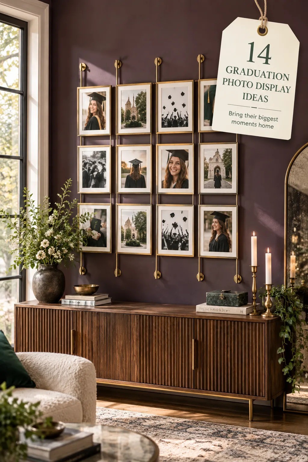
6Mix Candid Prints with Formal Portraits
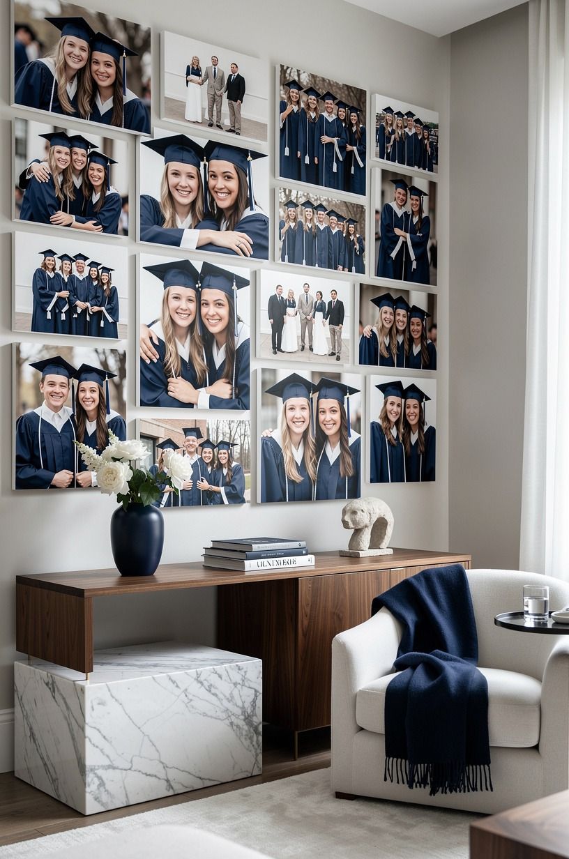
Use formal portraits for structure and candid images for emotion. Your graduate’s cap-and-gown photo tells guests what happened, but the blurry kitchen laugh or road-trip snapshot tells them who this person is.
Print the candid images on uncoated photo paper so the surface feels soft rather than glossy under party lights. Rest the arrangement on a walnut ledge with a small Carrara marble accent.
I’d choose one formal image for every two candid photos. A display with only posed portraits can feel distant, even when the pictures are excellent.
Try a small card titled “The moments between.” Add three or four pictures of ordinary life: a messy desk, a sibling hug, a tired airport morning. Those details create a charming, intimate rhythm that formal photography can’t provide by itself.
If you’re planning a party around travel memories too, these dreamy getaway ideas can spark a destination-style color palette. Your display doesn’t need a theme, but it can have a mood.
7Build a Caption System Guests Can Follow
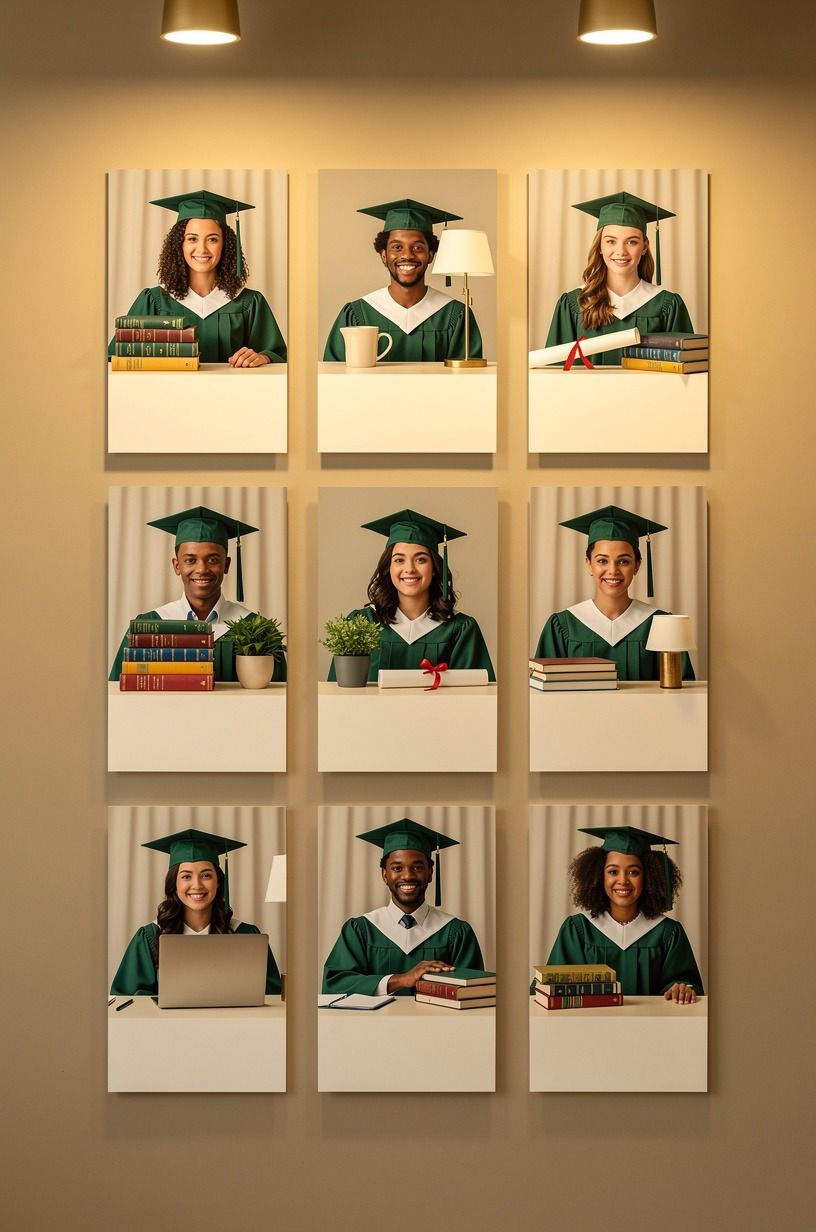
Write captions before you mount the photos. Your graduation party board ideas will feel more personal when the words explain a moment rather than repeat the date printed on the back.
Use gold archival ink on small cream cards, and mount them to a reclaimed weathered teak board. Keep every caption to one sentence.
“The summer she learned to drive” has more life than “Summer 2018.” If your family has a funny phrase, use it. Dry humor is often more memorable than a formal quote.
Group captions by size so your eye can find the hierarchy. Large chapter cards can be two inches wide, while small notes can stay closer to one inch. You’ll want enough contrast for older guests to read them without leaning into the wall.
And check every spelling before the party begins. A wrong school name or misspelled friend’s name will pull attention away from the display. I’d have the graduate proof the captions because they’ll catch details you’ve forgotten.
8Hang the Main Line with the 60-Inch Check
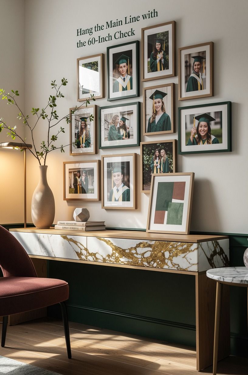
Choose one horizontal line and measure it before placing anything else.
9Add One Table for the Three-Source Light Stack
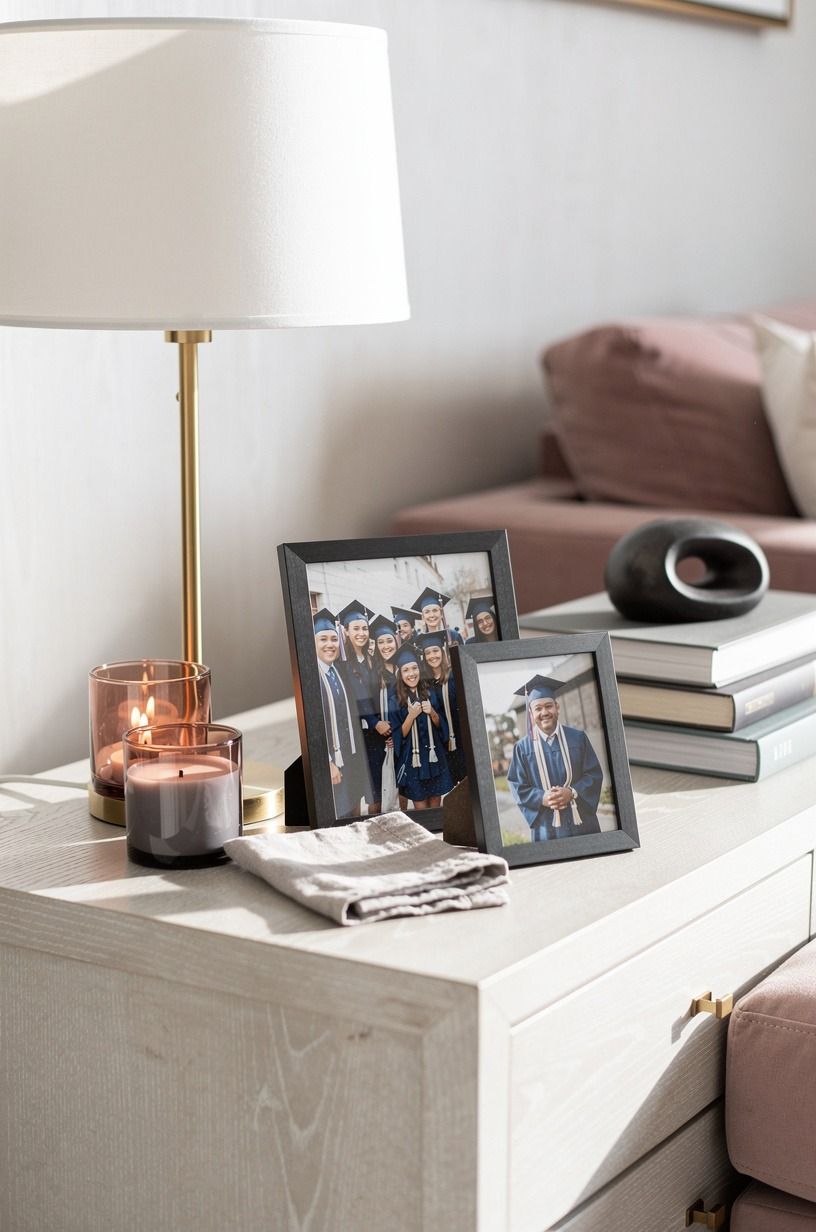
Photos need light from three directions: overhead, task, and ambient. Your display will look flatter under one bright ceiling fixture, especially if the photographs are glossy.
Create a Three-Source Light Stack with a warm LED table lamp on a cerused white oak table, the existing room light, and a nearby floor or wall light. Add a dusty-rose shade or charcoal accent, and keep bulbs warm rather than blue so skin tones remain natural. Three sources give you depth without making the display feel like a retail presentation.
Place the lamp beside the photos, not directly in front of them. You’ll want the light to skim across the surface instead of reflecting straight into guests’ eyes. A linen shade softens the glow and makes the whole corner feel welcoming.
And don’t run cords across a walkway. Tape them along the back edge of furniture or use a cord cover in a matching wall color. Safety is part of good styling, especially when relatives are carrying plates and children are moving around.
10Swap Matching Frames for One Common Material
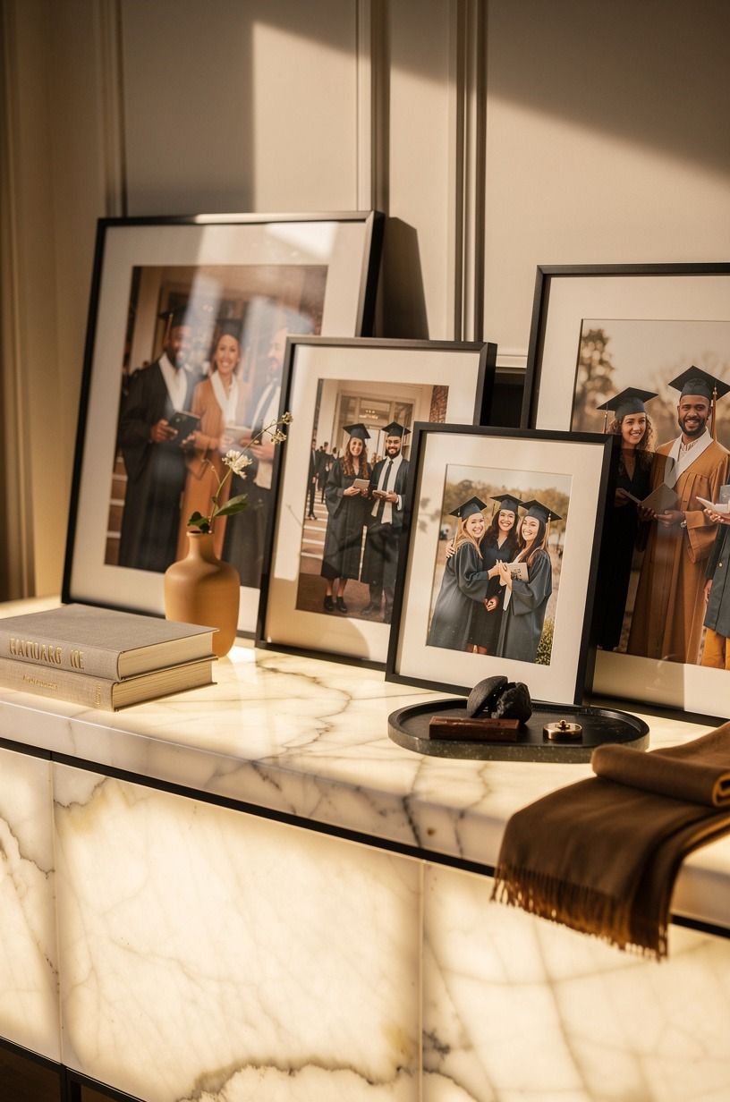
Use different frame shapes, but repeat one material. Your graduation photo display will feel collected when the frames vary slightly while sharing a visual thread.
Try warm-white frames with camel mats and black accents, backed by a slim panel of backlit translucent onyx. The gentle glow gives the display warmth without competing with the photos. I’d avoid matching every frame exactly because the result can feel more like an office corridor than a family celebration.
Keep the largest frames toward the center or bottom of the arrangement. Smaller frames can travel outward, creating a gentle taper. You’ll want the edges to look intentional, but not so precise that guests worry about touching anything.
If your room already has dark furniture, use Farrow & Ball Pigeon No.25 on the wall behind the display. It’s soft and earthy without turning the photographs muddy. Test a sample first because every room changes paint color as daylight shifts.
11Layer a Memory Basket Beside the Photos
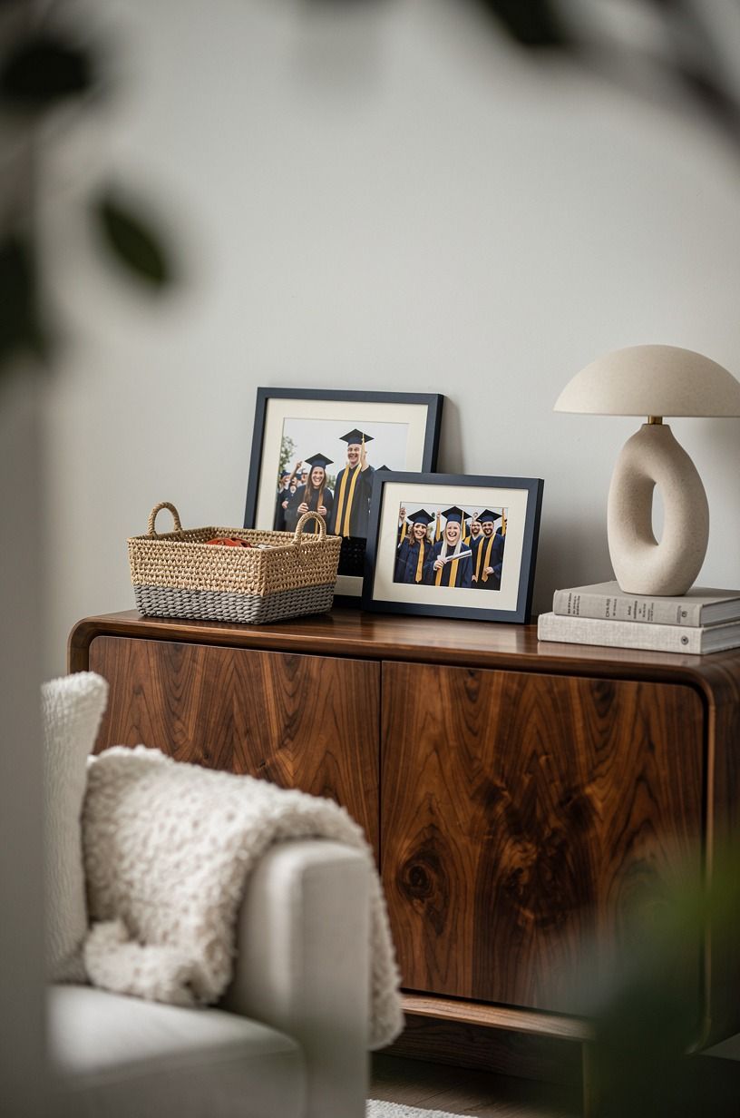
Add a basket for extra prints, handwritten notes, or small cards from guests. Set it on a book-matched walnut shelf beside the display, with midnight-blue, copper, and ivory details to connect it to the photographs.
12Frame the Wall with a Soft Color Block
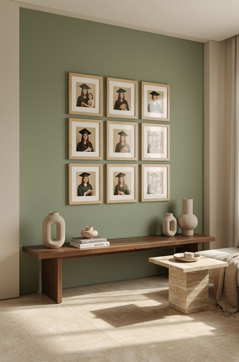
Paint a small rectangle behind the display if the wall feels too empty. You don’t need to repaint the entire room. A sage-green color block can define the memory area and make your graduation photo boards read as one composition.
Use Sherwin-Williams Clary Sage SW 6178 for a soft green block, or choose a warm cream if you want the lightest possible backdrop. Add a warm travertine ledge beneath the arrangement. I’d skip a high-contrast black rectangle because it can make casual photos feel overly dramatic.
Keep the painted shape slightly wider than the display and extend it below the lowest frame. That extra margin gives your arrangement a calm edge. You’ll want the photos to sit inside the color, not appear to float randomly across it.
And test the paint beside your actual photographs. Skin tones, school colors, and paper white can shift the way a wall feels. If you’re styling a rental, use a removable fabric panel instead and read this renter-friendly decorating reference for texture ideas.
13Make the Ceremony Portrait the Quiet Center
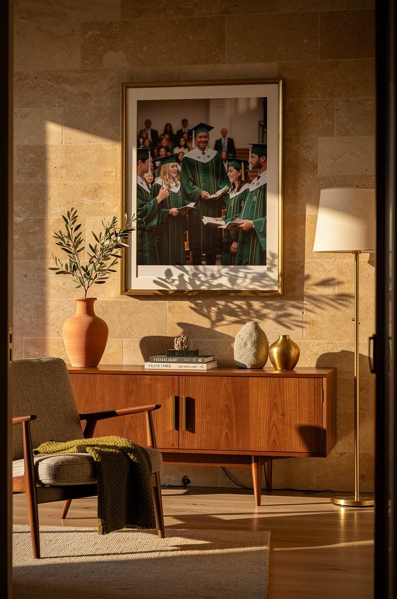
Let one final portrait close the story. Your graduation display needs a destination, and the ceremony image should feel like the natural place the eye lands last.
Use a stone-colored frame with a terracotta mat around the final portrait. The extra paper gives the image room to breathe and helps it stand apart from smaller snapshots. I’d skip a giant poster unless the party room is very large because oversized prints can swallow the warmth of the rest.
Add one short line beneath it, such as “You made it.” That’s enough. You don’t need a long quote when the photograph already carries the achievement.
For a bright, energetic party, place the final portrait near an unlacquered brass vase developing a soft patina, with one olive branch inside. Keep decorative objects below the frame so they don’t compete with the graduate’s face. Your display should end with pride, not clutter.
14Finish with a Guest Path and a Photograph
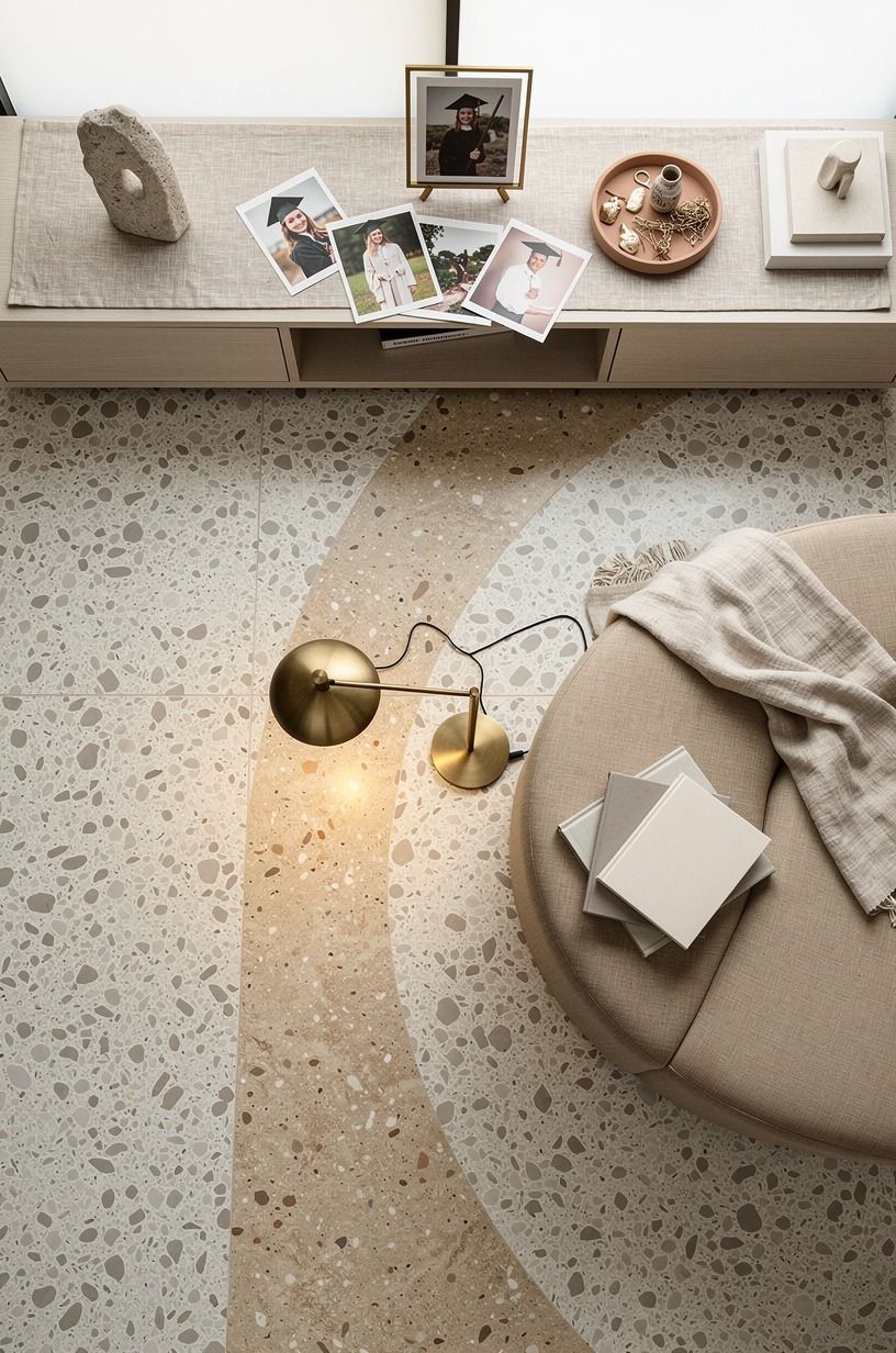
Walk through the room as if you’ve never seen it before. Your guests should enter, notice the main portrait, follow the photo sequence, and reach the note basket without stepping around furniture.
Use clay linen on a nearby chair or bench, with aged-brass hardware and an oversized-chip terrazzo surface if you need a soft place for grandparents to sit. The texture adds a warm, calming note without adding another display object. If the room is tight, move one accent chair rather than shrinking the photographs.
Take a picture of the finished arrangement before guests arrive. You’ll catch crooked labels, reflections, and gaps that weren’t obvious while you were working. I made that mistake once and didn’t notice a tilted frame until the party photos came back.
And leave one open spot for a photograph from the celebration itself. Clip it in before the night ends.
That final image turns your display from a history lesson into a living record. Worth it!
The Rule I’d Keep After Making This Display
I’ve made graduation displays that looked polished from across the room and strangely empty up close. The difference wasn’t the number of photographs. It was whether the display had a point of view.
A wall covered in memories can still feel anonymous if every image receives the same weight.
My favorite approach is the story grid with one quiet center portrait. It gives guests a beginning, a middle, and a satisfying last image. I’d choose that over a loose collage every time because people can understand it while they’re holding a plate, greeting relatives, or walking through the room.
A party display has to work in motion.
I also think the material choices matter more than people expect. A flimsy poster board, shiny ribbon, and bright plastic clips can make meaningful photographs feel temporary.
Linen, pale wood, cotton cord, and warm paper give the display a tactile quality that makes guests slow down. You don’t need expensive pieces.
You need materials that don’t compete with the faces.
The place where I’d spend money is printing. Your typical budget may sit within $200 to $800 if you’re also refreshing textiles, paint, art, and organization, but the photo display itself can cost far less. Spend on clear prints, sturdy removable hardware, and one frame you’ll keep.
I’d skip a large custom installation unless you know you’ll reuse it.
Finally, leave room for imperfection. A crooked candid photo, a handwritten caption, or an old picture with soft focus can be more moving than a flawless portrait.
Your guests aren’t coming to inspect a design project. They’re coming to remember a person.
That’s the part worth protecting.
The Questions I Get Asked Most
What is the best graduation photo display for a small space?
A narrow picture ledge with natural wood frames works best because it uses wall height without taking floor space. You can also use a single linen-covered board above a console. Keep the arrangement vertical, and choose one large portrait with smaller images beneath it.
For more compact styling, see this small-space inspiration.
Where can I buy graduation photo display pieces on a budget?
Start with IKEA, Target, Wayfair, thrift stores, and Facebook Marketplace. Secondhand frames can look refined after one coat of paint, and you may already own clips, baskets, or boards that work. Look for consistent materials rather than matching brands.
A thrifted frame with a new matte print can feel more personal than a complete set.
How much does a graduation photo display makeover cost?
A simple display can cost about $25 to $100 if you already have frames and tools. A broader room refresh may fall within the typical $200 to $800 budget tier for paint, textiles, art, and organization. Free options include family frames, handwritten labels, and photos printed at home.
Can I create a graduation photo display on a budget?
Yes, and you can start with three free moves: sort photos by story, reuse frames, and write captions from memory. Removable hooks and inexpensive clips can handle the structure.
Add one quality print for the center instead of buying fourteen matching frames. You’ll get more warmth from editing than from spending.
Is a graduation photo display worth it in a small space?
Yes, because a small wall gives the story natural limits. Choose one vertical arrangement, keep the main portrait around 57 to 60 inches high, and let the surrounding wall stay open. For a calm party atmosphere, use one soft lamp and avoid placing the display behind a serving table.
This warm travel-inspired reference may help with color.
Is a graduation photo display a good idea for a rental?
Yes. Use removable hooks, painter’s tape, a tension rod, or a freestanding board.
Peel-and-stick strips can support lightweight frames when the wall surface is clean and dry. Avoid heavy glass over busy walkways, and test every attachment before guests arrive. Your rental display can still feel polished without permanent changes.
Where I’d Start First
If I had to pick one step, I’d start with the story grid. Your guests will understand the graduate’s journey before they notice the frames, labels, or lights. Sort the photos tonight, choose the center portrait, and let every other detail support that one clear path.