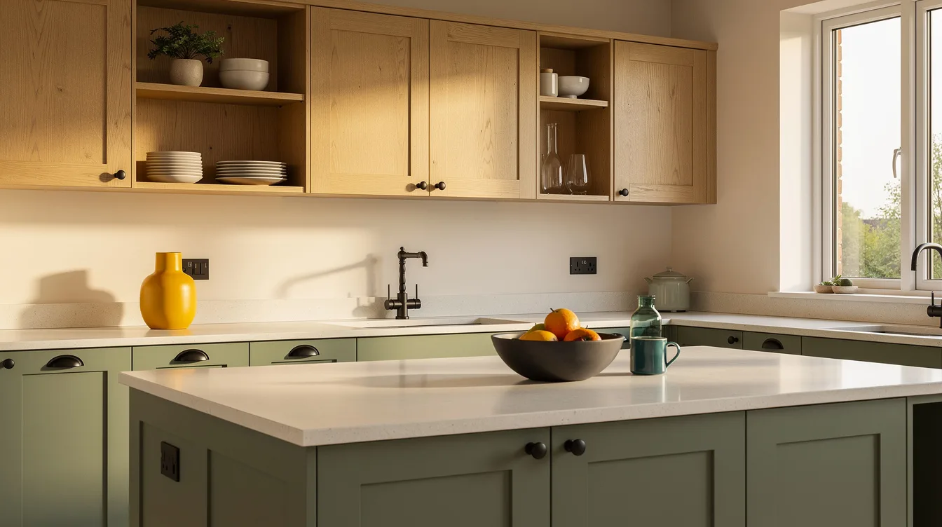
A kitchen can have the right cabinets and still feel strangely wrong once the paint goes up. In a typical 10-by-12-foot layout with 8-foot ceilings, color touches far more visual surface than most people realize.
The safest palettes don’t disappear into the background. They give wood, metal, stone, and everyday appliances a clear role, whether your taste runs modern, farmhouse, minimalist, or polished.
Warm Up White With Natural Wood
Start with a soft cream on the walls, then let matte oak carry the warmth through stools, shelving, or a slim range-hood trim. This pairing feels calm in a minimalist kitchen, but it also gives farmhouse doors and traditional millwork a cleaner edge.
A typical 10-by-12-foot kitchen has about 20 to 25 linear feet of cabinetry, so wood should appear in deliberate breaks rather than cover every surface. Keep cabinets creamy and counters quiet, then use one wood tone throughout, because mixed orange, gray, and espresso stains make this dependable palette feel accidental.
For a refresh, Home Depot can be a practical place to compare warm-white paint swatches against unfinished oak samples. Painting only the walls in a kitchen of this size typically runs about $1,000 to $1,700 with professional labor, while a DIY paint-and-primer purchase is roughly $100 to $400.
The firm opinion here: skip bright blue-white paint unless your kitchen gets very little daylight. Cream gives stainless appliances, brass, black, and pale stone somewhere softer to land.
Ground Greige With Black Hardware
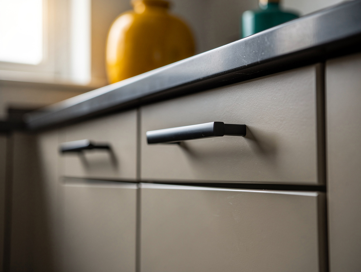
Mushroom, taupe, and warm greige are the neutrals for people who are tired of a blank white kitchen. Put the shade on lower cabinets or walls, then add matte-black pulls for definition without committing to a high-contrast all-black room.
An 8-by-12-foot galley kitchen usually has two cabinet runs of about 10 to 12 feet each, which makes this split especially useful: deeper lowers, lighter uppers. The darker color visually anchors the floor line and leaves the narrow center aisle from feeling closed in.
Choose straightforward bar pulls around 5 to 6 inches long, a proportion that works on most standard doors and drawers. Mid-range black hardware typically costs about $4 to $10 per piece, so replacing roughly 30 to 40 pulls may land around $200 to $400 before installation.
Walmart and Amazon both make this update easy to shop, but buy one sample first and live with it for a few days. Black should repeat at least once in a pendant, faucet, or chair frame, otherwise it can look pasted on.
Use Sage as a Quiet Neutral
Sage works because it has enough gray and brown beneath the green to behave like a neutral. A muted sage cabinet finish brings personality to flat-front modern doors, Shaker cabinets, and even a polished kitchen with veined stone.
Keep surrounding walls warm white and use a low-sheen finish, especially on broad cabinet faces. Glossy green reads louder than most homeowners expect, while a soft finish lets the color shift gently from morning light to evening.
In my view, sage needs warm partners: pale oak, aged brass, cream tile, or a tan runner. Cool gray flooring and icy white counters can push it toward a dated, overly themed look.
Try the color on a single cabinet bank before painting every door. A Home Depot sample pot and one removed drawer front tell you far more than a tiny paper chip under store lighting.
Build Depth With Inky Blue
A deep blue belongs in kitchens that need contrast but don’t want the severity of black cabinetry. Use inky navy on an island, a pantry wall, or lower cabinets, then pair it with creamy walls and pale wood so the room still has air.
This color earns its keep in luxe and traditional spaces, yet it can look sharp beside plain slab doors and brushed steel. The mistake is treating blue as an accent color and then scattering unrelated colors across the backsplash, stools, and dishes.
For a standard 54-inch island, navy on the base gives the center of the room enough visual weight without swallowing the perimeter cabinets. Choose a simple pale countertop, then limit metal finishes to one main tone and one small supporting note.
Wayfair has plenty of navy counter stools, but a stool purchase should follow the paint decision, not lead it. Blue cabinets are already the statement, so patterned seating usually adds noise rather than character.

Let Terracotta Stay Small and Intentional
Earthy clay tones bring life to kitchens that feel too polished, especially beside cream cabinets, walnut, or dark bronze. Use terracotta tile as a backsplash, floor border, or open-shelf backdrop rather than painting every cabinet a reddish brown.
This is the palette’s strongest move because it gives modern rooms texture and makes farmhouse details feel less predictable. A handmade-looking tile with slight color variation has more staying power than a perfectly uniform orange square.
Keep the field modest, roughly a backsplash zone rather than four painted walls, and use a soft off-white grout. Large areas of saturated clay can make even a generous kitchen feel visually heavy.
A small IKEA wood-and-clay accessory mix can help test the direction before tile work begins: a cutting board, a ceramic bowl, one linen towel. The color should feel like a grounded detail, never a costume.
Begin with the surface you are least likely to replace, usually the cabinets or countertop, and pull one undertone from it before buying paint. A single large sample on the wall is the cheapest way to avoid an expensive color regret.
Mia Carter writes about small-space living and budget home makeovers. She has restyled three rentals and tests most ideas in her own 45 sqm flat.