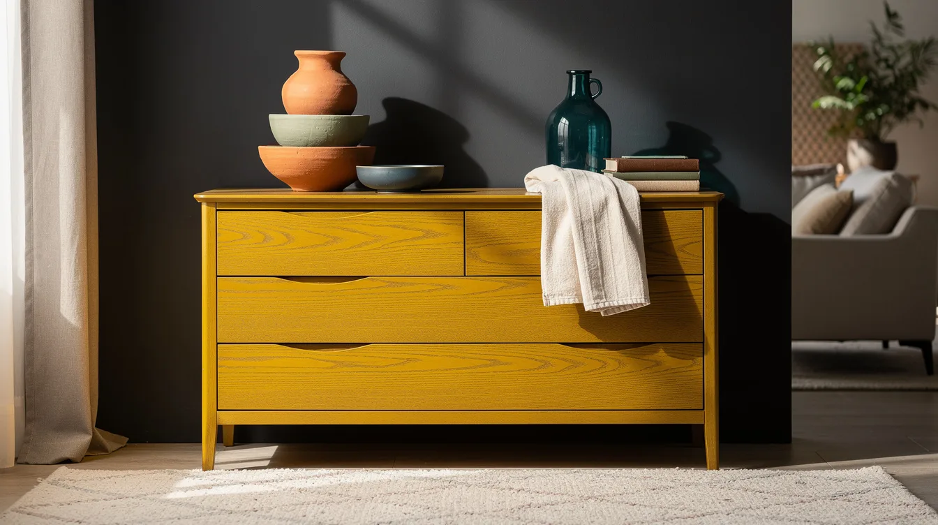
I get why people freeze at the paint aisle. On a typical 48- to 60-inch dresser, one wrong color can turn a solid piece into something that suddenly looks cheaper than it did in bare wood.
The shift in 2026 is pretty clear: designers are moving away from cold gray and leaning into layered, lived-in color, browns, earthy greens, terracotta, dusty blues, jewel tones, and warm off-whites. The best part is that this palette works on both thrift finds and newer furniture from big-box stores.
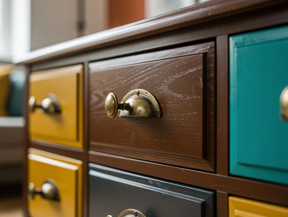
Ground Big Pieces in Chocolate Brown
For a typical 48- to 60-inch dresser, chocolate brown is the color designers keep circling back to because it reads warm, expensive, and calm all at once.
I like it most on anchor pieces, a sideboard, tall chest, or wardrobe, where cool gray now feels dated and a deep brown still looks right with oak floors, brass, and linen.
A quart of furniture enamel from Home Depot typically costs about $25 to $55, which is enough for two coats on many medium-size pieces if the surface is already in decent shape.
Choose satin or matte, not high gloss. Brown gets better when it has a little softness and a slightly timeworn finish.
Soften a Nightstand With Earthy Green
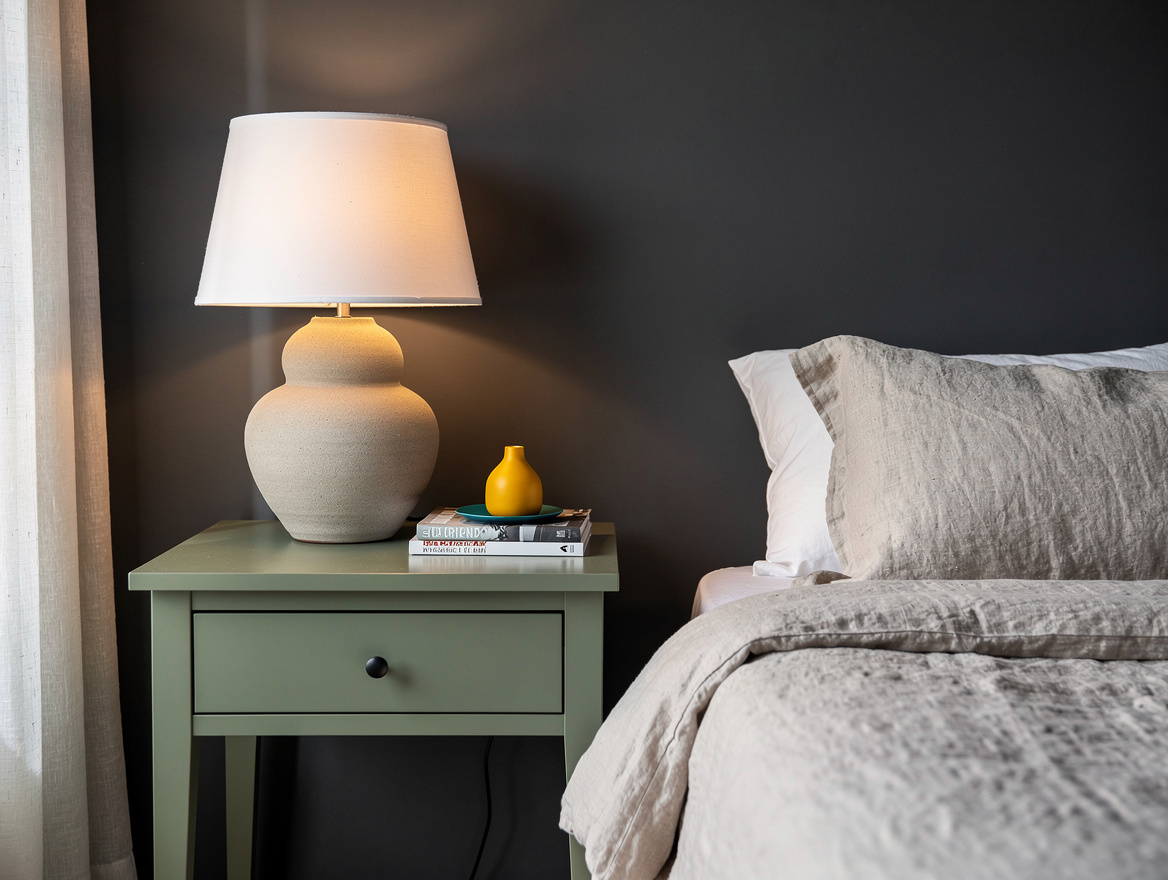
sage green is still one of the easiest designer colors for furniture because it has color without shouting, especially on bedside tables, small cabinets, and benches.
It works best when the green leans olive or eucalyptus instead of mint. Anything too bright starts looking crafty fast.
At Lowe’s, a cabinet and trim paint in an eggshell or satin finish usually lands around $30 to $60 per quart, and that range makes sense for DIY furniture that gets touched every day.
Pair it with aged brass hardware or black iron. Green furniture needs some weight around it or it can turn cute instead of polished.
Warm Up Accent Pieces With Terracotta
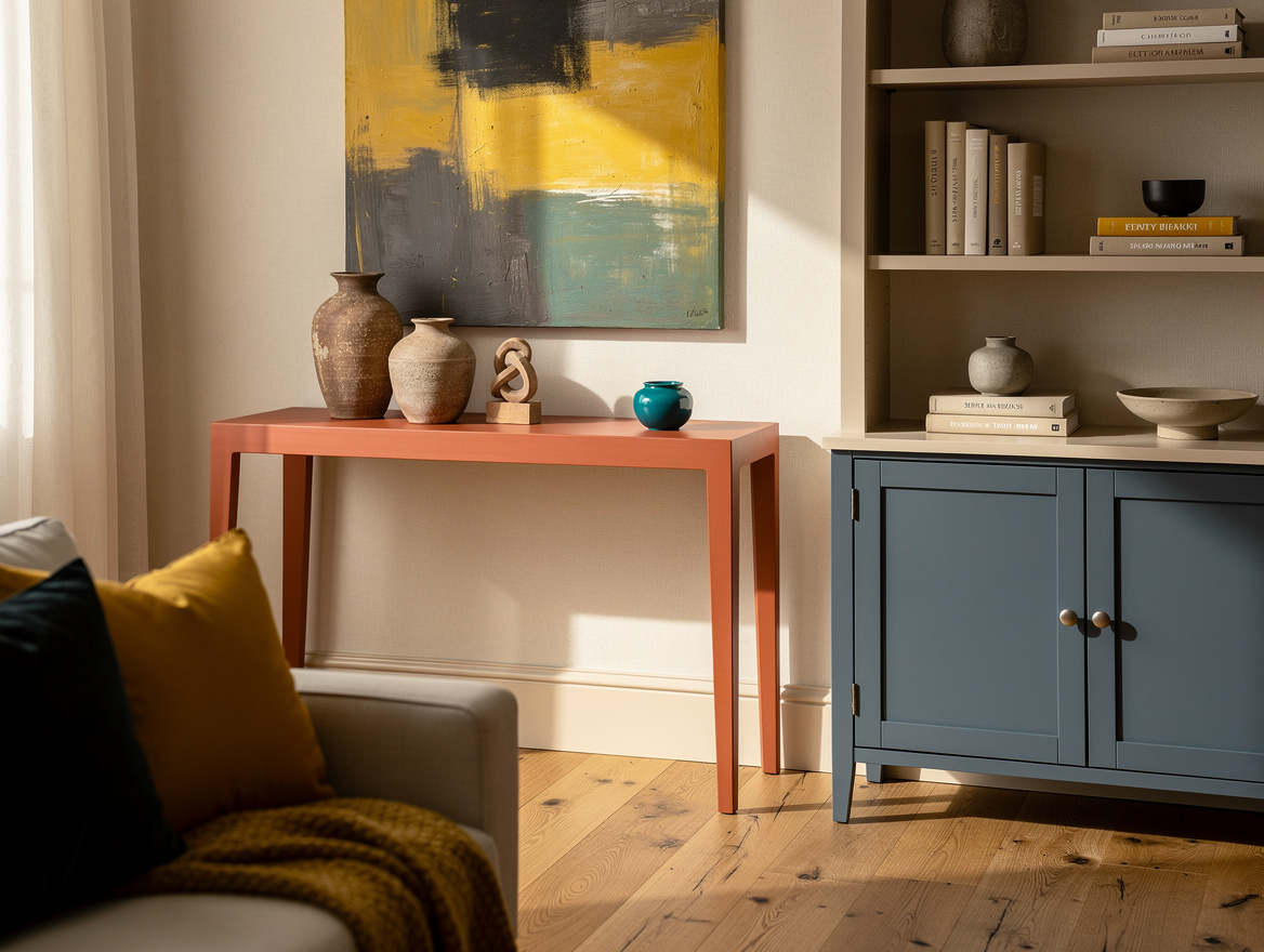
Designers are using terracotta, ochre, and deep clay on the furniture that should feel collected, not matchy, think console tables, stools, and small accent chests.
This is my favorite fix for rooms that have too much beige and not enough pulse. One clay-painted piece can wake up the whole corner.
A simple unfinished table from IKEA or a thrifted wood stand is a smart starting point, because this family of colors looks better on shapes with a little heft and visible grain.
Use a tinted primer that sits close to the final paint color. Terracotta can look streaky over dark wood if you rush straight to the top coat.
Make Dusty Blue Feel More Grown Up
dusty blue is the version of blue that still feels current in 2026, especially on buffets, dressers, and built-ins that need color but not a beach-house vibe.
The smartest move is to push it toward smoke, slate, or powder with gray-brown undertones. Clean baby blue is the one designers are skipping.
When I want this look to feel serious, I style it with walnut, burgundy books, or a brown lamp from Target. That mix gives the blue some backbone.
Stick with eggshell or satin on furniture fronts. Flat paint can look chalky in a bad way once fingerprints start building up.
Use Dusty Jewel Tones on One Statement Piece
muted emerald, deep sapphire, and cranberry are still in the designer toolkit, but mostly for one memorable piece, not an entire matching set.
That restraint is what keeps jewel tones from feeling theatrical. A single painted cabinet has impact, while six jewel-tone items in one room usually look overworked.
I would try this on a bar cabinet, library console, or vintage chair frame, then keep the rest of the room quiet with cream walls and natural fiber texture from Wayfair.
If the piece gets heavy wear, add a clear water-based topcoat. Saturated color shows scuffs faster, and the extra protection is worth the step.
Keep Built-Ins Fresh With Warm Off-White
warm off-white and buttercream are the furniture colors designers recommend when someone says they want light cabinets or wardrobes without the sharpness of bright white.
This is the shade family that actually flatters wood floors, stone counters, and older homes. Stark white can make those same materials look colder than they are.
For a typical DIY refresh, primer, enamel, sandpaper, and a topcoat from Ace Hardware or Amazon often total around $50 to $120, depending on how much prep the piece needs and whether you already own brushes.
Skip the temptation to go pure white. A creamy undertone is what makes the finish feel designer instead of builder basic.
Start with the piece you see first when you walk into the room, then choose the color family that matches its job: brown for weight, green for softness, clay for warmth, blue for calm, jewel tones for drama, cream for light.
Get the undertone right before you worry about anything else. That decision does more for a painted piece than fancy hardware ever will.
Mia Carter writes about small-space living and budget home makeovers. She has restyled three rentals and tests most ideas in her own 45 sqm flat.