I keep seeing the same problem in blue rooms: the paint chip looked refined in the store, then the room turned cold once the bed, rug, and lighting went in.
Blue needs a partner with some friction. Designers are leaning into warmer earth tones, fresh greens, soft neutrals, dark contrast, and a little brass because those pairings make blue feel finished instead of flat.
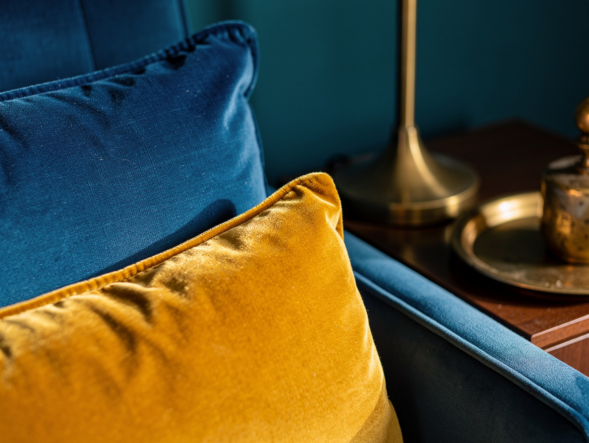
Anchor Blue With Goldenrod Velvet
A soft duck egg wall gets far richer when you add goldenrod velvet. That mustard cast pulls the gray out of blue and gives the room a warmer pulse, which matters in a bedroom that only gets morning light.
For a real-world version, a queen IKEA upholstered bed typically lands around $500 to $700, with a width close to 63 to 67 inches and a headboard around 47 to 55 inches high. In a 130 to 170 square foot bedroom, that scale reads plush without swallowing the floor.
I’d keep the frame in wood or plywood under the upholstery and skip shiny yellow satin. Matte velvet looks expensive with blue, and the slicker fabric usually makes the whole pairing feel forced.
Warm Pale Blue With Rust-Red Tile
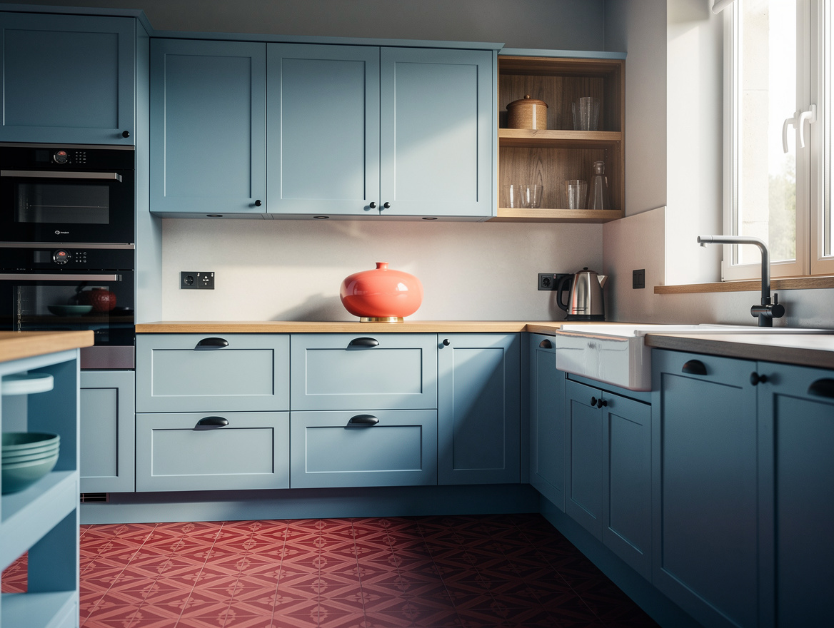
Pale blue cabinets can feel sugary fast, so designers keep grounding them with rust-red tile. That clay tone gives the kitchen weight and keeps the blue from sliding into nursery territory.
An 8-by-8-inch porcelain floor tile in a rust and cream pattern typically runs about $3 to $6 per square foot at Lowe’s or Home Depot. For a 110 to 190 square foot kitchen, the flooring cost stays far more manageable than handmade cement tile.
For cabinets, a stock IKEA kitchen run in a small to midsize layout usually starts in the low thousands before installation, and that is enough to make the color story matter. I like this pairing most when the counters stay quiet, butcher block or a simple off-white surface works better than busy stone.
Sharpen Slate Blue With Matte Black
Slate blue already has some muscle, and matte black hardware makes that strength look intentional. The combination feels clean, modern, and a little tailored, especially in a galley kitchen.
A typical pack of 20 to 30 black cabinet pulls from Amazon lands around $40 to $120, depending on the metal and length. That small swap changes the read of blue cabinets faster than repainting walls or replacing counters.
Add one black kitchen faucet from Home Depot or Ace Hardware, usually around $150 to $350, and stop there. Too many black elements can crowd the room, but a few sharp lines against blue look crisp every time.
Spike Soft Blue With Chartreuse Accents
When a powder blue room starts looking sleepy, chartreuse wakes it up in one move. Designers use it in small doses because the color is loud, and that is exactly why it works.
A Wayfair accent chair in a yellow-green velvet typically costs about $300 to $700, which is enough presence for a guest room or reading corner. In a 110 to 150 square foot room, one chair can carry the whole palette without adding clutter.
Then add Target curtain panels or a couple of Walmart pillows in the same family, usually $15 to $90 depending on the size and fabric. I would never spread chartreuse evenly around the room, one concentrated burst feels smarter and much more designer-led.
Wrap Indigo In Golden Tan Texture
Deep blue looks richer when the wall behind it has a warm, dry texture, and golden tan wallpaper does that job well. This is one of the easiest ways to make indigo feel tailored instead of heavy.
A roll of peel-and-stick grasscloth-look wallpaper from Wayfair or Amazon typically runs about $35 to $70 and often covers around 28 square feet. That makes it realistic for one bedroom wall, the back of built-ins, or a small office nook.
Pair it with an indigo bench, throw, or headboard rather than layering blue everywhere. I like this scheme because tan gives blue warmth without turning the room beige, which is the mistake a lot of safer palettes make.
Ground Blue With Olive Green Textiles
Blue and green can absolutely share a room, but the green needs some earth in it. Olive green has enough brown and gray to steady blue, so the palette feels grown-up instead of preppy.
A typical 8-by-10 area rug in olive tones from Wayfair or Costco usually falls around $150 to $350, depending on the pile and fiber. That is a useful anchor under a blue sofa, especially in a living room that needs color but cannot handle another painted wall.
I also like IKEA plant pots and a real leafy plant here because natural green reads better than a dozen decorative green objects. Blue plus olive works best when one surface stays quiet, an oatmeal sofa, a wood coffee table, or simple white trim is enough.
Soften Navy With Warm White and Aged Brass
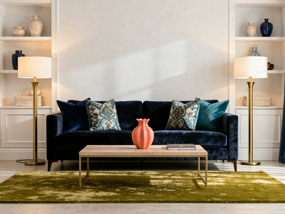
Navy has a habit of eating light, so designers soften it with warm white first. That creamy contrast keeps the room from feeling severe and gives the darker blue a cleaner edge.
Then bring in brass table lamps or sconces from Target, Amazon, or Home Depot, with typical prices around $40 to $140 each. The metal adds a little glow that chrome never gives to navy.
For walls, trim, or bedding, I would choose an off-white cotton or painted finish over stark bright white every time. Navy already brings drama, so the rest of the room should feel easy to live with on a Tuesday afternoon, not just in a photo.
Start with the blue element you already own, a sofa, cabinet, rug, or bed, then test one warmer partner beside it before you buy anything big. If the room still feels chilly at dusk, add texture before you add more color.
Mia Carter writes about small-space living and budget home makeovers. She has restyled three rentals and tests most ideas in her own 45 sqm flat.