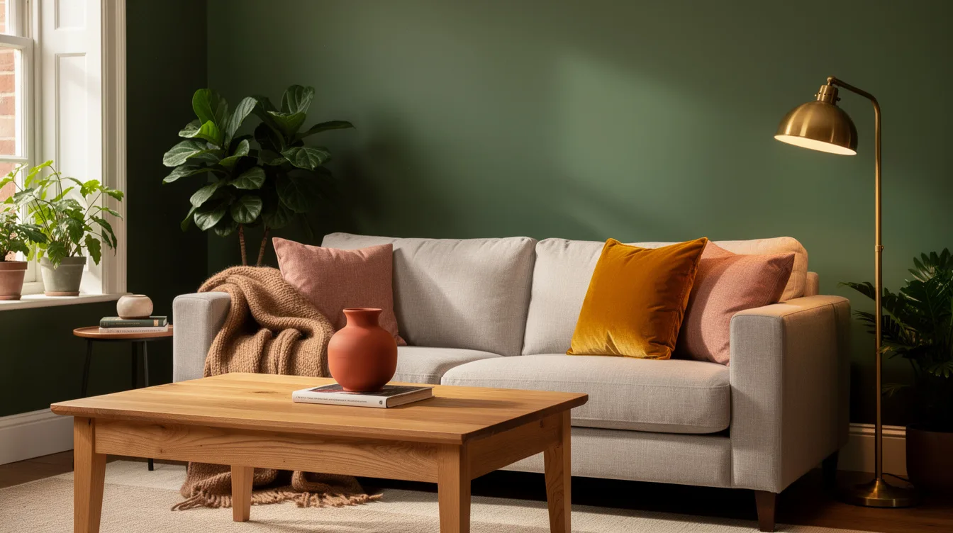
I get why people hesitate with green paint. In the can, it can look elegant and grown-up, then somehow land on the wall looking either minty, murky, or way too loud next to your sofa.
British designers have been much better at solving that problem than most of us. The greens they keep using are warmer, muddier, and more nature-based, which is exactly why they hold up in real homes instead of just on a sample card.
Start With Olive Instead of Bright Leaf Green
The green British designers return to most often is the one people skip in the paint aisle: a browned-out olive wall color with a little earth in it. It feels richer, calmer, and far more expensive than a fresh spring green that can turn sugary by 3 p.m.
I like this direction most in a den, dining room, or on kitchen cabinets with walnut or oak nearby. British rooms often lean cozy rather than crisp, and olive is what gives that wrapped, low-glare effect.
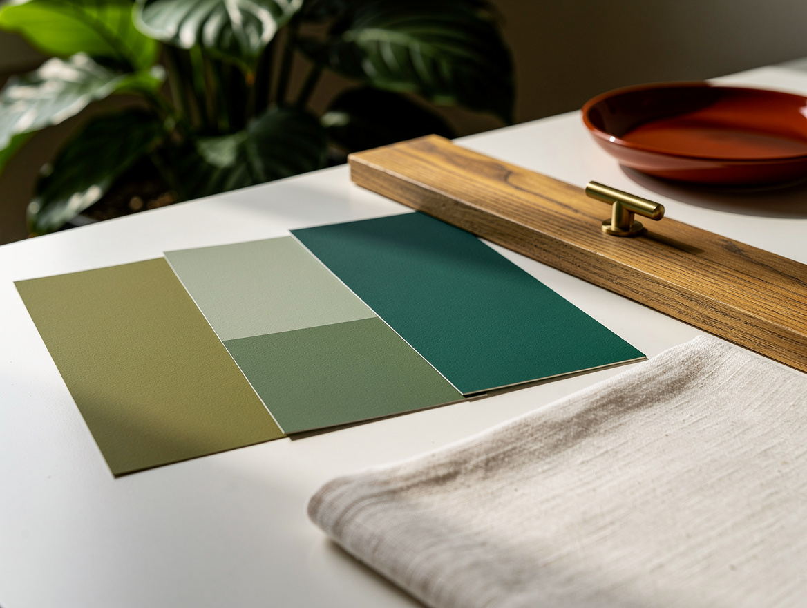
It also handles moody weather and weak daylight well, which is part of why UK designers keep choosing it. If you are testing the look in the US, start with large peel-and-stick samples from Amazon or sample cards from Home Depot, because an olive that looks refined in the store can go flat on a north-facing wall.
Choose Muddy Greens That Carry a Bit of Brown
This is the shade family that reads most “British” to me: a muddy botanical green with a brown-black base. It has weight, it hides scuffs better than pale sage, and it makes trim, books, and old wood furniture look intentional.
Designers love these tones because they act almost like a neutral once the room is fully furnished. Put one next to brass hardware, linen drapes, and an aged wood table, and the whole room settles down in the best way.
There is also a practical reason to test before buying gallons. In the UK, a typical 2.5-liter designer paint can run about £60 to £70, and sample pots are often around £4 to £6, so the culture of sampling first is smart, not fussy.
Lean Into Eucalyptus When You Want a Softer Bedroom
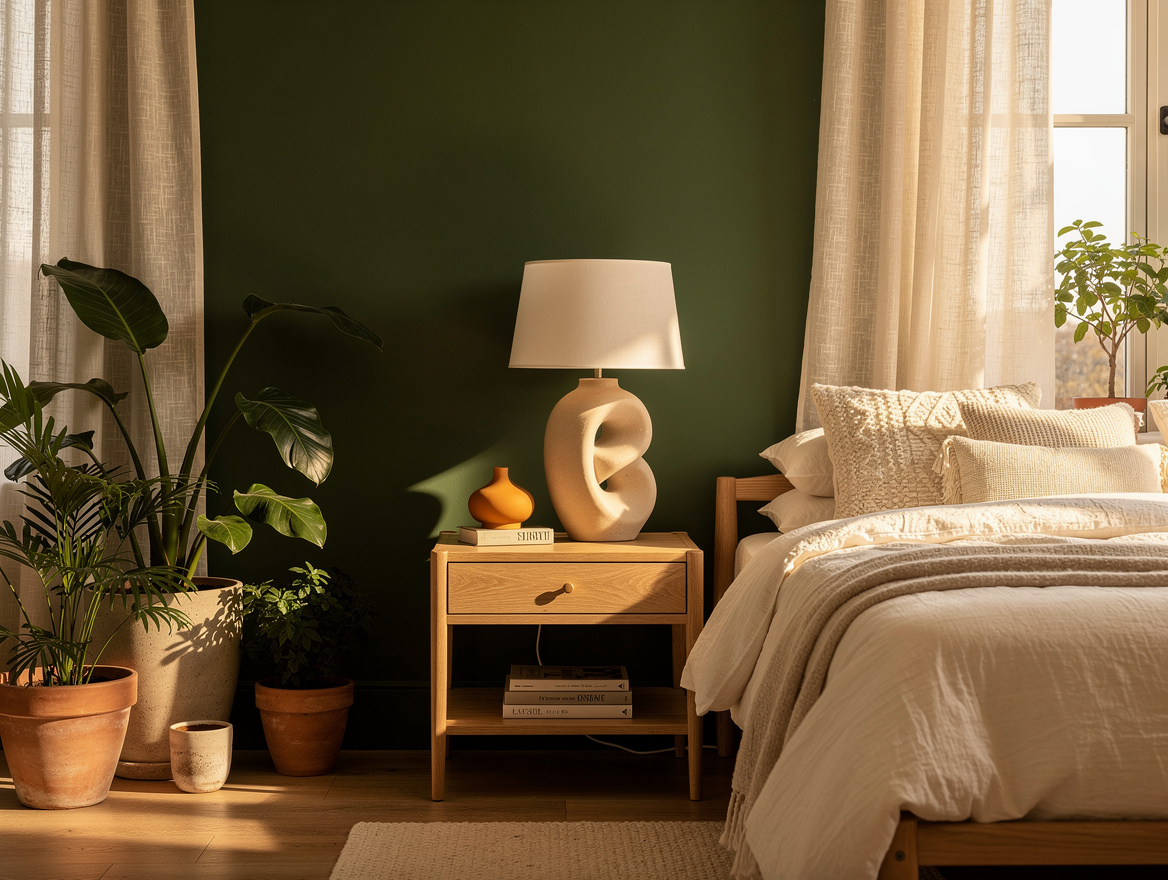
Warm eucalyptus green is where British taste gets especially good. It is gentler than classic sage, less chalky than mint, and usually carries enough gray to keep a bedroom from looking themed.
If your room already has cream bedding, a wood dresser, and soft black lamps, this is the green that will connect everything without shouting. I would absolutely pick it over a cool pastel green, which can make a room feel younger than you probably want.
This is also the family that works best for renters who need a forgiving color. Try it with a Lowe’s sample first, then check it in morning light and lamplight, because these foggy greens can swing from restful to drab depending on undertones.
Wrap Walls and Trim in the Same Shade
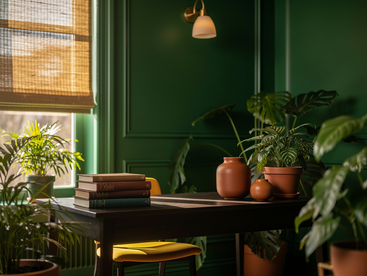
One of the smartest British moves is using the same paint finish on walls, trim, and sometimes built-ins. A mossy or olive green used this way makes a room feel architectural instead of decorated, and it is especially strong in smaller studies, entryways, and TV rooms.
I prefer this over the old habit of green walls with bright white trim. White trim can chop the room into pieces, while a color-drenched approach lets the eye move across the whole space without stopping every few feet.
You do not need a giant room to try it. A typical 2.5-liter tin is the size British brands often sell, and that scale is a useful reminder that even a small hallway or powder room can handle a bold, enveloping color without becoming too much.
Use Green-Blue Teal in Small Doses, Not Everywhere
British designers also love a green-blue teal that sits right between jade and deep blue. In real rooms it can work almost like a dark neutral, but only when you place it where drama helps, like a hallway, a bar nook, or a library-style corner.
I would not spread this shade through an entire open-plan main floor unless the home has excellent natural light. In a compact room, though, teal with Target brass lighting or a dark wood console looks sharp and a little historic without feeling dusty.
This is the color family that benefits most from contrast. Add warm ivory, tobacco leather, or mustard accents, and it suddenly looks intentional instead of heavy.
Ground the Green With Warm Wood and Natural Texture
The reason these British greens work so well is not the paint chip alone. They nearly always sit beside oak furniture, wool, linen, stone, or woven shades, which keeps the color from reading cold or trendy.
If you paint a room olive and fill it with glossy white furniture, the whole idea falls apart. British-inspired green needs a little friction, a nubby throw, a wood frame, a matte ceramic lamp, maybe a jute rug from Wayfair or IKEA.
That pairing is what makes even deeper greens feel livable. The paint sets the mood, but the materials stop it from turning gloomy.
Begin with the family, not the exact shade name: olive if you want depth, eucalyptus if you want calm, teal if you want drama. Then test the color beside your wood tones first, because that is what will decide whether the room feels expensive or slightly off.
Mia Carter writes about small-space living and budget home makeovers. She has restyled three rentals and tests most ideas in her own 45 sqm flat.