
The best preppy coastal bedroom doesn’t look like a beach gift shop. It looks like someone who’s been sailing for thirty years and has good taste.
Navy, shiplap, grosgrain ribbon, a kilim rug that’s been around. That’s the formula. Not a theme. A point of view.
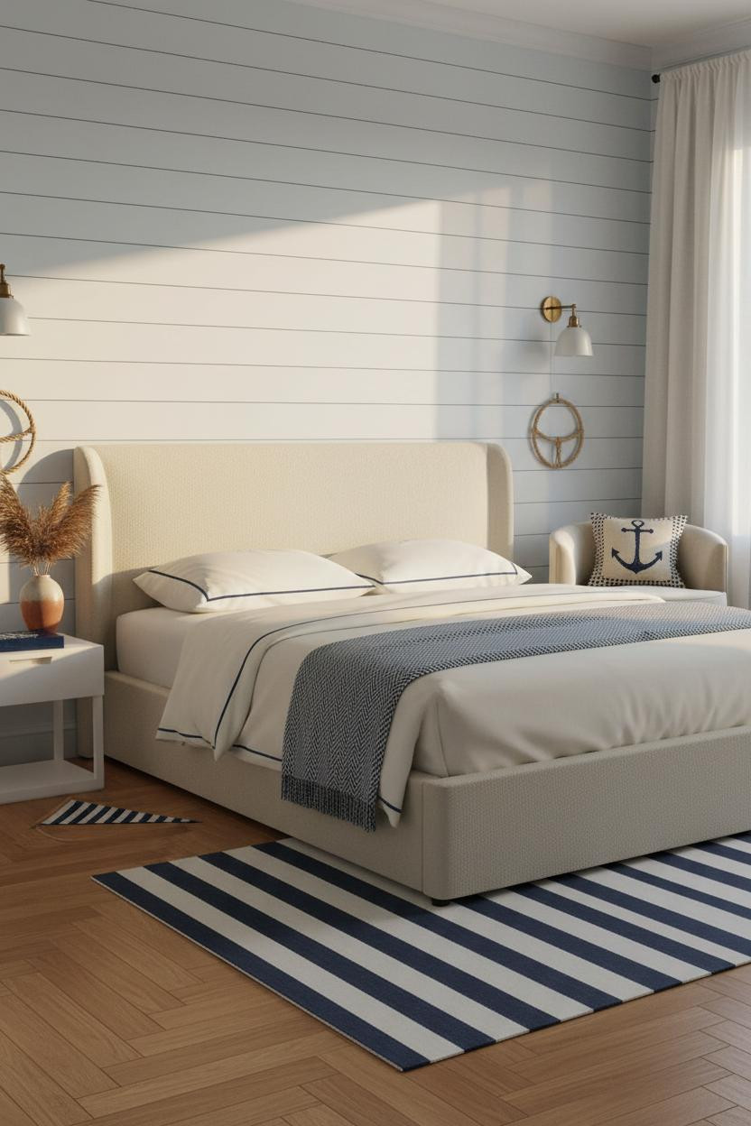
White Shiplap Wainscoting That Earns Its Keep
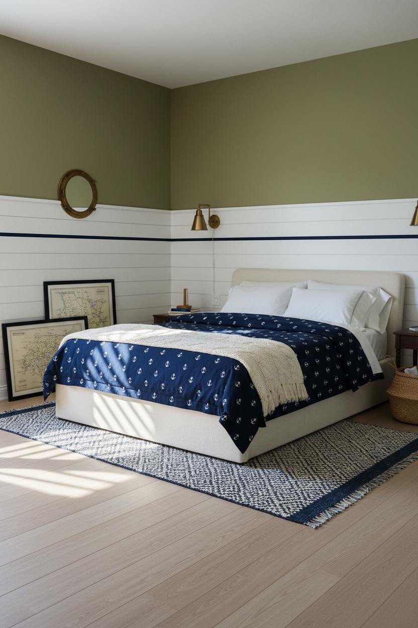


Half-height shiplap with a navy grosgrain cap rail is honestly one of the best moves in coastal prep. It does a lot of work in a small footprint.
Why it holds together: The horizontal shadow grooves in white-painted shiplap create rhythm without needing pattern anywhere else in the room.
Steal this move: Keep the upper wall in warm olive and let the shiplap stay bright white. The contrast is what makes the navy pop.
The Vertical Slat Wall Teen Rooms Actually Want


Floor-to-ceiling vertical slatted planks behind the bed feel more interesting than a painted accent wall, and they’re not much harder to pull off.
What gives it depth: Each plank casts a thin repeat shadow that gives the wall texture in flat light, which means it reads well even on grey days.
Pair it with honeyed caramel walls and a navy ticking-stripe rug. The warmth keeps it from feeling too nautical-uniform.
Navy Wainscoting With a Grosgrain Border Trim
This is the version of wainscoting I keep coming back to. Crisp white raised panels below, a single navy grosgrain ribbon at the cap. That’s it.
Why it looks custom: The navy grosgrain border at the cap rail creates a graphic horizontal stripe that divides the wall like a printed pattern, without needing wallpaper.
The finishing layer: Go terracotta-tinted clay above the cap. It sounds wrong with navy. It isn’t.
Floor-to-Ceiling Panel Molding for New England Drama

Bold choice. Full-height colonial panel molding can tip into formal fast. But in a coastal prep bedroom, it somehow stays breezy.
The reason it feels relaxed instead of stiff is the palette: cream walls, cream curtains with navy ticking-stripe trim, dusty pink duvet. Nothing too precious.
What to borrow: Floor-to-ceiling cream linen curtains with a narrow navy trim are doing most of the nautical work here. The panels just set the stage.
A Navy Gallery Wall That Reads Personality, Not Pinterest
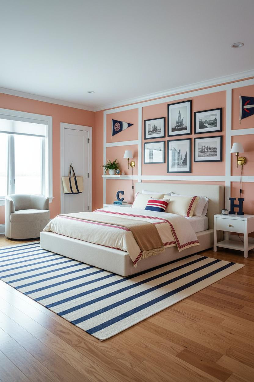
Gallery walls get a bad rap because most of them look like a craft project. This one doesn’t.
What makes it work: All navy-framed prints against pale coral walls keeps the grid cohesive while the mix of pennants and coastal art gives it actual character. The room feels collected, not assembled.
Avoid this mistake: Don’t frame everything the same size. One oversized print breaks the pattern just enough to feel real.
Board-and-Batten That’s Relaxed Enough for a Cottage
I like board-and-batten more in coastal rooms than almost anywhere else. The vertical lines feel nautical without trying.
Admittedly, white-on-white batten against stone grey flanking walls sounds flat. But the contrast in texture is what the room feels. Paint sheen on the batten, matte on the walls. That gap is enough.
Pro move: A vintage oversized regatta pennant above the batten keeps the preppy signal strong while the reclaimed wood floors soften everything below it.
Crittall-Style Window Wall as the Whole Design Move
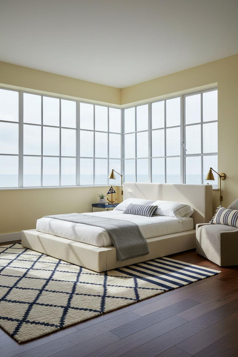
When you have a floor-to-ceiling Crittall-style window grid, you don’t actually need another accent wall. The mullions are the design.
Why it feels expensive: Crisp white painted steel mullions cast thin geometric shadow lines across butter yellow walls, giving the room graphic structure that changes through the day as light shifts. It’s almost like a moving print.
Layer a dark walnut floor underneath and the room snaps into contrast. Nothing too matchy.
Whitewashed Ceiling Beams Are the Unexpected Ceiling Move
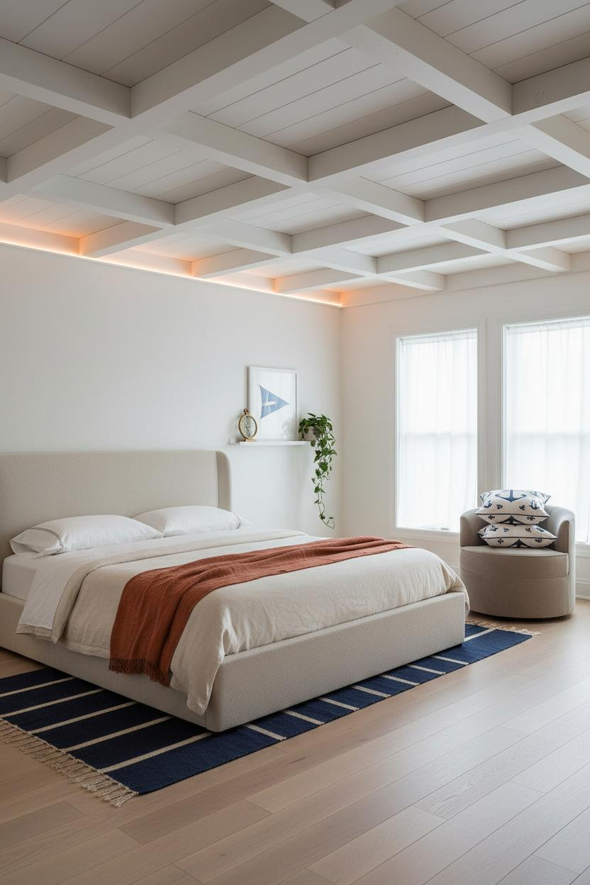

Most coastal rooms forget the ceiling entirely. These whitewashed timber beams prove that’s a mistake worth correcting.
The real strength: Whitewashing keeps the grain visible while the beam casts shadow lines across the plank ceiling, giving the room a structural rhythm that coral-tinted white walls alone could never deliver.
Worth copying: Stack a navy-anchor print pillow on a reading chair in the corner. Just enough nautical detail to keep things intentional, while still feeling like a bedroom and not a ship cabin.
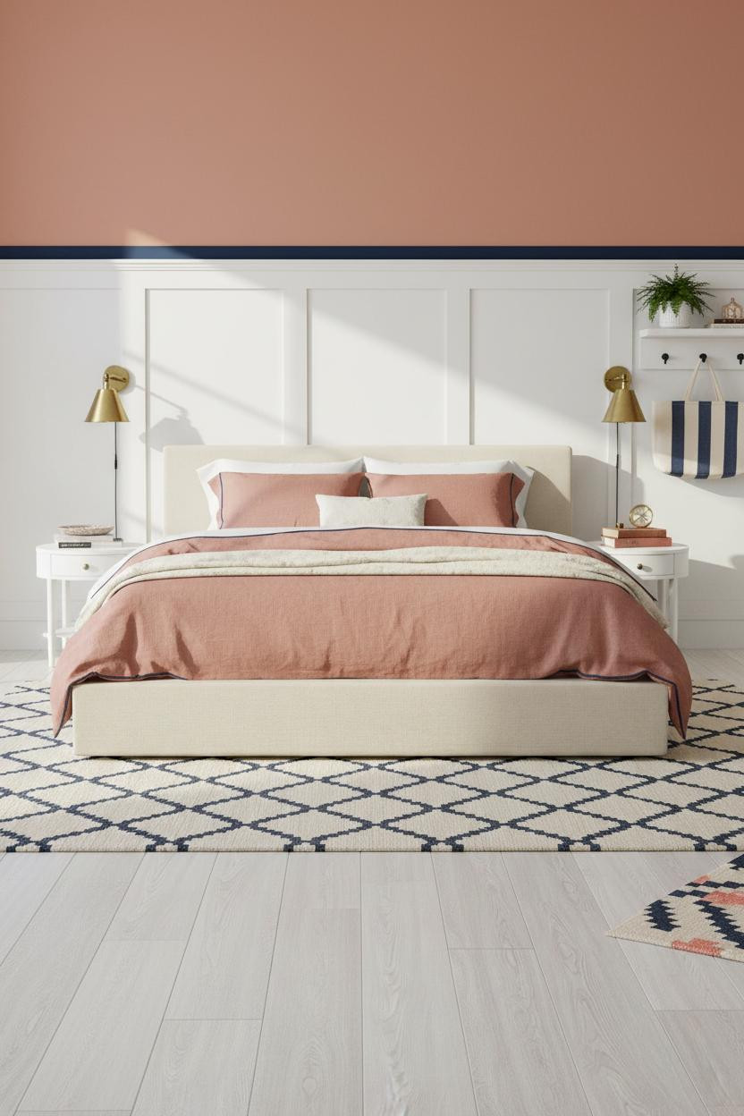
Navy Coffered Ceiling Over Blush Pink Walls
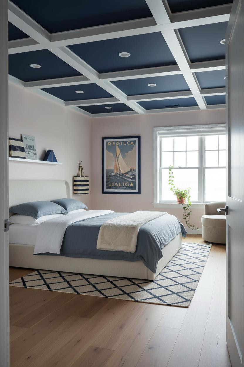
A navy coffered ceiling with white trim is one of those choices that sounds risky and looks completely obvious once you do it.
Design logic: The recessed squares frame the room from above like an architectural grid, so the pale blush pink walls below don’t need any other pattern to feel finished. The ceiling carries the graphic weight.
The smarter choice: Keep the rug in a cream and navy diamond print. It echoes the geometry without competing with it.
Navy and White Inset Panel Board-and-Batten
This is the two-tone board-and-batten version I think more people should try. White batten frame, navy painted inset panels alternating in a grid. Much stronger than all white.
Why the palette works: The navy insets create enough contrast that the wall reads as a geometric pattern at a distance, in a way that feels intentional rather than busy.
And a rope-wrapped pendant light overhead is the exactly right nautical nod. Subtle. Not a ship wheel.
Sage Green Walls With Built-In Shelving That Actually Works
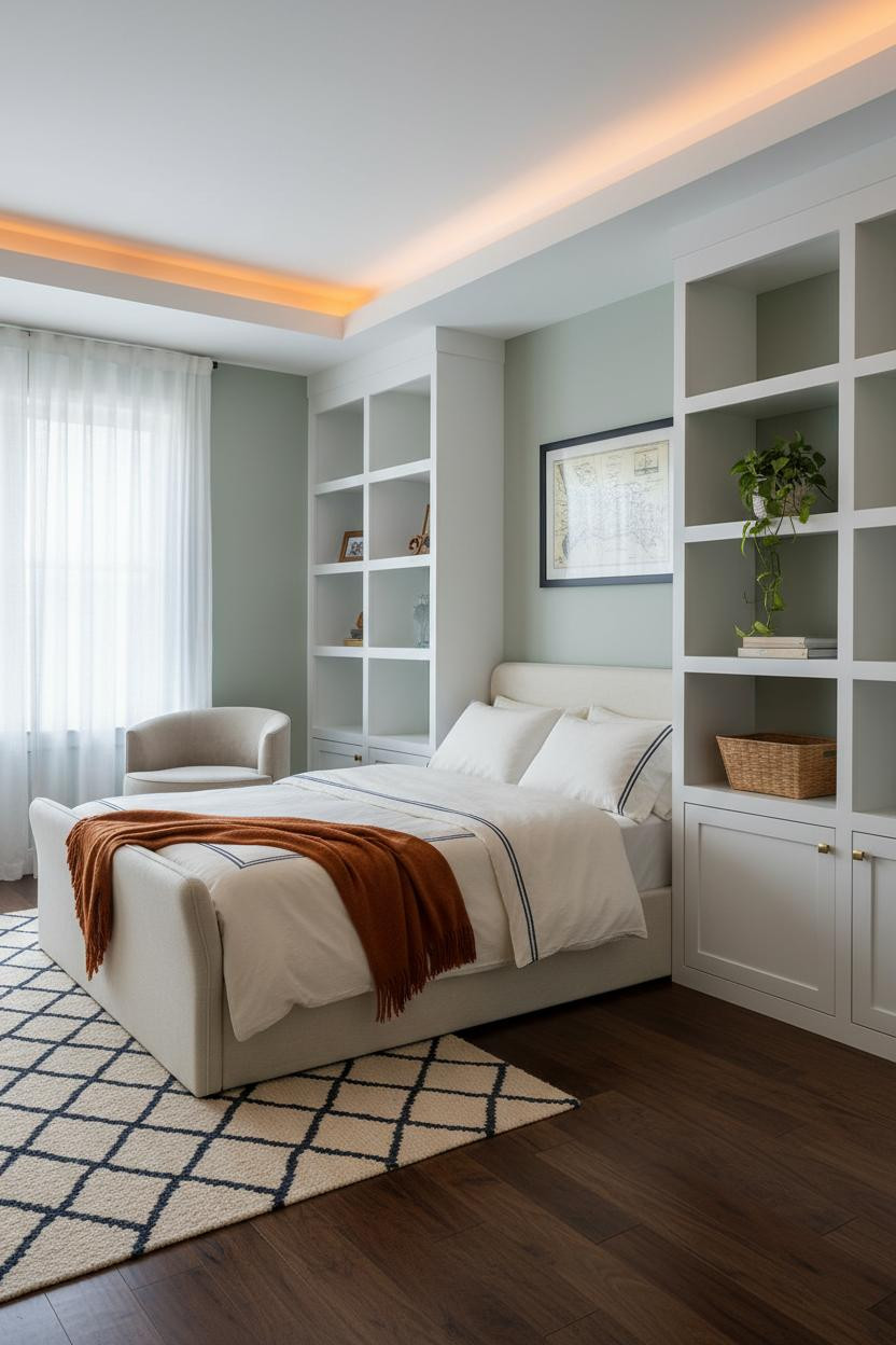
Built-in shelving with a sage green backing behind white frames is one of those combinations that shouldn’t need explaining but somehow keeps surprising people.
What creates the mood: The contrast between crisp white shelf frames and the soft sage backing creates a grid that the room feels organized by, even when the shelves themselves are casual and lived-in.
One smart swap: Use a burnt orange mohair throw on the bed. It breaks the green-navy circuit in the best possible way.
Powder Blue Walls With a Pennant Bunting Statement
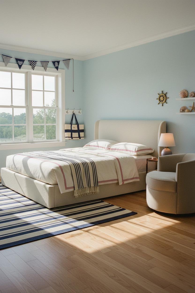
Fair warning: pennant bunting strung above a window is extremely preppy. I mean that as a compliment.
In a preppy teen bedroom context, it’s the right level of personality. Pale powder blue walls keep the bunting from feeling too campy, and a tall white-muntin window grid behind it adds enough architecture that the room still has bones.
The easy win: A small brass ship’s wheel mounted on the wall beside the window. Old enough to feel found, not bought.
An Arched Niche That Makes the Bed Wall Feel Architectural
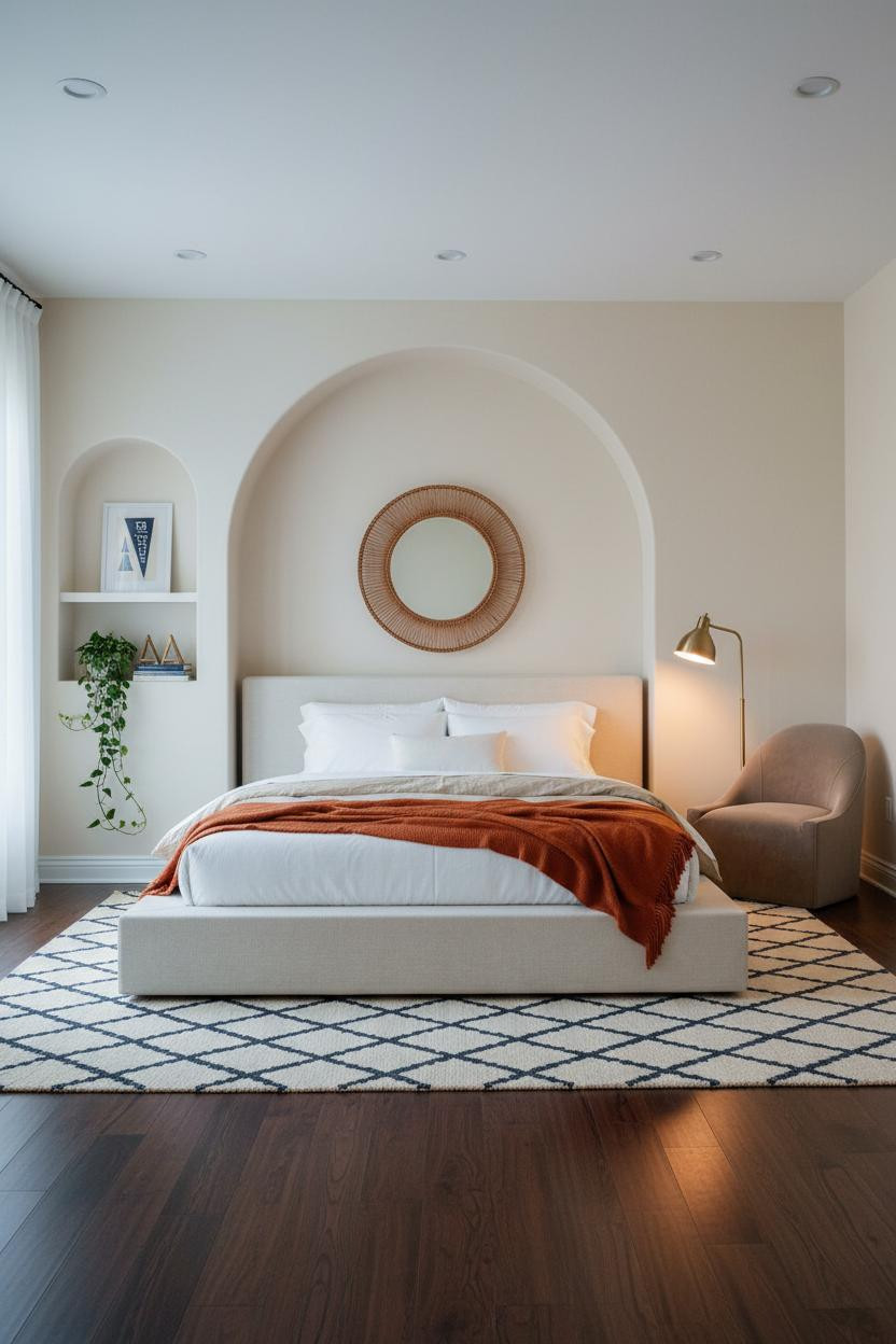
I almost dismissed the arched niche as too Mediterranean for a preppy coastal room. But the chalk white plaster curve paired with warm ivory walls lands somewhere genuinely different.
What carries the look: A rattan-framed round mirror hung inside the arch makes the niche feel like it was designed to hold something, which keeps the whole wall from looking like a trendy afterthought.
Where to start: Get the navy and cream Moroccan rug right first. It grounds the bed in a way that the arched wall above can then speak to.
White Wainscoting With Dusty Blue Walls and Golden Hour Light
This is the combination I’d actually do in my own house. Floor-to-ceiling white raised-panel wainscoting with dusty blue flanking walls. It’s the most quietly coastal thing you can do.
Why it feels balanced: The white wainscoting reflects raking afternoon light in a way that makes every panel edge glow, while the dusty blue keeps the room from feeling too bright or too cool. The honey oak herringbone floor ties it warm.
The detail to keep: A woven rope wall hanging above the nightstand. Just enough texture to keep things interesting, without competing with the panel work behind the bed.
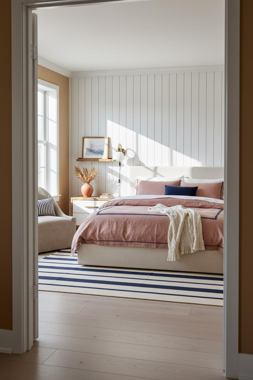
Whitewashed Shiplap With Seafoam Walls for a Breezy Teen Room
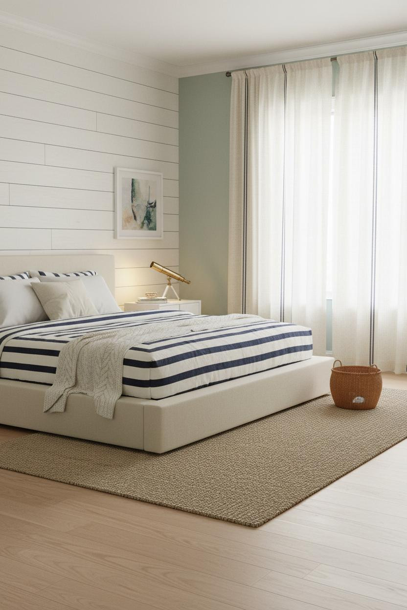
Whitewashed shiplap against soft seafoam walls is the easiest version of coastal prep you can pull off in a teen room. Both surfaces are forgiving. Neither fights the other.
What softens the room: A natural jute rug under the bed pulls the bleached oak floor and the ivory shiplap into the same warm family, so the seafoam walls read as fresh rather than cold.
And floor-to-ceiling cream linen curtains with a navy striped trim at the hem do the nautical heavy lifting. The vintage brass telescope on the nightstand is a nice touch too (it looks like it was actually used, not bought for the photo).

Our #1 Pick
Saatva Classic Mattress
America’s best-selling online luxury innerspring. 365-night trial, lifetime warranty, free white glove delivery.
Shop Saatva Classic
The Foundation Of Every Beautiful Bedroom
All of this, the shiplap, the wainscoting, the navy grosgrain details, reads differently depending on one thing: what the bed actually feels like to sleep in.
The Saatva Classic is what I’d put under all of it. Dual-coil support that holds its shape over years, an organic cotton cover that doesn’t trap heat on a warm coastal night, and a Euro pillow top that’s soft without losing structure. It’s the kind of mattress that makes the whole room feel worth it.
Get the walls right. Then get the bed right. The rest is just styling.

The rooms people actually live in are the ones where the comfort matches the design. Start with the bed. The rest figures itself out.