
The first thing you notice in the best Vintage Modern Bedroom is that nothing looks like it was ordered all at once. It looks gathered. A little worn in the right places. Honestly, that’s the whole point.
These ten rooms nail that balance between old soul and clean lines. Each one has something worth stealing.
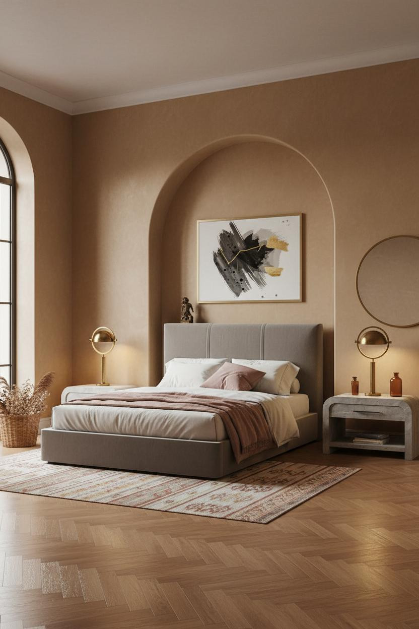
The Recessed Niche That Makes Moss Walls Work
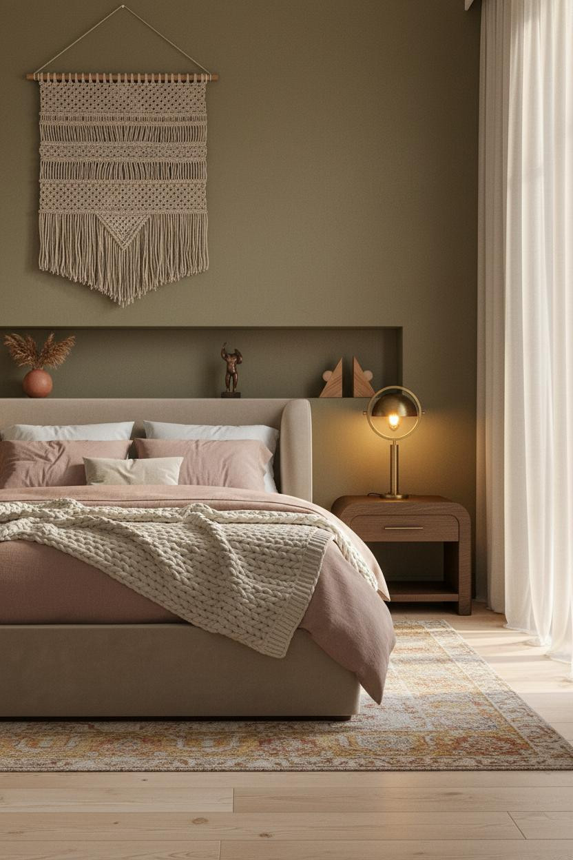

I keep coming back to this one. The matte plaster niche does more work than any artwork could.
Why it holds together: That recessed shelf breaks up the moss wall so the color reads as grounded rather than heavy, especially with dusty pink linen pulling warmth forward.
Steal this move: Style the niche with three objects at most. A terracotta vase, something sculptural, something with age. Done.
Wainscoting That Earns Its Place
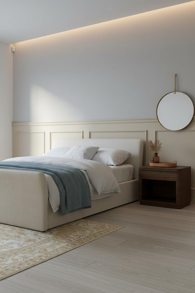


Quiet authority. That’s what cream wainscoting brings when the rest of the room lets it breathe.
But the reason it doesn’t feel stuffy here is the dove grey wall above it. The panel relief catches soft diffused light, which keeps the wall from flattening out entirely.
Pro move: Run the wainscoting the full width of the accent wall, not just to the corners. Partial panels are what make this look feel dated.
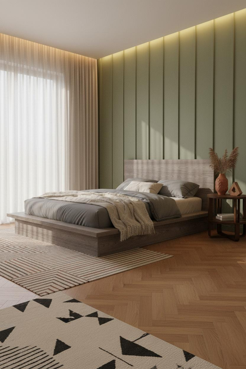
Why Slatted Oak Walls Feel Modern and Old at Once
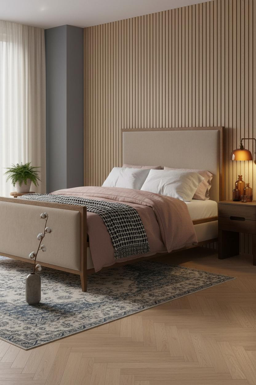

This is the kind of room that makes you want to slow down before you even sit on the bed.
What gives it depth: Vertical slatted oak panels in a matte natural finish catch raking light in a way that smooth drywall never could, which is exactly why the MCM bones feel warm rather than cold.
Pair the oak with blue-grey flanking walls and a herringbone parquet floor. The contrast does the decorating for you.
The Arched Niche Room I Think About Most

Fair warning. Once you see what a hand-smoothed plaster arch does to warm camel walls, you’ll never look at a flat headboard wall the same way.
Why it feels expensive: The curved molding of an arched alcove casts shifting shadows as the light moves through the day, giving the wall a life that paint alone can’t replicate.
What to copy first: Get the wall color right before anything else. Camel only works here because it’s warm enough to make the ivory bedding glow rather than look washed out.
Exposed Brick Is Back, But Not Like This Before
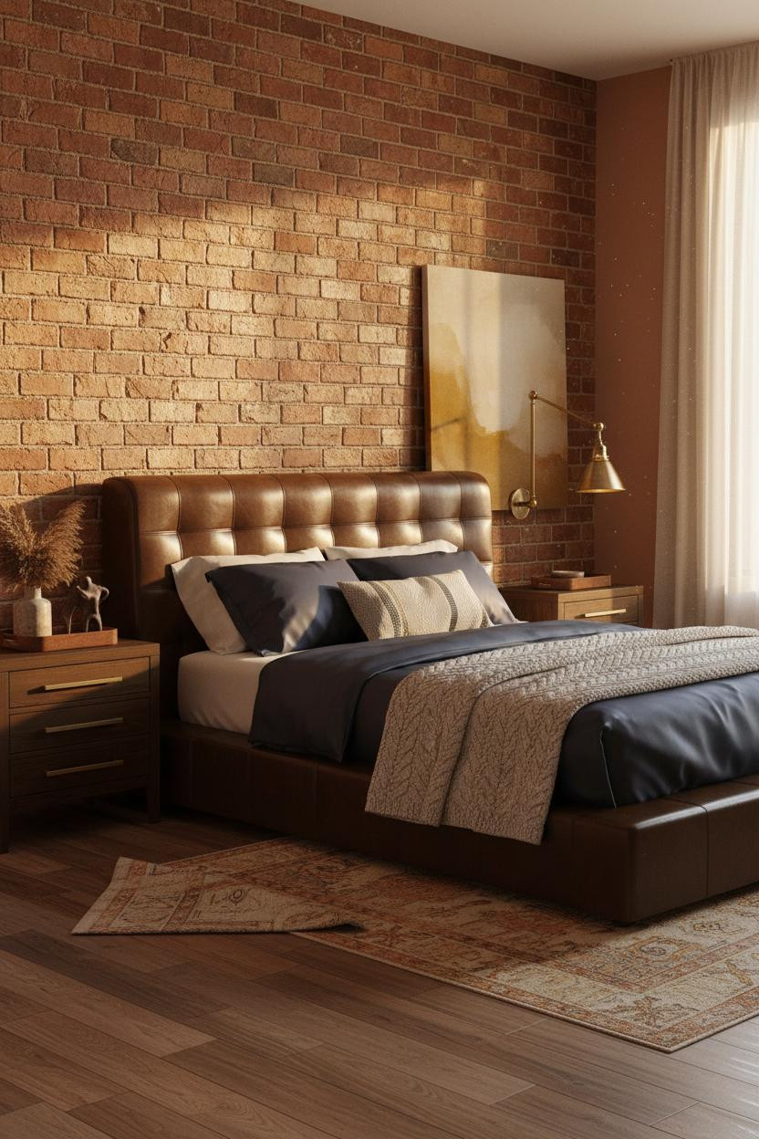


The room feels nostalgic and alive at the same time, which is actually hard to pull off with exposed brick.
What makes this one different: Soft terracotta flanking walls keep the brick from reading as industrial, while golden morning light raking across the irregular mortar lines adds texture you’d otherwise have to buy.
A cable-knit cream throw over navy sateen is the contrast move that keeps everything from going too rustic. Just enough softness.
A Gallery Wall That Doesn’t Feel Like a Pinterest Board
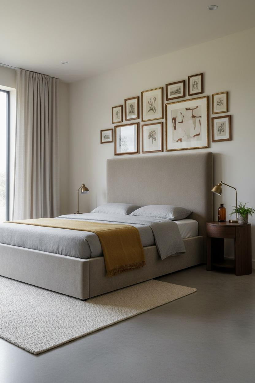


I’ve seen a hundred gallery walls. Most of them feel finished the day they go up and tired the day after. This one doesn’t.
Why it lands: Mixing warm walnut frames with gilt ones means no single finish dominates, so the wall reads as collected over time rather than assembled in an afternoon. The small oil sketches carry as much weight as the large abstract.
Avoid this mistake: Don’t space the frames evenly. Tight clusters with intentional gaps feel like an archive. Even rows feel like hotel art.
Stone Grey Walls Are Doing More Than You Think

Nothing fancy here. That’s actually the strength.
A dark walnut floating shelf at eye level does two things at once: it breaks the stone-grey wall into upper and lower zones, and gives the room a horizontal anchor that feels architectural without touching the ceiling. The camel throw folded at the foot keeps the bedding from going too cool.
In a room this minimal, the smarter choice is loading texture onto the shelf rather than adding more furniture. Three objects, honest materials, nothing too precious.
Sage Green Board-and-Batten That Gets the Scale Right


Board-and-batten in sage green is one of those moves that looks complicated in theory and obvious once you see it done right.
Why the palette works: The slim painted battens cast shadow lines down the wall as midday light rakes across them, which gives sage green a structure it wouldn’t have with flat paint alone, while still feeling warm against the honey oak floor.
Where to start: Run it floor to ceiling, not just above chair rail. Half-height board-and-batten reads as a renovation project. Full height reads as a design choice.
Japandi Blue-Grey With Cream Shiplap Behind the Bed
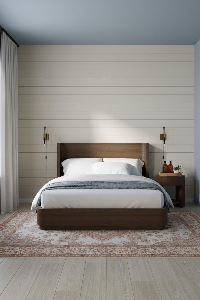

This one surprised me. The combination of matte cream shiplap and dusty blue-grey walls shouldn’t feel this quiet, but it does.
The real strength: Horizontal shiplap grain catches the cool morning light in shallow relief, which is why the wall reads as textured without competing with the furniture. It’s a quiet nod to cottage style, in a way that feels genuinely restrained.
One smart swap: The blackened steel curtain rod is what keeps this from going too soft. One dark line at ceiling height pulls the whole scheme together.
Wood Beam Ceilings Are the Architecture You Can’t Buy at a Store
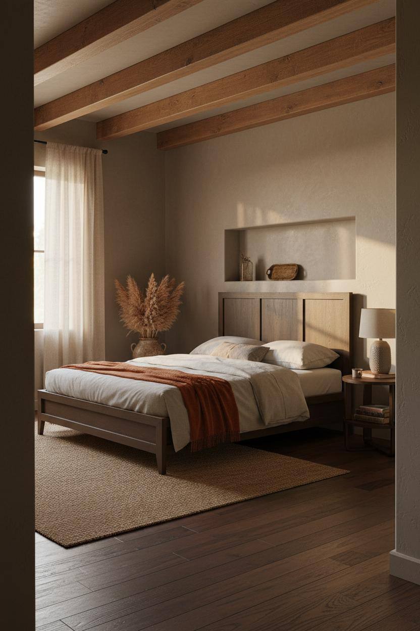

Not everyone has this. But if you do, the rest of the room’s job is just to stay out of the way.
And that’s exactly what happens here. The hand-hewn ceiling beam catches late afternoon amber light across its natural patina, casting soft shadows below that make the greige plaster walls feel alive rather than flat.
What not to do: Don’t fill this kind of room with fussy furniture. A burnt orange mohair throw and a stack of antique books on the nightstand is enough. The architecture already did the heavy lifting.

Our #1 Pick
Saatva Classic Mattress
America’s best-selling online luxury innerspring. 365-night trial, lifetime warranty, free white glove delivery.
Shop Saatva Classic
The Foundation Of Every Beautiful Bedroom
Walls get repainted. Linen gets swapped out. The mattress stays. And honestly, that’s the argument for getting it right the first time.
The Saatva Classic uses dual-coil support that holds up year after year without losing shape, a breathable organic cotton cover that doesn’t trap heat through the night, and a Euro pillow top that feels substantial without going too soft. It’s the kind of mattress that still feels right in the morning (not just when you first lie down).

Good design ages well because it’s made well. Start with the bed and the rest of the room has something real to build around.