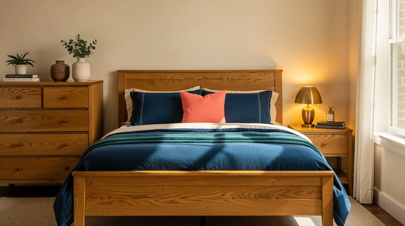
A bedroom with a 160 × 200 cm bed, honey-toned wood, and orange-leaning varnish can look warm by day and overly yellow at night. The fix is a controlled blue accent, not a pile of disconnected navy accessories.
Designers tend to start with denim blue, warm ivory, and the honey-toned wood already in the room. Put blue on one large surface, repeat it once in a smaller accent, and let the grain stay visible.
That approach gives you contrast without forcing a full makeover. It also makes the right shade easier to judge before you spend money on paint, bedding, or curtains.
Anchor the Room With One Blue Surface
Start with denim blue on one large surface: the bed, the window, or the wall behind the headboard. That single decision gives the room a visual center and keeps the honey-toned wood from competing with small decorative pieces.
For a no-paint update, IKEA SOLFIBBLA bedding was listed at about €29.99, while the matching dark-blue curtains were about €24.99 per pair. Together, the two pieces create a strong color block for roughly €54.98 on the supplied listing.
Repeat the blue once at a smaller scale, perhaps in one cushion, a framed print, or a bedside object. More repetition will make the palette feel overly planned, especially when the floor, bed, and wardrobe already share a warm wood tone.
Read the Wood’s Undertone Before Choosing Blue
Orange-leaning varnished pine needs a softer partner, so begin with a muted blue-gray that takes the edge off the orange without making the room feel cold. This pairing works best when the wood has a glossy finish or strong knots.
Golden oak can handle more contrast. I’d choose navy with warm ivory when the grain is pale and honeyed, because the deeper blue gives the furniture definition instead of allowing every surface to blend together.
Hold fabric or paint samples directly beside the wood in daylight and again under the bedside lamps. A blue that looks calm online can turn noticeably purple, green, or gray once the room’s existing bulbs and varnish enter the picture.
Build the Bed Around Warm Ivory
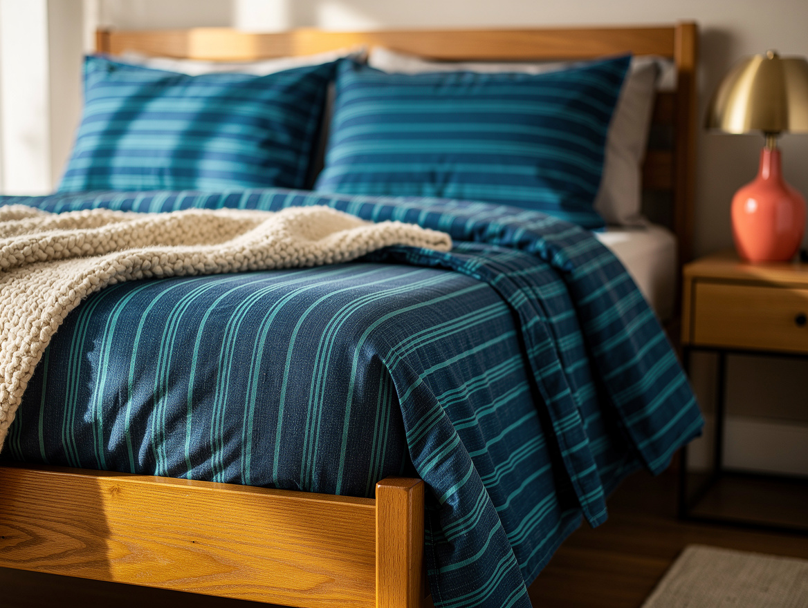
Use warm ivory on the sheets, quilt, or throw to connect the blue with the wood. Pure white can look sharp beside honey oak, while ivory gives the palette a softer middle ground.
IKEA SOLFIBBLA uses blue-and-white stripes and comes in a listed format of about 240 × 220 cm with two pillowcases measuring roughly 65 × 65 cm. Match the set to your duvet and pillows, not simply to the mattress width.
If stripes feel too busy, IKEA ÄNGSLILJA in dark blue was listed at about €29.99 in cotton, while HAMPFLOCKEL was about €55 in cotton percale. Choose the solid option when the headboard has a strong shape or the room already contains patterned flooring.
Use Curtains to Control the Light
Bring blue to the window with GINSTMOTT dark-blue panels when the bed or wall needs to stay quiet. The color will repeat the bedding from across the room, while the vertical fabric adds height near a low headboard.
The IKEA panels were listed at roughly 145 × 250 cm per panel and about €24.99 per pair. Their recycled polyester fabric filters light rather than blocking it, so they suit a bedroom that needs color without losing daytime brightness.
Measure from the rod to the floor before ordering, then check the total fabric against the rod width. The supplied pair gives about 290 cm of flat fabric, or roughly 1.9 times the width of a 150 cm rod, which creates a fuller look than hanging a single narrow panel.
Test Paint Against the Grain
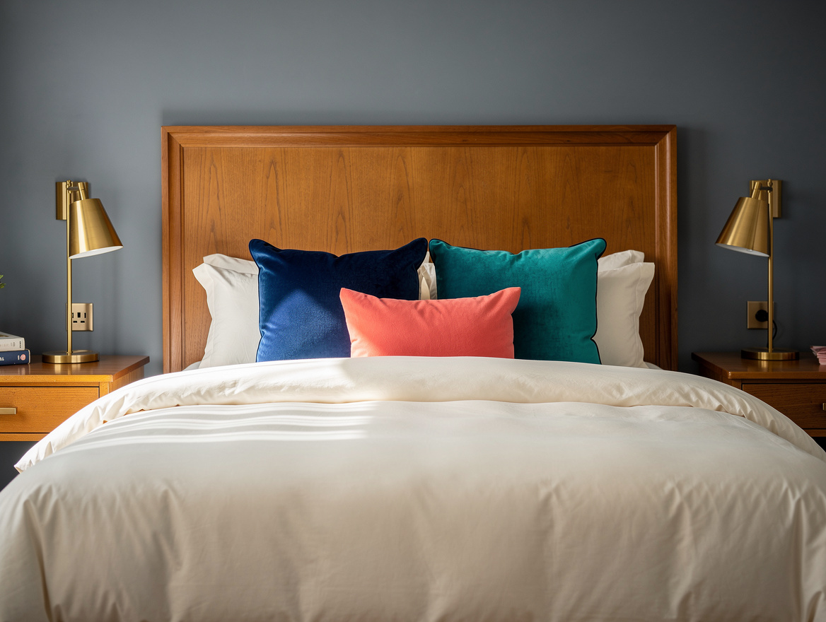
A denim-blue wall behind the bed is the strongest move when the headboard is already the room’s feature. Keep the remaining walls a warm off-white so the wood grain stays visible and the bed does not disappear into a dark box.
Paint a large sample beside the honey-toned wood and inspect it at several times of day. The sample matters more than an online image because varnish, daylight, and bedside lighting can shift the blue’s apparent temperature.
For a wall measuring about 3.2 × 2.5 meters, the surface is roughly 8 square meters, or around 16 square meters for two coats. That can fit within the nominal coverage of a 2.5-liter tin, though primer may require a separate budget depending on the existing wall.
Repeat Blue Once, Then Stop
When the floor is the wood feature, use a blue-and-ecru rug instead of a solid navy one. The ecru creates a second light tone for the bed, and the pattern prevents the floor from reading as one heavy dark shape.
A rug around 160 × 230 cm works naturally beneath a 160 × 200 cm bed when the longer side runs across the bed. Leave enough visible flooring around it to show the room’s character and keep the wood from feeling buried.
Finish with one small blue object, such as a ceramic lamp base or a framed print, then stop adding color. The room will feel more collected when the honey wood remains the dominant material and the blue has a clear supporting role.
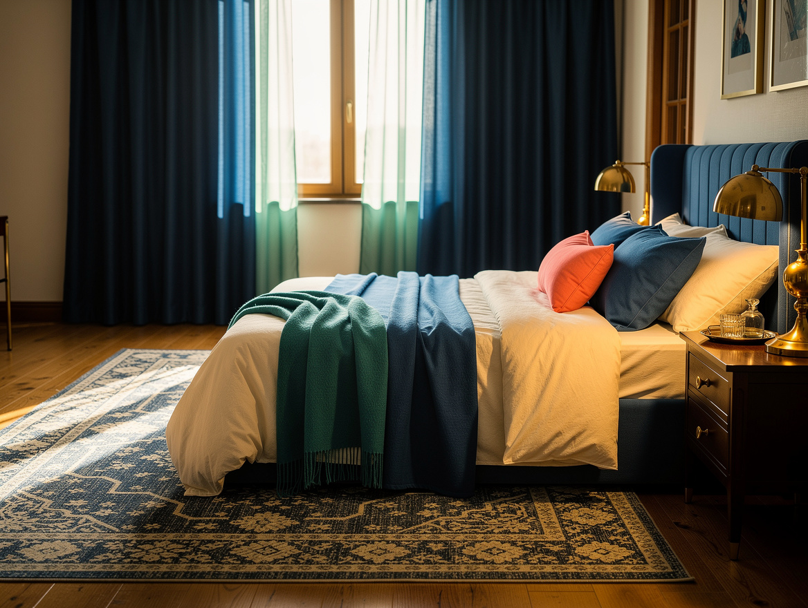
Begin with the bed or wall, then place one blue sample beside the wood before buying anything else. Once the blue feels balanced in both daylight and lamplight, use ivory to soften the transition and leave the golden finishes alone.
Mia Carter writes about small-space living and budget home makeovers. She has restyled three rentals and tests most ideas in her own 45 sqm flat.