
The best romantic bedroom ideas don’t announce themselves. They pull you in slowly, through lamplight and texture and a wall color that feels like it was always supposed to be that dark.
These eleven rooms lean moody without tipping heavy. Every one of them earns the warmth it creates.
The Dark Feminine Room That Actually Feels Cozy
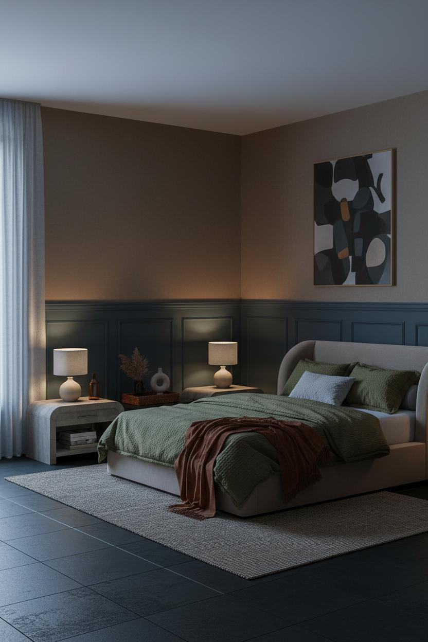

This is the room I keep returning to when someone says dark bedrooms feel oppressive.
Why it works: The slate-blue wainscoting stops at mid-wall, which keeps the lower half architectural and grounded while the warm mushroom plaster above breathes. The panel moldings catch amber lamplight along each edge, so the whole room pulses quietly instead of sitting flat.
Steal this move: Pair wainscoting in a muted cool tone with warm plaster above. The contrast does more work than a single paint color ever could.
Why Crittall Windows Change the Whole Mood
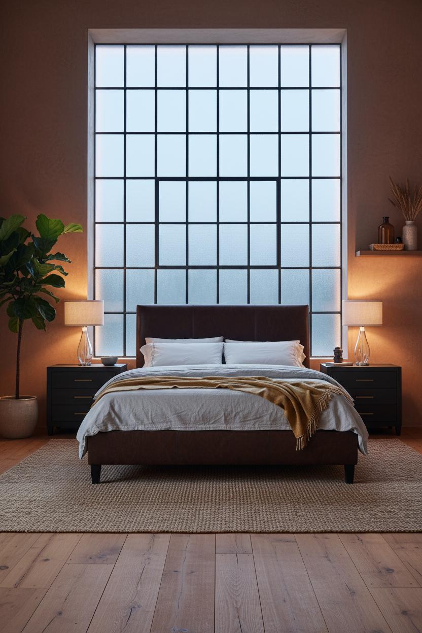


Divisive. Not every bedroom can pull this off.
But when the geometry of dark iron Crittall frames lands against textured terracotta plaster, the room stops feeling like a bedroom and starts feeling like somewhere you actually want to spend a Sunday morning in.
What makes it work: Raw iron meeting handmade plaster is a tactile contrast that no wallpaper can replicate. The grid casts shadow lines across the wall as the light shifts, so the room literally changes throughout the day.
The smarter choice: If you can’t do full Crittall, a steel-framed mirror leaned against a terracotta wall gets you most of the way there.
Aubergine Walls That Read Warm, Not Cold
Aubergine is the color I’d pick if I had to choose just one dark wall tone. Honestly, nothing else ages as well.
The real strength: Alternating matte and satin vertical strips in deep aubergine paneling means the wall shifts as the light rakes across it. Some strips absorb light completely. Others throw a thin seam of warmth upward. It’s architectural, not just painted.
Worth copying: Ground it with herringbone oak parquet and navy bedding. The warmth in the floor keeps the purple from reading cold.
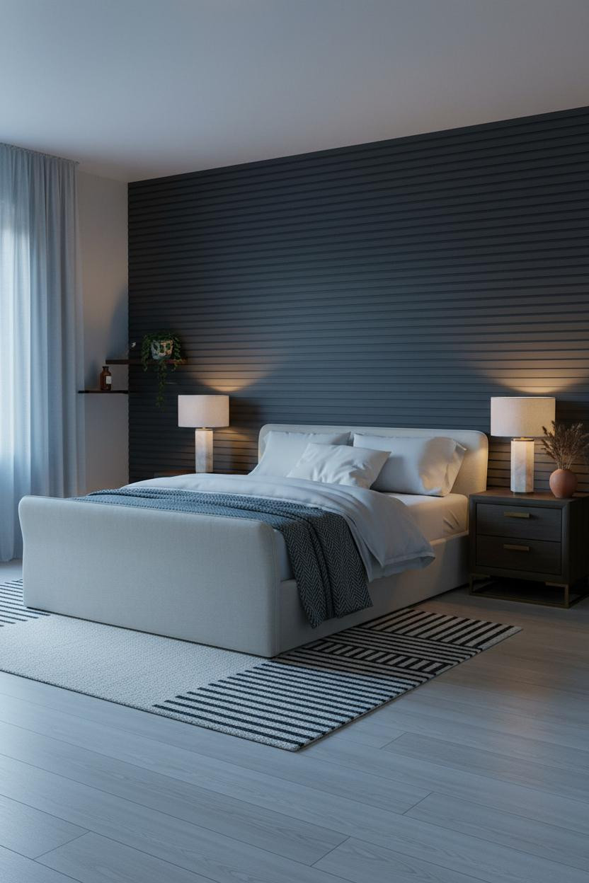
Navy Shiplap Done Right
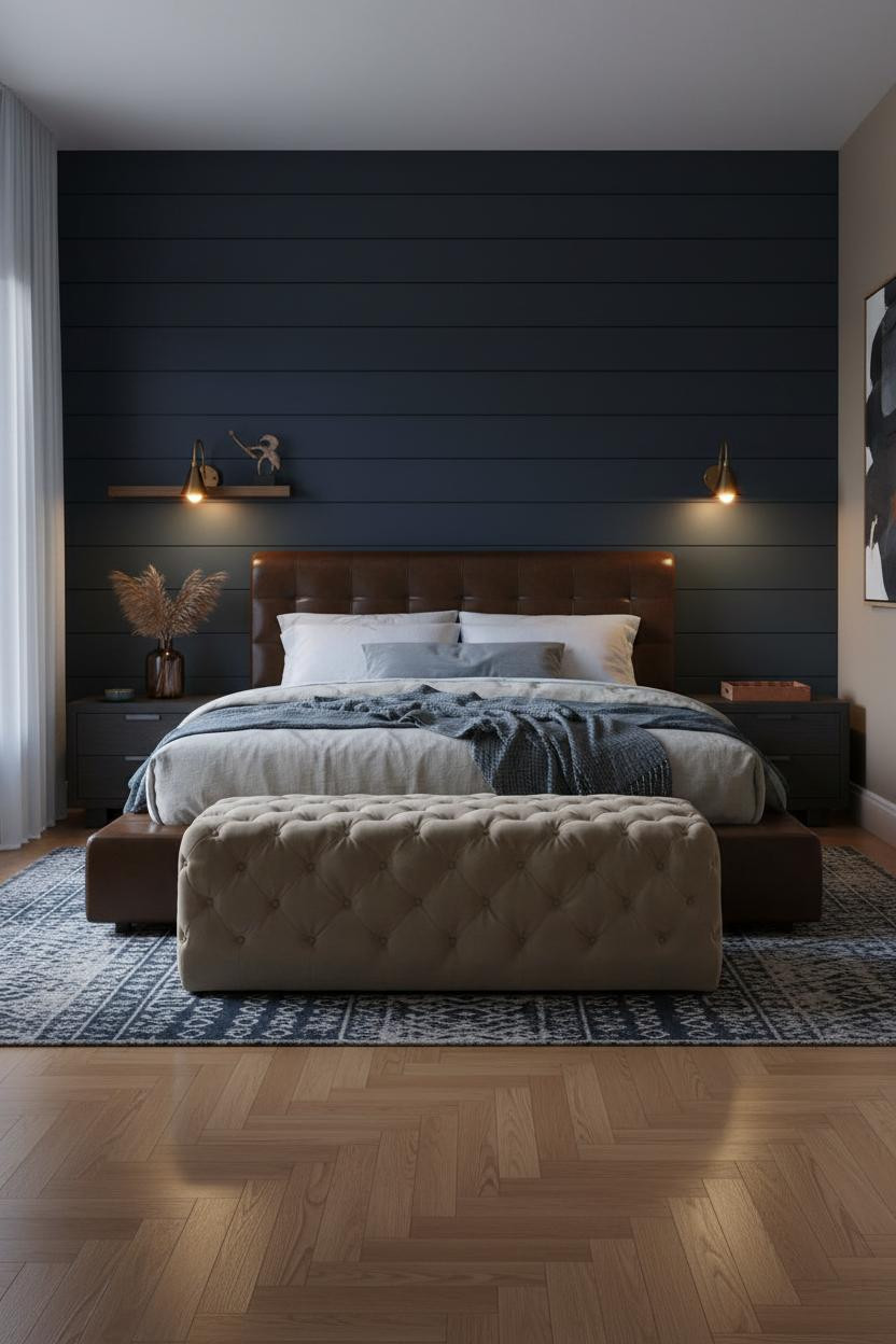


Shiplap gets a bad reputation because most people use it in cream. Dark navy changes everything.
The horizontal planks catch raking lamplight in a way that makes the wall feel dimensional rather than flat, which is why the room feels intimate and layered instead of just painted dark. Pair the navy matte shiplap with warm taupe on the remaining walls and the contrast stays moody without going stark.
Avoid this mistake: Don’t use a cool-toned rug. A kilim in navy and cream keeps the floor from fighting the wall.
I Didn’t Expect Indigo To Feel This Warm
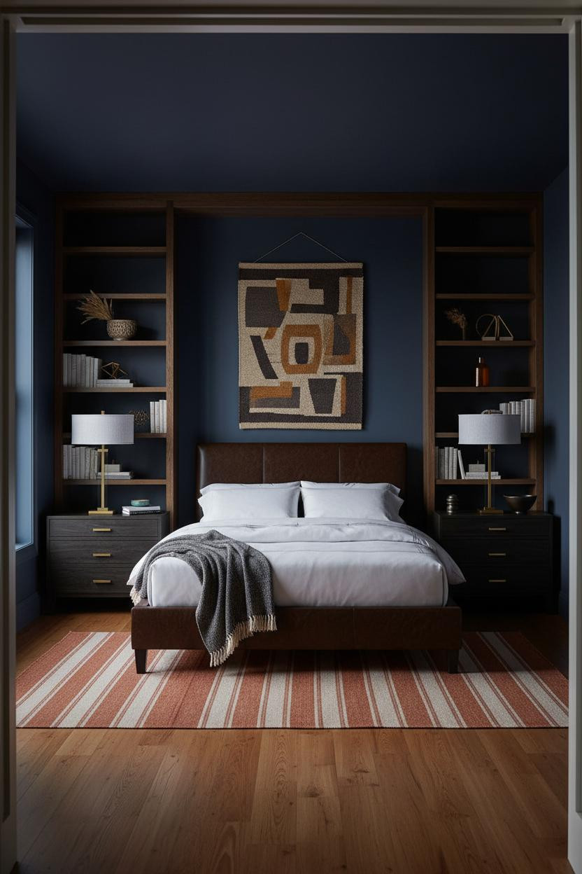
Indigo walls with warm maple floors. It shouldn’t work as well as it does.
What creates the mood: Built-in shelving in dark-stained oak recedes into the indigo wall, which makes the whole corner feel excavated rather than added on. The amber floor lamp pools warmth across the maple grain while the upper wall stays cool and shadowed. Two temperatures, one room, genuinely collected.
Style the shelves with ochre, bronze, and dried botanicals. Nothing too precious.
Charcoal Paneling With a Grooved Finish That Earns Its Price

Linear-grooved paneling in deep charcoal is the detail that makes a bedroom feel like it was designed, not just decorated.
Why it feels expensive: Each groove in the charcoal wood paneling catches lamplight differently, rolling warm amber across the ridges while shadow settles into the channels. The effect is dimensional in a way flat paint never reaches, especially when paired with pale birch floors that bounce light back up into the room.
The easy win: Keep bedding in cream percale. The contrast between the dark wall and light bedding is where the drama actually lives.
The Arched Alcove That Makes Everything Else Feel Unnecessary
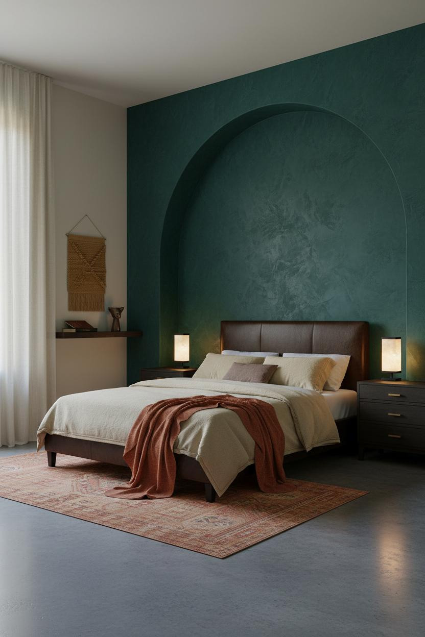

A floor-to-ceiling arched alcove in hand-troweled emerald plaster is the kind of architectural detail that makes art on the wall feel redundant.
What gives it presence: The rough plaster texture drinks lamplight at the curve’s edges and pools shadow at the crown, which makes the arch feel sculpted rather than built. The room feels enveloping and calm, the way a good restaurant booth does. Warm cream on the remaining walls keeps the green from reading cold.
Pro move: A rust linen throw across warm cream bedding bridges the emerald and terracotta without matching anything too precisely.
Board-and-Batten in Deep Rust
Fair warning. Deep rust board-and-batten is not a safe choice. But I’ve yet to see someone regret it.
Why it holds together: The vertical battens cast thin downward shadow lines that make a standard ceiling feel taller, while the matte rust surface absorbs lamplight rather than reflecting it. The room stays intimate at night in a way that high-gloss walls never manage.
What not to do: Don’t pair it with cool-grey bedding. Dusty pink linen and a cream knit throw keep the whole palette reading warm and feminine, while still feeling grounded.
The Forest Green Plaster Room I Think About Often
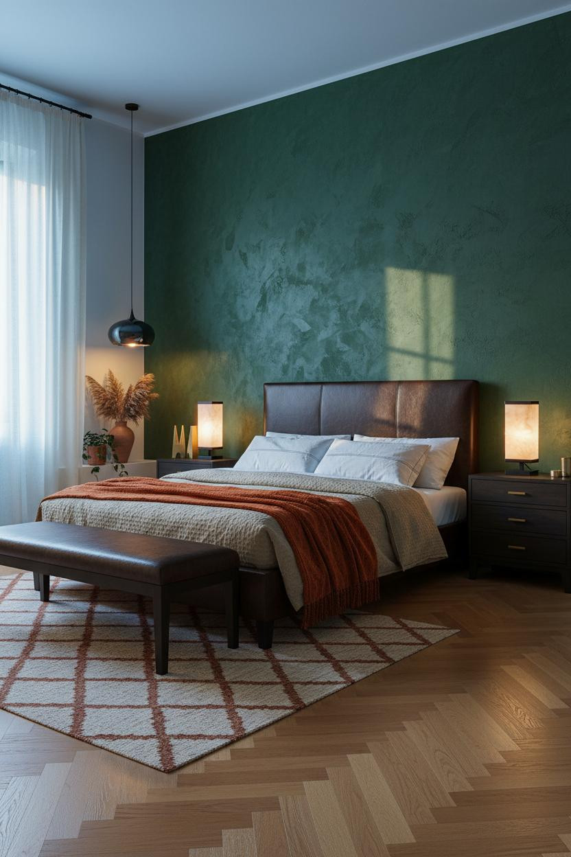
Raw plaster walls in deep forest green sit somewhere between old-world and genuinely modern. That tension is the whole point.
Why the materials matter: The rough-hewn surface of exposed textured plaster catches light in irregular patches, so the wall looks hand-made rather than applied. Lamplight pools warm at the lower wall. The upper edges stay shadowed and green and somehow richer for it.
One smart swap: A burnt orange mohair throw on oatmeal waffle bedding pulls the earthy warmth of the plaster through to the bed. Nothing matchy.
Burgundy Walls With a Backlit Panel Behind the Bed
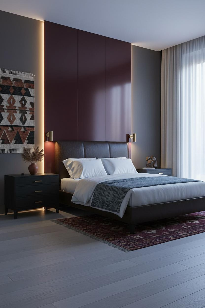
Admittedly, a backlit burgundy panel behind the bed sounds excessive. But the room doesn’t feel excessive. It feels like dusk, held still.
What carries the look: The lacquered burgundy surface catches warm backlight across its dimensional face in a way matte paint never would, giving the wall a quiet glow rather than a flat wash of color. Paired with warm charcoal on flanking walls, the contrast lands dramatic without tipping gothic.
The key piece: Bleached oak floors keep the palette from reading too heavy. The light wood pulls the room back toward livable.
Plum Velvet Walls That Belong in a Parisian Apartment
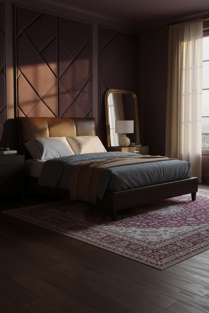
I almost scrolled past this one. Glad I didn’t.
What gives it depth: Floor-to-ceiling quilted plum velvet panels catch raking afternoon light along each tufted ridge, so the wall has texture that most rooms spend thousands trying to fake. And the faded Persian rug on dark walnut floors is the kind of thing that looks expensive because it’s old, not because it’s new.
Where to start: A large brass-framed mirror leaned against the opposite wall reflects the velvet back into the room. The doubling effect makes a smaller space feel considered rather than cramped.

Our #1 Pick
Saatva Classic Mattress
America’s best-selling online luxury innerspring. 365-night trial, lifetime warranty, free white glove delivery.
Shop Saatva Classic
Why Luxury Bedrooms Always Feel Better
Walls get repainted. Lamps get swapped. The mattress stays. And in a room this carefully considered, it matters more than people admit.
The Saatva Classic is built around dual-coil support that holds its shape over years, not just months. The breathable organic cotton cover doesn’t trap heat, which means a dark, layered bedroom doesn’t have to mean a warm, uncomfortable sleep. And the Euro pillow top is soft in the way that has structure behind it.
Good design ages well because it’s made well.

The rooms people save are the ones where nothing looks accidental. These eleven prove that dark, warm, and romantic aren’t competing ideas. They’re the same idea, done right. Start with a wall color that makes you feel something. Build the rest from there.