
The first thing you notice in the best Japanese studio apartment is what’s missing. No clutter, no filler, no furniture fighting for attention. Just materials doing their job quietly.
These 13 layouts prove that a small footprint doesn’t mean a small life. Each one finds a different way to make stillness feel intentional.
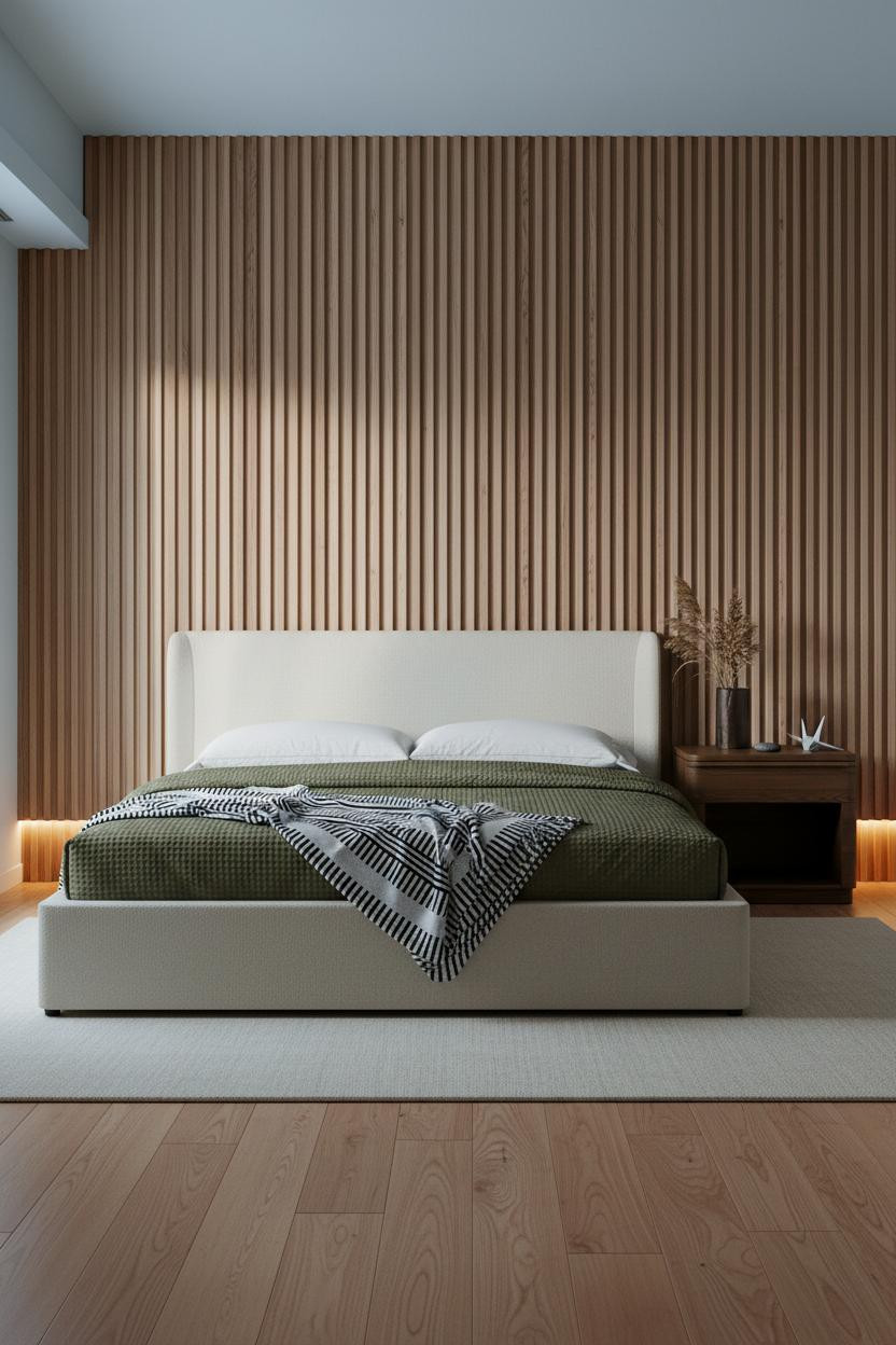
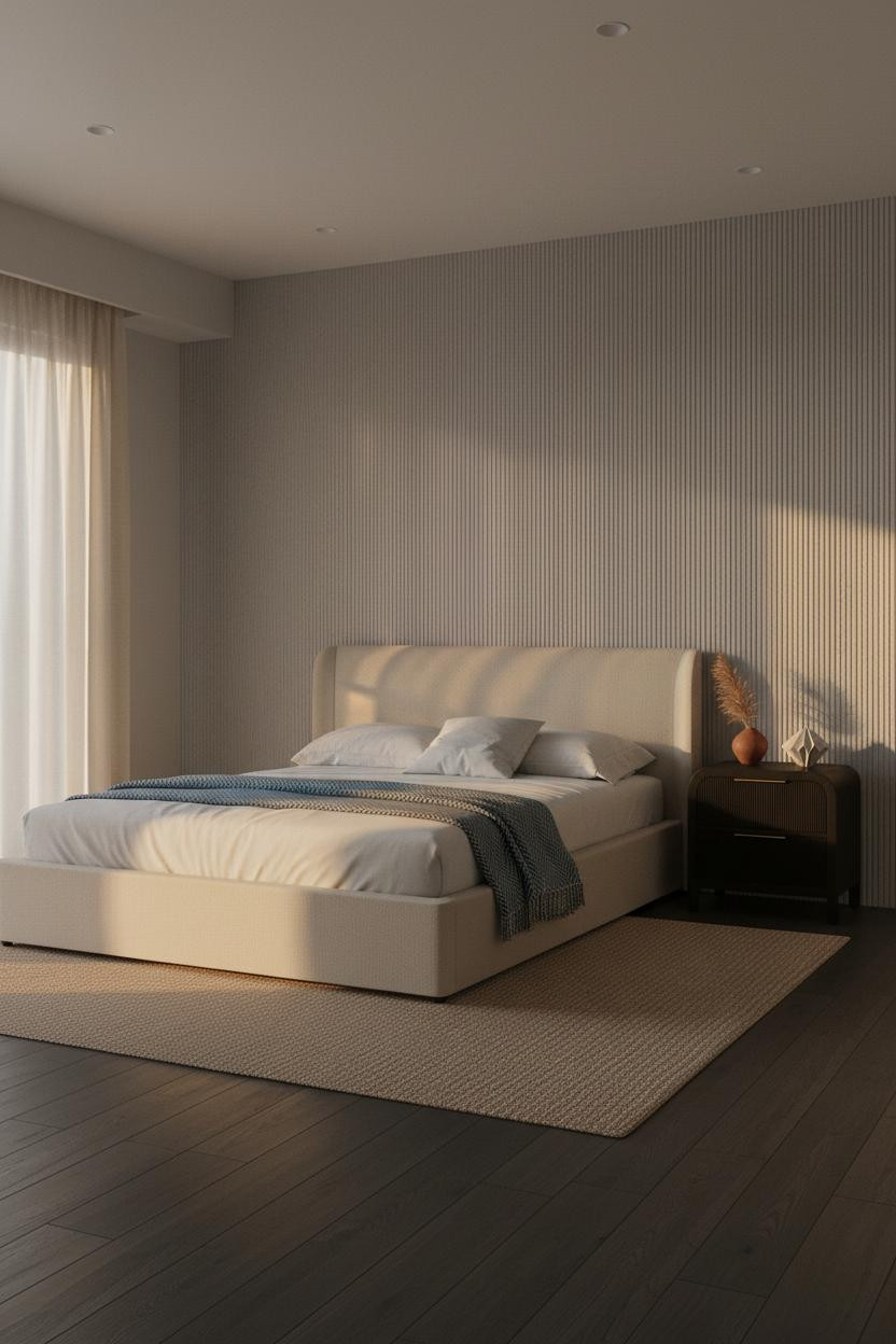
The Cedar Wall That Makes The Room Feel Twice As Deep


Bold choice. Not obvious. But somehow the right one.
Floor-to-ceiling fluted cedar running the full sleeping wall creates a rhythm that paint never could. Each groove catches morning light differently, and the raw cedar grain releases just enough warmth to keep the palette from feeling cold.
Steal this move: Pair it with a cream linen rug and pale sand plaster on the surrounding walls. The contrast is immediate.
When A Backlit Stone Panel Does All The Work
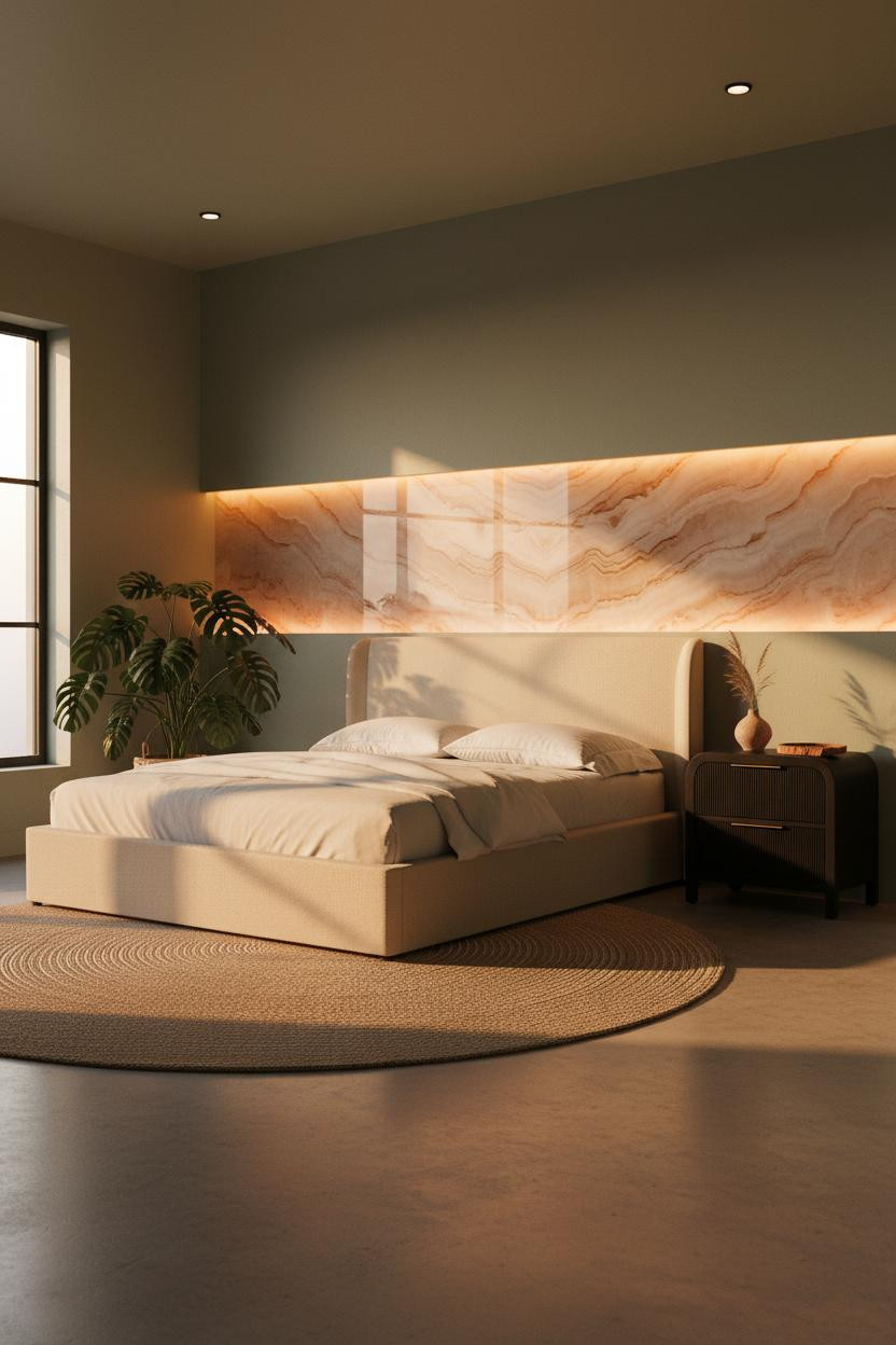
This one is honestly the most dramatic layout in the bunch, and I mean that as a compliment.
Why it feels expensive: A backlit translucent onyx panel spanning the full sleeping wall turns ambient light into architecture, so the room feels warm even when it’s technically dark. The sage plaster on the surrounding walls keeps it grounded.
The practical move: This only works if you commit to low furniture. Any piece that blocks that glow defeats the whole thing.
This Low-Profile Bed Changes How The Ceiling Feels

In a room this small, scale matters more than style. A low-profile bed isn’t just an aesthetic choice.
What makes it work is how the Ranma-inspired transom shelf at the upper wall creates a horizontal anchor that the eye reads as a ceiling line. The room feels taller because there’s less competing furniture height below it.
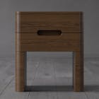
The smarter choice: Keep the nightstand low to match. One tall piece breaks the proportion entirely.
I Keep Coming Back To The Botanical Grid Idea
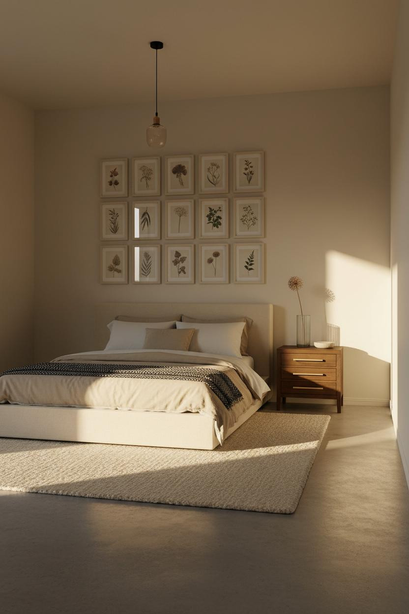


Twelve matching frames in a tight two-column grid, floor to ceiling. Sounds fussy. It’s actually the opposite.
But here’s why it lands: framed pressed botanical prints in pale ash give the wall visual weight without any color, which lets the chunky wool cream rug and polished concrete floor carry the warmth. Order and texture working together.
Worth copying: Use identically sized frames only. Mixed sizes would break the meditative quality this layout depends on.
Whitewashed Brick In A Studio That Earns It
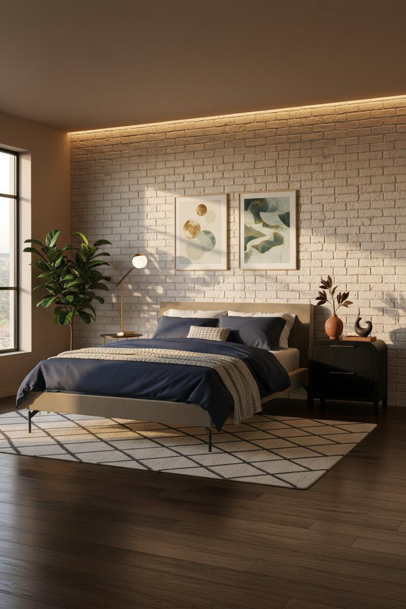

Exposed brick in a Japanese-style apartment seems like it shouldn’t work. And yet.
What makes this one different: The whitewashed clay brick keeps the texture without the industrial weight, and an LED cove strip washing up the wall face at night turns it into something almost glowing. The navy bedding pulls the room together without competing.
Avoid this mistake: Don’t skip the cove lighting. Without it, raw brick reads as unfinished rather than intentional.
The Platform Bed Alcove Every Tiny Apartment Needs

Having a built-in sleeping zone changes how you actually move through a studio. The rest of the floor suddenly feels like a different room.
Design logic: A shallow tokonoma-inspired alcove in pale ash frames the bed without enclosing it, giving the sleeping zone its own visual address while keeping the layout open. The reclaimed grey-wash planks on the floor reinforce the boundary without a rug even being necessary.
A storage platform bed here pulls double duty, especially in a space where under-bed storage is the only kind you’ve got. The key piece: Don’t skip it.
Cedar Wainscoting Half-Height Actually Works Better Than Full
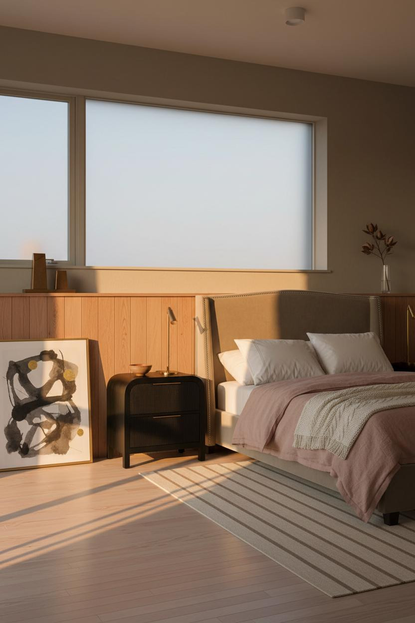

I expected to prefer the full-height cedar versions. But this half-height wainscoting layout actually reads calmer.
The reason it feels grounded instead of heavy: raw natural cedar wainscoting stops at the rail line, letting warm khaki plaster take over above. That break gives the wall two temperatures, and the raking afternoon light catches the grain at the lower half in a way that plain plaster never could. The room feels warm and collected, but there’s real breathing space above.
Try this: Lean an oversized ink-wash print against the wainscoting instead of hanging it. It makes the whole thing feel less finished, which is actually the point.
A Floating Shelf That Quietly Organizes A Whole Studio
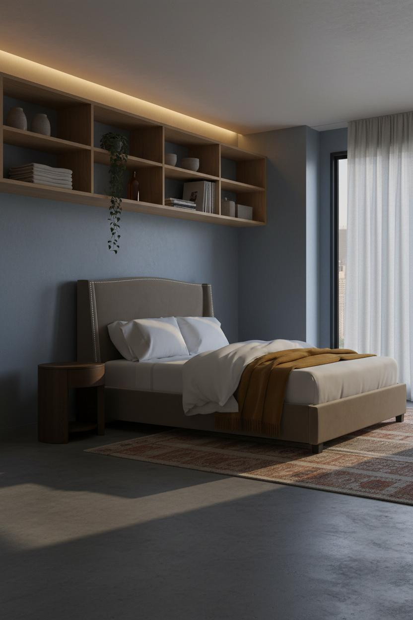

Nothing fancy. That’s the point.
What carries the look: A full-width blonde oak shelf at eye height across the sleeping wall does more work than a full bookcase, because open compartments holding folded textiles and unglazed ceramics feel curated without being precious. The dusty blue plaster behind it keeps the whole shelf from blending into the wall. And the kilim runner in muted rust on polished concrete below ties the warmth back down to floor level.
The easy win: Cove lighting grazing the underside of the shelf turns storage into atmosphere at night.
What Wabi-Sabi Actually Looks Like In Real Life
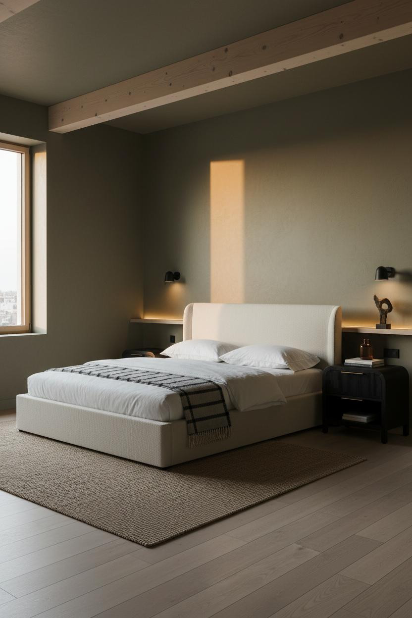
Admittedly, “wabi-sabi” gets thrown at every neutral room with a dried stem in it. This one actually earns the label.
What gives it presence: A single exposed raw ash ceiling beam spanning the full width catches raking light from the tall window and casts parallel shadows across the ceiling plane. It’s a structural element doing aesthetic work, which is pretty much the definition of good design. The moss-toned plaster on the walls keeps everything alive rather than grey.
What to borrow: Keep the floor objects sparse. Stacked books and one amber glass bottle. That’s the ceiling.
Board-And-Batten That Somehow Feels Japanese
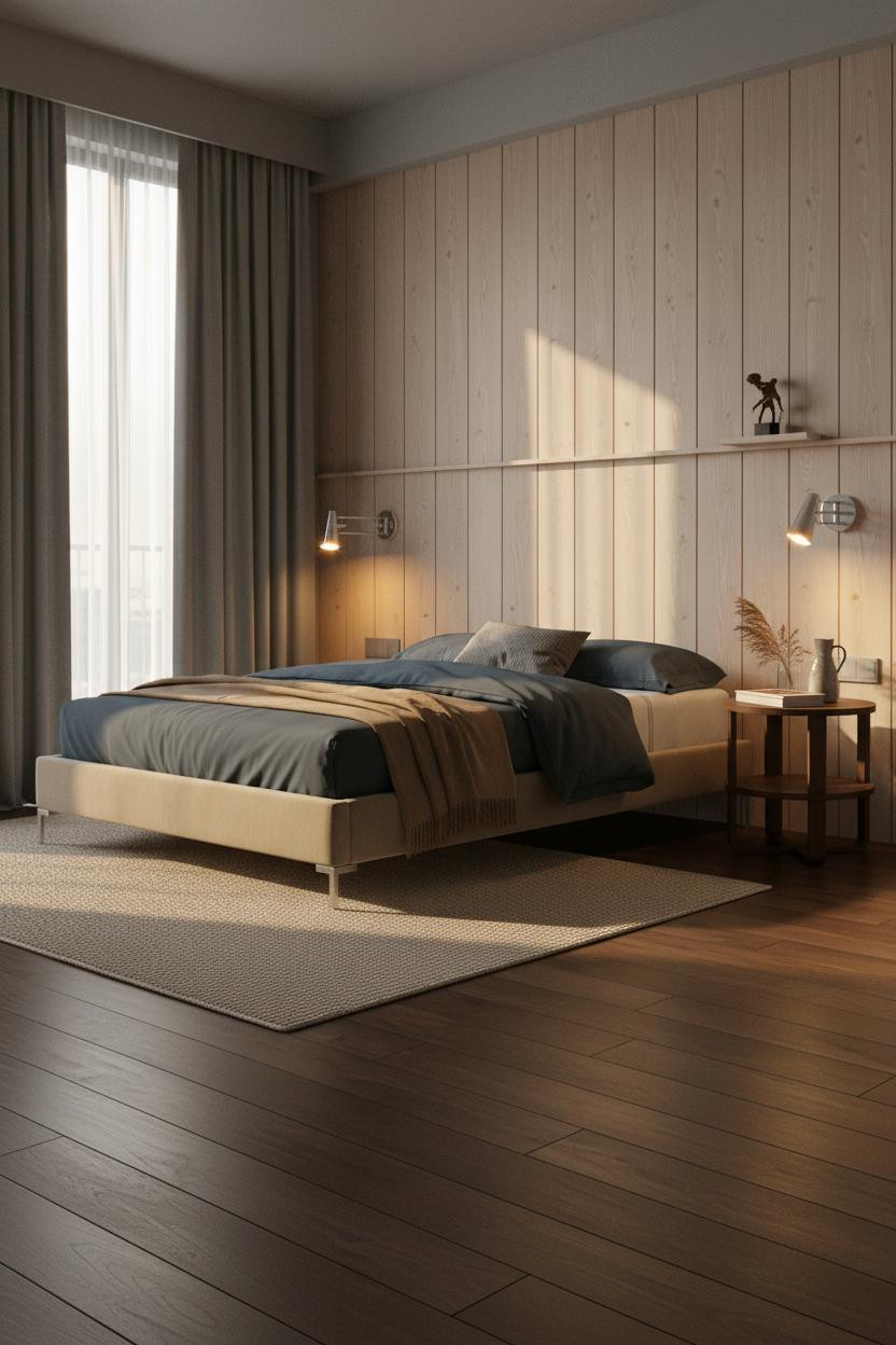


It works because the execution is restrained, not because the material is exotic.
Each vertical slat in raw pale ash board-and-batten catches side light and throws a fine shadow line, giving the sleeping wall texture that reads as crafted at any scale. The stone grey plaster above the batten rail and deep slate linen curtains floor-to-ceiling keep the mood from tipping into rustic. Room feels warm without being heavy.
Pro move: Pair warm sconces flanking the bed with cool daylight flooding from the side window. The contrast between those two sources is what makes the wall texture visible at night.
The Textured Plaster Wall That Earns A Second Look
I almost scrolled past this one. Glad I didn’t.
The real strength: Reed-pressed dove grey plaster running the full sleeping wall looks flat in overhead light and almost sculptural once the afternoon sun rakes across it. It’s a small move, but the depth is real. Ivory percale bedding and a steel blue herringbone throw at the foot keep it from tipping into monochrome.
Where to start: This look only works if the flooring is dark. Pale floors flatten the whole contrast.
Built-In Shelf Walls That Replace A Whole Room’s Worth Of Furniture
This is the layout I’d actually use. A full-width low built-in shelf at knee height frees up the walls above entirely.
Why it holds together: The natural-grain timber shelf running the full room length keeps every object at a consistent low plane, which makes the taupe matte plaster above read as open volume rather than empty wall. The herringbone parquet in warm honey below ties the whole composition to the floor. Room feels collected rather than decorated.
What not to do: Don’t overcrowd the shelf compartments. Three objects per section. The restraint is what makes each one count.
The Shoji Partition That Earns Its Square Footage
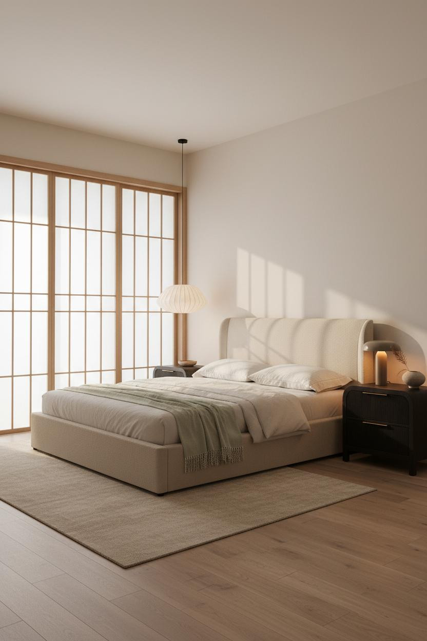
Fair warning. A full-height shoji partition is a commitment, and it only works in a studio that can genuinely spare the visual weight.
But when the proportions are right, the translucent rice paper panels in light ash do something a solid wall never could: they divide the sleeping zone while still letting morning light wash through. The soft lattice shadows it casts across the bleached oak flooring are the whole atmosphere of this room. And the washi paper pendant hanging near the partition keeps the Japanese interior design language consistent without overstating it.
The finishing layer: Natural linen bedding in warm white, pale sage throw at the foot. Nothing too precious.

Our #1 Pick
Saatva Classic Mattress
America’s best-selling online luxury innerspring. 365-night trial, lifetime warranty, free white glove delivery.
Shop Saatva Classic
Why Luxury Bedrooms Always Feel Better
Every one of these layouts proves the same thing: the walls, the materials, the lighting — they all build toward the bed. And the bed is where it either pays off or doesn’t.
The Saatva Classic is the one I’d put in any of these rooms. Dual-coil support that holds up over years (not months), a breathable cotton cover that doesn’t trap heat in a small space, and a Euro pillow top that feels substantial without going soft on you. The organic cotton matters more than people think, especially in a compact apartment where air circulation is limited.
Walls get repainted. Furniture changes. The mattress stays. Get that part right first.

The rooms worth saving aren’t the ones with the most ideas. They’re the ones where every choice was made once, carefully, and then left alone. Start with the bed. The rest figures itself out.