Your living room holds a floral pillow, striped throw, and geometric rug purchased six months apart from three different stores. By 3pm Tuesday when light hits the west wall, all three patterns vibrate against each other like competing radio stations. You followed the “mix patterns” advice but the room photographs busier than before you started. The problem isn’t the patterns themselves—it’s that your 18-inch floral pillow, 3-inch stripe width, and 4-inch rug motifs all occupy mid-scale territory where your eye can’t distinguish foreground from background. Same visual weight, same spatial frequency, same fight for attention.
Design blogs say “mix florals with geometrics” without explaining that a 4-inch floral and 4-inch chevron create the exact problem they’re meant to solve. When patterns share similar scale—measured by the size of the repeating motif, not the overall fabric piece—your eye processes them as competing layers rather than harmonious depth. A 225-square-foot living room needs visual hierarchy: one pattern the eye reads first (large-scale, 8+ inches), one that fills mid-ground (medium, 2-4 inches), and one that adds detail without demanding focus (small, under 1 inch).
The “3 patterns, 1 color family” formula only works when those three scales create perceptual distance, not when they cluster in the same 2-4 inch zone fighting for dominance. Interior designers featured in Architectural Digest confirm that most DIY pattern mixing fails because homeowners unknowingly buy three medium-scale patterns, then wonder why the room feels like visual static. And the fix isn’t about choosing better colors or expensive fabrics—it’s about measuring the motif size before you buy.
Why pattern advice fails in rooms that feel like visual noise
Professional organizers with certification note that when patterns share identical scale, your brain can’t build a resting point. The eye scans the floral, jumps to the stripe, registers the geometric, then loops back without landing anywhere. This creates measurable stress in small spaces where every surface competes for attention within a tight sightline. A 200-square-foot studio apartment amplifies this problem—there’s no spatial buffer to absorb visual chaos.
The mistake compounds when you shop by color alone. You find a cream-on-cream layering that actually shows texture differences, pick terracotta patterns that all coordinate beautifully, then bring them home to discover they scream instead of harmonize. That’s because you matched hue but ignored scale. And scale determines whether patterns layer or collide.
From standing position in a standard living room, patterns under 1 inch read as texture, 2-5 inches demand active focus, and 8+ inches establish visual dominance from across the room. When all three patterns land in that 2-5 inch zone, none of them win—they just wrestle for attention every time you sit down with coffee.
The scale breakdown that stops afternoon chaos
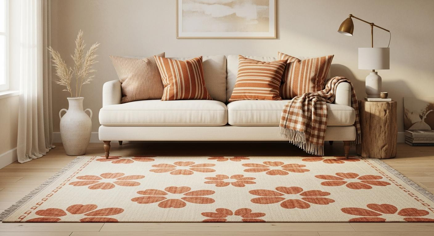
Large-scale anchors—motifs measuring 8 to 18 inches—ground the space because the pattern stays readable from 10 feet away. An 8×10 rug with 12-inch terracotta florals establishes visual dominance the moment you enter the room. The eye completes the pattern quickly, registers it as the foundation layer, then moves on to hunt for the next level of detail. This scale works for base layers that cover significant square footage: area rugs above 48 square feet, full curtain panels spanning 84 inches, upholstered headboards.
But here’s where most attempts die: the medium-scale zone of 2 to 5 inches. A 3-inch stripe on throw pillows, 4-inch geometric on a blanket, 2.5-inch dots on an accent chair—all mid-scale, all competing. Instead, use medium patterns sparingly on one element: sofa pillows in 4-inch stripes, period. Let everything else shift up to large or down to small, creating that perceptual distance your eye needs to build hierarchy instead of chaos.
Small-scale details under 1 inch—gingham checks at 0.5 inches, micro-florals, pin-dot patterns—add texture without demanding focus. These function like visual seasoning, noticeable only when light filters through sheer curtains at $25 per panel or when you run your hand across a checkered throw. Design experts featured in House Beautiful confirm this is the layer that separates collected rooms from busy ones.
The terracotta test: one color family across three scales
Terracotta, rust, cream, and muted sage share low contrast ratios, which softens pattern edges even when scales overlap slightly. A large terracotta floral rug, medium rust stripe pillows, and small cream gingham curtains read as layers because the warm tones blur boundaries between patterns. The result is a space that feels intentional, not accidental. Navy-and-white or black-and-white combinations amplify every scale error—high contrast makes competing patterns scream rather than whisper.
ASID-certified interior designers recommend starting with one earthy family to learn the mechanics before attempting higher-contrast palettes. Target offers bohemian bloom rugs at $150 with 10-inch terracotta motifs that anchor 225-square-foot spaces without overwhelming sightlines. Pair that with Amazon’s washable pillow cover sets—4-pack for $40, featuring 3-inch stripes in rust that maintain medium-scale presence on a neutral sofa. Add gingham sheers from Target at $25 per pair with 0.5-inch checks, and you’ve built the formula for under $300.
The texture of linen stripe pillows against cotton rug pile creates tactile interest that photographs like odd-number arrangements that break symmetry without chaos. And when afternoon light hits those gingham curtains, the micro-checks cast honeycomb shadows across cream walls—detail your eye registers subconsciously, not something it has to actively decode.
What happens when you fix the scale instead of the color
Change nothing about your color palette—keep the terracotta family you already committed to. Replace only the scale distribution: swap your 4-inch geometric rug for an 18-inch floral, keep the 3-inch stripe pillows, add 0.75-inch checkered napkins on the coffee table. The room calms within the first afternoon because your eye now has a path: rug, pillows, checks. Hierarchy appears without adding or removing objects.
Renters see this in before/after photos where the “after” uses identical furniture, identical colors, but different-scaled patterns that suddenly photograph like professional staging instead of thrift store overflow. Lighting designers with residential portfolios note this shift happens fastest in rooms with western exposure—those 3pm-to-sunset hours when competing patterns used to vibrate now settle into distinct layers. That’s the vertical zoning trick that makes 280 square feet read larger, applied horizontally across textile surfaces.
Your questions about pattern mixing made simple answered
Can I mix three patterns if my room is only 180 square feet?
Yes, but scale matters more in small spaces. Use one large pattern on the rug or curtains, one medium on pillows, one micro-scale on throws or napkins. Avoid medium-scale on walls—wallpaper in tight quarters needs to go large (8+ inch motifs) or tiny (under 1 inch) to prevent visual crowding that makes the room photograph smaller than actual measurements.
What if my patterns are different colors in the same family?
Terracotta-to-cream gradient works across three scales as long as value stays consistent—all warm, all muted. Adding one cool tone like sage keeps harmony if it appears in small doses, similar to how Amazon’s $40 towel set in one earthy family layers without competing. Avoid equal distribution—let terracotta dominate 60%, cream fill 30%, sage accent 10%.
Do I need to replace everything or can I add one piece?
Start with the missing scale. If you have two medium patterns (3-4 inch motifs), add one large-scale rug or small-scale throw. The room balances immediately because the eye gains entry and exit points instead of circling the same mid-scale layer, hunting for somewhere to land and finding only competing frequencies.
By 4pm Thursday the terracotta rug catches slanted light, 14-inch florals glowing rust against cream. Your eye travels from rug to striped pillows to gingham curtains filtering afternoon sun into honeycomb shadows. Three patterns, three scales, one warm family—the room breathes instead of shouts, layered instead of loud.