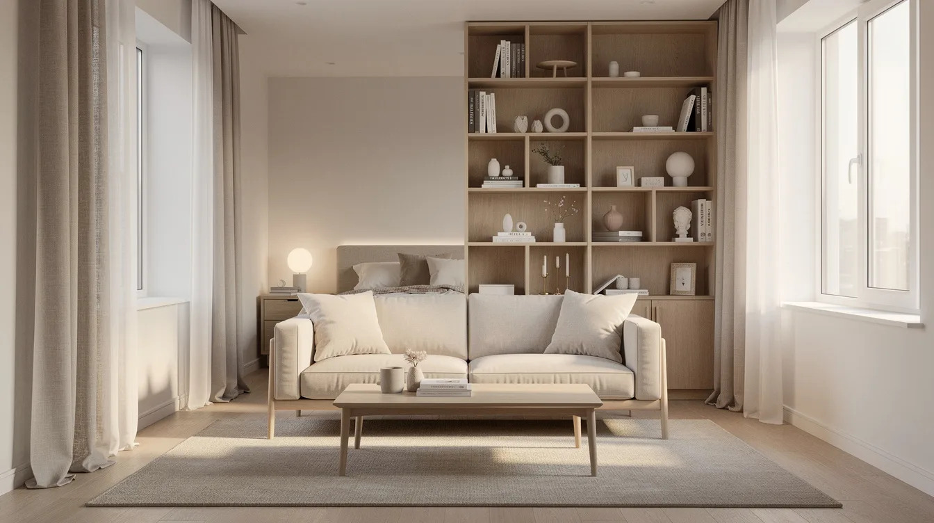
A studio usually starts feeling crowded long before it is actually full. The problem is familiar: the bed is visible from the front door, the sofa is a little too deep, and one bad lamp makes the whole place feel smaller at night.
Designers tend to solve that tension the same way in 2026: lighter color, cleaner zoning, and furniture that does more than one job. The goal is not to make a studio look packed with ideas, it is to make it feel easy to live in.
Map Clear Zones Before You Buy Anything
A studio gets messy fast when the bed, sofa, desk, and dining spot all compete for the same few feet. Designers usually start with zones, not furniture, because a smarter layout fixes half the visual chaos before decor even enters the room.
For a sleeping area, a typical 140×200 cm bed works in many studios, while a 120×200 cm size is often easier in spaces under about 25 square meters. Keep roughly 60 to 80 cm of clearance where you can, and if the floor plan is tight, push one long side to the wall and préservé walking space at the foot.
In the living zone, keep a small sofa around 160 to 190 cm wide and no deeper than about 85 to 95 cm. Overscaled seating is one of the fastest ways to make a studio feel cramped, and designers rarely think the extra inches are worth it.
For a dining spot, a round table around 75 to 90 cm across is usually enough for daily use and still leaves breathing room. A mobile island around 100 to 120 cm long can also pull double duty for prep, storage, and casual meals.
Keep the Base Light and Warm
Designers still favor a pale envelope in a studio because it stretches light better than anything else. Warm white paint, soft beige, or very light greige makes a small apartment feel calmer, and it gives you flexibility when the rest of the room has to work hard.
If you want contrast, use it in small doses. A muted terracotta accent, soft olive, or clay tone on pillows, art, or one painted panel has more impact than covering a whole studio in dark color.
This is also where materials matter. Pale wood, linen-look curtains, and a light rug soften the room without adding visual noise, which is exactly what a one-room home needs.
I would not chase sharp black-and-white contrast in a compact rental unless the apartment already has great natural light. In most studios, softer neutrals simply look more expensive and less tiring to live with.
Use Dividers That Filter Light
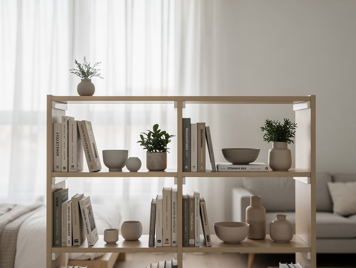
Solid partitions can make a studio feel chopped up, so designers often separate spaces with pieces that hold shape without blocking light. A IKEA KALLAX shelf is still one of the most practical examples, especially in the 147×147 cm or 182×182 cm formats.
That kind of divider creates privacy for the bed while still letting the room breathe. The mistake is stuffing every cube with random storage, because open shelving only works when the contents are edited hard.
Another strong move is a ceiling track with sheer curtains spanning roughly 200 to 300 cm. It gives the bed a soft niche, hides visual clutter at night, and feels lighter than a folding screen.
If your studio already feels dim, skip heavy room screens in dark wood or opaque fabric. A divider should define the room, not swallow the daylight.
Choose Pieces That Earn Their Footprint
In a studio, every item has to work harder. Designers consistently lean toward storage beds, sofa beds, nesting tables, and expandable dining pieces because dead space is a luxury small homes do not have.
A nesting set with the largest coffee table around 70×45 cm is usually more useful than one chunky square table. You get surface area when you need it, then tuck it back and reclaim the floor.
For dining, a drop-leaf table from IKEA or Target often makes more sense than a fixed four-seater. Guests come over occasionally, but bad circulation is something you deal with every single day.
A full studio setup with mid-range pieces typically lands around $3,300 to $8,800, depending on quality and how much you already own. That is why designers would rather buy fewer useful pieces than fill the room with cheap extras that create clutter.
Layer Lighting Instead of Relying on One Fixture
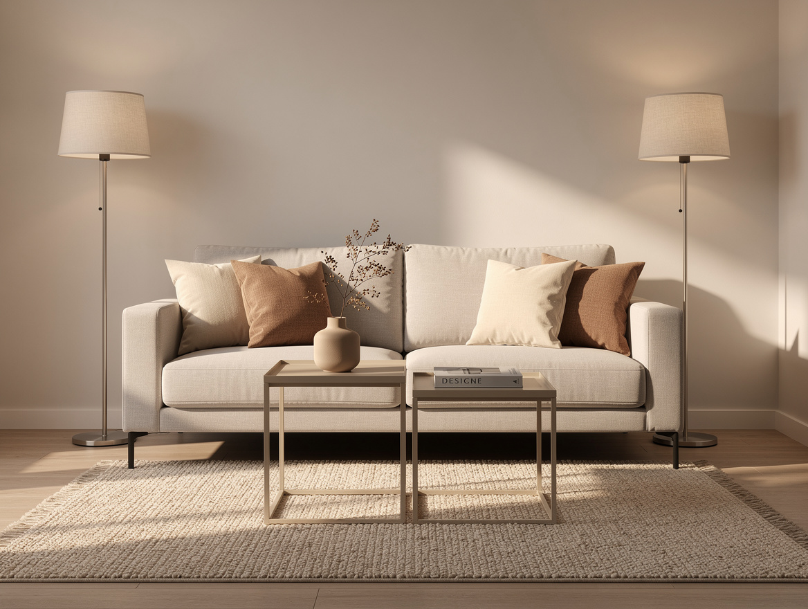
One overhead light makes a studio feel flat, and flat rooms usually read smaller. Designers prefer layers: a ceiling fixture, a floor lamp, a bedside or desk lamp, and one softer accent source.
If hardwiring is not possible, a tall arc lamp from Wayfair or Amazon can cover a dining area without any electrical work. It is a practical fix in rentals, and it visually carves out a separate zone.
A 50×150 cm mirror placed near a window can also amplify natural light and help the room feel deeper. This is one of the few studio moves that is cheap, easy, and almost always worth doing.
Warm bulbs are the safer call here. Cool white lighting can make beige walls look lifeless and turn a compact apartment into something that feels more like an office than a home.
Anchor Each Zone With Soft Texture
Studios need visual boundaries, and textiles do that without adding bulk. A 160×230 cm rug is a common size for a small living area, and designers often go slightly larger so the furniture can sit on it instead of floating awkwardly around it.
The same logic applies to the bed. A slim painted headboard shape, usually around 160 to 180 cm wide and 110 to 130 cm high, can frame the sleeping zone even when you do not have a real headboard.
Window treatments matter more than people think. Full-length curtains hung high make the ceiling feel taller, and softer fabric helps counter the hard edges of kitchen cabinets, desks, and storage.
Keep the styling restrained. A chunky throw. One blond wood frame.
Two pillows in textured neutrals. Small rooms look better when the softness is layered, not piled on.
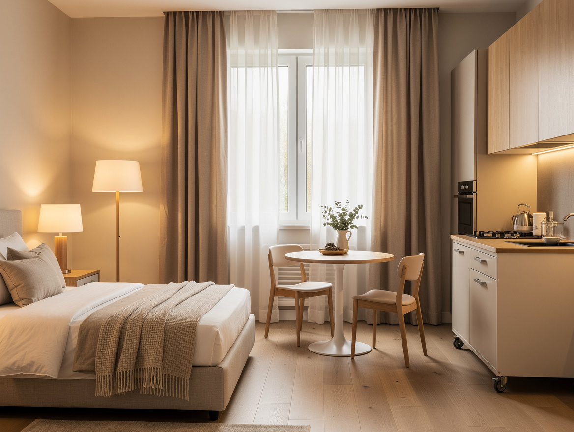
Start with the layout, then the rug, then the lighting. Once those three are right, the rest of the studio gets much easier to finish without wasting money or floor space.
Mia Carter writes about small-space living and budget home makeovers. She has restyled three rentals and tests most ideas in her own 45 sqm flat.