
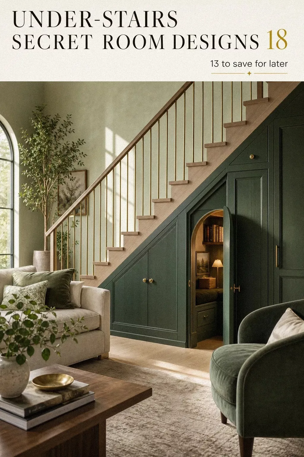
Under-stairs space can become a real room, and in my case it took paint, shelving, a hidden panel, and a lot less square footage than you’d think. I did this while our living room was still in daily use, which meant every choice had to earn its keep. Compact footprint. Big payoff! Here’s every move that worked, the ones that didn’t, and what I’d quietly copy if I started over today.
Here’s what it looked like before
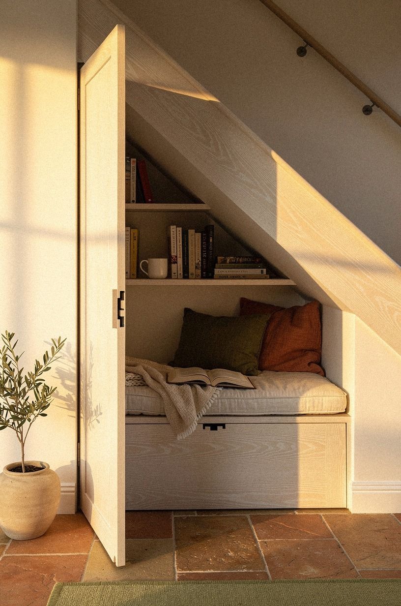
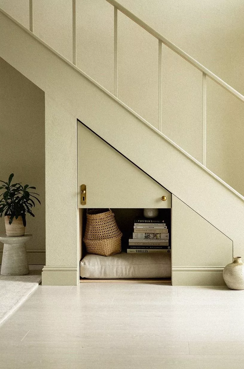
Before I touched it, the stair wall was that frustrating kind of blank that still manages to make a room feel crowded. You know the type.
One long painted plane, a baseboard that stopped awkwardly, and a dead triangle underneath that collected baskets, charger cords, and the chair I moved when company came over. From the sofa, it looked heavier than it was, and that made the whole living room read smaller. It was the kind of awkward, cramped corner your eye just slides past.
I kept thinking I needed more storage somewhere else. I didn’t.
What I needed was to stop treating the stair void like a leftover and start treating it like millwork. Once I looked at it that way, the decisions got easier. If you’re fighting a living room that feels underscaled in some spots and clumsy in others, the logic is close to what I wrote in this piece on furniture that runs too big for the room.
The wall wasn’t empty. It was waiting for a job.
- I claimed the awkward stair wall first
- I drew the seam in panel molding rather than tape
- A tall bookcase gave the stair opening a believable face
- I tucked the hinge behind stacked trim
- Why the baseboard matters more than the door itself
- I hid the latch beneath a brass sconce
- I painted the staircase panel smoky green
- I lined the inside with walnut shelves
- I added a velvet chair under the slope
- I tucked floor cushions into the low corner
- I mounted picture lights rather than pot lights over the shelves
- What changed once I styled books to break the doorway line
- Why the door reads better than the doorway (and what I mean)
- I closed the panel until the room vanished
- Quiet storage for the cords and baskets nobody wants to see
- How the nook earns its keep in a real living room
- Could you do this in a rental? (Honest answer.)
- What I’d quietly steal from this room if I started over
1I claimed the awkward stair wall first
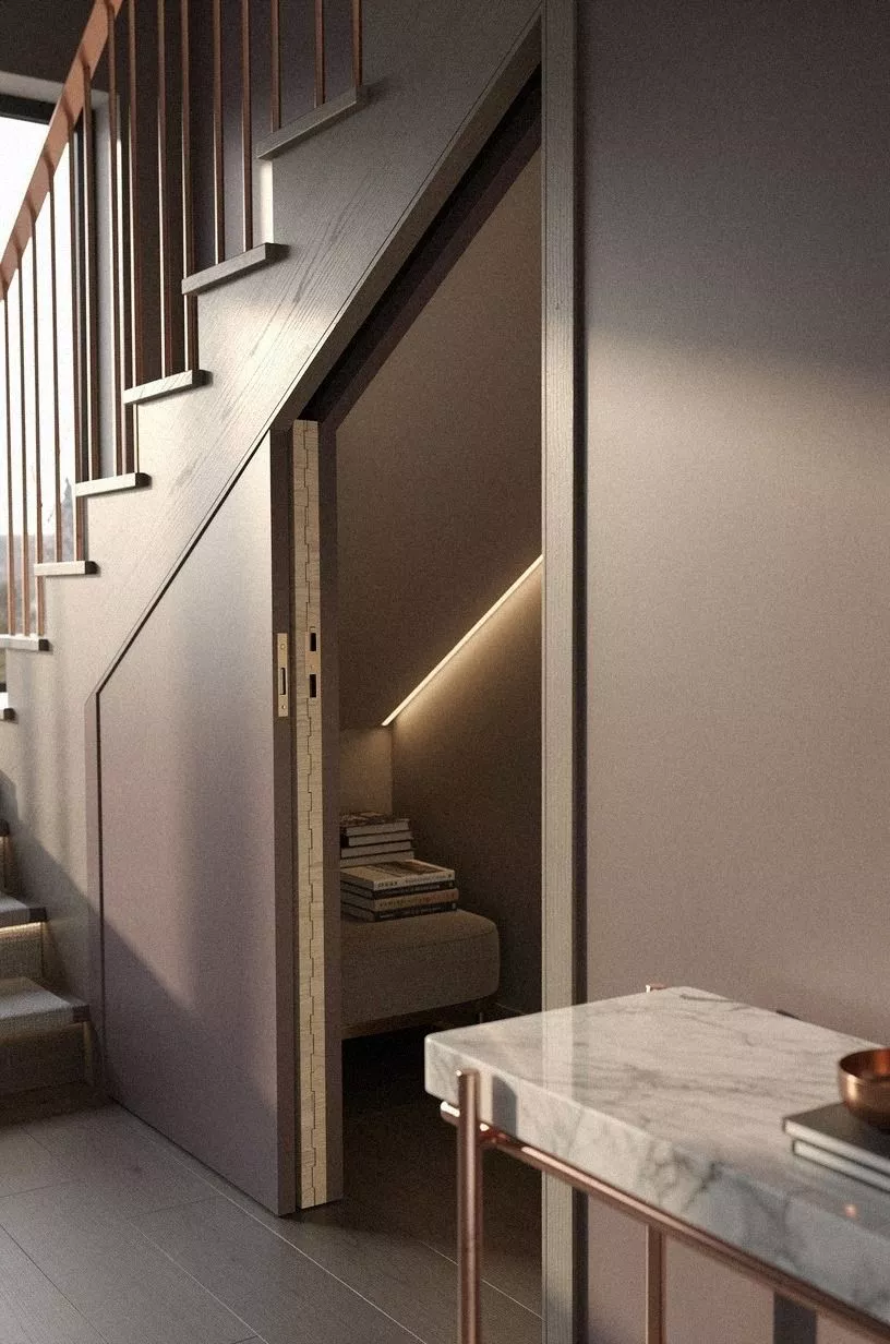
I started by giving the stair wall one clear role: built-in reading nook, not catchall. That sounds obvious now, but you need to claim the wall before you choose a finish, because otherwise you’ll keep designing around clutter you don’t even want. In the final version, the centered panel opens to a tiny bench with books underneath, and the whole move works because the wall finally reads as one calm surface instead of three random storage decisions.
I kept the outer face in white oak tones so the panel felt like furniture, not a patch. That mattered more than size.
If your living room already has warm white oak flooring or a table with oak grain, you’ll get a smoother result by repeating that family once here and nowhere else. But don’t overdo the wood.
I learned fast that one oak note looks tailored, while five oak notes start arguing with each other. The part you feel right away is order, and you’ll notice it every single evening.
It felt wildly better the first night we shut the panel and the wall finally stayed quiet! You can read more on the same logic in my guide to cozy reading nook ideas for adults and kids, because the wall-reads-as-one rule applies just as much to the inside.
2I drew the seam in panel molding rather than tape
The door disappeared once I stopped treating the seam like a thing to hide and started drawing it on purpose with molding. You can do that too.
A slim shadow line inside a larger field of trim feels intentional, and your eye reads the full clay-plaster wall first instead of hunting for the opening. That was the whole point.
I used clay plaster around the panel because flat drywall made the seam too obvious in afternoon light. Texture saved me here. If you’ve got a linen chaise or any soft woven upholstery nearby, that chalky finish makes the whole zone feel related without matching it to death.
And yes, I tested cleaner, crisper trim first. It looked fussy.
The softer surround let the off-center opening disappear until you were right in front of it, which is exactly when you want the reveal to happen. Same thinking shows up in hidden bookshelf door ideas, where the seam earns the disguise instead of fighting it.
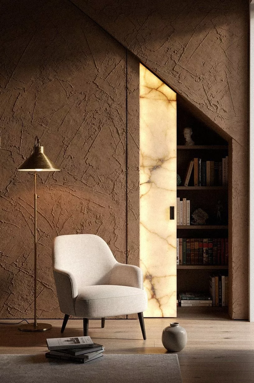
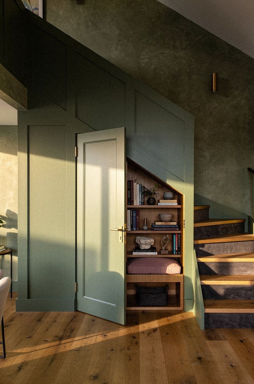
3A tall bookcase gave the stair opening a believable face
A bookcase made the opening believable because it gave the wall a public face. That’s the test I keep coming back to: would a guest, on their first visit, register this thing as a doorway or as a shelf?
The moment the eye reads shelves first, your reveal stops being a reveal at all. That’s the goal.
I went floor-to-soffit with a slim Billy-style bookcase in Farrow & Ball Down Pipe so the case looked built-in without any custom millwork bill. I anchored it through the side panels into studs, not just the drywall anchors the kit ships with, because a tipped shelf would have given the whole thing away in a second.
If you’re doing this on a rental, swap the bolts for a heavy West Elm Mid-Century Modular that sits proud of the wall and looks intentional from any angle. Either way, give the case a back panel in the same paint as the wall so the silhouette goes quiet against the room.
4I tucked the hinge behind stacked trim
This was the part I obsessed over, because a visible hinge would’ve cheapened the whole thing in one second.
5Why the baseboard matters more than the door itself
Nothing gives away a disguised panel faster than a baseboard that stutters, changes height, or dies before the opening. So I ran the profile straight across the seam and treated it like uninterrupted trim.
That one move settled the whole wall. Suddenly the doorway didn’t look inserted.
It looked like it had always belonged there.
I kept the room in Benjamin Moore Essex Green HC-188 and cream upholstery so the base detail didn’t have to perform alone. If you want your own panel to vanish, match the baseboard profile exactly and keep the finish identical, even on the back edge you think nobody will see.
But don’t skip the test from across the room. I checked mine from the sofa, from the doorway, and from the rug line.
If the line breaks in one of those places, you’ll feel it even when you can’t name why. The same obsess-over-the-line logic shows up in layered living room lighting ideas, where tiny breaks in a rhythm will quietly wreck the whole layered feel.
6I hid the latch beneath a brass sconce
The latch needed a reason to exist near the panel, so I gave it cover.
7I painted the staircase panel smoky green
Paint is where the project stopped feeling like an experiment and started feeling rooted. I used Sherwin-Williams Evergreen Fog SW 9130 on the full stair panel because I wanted the wall to recede without going flat or dark for the sake of drama.
You don’t need black here. You need a color with a little smoke in it, one that looks soft at breakfast and grounded at night.
And I tested Farrow & Ball Hague Blue No. 30 first, and I wouldn’t choose it again for this application. It’s richer, sure, but in my room it made the opening feel narrower by 3 p.m.
Evergreen Fog held the shape better. If you have cream upholstery, camel accents, or white oak nearby, that green gives you tension without noise. And when the panel is closed, the wall still looks finished.
That’s the win! Paint should make the disguise calmer, not louder.
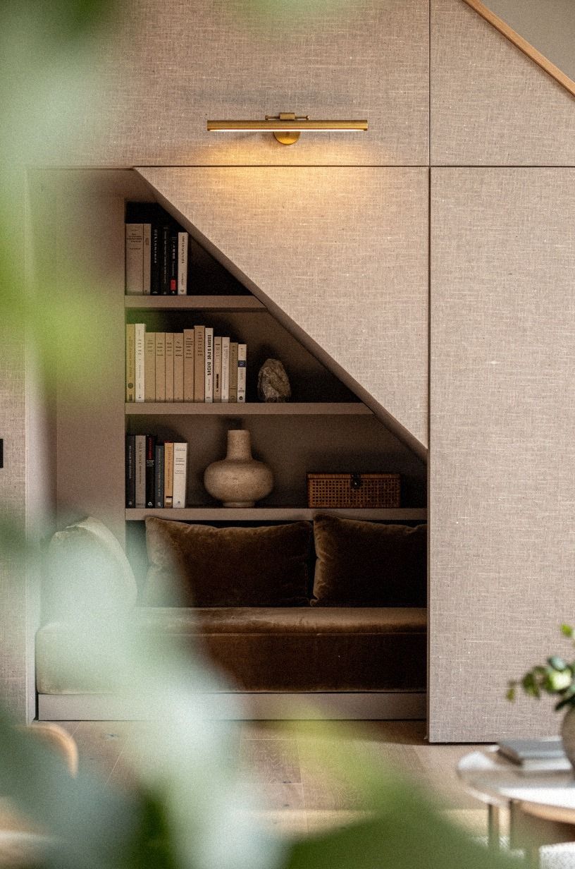
8I lined the inside with walnut shelves
Once the panel opened, I wanted the inside to feel deeper and warmer than the wall outside it.
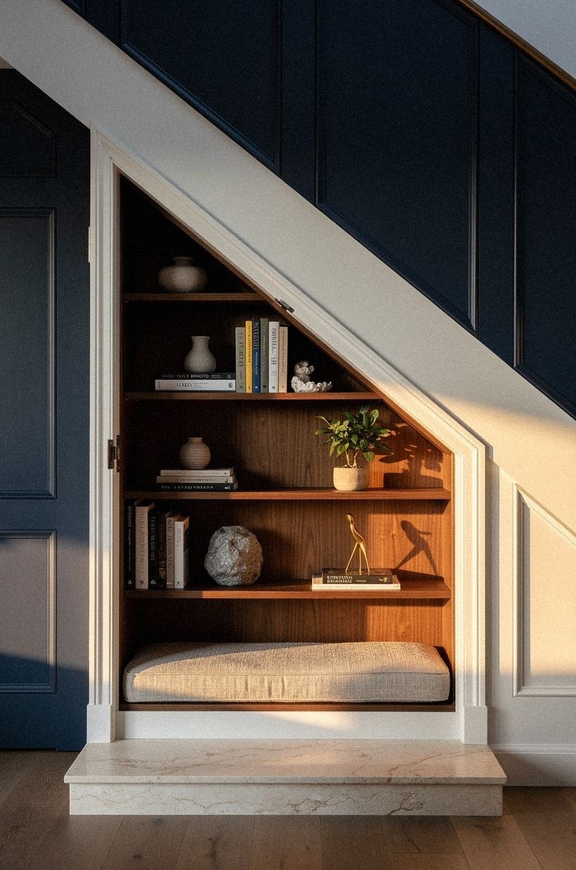
9I added a velvet chair under the slope
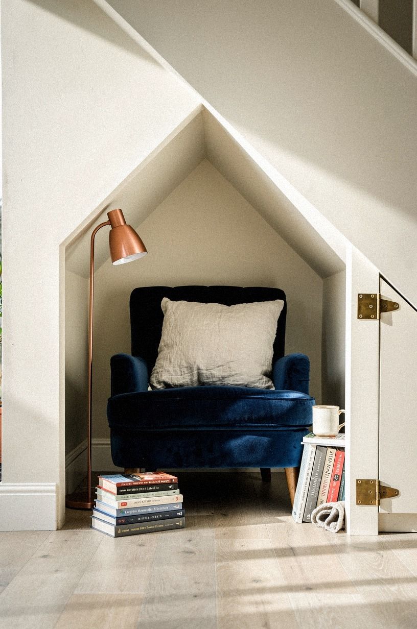
The chair was my test for whether this nook was a room or just a disguised storage pocket. I chose a low, rounded velvet accent chair that could sit under the slope without looking like it had been shoved there as an afterthought.
From a low floor-level view, that soft shape is what makes the opening feel human. You can picture yourself sitting there, book in hand, lamp on, door half-open.
I would’ve made a mistake with anything too angular. Under a slope, sharp lines look apologetic. A chair with a little give in the back and a tighter footprint does better.
Keep in mind that many full-size sofas run 35 to 40 inches deep, and that’s exactly why I didn’t force a mini version of a living-room chair into this spot. You want something that acknowledges the corner.
But you still want proper support, or the room turns into one of those ideas you admire and never use.
10I tucked floor cushions into the low corner

The lowest corner couldn’t hold furniture, so I let it become the softest part of the room instead. That unexpected softness is what tells a guest this is a place to settle in, not a place to step past.
I stacked three IKEA TUFFELIG floor cushions in washed linen and rotated them with the seasons. In winter I swap to a bouclé pair, and in spring the linen ones come back out.
They cost me $35 each and they cover the awkward zone where a chair simply won’t sit. If you’ve got a kid or a regular reader in the house, you’ll understand immediately: people prefer the floor if the floor is good.
Buy two extra inserts and keep them in a basket, because once the seat goes flat the magic does too. The “soft beats shaped” rule carries over to the family room layout ideas guide, where lived-in comfort almost always wins over a styled layout.
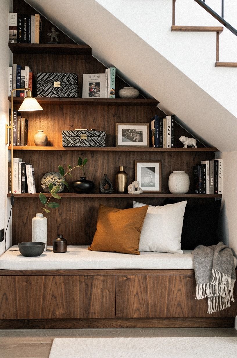
11I mounted picture lights rather than pot lights over the shelves
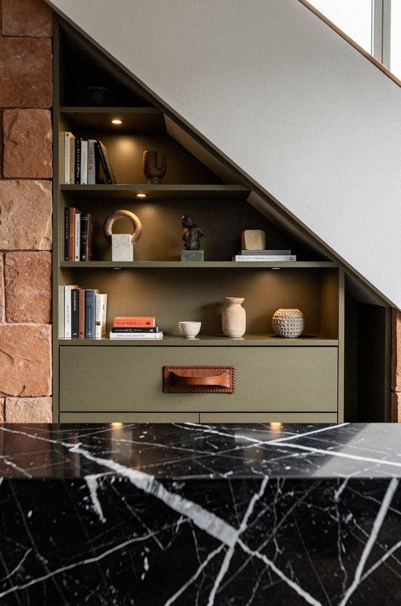
Lighting changed everything. I mounted picture lights over the false shelf line so the wall gained a believable reason for glow, and the marble ledge underneath reflected just enough of it to make the panel face feel layered. In the photo, you can see how the white veining in the Nero Marquina marble catches that light before your eye ever finds the joinery.
You don’t need a lot of fixtures here. You need a low, directed beam that brushes objects and leaves the rest alone.
If you’ve ever wondered why some built-ins look expensive and others don’t, that’s usually the difference. But keep the mounting height disciplined. I followed the same logic I use for coffee tables, where 16 to 18 inches is a useful reference because proportions matter more than bulk.
Same story here. The right light line makes the shelf believable, and the shelf makes the door disappear.
12What changed once I styled books to break the doorway line
Books did more than decorate the shelves. They interrupted the exact moment your eye might’ve traced the doorway edge. I used linen-bound books in staggered stacks, a few turned horizontally, a few upright, and one leafy branch in front to blur the line from the next room over.
That soft obstruction was enough.
If you style every book spine to the same depth, the seam reads too clearly. You want a couple of forward moments and a couple of recessive ones so the wall feels lived in.
I borrowed some restraint from this small-space storage piece built around six inches of forgotten room, because the lesson is the same: the smartest storage rarely announces itself. But don’t crowd the shelf to prove a point.
A little asymmetry covers more ground than a stuffed display ever will. You’ll see the same restraint play out across my hidden library room ideas, where the goal is always a quiet wall that happens to hold books, not a library shouting for attention.
13Why the door reads better than the doorway (and what I mean)
Once everything else was in place, the door itself did almost no work. That’s the part nobody tells you.
The seam did the camouflage. The trim did the architecture.
The books did the disguise. The door just had to swing quietly, settle into its closed position, and stop looking like a door.
Anything more would have tipped the hand.
I went with a soft-close Tectite satin brass hinge because the slower close keeps the wall from announcing itself whenever someone walks through. Hinges are the unglamorous part of this whole project, and that’s exactly why they matter.
A loud hinge will spoil the reveal before your guest even gets to the room. If you’re shopping, look for a hinge with at least 50,000-cycle ratings, because the cheapest ones sag after a year and start showing a sliver of daylight at the top of the seam.
That sliver is the giveaway. Don’t let it happen.
The quiet-hinge rule shows up again in detail room door ideas, where I obsess about the same thing.
14I closed the panel until the room vanished
This was my favorite moment of the whole project. Once the panel swung shut, the room disappeared and the living room got calmer by default.
No visual noise. No visible compromise.
Just a plum-gray and rose-toned wall composition that held together whether the nook was open, closed, used, ignored, or shown off to a friend who’d never seen it before.
But I think that’s why this kind of project stays satisfying. You aren’t adding a feature that demands attention all day. You’re adding choice.
Open when you want intimacy, close when you want quiet. If your house has a hidden staircase in house plan terms, or even just a weird leftover angle, that’s the part worth respecting.
But the panel only vanishes if the room around it is edited too. I had to remove more styling than I added, and that was the right call every time.
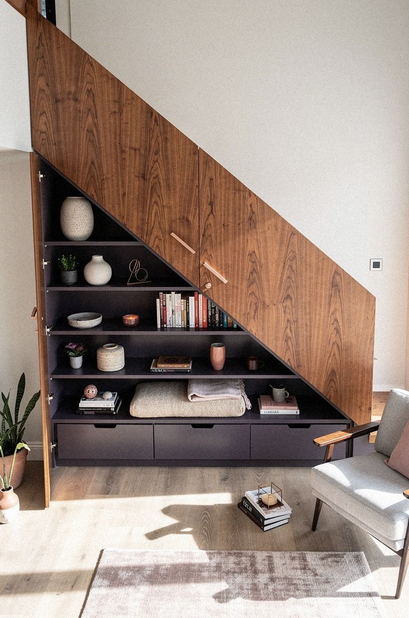
15Quiet storage for the cords and baskets nobody wants to see
Behind a hinged panel, you always have to think about what’s actually against that wall. In my case it was a tangle of router cords, a vacuum charging dock, and a small basket of dog leashes.
None of that is pretty, and none of it belongs in the photo. So I built a 6-inch-deep birch plywood cabinet on the dead side of the panel, fitted with cord cutouts at the back and a hinged door on a push latch.
From the living-room side, you see nothing. From the alcove side, you see a calm little utility zone, and that tidiness reads as part of the design.
If you’re doing this, build the cabinet before you hang the panel, because the weight of the door will eventually pull against any side storage. I learned that the annoying way.
Now I keep a small CB2 rattan tray in there to corral the leashes, and it doubles as a styled object when the panel swings open. The same hide-the-cords discipline shows up in my living room curtain ideas guide, where the wiring behind smart curtains gets the same treatment.
16How the nook earns its keep in a real living room
Once the disguise was solid, the test was whether the room actually got used. Not styled for a photo, not opened once for a dinner party, but used on a Tuesday at 8 p.m. by someone reading. I am happy to report it passes that test.
My partner and I trade evenings in the nook without needing to negotiate. Whoever gets there first, wins the chair.
That little daily ritual is what tells me the project was worth the panel, the hinge, the seam-matching, and the soft-close everything else. The room earns its keep because nobody has to dust it twice. It earns its keep because it gives one corner of the house a private mood the rest of the layout can’t carry.
And it earns its keep because closing it puts the calm back. That’s the win, quietly.
For similar small-room wins, my 5 cozy cabana corner ideas that turned my dead space into a boutique hotel nook for under $100 covers the budget side of the same problem.
17Could you do this in a rental? (Honest answer.)
Honestly? Most of it.
The rule is to keep every move reversible, and once you accept that constraint, the project gets easier. I built a version of this in our last rental using a heavy Target Threshold floor bookcase pushed flush against the stair wall, a plug-in sconce with a cord cover painted the wall color, and a couple of tension-rod curtains behind a thrifted leather chair.
It wasn’t the same room. It wasn’t trying to be.
It was a hidden moment in a rental that we got to take with us when we moved. And honestly, the rental version taught me more about restraint than the permanent one did!
If that’s your only option, skip the hinge and the panel and put your energy into the floor cushions, the lighting, and the small leather chair. Those three moves alone will create a tucked-in feeling that disappears the moment you move out. And if you want a slightly more permanent option, my kids hidden hangout guide leans entirely on removable hardware for the same reason.
18What I’d quietly steal from this room if I started over
If I had to start from scratch tomorrow, I’d begin with the paint and the hinge, not the millwork. The millwork is the long tail of the project, but the paint is what makes the whole disguise read in the first place, and the hinge is what keeps the seam quiet on day 400. Order matters more than budget on this one, and you’ll save yourself real money by doing it in that order.
I’d also splurge on a single brass detail instead of three. One unlacquered brass hinge, not three.
One unlacquered brass sconce, not a whole hardware family. One hits because it reads as a choice.
Three start to read as a theme, and themes get noisy fast in a tiny footprint. The splurge-on-one rule is the same logic I use when picking art, and it’s the difference between a room that looks considered and a room that looks decorated.
Spend less, choose harder, get farther.
How much it cost
I didn’t treat this as a full custom millwork job, because that wasn’t the point and it wasn’t the budget. The useful answer is that under-stairs room makeovers can land anywhere from a styling-level update to a serious built-in investment, depending on whether you’re adding only paint and seating or commissioning cabinetry and electrical work. If you’re doing what I did, think in layers: finish first, light second, seating third, storage last.
That table is broad on purpose, but it helps you decide where your money matters. A built-in look doesn’t always require a built-in budget.
If your living room already has an 8×10 or 9×12 rug anchoring the seating area, decent lighting, and a chair that isn’t oversized, you’ll get farther by refining the stair wall than by buying more loose furniture. And if you’re weighing warm finishes around the room as a whole, this cabana corner makeover under $100 makes the same point in a different footprint.
A better rule of thumb: spend the same dollar on lighting before you spend it on furniture, because lighting compounds and furniture gets photographed alone. You’ll feel this every evening the panel swings shut, and that’s when you’ll know the whole project paid for itself!
The Vanishing-Line Rule
The biggest thing I learned is that a hidden room under stairs succeeds or fails on line control, not novelty. People think the magic comes from the disguised door.
It doesn’t. The magic comes from the wall reading as one thought before it reads as an object with moving parts.
That means your baseboard needs to flow, your panel rhythm needs to feel architectural, and your color needs to settle the volume instead of carving it up. Once those pieces are right, the reveal feels effortless even though the planning wasn’t.
I also learned that tiny rooms don’t forgive indecision. In a larger living room, you can hide one wrong finish with distance. Here, every mismatch sits six inches from the next one, and you’ll feel that tension immediately.
I changed my mind more than once. I tested a darker blue, a sharper trim profile, and a chair with straighter arms because I thought cleaner lines would make the nook feel smarter.
They didn’t. They made it feel colder.
The better choices were the ones with a little softness: smoked green paint, rounded seating, chalky wall texture, warm wood inside.
And here’s the part nobody respects enough. You have to edit the room around the panel if you want the panel to disappear.
I removed a basket, thinned the art nearby, and stopped trying to balance every surface with another decorative object. The wall needed quiet around it.
Once I gave it that, the under-stairs room stopped feeling like a stunt and started feeling like architecture. I think that’s also why this kind of project pairs well with the calm-edit philosophy in my hidden reading nook study ideas guide, where restraint does most of the heavy lifting.
Would I do it again in another house? Instantly. But I’d begin with the outer room before I touched the nook itself.
If the living room is already overloaded, the best hidden room in the world won’t read clean. If the seating is scaled right, the light is warm, and the wall has some breathing room, then the under-stairs opening gets to be the surprise instead of the apology.
That’s the difference. Not more stuff.
Better restraint.
A Few Things Worth Answering
What does an under-stairs detail room actually cost in real money?
Most of them land in a broad range of about $300 to $8,000 depending on whether you’re styling, adding lights, or building millwork. Free moves still matter. Paint you already own, books from another room, and a chair you can rehome later all lower the spend without lowering the effect.
Where can you buy the pieces for an under-stairs detail room without overspending?
Start with IKEA, Target Threshold, and Wayfair for the basics, then check Facebook Marketplace for the one piece with age or grain you can’t fake. A used wood chair, a real sconce, or a small shelf unit often gives you the most character for the least money.
Can you actually build an under-stairs detail room in a rental?
Yes, if you keep the moves reversible. Peel-and-stick color, plug-in lighting, and freestanding storage can give you the same tucked-away feel without cutting into the wall. A tension-rod curtain, removable hooks, and stackable boxes make sense when the lease matters more than the millwork.
What is the best use for the under-stairs space in a small living room?
A reading nook is the best fit for most small living rooms because it gives you seating, storage, and mood in one footprint. A low bench plus shelves usually beats a desk here. If you’re shopping, start with IKEA for boxes and then upgrade the visible pieces slowly.
How long does an under-stairs detail room actually take to build?
Plan on two weekends if you’re only painting and styling. Add another weekend per trade if you’re routing electrical for a sconce, building a real cabinet, or commissioning a custom door. The wall reads as one calm plane after step one, so you can stop there if time is tight.
What’s the biggest mistake people make with an under-stairs detail room?
They treat it like a closet instead of a room. The minute you put a door on it and close it, you stop styling the inside and the moment loses its magic. A chair, a lamp, a single styled shelf, and the rest of your time goes into making the outside read as wall, not storage.
Where I’d Start First
If I had to pick one, I’d start with the paint. Until the wall reads as one calm plane, every shelf, light, and seat will fight for attention.
Get that envelope right first. Then the hiding part feels effortless.
The same envelope-first logic carries through my white trim makes your small living room feel smaller piece, where the wall color decides everything downstream.