
The first thing you notice in the best white bed frame bedroom ideas is how intentional everything feels. Not sterile. Not a showroom. Just a room where someone made real decisions.
These 15 setups do that. Each one pairs a white frame with a specific wall treatment, material, or light condition that gives the whole room a point of view.
Exposed Brick That Actually Feels Warm
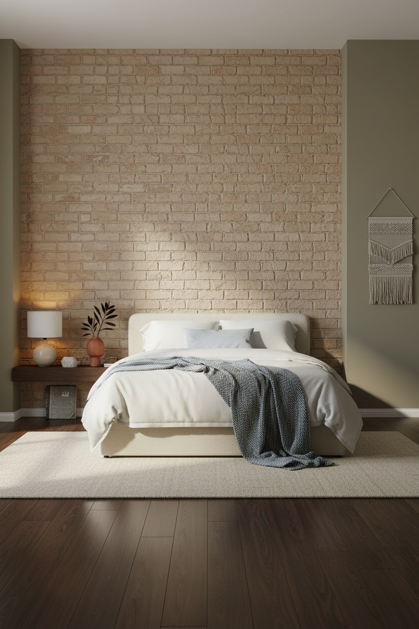

This one surprised me. A white frame against raw brick should feel cold, but it doesn’t.
Why it holds together: The matte clay-painted brick behind the bed absorbs the lamp’s amber glow, which keeps the whole room feeling grounded rather than industrial.
Steal this move: Add a single dried branch in a terracotta vessel beside the lamp. It bridges the raw wall texture with the clean frame without forcing it.
Whitewashed Brick With a Japandi Lean
Calm without effort. That’s exactly what a Japandi room should feel like, and this one nails it.
What creates the mood: The whitewashed brick wall tones down the raw texture just enough. Each horizontal course still catches the diffused light, which gives the room quiet rhythm without visual noise.
The easy win: Lay a flat-weave charcoal throw at the foot and keep the bedside styling minimal. Two objects, three maximum. The restraint is the point.
Herringbone Wood Wall Nobody Expects in a Bedroom
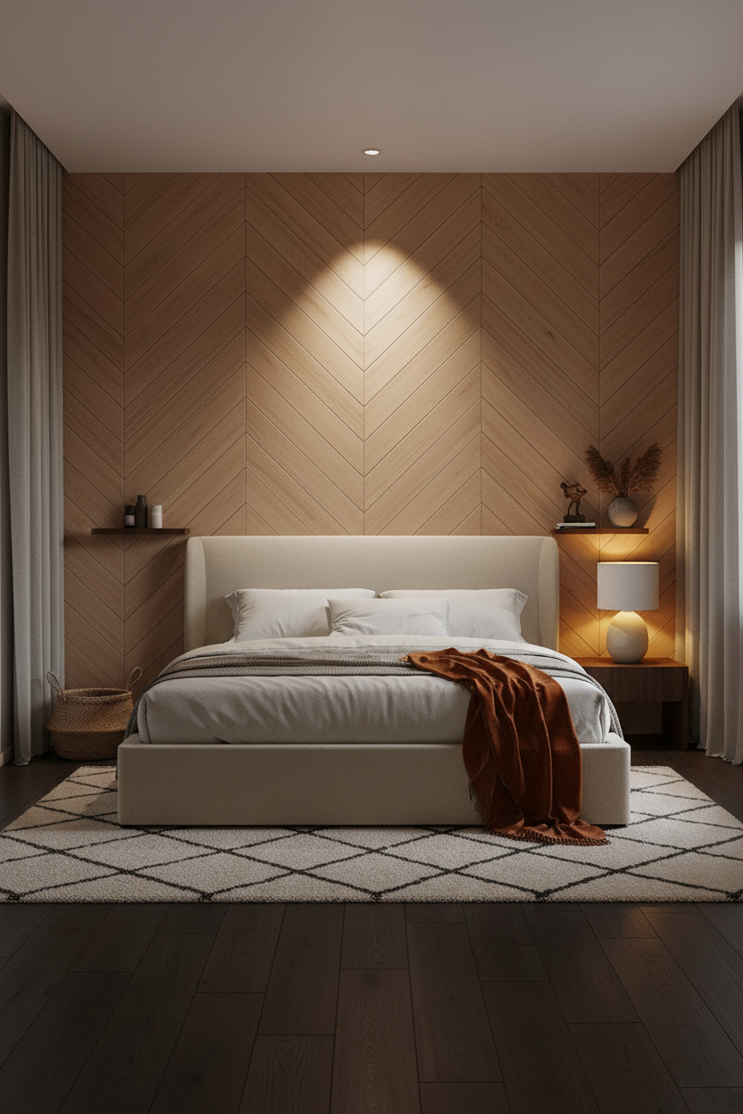

This is divisive. A floor-to-ceiling chevron wall in a bedroom is a lot. But honestly, I think it earns it.
The reason it feels warm rather than busy is the pale natural oak planks. Each diagonal catches lamp light at a different angle, which keeps the surface alive without competing with the bed.
What to borrow: Keep everything else quiet. Camel walls, dark floor, one textured throw. The wall does the work.
Board-and-Batten That Reads as Architecture

This is the kind of guest bedroom that makes people ask who did your walls.
Why it looks custom: Full-height board-and-batten joinery casts hairline shadows down its own surface, making flat paint look dimensional. It’s graphic at a glance and quiet up close.
Avoid this mistake: Don’t stop the batten at chair-rail height. Full-wall treatment or it reads unfinished. The whole point is the scale.
Gallery Wall That Earns Its Grid
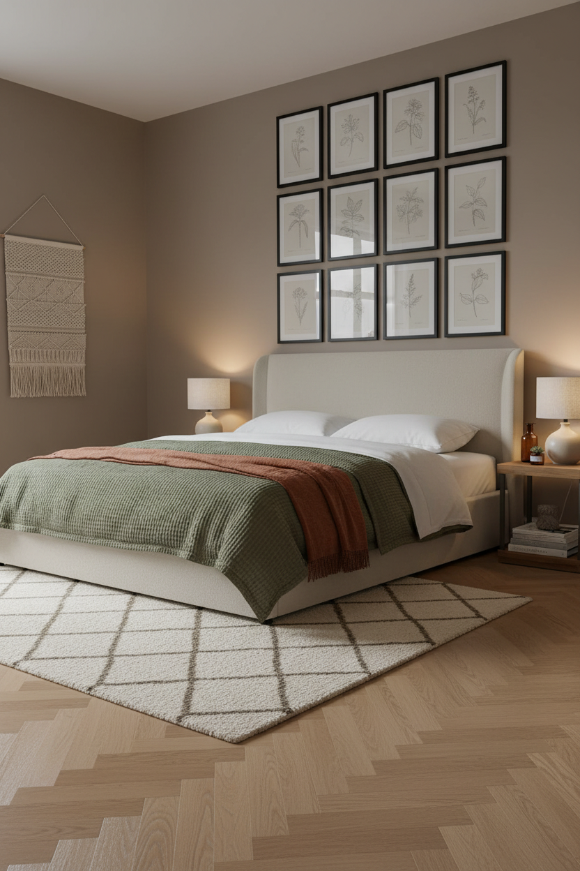
Gallery walls usually feel random. This one doesn’t, and the difference is commitment to the grid.
What gives it presence: Twelve slim black frames in identical sizing and three precise rows create graphic rhythm that feels intentional, not collected-over-time. The warm clay wall behind them keeps it from going corporate.
Use botanical line drawings, not photos. Same subject, same scale. That’s what makes the whole wall read as one decision.
Scandi Paneling That’s Softer Than It Sounds
I keep coming back to this one. The room feels airy and considered in a way that takes genuine restraint to pull off.
Why it feels elevated: Floor-to-ceiling ivory molding panels cast crisp shadow lines across smooth matte plaster, which gives the wall architectural scale while the ivory tone stays quiet enough to disappear into the bedding.
The finishing layer: A dusty pink linen throw at the foot breaks the all-ivory palette just enough. Nothing too precious. One warm note against all that calm.
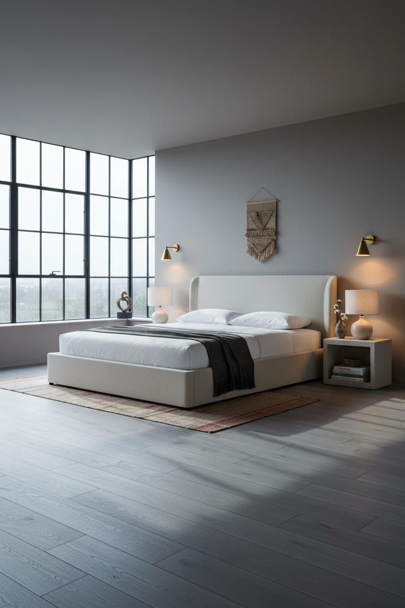
Arched Steel Windows That Change the Whole Mood
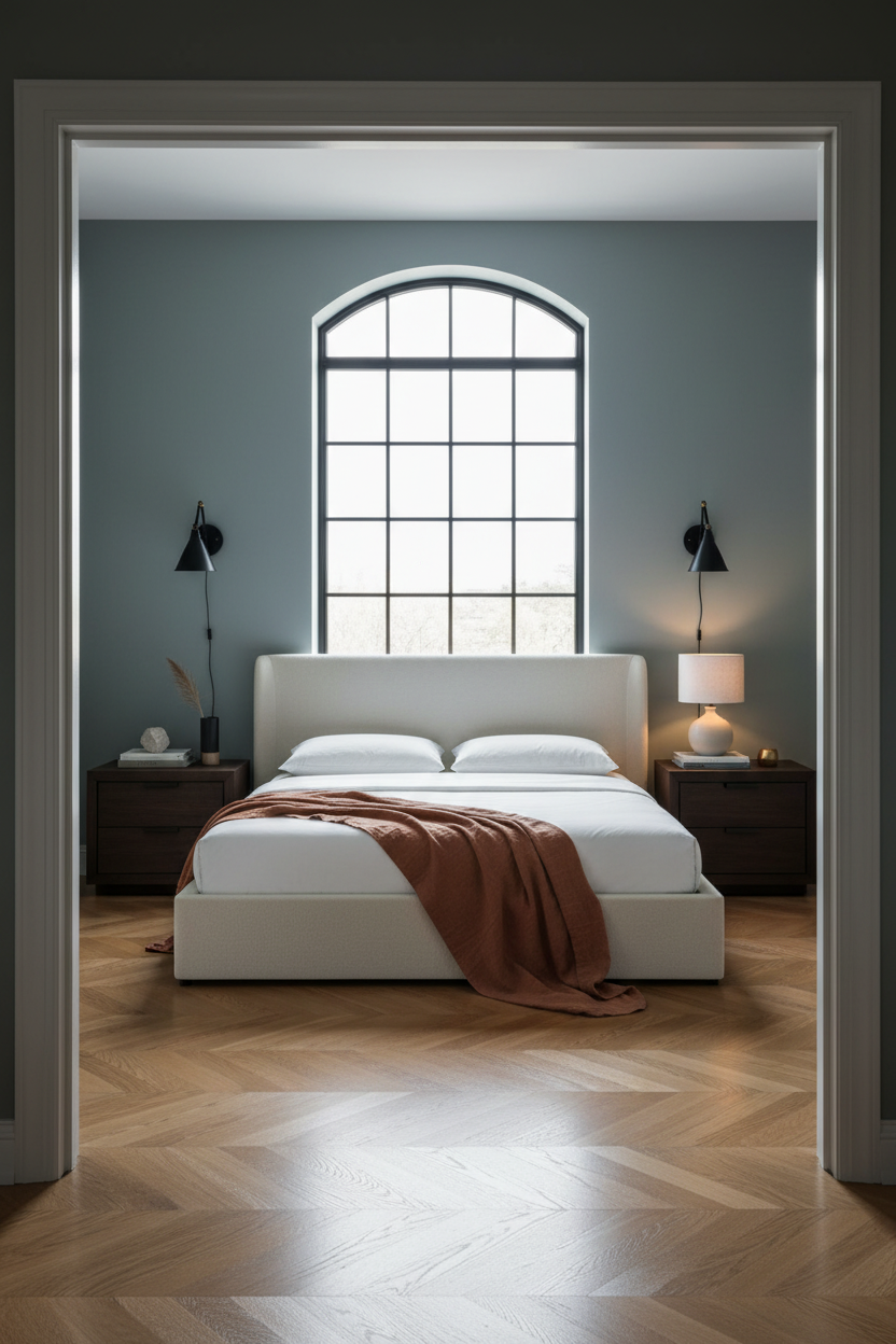
Fair warning. Tall black steel grid mullions are a hard commitment. But I’ve never seen anyone regret them.
The real strength: The geometric shadow lattice they cast across warm caramel oak parquet makes natural light do design work all day. The room feels different at 8am than at 3pm, and that’s genuinely rare.
Where to start: Balance the industrial window with slate blue-green matte walls. The cool tone stops the steel from feeling loft-ish and keeps the room residential.
Crittall-Style Windows With Mushroom Walls
This shouldn’t feel as calm as it does. Steel frame window walls read industrial on paper. But paired with matte mushroom walls, the room settles into something almost meditative.
Worth copying: Paired bedside sconces at the same height flank the bed symmetrically. That symmetry is what keeps all the architectural tension from tipping into chaos.
Slatted Wood Panel With Warm Honey Parquet
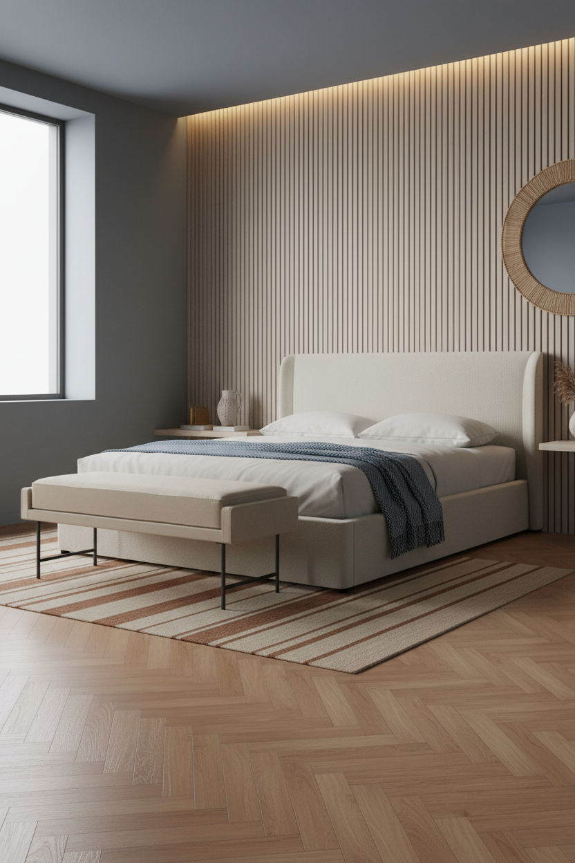

Having a bench at the foot of the bed changes how you actually use the room. But this setup does something more than that.
Design logic: Floor-to-ceiling pale ash slatted panels cast thin shadow stripes downward, creating rhythmic depth across the headboard wall. Each slat is narrow, so the effect is texture rather than pattern.
In a darker room, the smarter choice is warm-grained wood on the feature wall rather than paint. The natural material holds light differently hour to hour while still feeling grounded.
Arched Plaster Alcove for a Coastal Room
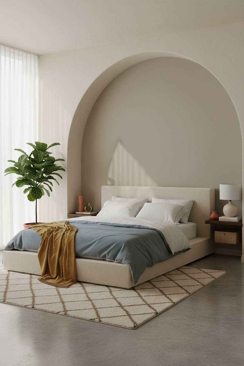
I almost scrolled past this. Glad I didn’t.
The troweled plaster alcove curves from wall to ceiling in one unbroken ivory form, and it makes the whole bed zone feel framed without adding a single frame. That’s the move: architecture instead of decoration. A fiddle-leaf fig anchoring the left corner keeps it from feeling too formal.
Best for: Rooms where the walls are already doing nothing. One arched alcove is enough to make the entire room feel considered.
Sage Walls With a Natural Ash Shelf
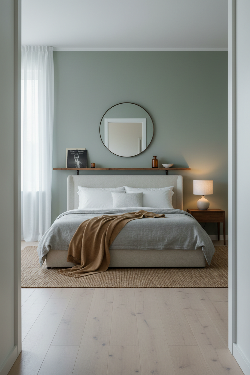
Nothing fancy. That’s the point.
What softens the room: A wide natural ash floating shelf running behind the bed does two things at once. It replaces the need for a headboard and keeps nightstand clutter off the floor, which helps the room stay guest-ready without much effort. The soft sage walls behind it make the warm wood grain pop without competing.
Built-In Bookshelf Wall for the Reader’s Bedroom
This is the room I’d actually live in. Floor-to-ceiling shelving painted warm cream flanking the bed makes the whole wall feel intentional rather than busy.
Why it feels expensive: The cove ceiling LED washes down the bookshelf wall from above, which makes the books and objects glow warmly while the window light stays cool across the floor. Two light temperatures, zero effort.
What not to do: Don’t fill every shelf. Negative space between objects is what keeps it from reading as a storage wall.
Sage Wainscoting That Makes the Bed Pop
Wainscoting in a white bed decor setup is an underused move. This Japandi version does it right.
Why the palette works: Full-height stone grey wainscoting panels with shadow-gap joinery create calm layered geometry, and matching the plaster above to the same tone means the transition disappears. The warm maple floor keeps the whole room from going cold.
Pro move: Layer a navy sateen duvet over cream cable knit. Two textures, one tone family. The contrast is immediate and quiet at the same time.
Handworked Plaster Wall at Golden Hour
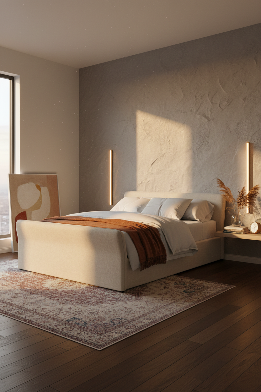
Bold choice. A handworked plaster wall reads very differently depending on the light. At midday it’s subtle. At golden hour it’s alive.
That’s what makes dove grey textured plaster worth the effort: it catches afternoon light differently on each surface angle, which gives the room visual depth that flat paint genuinely cannot replicate.
The common miss: Pairing handworked plaster with too many competing materials. Keep it to dark walnut flooring and one warm throw. Let the wall be the thing.
Shiplap That Makes White Feel Intentional
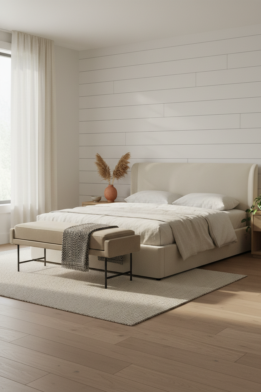
Shiplap gets dismissed as farmhouse-adjacent. But done like this, with bleached oak flooring and cream linen bedding, it reads Scandi and clean rather than rustic.
What makes this one different: Horizontal planks in a bright morning room catch raking light along every subtle groove, which means the wall has texture without color. And a slate herringbone throw folded over the bench at the foot gives the all-white room its one strong contrast note. That’s enough.

Our #1 Pick
Saatva Classic Mattress
America’s best-selling online luxury innerspring. 365-night trial, lifetime warranty, free white glove delivery.
Shop Saatva Classic
The Foundation Of Every Beautiful Bedroom
Walls get repainted. Throws get swapped out. The mattress stays. And honestly, a room that looks this considered deserves a bed that feels as good as it photographs.
The Saatva Classic is the one I keep recommending. Dual-coil support means the structure holds up over years, not just months. The Euro pillow top is soft without losing shape, and the breathable organic cotton cover keeps the temperature from building overnight. It feels like the good hotel kind (not the business hotel kind).
Good design ages well because it’s made well.

The rooms people save are the ones where everything from the wall treatment to the bedding to what’s underneath the sheets feels like someone actually thought it through. Start with the frame. Then the mattress. The rest figures itself out.