
The first thing you notice in the best coastal blue bedroom isn’t the color. It’s the feeling. Salt air, unhurried light, a room that somehow looks like it was never really decorated.
These 14 rooms get that right. Some lean warm and cottaged-up. Others go clean and Scandi. But every single one feels like the beach in a way that matters.
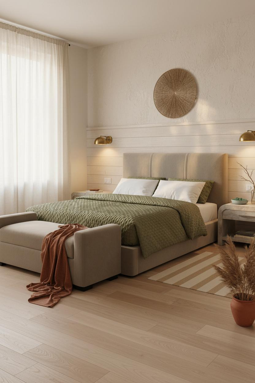
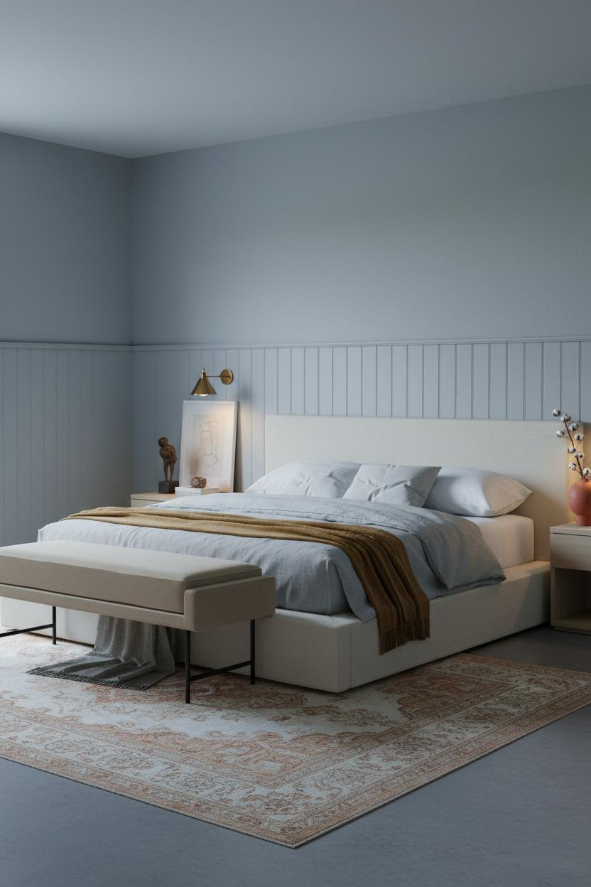
The Board-and-Groove Headwall That Anchors Everything


This is the kind of room that makes you want to slow down before you’ve even sat on the bed.
Why it holds together: The board-and-groove timber rail at mid-height cuts a clean shadow line across the plaster, giving the headwall structure that reads from across the room. It’s a simple move, but it changes the whole scale of the space.
Steal this move: Pair the rail with a round woven seagrass hanging above the bed. The geometry contrast keeps it from feeling too carpenter-y.
Herringbone Walls Done the Warm Way
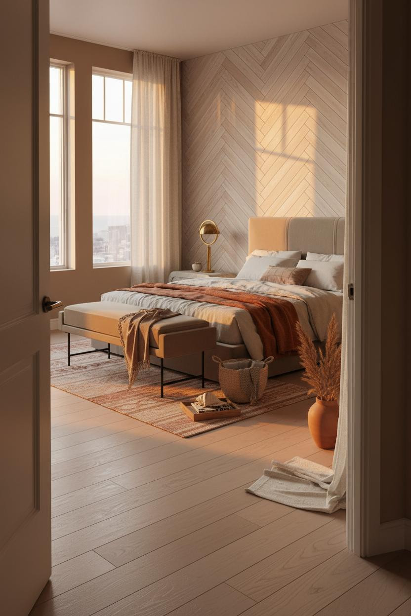

Fair warning. A floor-to-ceiling herringbone wall sounds like a lot. But when the timber is painted in pale driftwood tones, it lands closer to woven textile than bold feature wall.
What makes it work is how the chevron grain catches raking evening light, throwing fine diagonal shadows across the headboard zone. The room feels warm without being heavy.
The easy win: Drape a rust linen throw loosely over the bench at the foot. That one color ties the warm timber to the bedding in a way that feels collected rather than decorated.
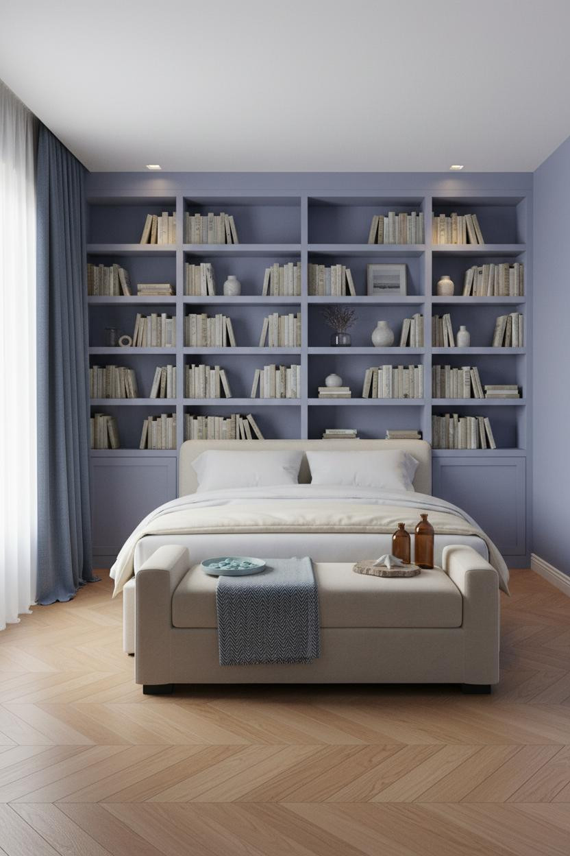
Light Blue Walls With Shelving That Actually Works
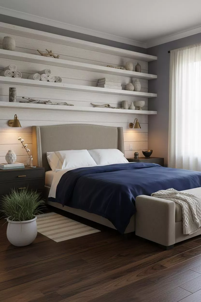

Open shelving in a bedroom either looks curated or it looks like a storage problem. This one is the former.
What gives it depth: Weathered white-painted timber shelves cast horizontal shadow lines across the plaster behind them, which keeps the wall from looking flat while the dusty indigo paint pulls focus to the overall palette. It’s a light blue room that actually reads as a design decision.
Where to start: Keep the shelf styling minimal. Rolled linen, a pale ceramic vessel, one short driftwood fragment. Resist the urge to fill every shelf.
Stone Walls Are Having a Coastal Moment
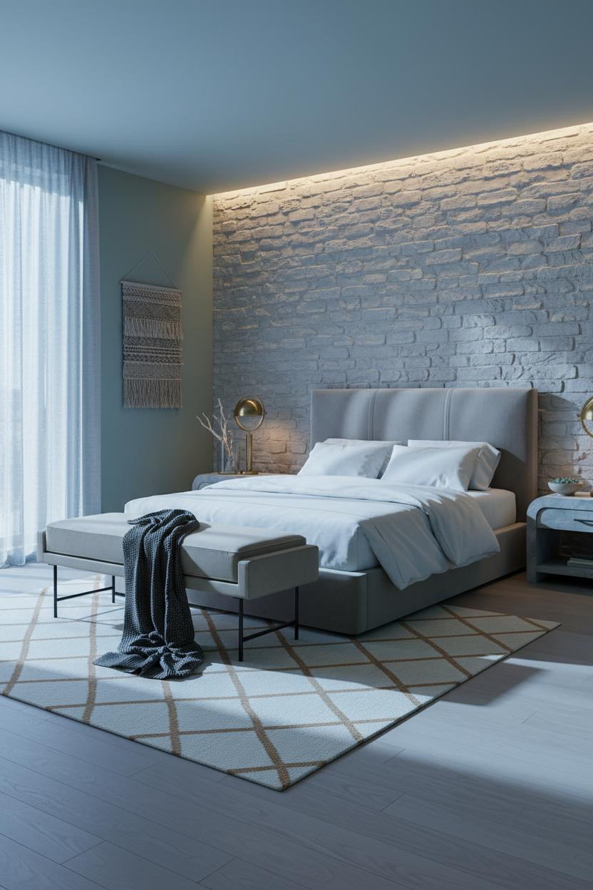
I keep coming back to this one. The exposed limestone behind the bed shouldn’t feel soft, but it does.
The reason it feels coastal instead of rustic is the seafoam blue-green on the flanking walls. Pale bleached limestone reads raw and tactile on its own. But pair it with that particular blue-green and the room finds its identity fast.
Pro move: Let a woven wall hanging do the styling above the bed. Don’t mount art over stone. The texture is the statement.
Why White Paneling on a Celadon Wall Just Works
Raised panel molding behind a bed looks custom. It looks expensive. And honestly, it’s not that hard.
Why it looks custom: Each vertical shadow groove in the white-painted raised panels catches morning light and creates rhythmic depth that flat paint simply can’t replicate. The celadon flanking walls keep the whole thing from looking like a colonial dining room.
Avoid this mistake: Don’t add a headboard on top of full-height paneling. The architecture is the headboard. Trust it.
The Driftwood Gallery Wall I’d Actually Hang

Most gallery walls above a bed look restless. This one doesn’t, and the frame material is why.
What carries the look: Three oversized panels in weathered pale driftwood frames catch warm raking light and cast thin shadows across the plaster behind, so the wall has depth without needing another layer. The muted sage-teal plaster ties the whole thing together without a lot of effort.
Worth copying: Use abstract coastal watercolors in sand and wash-blue tones. Avoid anything too literal (no anchors, no fish). The frames do the beach work.
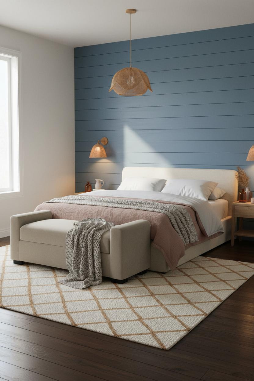
Shiplap That Earns Its Place on a Cobalt Wall
Shiplap can go very beach-house-cliché very fast. This version avoids it.
Why it feels Scandi instead of Cape Cod: The muted cobalt-washed walls flanking the shiplap give the room a quieter coastal register, while each painted board catches diffused side light and throws a faint shadow ridge that gives the wall texture without pattern. The dark stained narrow-plank floor grounds it so the whole room doesn’t float away into pale minimalism.
Swap any overhead fixture for woven rattan pendants and the warmth lands immediately. That contrast between the cool blue walls and natural fiber is the whole move.
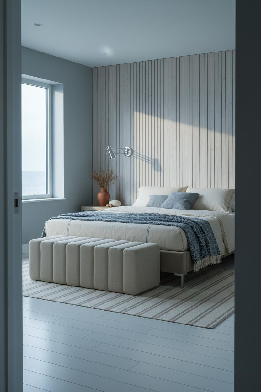
Slatted Wood Behind the Bed. Quieter Than You’d Expect.

Nothing fancy. That’s the point.
What changes the room: Full-height pale painted timber slats create fine vertical shadow stripes as diffused grey light rakes softly from the side. It’s subtle enough to feel residential, not like a hotel lobby. The soft slate walls keep it from reading too stark.
The smarter choice: A channel-tufted ottoman at the foot reads more considered than a standard bench in a room this restrained. The structured detail gives the space something to hold onto.
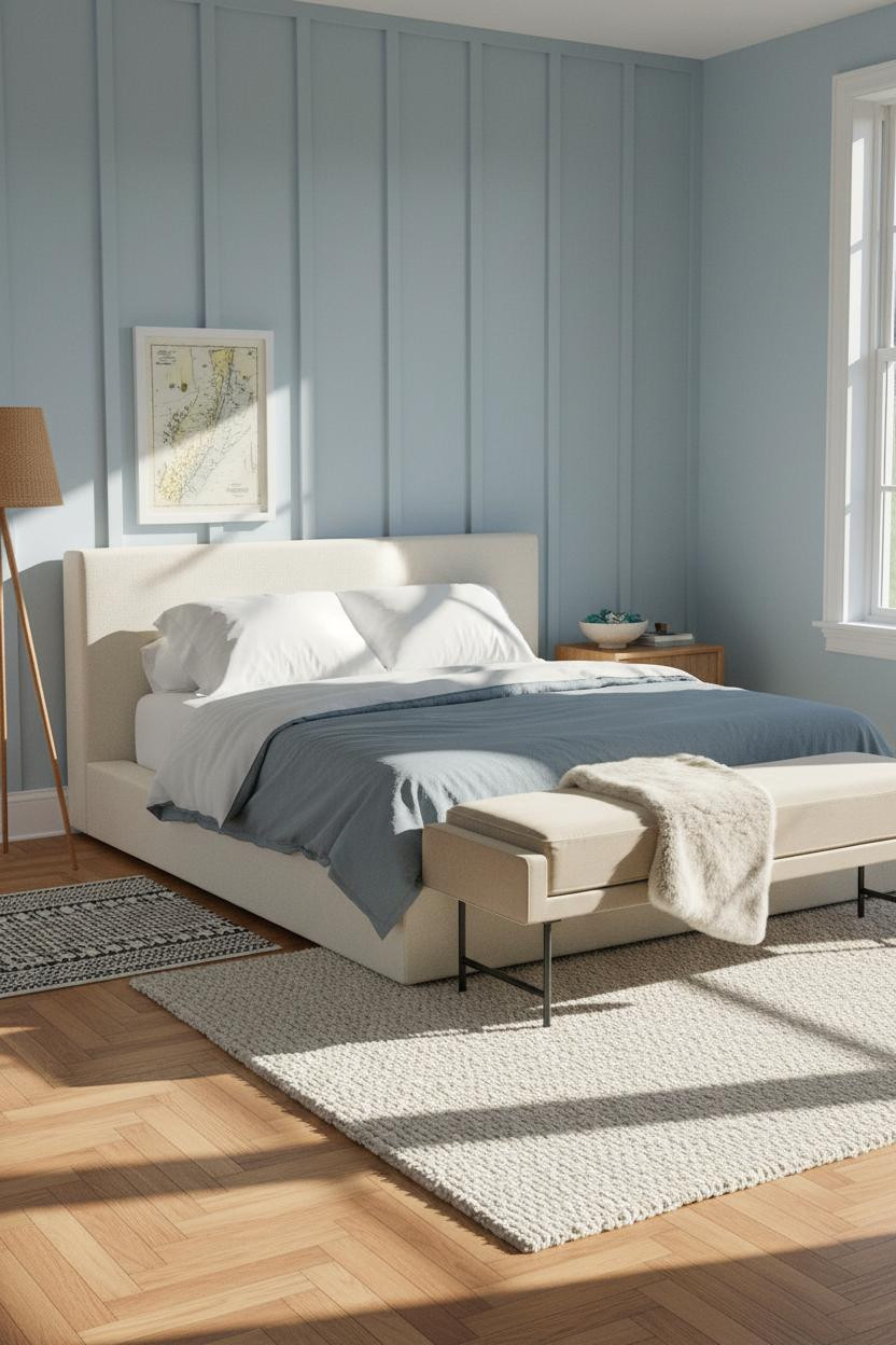
Wainscoting in Blue-Grey Is the Coastal Cottage Secret

I’ve seen this done badly more times than I can count. The version that works is this one, where the rail height is just right.
Why it feels balanced: The slim painted rail where tongue-and-groove panels meet smooth plaster above casts a thin horizontal line that grounds the room with quiet architectural rhythm. It’s a small move, but it defines the lower half of the wall without splitting the room in two.
Don’t ruin it with: Heavy art above the rail. The composition is already complete. A single leaning frame, slightly off-center, is plenty.
The Denim Blue Bedroom I Keep Revisiting
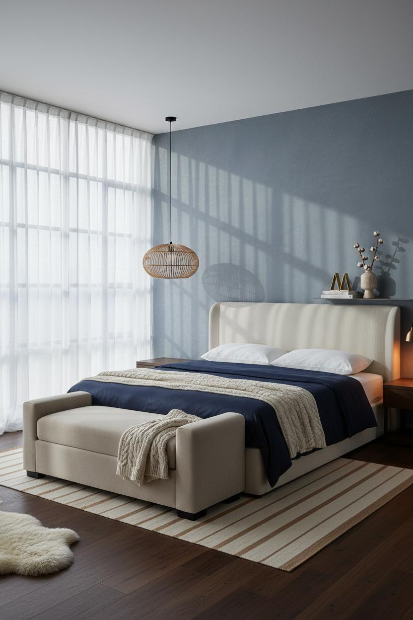

Faded denim blue walls plus black steel window frames sounds like a lot. It isn’t.
Why the palette works: The slim black Crittall-style frames cast thin grid shadows across the plaster, giving the faded denim walls a structural counterpoint that keeps the whole room from feeling too soft. Dark walnut floors do the same thing from below. The room feels lived-in and intimate rather than overdone.
What to borrow: The rattan pendant off-center above the bench. Not centered. Off-center. It breaks the symmetry just enough to feel uncontrived.
Board-and-Batten in Powder Blue Is Doing Too Much (and I Love It)
Admittedly, full-wall powder blue board-and-batten is a commitment. But paired with warm honey parquet underfoot, it lands somewhere between beach cottage and French countryside.
The crisp vertical batten relief catches angled midday light and throws dimensional shadow lines that give the wall geometry without pattern. It’s the kind of surface that looks better the longer you sit with it.
Where people go wrong: Adding too much color in the bedding. Keep it neutral (slate grey, cream) so the wall is the only thing talking.
Periwinkle Built-Ins as the Whole Design Statement
Built-ins painted in the same color as the walls make a room feel like it grew that way.
What makes this one different: The muted periwinkle on the full-width shelf wall (worn edges and all) has the kind of softness that a freshly painted room never quite achieves, while the warm honey herringbone parquet stops the blue from feeling cold. The room feels collected rather than decorated. That’s harder to get right than it looks.
The finishing layer: Floor-length indigo linen curtains, one panel bunched casually at the base. Imperfect on purpose.
An Arched Alcove That Changes the Whole Mood
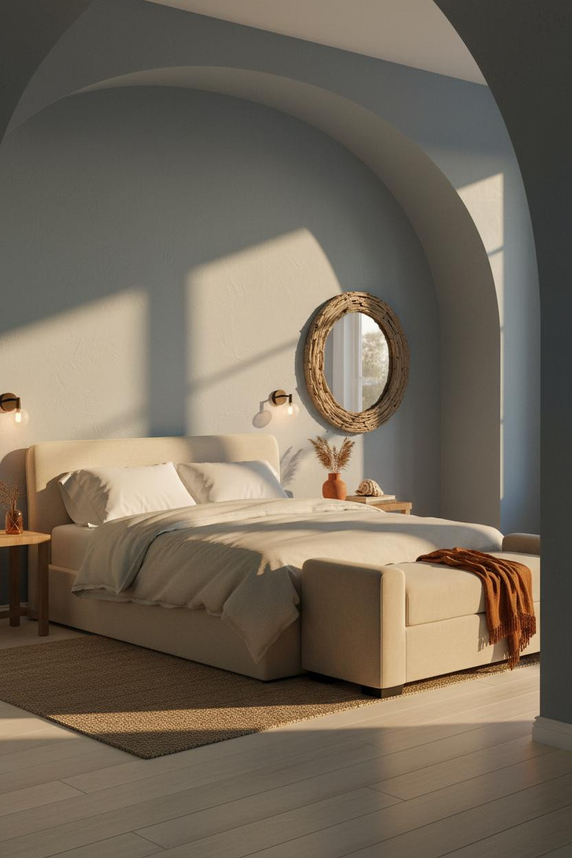
Bold choice. Not every home can do an arched alcove. But if yours can, I’d stop hesitating.
The deep-set plaster reveal frames the bed in a way that no headboard quite matches. Dusty blue-grey smooth plaster inside the curve catches late afternoon light differently than the flat surrounding walls, which gives the whole headboard zone a presence that’s hard to name but impossible to ignore.
One smart swap: Hang an oversized round driftwood-framed mirror above the foot bench instead of art above the bed. It reflects the alcove curve back into the room and doubles the architectural interest.
Seafoam Shiplap and Whitewashed Shutters. Classic. Earned.
This is the room I’d build if I actually lived near the water. Nothing ironic about it.
Why it feels authentic: Whitewashed wooden shutters with weathered blue-grey frames cast soft dappled stripes across the room as light shifts through the day, giving the seafoam shiplap walls a surface quality that solid paint walls can’t replicate. The honey oak floor ties warm and cool without forcing it.
The detail to keep: Floor-length cream linen curtains, one panel bunching unevenly at the base. That slight imperfection is what keeps the whole room from looking like a showroom.

Our #1 Pick
Saatva Classic Mattress
America’s best-selling online luxury innerspring. 365-night trial, lifetime warranty, free white glove delivery.
Shop Saatva Classic
Why Luxury Bedrooms Always Feel Better
A coastal bedroom can have every right wall treatment and still feel wrong if what’s underneath you doesn’t match the effort you put into what’s around you.
The Saatva Classic is the bed that earns that room. Dual-coil support that holds its shape over years. A Euro pillow top that feels genuinely soft without losing structure underneath. And breathable organic cotton that keeps things comfortable through the night rather than trapping warmth the way cheaper materials do.
Walls get repainted. Linen gets swapped out. The mattress stays. Start with the one piece that’s worth getting right.

The rooms people save are the ones where nothing looks accidental. And the ones people actually want to sleep in are the ones where the bed is as good as everything around it.