
The first thing you notice in the best blue cottage bedroom isn’t the color. It’s how the room feels: unhurried, settled, like it’s been that way for years. That’s harder to fake than it looks.
These 15 rooms prove you don’t need a renovation to get there. Just the right shade, the right surface, and a little patience.
French Blue Dado Rail That Makes The Room Feel Twice As Tall
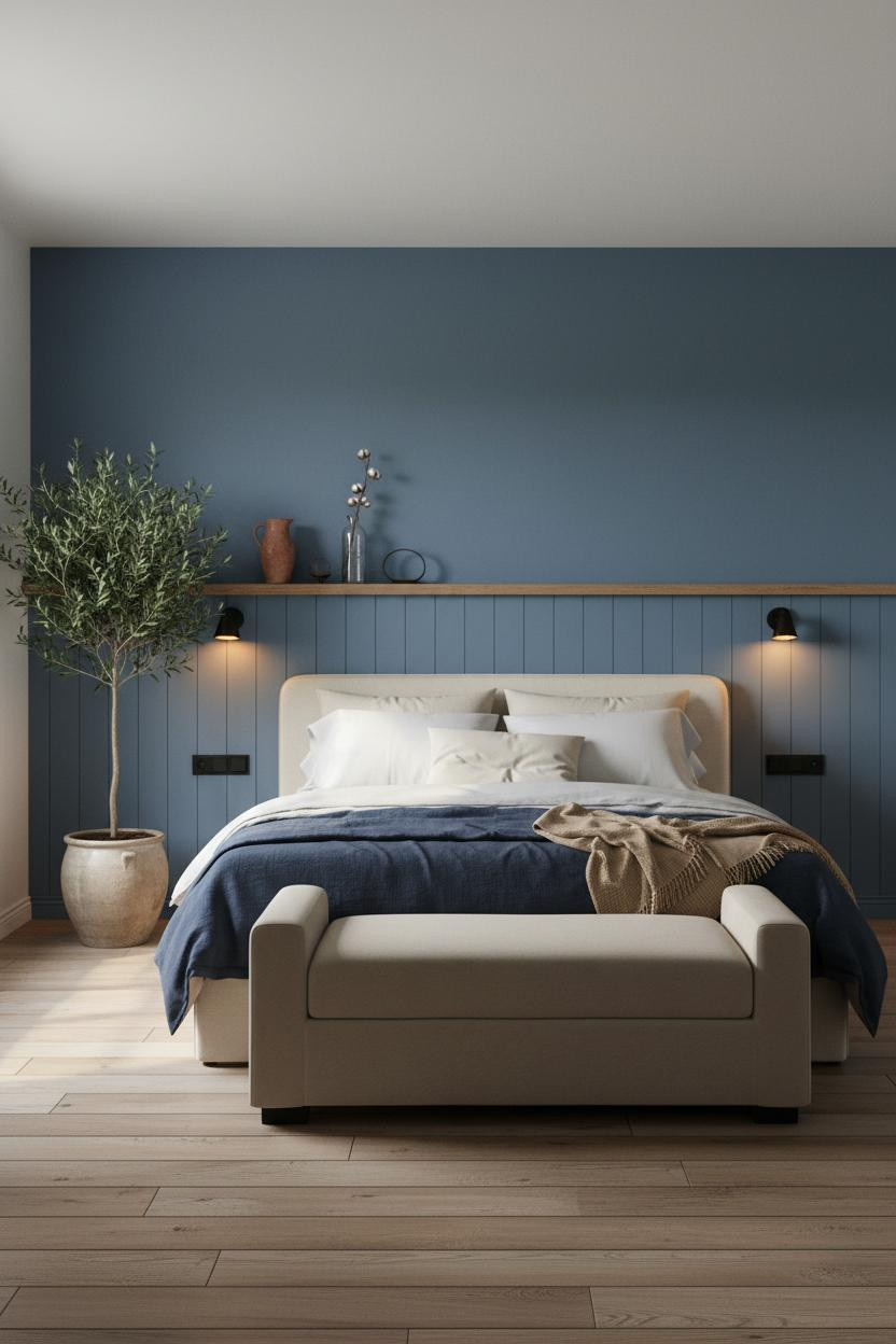

Half-height tongue-and-groove in chalky French blue, raw oak ledge capping it. Simple, but it changes the whole room.
What gives it presence: The horizontal plank dado draws the eye across the wall rather than up it, which makes low ceilings feel intentional instead of cramped.
The finishing layer: Cap the paneling with a raw oak shelf and keep the objects on it sparse. Three things maximum, or it starts looking cluttered.
Denim Paneling That Earns Its Place In A Scandi Room
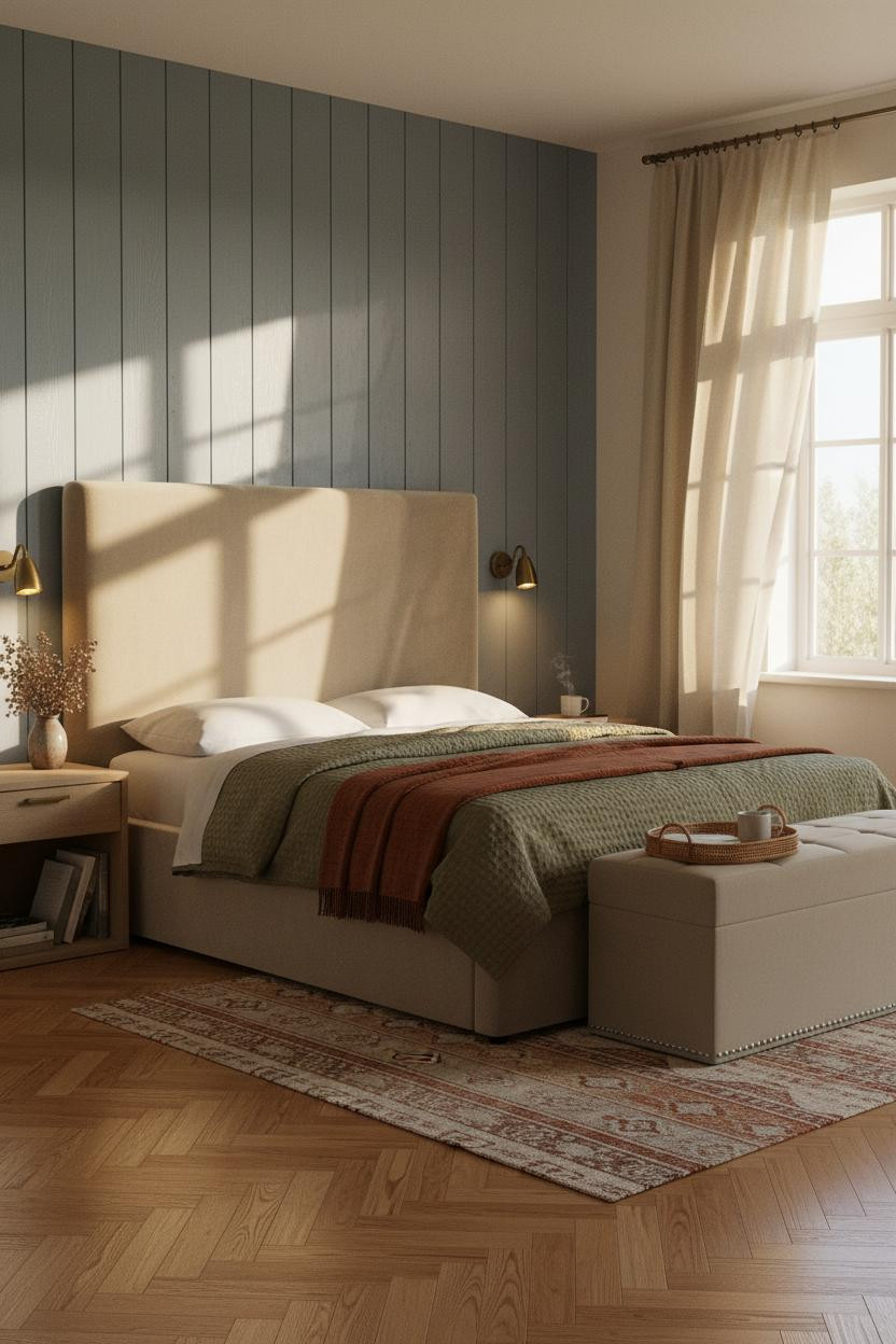

Full-height vertical tongue-and-groove in faded denim blue. The grain shows. The shadow grooves show. That’s the point.
Why it lands: Vertical planking pushes the eye upward in a way that flat paint simply cannot, and the faded denim keeps it from feeling too stark against cream plaster flanking walls.
What to borrow: Anchor the floor with a rust kilim runner. It pulls the warmth out of the wood grain while still feeling relaxed.
An Indigo Plaster Alcove That Feels Like It Was Always There
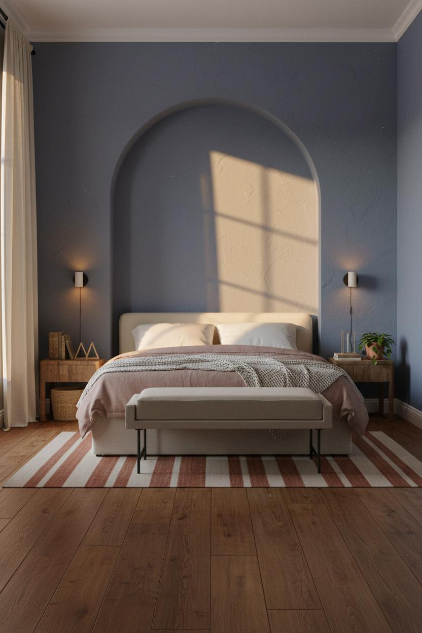
This one surprised me. The arch shouldn’t feel this grounded, but it does.
But when you set a bed inside a hand-troweled plaster alcove, the curve does the framing work for you. No headboard required, honestly.
Why it looks custom: Visible trowel ridges in the plaster catch morning light in a way that smooth paint never would. The imperfection is the detail.
Pro move: Keep the flanking walls the same muted cornflower-indigo as the alcove. Breaking the color at the arch edge is what cheapens this look.
Built-In Shelving That Justifies The Blue
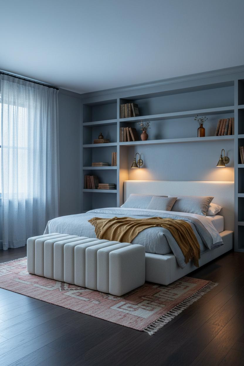
I keep coming back to built-ins with painted backing. The color lands differently when it’s framed by shelf edges on all sides.
The reason it feels collected rather than decorated is the slate-periwinkle backing panels: they give each shelf its own depth, so the objects in front read as intentional, not just placed.
The smarter choice: Paint only the backing, not the shelf faces. It keeps the blue from taking over while still giving the whole wall a visual anchor. For more ideas on working color into bedroom storage, see our guide to cottagecore bedroom ideas.
Indigo Limewash Walls With A Fireplace That Steals The Room
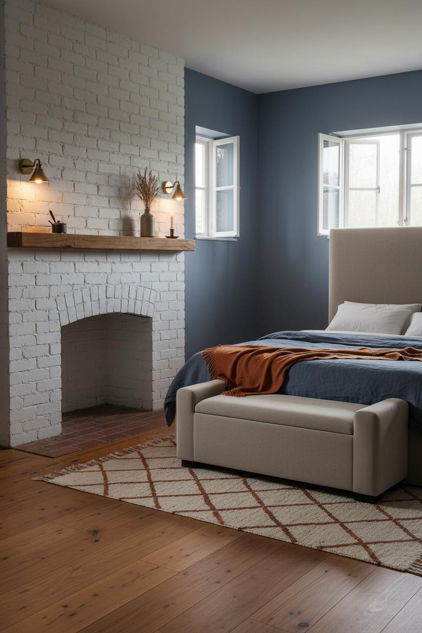
A bedroom fireplace is divisive. I think it’s one of the best things you can do to a blue cottage bedroom, if the rest of the room doesn’t fight it.
What carries the look: The matte limewash finish on indigo walls absorbs the firelight rather than reflecting it, which keeps the room warm without feeling theatrical.
Avoid this mistake: Don’t paint the whitewashed brick surround. The raw texture contrast between aged brick and matte wall is exactly what makes the fireplace feel original, not installed.
Cream Wainscoting That Makes Powder Sage Feel Grounded
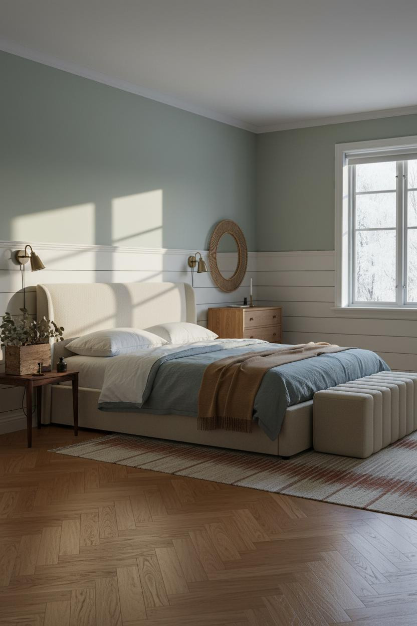

Nordic rooms go cold fast. This one doesn’t, and the cream horizontal wainscoting is most of the reason why.
Why it feels balanced: The crisp white rail line at 42 inches gives the eye a place to rest, which lets the powder sage above breathe without making the walls feel bare or unfinished.
One smart swap: A rust and cream kilim runner on herringbone parquet keeps the floor from reading too formal. Just enough warmth to offset the winter light. If you love this Nordic approach, there’s more to explore in our cozy bedroom ideas roundup.
Powder Blue Shiplap That Actually Suits A Small Room
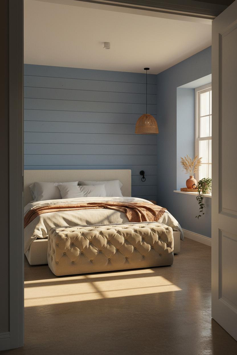
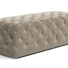
In a small room, the wall treatment has to work harder than the furniture. Shiplap in faded powder blue does that.
What changes the room: The hairline shadow between each horizontal plank creates quiet rhythm in a way that solid paint can’t, in a way that feels organic rather than deliberate.
Where to start: Skip the rug on concrete or greige floors. The planks already provide enough texture. Adding a rug underneath crowds the visual field.
Exposed Stone That Turns A Blue Bedroom Into Something Older
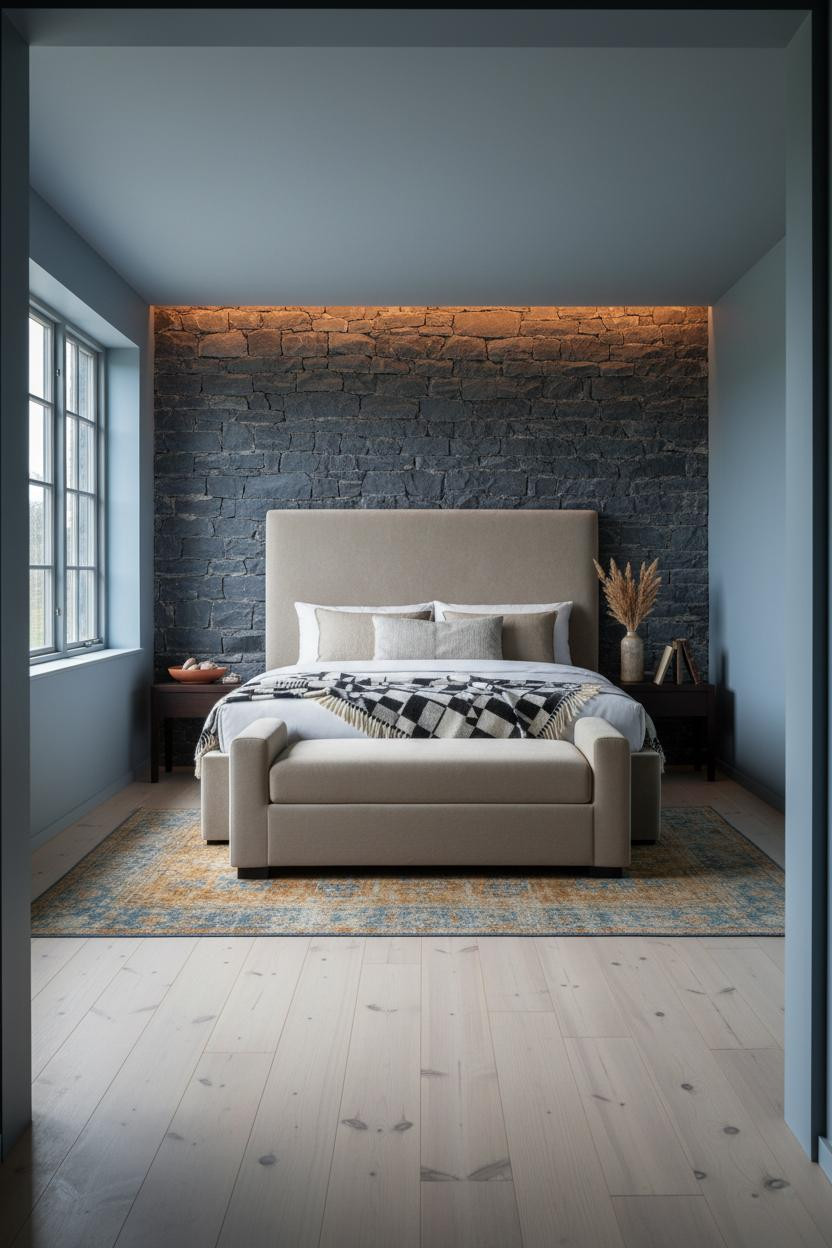
Fair warning. Exposed stone behind a bed is not subtle. But paired with dusty cobalt blue walls, it somehow reads restful rather than rustic-overload.
Why the materials matter: Rough-hewn fieldstone deepens every mortar joint in low light, so the wall changes character between morning and evening in a way no painted surface could.
Layer an overdyed vintage wool rug in amber and blue underneath. Old and new, same palette. The contrast is what keeps the stone from feeling like a museum.
Chalky French Blue Paneling That Belongs In An English Country House
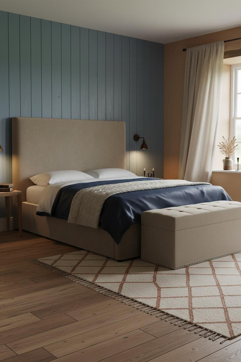
Admittedly, full-height tongue-and-groove is a commitment. But the rooms that go all the way with it look settled in a way that half-measures don’t.
Why it holds together: Authentic grain variation and soft wear at board knots make the paneling look like it predates the house, which is the highest compliment a finish can get.
The detail to keep: Pair chalky French blue paneling with warm clay plaster on flanking walls. The contrast in texture, not just color, is what makes it feel considered. This kind of English cottage bedroom styling is worth exploring further if the look speaks to you.
A Vintage Picture Rail That Reframes The Whole Room
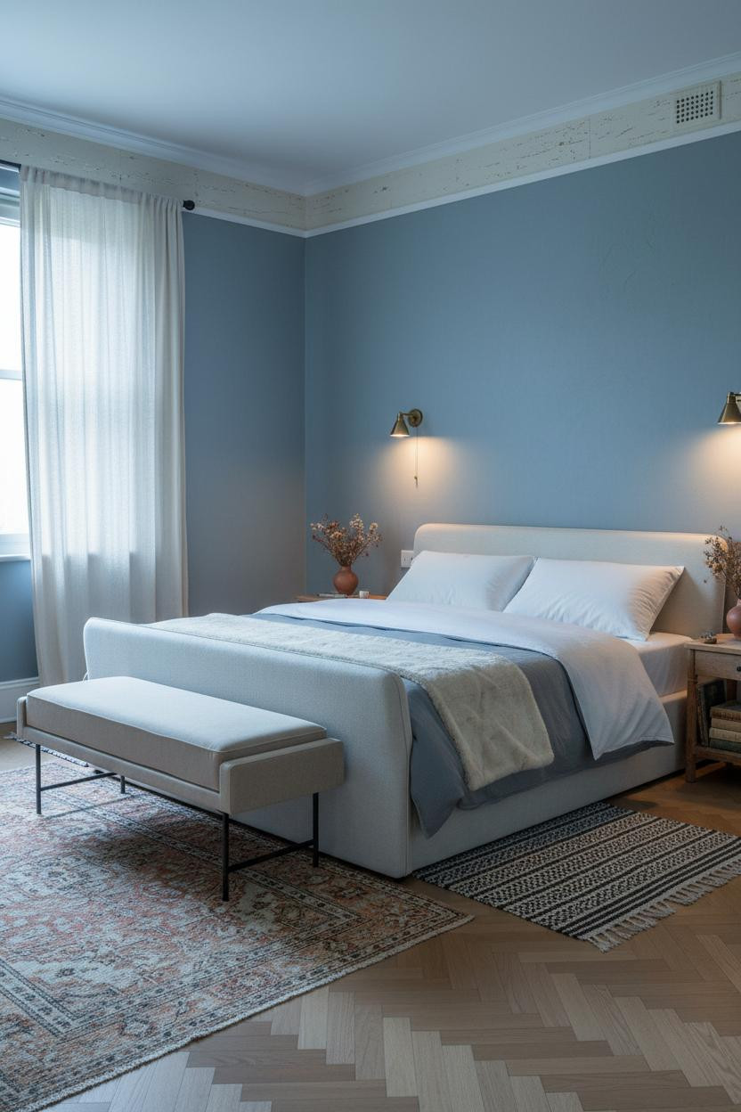
Nothing fancy. That’s the point.
What creates the mood: A cream-painted vintage picture rail with honest patina chips along the top edge traces the room’s geometry with quiet craft, giving dusty steel-blue walls a period detail that paint alone can’t replicate.
Try this: Hang nothing on the rail. Let it exist as architecture. Adding art makes it functional and loses the subtlety entirely.
Slate Indigo Walls With A Mantelpiece That Grounds The English Mood
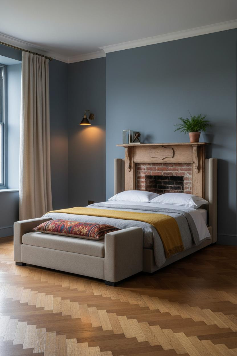

I think the mantelpiece is underrated as a bedroom focal point. It gives the room a second anchor beyond the bed, and with slate-indigo matte plaster on the walls, the whole thing feels like a proper English countryside retreat.
Why it feels intentional: Authentic wear at the corbels and painted edges of a vintage wooden mantel reads as age, not neglect, which is the difference between a room that feels collected and one that just feels old.
What not to do: Don’t overcrowd the mantel shelf. Two or three objects with breathing room between them. The matte plaster wall should do most of the work.
A Cornflower Arch That Makes A Small Bedroom Feel Architectural
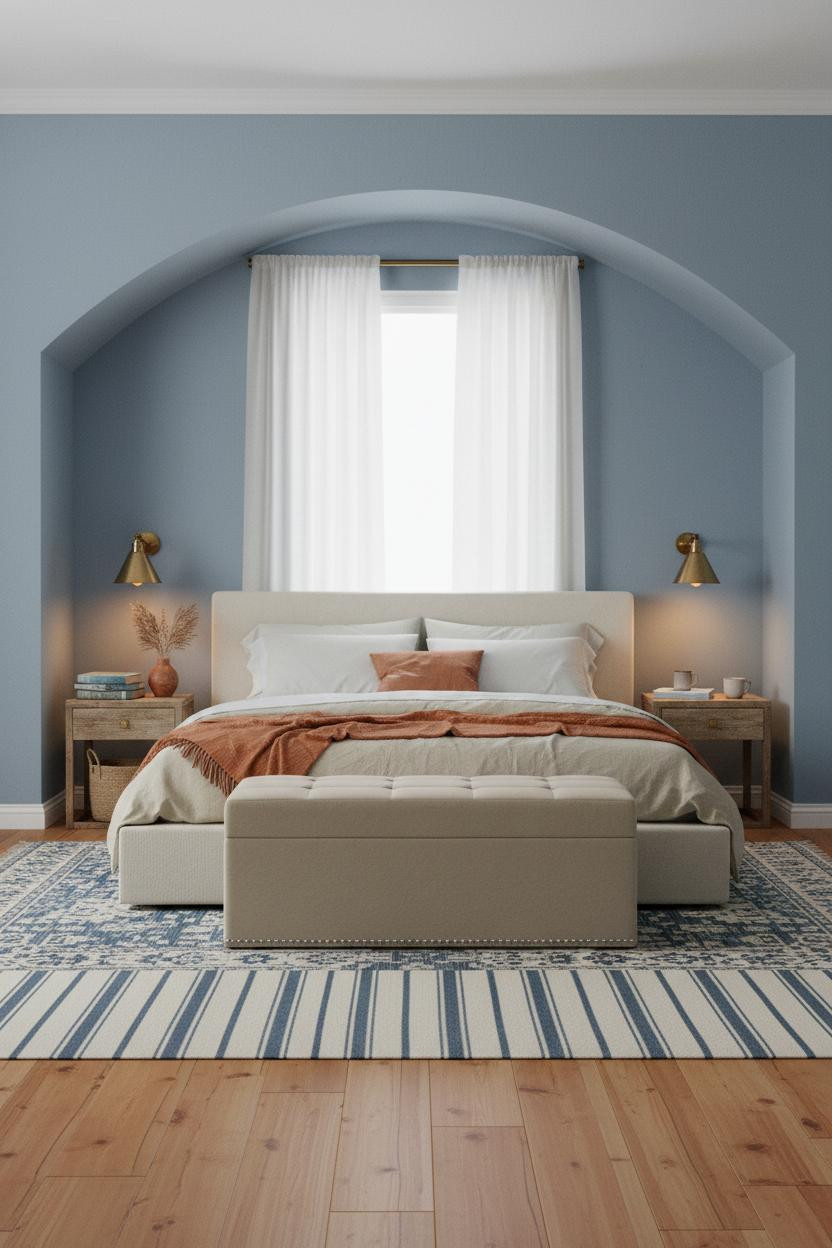
The arch does something a flat wall can’t. It frames the bed without a headboard, and the faded cornflower blue plaster inside the curve catches diffused light differently than the surrounding walls.
The easy win: Warm honey maple flooring pulls the cool arch color back toward something livable. The contrast in floor and wall temperature keeps the room feeling warm without being heavy. For more small-room strategies, our small cottage bedroom ideas page covers this approach in depth.
Denim Board-And-Batten That Stays Calm Under Overcast Light
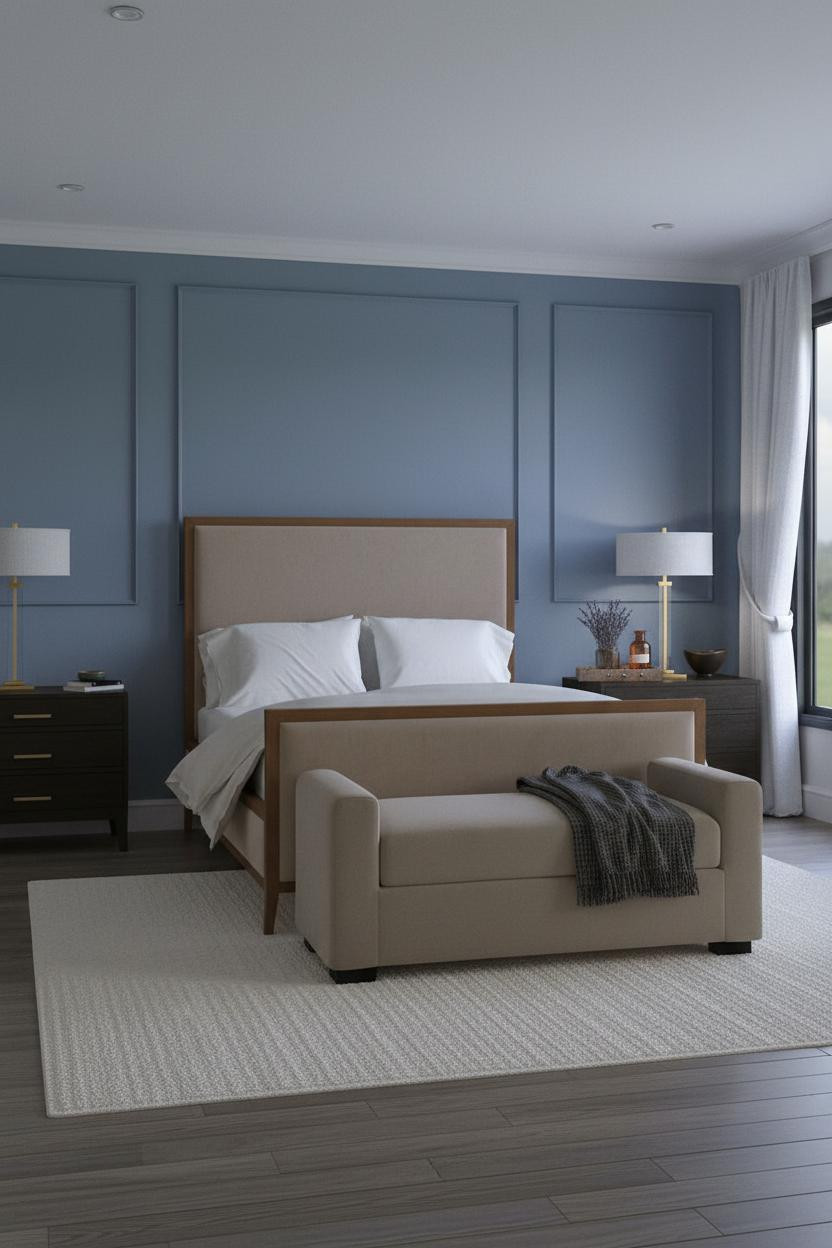

Denim blue reads differently on a flat wall versus board-and-batten. Each vertical batten casts a hairline shadow that keeps the color from looking painted-on, even on a grey morning when everything else goes flat.
Where people go wrong: Matching the flanking walls to the batten color exactly. The dusty slate-blue plaster on the sides needs to be a shade lighter, or the whole room closes in. And a chunky cream wool rug underfoot corrects for the cool tone without fighting it.
Sage Blue Shiplap With Farmhouse Warmth That Actually Holds
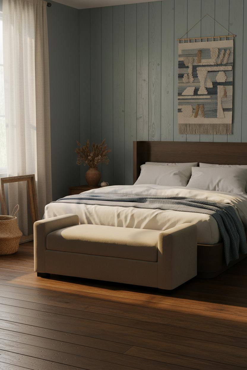

Weathered sage-blue shiplap in late afternoon light. The boards show authentic grain and hand-planed patina. The room feels warm without trying.
The real strength: Dark stained narrow-plank flooring below pulls the aged shiplap boards down into something grounded, which helps balance the cool blue so the room stays relaxed rather than airy.
Steal this move: Add an oversized woven wall hanging above the bench at the foot. It softens the vertical rhythm of the shiplap while still feeling like it belongs in a farmhouse.
Periwinkle Walls With Beadboard Wainscoting And Morning Calm
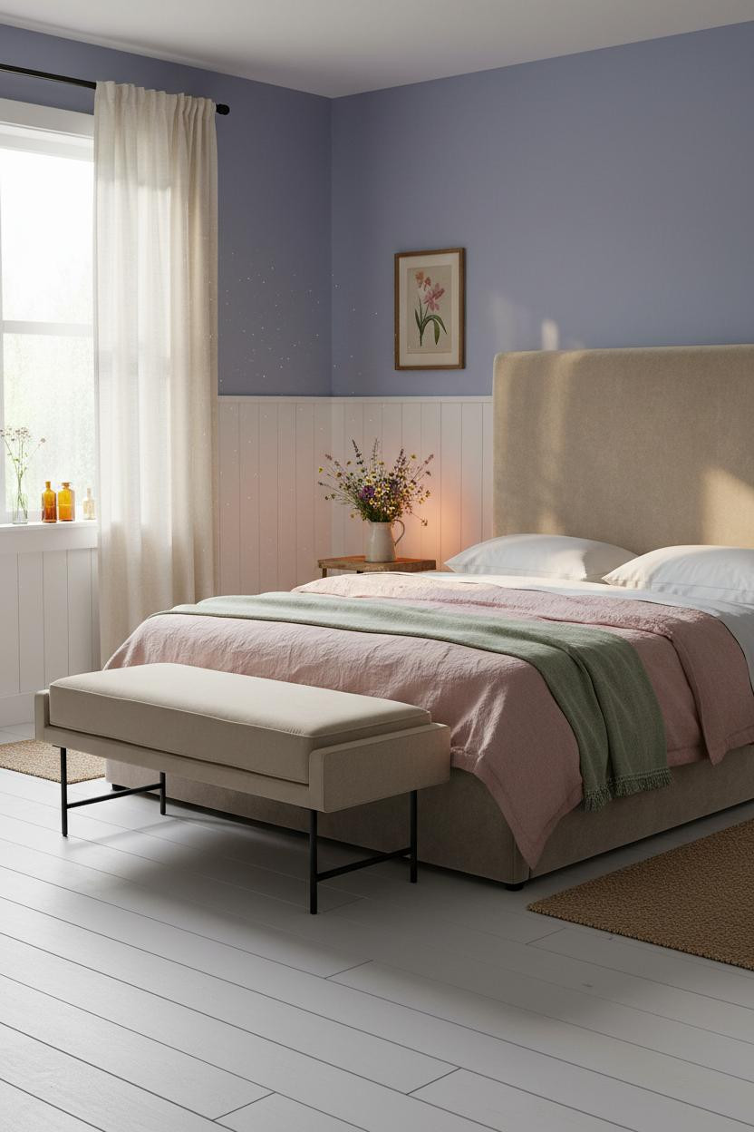
Glad I landed on this one. Periwinkle is the trickiest blue to get right, but whitewashed beadboard wainscoting at 36 inches keeps it from tipping too cool or too sweet.
Why it works: The hand-painted patina on the beadboard grooves catches early light with a warmth that periwinkle walls alone wouldn’t generate. And a sage green wool throw at the foot adds just enough green to settle the blue without shifting the whole palette. This is the kind of room that feels lived-in from the first morning. The best vintage cottage bedroom looks are built exactly this way, one honest layer at a time.

Our #1 Pick
Saatva Classic Mattress
America’s best-selling online luxury innerspring. 365-night trial, lifetime warranty, free white glove delivery.
Shop Saatva Classic
The Foundation Of Every Beautiful Bedroom
Walls get repainted. Linen gets swapped out. The mattress stays. And in a room this carefully considered, the bed has to hold up its end.
The Saatva Classic is what I’d put under all that washed linen and wool. Dual-coil support means the structure doesn’t compress over time the way foam tends to, and the Euro pillow top has that particular softness that feels right without losing shape. The cotton cover breathes, which matters more in a cottage bedroom (where the windows stay open and the air actually moves).
Good design ages well because it’s made well.

The rooms that people save to Pinterest boards and come back to months later are the ones where nothing looks accidental. Pick one blue, one surface treatment, and commit fully. The rest figures itself out.