
Think your room is too small for a real personality? Teen bedroom ideas keep proving otherwise. The ones worth saving aren’t decorated. They feel lived in.
These 14 rooms are all over our feed right now, and honestly, I keep coming back to them. Each one does something specific well.
The Brick Wall That Makes This Room Feel Like Hers
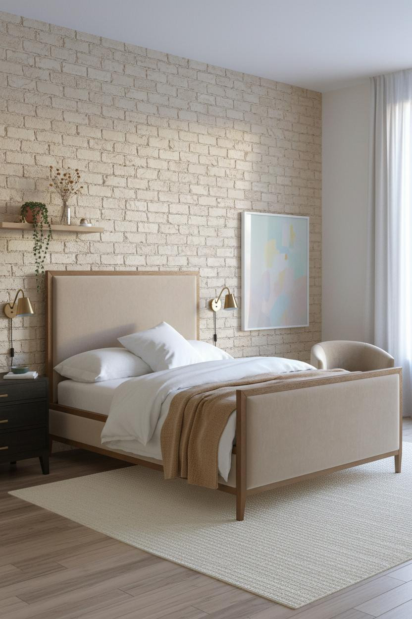


I almost scrolled past this one. Glad I didn’t.
The cream-painted brick wall keeps the raw texture without making the room feel unfinished, which is a harder balance than it looks.
Steal this move: A camel wool throw over white percale is the fastest way to make a simple bed feel considered. No matching required.
Why A Gallery Wall Works Better Than Art In A Teen Room
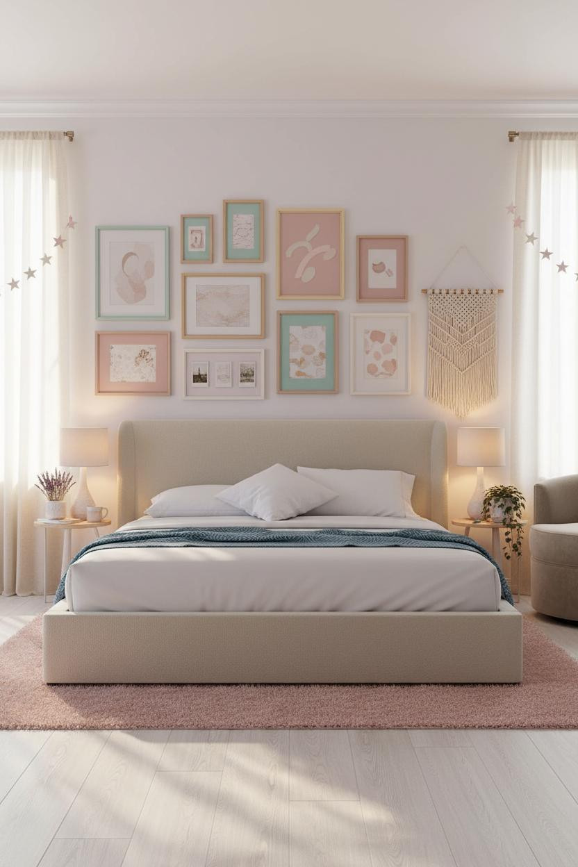

A full-width gallery wall does something single artwork can’t: it grows with the person sleeping in the room.
What gives it depth: Mixing pastel frames with pinned polaroids means the wall feels collected rather than purchased, which is exactly the point for a cozy aesthetic bedroom.
The easy win: A macrame hanging in the reading corner gives the boho layer without crowding the gallery wall.
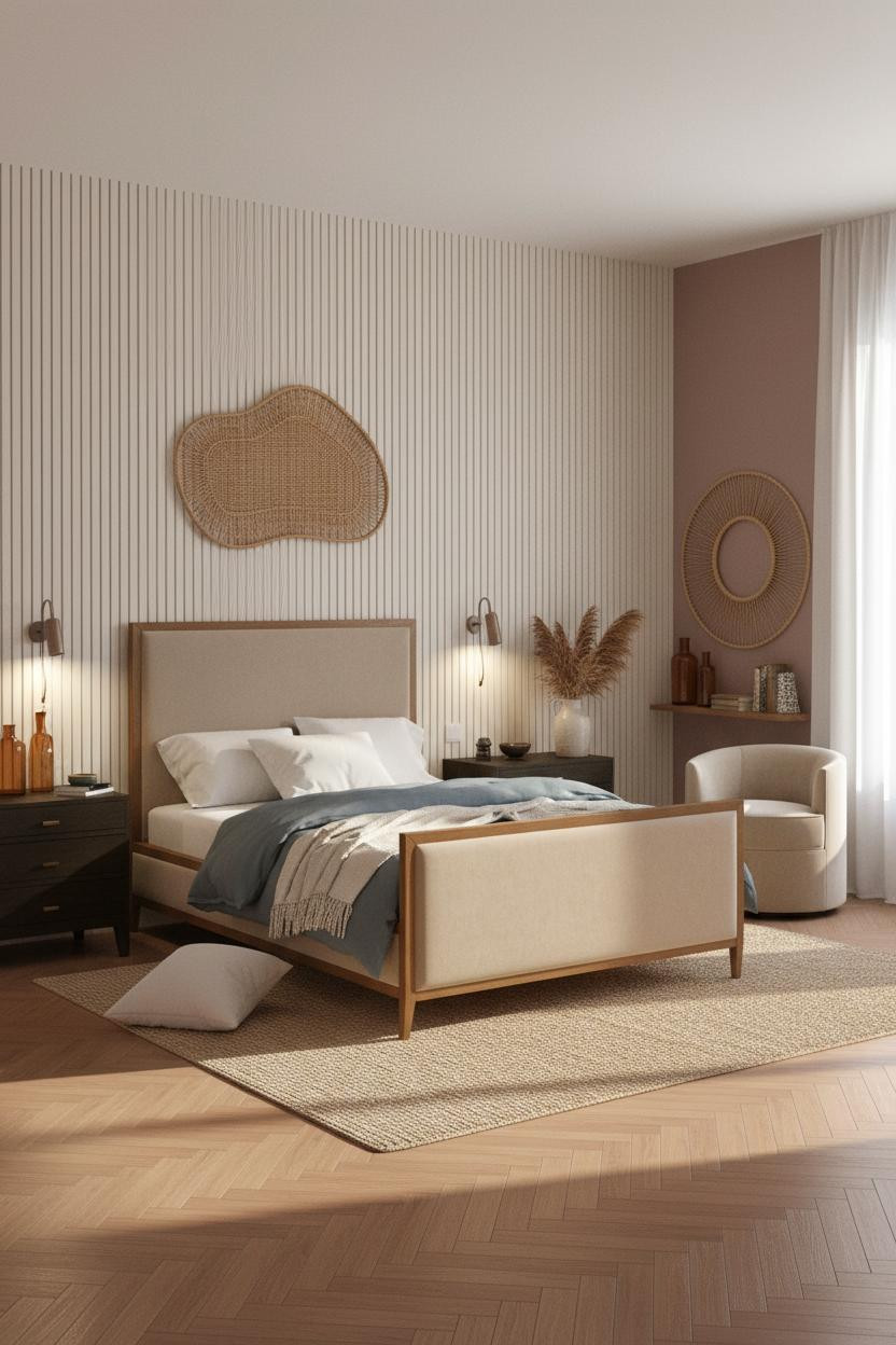
This Herringbone Wall Changes The Whole Mood
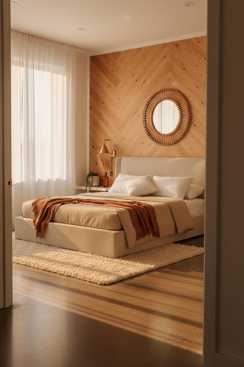
Coastal doesn’t have to mean shells and rope. This version is more grown-up than most.
Why the materials matter: The diagonal honey herringbone planks catch light differently at every hour, so the wall actually looks different morning versus evening. That’s the kind of detail that makes a room feel designed, not just decorated.
An oversized rattan mirror above the shelf keeps the coastal nod without a single seashell in sight. That restraint is the move.
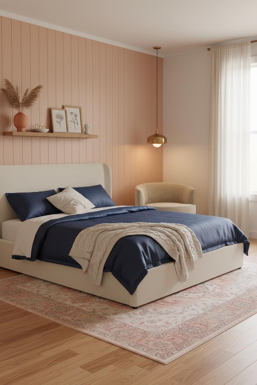
Peach Walls Done Right Are Harder Than They Look
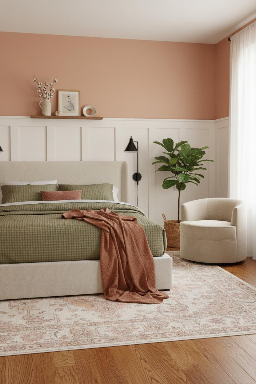
Fair warning. Peach-coral can go very wrong very fast.
But pair it with white wainscoting below a cap rail and the combination reads warm without reading sweet. The paneling does the heavy lifting, keeping the color from feeling like a nursery leftover.
What to borrow: A rust linen throw against an olive duvet is the kind of earthy contrast that keeps a warm room from feeling too matchy.
I Keep Coming Back To This Curved Plaster Niche
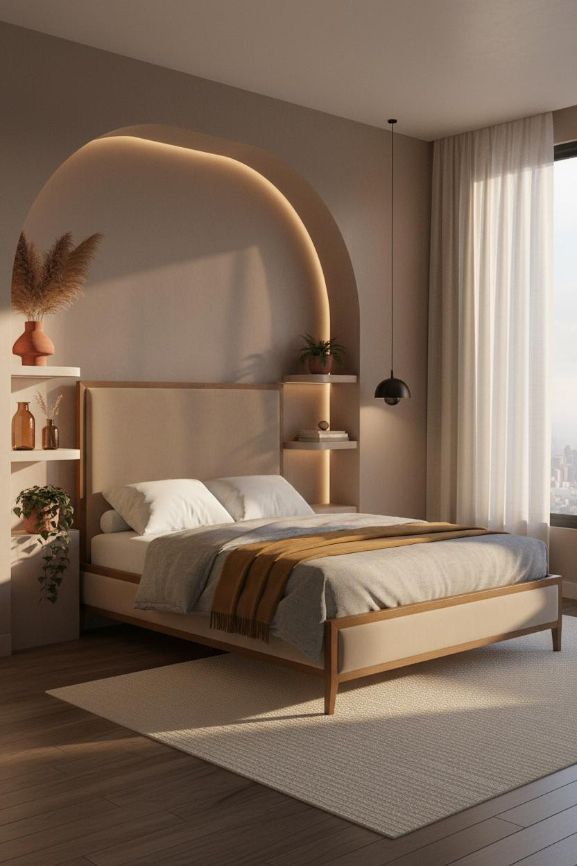
This is the kind of dark feminine design that feels genuinely considered. Not a mood board. A room.
Why it feels intentional: The mushroom matte plaster catches amber light along its curved edges, which means the niche glows rather than just sitting flat on the wall. Strip lighting on the shelves is a small move that reads as very custom.
Pro move: A mustard wool blanket layered over a grey duvet keeps the dark palette warm, while still feeling moody rather than heavy.
Soft Paneled Walls For The Girl Who Wants Quiet Luxury
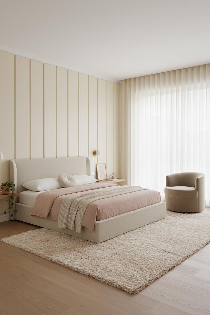
Nothing dramatic. That’s the whole point.
The ivory vertical paneling casts just enough shadow rhythm to make the wall interesting without demanding attention. And that’s harder to pull off than a bold color. The room feels calm and cohesive in a way that ages well.
The finishing layer: Floor-to-ceiling sheer curtains in a botanical room carry more visual weight than any plant on a shelf.
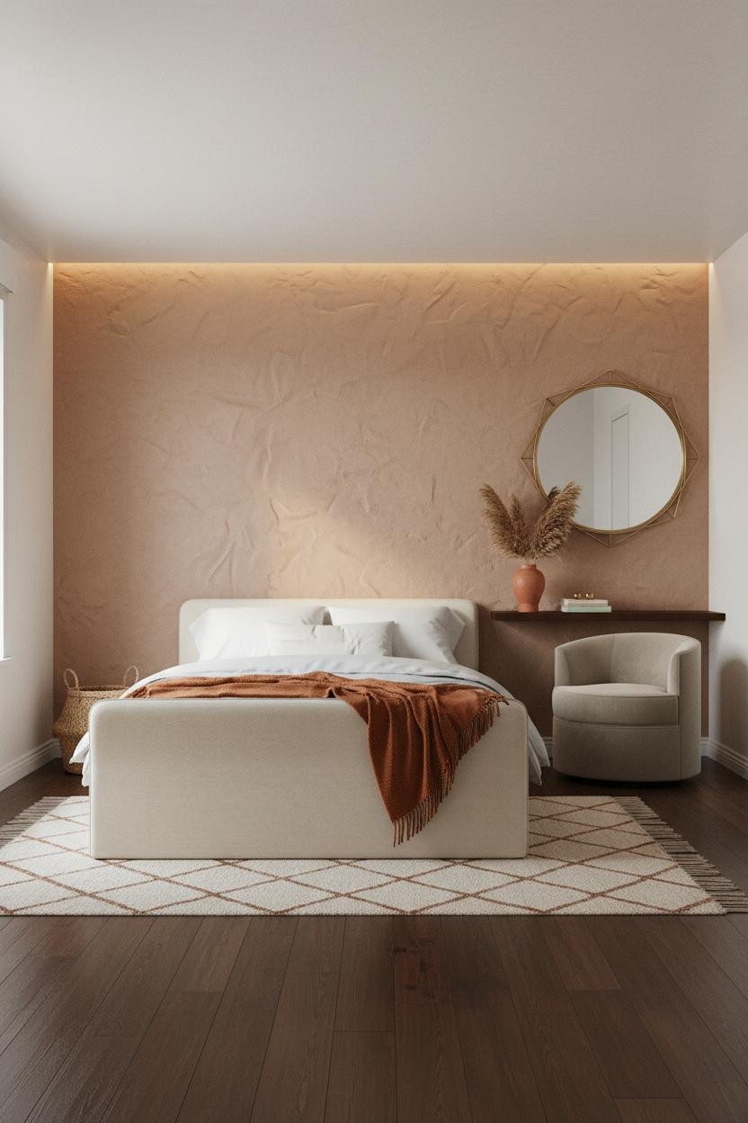
The Terracotta Plaster Alcove Teens Are Obsessing Over
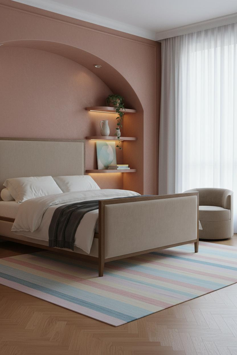
This one is divisive. But the people who go for it never look back.
What creates the mood: Hand-applied terracotta plaster inside a curved alcove holds warm light in a way that painted drywall simply can’t replicate. The texture is the whole trick.
Where to start: An ivory duvet with a charcoal throw keeps the earthy palette grounded. Don’t fight the warmth of the plaster with cool-toned bedding.
Forest Green Alcoves Are Having A Moment And I Get It
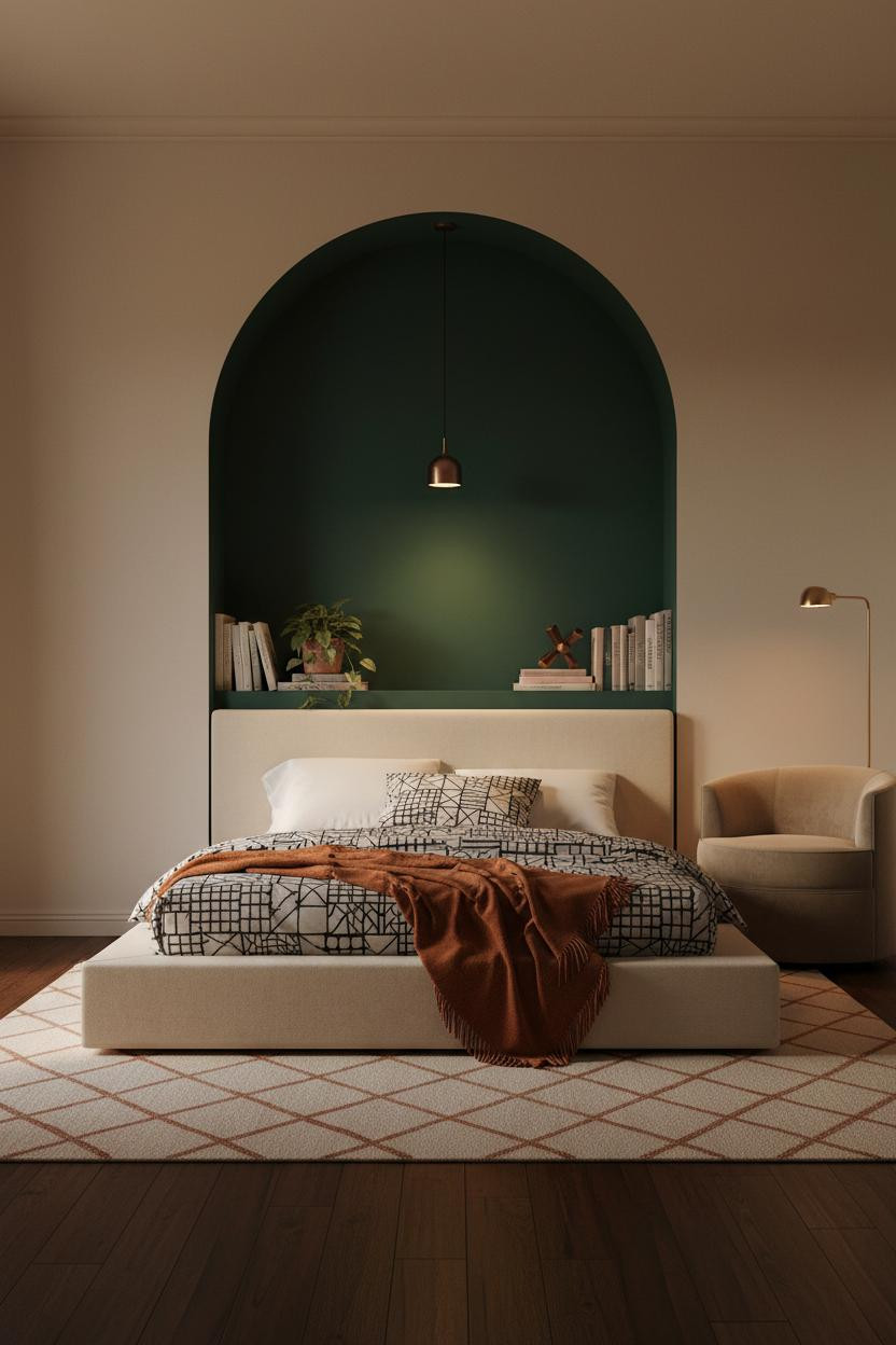

Deep forest green in a teen room sounds bold. It lands as intimate.
The real strength: The arched forest green alcove pools warm amber lamp light inside its curve, which makes the bed feel tucked-in rather than exposed. That sense of enclosure is why this works so well for cozy bedroom designs in small rooms.
A burnt orange mohair throw against a graphic black-and-white duvet is a color combination that’s harder to argue with than it should be. Moody but never cold.
Peachy Shiplap Proves Farmhouse Can Feel Fresh
Shiplap in a peachy-blush tone is not the farmhouse cliché you’re picturing. I promise.
Why it looks custom: Each plank edge catches side-rake natural light and creates a clean vertical line that makes the compact room feel taller. The color reads warm rather than pink because warm maple flooring underneath it pulls the whole palette toward amber.
One smart swap: Navy sateen bedding against a blush wall creates just enough contrast to keep the room from feeling like one uninterrupted soft tone.
Rattan And Wood Slats Together For A Boho Room That Isn’t Overdone
This is where boho gets edited down to the parts that actually work.
What carries the look: Thin shadow lines from the ivory vertical wood slats create dimensional rhythm on the feature wall, and the rattan hanging adds organic texture without competing. Together they do what a solid painted wall can’t: the room feels layered without being full.
Admittedly, dusky mauve-rose walls are a commitment. But paired with a jute rug and warm herringbone floors, the whole thing lands.
Warm Clay Plaster For The Botanical Room On Your Mood Board

The hand-applied warm clay plaster behind the bed is the detail that makes everything else in this room feel intentional. Not expensive. Just considered.
What makes this one different: Organic ridges in the plaster surface catch diffused light in a way that flat paint never does, giving the wall genuine depth rather than just color. And a geometric round mirror above the shelf keeps the look from tipping into purely earthy territory, in a way that feels balanced rather than forced.
Lavender Japandi Is A Combination I Didn’t Expect To Work
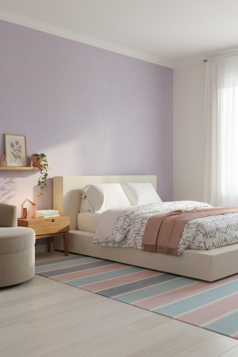
Somehow lavender and Japandi restraint make total sense together.
Why the palette works: The textured lavender wallpaper has just enough vertical rhythm to make a small room feel taller, while white-washed pine floors keep the palette cool without going cold. The look only works if you resist adding too many warm tones that would fight the lavender.
The smarter choice: A dusty rose mohair throw over a graphic black-and-white duvet gives the room its only real warmth, which is exactly enough.
Blush Board-And-Batten For The Girly Room That Doesn’t Apologize
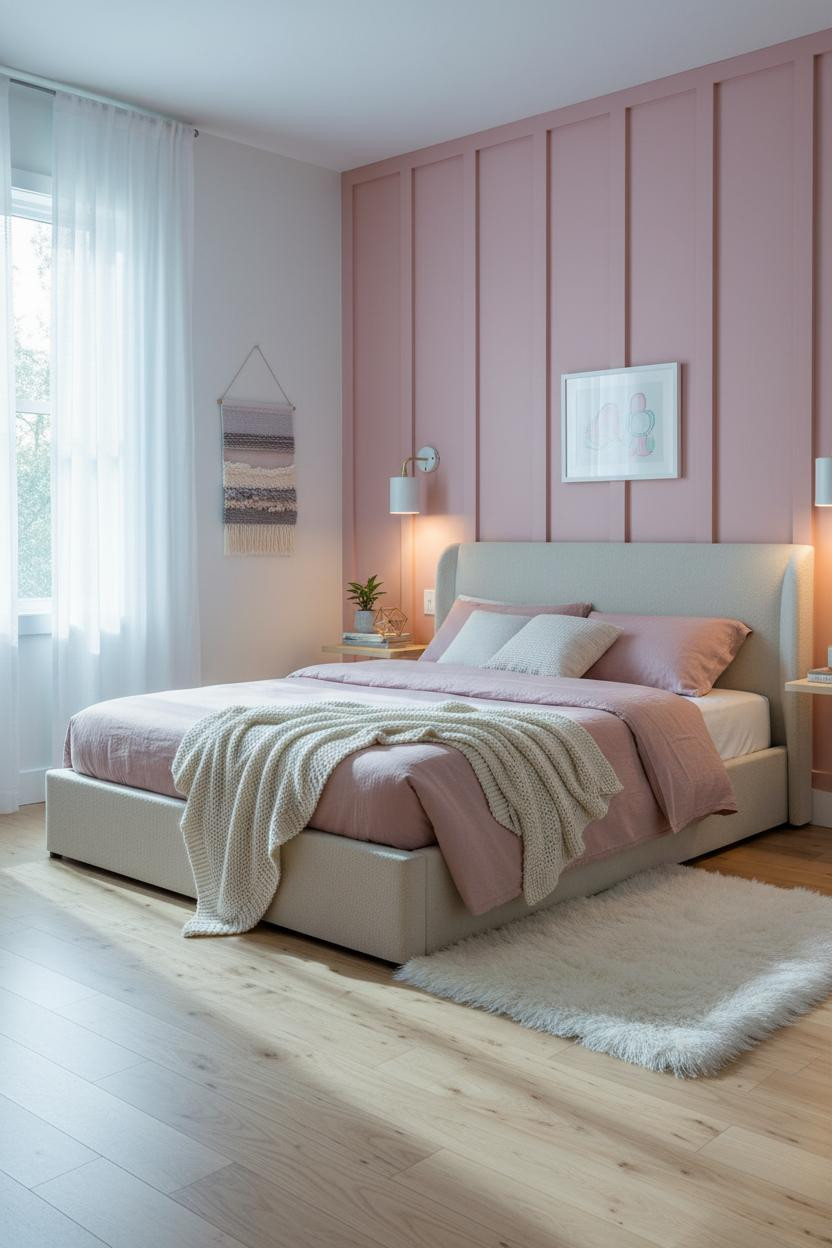
This is a girly room idea done with enough structure that it doesn’t feel juvenile.
Design logic: The raised white batten trim against blush creates a vertical grid that makes the room feel structured, not sweet. Without the battens, the same pink would read very differently.
Worth copying: A chunky cream knit throw over dusty pink linen bedding keeps the palette soft while still feeling intentional. Nothing too matchy.
Sage Green And Fairy Lights Is Still The Combination Everyone Saves
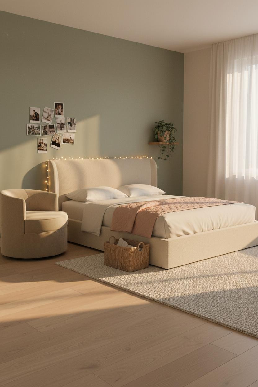
I’ve seen this combination a hundred times and it still works. Honestly, it probably always will.
What softens the room: The dusty sage matte wall makes the warm amber fairy light glow look deliberate rather than dorm-room, because the color is quiet enough to let the light be the detail. Paired with cream linen bedding, the room feels lived-in and intimate without trying.
The practical move: A polaroid collage pinned directly to the wall costs nothing and does more for the personal feel of a small room than most decor ever will.

Our #1 Pick
Saatva Classic Mattress
America’s best-selling online luxury innerspring. 365-night trial, lifetime warranty, free white glove delivery.
Shop Saatva Classic
The Foundation Of Every Beautiful Bedroom
Every room on this list has one thing in common: the bed is the anchor. Not the gallery wall, not the plaster niche. The bed.
The Saatva Classic is the one I’d put under all of it. The dual-coil support system holds up through the kind of sleep that teenagers actually get (which is a lot), and the organic cotton cover breathes instead of trapping heat. The Euro pillow top feels substantial without going soft in the wrong way.
Good design ages well because it’s made well. Start with the bed and the rest figures itself out.

The rooms people save are the ones where nothing looks accidental. But they always sleep on something that actually supports them.