The first thing you notice in the best French inspired bedroom is what’s missing. No matching sets. No theme-park Versailles. Just plaster, linen, and objects that look like they’ve always been there.
These 13 rooms are proof that the French bedroom aesthetic is less about buying the right things and more about editing the wrong ones out.
The Arched Doorway That Changes Everything About Scale
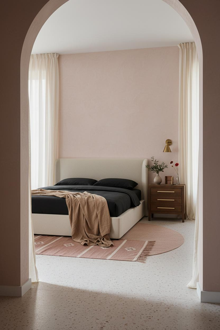


An arched doorway does something furniture can’t. It gives the room a reason to exist before you’ve put a single thing in it.
Why it holds together: The rounded timber frame with smooth plaster reveals draws the eye upward, which makes the whole room feel taller than it is.
The part to get right: Keep everything else low and quiet. The arch does the work. Let it.
Gallery Walls That Feel Found, Not Arranged
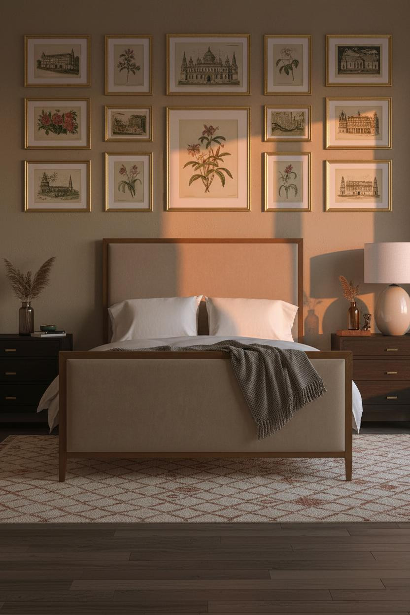

The secret to this one is the frame that’s tilted slightly off-level. On purpose? Maybe not. But that’s exactly the point.
Symmetrically hung gilt frames work because the hand-troweled plaster between them catches raking light, which keeps the wall from reading as flat or staged. The wall breathes.
Avoid this mistake: Don’t use identical frames at identical sizes. Mix botanical prints with architectural sketches, and let the spacing be almost-right rather than perfect.
Exposed Stone That Earns Its Place
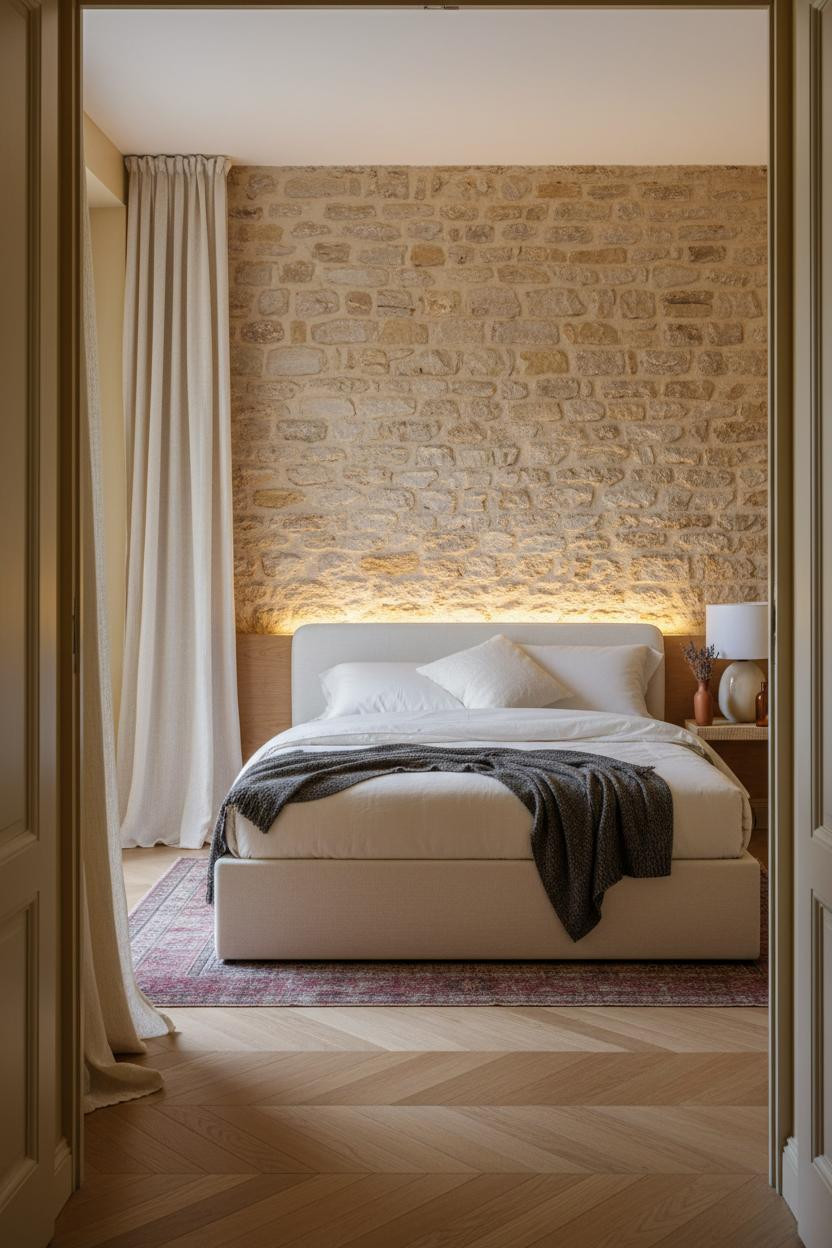

I keep coming back to this one. There’s something about a rough limestone wall that no paint color has ever replicated.
What gives it presence: Raking lamp light across pocked limestone blocks turns every mortar line into a shadow, which makes the wall feel three-dimensional rather than decorative.
The smarter choice: Pair it with ivory linen and a charcoal throw. Anything too polished next to raw stone looks like a mistake.
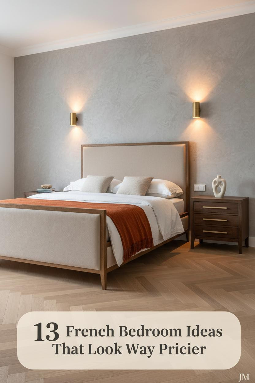
Board-and-Batten Done the Provençal Way


Bold choice. But when afternoon light hits aged ivory battens at a side angle, the fine parallel shadows they throw make the wall look like it cost twice what it did.
Why it looks custom: The vertical rhythm of floor-to-ceiling batten work draws the eye upward in a way that flat plaster simply doesn’t.
Don’t ruin it with: Cool-toned bedding. This wall needs warmth. A burnt orange mohair throw is the right counterpoint.
The Moody Parisian Room I’d Actually Sleep In
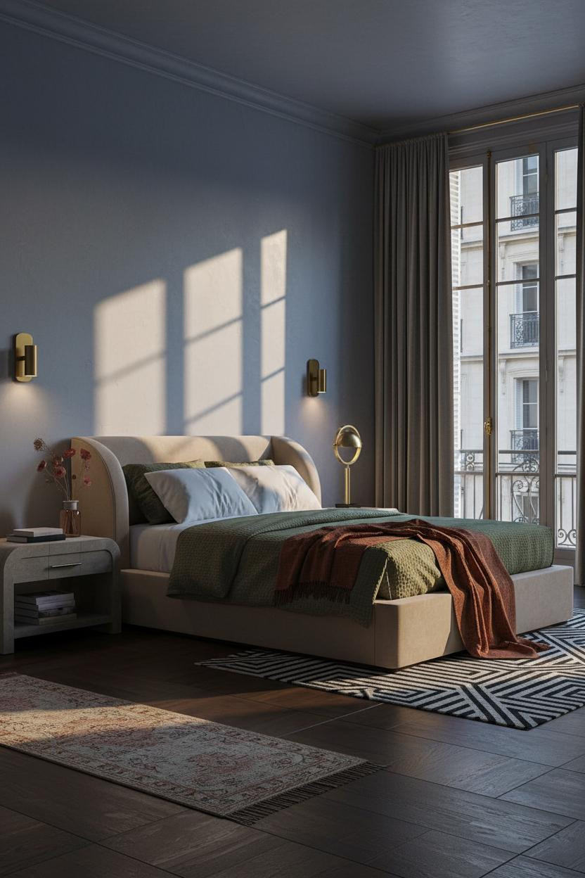


Muted indigo walls with hand-troweled plaster. Brass-framed French doors casting geometric shadows. The room feels like a Parisian apartment settling into night, calm and cohesive in a way that’s honestly hard to manufacture.
What creates the mood: Paired brass sconces at the headboard cast symmetrical amber pools, while the faint grid of the door frames adds structure to an otherwise soft palette. One material does both jobs.
Rustic Plaster That Makes the Room Feel Older Than It Is

Nothing precious. That’s the whole point of this kind of room.
What makes it work: Deep hand-scored striations in the raw limestone-grey plaster catch morning light across each groove, giving a surface that looks like it was made by someone’s hands rather than a roller.
Steal this move: A dusty pink linen duvet and a Moroccan rug in rust tones keep the rawness from reading too cold. Texture on texture, nothing too considered.
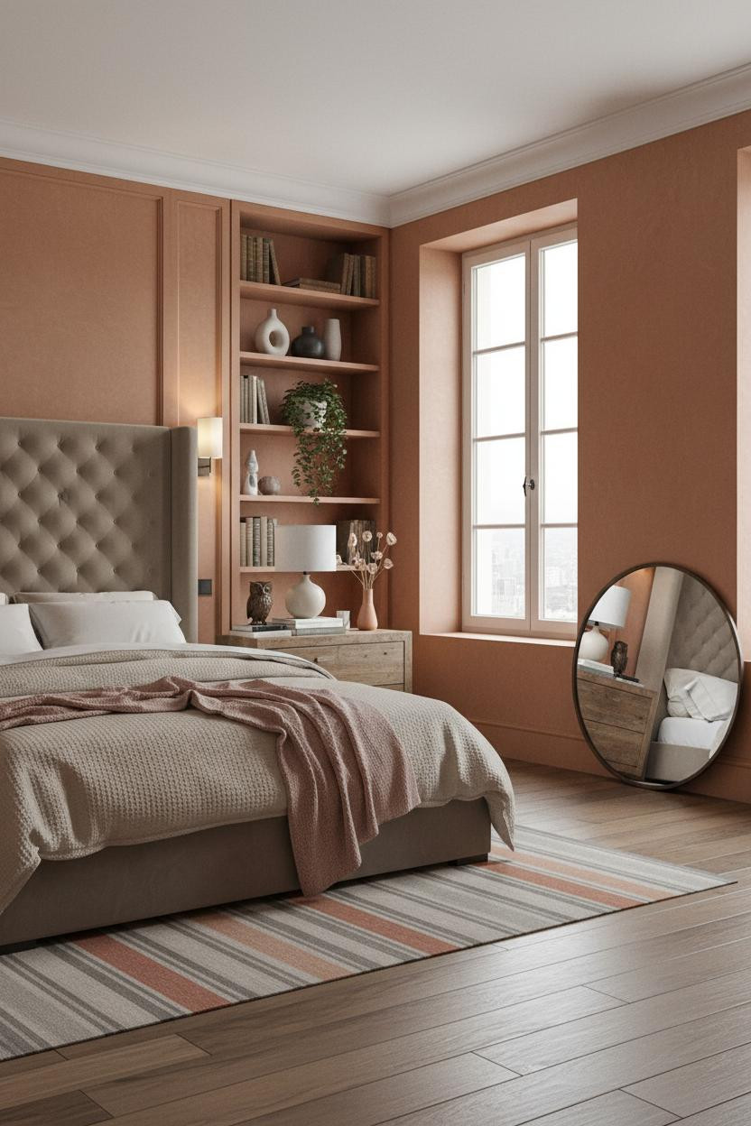
Built-In Shelving as the Room’s Quiet Centerpiece

I almost scrolled past this. Glad I didn’t.
The full-height shelving painted in deep warm ivory makes the architecture itself do the decorating. Leather spines, ceramic forms, a trailing fern. None of it matches. All of it works because the vertical lines pull the eye up to the cornice, where the room feels finished rather than filled.
Where to start: Paint your shelving the same color as the wall, just a half-shade warmer. The books and objects handle the rest.
Stone Grey Wainscoting Is Having a Moment
Admittedly, wainscoting can look stiff. But paneled stone grey frames with raised edges catching shadow at each corner feel earned rather than fussy, especially with warm clay walls above the rail.
Why it feels intentional: The contrast between cool grey below and warm clay above splits the wall horizontally, which grounds the room without shortening it.
The easy win: Navy sateen bedding plays against the cool paneling in a way that feels classic and a little unexpected. Don’t default to white here.
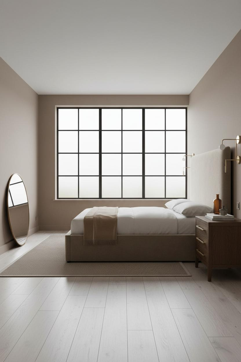
Dusty Rose Walls and the Sash Window Doing All the Work
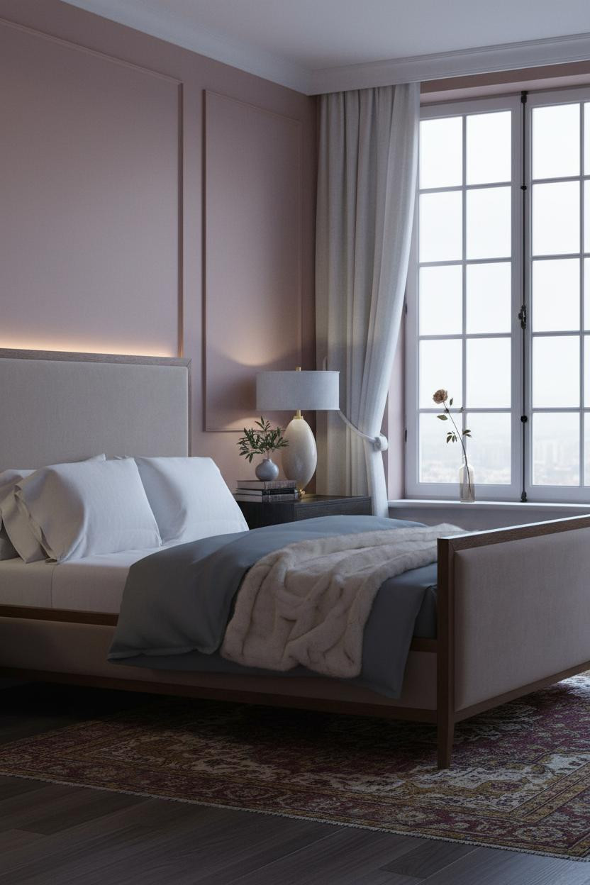
This room is softer than I’d usually go. But somehow it works.
The real strength: A twelve-pane sash window grid casts precise shadow lines across the dusty rose plaster, giving a wall with no architectural detail a quiet geometric rhythm it otherwise wouldn’t have.
What to borrow: Slate jersey bedding against a pink wall is the move. It grounds the room and keeps the rose from reading too sweet.
Why a Whitewashed Arch Beats a Feature Wall Every Time
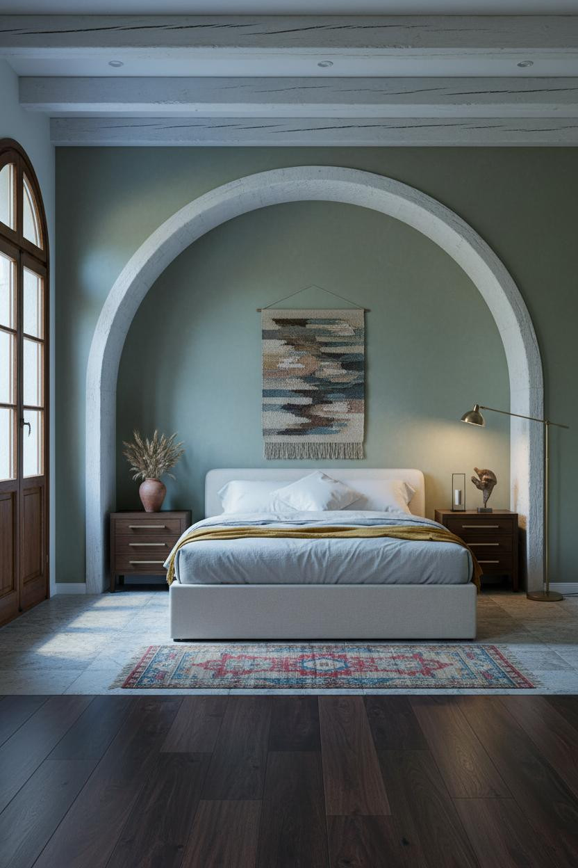
A floor-to-ceiling arched alcove with rough-hewn whitewashed beams curving overhead gives this room something a paint color never could. The arch’s shadow falls in a romantic crescent that changes with the light all day.
What carries the look: Sage green matte plaster walls frame the arch in a way that feels agricultural rather than precious, which is exactly the tone this kind of Provençal bedroom needs.
Pro move: A mustard wool blanket on stone-washed cotton bedding keeps the palette rooted and warm, while still feeling like it belongs to a room, not a catalog.
Crittall Windows and the Case for Restraint

Fair warning. This room looks understated at first. But I think that’s where it gets you.
Why it feels balanced: Slender black steel Crittall frames are a crisp contrast to the warm mushroom walls behind them, and that tension keeps the room from reading too soft or too industrial.
The common miss: Overloading this kind of room with accessories. A weathered bronze inkwell and a single amber glass bottle on the nightstand are genuinely enough.
Dove Grey Paneling With Light That Does the Heavy Lifting
The detail isn’t the color. It’s the light hitting the vertical dove grey slats at a side angle, each edge throwing a thin shadow line that gives the wall quiet rhythm without ornament.
Why it looks custom: Floor-to-ceiling paneling makes the ceiling feel higher. That’s the actual trick here, not the grey itself.
Worth copying: A burnt orange mohair throw against oatmeal cotton bedding brings the warmth this palette needs. Don’t go cool-toned in front of a grey wall.
The Ceiling Medallion Nobody Talks About Enough
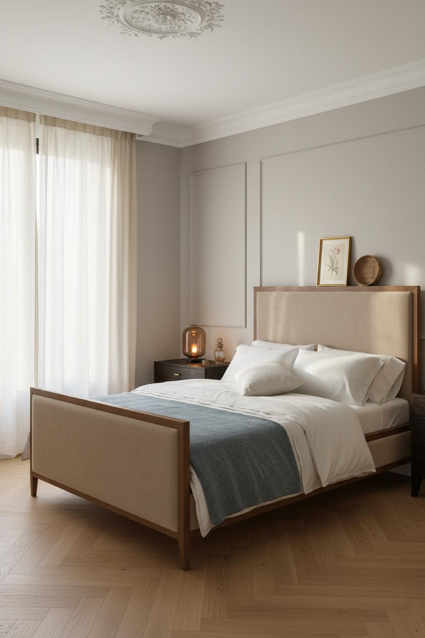
Most people paint the ceiling white and call it done. But a cream plaster ceiling medallion with classical relief texture is one of those details that you don’t consciously notice, and yet the room feels completely different without it.
Where the luxury comes from: The slim crown molding at the cornice reads as a refined architectural frame, anchoring the soft greige walls and light oak herringbone parquet into something that feels considered rather than assembled.
One smart swap: Replace a flush ceiling light with a pendant dropped from that medallion. The proportion changes the whole room’s mood.

Our #1 Pick
Saatva Classic Mattress
America’s best-selling online luxury innerspring. 365-night trial, lifetime warranty, free white glove delivery.
Shop Saatva Classic
The Foundation Of Every Beautiful Bedroom
Walls get repainted. Linen gets swapped out. The medallion stays, and so does the mattress. And honestly, that’s where most French bedroom rooms fall short: the bed looks beautiful and sleeps like an afterthought.
The Saatva Classic fixes that. Dual-coil support that holds its shape year after year, a breathable organic cotton cover that doesn’t trap heat on warm nights, and a Euro pillow top that’s soft in the way a good hotel bed is soft. Structured, not squishy.
The rooms worth saving are the ones where nothing looks accidental. Start with what you sleep on. The rest figures itself out.

Good design ages well because it’s made well. The effect is subtle in a French classic bedroom, but you feel it the moment you walk in, and again every single morning when you wake up in a bed that actually earns its place in the room.