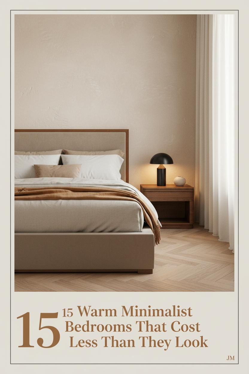
The first thing you notice in the best warm minimalist bedroom isn’t what’s there. It’s what isn’t. No clutter. No obvious effort. Just a room that feels like someone actually chose every piece on purpose.
These 15 rooms prove that minimalist doesn’t mean cold. Earthy tones, honest materials, and a little restraint go further than a full renovation.
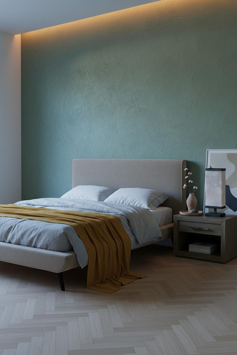
The Sage Wall That Makes Everything Else Click
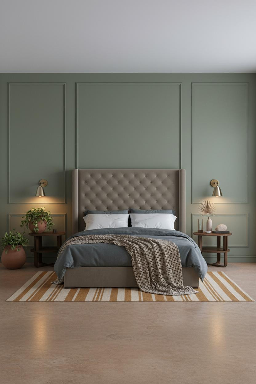


I keep coming back to this one. The whole room settles around that single wall color in a way that feels almost effortless.
Why it works: The matte board-and-batten in sage olive gives the eye a place to land, so the polished concrete floor and ochre runner don’t compete. They complete.
Steal this move: Pair a green-leaning wall with warm amber accents on the nightstand. The contrast grounds the palette without tipping into earthy overload.
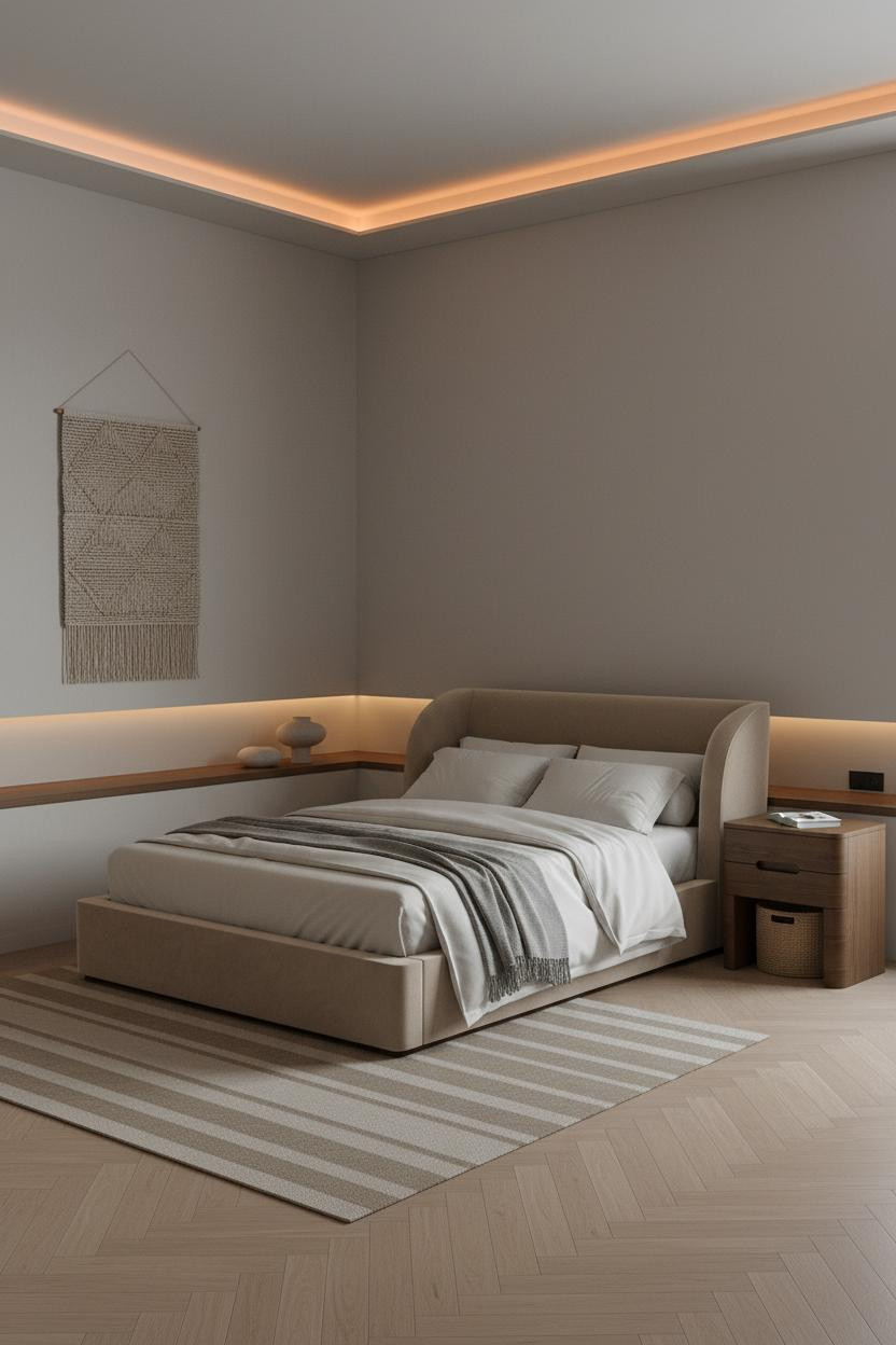
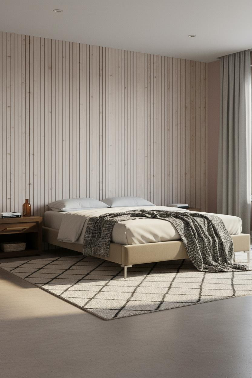
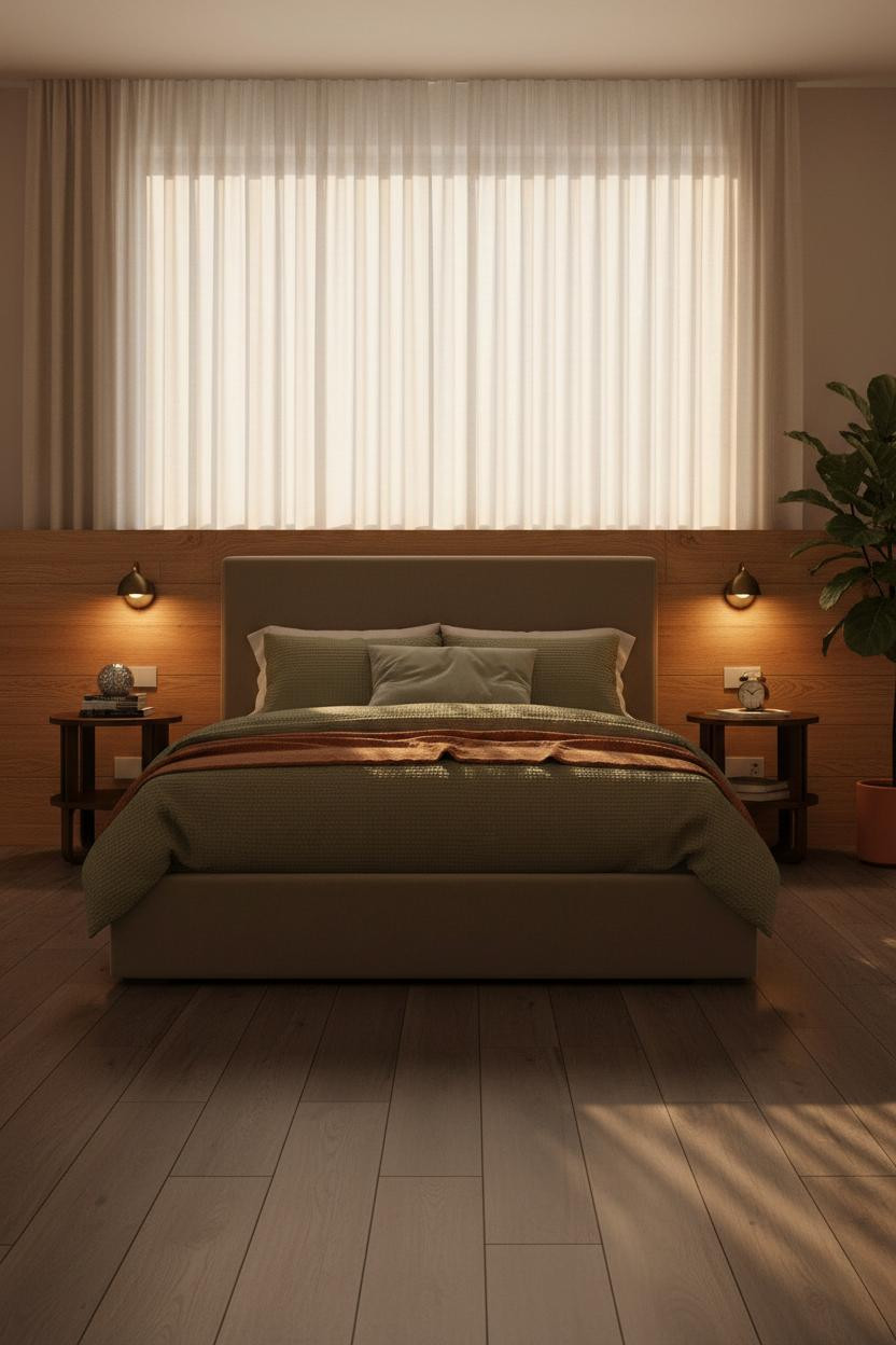
When Plaster Walls Do All The Work
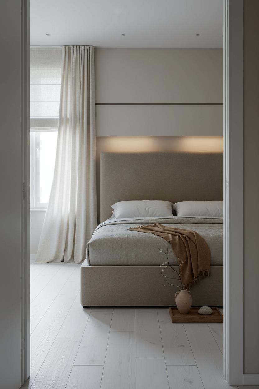

Nothing fancy. That’s the point.
Smooth pale sand plaster and floor-to-ceiling linen curtains pooling slightly at the base. The room feels lived-in and intimate because nothing in it is trying too hard.
The real strength: That recessed shadow line above the headboard does more architectural work than a piece of art ever could. It costs almost nothing to replicate. Pro move: Keep the bedding warm grey and let the caramel wool throw carry all the color.
This Gallery Wall Approach Changed How I Think About Art
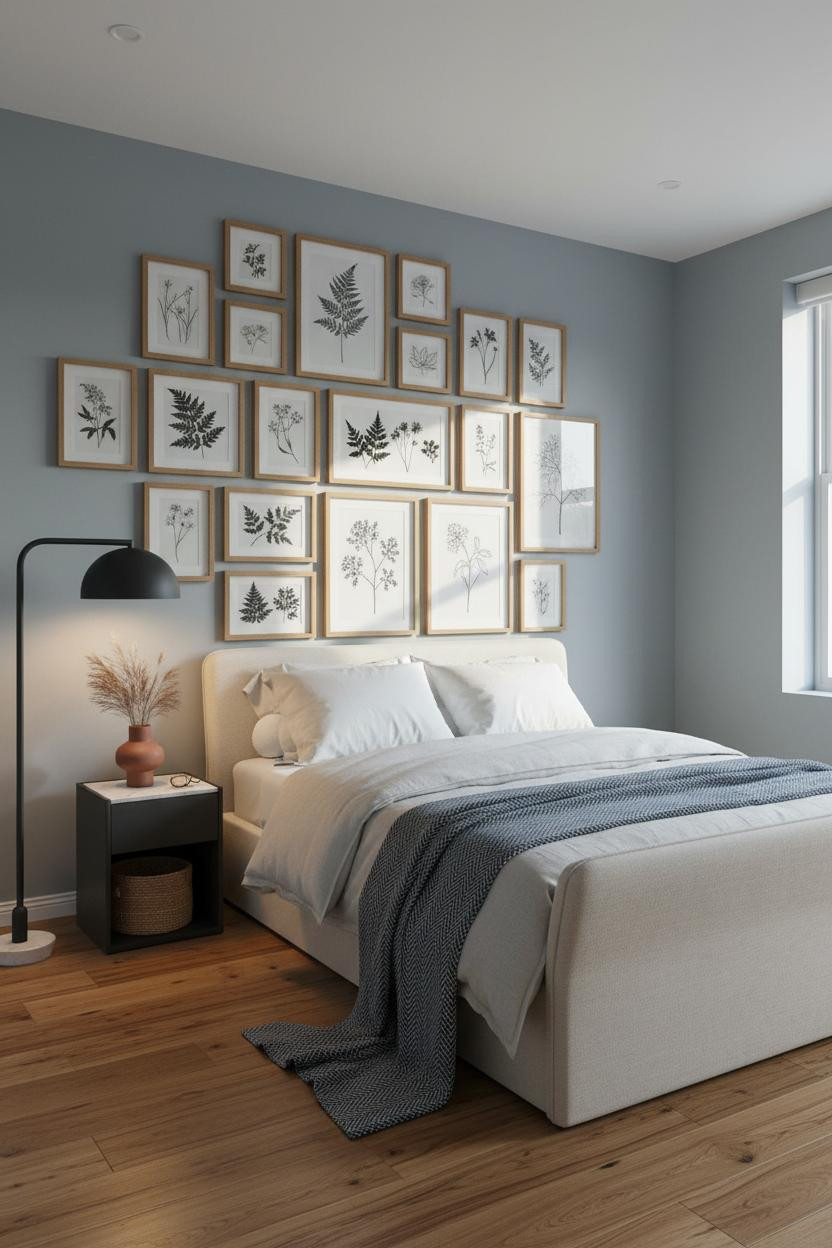

Most gallery walls feel chaotic. This one somehow feels calm, and I think I finally understand why.
Why it looks custom: Slim natural oak frames in varying sizes keep the whole wall feeling collected rather than assembled. The matching wood tones across frames and floor pull everything into one quiet language.
What to borrow: Stick to pressed botanicals and simple line drawings. Anything busier and the wall fights the room instead of anchoring it.
A Linen Wall Hanging That Earns Its Place

Textile walls are divisive. But when the fabric is right, they add something paint never could.
A floor-to-ceiling cream woven linen hanging catches raking afternoon light across every vertical thread, making the wall feel like it has actual depth. That’s what separates it from a tapestry that just fills space.
The smarter choice: Use undyed or natural-toned fabric so the wall reads warm without pulling the eye away from the bed.
Half-Height Wainscoting With a Lot to Say


This one is underrated. The wainscoting rail running wall to wall does something a single paint color can’t: it gives the room a horizontal anchor without touching a single piece of furniture.
Design logic: Warm sand beige above the rail, bare plaster below. The pale birch herringbone floor picks up the light tone from above, while the plaster keeps the base grounded.
Avoid this mistake: Don’t fill the nightstand with too many objects. One clay vessel, one smooth stone. That’s enough.
Oak Slats Are Having a Moment For Good Reason
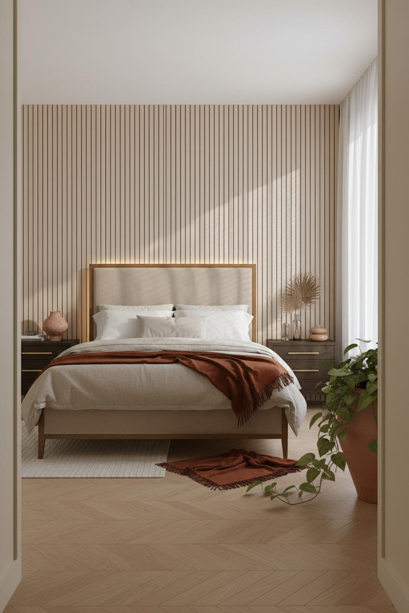


I was skeptical about slatted walls for a while. Too trend-forward, I thought. But this room changed my mind.
Why the materials matter: Pale raw oak slats catch even flat grey light across their grain, creating hairline shadow lines that add rhythm in a way painted walls physically can’t. The honey herringbone floor echoes the same warm wood tone so nothing fights.
One smart swap: The deep rust throw against oatmeal linen bedding is the move. Skip anything cooler and the room loses its warmth.
Moss Green Plaster Is the Earthy Wall Color I Didn’t Expect to Love


Bold choice. Not for everyone. But the payoff is real.
What creates the mood: Hand-troweled moss green plaster catches raking morning light across shallow ridges in a way smooth paint never would. It’s alive in a quiet, organic sense. And the mustard wool blanket at the foot keeps the whole palette feeling warm rather than cool.
Worth copying: Lean an oversized abstract canvas against the wall instead of hanging it. Feels more intentional, less decorated.
The Built-In Shelf That Makes Bare Walls Look Considered

Having a low walnut shelf inset at headboard height changes how you actually interact with the wall. It’s functional and architectural at once.
What gives it presence: The shelf’s warm grain casts a clean horizontal shadow line against the soft camel plaster behind it, while the warm honey oak herringbone floor below echoes the same timber tone. Cause and effect: one shelf, two materials in conversation.
The finishing layer: Add a single pottery vessel and a pale river stone on the shelf surface. Nothing more.
Rattan Panels Are Doing More Than You Think

A full-width woven rattan wall panel sounds like it should feel heavy. It doesn’t. The natural weave pulls warmth into the room while still feeling open and airy.
The dark walnut floor below would feel oppressive against a plain wall. But pair it with raw rattan overhead and the contrast is immediate. Earthy + dark = grounded, not heavy. That’s the logic here.
Don’t ruin it with: Overhead lighting. A bedside sconce at low height keeps the warmth pooled where you want it.
Pale Birch Herringbone on the Wall Is a Quieter Statement Than You’d Think

The reason this feels calm instead of busy is the color choice. Pale birch herringbone in a light tone reads almost like texture from a distance. Bold up close. Quiet at thumbnail.
Why it feels balanced: The dusty rose side walls soften what could feel like a sharp wood feature, while the pale warm concrete floor keeps the whole composition grounded. It’s a small tonal move with a big payoff.
The easy win: Drape a kilim runner across the foot of the bed for a graphic contrast that doesn’t repeat the wall’s pattern.
Stone Grey Shiplap Earns Its Reputation

Admittedly, shiplap has been overdone. But painted matte stone grey floor to ceiling (not the white barn version) is a completely different thing.
What carries the look: The ridged shiplap texture catches side-raking light to create just enough shadow rhythm, while the dark walnut wide-plank floor anchors the cool grey without pulling the room cold. The burnt orange mohair throw does the rest.
Where people go wrong: Painting shiplap white in a bedroom this direction. It flattens everything the texture is trying to do.
An Arched Niche That Makes the Whole Room Feel Older Than It Is
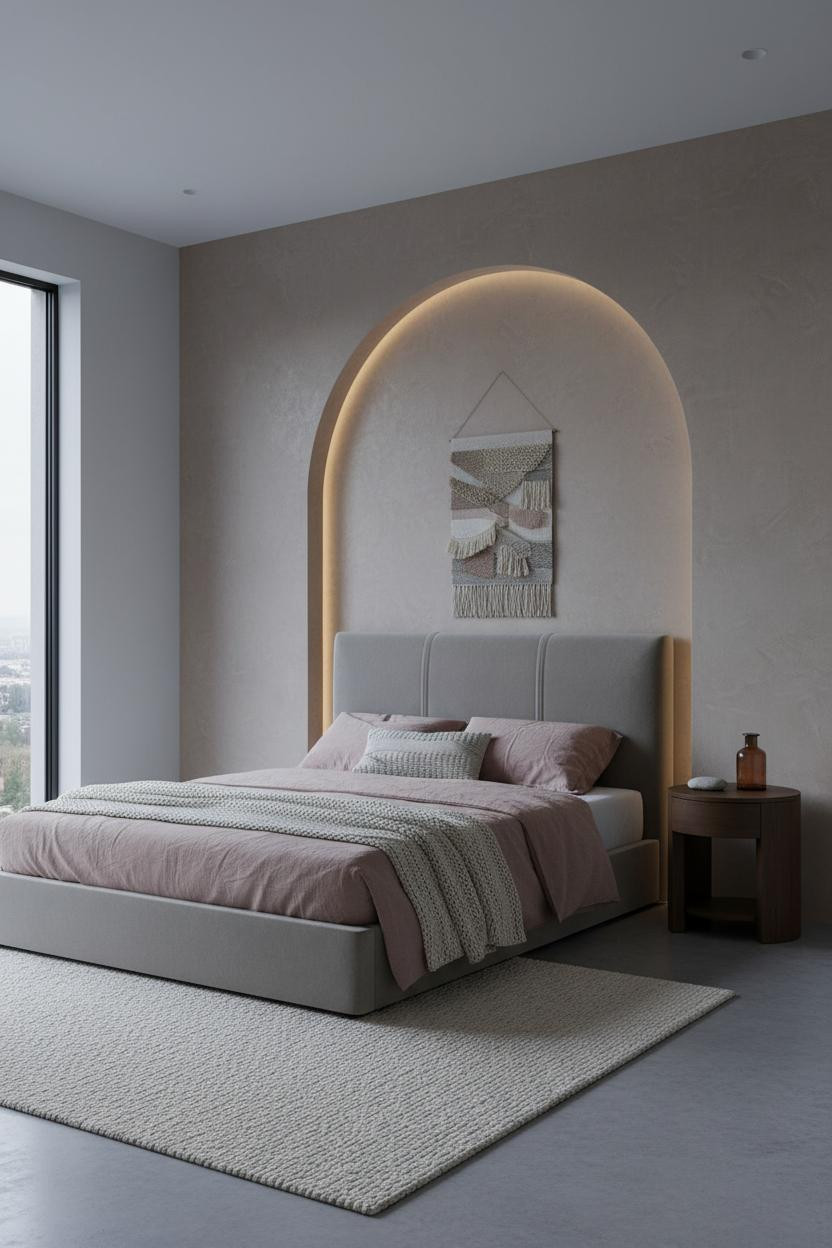

I almost scrolled past this one. Glad I didn’t.
What gives it depth: A shallow arched niche in fine sand-grain plaster catches soft raking light along its curved edge, framing the headboard with architectural warmth that flat walls simply can’t replicate.
The dusty pink linen bedding against warm taupe stone walls keeps the room feeling soft rather than stark. Ideal if you want architectural character without a full renovation.
Dove Grey Board-and-Batten Is Warmer Than It Sounds
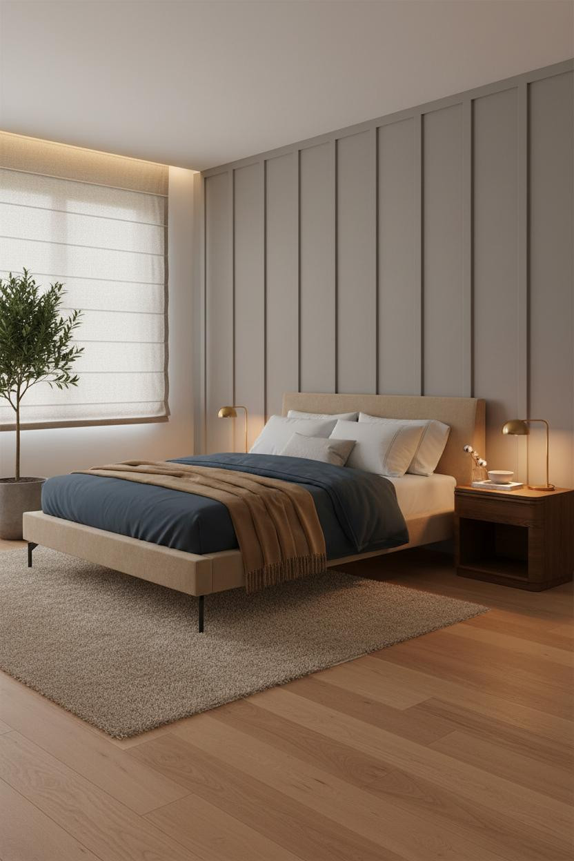

Fair warning: dove grey sounds cold on paper. In person, especially with warm maple flooring and a bedside lamp running amber, this room feels like the coziest thing you’ve seen all week.
Why it feels intentional: Each vertical batten casts a thin shadow line that draws the eye upward and adds rhythm without ornament. The camel wool throw at the foot keeps everything from leaning too spare.
In a minimal cozy bedroom, this is the combination I’d actually recommend first. The practical move: Keep the nightstand tray to one small ceramic bowl and one dried stem. No more.
Horizontal Oak Paneling At Headboard Height Hits Different

This one surprised me. Horizontal paneling could easily feel like a corporate conference room. Here it doesn’t, and the reason is scale.
What makes this one different: Full-width horizontal oak boards at headboard height anchor the bed without filling the whole wall, letting the warm clay flanking walls carry the color. The olive waffle-weave bedding with a rust linen throw ties the wood and wall tones together in a way that feels natural, while still feeling grounded.
Paired sconces on either side of the paneling beat a single overhead fixture every time. The key piece: The floor-to-ceiling linen curtains. Don’t skip them.
A Floating Walnut Shelf That Proves Less Is Genuinely More

Three objects on a floating walnut shelf. That’s it. And somehow the wall feels more considered than rooms with a dozen things on it.
Why it holds together: The shelf’s natural grain catches warm morning light in a way that makes even a simple terracotta vase look like a deliberate choice. The warm greige walls behind it keep the walnut from reading too dark, while the steel blue herringbone throw at the foot adds the only cool contrast in the room. One tone, two textures, clean result.
What to copy first: Mount the shelf at eye level above the nightstand, not above the headboard. It should feel reachable.

Our #1 Pick
Saatva Classic Mattress
America’s best-selling online luxury innerspring. 365-night trial, lifetime warranty, free white glove delivery.
Shop Saatva Classic
The Foundation Of Every Beautiful Bedroom
Walls get repainted. Linen gets swapped out. The mattress stays. And in a warm minimalist bedroom where everything else is stripped back, what you sleep on matters more than it does in a room full of distractions.
The Saatva Classic is what I’d put under all of this. Dual-coil support that holds up year after year, a breathable organic cotton cover that doesn’t trap heat, and a Euro pillow top that feels genuinely soft without losing structure underneath.
Good design ages well because it’s made well. Start with the bed. The rest figures itself out.

The rooms worth saving are the ones where every choice feels like it was made once, on purpose, and left alone. These 15 rooms nail that. And now you know exactly how they do it.