Think your apartment is too small to feel like a real home? Mini studio apartment ideas prove otherwise, every time. The best ones don’t hide the size. They work with it.
These 13 rooms are proof that a tight footprint can still feel warm, considered, and genuinely livable.
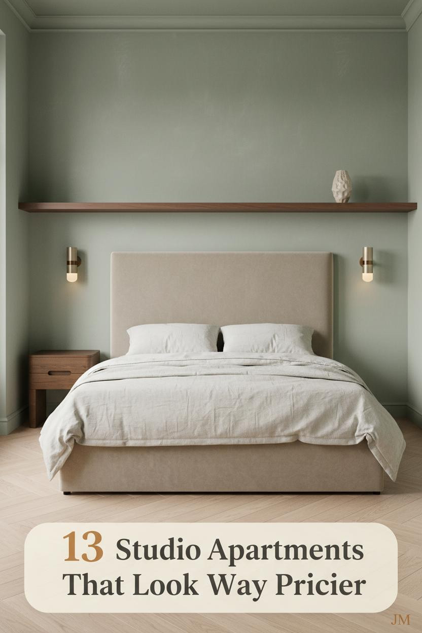
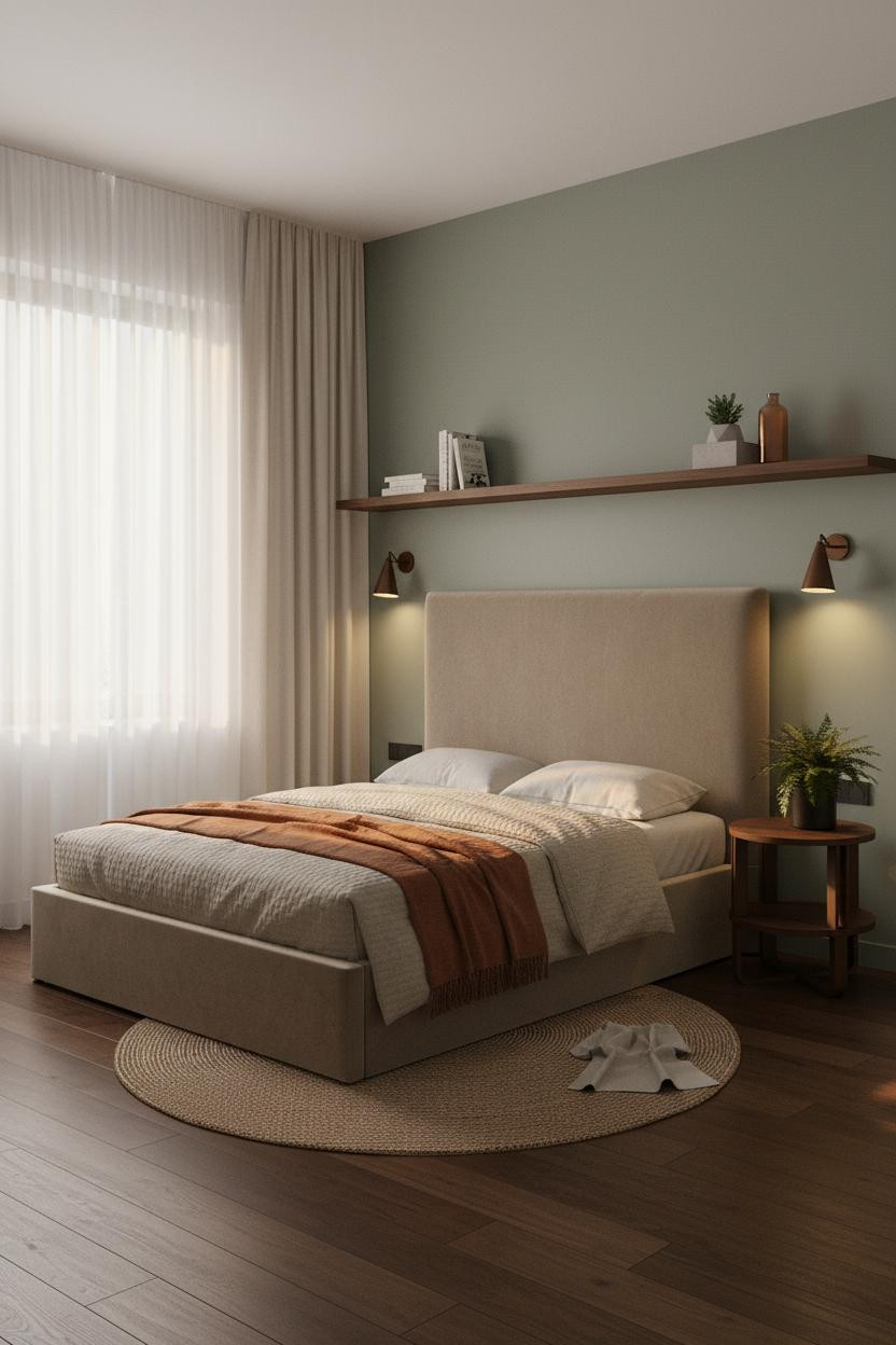
The Japandi Studio That Gets Calm Right

I keep coming back to this one. The room feels calm in a way that takes actual restraint to pull off.
Why it holds together: A full-width dark walnut shelf spanning the moss green wall gives the eye one place to land, which helps balance the compact floor plan without carving it up.
Steal this move: Pair a warm wood horizontal line with a muted green wall and let everything else stay neutral. The kilim runner does the rest.
Built-In Shelving That Earns Its Square Footage


Honest opinion: floor-to-ceiling shelving in a micro studio can go very wrong. This one doesn’t.
The matte white built-in bookshelf wall adds density without crowding, because the staggered shelf heights keep it from reading as a solid block. And the pale birch herringbone floor opens the room right back up.
The smarter choice: Irregular shelf heights do more visual work than a perfectly even grid. Stagger them and the wall feels architectural, not storage-focused.
A Boho Bedroom That Doesn’t Try Too Hard
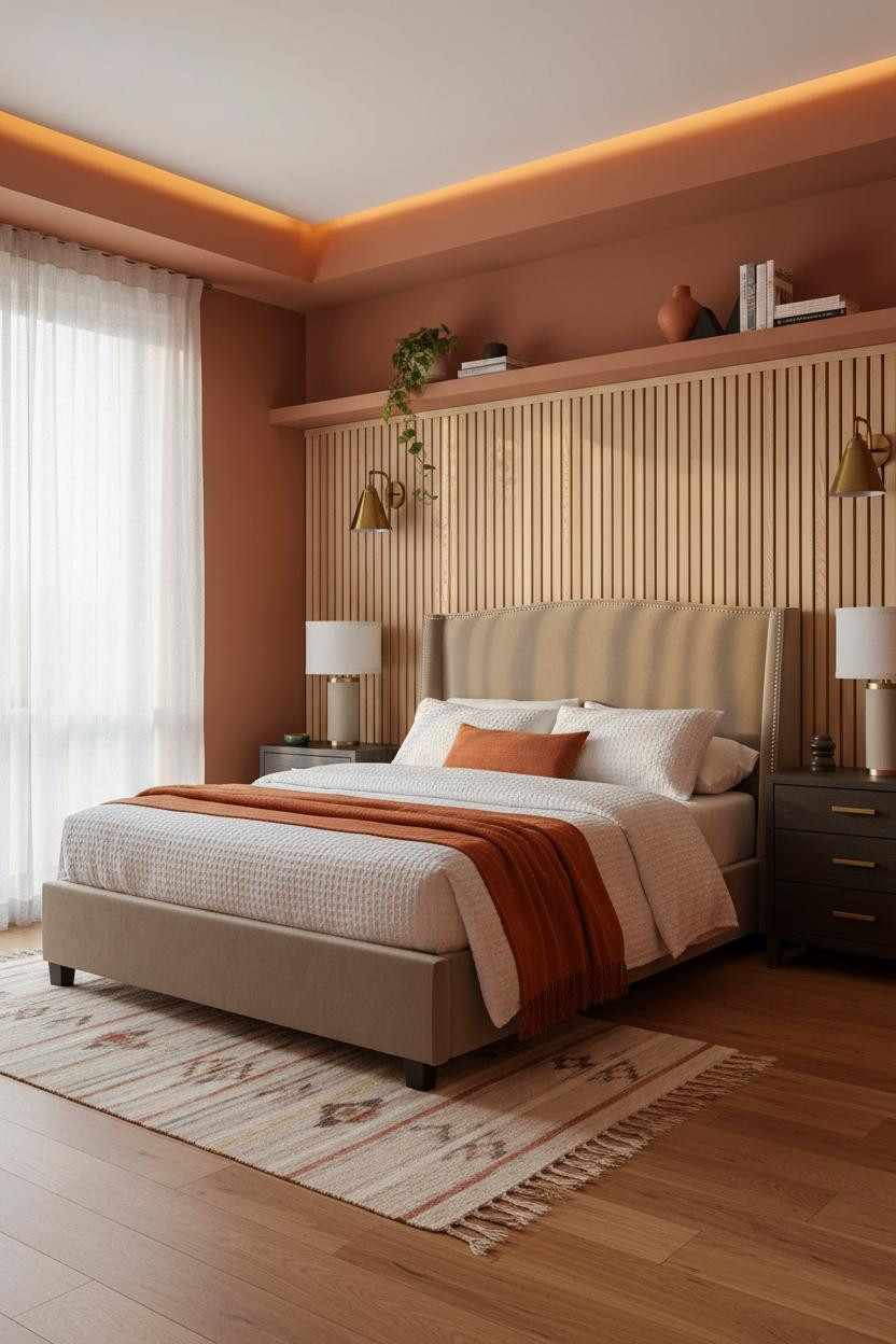
Boho done badly looks cluttered. This is what it looks like done right, in about 250 square feet.
What gives it depth: The slatted natural pine wall panel behind the bed casts thin shadow lines as the light shifts, so the room feels textured rather than flat throughout the day.
Worth copying: Terracotta walls plus warm pine plus a cream kilim runner is a combination that’s hard to get wrong. Keep everything else simple.
Textured Plaster That Makes a Studio Feel Expensive


This one surprised me. Hand-troweled plaster in a micro studio shouldn’t work. But it does.
The visible blade marks in the mushroom matte plaster catch light differently at every hour, which means the room feels alive without a single decorative object doing the heavy lifting.
The easy win: Layer a stone-washed linen duvet against raw plaster and the pairing reads as genuinely curated. Skip anything too polished.
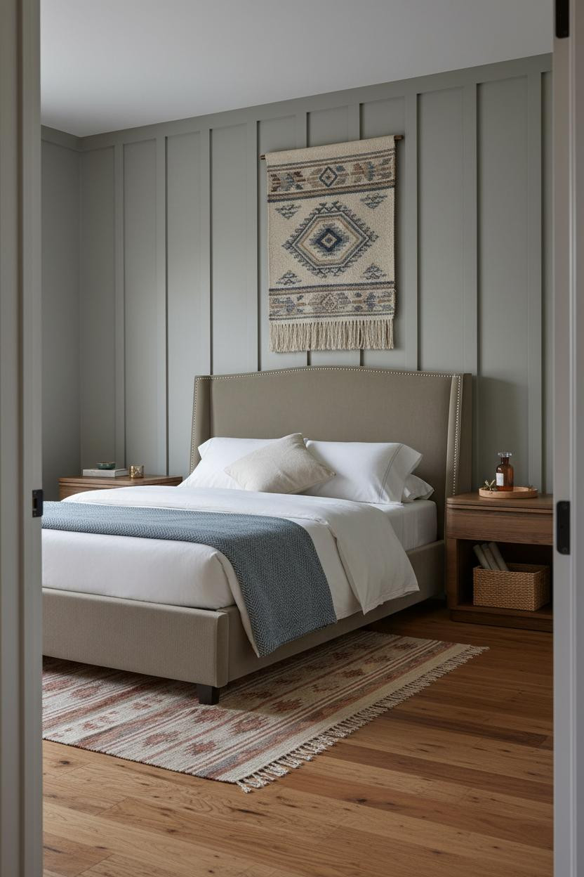
Wainscoting That Doubles As Display Space
Having architectural detail in a small room changes how deliberate the whole thing feels (even when the budget doesn’t match the ambition).
What makes this work: Half-height honey wood wainscoting with a slim shelf rail gives you display space and a strong graphic band without pushing the ceiling down visually. The terrazzo floor holds its own against it.
Pro move: Use the shelf rail for two or three objects only. More than that and the architecture disappears.
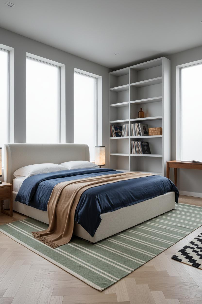
Floating Shelves That Actually Pull Off Multipurpose Living
In a studio where sleeping and working share the same wall, the layout has to be decisive or it falls apart.
A light oak floating shelf with an integrated task strip solves the desk zone without sacrificing floor space, while still feeling warm enough that the room doesn’t read as an office.
One smart swap: Warm clay walls behind a light wood shelf keep the work zone from feeling clinical. The mustard wool throw at the foot of the bed seals it.
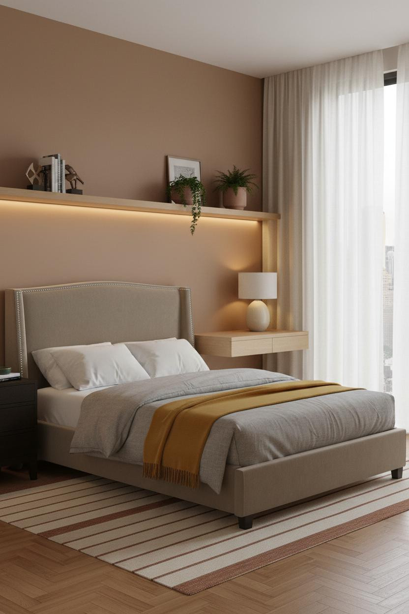
The Farmhouse Wall Treatment That Punches Up

Nothing fancy. That’s the point.
But the board-and-batten wall in muted khaki does something flat paint never could. Each vertical plank edge catches the side-rake light and throws a hairline shadow, which creates quiet rhythm across the whole sleeping zone. The room feels intentional rather than spare.
Avoid this mistake: Don’t paint the batten wall the same tone as the remaining walls. The contrast is what makes the architecture read. Even two shades is enough.
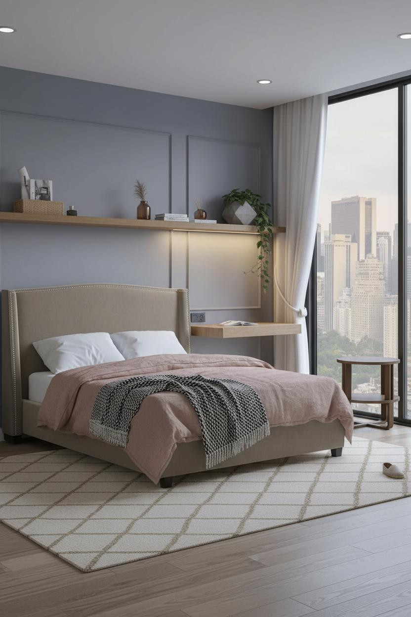
Slate Blue Walls With a Shelf That Holds the Room Together
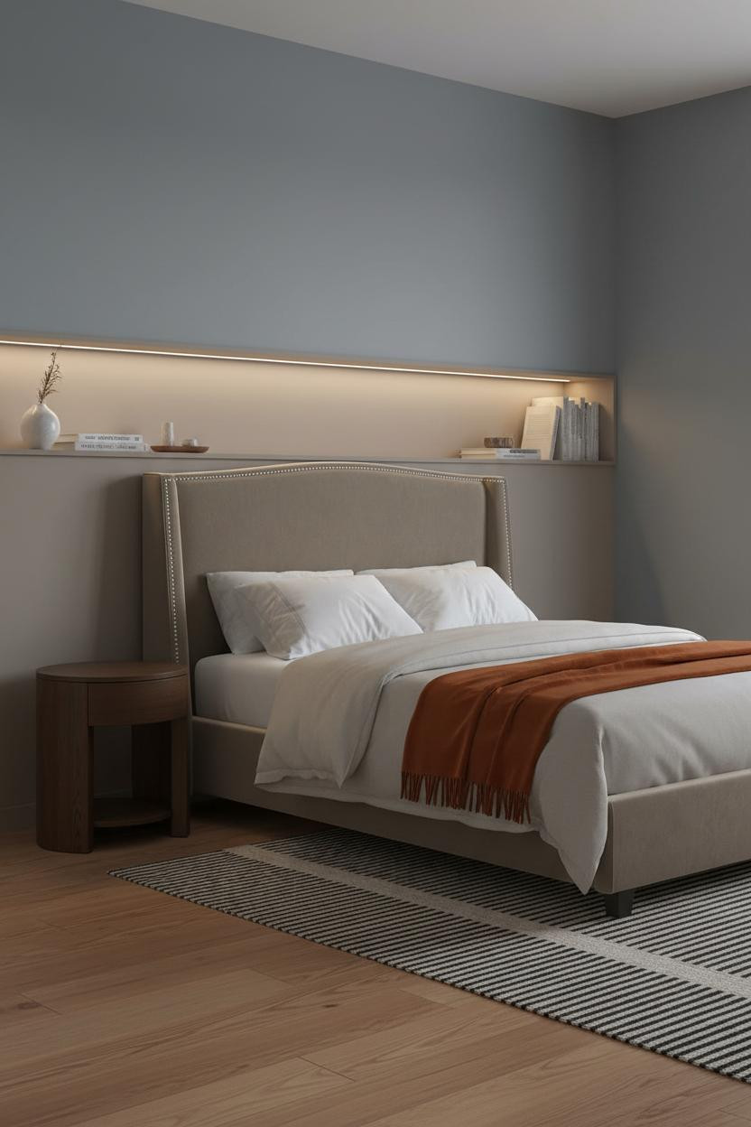

I almost dismissed the slate blue walls here as too moody for such a tight space. Honestly, it’s the thing that makes the room feel intentional rather than accidental.
The real strength: A recessed light oak shelf spanning the full width above the headboard anchors the room horizontally, so the dark walls read as cozy rather than closing in. The LED strip pooling across the shelf surface helps too.
Place four or five objects on the shelf, not eight. Restraint is the whole trick here.
I’d Copy This Coastal Layout in a Weekend

The reason this feels like a real apartment and not a staged box is the floating oak desk shelf at shoulder height. It gives the sleeping zone a reason to end and the work zone a reason to begin, in a way that feels natural rather than forced.
What to copy first: Muted blue-grey walls plus bleached oak flooring plus a dusty pink linen duvet. That palette combination is forgiving and somehow always looks put-together.
Deep Olive Japandi With a Layout That Breathes
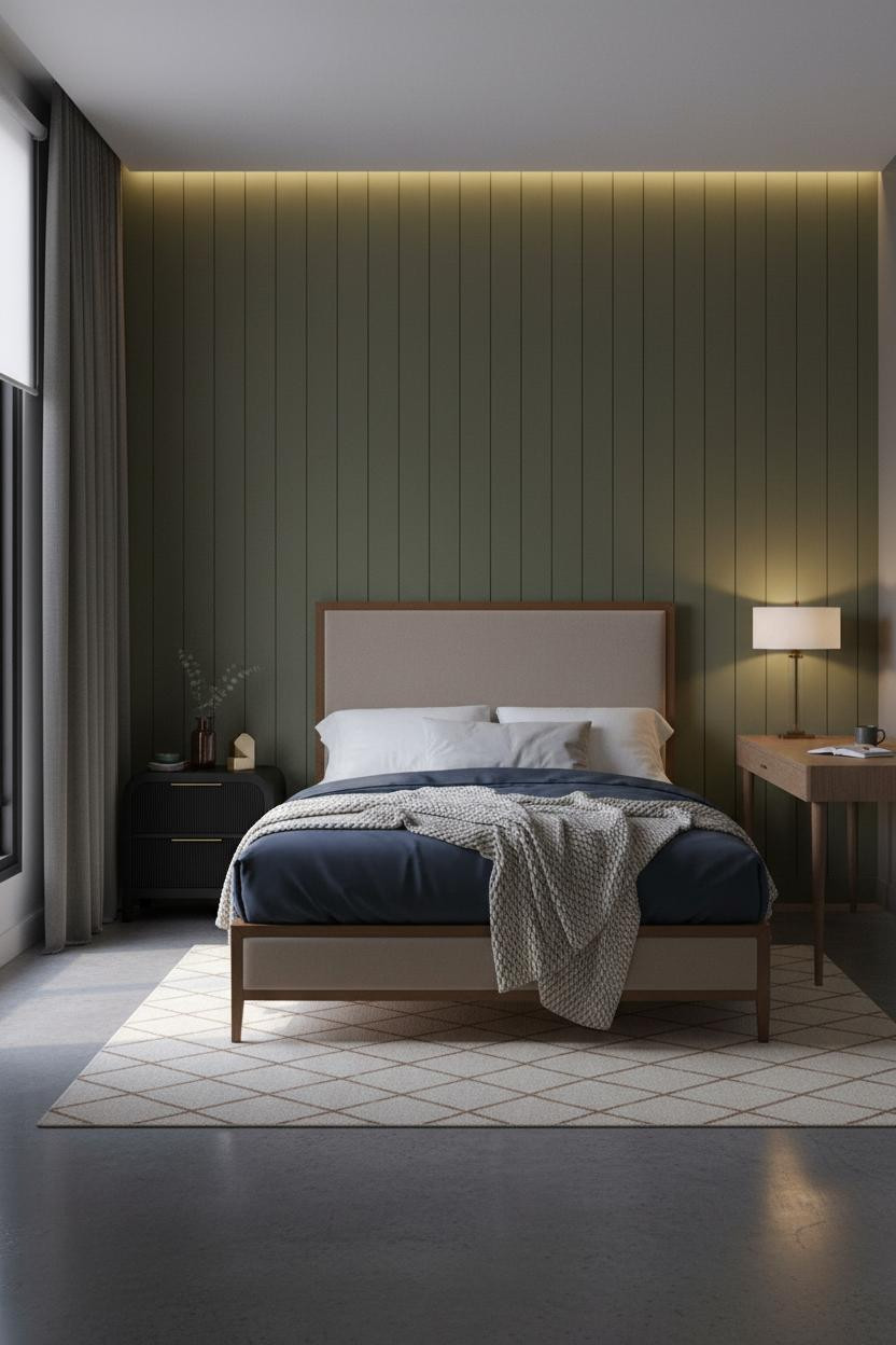

This is a divisive palette. But for the right person, it’s exactly right.
Why the palette works: Deep olive board-and-batten against charcoal walls sounds heavy on paper. The polished concrete floor and the cream clay rug keep it grounded, while the cove lighting at evening makes the whole room feel warm rather than closed off.
Where to start: Commit to the olive wall fully. A single feature wall of this color is more powerful than four lighter walls trying to split the difference.
Dusty Rose Walls That Work Harder Than They Look
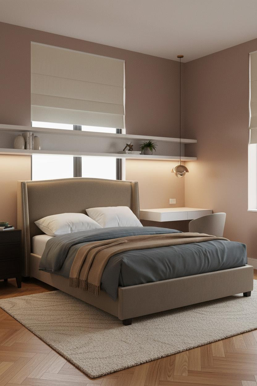
Admittedly, dusty rose walls sound like a risk in a compact studio. But this room feels warm and collected from the doorway, which is exactly what small spaces need to do immediately.
Design logic: Matte white floating shelves against a warm pink wall read as crisp, not sterile, because the herringbone parquet floor connects the two tones. And the camel throw at the foot ties it all back to warm.
The detail to keep: A sculptural pendant above the desk zone keeps the eye moving upward. That vertical movement is what stops a low-ceilinged studio from feeling compressed.
A Sage Bedroom That Feels Bigger With One Shelf

Simple. And the simplicity is exactly why it works.
The natural walnut floating shelf spanning the full width above the bed turns what could be dead wall space into a strong horizontal anchor, especially with the soft sage wall behind it. Paired sconces frame both the shelf and the bed zone in one move.
What not to do: Don’t crowd the shelf. Three objects with breathing room between them reads as intentional. Six reads as storage.
Scandi Light That Makes 300 Square Feet Feel Like 500
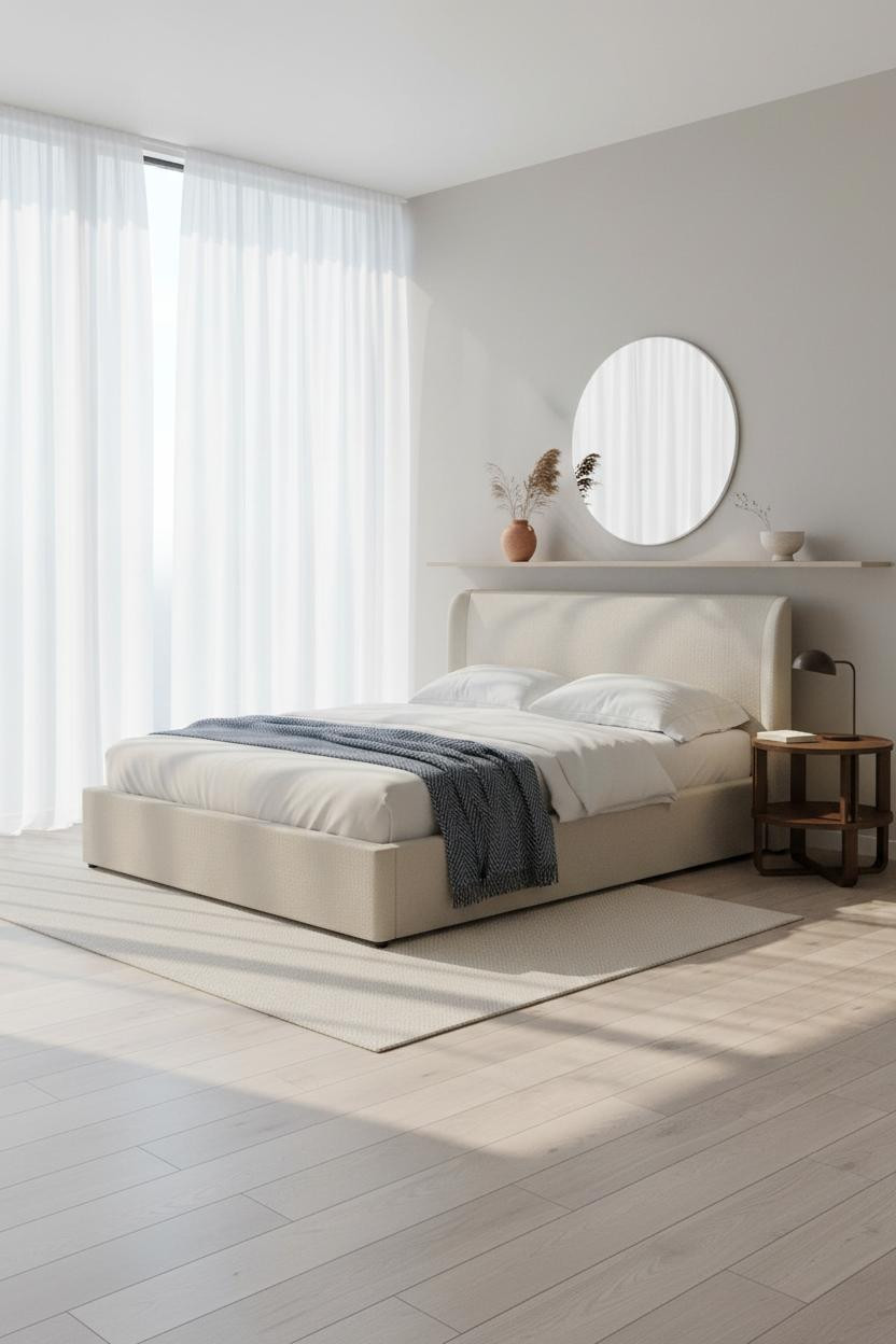
The scale trick here is clever. Floor-to-ceiling sheer white linen panels across the full window wall pull the eye upward and outward, so the room reads taller and wider than it actually is. And that oversized round mirror leaning against the wall amplifies the effect.
Ideal if your studio gets good morning light and you want to protect it at all costs. Sheer panels filter without blocking.
The finishing layer: Pale birch flooring plus a cream linen rug plus warm white walls is the formula for a Scandi micro-studio that never feels cold or clinical. Nothing too precious. Just clean and light.

Our #1 Pick
Saatva Classic Mattress
America’s best-selling online luxury innerspring. 365-night trial, lifetime warranty, free white glove delivery.
Shop Saatva Classic
The Foundation Of Every Beautiful Bedroom
Walls get repainted. Linen gets swapped. The mattress stays. In a studio where the bed is the room, getting that part right matters more than in any other space.
The Saatva Classic uses dual-coil support that holds up through years of actual use, a breathable organic cotton cover that doesn’t trap heat in a smaller room, and a Euro pillow top that’s soft without losing structure underneath. It’s the kind of mattress you stop noticing because nothing ever feels wrong.

The rooms people actually want to live in are the ones where every choice looks considered. Start with the bed. The rest figures itself out.