The first thing you notice in the best cozy colorful bedroom is that nothing looks like it was ordered from the same cart. It feels accumulated. Personal. Like someone lived their way into it.
These 12 rooms are proof that color and comfort aren’t opposites. Pick one idea and run with it.
The Terracotta Alcove That Makes the Whole Room Glow
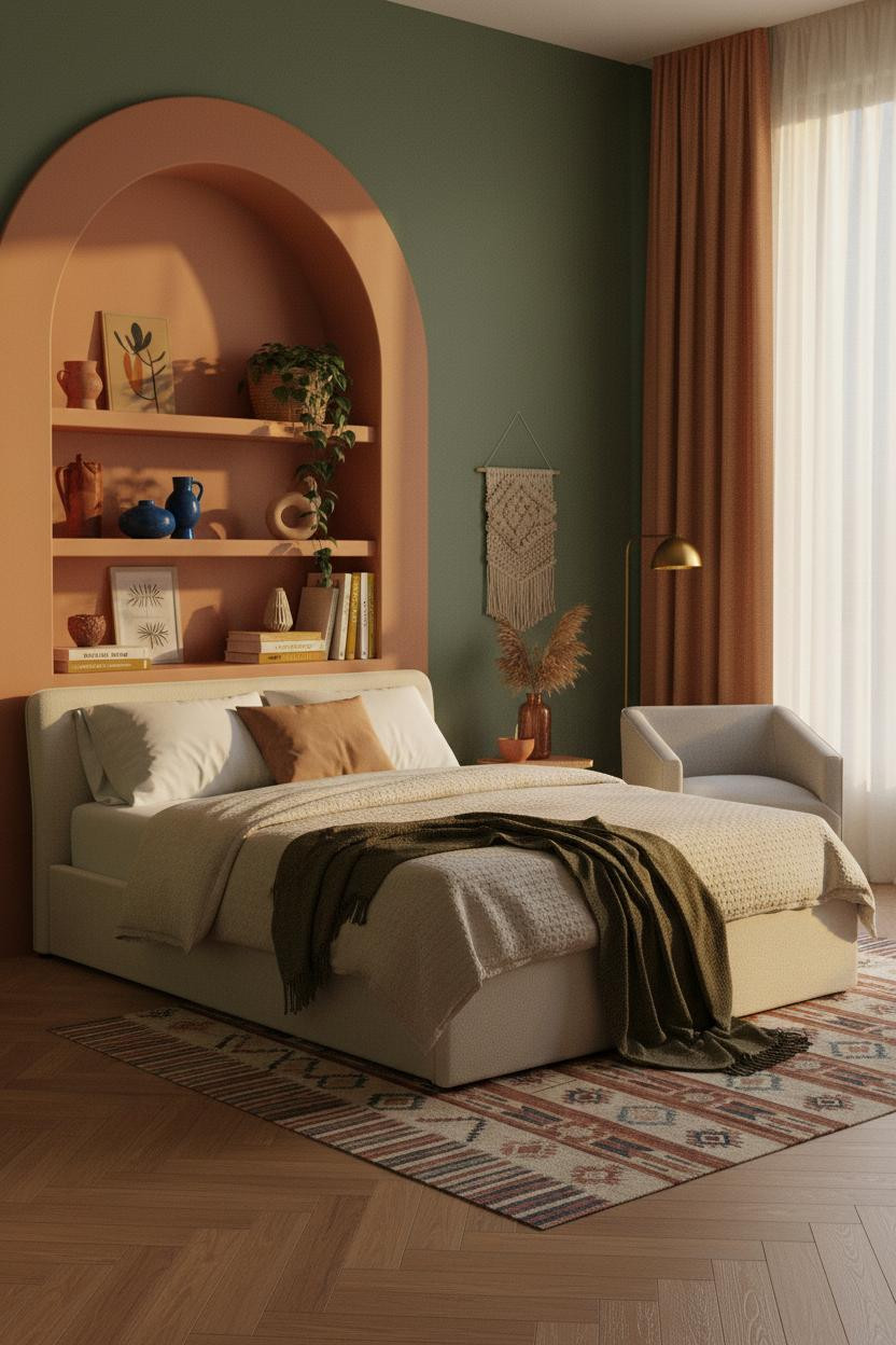


I keep coming back to this one. The arched alcove does something no flat wall can.
Why it feels expensive: Warm terracotta plaster curves catch afternoon light along the arch edges, so the wall reads as sculptural rather than just painted. It’s a small architectural move with a big payoff.
Steal this move: Pair the alcove color with forest green on the flanking walls. The contrast grounds it without making either shade fight for attention.
Cobalt Panels That Stop the Scroll
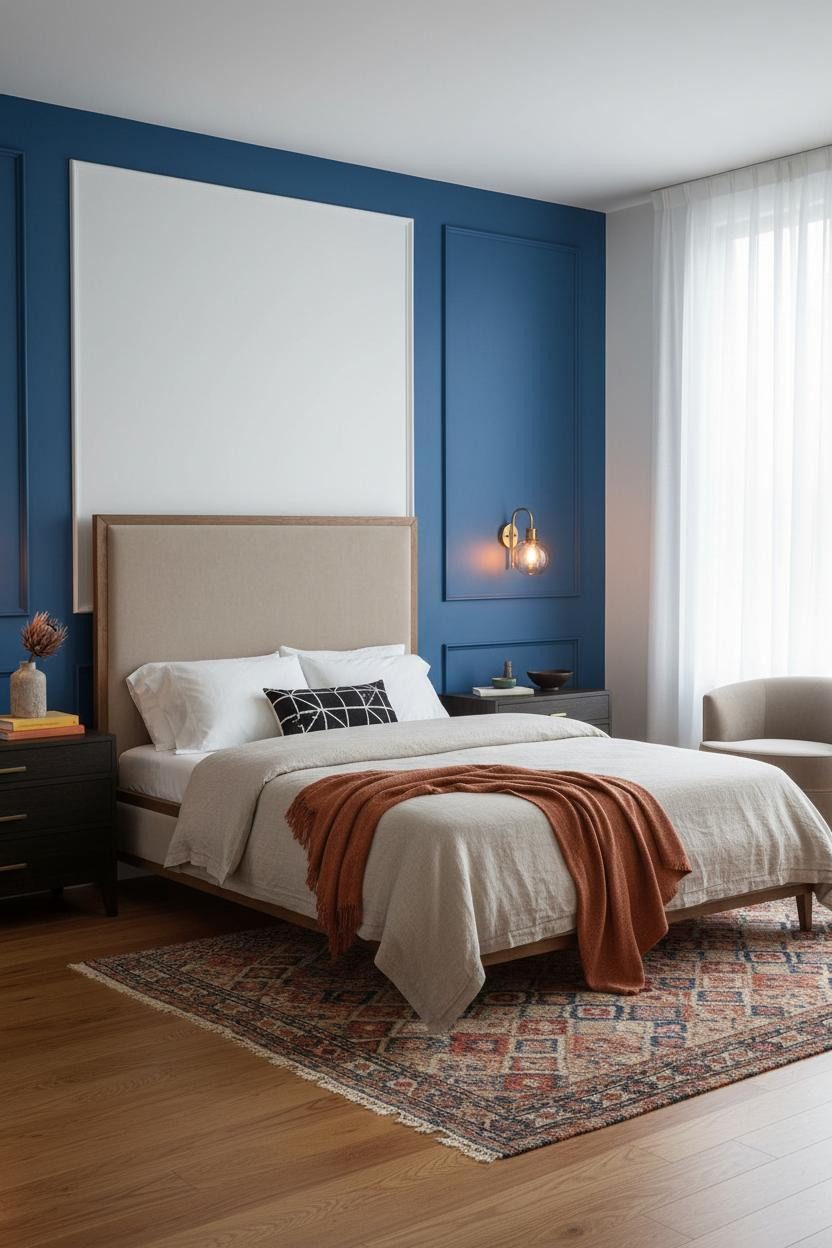


Bold choice. But rooms that commit to this kind of color never look tentative.
The graphic trick here is the raised panel molding painted cobalt blue in the recesses, each panel edge throwing a hairline shadow that makes the wall read as architectural, not just colorful.
What to borrow: Ground the saturation with honey maple flooring and a vintage overdyed rug. Warm wood against deep cobalt keeps the room from tipping into cold.
Gallery Walls That Feel Collected, Not Curated
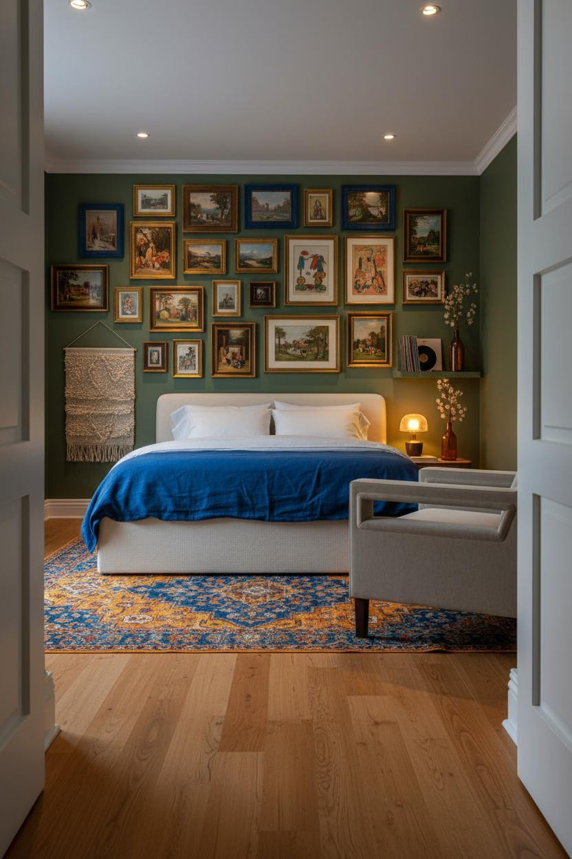

This is the kind of room that makes you want to slow down and look at every corner.
What gives it depth: Mixed cobalt, rust, and gilt frames packed edge to edge read as exuberant rather than chaotic because the color repeats in the rug below. The wall and floor echo each other. That’s why it holds together.
Honestly, the secret to a gallery wall that feels real is using frames you’d never buy as a set. Avoid this mistake: Don’t match the frame metal to your hardware. Mismatched is the point.
How Burgundy Walls Changed My Mind About Dark Color
I used to think burgundy would make a bedroom feel heavy. Wrong.
The reason this works is the black steel Crittall-style window grid casting crisp geometric shadows across matte burgundy plaster. The hard lines and saturated color play off each other in a way that feels intentional rather than loud. And the layered textile approach keeps warmth in the equation.
Pro move: Use a burnt orange mohair throw against burgundy walls. The tones are close enough to feel connected, while still feeling distinct.
Sage Shiplap That Makes a Small Wall Work Harder
Nothing fancy. That’s the point.
Why it holds together: Half-height sage shiplap painted in a warm green gives each board a hairline shadow between planks, adding texture that a flat paint wall can’t deliver. The room feels lived-in without trying.
In a colorful bedroom, the smarter choice is limiting the shiplap to half-wall height rather than floor to ceiling. It keeps the color from consuming the whole room. Pair with bleached oak flooring for contrast that stays soft.
Curved Corner Shelving That Turns Storage Into a Feature
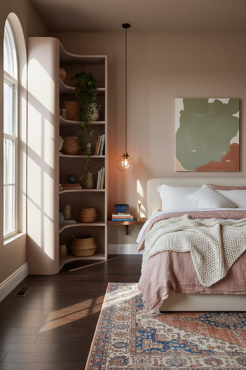
This one surprised me. Floor-to-ceiling shelving in a bedroom sounds impractical. But it isn’t.
What creates the mood: The curved blush mauve shelving unit fills a dead corner with rounded edges that soften the whole composition. Ceramics, trailing pothos, and woven baskets make it feel collected over time rather than styled in an afternoon.
The easy win: Mix object heights on every shelf. Tall ceramic beside a stack of books beside something trailing. That variation is what stops it from looking like a display case.
Deep Plum Slats That Earn Their Boldness
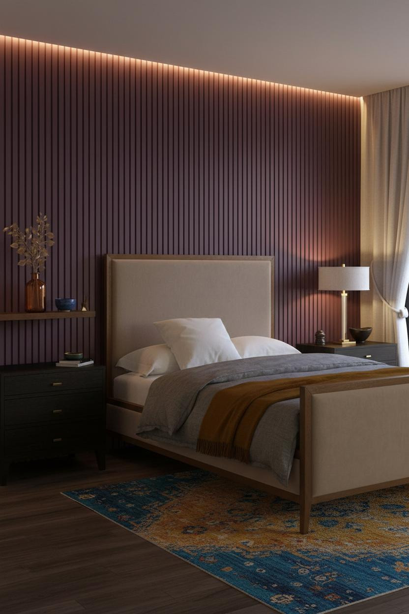
Fair warning. Plum is not a color you try halfway.
But the vertical slatted wood panels painted deep plum do something flat paint can’t: warm lamp light catches each ridge and falls into cool shadow in the grooves, giving the wall a rhythmic texture that changes depending on where you’re standing. The room feels quiet and rich at the same time.
What not to do: Don’t pair plum slats with cool grey bedding. The contrast is harsh. A deep mustard wool blanket pulls warmth back in and makes the color feel intentional.
The Sage Alcove That Feels Like It Was Always There
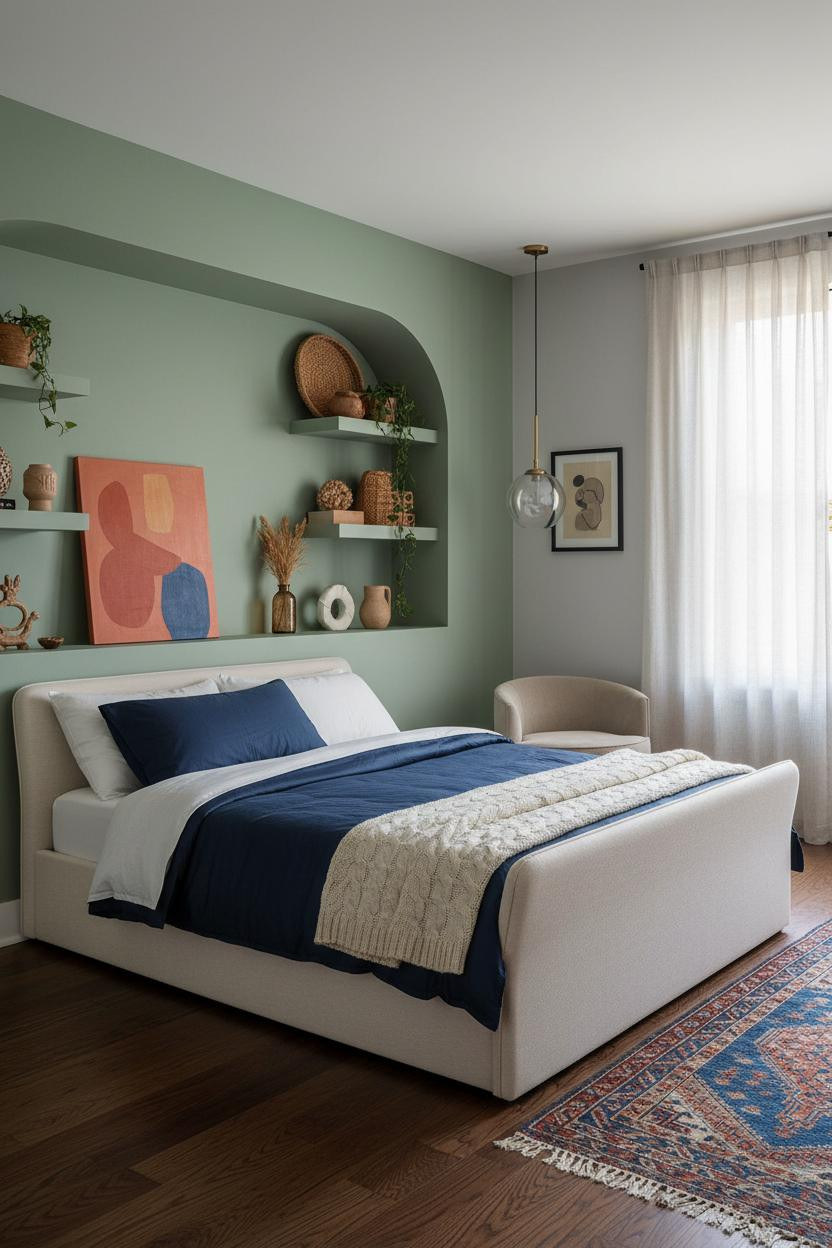
A curved alcove in soft sage against dove grey walls. Somehow it feels original even though you’ve seen the idea before.
Why it looks custom: The rounded niche edges catch morning light along each curve, making the green look warmer than it would on a flat wall. That’s the whole trick.
Use the alcove shelves for collected objects with different heights and textures. The detail to keep: A trailing plant at one end grounds the vertical arrangement and stops it from reading as a display.
Ochre Plaster That Makes Warm Walls Feel Sculptural
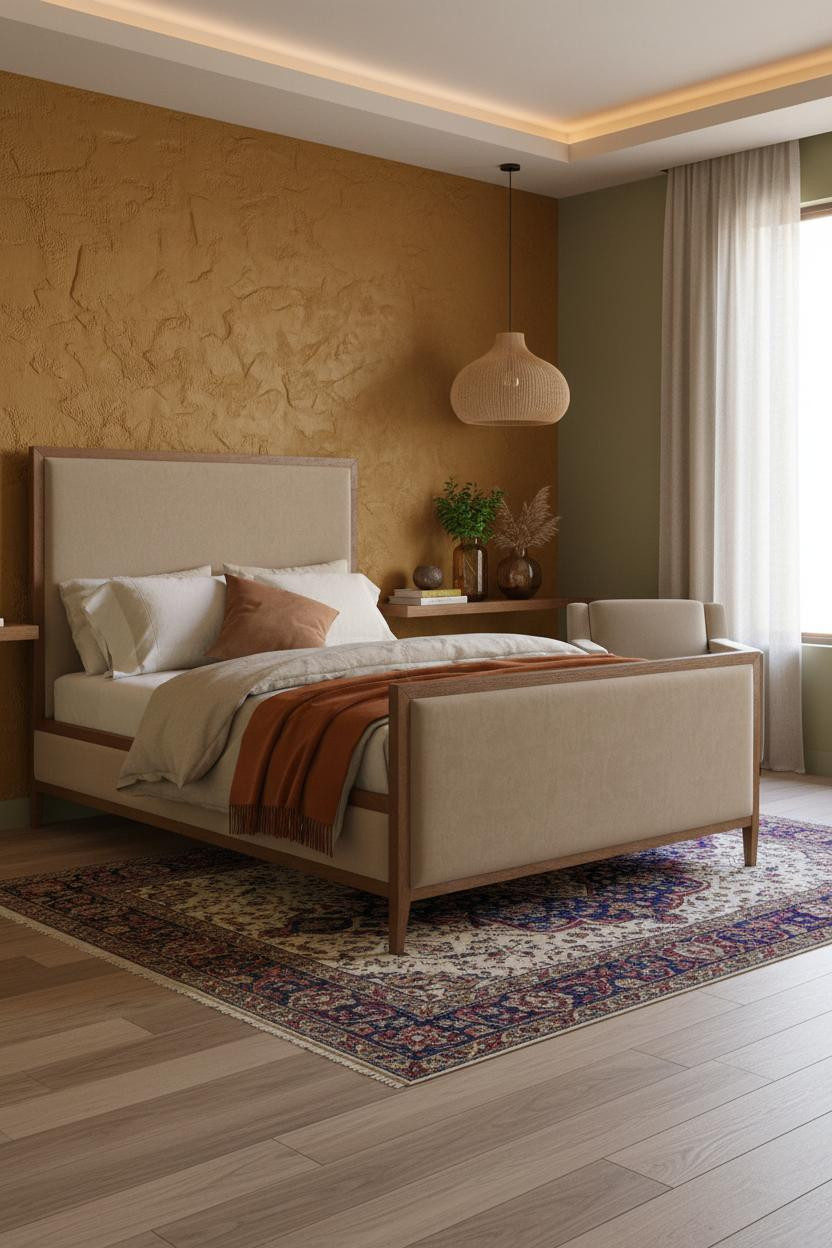
This is the kind of wall that makes a room feel like it has a history. Even if you just moved in.
Hand-applied ochre-mustard plaster catches raking light across irregular ridges, turning what’s essentially a color choice into a texture statement. The warmth it throws onto olive side walls makes the whole palette feel deliberate.
Where to start: Add a rattan pendant overhead before anything else. The organic texture against warm plaster sets the tone for everything else you bring in.
Built-In Shelving That Replaces a Feature Wall Entirely
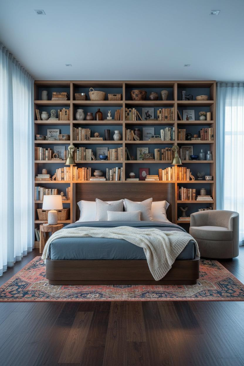

I almost scrolled past this. Glad I didn’t.
The real strength: Floor-to-ceiling natural oak shelving spanning the full wall gives the dusty blue room its visual weight. The warm grain against cool walls creates contrast that makes both the color and the wood look better than they would separately. And because the shelving is open, every object contributes to the overall palette.
What cheapens the look: Matching baskets. Buy them from different places at different times. The variety is what makes the shelving feel lived-in rather than staged.
Teal and White Wainscoting That Feels Both Graphic and Calm
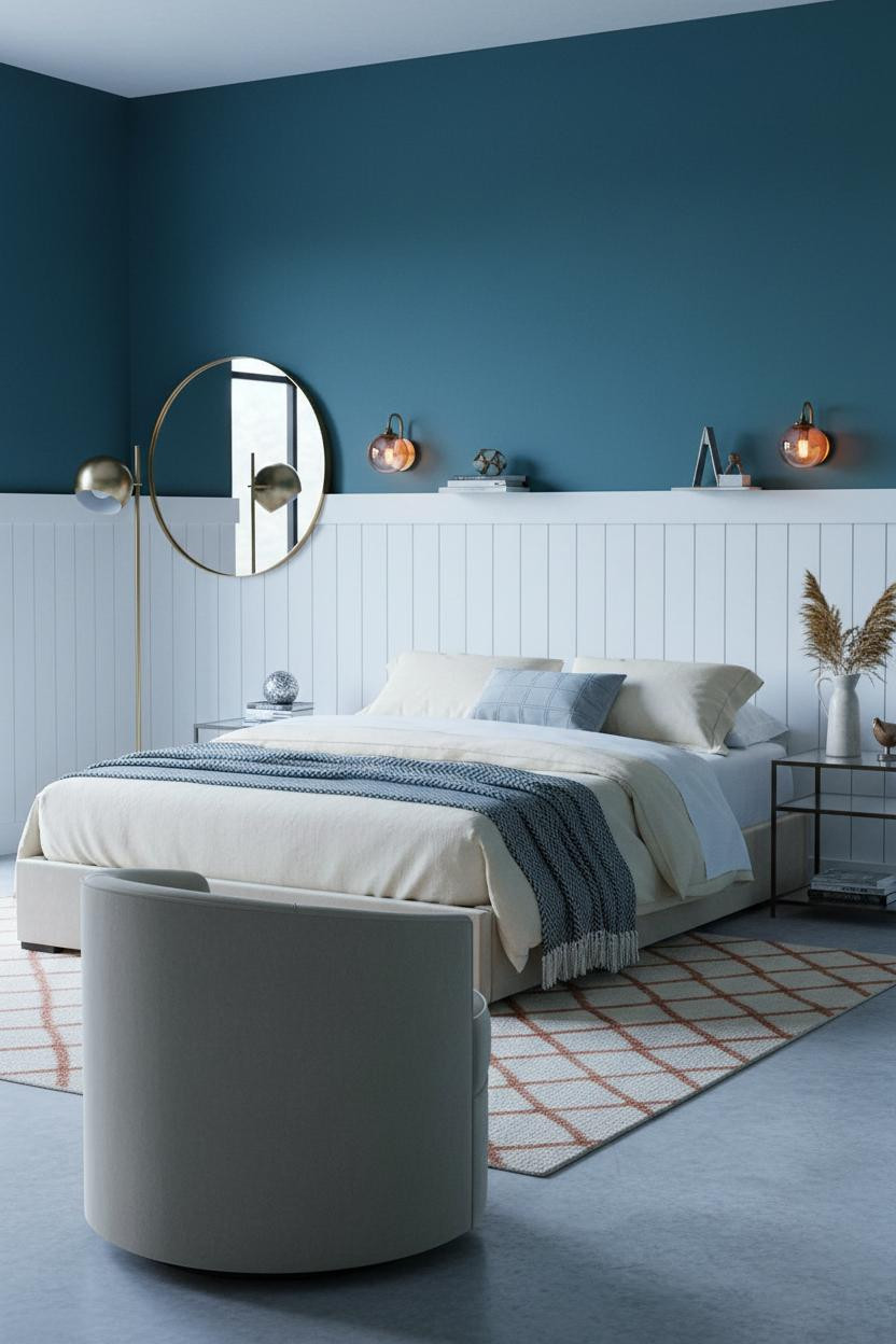

It shouldn’t feel restful. Deep teal above crisp white board-and-batten wainscoting is a lot of contrast. But it does.
Design logic: The white battens throw narrow shadow lines that add architectural rhythm, so the teal reads as intentional rather than just saturated. The two-tone split also breaks up the wall height in a way that makes the ceiling feel higher. And a jewel-tone palette like this needs that kind of grounding to stay calm.
Admittedly, this one requires commitment. Best for adults who want color without chaos.
Terracotta Walls With Exposed Beams That Earn Every Layer
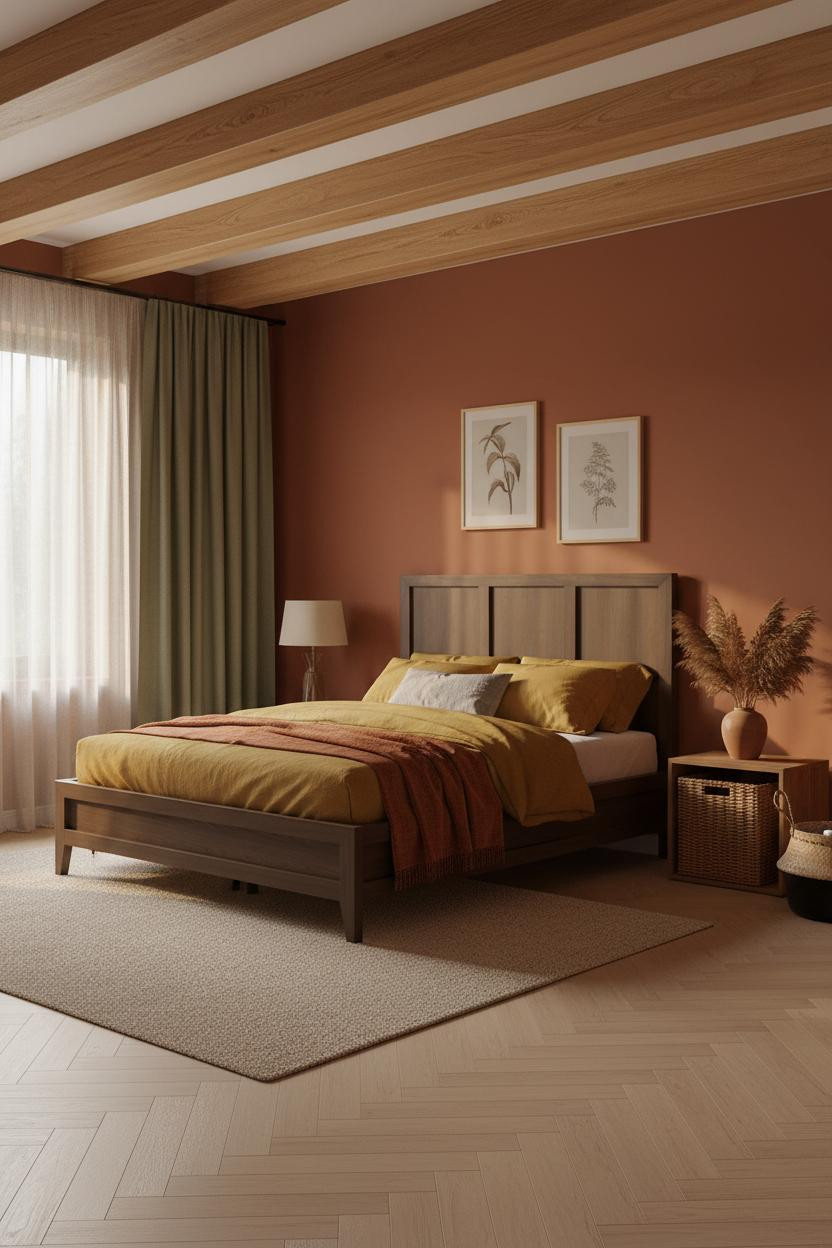

Exposed honey-toned timber beams do more structural work here than any color choice. They anchor the terracotta palette and give every textile layer something raw to lean against.
Why the palette works: Terracotta walls and floor-to-ceiling sage curtains are close enough on the warm-cool spectrum to feel related, while the contrast between them keeps the room from reading as monochrome. It’s a quiet nod to earthy boho without the clichés.
The finishing layer: Dried pampas grass in a ceramic vase. That single organic element pulls the whole palette together in a way that a purchased print never would.

Our #1 Pick
Saatva Classic Mattress
America’s best-selling online luxury innerspring. 365-night trial, lifetime warranty, free white glove delivery.
Shop Saatva Classic
The Foundation Of Every Beautiful Bedroom
All of this, the color, the texture, the objects on the shelf, gets noticed first. But what you actually feel every night is the bed. And that part deserves just as much thought.
The Saatva Classic is the mattress I’d put under any of these rooms. Dual-coil support means the structure holds up regardless of how you sleep. The Euro pillow top adds softness that doesn’t flatten out after a few months. And the breathable cotton cover doesn’t trap heat, which matters more than people think.
Walls get repainted. Textiles get rotated. The bed stays. Start with the right one.

The rooms people save aren’t the most colorful ones. They’re the ones where everything, including what’s under the duvet, feels like a considered choice. Good design ages well because it’s made well.