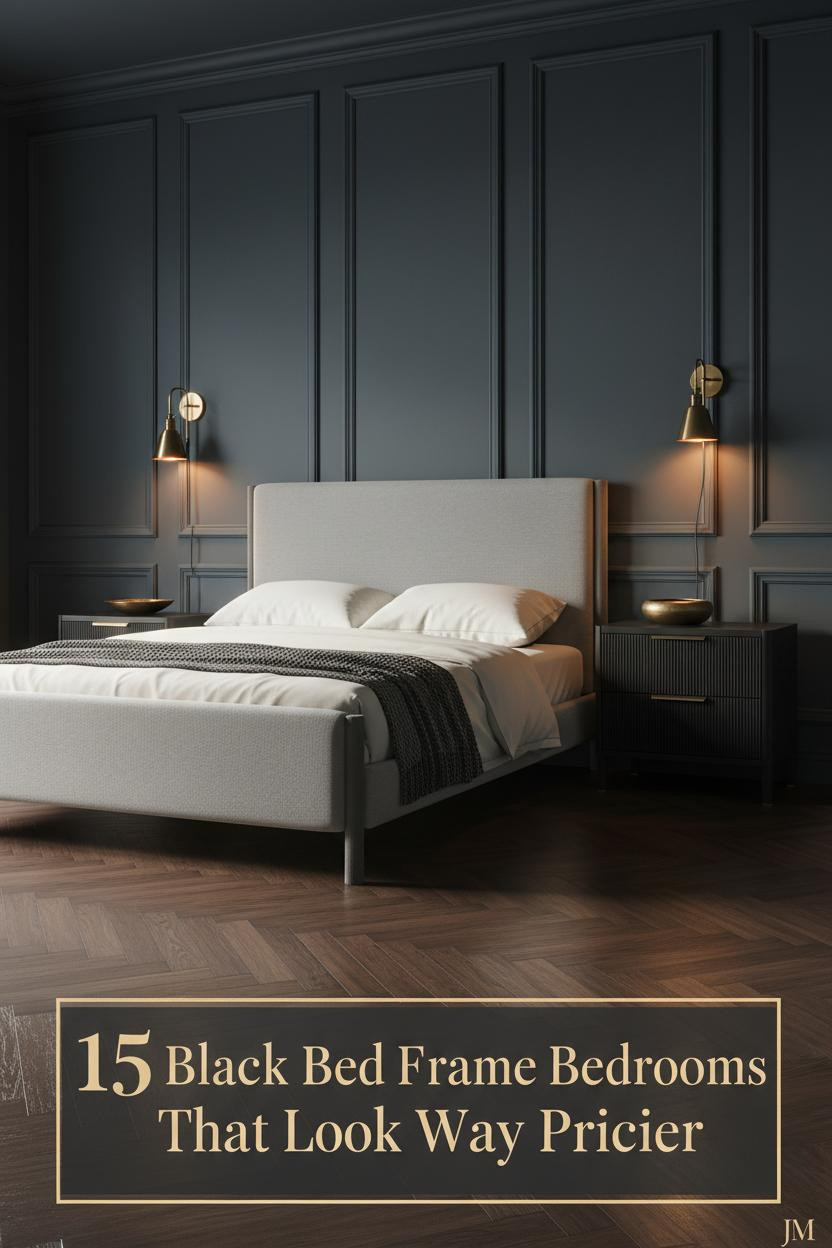
The first thing I notice in a great bedroom ideas black bed frame setup is that nothing looks like it was styled for a photo. The frame anchors. The room answers.
These 15 rooms do that well. Different styles, same principle: the dark frame makes everything around it feel more considered.
The Stone Wall That Makes This Room Feel Ancient and New
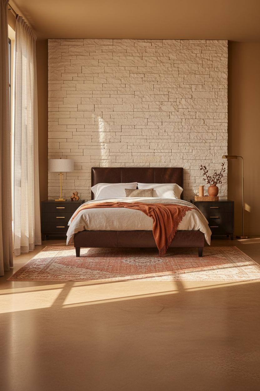


This one is divisive. But the people who commit to a dry-stacked limestone wall behind the bed never regret it.
Why it holds together: The rough-cut stone pulls just enough contrast from the black frame so the room feels grounded rather than heavy. The warm honey walls flanking it keep things from tipping cold.
Steal this move: Layer a terracotta throw at the foot and a woven rattan tray on the nightstand. The organic textures soften the stone while still feeling honest.
A Walnut Herringbone Wall That Earns Every Inch
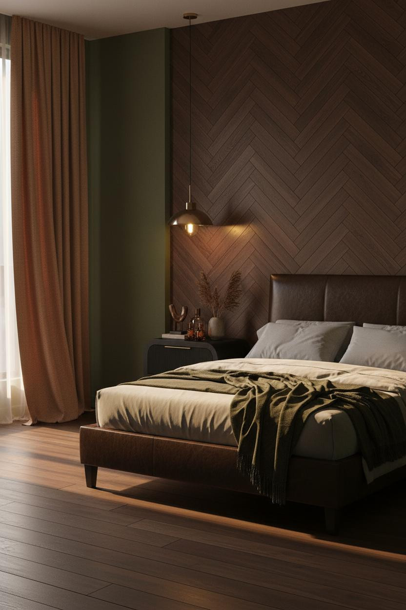
I keep coming back to this one. There’s a twilight-hush quality here that feels genuinely rare.
Why it looks custom: Floor-to-ceiling walnut herringbone planks catch directional light at every angle, which means the wall has depth even in low light. The forest green flanking walls stop it from reading too boardroom.
The smarter choice: Skip the rug here. Dark narrow-plank flooring runs directly under the bed and keeps the geometry clean.
An Arched Niche That Costs Less Than You Think
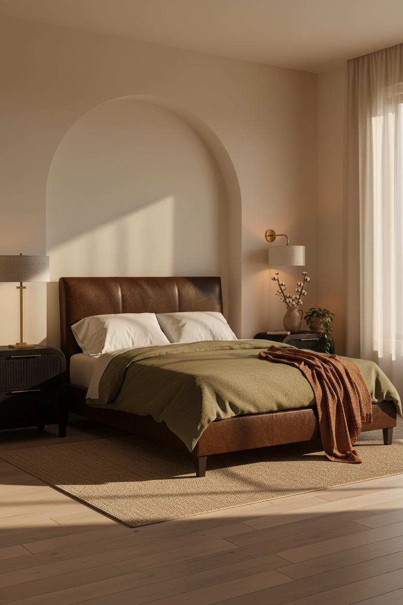
Quiet move. Big payoff.
The arched niche does something a flat wall never quite manages. It frames the bed like a decision, not a default.
What gives it presence: Smooth ivory plaster inside the arch catches raking afternoon light, pulling a soft halo of shadow at the curved edges. The caramel walls on either side stop it from reading too clinical.
Worth copying: A rust linen throw draped unevenly off the far corner ties the warm wall tones back into the bedding without matching anything exactly.
The Scandi Room Where Texture Does All the Work
The room feels warm and grounded without a single dark color in it. Honestly, that’s harder to pull off than it looks.
The sand-toned plaster panel behind the bed shifts from pale ivory at center to shadow at the edges, which gives the wall architectural depth that paint alone just can’t replicate. An oversized round brass-framed mirror leaning against it amplifies the warmth.
Pro move: A kilim runner in muted terracotta beneath the bed ties the rust throw into the flooring without anything looking matchy.
Mediterranean Warmth With a Coffered Ceiling Twist
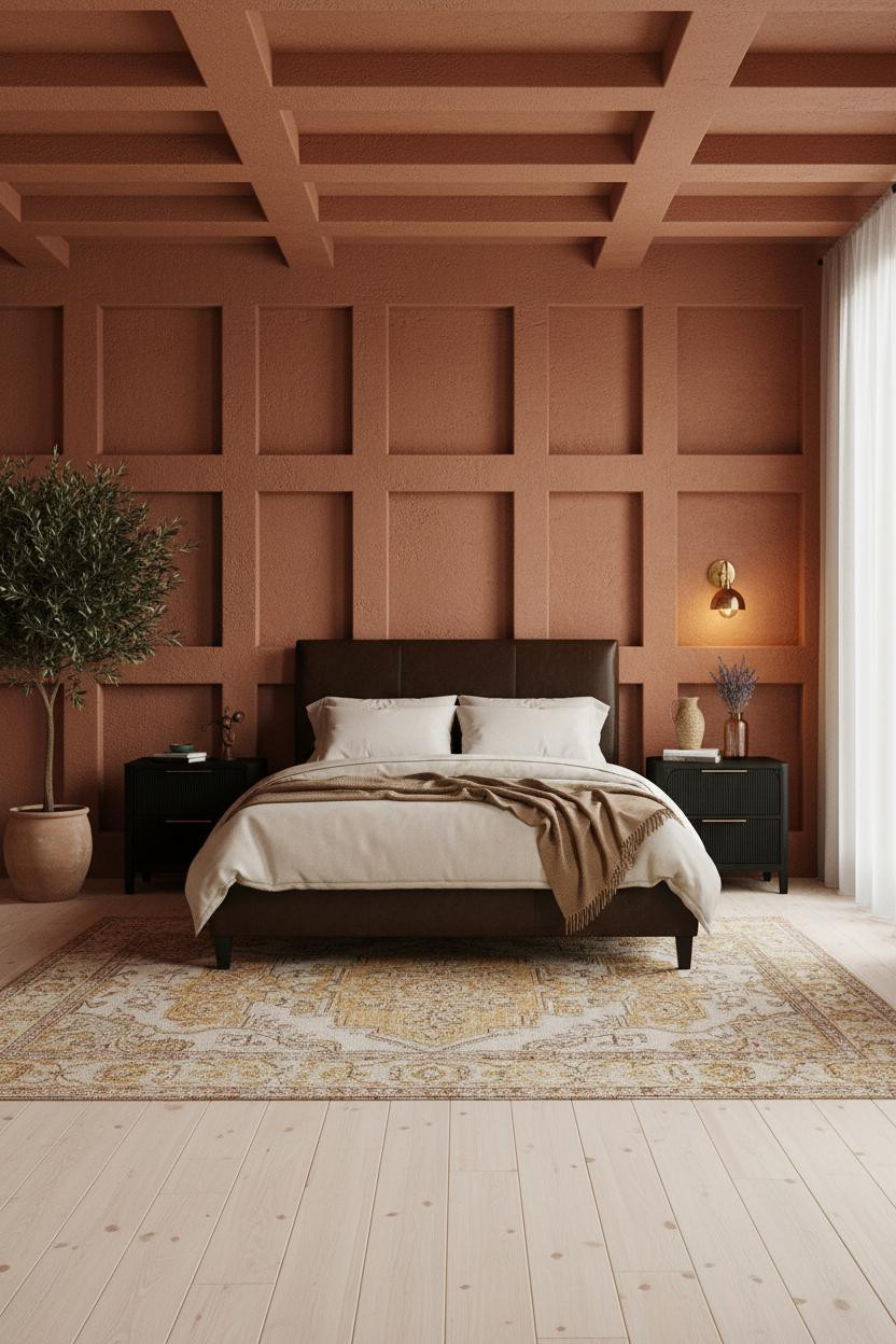
Most people forget the ceiling. This room doesn’t.
What carries the look: The deep horizontal coffered ceiling draws your eye up before it settles back to the black frame below, which makes the bed feel anchored rather than just placed. The rust-clay walls do the rest.
The finishing layer: A large potted olive tree in the far corner softens the geometry in a way that feels genuinely lived-in, not staged.
Dark Walls That Make the Frame Disappear Into the Room
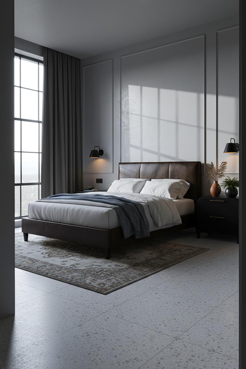
I was skeptical about going this dark. But the room feels calm and cohesive in a way lighter rooms rarely do.
Why it feels intentional: The slim Crittall steel grid cast against grey-white glazed plaster reads as bold graphic structure, giving the charcoal walls something to work with rather than just absorbing everything.
Avoid this mistake: Don’t add warm wood here. A steel blue herringbone throw on pale percale keeps the palette in the same cool register and stops the room from feeling confused.
Built-In Shelving That Actually Changes How You Use the Room
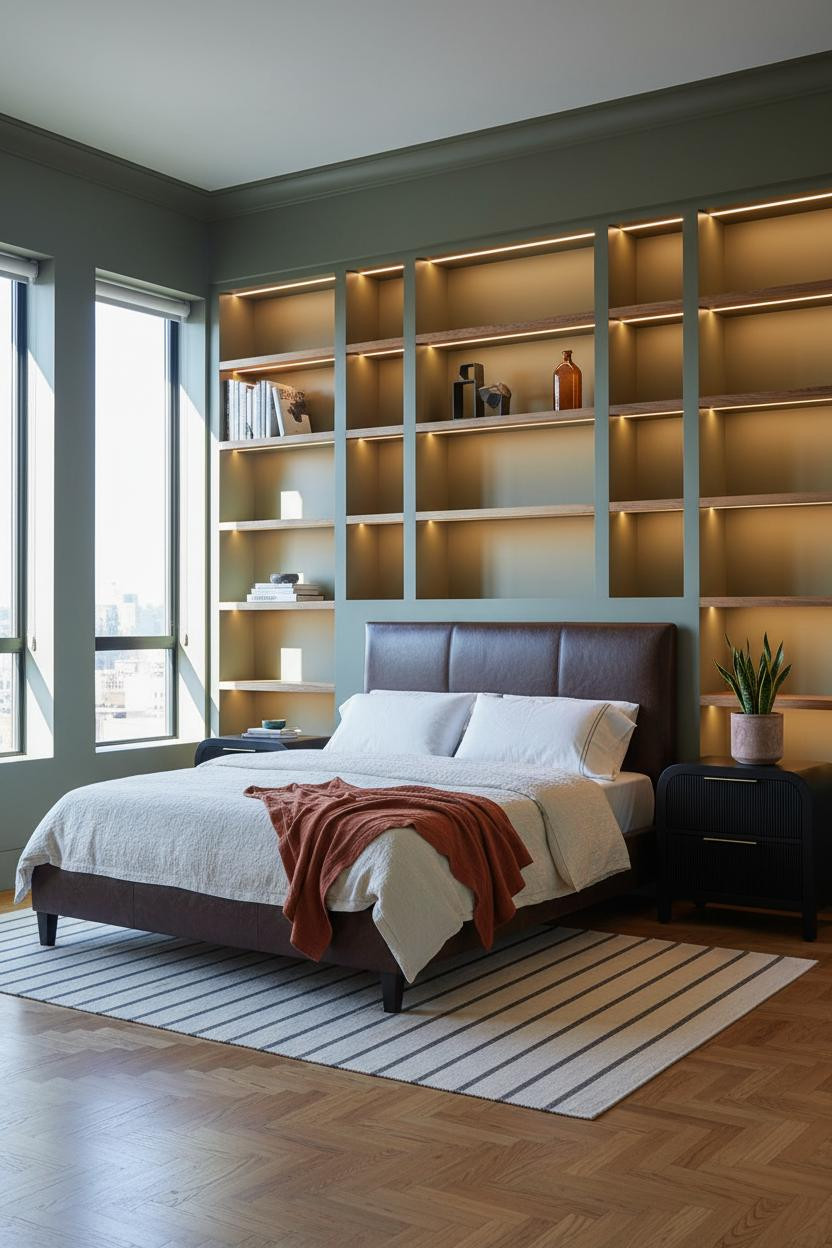
Having full-height storage behind the bed changes how you actually live in the room. No more bedside pile-up.
What creates the mood: The matte olive shelving acts as a backdrop with density, so the black frame reads against it rather than floating in front of a plain wall. Warm shelf LEDs pool amber onto displayed objects while the rest stays calm.
Keep negative space in the shelving. A snake plant in a raw clay pot, a few stacked books, one amber glass bottle. Nothing too precious.
Mushroom Plaster and Reclaimed Wood That Feels Found, Not Bought
This room is collected rather than decorated. I mean that as the highest compliment.
The real strength: Reclaimed grey-brown planks underfoot give the room age that the black frame and mushroom plaster walls can’t manufacture on their own. The combination makes it feel like the pieces have always been here.
One smart swap: A charcoal cashmere throw folded unevenly at the foot adds just enough softness to keep things from reading too austere, while still feeling honest to the palette.
Dusty Blue Walls and Built-Ins That Make a Small Room Feel Larger


In a small room, built-ins painted to match the wall color make the shelving disappear. You gain storage without the room feeling boxed in.
The dusty blue-grey walls and matching shelves read as one surface, so the eye travels through rather than stopping at the furniture line. Warm maple flooring beneath keeps the room from going cold.
The detail to keep: A dusty pink linen duvet against the blue-grey palette is softer than it sounds. Just enough warmth to keep things interesting.
Industrial Minimal With One Unexpected Color Payoff
Fair warning: the mustard wool blanket against dove grey wainscoting either works completely or not at all. This room makes it work.
Design logic: The crisp horizontal rail where dove grey meets warm cream stops the eye at mid-wall height, giving the black frame a clean architectural base to sit against. The mustard becomes the room’s one warm pop, which makes it feel deliberate rather than accidental.
Where to start: A vintage Persian rug beneath the bed softens the polished concrete floor and keeps the industrial edge from feeling sparse.
Sage Shiplap That Proves Coastal Doesn’t Mean Beachy
This is the kind of bedroom that makes you want to slow down in the morning. Nothing urgent about it.
Why the palette works: Each horizontal shiplap plank in soft sage-greige casts a fine shadow groove, so the wall has subtle rhythm without needing anything hung on it. The black frame against that surface creates just enough contrast to keep both from disappearing.
The easy win: A chunky cream wool rug layered on white-washed pine anchors the bed zone with warmth the shiplap alone can’t provide.
Whitewashed Brick and Dusty Rose That Shouldn’t Work Together
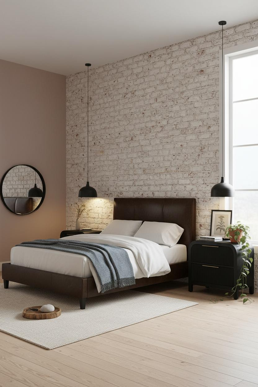
I almost dismissed this one. But the whitewashed exposed brick against dusty rose walls is softer than you’d expect. It works because both surfaces share the same muted, chalky quality.
Why it feels balanced: Raw brick texture catches raking light in a way that painted surfaces don’t, which gives the room grit without hardness. The black frame grounds it so the dusty rose doesn’t read too sweet.
A modern farmhouse bedroom like this lives or dies on the rug. A chunky cream wool area rug beneath the bed keeps the bleached maple floor from competing with the brick. Let one surface lead.
Charcoal Slatted Wall With a Herringbone Floor That Earns Attention
Two strong surfaces. One room. Somehow they don’t compete.
What makes this work: The matte charcoal vertical slats absorb diffused light across the grain, so the wall has raw depth without needing anything decorative on it. Warm amber herringbone parquet below creates a counterpoint that keeps the room from reading all grey.
Avoid this mistake: Don’t add a rug. The herringbone floor is the texture. Covering it loses the whole point.
A Slate Board-and-Batten Wall That Leans Moody Without Going Dark
This is the moody bedroom look done with actual restraint. And restraint is where most people lose the thread.
Why it feels expensive: Each vertical batten on the deep slate board-and-batten wall casts a thin shadow line that amplifies depth, so the wall earns its color without needing artwork to fill it. Paired bedside sconces pool warm amber tones that stop the slate from going cold.
What to copy first: Bleached oak flooring with a graphic black-and-white flat-weave rug beneath the bed. The contrast pulls the eye down and keeps scale in check.
A Japandi Arched Alcove With Golden Hour Written Into the Walls
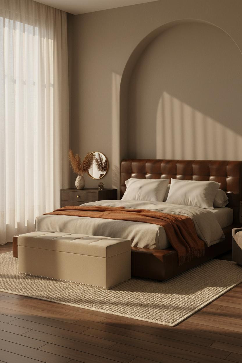

This is the room I keep saving. The floor-to-ceiling arched alcove with recessed ambient light makes the sleeping area feel genuinely apart from the rest of the world.
Where the luxury comes from: Warm greige plaster walls absorb the golden afternoon light slowly, which means the room shifts tone as the day moves. Dark walnut flooring underneath keeps it grounded in the Japandi register rather than drifting soft.
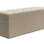
The key piece: A storage bench at the foot solves half the bedroom chaos. And a burnt orange mohair throw draped at the foot ties the whole warm palette together without any one piece working too hard.

Our #1 Pick
Saatva Classic Mattress
America’s best-selling online luxury innerspring. 365-night trial, lifetime warranty, free white glove delivery.
Shop Saatva Classic
Why Luxury Bedrooms Always Feel Better
Walls get repainted. Linen gets swapped. The mattress stays. And the Saatva Classic is the one worth keeping.
It runs on dual-coil support that holds its shape the way a good room holds its palette. The breathable organic cotton cover doesn’t trap heat, and the Euro pillow top has that sink-in quality that actually costs what it feels like it costs.
Get the frame right. Get the walls right. Then get the bed right. That’s the order.

The rooms people keep coming back to are the ones where the comfort matches what the design promises. Good design ages well because it’s made well.